The Freedom of the Press

By now you may have heard that this Thursday media outlets across the United, joined by some international outlets as well, have all published editorials about the importance of the freedom of the press and the dangers of the office of the President of the United States declaring unflattering but demonstrably true coverage “fake news”. And even more so, declaring journalists, especially those that are critical of the government, “enemies of the people”.

I have commented upon this in the past, so I will refrain from digressing too much, but the sort of open hostility towards objective reality from the president threatens the ability of a citizenry to engage in meaningful debates on public policy. Let us take the clearly controversial idea of gun control; it stirs passions on both sides of the debate. But, before we can have a debate on how much or how little to regulate guns we need to know the data on how many guns are out there, how many people own them, how many are used in crimes, in lethal crimes, are owned legally or illegally. That data, that verifiably true data exists. And it is upon those numbers we should be debating the best way to reduce the numbers of children massacred in American schools. But, this president and this administration, and certain elements of the citizenry refuse to acknowledge data and truth and instead invent their own. And in a world where 2+2=5, no longer 4, who is to say next that no, 2+2=6.

There are hundreds of editorials out there.

Read one from the Philadelphia Inquirer, the Chicago Tribune, the Guardian, and/or the New York Times.

But the one editorial board that started it is that of the Boston Globe. I was dreading how to tie this very important issue into my blog, which you all know tries to focus on data and design. As often as I stand upon my soap box, I try to keep this blog a little less soapy. Thankfully, the Globe incorporated data into their argument.

The end of their post concludes with a small interactive piece that presents survey data. It shows favourability and trustworthiness ratings for several media outlets broken out into their political leanings. The screenshot below is for the New York Times.
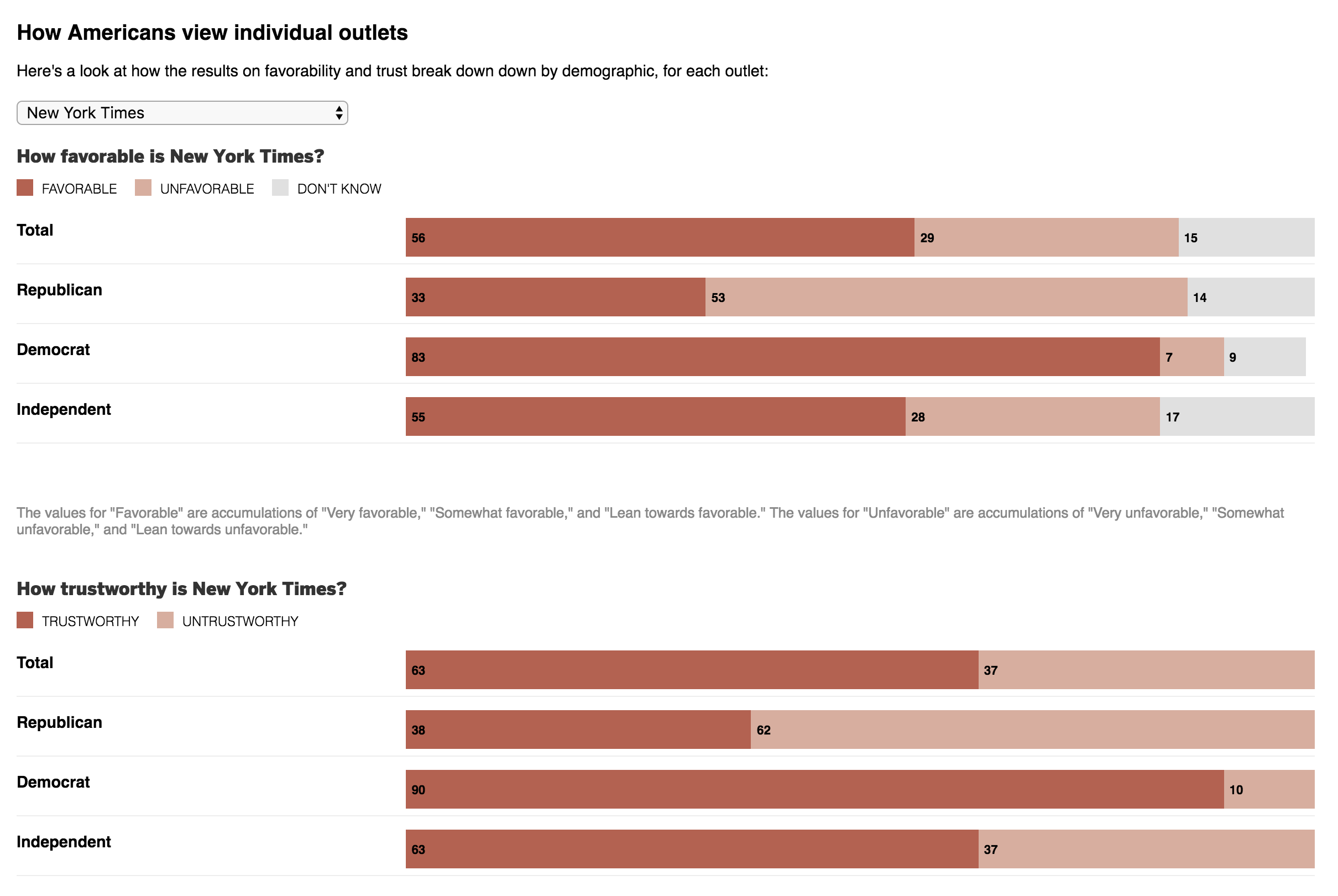
Clearly Republicans and Democrats view the Times differently

The design is simple and effective. The darker the red, the more people believe an outlet to be trustworthy and how favourably they view it.

But before wrapping up today’s post, I also want to share another bit from that same Boston Globe editorial. As some of you may know, George Orwell’s 1984 is one of my favourite books of all time. I watched part of a rambling speech by the president a few weeks ago and was struck at how similar his line was to a theme in that novel. I am glad the Globe caught it as well.

Credit for this piece goes to the Boston Globe design staff.

Water Level on Lake Michigan

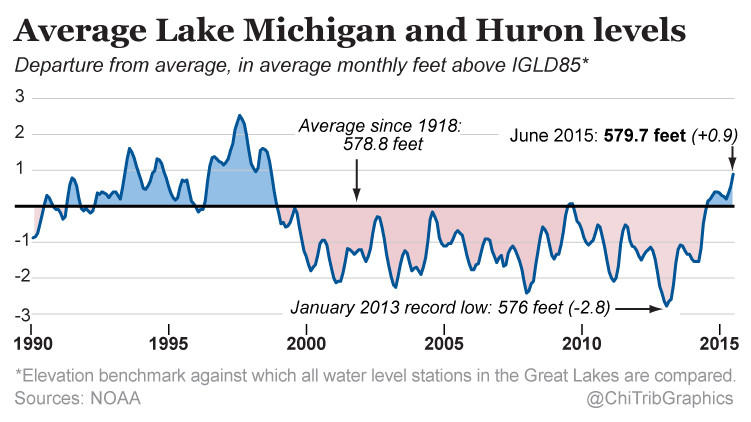
Today’s a little piece for those of you who follow me from the Chicago area. It turns out that in the last 30 months, the water level of Lake Michigan has risen three feet. Despite what some people think, Lake Michigan is not an ocean—I have overheard conversations in my neighbourhood about people who went “swimming in the ocean today” and want to show them a map that points out the Atlantic is almost a thousand miles away—and is not under the same threat as the coast via melting icecaps. The Great Lakes are instead impacted by other regional and cyclical patterns, e.g. El Niño. This article by the Chicago Tribune makes use of this small but clear line chart in its discussion of those very factors.

Water levels for Lakes Michigan and Huron

Credit for the piece goes to the Chicago Tribune’s graphics department.

FAA Fire in Aurora

Last Friday a fire in an FAA centre in one of Chicago’s suburbs shut down air traffic in the Chicago area. You know, not a big deal. So the Chicago Tribune made a small graphic to show just how much of a difference a closure of air space can make.

Air traffic shutdown

Credit for the piece goes to the Chicago Tribune’s graphics department.

Speeding on Chicago’s Tollways

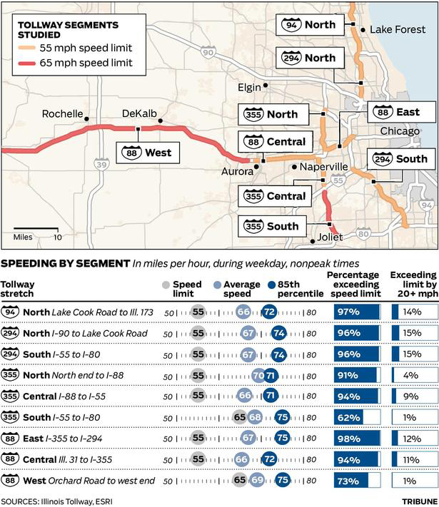
The Illinois Tollways will be raising speed limits starting 1 January. Part of that process includes researching current driving habits and patterns. This graphic by the Chicago Tribune looks at some of the results. While the map part is necessary to show the routes themselves and the limits on those routes, the more interesting part is the dot plot below.

Illinois Tollway speeds

Credit for the piece goes to the Chicago Tribune’s graphic department.

Rebuilding Chicago’s Red Line

For those of you who read this blog in Chicago know very well that the Red Line, Chicago’s busiest subway line, is undergoing major construction as the transit authority rebuilds much of the line. But what exactly does that entail?

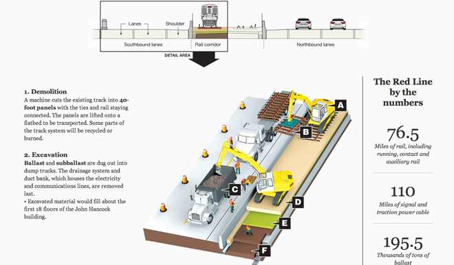
Earlier this year the Chicago Tribune looked at that and with a series of illustrations, explained the different steps of the process. This first section details the steps taken to rip up the rails.

Dismantling the existing rail lines

Credit for the piece goes to Jemal R. Brinson and Kyle Bentle.

Renovating Wrigley Field

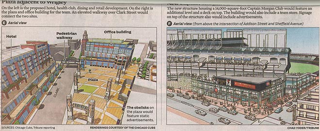
In Chicago there is much ado about renovating Wrigley Field. As a Red Sox fan, I can only say that the Fenway renovations are being well-received. A little while back, the Chicago Tribune illustrated just what these proposed changes will be. The first image was from the above the fold section, and the second was a smaller set of illustrations that were below the fold.

Above the fold illustrations
Below the fold illustrations

Really, it’s just always a treat to be able to post printed graphics.

Credit for the pieces go to the Cubs and Chad Yoder of the Tribune.

Fast and Shiny Trains

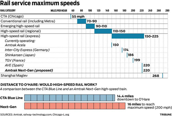
This is another comparison of high-speed lines and how woefully inadequate American infrastructure is in this particular department. The graphic comes via the Chicago Tribune in support of this article, wherein the outgoing mayor states the need for a high-speed line to link downtown Chicago to O’Hare International Airport. Apparently his desire for such speedy transit was inspired by his trip to Shanghai, where the Chinese have had a magnetically-levitated (maglev) train connecting the airport to the city for a few years. It’s fast. (Though as the article makes a point to call out, the Shanghai train does not stop in downtown Shanghai, but rather the city’s edges where travelers then link up with a more conventional train to reach downtown.)

Chart Comparing Rail Maximum Speeds

The chart is nice because it breaks down the types of trains into categories based upon speed, and in the area of interest, namely high-speed, the express section is broken out in detail with the several main types of high-speed trains described. Of course these are all maximum speeds and I would be curious to see a comparison of average operating speeds. For example, while Acela is billed as fast, it frequently operates well below maximum speeds because of its route—the Northeast Corridor was not designed for trains running at such high speeds all those years ago.

At the bottom is a comparison of the overall length of the Blue Line, the Chicago route that connects the Loop (downtown) to O’Hare, to the distance needed to accelerate and decelerate a high-speed train to its maximum speed. Overall, I think the plan sounds like a glossing over of other deficiencies in the Chicago mass transit network for the sake of shiny new toys for (outgoing) mayoral boys.