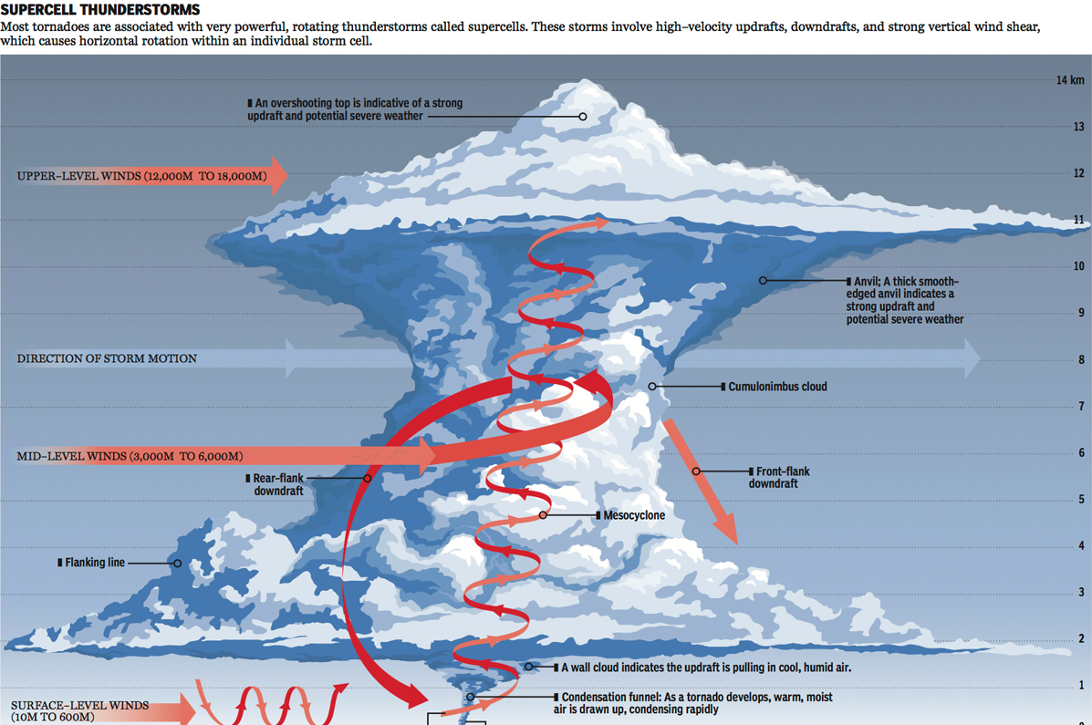
I just returned from my trip to Kansas City last night. Kansas, if you did not know it, exists within what people call Tornado Alley. That means they receive a lot of tornadoes. But what are tornadoes beyond the plot points of mid-90s action films? Basically complicated micro-weather systems. So complicated we still don’t entirely understand them. But the National Post looks at explaining what we do know.
Inside a tornado
Credit for the piece goes to Andrew Barr and Mike Faille.
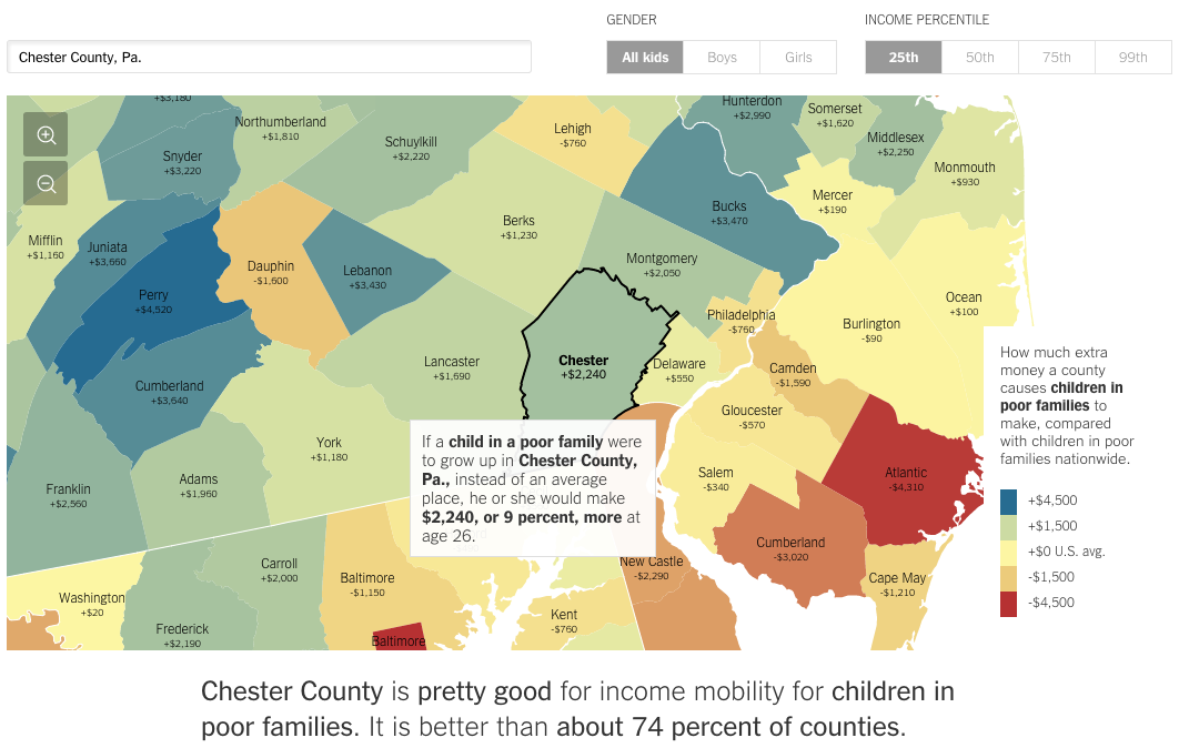
Today we have a really interesting piece from the New York Times. In terms of visualisations, we see nothing special nor revolutionary—that is not to say it is not well done. The screenshot below is from the selection of my hometown county, Chester County in Pennsylvania. Where the piece really shines is when you begin looking at different counties. The text of the article appears to be tailored to fit different counties. But with so many counties in the country, clearly it is being done programmatically. You can begin to see where it falls apart when you select rather remote counties out west.
How the poor in Chester County fare
But it does not stop simply with location. Try using the controls in the upper right to compare genders or income quartiles. The text changes for those as well.
Credit for the piece goes to Gregor Aisch, Eric Buth, Matthew Bloch, Amanda Cox, and Kevin Quealy.
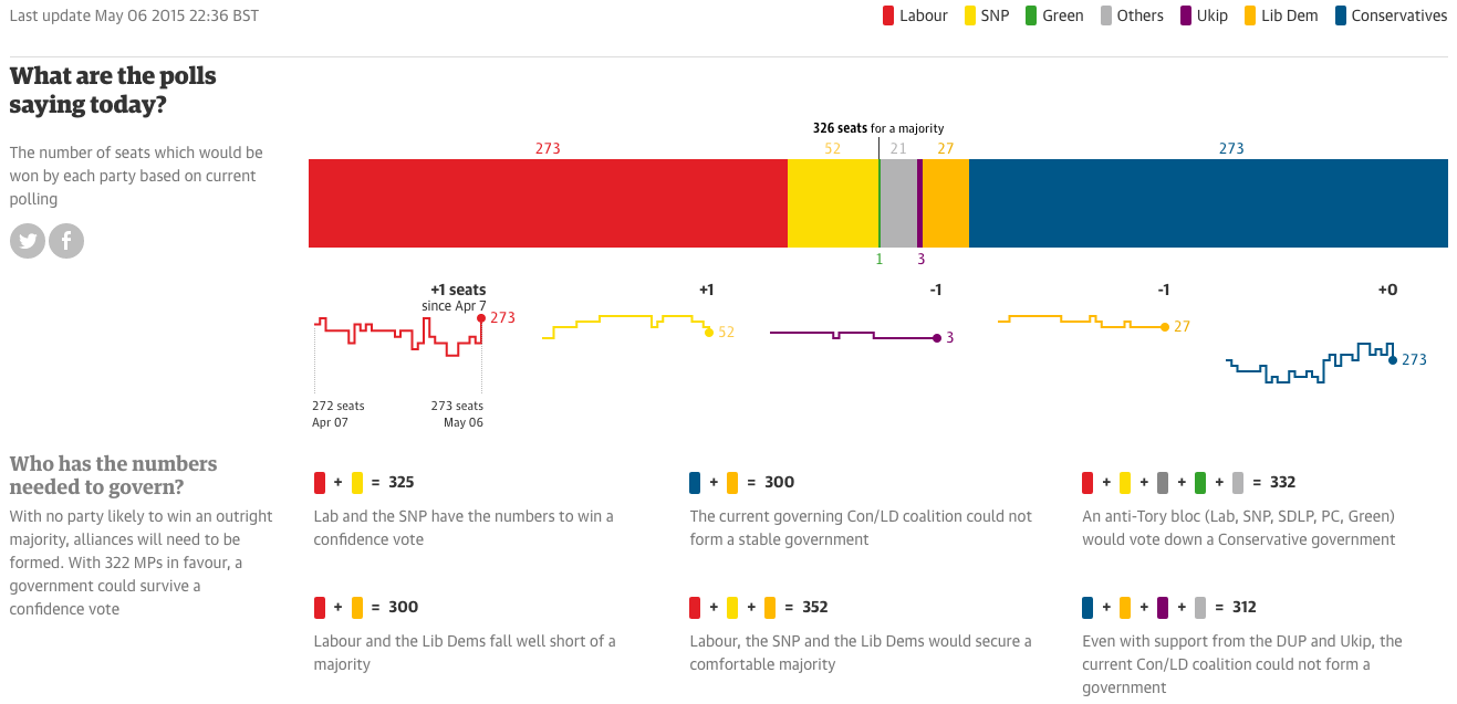
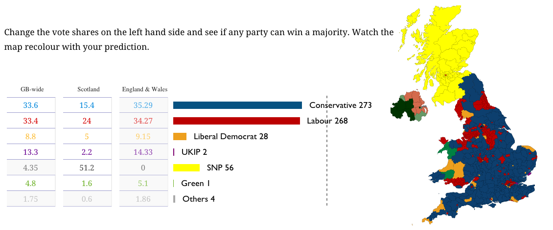
Well for those of you among my British audience, today is the big day. Can Malcolm Tucker save Nicola Murray from—wait, nope, that’s fictional British politics. But that doesn’t mean today’s results won’t be exciting. For those of you now from the UK, a majority of my readers, the UK is looking at what is called a hung parliament. In other words, nobody will win a majority of seats, which means that smaller parties will need to be included in a coalition government, a sort of fairly new—but also not really—development in British politics.
We could dive deep into all of these, but I have not the time. But, let’s start with the Guardian. They have a nice set of polling and prediction guesstimators. What is really nice, however, is the seat changing graphics. These show you where the gains and losses are predicted to originate.
The Guardian’s predictions
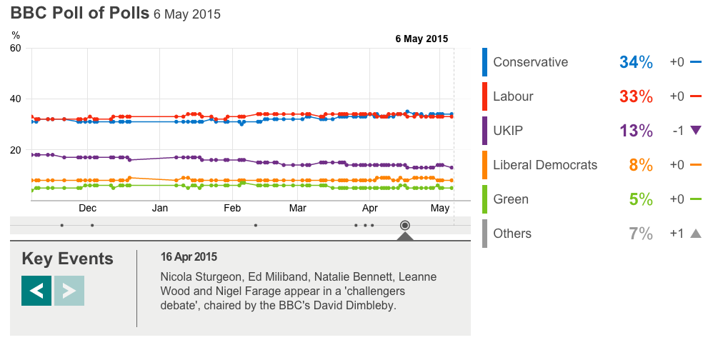
The BBC has a much less involved piece. This is the only thing I can find. However, the BBC will undoubtedly have interesting visuals during their live broadcast of the results. Jeremy Vine can always be counted on for weird presentational things. Oh, and they have the swingometer.
The Economist has a nice poll tracker with some simple controls for some simple filtering. But, these are, like the BBC’s, without an impact of number of seats. The Economist does, however, offer a separate build-your-own-majority calculator.
What the Economist shows on their Election homepage
The New Statesmen has built a site dedicated to May 2015, and their current predictions are as follows below.
New Statesmen’s predictions
The only drawback to all of these pieces is that I will be busy coaching softball tomorrow night. So I will be unable to watch the BBC’s coverage of election results. And that is most unfortunate, because British politics are far more fascinating than the bland and boring two-party politics of the United States.
Credit for the Guardian piece goes to Caelainn Barr, Helena Bengtssoni, Chia-Jung (Apple) C.Fardel, Seán Clarke, Cath Levett, Alberto Nardelli, and Carlo Zapponi.
Credit for the BBC piece goes to the BBC graphics department.
Credit for the Fivethirtyeight piece goes to Matthew Conien and Ritchie King.
Credit for the Economist piece goes to the Economist’s graphics department.
Credit for the New Statesmen piece goes to the May 2015 graphics team.
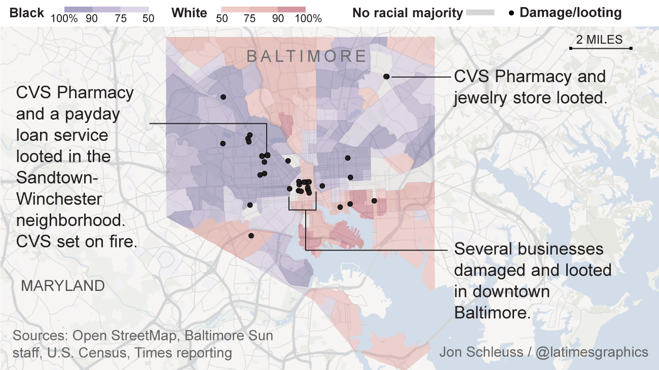
Baltimore is going crazy, if you haven’t heard. So the LA Times put together a set of maps putting the riots in context. They look at the racial makeups of the neighbourhoods with the violence along with median income and education.
The racial makeup of the neighbourhoods witnessing riots
Credit for the piece goes to Jon Schleuss, Kyle Kim, and the LA Times graphics department.
(To be fair, I forgot to schedule to publish this post before I left somehow.)
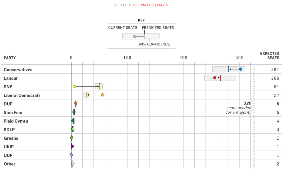
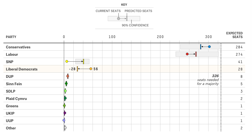
Your humble author is still on holiday. So, today, you can enjoy a nice interactive piece from FiveThirtyEight that predicts the results of the 7 May general election. Of particular interest, the box part of the plot that shows the 90% confidence range.
Dot plotting the results
The piece also has a choropleth map. My only feature request(s) would be to have a zoom feature for urban constituencies and/or to have a search field that allows the user to see the predicted results for a specific constituency.
Credit for the piece goes to Matthew Conlen and Ritchie King.
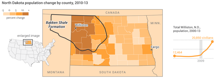
North Dakota’s economy has been booming because of shale oil. Most of that economic growth has been centred on what was the small city of Williston, North Dakota. Economic growth often leads to population growth, however, and that can at times lead to growth in less than wholesome economic activities. The National Journal took a look at the population growth in the area and what has been happening concurrently in a few metrics of the less wholesome sectors of the economy, i.e. drugs and prostitution. Turns out, they are both up.
Population growth in North Dakota
Credit for the piece goes to Clare Foran and Stephanie Stamm.
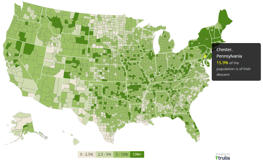
I am unabashedly Irish-American. So, Happy St. Patrick’s Day. But, I am not the only Irish-American in America. In 2013, Trulia put together a post about the Irish in America using US Census Bureau’s American Community Survey data. The post also links to an interactive map looking at US counties by their self-reporting Irish-ness. Not surprisingly, the Northeast is the most Irish, Philadelphia is the 8th largest metro area at 14.2%.
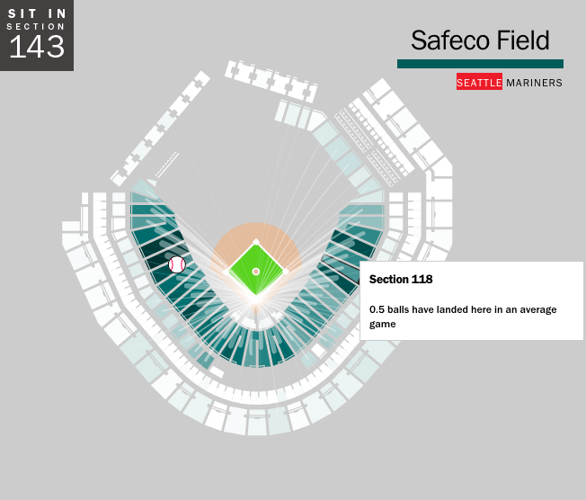
As we established yesterday, baseball is rumbling back to life with Spring Training. That means it is time to start buying tickets for games. But if, like me, you have never caught a foul ball or home run, you may want to sit in a location where you can optimise your chances. Where is that? Well, now we have an app for that, Ideal Seat, as covered by Time. It uses interactive maps of stadiums and data on where hit balls land to generate an average number of balls per game—an average of about 30 foul balls per game.
Choropleths are not always a good idea. For example, look at election maps. Highly populated but geographically small cities appear as mere drops of ink on paper or pixels on a screen. Meanwhile, vast deserts appear gigantic empires. Nothing new there. But even within cities, these issues exist. London is one such city and one design studio has been working on a means of changing that. London Squared Map converts the boroughs of London into almost all squares of equal area. Each is placed in the appropriate space to represent geographic location. But to convey actual geography and familiarise the audience, not all squares are equal. Instead, just like the city itself, the squares are divided by a simplified shape of the Thames.
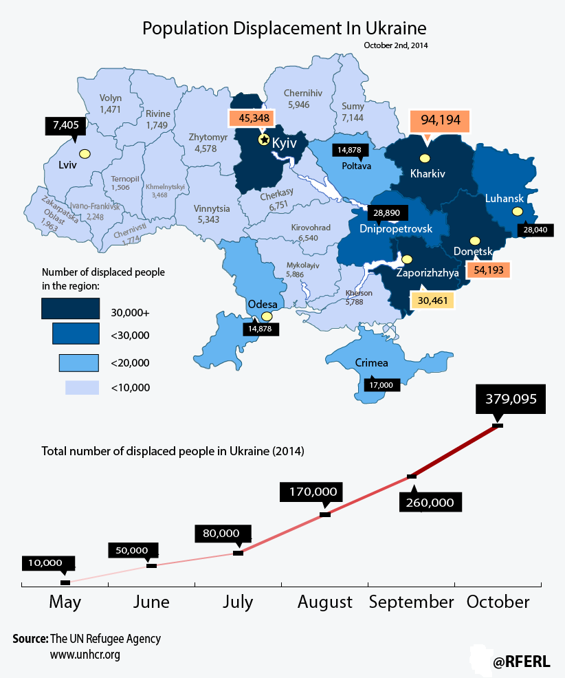
Ukraine continues to suffer the effects of a Russian invasion. Though we won’t call it that. This piece from Radio Free Europe looks at the displaced persons in the country. Unfortunately, it is not quite the best example of what to do.
Displacement in Ukraine
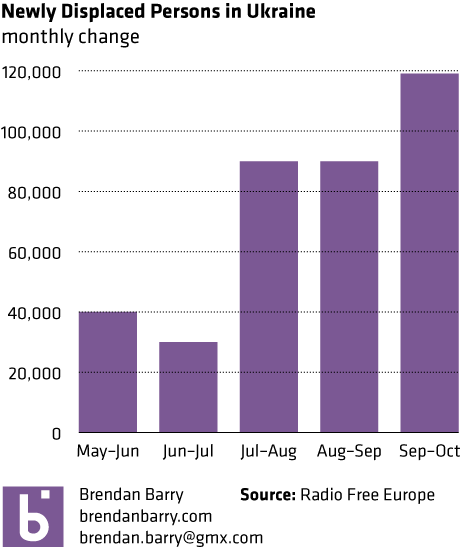
The line chart looks at the cumulative number of displaced persons. But, a monthly growth or absolute number for that month would tell a different story. See below. Hint, it slowed down, and then got pretty bad again.
Monthly population change
I am also not a fan of labelling every data point on the map. Maybe call out a few interesting ones, the outliers perhaps. But do we need to know to the person how many people are in Ternopil. Probably not.
Credit for the piece goes to the graphics department of Radio Free Europe.