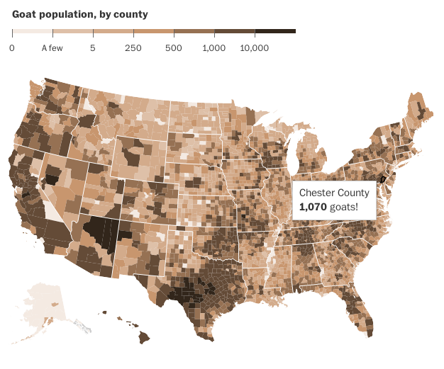
Today is Friday. And that means it is time for the seriousness. So here you go, folks. Goats. All the goats. The US Agricultural Census recorded all the goats as of 2012. And so people can map that out. Thankfully the Washington Post did it for me.
Note the exclamation point
Credit for the piece goes to the Washington Post graphics department.
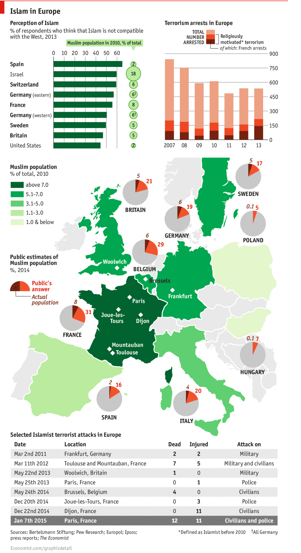
Last week’s terror attacks in Paris highlight the tension in Europe between secular Europe and those believing in Islamist values. The Economist looked at some of the available data and noted the gap between Europe’s perception of Islam and its reality. A quick figure called out for France, French respondents thought 31% of the French population to be Muslim. The reality is a mere 8%.
Perception vs reality
Credit for the piece goes to the Economist Data Team.
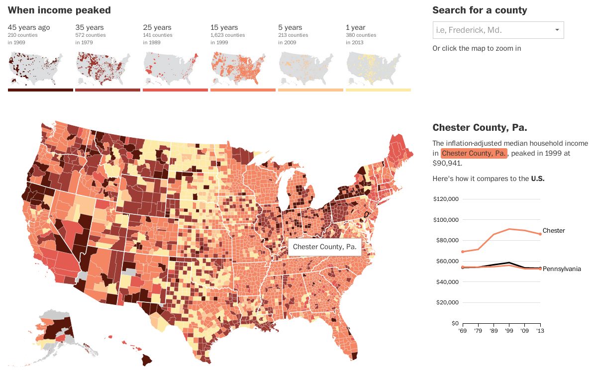
Today’s post looks at peak income for the middle class. The Washington Post looked at peak median household income for each county in the United States. And for 81% of counties, that peak was over 15 years ago.
Income map
The really nice features of this piece are not actually the map, which is a standard choropleth map. Instead small multiples above the map breakdown the appearance of counties in each era bracket. And then to the right the user can compare a selected county against both the state and the United States. Overall, a very nice piece.
Credit for the piece Darla Cameron and Ted Mellnik.
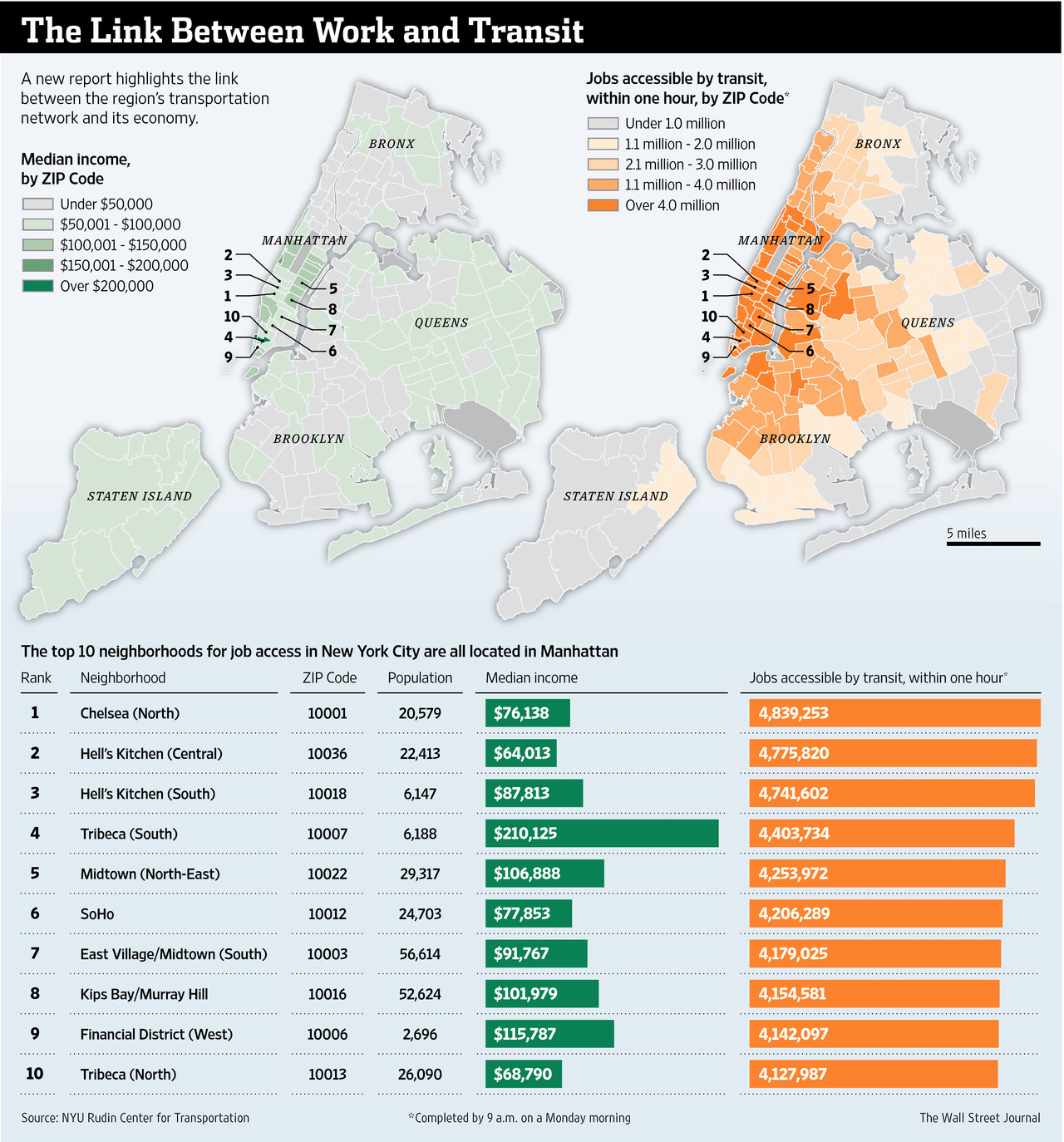
The Wall Street Journal recently published an interesting article about the link between work and access to transit. They included a graphic that looked at the link between the two.
Linking the two together
Credit for the piece goes to the Wall Street Journal graphics department.
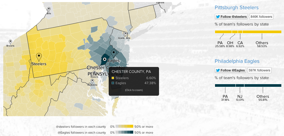
To continue with the sports theme from yesterday, today we have an interactive map from Twitter that looks at NFL team popularity. The methodology is simple, where are the users following the various football teams and map that out by county. The overall blog post features a country-wide map, but then narrows down into a few particular stories. The image below is from the divide in the state of Pennsylvania between Eagles fans and Steelers fans.
Philly vs. Pittsburgh
Credit for the piece goes to Simon Rogers and Krist Wongsuphasawat.
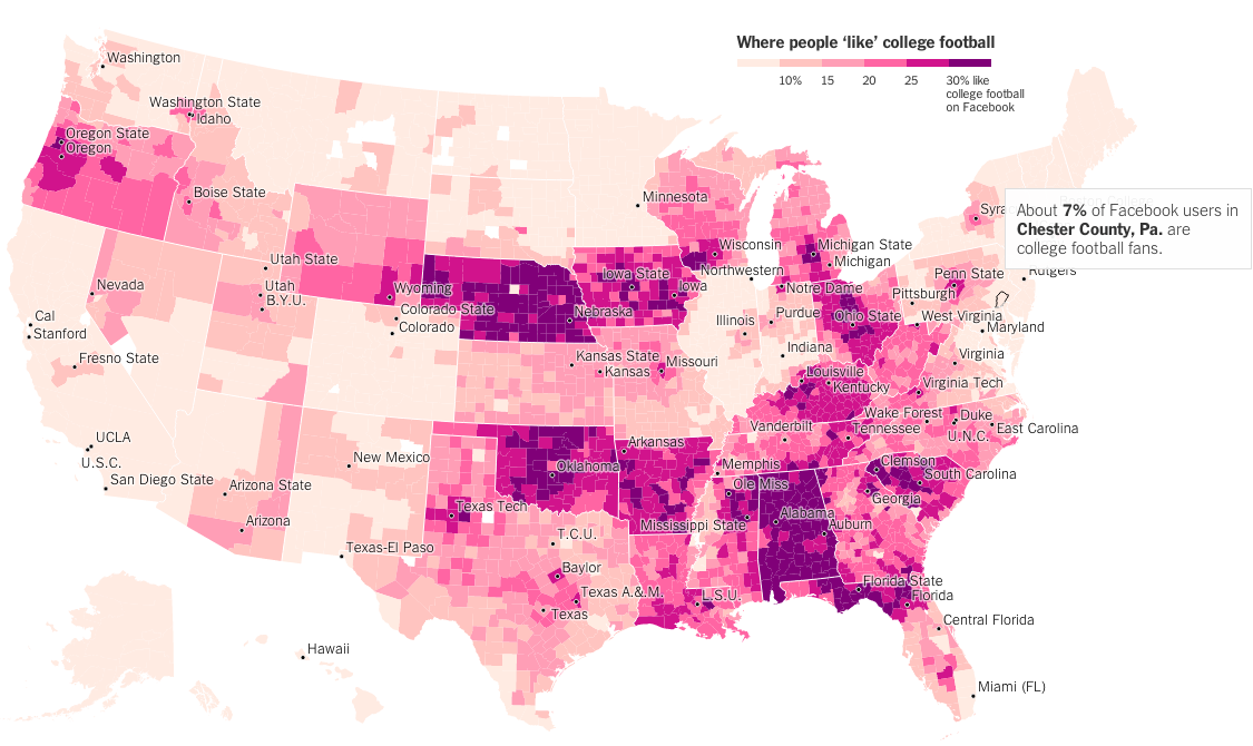
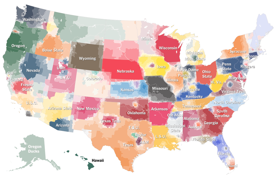
A couple of weeks ago I shared a map from the New York Times that looked at American college football programme loyalty. And I quipped that none of it made sense to me as someone born and raised in the Northeast. The New York Times followed that piece up with another that looks solely at Facebook likes of college football via likes for any team. Not surprisingly the sport does not do too well in the Northeast. But it does appear quite popular in other regions of the country.
Chester County is not big on it…
Credit for the piece goes to Neil Irwin and Kevin Quealy.
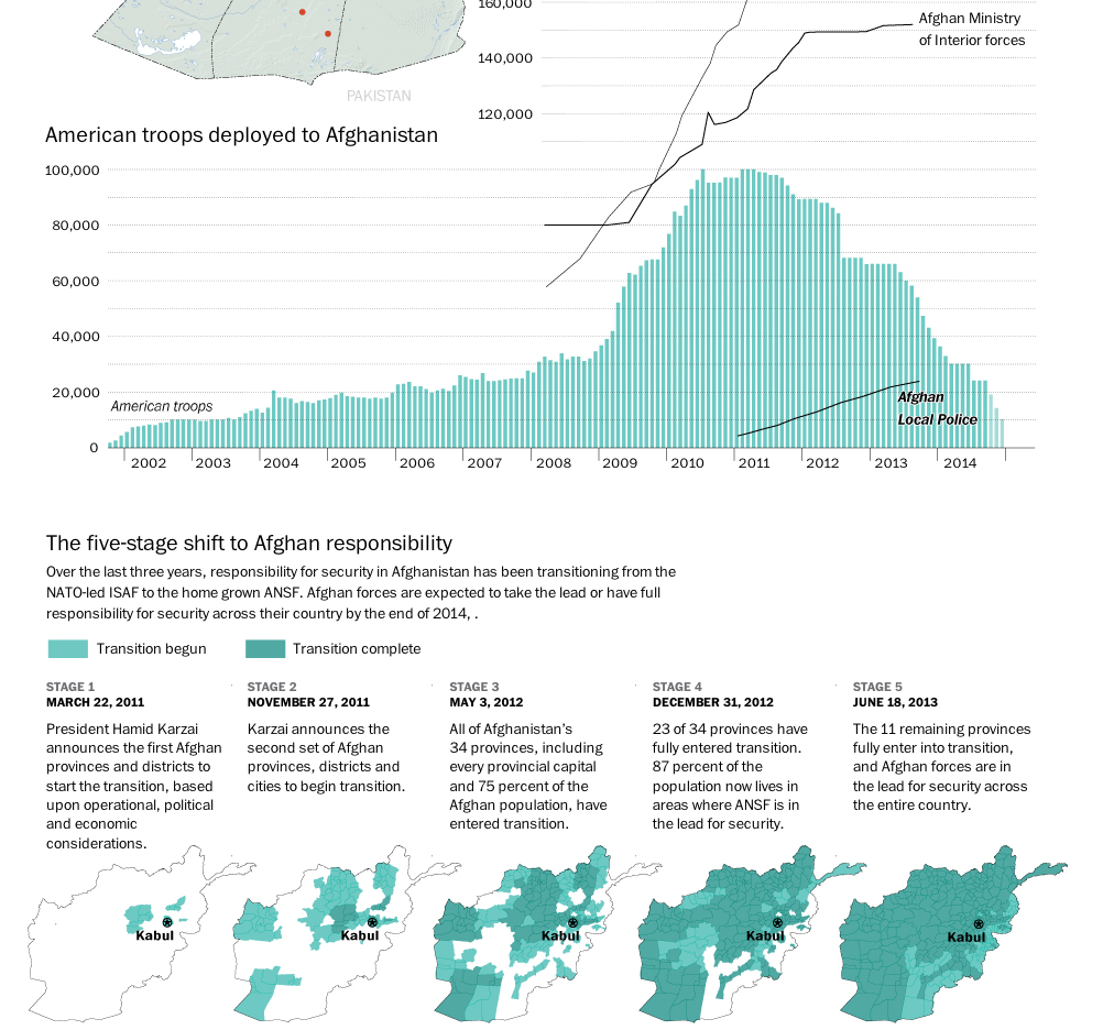
The United States and its allies are slowly beginning to pull out of Afghanistan. While several thousand troops will remain, the total will be nowhere near the peak figure a few years ago. This graphic from the Washington Post details just how this transition has been occurring.
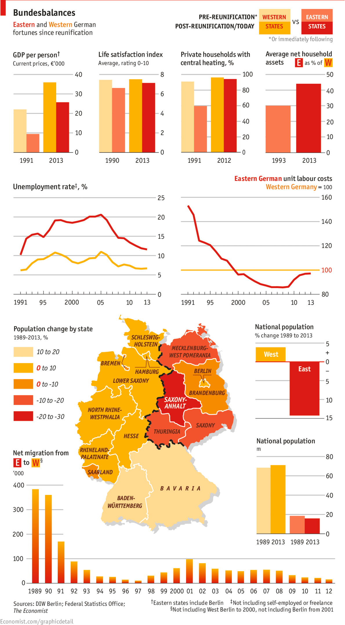
Yesterday marked the 25th anniversary of the fall of the Berlin Wall. But with the reunification of Germany a year later, has the former East Germany been able to catch up to what was West Germany? The Economist looks at the results in this graphic and the answer is yes. And no.
East vs. West. 1989 vs. 2013.
Credit for the piece goes to the Economist’s graphics department.
American college football. This is not a thing that Northeasters like myself understand. And it is not just because yours truly attended the University of the Arts whose only competitive sporting team was, I believe, fencing. Here in the Midwest, many things are strange and alien. One of them is their affinity for said sports that do not make sense. Thankfully the New York Times has attempted to explain specific programme affinities much like they did with their baseball map. (Which made infinitely more sense.)
Click the big map at the article’s beginning to get to the interactive version
Credit for the piece goes to Tom Giratikanon, Josh Katz, David Leonhardt, Kevin Quealy, and Marc Tracy.
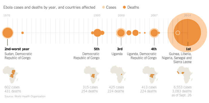
I really enjoy reading articles where graphics accompany the text and not just for the want of graphics. While the Ebola outbreak in West Africa is tragic, the data allows for some nice visualisation pieces. Additionally, one could say that the United States is victim to quite a bit of scaremongering as a result of a few isolated cases of Ebola in Dallas, Texas. Spoiler, an Ebola outbreak is not really a threat to the United States or Western Europe. Perhaps to relieve some of said scaremongering, the New York Times has a nice article titled Ebola Facts that outlines just that, the facts about Ebola. And guess what? The article is accompany by a number of useful inline graphics.
Ebola outbreaks
Credit for the piece goes to the New York Times’ graphics department.