Hotter Muggier Faster

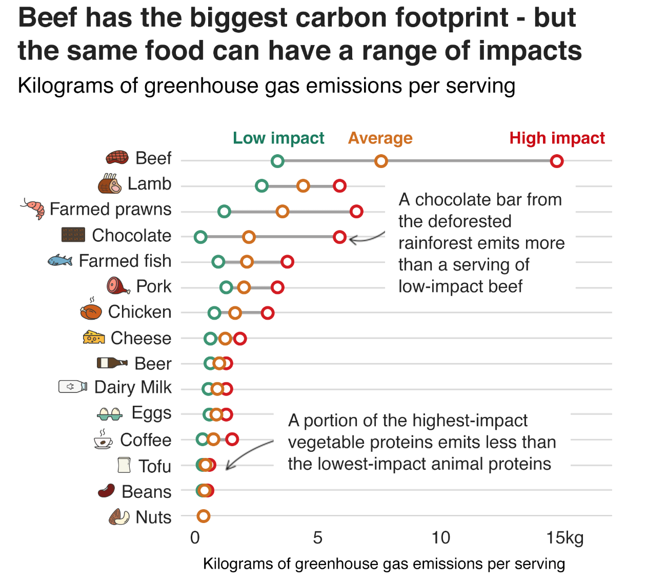
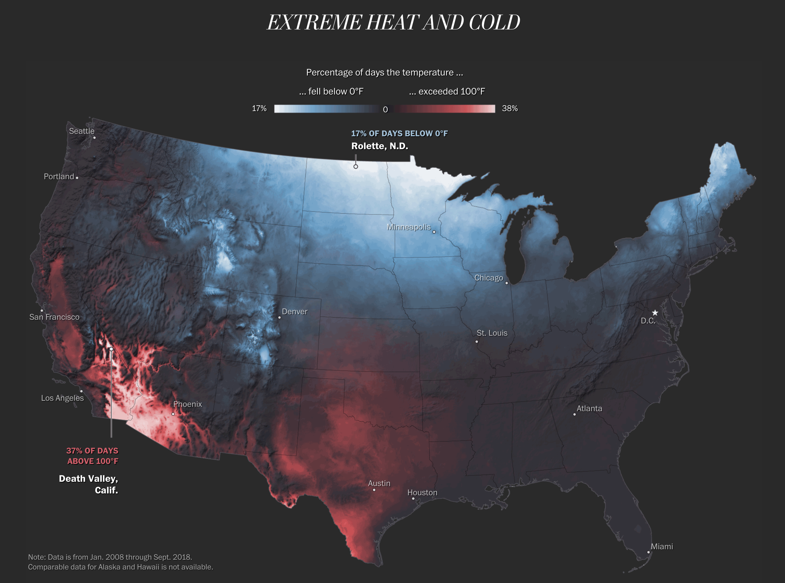
Last week we looked at a few posts that showed the future impact of climate change at both a global and US-level scale. In the midst of last week and those articles, the Washington Post looked backwards at the past century or so to identify how quickly the US has changed. Spoiler: some places are already significantly warmer than they have been. Spoiler two: the Northeast is one such place.

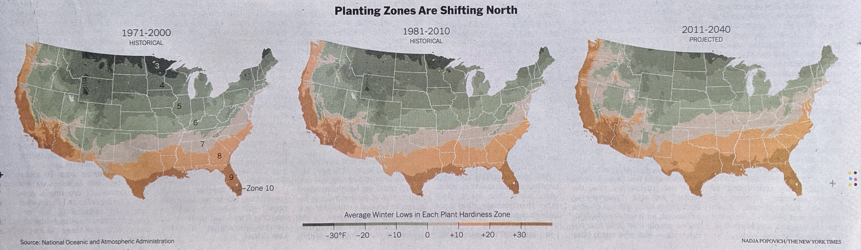
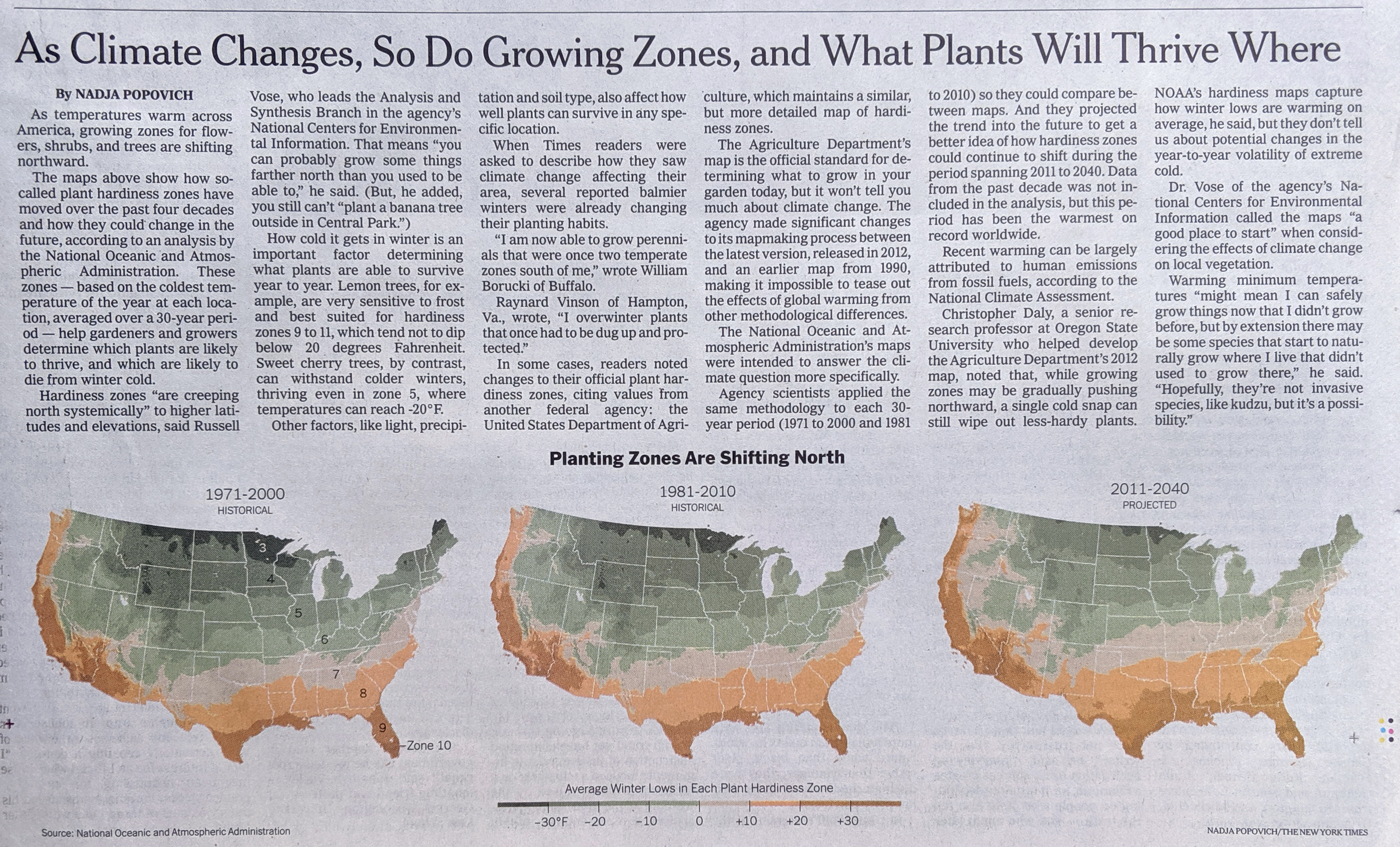
The piece is a larger and more narrative article using examples and anecdotes to make its point. But it does contain several key graphics. The first is a big map that shows how temperature has changed since 1895.

The Southeast is an anomaly, but its warming has accelerated since the 1960s

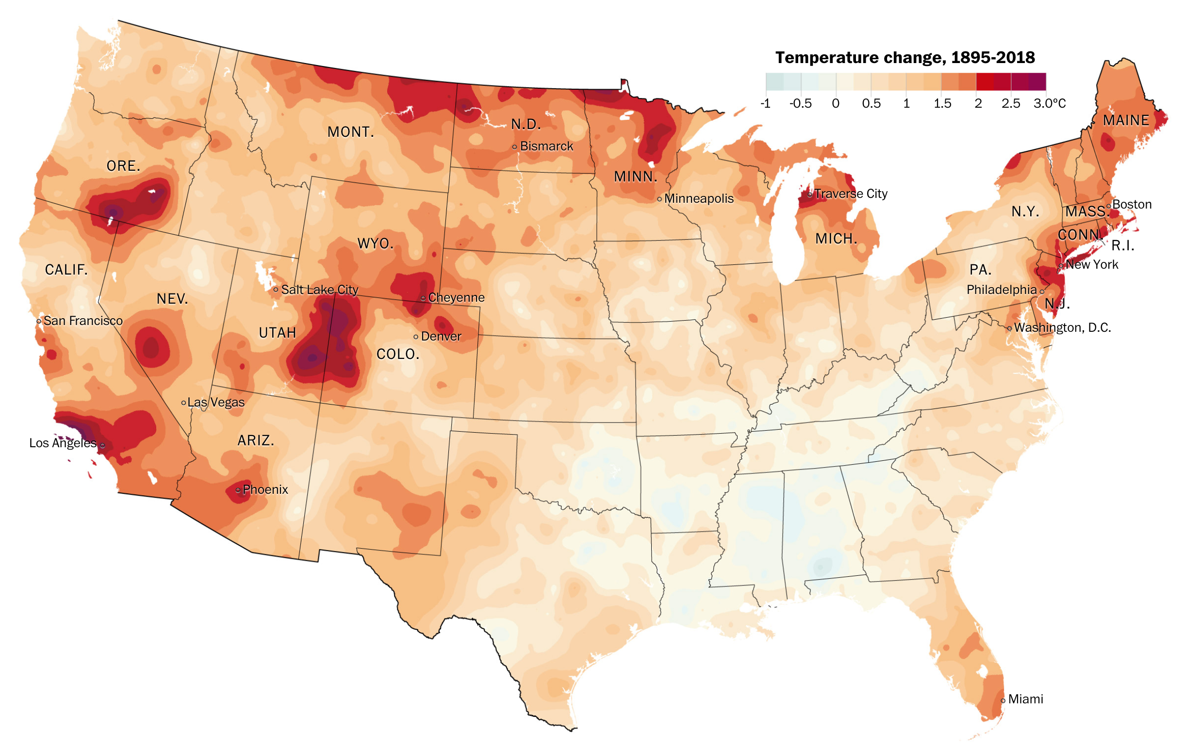
The map does what it has to and is nothing particularly fancy or groundbreaking—see what I did there?—in design. But it is clear and communicates effectively the dramatic shifts in particular regions.

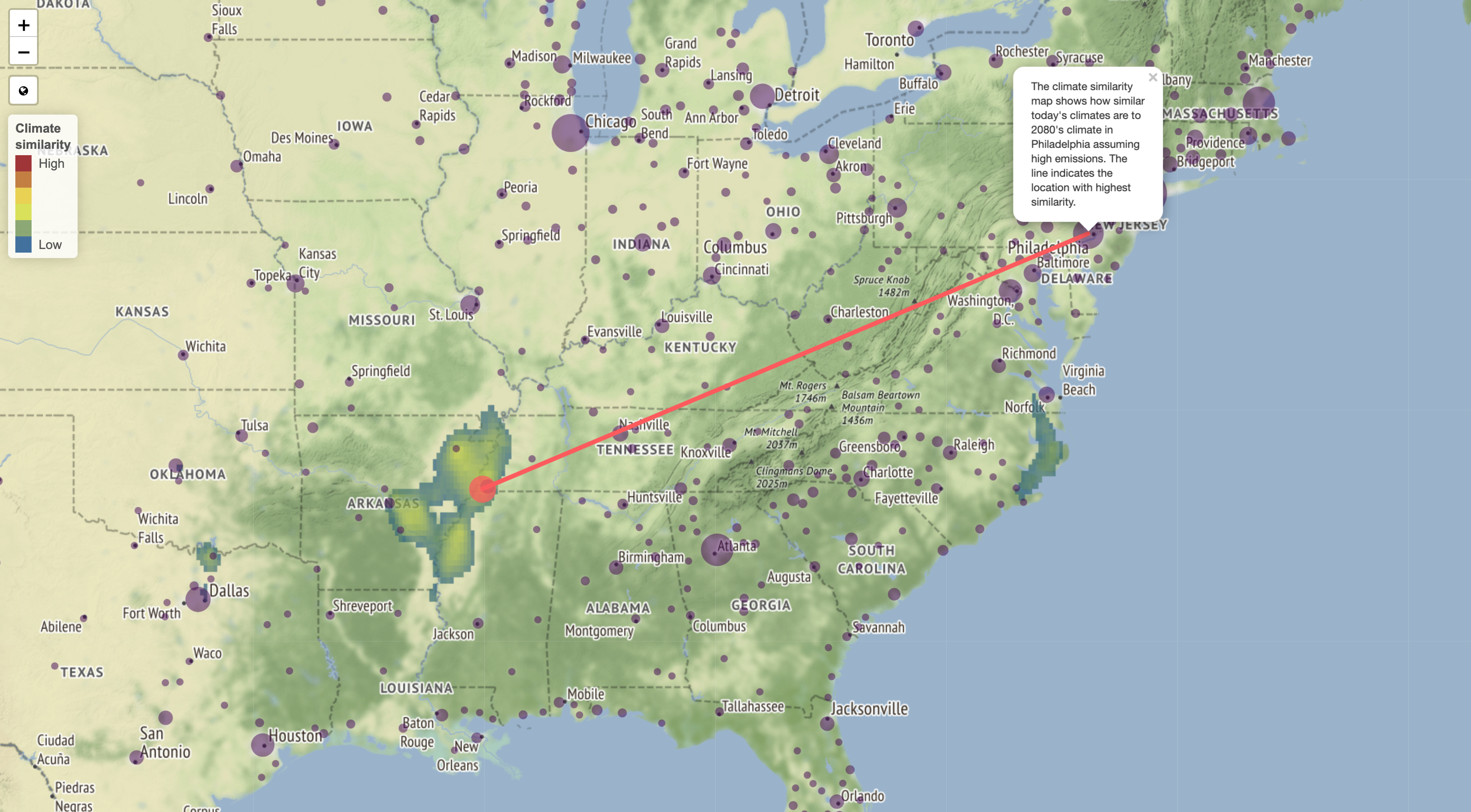
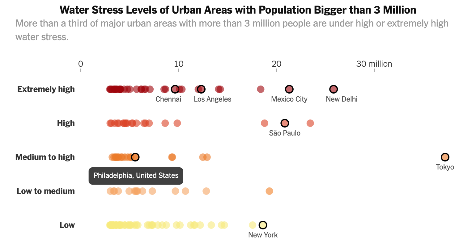
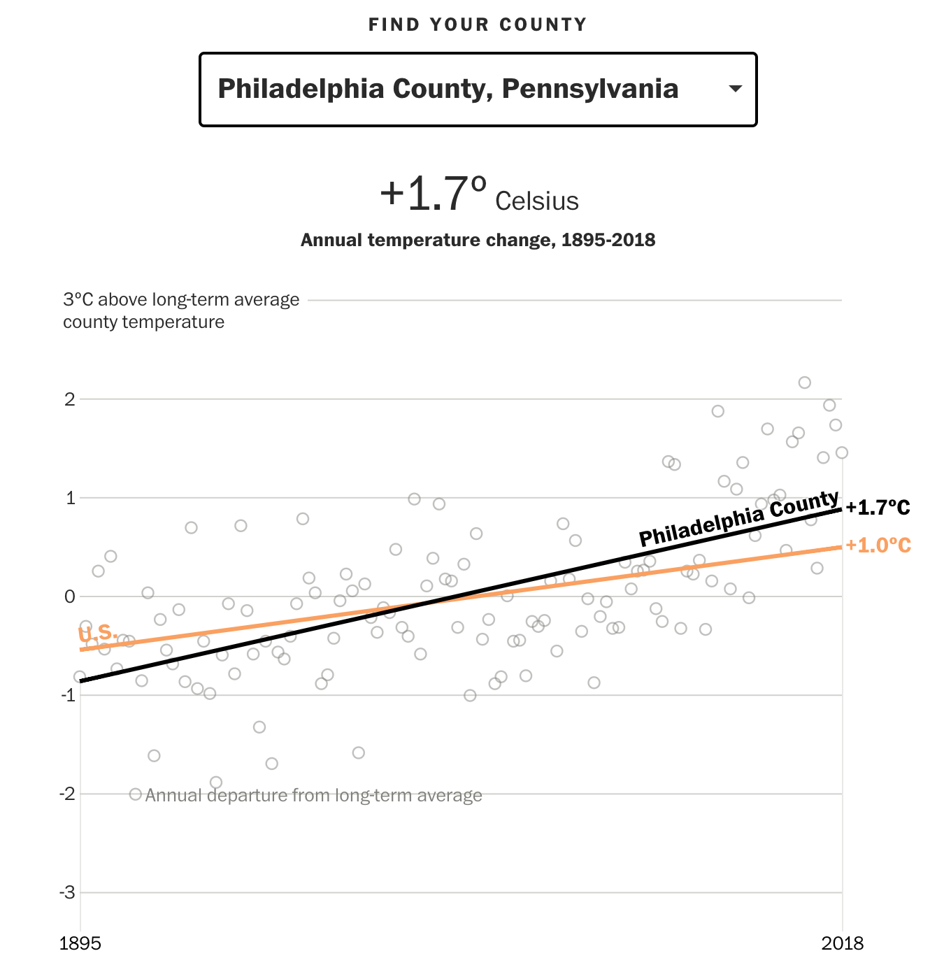
The more interesting part, along with what we looked at last week, is the ability to choose a particular county and see how it has trended since 1895 and compare that to the baseline, US-level average. Naturally, some counties have been warming faster, others slower. Philadelphia County, the entirety of the city, has warmed more than the US average, but thankfully less than the Northeast average as the article points out.

This ain't so good
This ain’t so good

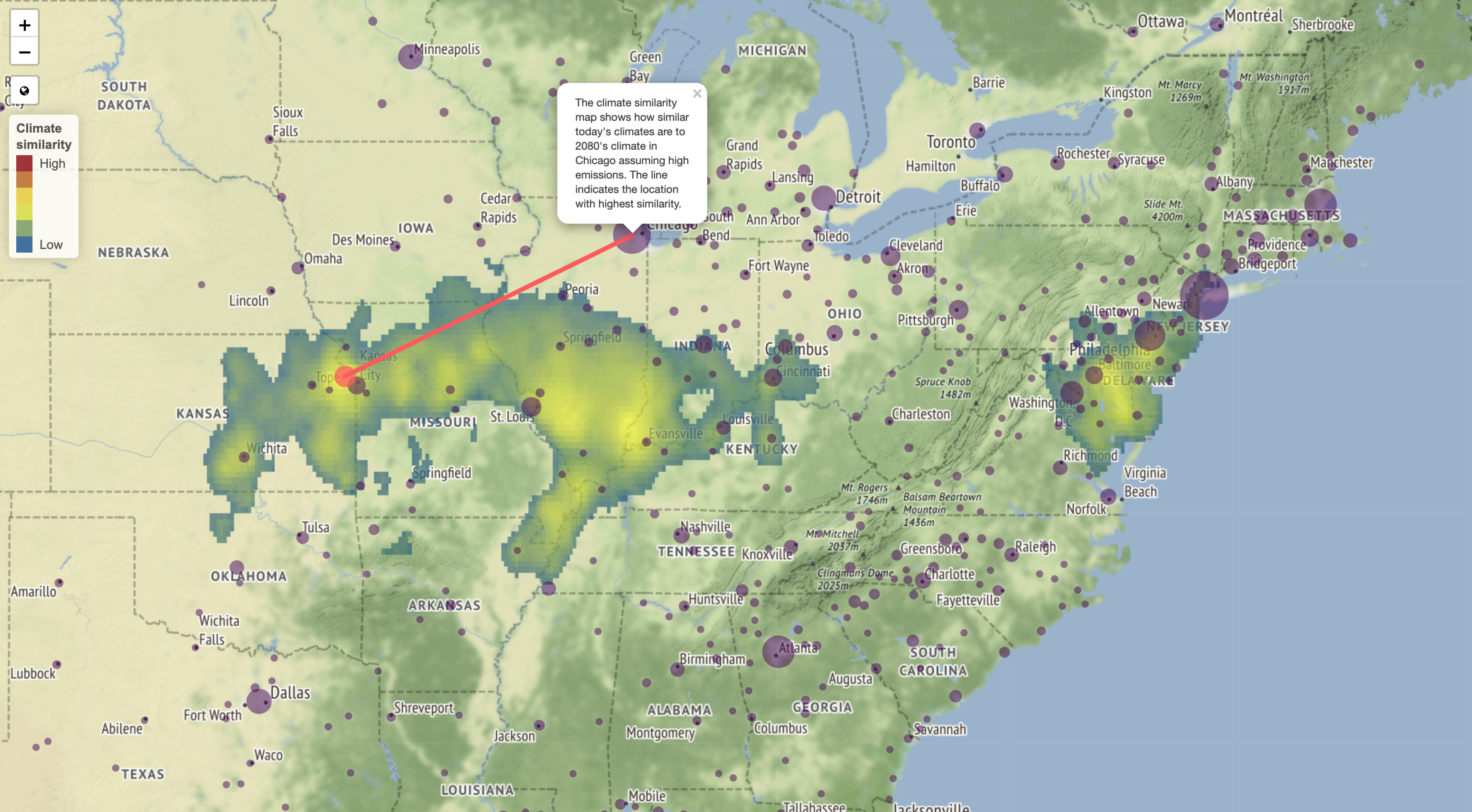
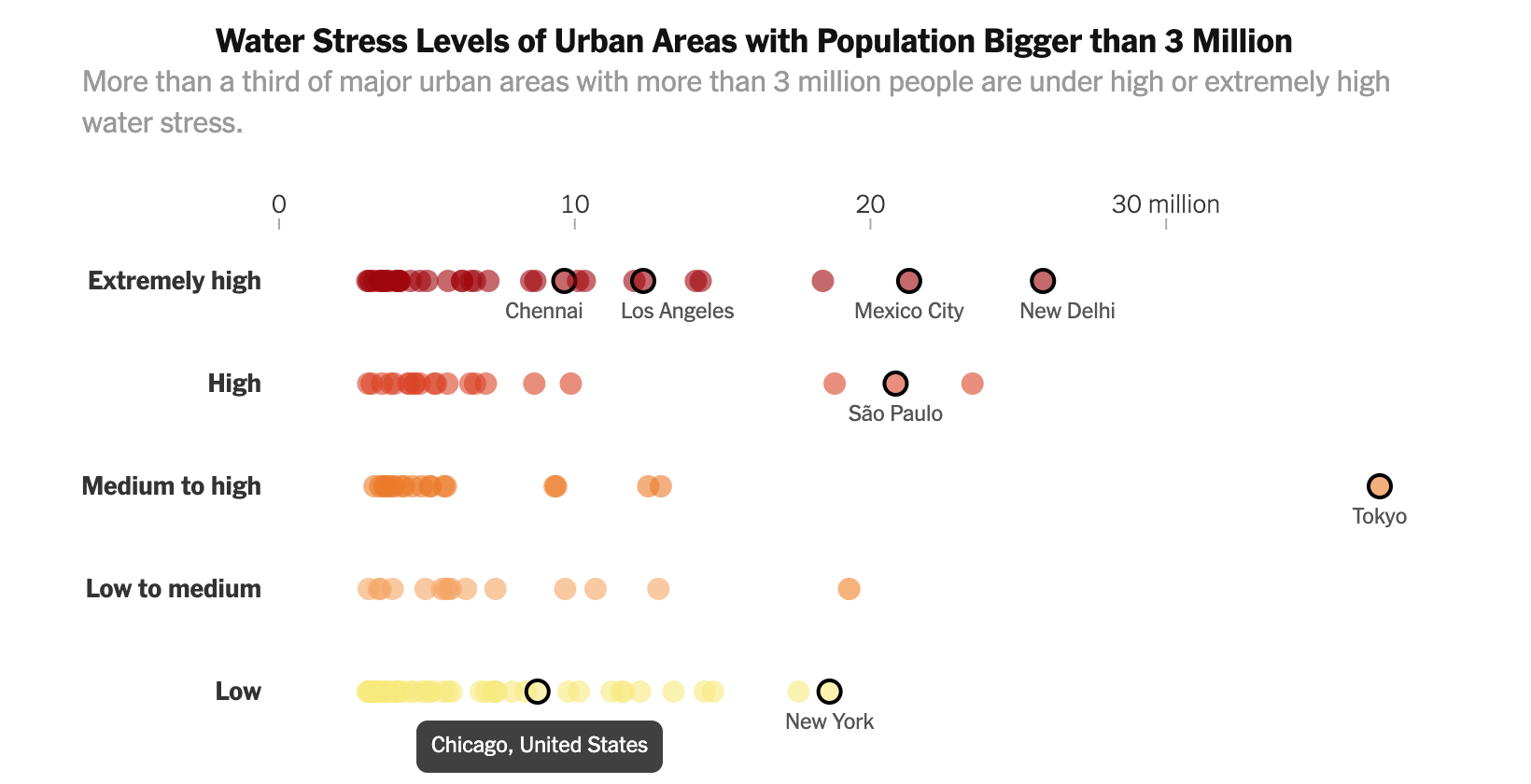
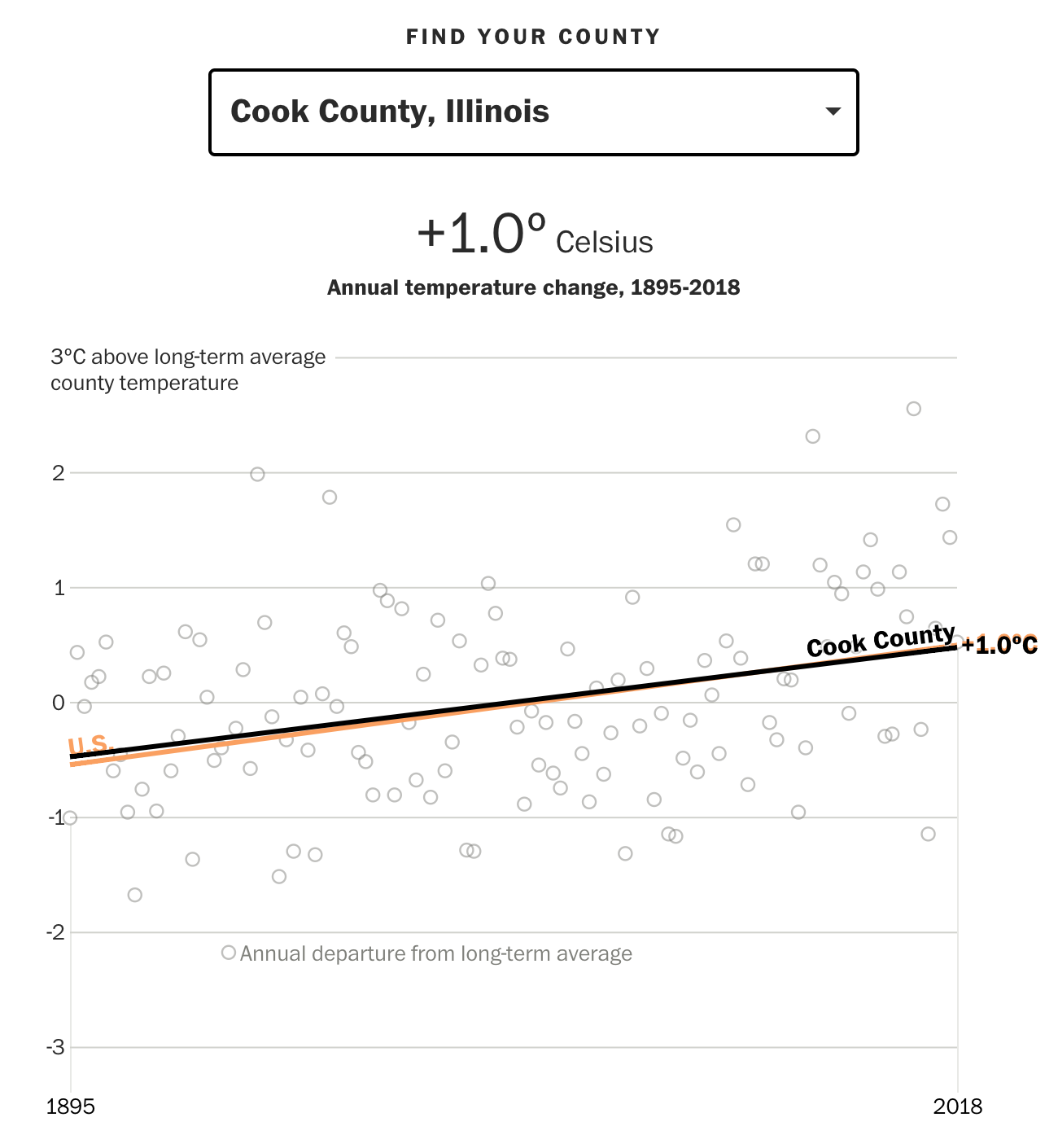
But, not to leave out Chicago as I did last week, Cook County, Illinois is right on line with the US average.

Nor is this, but it's average
Nor is this, but it’s average

But the big cities on the West Coast look very unattractive.

Tinseltown is out of the question

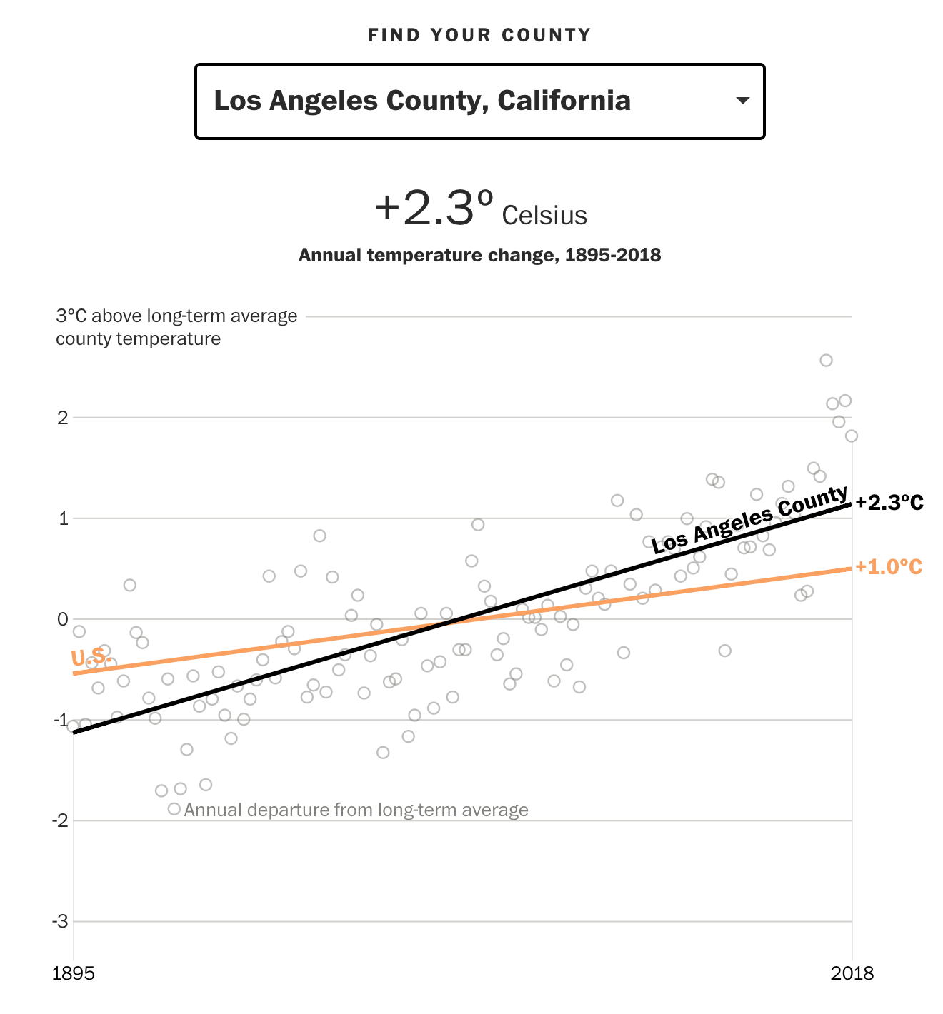
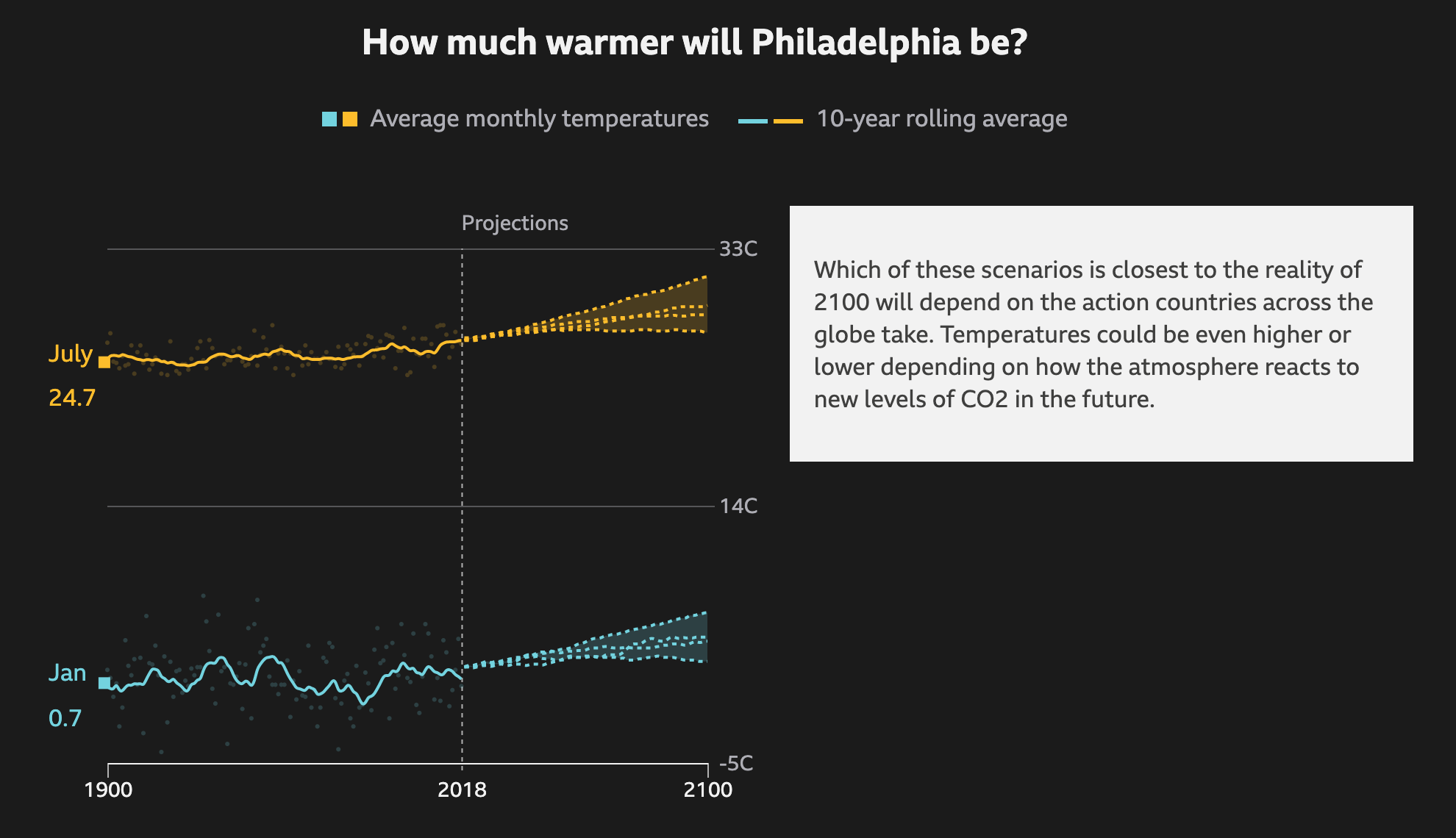
The interactive piece does a nice job clearly focusing the user’s attention on the long run average through the coloured lines instead of focusing attention on the yearly deviations, which can vary significantly from year to year.

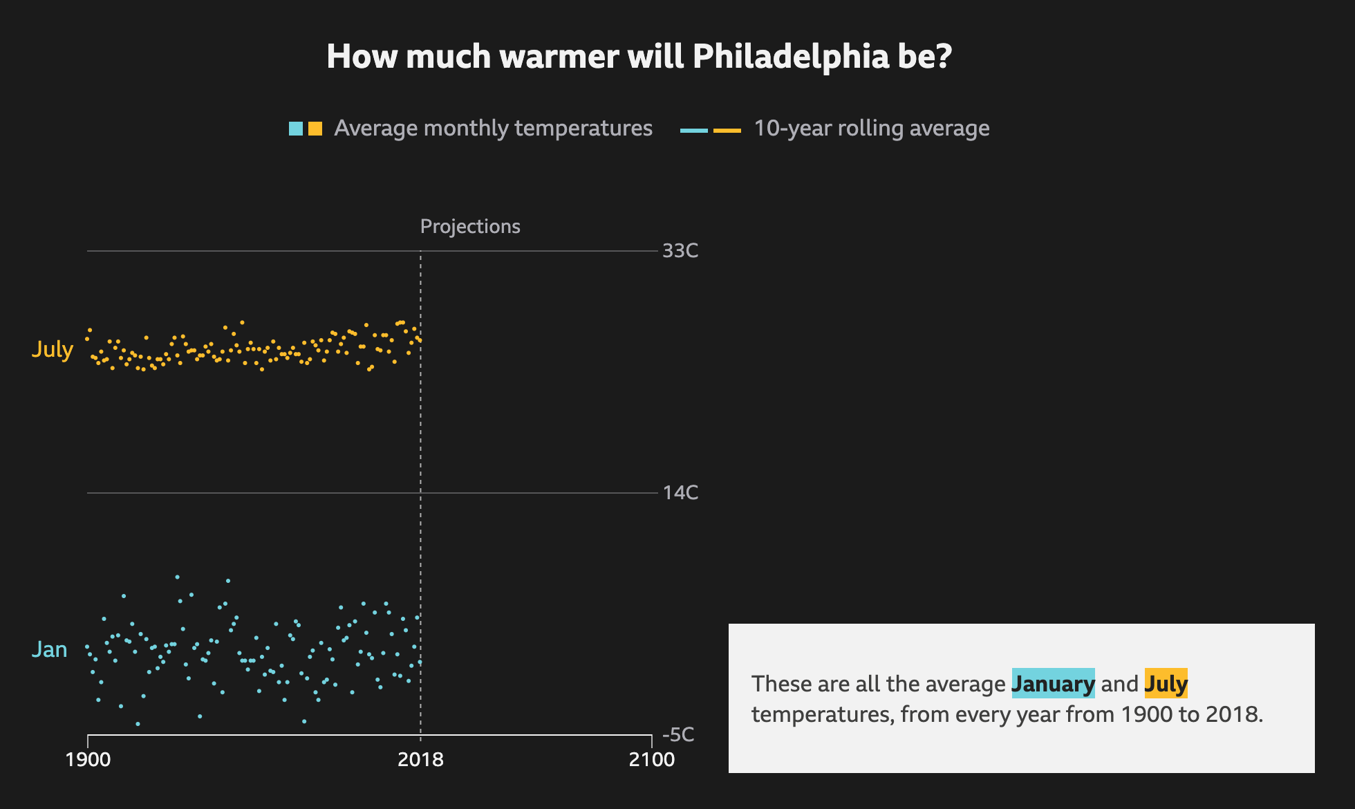
And for those Americans who are not familiar with Celsius, one degree Celsius equals approximately 1.8º Fahrenheit.

Overall this is a solid piece that continues to show just what future generations are going to have to fix.

Credit for the piece goes to Steven Mufson, Chris Mooney, Juliet Eilperin, John Muyskens, and Salwan Georges.

How Warm Will It Get? Part II

Yesterday we looked at a nice piece from the BBC showing how big cities across the world will warm from the impact of climate change. It did a really nice job of showcasing the numbers. But it was admittedly number heavy. (And for the Americans in my audience, you probably were left out in the…cold…because the rest of the world uses Celsius to talk temperature.)

But this piece from the University of Maryland is something I have been raving about for weeks now. Generally speaking, people are able to better internalise data and information when they can compare it to something tangible or familiar. And degrees of Celsius, whilst accurate, fail to do that. So this piece takes their 2080 forecast and compares it to today, but in terms of place.

Ew. Just eeww.
Ew. Just eeww.

The above map is for Philadelphia. It shows how by 2080, according to a current emissions model, the city’s climate will best resemble that of Memphis, Tennessee and the lower Mississippi River Valley. Or, similar to the tidal regions of North Carolina. Having been to Memphis in the summer once, none of those are pleasant comparisons.

And for those of you in Chicago, it does not get a whole lot better.

Not as ew-y. But still ew.

So while these might not be as bad, it still is a swath of the plains and the lower Ohio River Valley. And…yes, a little like today’s climate here in Philadelphia.

From a design standpoint, I probably would have used a light or greyed out map. The colours used to represent the topography are too similar to those used to define the similarity. And that can make it tricky to read.

But the true strength of this piece is the designers’ ability to link tomorrow’s climate to today’s by use of space. And as I said at the beginning, I have been talking about this piece offline for weeks. And I likely will for weeks to come.

Credit for the piece goes to Matthew C. Fitzpatrick and Robert R. Dunn .

How Warm Will It Get?

In Philadelphia, this summer has been warmer than average. But with most recent years being warmer than average, that might not mean much. However, a valid question is that with climate change, how much warmer will the city get on average? The BBC recently published an article that explored the temperature changes in cities around the world according to several different models for best to worst case scenarios.

The raw data so to speak

It does a nice job via scrolling of showing how the averages work as a rolling average and the increase over time. It runs through each scenario, from best case to worst case, as a dotted line and then plots each in comparison to each other to show the range of possible outcomes.

Ew. Just ew.
Ew. Just ew.

I know that dark or black background is in style for big pieces. But I still do not love them. Thankfully the choice of these two colours work here. The dotted lines also work for showing the projections. And in the intermediate steps, not screencaptured, the previous projections go dark and only the current one is highlighted.

Thankfully the text boxes to the right capture the critical numbers: the actual projection numbers for the monthly average. And they tie them to the lines via the colours used.

Not shown here are a few other elements of the piece. The top of the article starts with a spinning globe that shows how the average temperature across the globe has already changed. Spoiler: not well. While the spinning globe adds some interactivity to the article, it by definition cannot display the entire world all at once, like flat, two-dimensional projections do. This makes it difficult to see impacts across the globe simultaneously. A more standard projection map could have worked really well.

Lastly, the article closes with a few stories about specific locations and how these temperature increases will impact them. These use more illustrations and text. The exception, however, is a graphic of the Arctic that shows how summer sea ice coverage has collapsed over the last few decades.

Overall this is a strong piece that shows some global impacts while allowing the user to dive down into the more granular data and see the impact on some of the world’s largest cities.

Credit for the piece goes to BBC Visual and Data Journalism team.

Water, Water Everywhere Nor Any Drop to Drink Part II

Yesterday we looked at the New York Times coverage of some water stress climate data and how some US cities fit within the context of the world’s largest cities. Well today we look at how the Washington Post covered the same data set. This time, however, they took a more domestic-centred approach and focused on the US, but at the state level.

Still no reason to move to the Southwest

Both pieces start with a map to anchor the piece. However, whereas the Times began with a world map, the Post uses a map of the United States. And instead of highlighting particular cities, it labels states mentioned in the following article.

Interestingly, whereas the Times piece showed areas of No Data, including sections of the desert southwest, here the Post appears to be labelling those areas as “arid area”. We also see two different approaches to handling the data display and the bin ranges. Whereas the Times used a continuous gradient the Post opts for a discrete gradient, with sharply defined edges from one bin to the next. Of course, a close examination of the Times map shows how they used a continuous gradient in the legend, but a discrete application. The discrete application makes it far easier to compare areas directly. Gradients are, by definition, harder to distinguish between relatively close areas.

The next biggest distinguishing characteristic is that the Post’s approach is not interactive. Instead, we have only static graphics. But more importantly, the Post opts for a state-level approach. The second graphic looks at the water stress level, but then plots it against daily per capita water use.

California is pretty outlying

My question is from the data side. Whence does the water use data come? It is not exactly specified. Nor does the graphic provide any axis limits for either the x- or the y-axis. What this graphic did make me curious about, however, was the cause of the high water consumption. How much consumption is due to water-intensive agricultural purposes? That might be a better use of the colour dimension of the graphic than tying it to the water stress levels.

The third graphic looks at the international dimension of the dataset, which is where the Times started.

China and India are really big

Here we have an interesting use of area to size population. In the second graphic, each state is sized by population. Here, we have countries sized by population as well. Except, the note at the bottom of the graphic notes that neither China nor India are sized to scale. And that make sense since both countries have over a billion people. But, if the graphic is trying to use size in the one dimension, it should be consistent and make China and India enormous. If anything, it would show the scale of the problem of being high stress countries with enormous populations.

I also like how in this graphic, while it is static in nature, breaks each country into a regional classification based upon the continent where the country is located.

Overall this, like the Times piece, is a solid graphic with a few little flaws. But the fascinating bit is how the same dataset can create two stories with two different foci. One with an international flavour like that of the Times, and one of a domestic flavour like this of the Post.

Credit for the piece goes to Bonnie Berkowitz and Adrian Blanco.

Water, Water Everywhere Nor Any Drop to Drink

Most of Earth’s surface is covered by water. But, as any of you who have swallowed seawater can attest, it is not exactly drinkable. Instead, mankind evolved to drink freshwater. And as some new data suggests, that might not be as plentiful in the future because some areas are already under extreme stress. Yesterday the New York Times published an article looking at the findings.

More reasons for me not to move to the desert southwest

The piece leads with a large map showing the degree of water stress across the globe. It uses a fairly standard yellow to red spectrum, but note the division of the labels. The High range dwarfs that of the Low, but instead of continuing on, the Extremely High range then shrinks. Unfortunately, the article does not go into the methodology behind that decision and it makes me wonder why the difference in bin sizes.

Of course, any big map makes one wonder about their own local condition. How stressed is Philadelphia, for example? Thankfully, the designers kept that in mind and created an interactive dot plot that marks where each large city falls according to the established bins.

Not so great, Philly

At this scale, it is difficult to find a particular city. I would have liked a quick text search ability to find Philadelphia. Instead, I had to open the source code and search the text there for Philadelphia. But more curiously, I am not certain the graphic shows what the subheading says.

To understand what a third of major urban areas is, we would need to know the total number of said cities. If we knew that, a small number adjacent to the categorisation could be used to create a quick sum. Or a separate graphic showing the breakdown strictly by number of cities could also work. Because seeing where each city falls is both interesting and valuable, especially given how the shown cities are mentioned in the text—it just doesn’t fit the subheading.

But, for those of you from Chicago, I included my former home as a different screenshot. Though I didn’t need to search the source code, because I just happened across it scrolling through the article.

It helps having Lake Michigan right there

Credit for the piece goes to Somini Sengupta and Weiyi Cai.

The Rise of the Tropic(al Plant)s

Last week I had three different discussions with people about some of the impact of climate change upon the United States. However, what did not really come up in those conversations was the environmental changes set to befall the United States. And by environment, I explicitly mean how the flora of the US will change.

Why? Well, as warmer climates spread north, that means tropical and subtropical plants can follow warmer temperatures northward into lands previously too cold. And they could replace the species native to those lands, who evolved adaptations for their particular climate.

Thankfully, last week the New York Times published a piece that explored how those impacts could be felt. Hardiness zones are a concept designed to tell gardeners when and where to plant certain crops. And while the US Department of Agriculture has a detailed version useful to horticulturists, the National Oceanic and Atmospheric Administration produces a very similar version for the purpose of climate studies. And when you group those hardiness levels by the forecast lowest temperatures in an area, you get this.

More palm trees?
More palm trees?

There you have it, the forecast change to plant zones.

From a design standpoint, I like the idea of the colour shift here. However, where it breaks seems odd. Though it could be more influenced by the underlying classifications than I understand. The split occurs at 0ºF, which is well below freezing. I wonder if the freezing point, 32ºF could have been used instead. I also wonder if adding Celsius units above the same legend could be done to make the piece more accessible to a broader audience.

Otherwise, it’s a nice use of small multiples. And from the editorial design standpoint, I like how the article’s text above the graphic makes use of a six-column layout to add some dynamic contrast to what is essentially a three-column layout for the graphics.

They're living on a grid
They’re living on a grid

Credit for the piece goes to Nadja Popovich.

The Climate Impact of Your Food

Climate change is a thing. And facing it will require a lot of our societies. But the longer we choose not to act, the more the impact will be felt by later generations. Consequently, across the world, young students have been walking out of class to shine light on an issue on which they, as children, have little direct impact. Yet. But what about us? The ones who can vote and make lifestyle decisions?

The BBC had a piece where, after soliciting questions from their readership, they answered questions. One question being, what can individuals do to reduce their impact. And while clearly individuals need to do more than one thing, one facet can be examining one’s diet. The article included this graphic on the climate impact of various food types, vis-a-vis greenhouse gas emissions.

Is this saying I should drink more beer?

Essentially we are looking at a simplified box plot of greenhouse gas emissions per serving of food (and drink) type. The box plot looks at a range of values for a specific item. It usually shows the extremes at both ends; the range of a significant number of the data points, e.g. 80% of the set, or by decile, or by quartile; and then lastly the average, be it mean or median. Here we have only low impact, high impact, and average impact. Presumably the minimum, maximum, and then either mean or median.

And it works really well. Chocolate is a great example of how on average, chocolate isn’t terrible. But certain chocolates can have far worse ramifications than low-impact beef, or average-impact lamb and prawns. And beef is well known to be one of the most impactful types of food.

From a design standpoint, I don’t know if the colours necessarily help. The average beef impact, for example, is worse than the high-impact maximum of every other food listed. But the association of green=good and red=bad  here has little value because by that logic, the average=gold beef should be red as it sits above the high-impact everything else. A less editorial choice could be made of say a light grey or blue and then have the bright colour, maybe still orange, indicate where the average sits on that spectrum.

I do like the annotations on the chart. It highlights particular stories, like the aforementioned chocolate one, that the casual, i.e. skimming, reader may miss.

I could probably do without the little food illustrations. But the designer did a good job of making them all recognisable in such a small space—far from an easy task. And being so small, they don’t really distract or take away from the whole graphic.

Overall, this is a strong graphic.

Credit for the piece goes to the BBC graphics department.

Natural Disasters

Today’s piece is another piece set against a black background. Today we look at one on natural disasters, created by both weather and geography/geology alike.

The Washington Post mapped a number of different disaster types: flooding, temperature, fire, lightning, earthquakes, &c. and plotted them geographically. Pretty clear patterns emerge pretty quickly. I was torn between which screenshots to share, but ultimately I decided on this one of temperature. (The earthquake and volcano graphic was a very near second.)

Pretty clear where I'd prefer to be…
Pretty clear where I’d prefer to be…

It isn’t complicated. Colder temperatures are in a cool blue and warmer temperatures in a warm red. The brighter the respective colour, the more intense the extreme temperatures. As you all know, I am averse to warm weather and so I will naturally default to living somewhere in the upper Midwest or maybe Maine. It is pretty clear that I will not really countenance moving to the desert southwest or Texas. But places such as Philadelphia, New York, and Washington are squarely in the blacked out or at least very dark grey range of, not super bad.

Credit for the piece goes to Tim Meko.

American Nuclear Generating Stations

Those that have followed me for a long time know that I am a big fan of nuclear power. It does have some drawbacks, namely its radioactive waste, but otherwise creates enormous amounts of stable, carbon-free electricity. So when I saw this article from Bloomberg about the impact of climate change on US nuclear powered electricity generating station. It makes use of a number of nice maps to show that, yeah, not good things.

Pennsylvania is a big state for nuclear power

I normally am not a huge fan of scaling circle size to the data point, but here it makes sense since the circles are tied to the geographical location. Like I mentioned with the one Notre Dame graphic, I’m not sure the advantage of the black background, but it could be that there is a benefit to the contrast over the white background.

There are additional maps in the piece that look at a few specific locations in a moderate hurricane and the expected storm surge. Again, not good. These also use light colours on a dark background.

Credit for the piece goes to Christopher Flavelle and Jeremy C.F. Lin.

Carbon Taxes

Last week the New York Times published an article about carbon taxes, looking at their adoption around the world and their effectiveness. It is a fascinating article about how different countries have chosen to implement the broad policy idea and the various forms it can take. And, most importantly, how some of those policies can end up blunting the intended effect of carbon emission reduction.

This, however, is about the print piece, because as I was flipping through the morning paper, I found the Business section had a world map above the fold. And we all know how I feel about big, splashy print graphics.

We could use some more green on this map

Here we have a pretty straight-forward piece. It uses a map to indicate which countries have adopted or are scheduled to adopt a carbon tax programme. The always interesting bit is how the federal system in the United States is represented. Whilst a carbon cap-and-trade deal failed in the US Senate in 2009, individual states have taken up the banner and begun to implement their own plans. Hence, the map shows the states in yellow.

There is nothing too crazy going on in the piece, but it is just a reminder that sometimes, as a designer, I love big splashy graphics to anchor an article.

Credit for the piece goes to Brad Plumer.