
Okay, so we’re going to post some more of my work today, but it’s not about cases and deaths. Instead, I took some data produced by my colleagues and thought that it could do for a small transformation from a table into a chart. The original table can be found in their report on consumer payment options during the Covid-19 pandemic.
After setting the kettle on for some tea this morning we started on their Table 1. Thirty minutes later and a cup of Irish Breakfast consumed, I had transformed it into this:
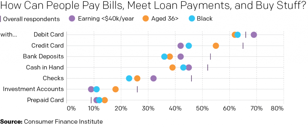
Obviously I changed the language/title a little bit. But the original was too long and didn’t fit. Also this is my blog, so my rules. The visualisation improves upon the table in a number of ways, but tables do have their place. Tables are great for organising information. Find a column header and a row header and you can get any specific data point. But, if you want to make a comparison between two data points or several of them, a chart is the way to go. Now, you may lose some precision. For example, do I know to the decimal point or to the tenths even what one of those dots represents? Nope. But at a glance, can I see which dots are below the overall respondents? Yep. It’s abundantly clear that those earning less than $40,000 per year have a greater availability of debit cards than the other groups shown.
And after all, I couldn’t have made this graphic without that table.
Full disclosure, as alluded to above, I work at the Federal Reserve Bank of Philadelphia. But I had nothing to do with the data, report, or presentation thereof.
Credit for the graphic is mine. The data to the folks over at the Consumer Finance Institute.