Yesterday I wrote about Covid-19 here in five states of the US. I mentioned how I am concerned about the levelling out of new cases in certain states, notably Pennsylvania and New Jersey. In Italy, the government issued a new round of lockdowns in an attempt to contain a new wave before it swamps their healthcare system.
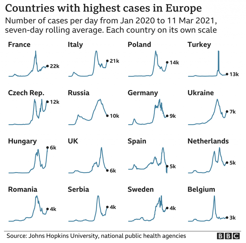
At the end of that BBC article, they used a small multiples graphic showing the seven-day average in several European countries. Today is the 16th, and so the data is now a few days old, but the concept remains important.
New cases curves for several European countries.
From a design standpoint, we are seeing a few things here. First, each country’s line chart exists with its own scale. Unfortunately this makes comparing country-to-country nigh impossible. We know from the title that in the present these are the countries with the highest new case rates in Europe. But, how do these rates today compare to earlier peaks? Without axis lines or a baseline, it’s difficult to say.
Of course, the point could well be just to show how in places like Italy, France, Poland, &c. we are seeing an emergent surge of new cases since the holiday peak.
If that is the goal, I think this chart works well. However, if the goal is to provide more context of the state of the pandemic in these select countries, we need some additional context and information.
Credit for the piece goes to the BBC graphics department.
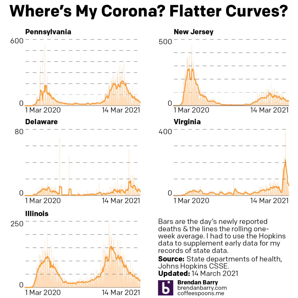
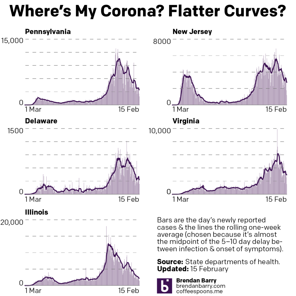
Last week I wrote about how our progress in dealing with Covid-19 was stagnating. To put it simply, this past week did not get any better on that front.
New case curves for PA, NJ, DE, VA, & IL.
In Pennsylvania, Delaware, and Illinois we see that the flattened tail I described last week, well remained a flattened tail. In Delaware, we see more movement, but the average of the average, if you will, is flat over the last two weeks. And in New Jersey, where I mentioned some signs of rising numbers, we see a clearly rising number of new cases over the last week. Only in Virginia are numbers heading down, and those are shallowing out.
The problem here is that in Pennsylvania and Delaware, the new case rate, whilst flat, is well above the summer rate of low transmission. This means that the environment is ripe for a new surge of cases if people stop following social distancing and begin resuming indoor activities with other people. Sadly, both those things appear to be occurring throughout the US.
In Europe we see a cautionary tale. They too saw their holidays peaks decline and the national governments began easing restrictions on their populations. Within the last several days, however, new cases have begun to surge. Italy has gone so far as to announce a new lockdown. Other governments are considering the same.
If the United States cannot resume pushing its numbers of new cases down, it could well follow Europe into a new wave of outbreaks that would threaten lockdowns and push back our eventual return of normalcy.
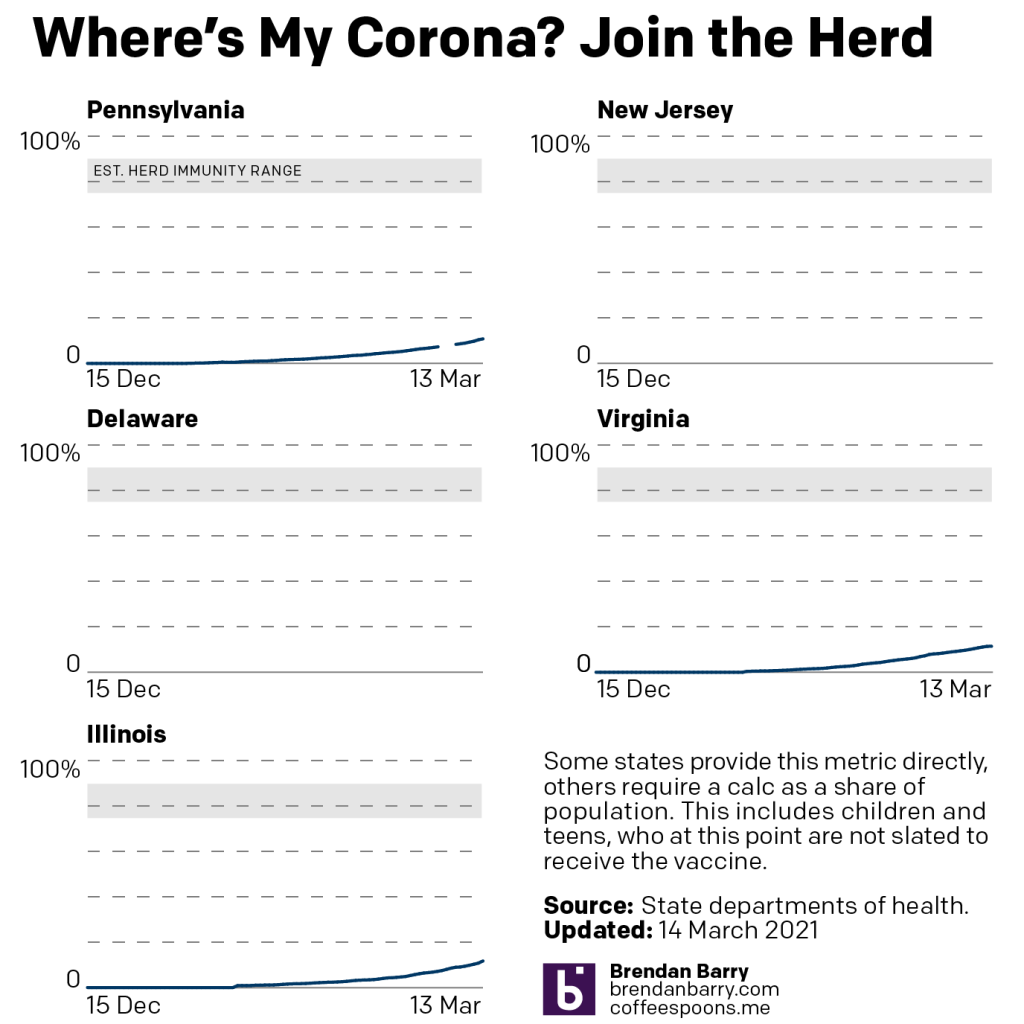
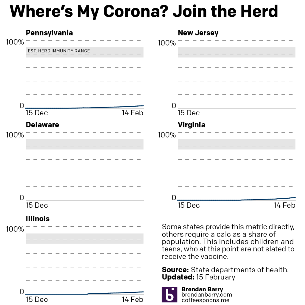
None of this would be an issue if vaccinations were nearing herd immunity levels. However, in the states we cover, nowhere is above 12% fully vaccinated.
Vaccination curves for PA, VA, & IL.
Pennsylvania now lags behind the other two states. But at least the Commonwealth is over 10% fully vaccinated.
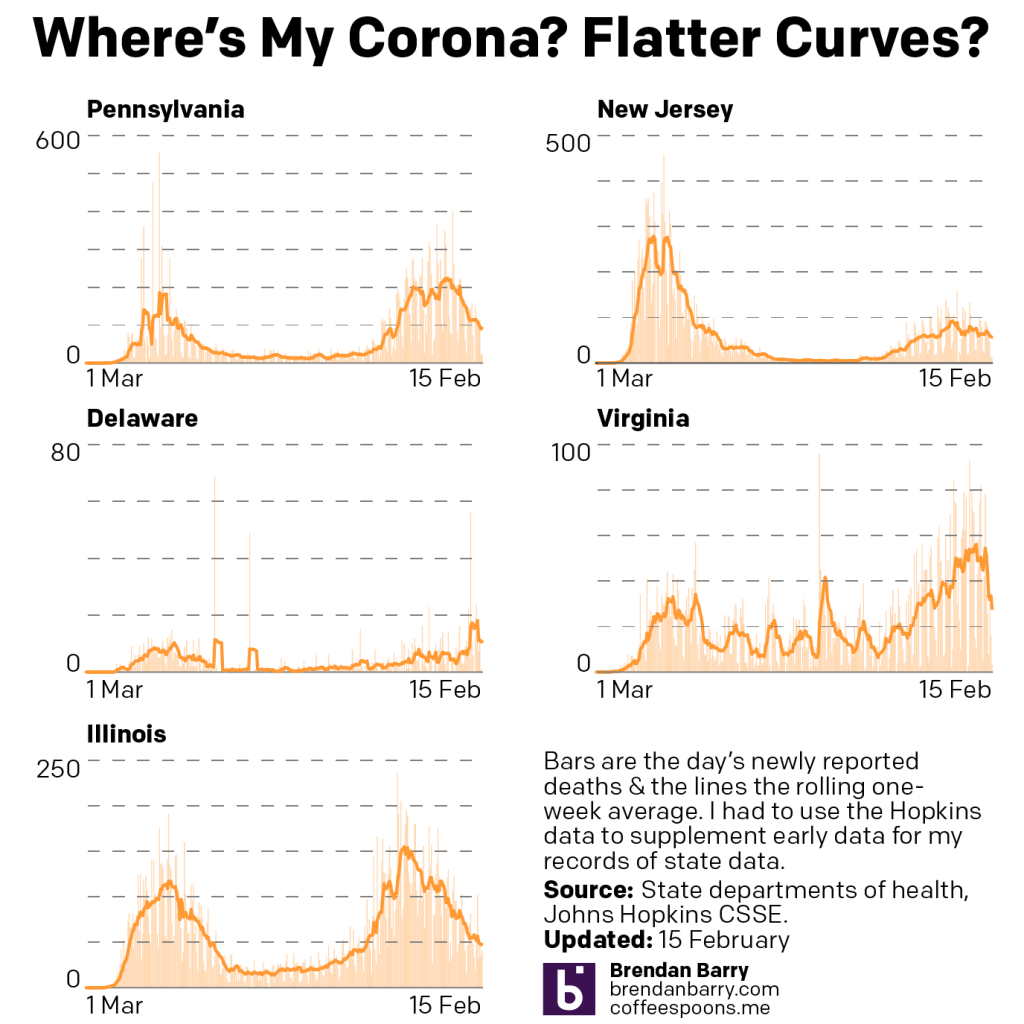
And of course, the problem under this dire scenario is that deaths could rise once again, though at this point the most vulnerable are in the middle of being vaccinated. Indeed, if we look at the last week, we see the good news for the week, that deaths are headed down in all five states.
Death curves for PA, NJ, DE, VA, & IL.
Previously, Virginia had been working through a backlog of death records, but those appear now cleared. We are not quite back to summer-level lows, but we are steadily approaching them.
The big question this week will be what happens to those new cases numbers. Today’s data, Monday, will likely show lower numbers because of lower testing on the weekend. But starting Tuesday, what do we see over the course of the next five days?
Last week I wrote about some signals indicating a potential stagnation in terms of declining numbers of new cases. I also wrote about some potential signs of reversals, or increasing numbers of new cases.
This week, what we saw signs of came to pass.
New case curves for PA, NJ, DE, VA, & IL.
At the tail ends of each chart, you can see that the last week was broadly stagnant. In Pennsylvania and Illinois the seven-day average was itself remarkably flat. Delaware is now where it was this time last week; a slight rise in new cases was met with an equal magnitude decline.
In reversals, we have New Jersey. New case numbers there increased throughout the week. With lower weekend data, those numbers have fallen slightly.
Only in Virginia did we see good numbers in new cases. Numbers there fell over the last week, though notably at a slower pace than in previous weeks.
Deaths presented broadly good news. Last week we had mixed signals with increasing numbers in Delaware and Virginia. We knew the increase in Virginia was due to the state processing a backlog of death certificates with Covid.
Death curves for PA, NJ, DE, VA, & IL.
But in the last few days, those numbers have also fallen though the state reports it is still processing the backlog. And in Delaware, the daily number of deaths has also fallen again. I think it’s too early to say this peak has crested, but it could well be.
And in the other states, we continue to see slowly falling numbers of deaths. There are some potential signs of that bottoming or stalling out in Illinois, but we’ll have to see how this week pans out.
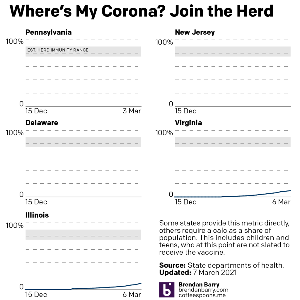
Finally, the best news we had over the course of last week was with vaccinations.
Vaccination curves for VA & IL.
Last week I mentioned that we can see the lines moving upwards as we approach 10% fully vaccinated in Pennsylvania, Virginia, and Illinois.
This week, well let’s start here: as I’ve pointed out in the past, Pennsylvania does not have a centralised reporting system. Most notably the state reports figures for all but Philadelphia county (coterminus with the city). The city reports its own figures. I aggregate the two. But for the last several days, the Philadelphia data site has been broken, so we don’t know the progress of vaccinations in the city. And as the largest city/county in the state, Philadelphia is an enormous part of figuring out the statewide numbers.
So looking only at Virginia and Illinois, the numbers look good. Virginia is at nearly 9.5%. Illinois is on 8.92%.
But we really need Philadelphia to get its act together.
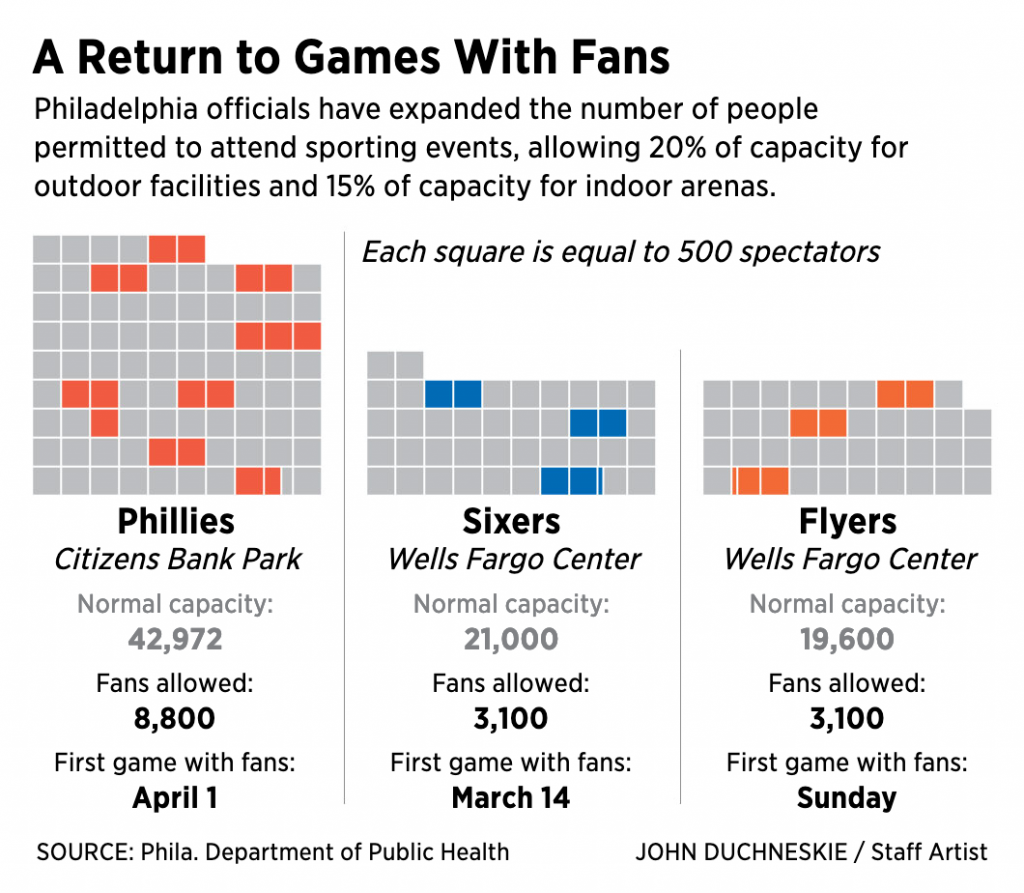
In 2020, baseball did not permit fans to attend regular season matches. (They changed this for the playoffs.) Instead, many stadiums opted for cardboard cutouts: fans often paid a fee and submitted a picture that the team printed on cardboard cutouts. Like so many things we will say about 2020, it was surreal.
But in Philadelphia at least, cardboard cutouts are out, and human fans are in. The state government in Harrisburg and the city government will allow 20% capacity at outdoor stadiums and 15% for indoor stadiums.
The Philadelphia Inquirer created a small graphic for its homepage to capture this news.
I cannot wait to safely attend a live match. C’mon, vaccines.
I intentionally included other site elements in the cropping to show how the graphic fits into the broader site. The extra white space around the image helps focus attention on the datagraphic over the numerous photographic elements for each article. Clicking on other tabs in the section brings up full-component-width graphics.
To the graphic itself.
Still can’t wait…
My guess would be this was a quick turnaround piece. There are a few things going on here. The first and most obvious one, the squares as spectators. Now I confess this confused me at first. I was not entirely certain what the coloured squares meant; they mean in-person attendees. Was this supposed to be an overall stadium? Or was it a representative seating section?
The quick turnaround becomes important, because this is probably how I would have first conceptualised the graphic. But, with more time, I may have attempted to incorporate the shape of the playing field, be it a baseball diamond or basketball court, or hockey rink—I know all the sports terms!—and surrounded them with shapes representing a certain number of spectators. Squares might not work in that case because of the curves. Circles? Hexagons? Regardless of the shape, the filling of occupied seats would be the same as here, but it would perhaps be clearer to some readers, i.e. me.
Second, we get to the table below the graphics. Here we have a subtle design decision. Note that here the designer greyed out the normal capacity figures. The new figures at that 20% and 15% rates are what appear in black bold text. My usual instinct is to use typographic weight, regular vs. bold, in these situations. But the grey here works equally well.
Third, and this also involves the table, we have the first game data. We talked about the comparison of the capacity and permitted attendance. But I wonder, did the date of the first game with fans needed to be displayed in the same way as the permitted attendance? Because the news isn’t the dates of the first games—at least not as I read the news—but the numbers of attendees. And because of that, maybe I would have reduced the size of the type for the date of the first game. Or, conversely, set the type for the new attendance in a larger point size.
Overall, I enjoyed seeing this news presented visually, even if I was left confused.
Last week we saw some positive trends with respect to new Covid-19 cases in the Pennsylvania, New Jersey, Delaware, Virginia, and Illinois area. What did we see this week? Curiously, we saw stagnating figures and, in some instances, slight reversals.
New case curves in PA, NJ, DE, VA, & IL.
This stagnation can be seen by the small flattenings at the end of the lines for Pennsylvania, Illinois, and Virginia. And if you look at Delaware and New Jersey, you can see the reversals as little upward hooks.
I do not think this means we will be returning to the levels we saw earlier this winter. In fact, if you look a little ways back in Delaware and a bit further back in both Pennsylvania and Illinois you can see a similar pattern. Slight reversals appear as jagged little outcrops on the slope. New cases do indeed climb for a week or so—probably isolated to specific geographies within those states tied to outbreak clusters, but that’s pure speculation on my part.
These reversals, therefore, are something we should pay attention to this week when the weekday data resumes on Tuesday. But I am not worrying about this breaking the overall trend of falling numbers of new cases.
Deaths, on the other hand, while still a bit mixed, are broadly positive. Last week we were in a similar position as we are with new cases this week. In particular, we were looking at increasing numbers in both Delaware and Virginia while the other three states saw slowly falling numbers.
Death curves for PA, NJ, DE, VA, & IL.
In Delaware we have the numbers down a bit, but the longer term trend remains generally up. I will be watching this closely this week. Virginia, however, is an easier, but maybe better explanation? During the course of this past week, Virginia stated that it’s processing death certificates from the post-holiday surge in deaths.
This means the state under-reported deaths earlier this year and so that the curve should have actually been significantly higher. But the positive news in that is that the deaths we are seeing now happened in the past so that deaths today are far lower than are being reported.
And with vaccinations we continue to have good news. The lines below are clearly off the baseline now as the three states we track move towards 10% fully vaccinated.
Vaccination curves for PA, VA, & IL.
It’s not all perfect, as the rate in Pennsylvania appears to have slowed slightly. This after vaccine administrators mistakenly used second doses for first doses. Now the state has to play catch-up.
But in Virginia and Illinois, we continue to see increasing rates. You can see this as the curve is beginning to gradually slope more and more upward instead of the shallow angle we saw for the last few weeks.
Like with new cases, which, while positive, still have a ways to go before we get to summer-like levels that would allow us to head out and socialise, vaccinations have a long way to go.
And importantly, just because someone is vaccinated doesn’t mean society should reopen just for those lucky to get their doses early. We need to wait—or should wait—for higher levels of vaccination before reopening.
Another week is over, and for the past few years I’ve often said we all made it to the end of the week. When in reality, for the last few months, thousands of people were not. We’ve started using Monday to sort of recap the state of the pandemic in a select region of the country. And then we moved straight into how the New York Times addressed the US reaching the grim milestone of 500,000 deaths.
So I want to end this week with a little story told over at xkcd that tries to explain these new mRNA vaccines. Who doesn’t love science, science fiction, and humour woven together into a narrative? True, this isn’t really data visualisation, but it dovetails nicely into the work we’ve been doing and reviewing of late. Plus, levity. We all need levity.
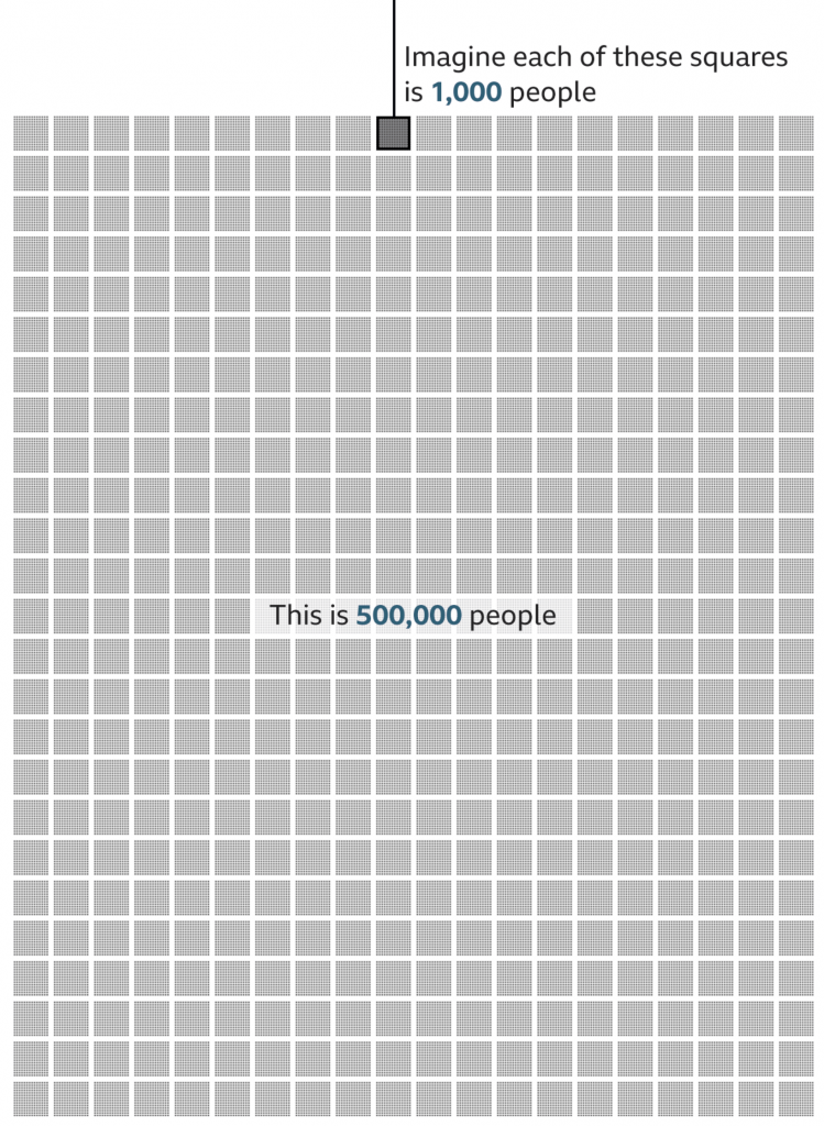
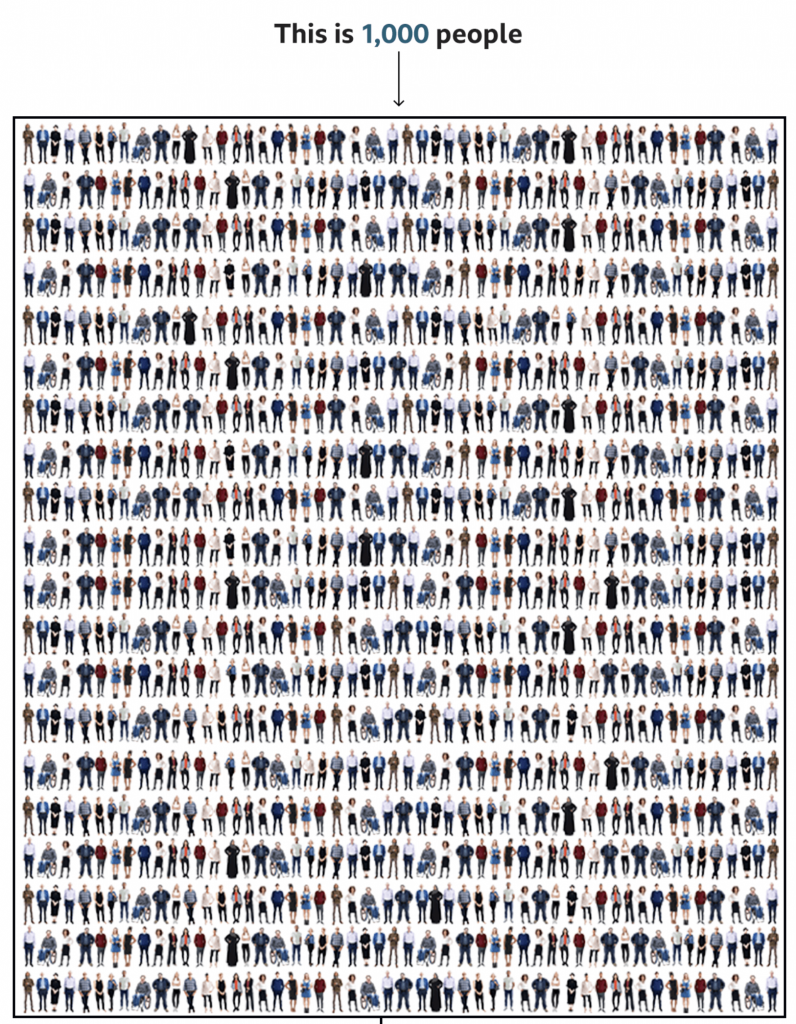
Yesterday we looked at how the New York Times covered the deaths of 500,000 Americans due to Covid-19. But I also read another article, this by the BBC, that attempted to capture the scale of the tragedy.
Instead of looking at the deaths in a timeline, the BBC approached it from a cumulative impact, i.e. 500,000 dead all in one go. To do this, they started with an illustration of 1,000 people. Then they zoomed out and showed how that group of 1,000 fit into a broader picture of 500,000.
We’re going to take a look at this in reverse, starting with the 500,000.
Half a statistic.
I think this part of the graphic works well. There’s just enough resolution to see individual pixels in the smaller squares, connecting us to the people. And of course the number 500 stacks nicely.
My quibble here might be whether the text overlay masks 8,000 people. Initially, I thought the design was akin to hollow square, but when I looked closer I could see the faint grey shapes of the boxes behind a white overlay. Perhaps it could be a bit clearer if the text fell at the end of all the boxes?
But overall, this part works well. So now let’s look at the top.
1,000 tragedies
This is where I have some issues.
When I first saw this, my eyes immediately went to the visual patterns. On the left and right there are rivers or columns of what look like guys in white t-shirts. Of course, once I focused on those, I saw other repeated patterns, the guy in the black jacket with his arms bent out, hands on his hips. The person in the wheelchair occupies a different amount of area and has a distinct shape and so that stood out too.
Upon even closer inspection, I noticed the pattern began to repeat itself. Every other line repeated itself and with the wheelchair person it was easy to see the images were sometimes just flipped to look different.
Now, allow me to let you in on a secret, unless you gave a designer a budget of infinite time, they wouldn’t illustrate 1,000 actual people to fill this box. We don’t have time for that. And I’ll also admit that not all designers are good illustrators—myself first and foremost. A good design team for an organisation that uses illustration should have either a full-time illustrator, or a designer who can capably illustrate things.
But this gets to my problem with the graphic. I normally can distance myself from reading a piece to critiquing it. But here, I immediately fixated on the illustrations, which is not a good sign.
There are three things I think that could have been done. The first two are relatively simple fixes whilst the third is a bit grander in scope.
First, I wonder if a little more time could have been spent with the illustrations. For one, white t-shirt guy, I don’t see his illustration reused, so why not change the colour of his t-shirt. Maybe in some instances make it purple, or orange, or some other colour. I think re-colouring the outfits of the people could actually solve this problem a good bit.
But second, if the patterns still appear visible to readers, mix it up a bit. I understand the lack of desire to spend time creating an individualised row for each row. Crafting each row person by person probably is out of the time requirements—though maybe the people above the designer(s) should know that content takes time to create. So what about repeating smaller blocks? I counted 20 rows, which means there should be 50 people per row. Make each row about ten blocks, and have several different blocks from which you can choose. Ideally, you have more blocks than you need per row, so not all figures are repeated, but if constrained, just make sure that no two rows have the same alignment of blocks.
Thirdly, and here’s the one that would really have required more time for the designer to do their job, make the illustrations meaningful. In a broad sense, we do have some statistics on the deaths in the United States. According to the CDC, 63% of deaths have been by white non-Hispanics, 15% by Black non-Hispanics, and 12% by Hispanic/Latino, 4% by Asian Americans, 1% by Native Americans, 0.3% by Hawaiian and Pacific Islander, and 4% by multiple non-Hispanic. Using those numbers, we would need 630 obviously white illustrations, 150 obviously Black, and so on.
If the designer had infinite time, the illustrations could also be made to try and capture age as well. Older people have been hit harder by this pandemic, and the illustrations could skew to cover that cohort. In other words, few young people. According to the CDC, fewer than 5% of deaths have been by people aged under 40. In other words, no baby illustrations needed.
That’s not to say babies haven’t died—87 deaths of people between 0 and 4 have been reported—but that when creating a representative average, they can be omitted, because that’s less than 0.1%, or not even 1 out of 1000.
To reiterate though, that third concept would take time to properly execute. And it would also require the skills to execute it properly. And I am no illustrator, so could I draw enough representative people to fake 1,000? Sure, but time and money.
The first two options are probably the most effective given I’d bet this was a piece thought up with little time to spare.
Credit for the piece goes to the BBC graphics team.
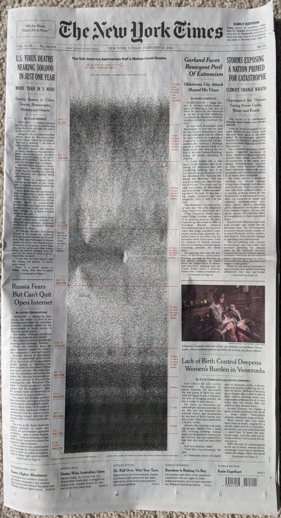
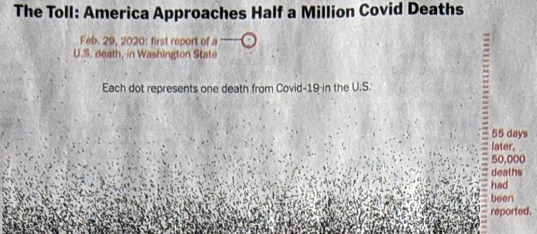
The United States surpassed 500,000 deaths from Covid-19. On Sunday, in advance of that sobering statistic, the New York Times published a front-page graphic that dominated the layout.
Sunday front page for the New York Times
Usually a front-page graphic will make use of the four-colour process and present richly coloured graphics. This, however, starkly lays out the timeline of deaths in the United States in black and white.
Meaningful graphics do not need to reinvent the wheel. This takes each life lost as a black dot and then, starting at the top in February, plots each day.
Detail of the graphic
The colour here serves as the annotation. The red circle drawing attention to the first reported death. And down the side the tick marks for days. Red lines indicate 50,000 death increments. The labels tell the story, we’ve needed fewer and fewer days to reach each subsequent 50,000 milestone.
As the first wave intensifies in March and April, the space fills with black dots. But as we enter summer and deaths fell, the space lightens. Late autumn and winter bring more death and you can see clearly towards the bottom of the chart, as we approach today, the graphic is nearly solid black.
If we want to look towards a hopeful point in the content, we can see first that it took 17 days then 15 to reach 400,00 deaths and 450,000 deaths, respectively. But it took 19 days to reach 500,000. As a nation we appear to finally be on the downward slope of this wave.
Returning to the piece, it’s a gut punch of simplicity in design.
Credit for the piece goes to Lazaro Gambio, Lauren Leatherby, Bill Marsh, and Andrew Sondern.
Another week, another snowstorm in the Northeast. This winter has been far busier than last, when Philadelphia saw no snow. Unfortunately, whilst people like me enjoy seeing the snow, it’s hampering with testing and vaccination.
Last week we saw some middling signs of improvement, but perhaps partially exaggerated by the closures caused by the storm. When we look back at the last week, despite the impact of a storm later in the week, it’s been a categorically positive week with respect to new cases.
New case curves for PA, NJ, DE, VA, & IL.
After the plateaus of the week before, most notably in the straight line in Pennsylvania, this week we saw the line for the seven-day average resume a sharp trajectory down. That isn’t to say we are seeing a slowdown in that reduction of new cases. Illinois best fits that, but we can see slight flattening of the downward curve also in Delaware and New Jersey. In Illinois’ case, that is still welcome as the state approaches early autumn levels of new case rates. In the remaining states, we still have a little ways to go before we reach those levels.
Deaths, on the other hand, remain a mixed bag of results. Last week we talked about a much improved picture from the week before with Delaware and Virginia in particular exhibiting significantly decreased rates.
Death curves for PA, NJ, DE, VA, & IL.
This week we saw some reversal of fortune in those two same states. In Delaware, the numbers of deaths have ticked back upwards and the seven-day average has made up about a third of the gains we saw. In Virginia, the upward swing can be largely—though not entirely—attributed to a one-day spike in numbers.
Whilst the other three states continued to see gradual improvements, the question over the coming week will be what trends emerge within Delaware and Virginia. Do the deaths increase and the situation worsen? Or will the increases prove a temporary aberration followed by a return to decreasing numbers of new deaths.
Finally with vaccines
The vaccination curves for PA, NJ, DE, VA, & IL.
The story to follow in Pennsylvania will be how distribution sites mistakenly administered second doses as first. 60,000 people awaiting their second dose will now have to wait—though still within the recommended window—for their second dose whilst 50,000 people will now have to wait for their first dose.
Otherwise, we continue to see an uptick in vaccinations. Last week we saw states make significant gains in their fully vaccinated populations. Virginia had passed 4% and Pennsylvania was about to hit the same milestone. This week begins with Virginia at nearly 5.5% and Pennsylvania almost at 5%, sitting on 4.77%. We need to keep in mind that this excludes any new vaccinations from the city, which doesn’t report vaccination data at the weekend. Illinois is now the lagging state at 4.29%.
Last week we discussed the potential impact of a major nor’easter that struck the East Coast and interrupted testing and vaccination operations in the states we cover: Pennsylvania, New Jersey, Delaware, Virginia, and Illinois (affected by the storm as one of the components moved east across the Midwest).
The possibility of an exaggerated downward trajectory concerned me and that it could be followed with an uptick in new cases and deaths. So a week later, where are we?
New case curves for PA, NJ, DE, VA, & IL.
We can see something in the middle. With the exception of Illinois, which has continued its downward trend for new cases, we saw a brief interruption last week. In some cases, like Pennsylvania, that emerged as a rolling seven-day average that began and ended the workweek with the same exact number. And without a lot of variation during the week, you can see that pattern as the flat line towards the end of the chart. As numbers resumed heading down, you can see that beginning of a downward direction at the line’s very end.
In the remaining states of New Jersey, Delaware, and Virginia we saw brief upticks in the seven-day averages with daily spikes of new cases. None of these upticks came anywhere close enough to be threatening—though any upward tick should be monitored—but they were all significant enough to be seen as the quick, upward pointing jogs in the lines. But as we entered the weekend, those numbers also began to drop again.
Next we look at deaths. Last week I described a muddled picture. Delaware and Virginia had begun to rebound and reach or approach new peaks whilst Pennsylvania and Illinois continued to see steady but significant declines. New Jersey fell somewhere between the two. What about this week?
Death curves for PA, NJ, DE, VA, & IL.
This week is an improved picture. We did see the potential interruption from the storm—Pennsylvania’s death trend evinces the disruption with the same straight line pattern we saw with new cases. But, overall, numbers continue to trend down. Delaware and Virginia show dramatic improvement with steep drops over the last week. And whilst Illinois continues to show steadily declining numbers, New Jersey now falls somewhere near the top of the pile. Its death rate continues to decline very slowly, relative to the other states. But it is heading down.
Finally, a look at vaccinations for Pennsylvania, Virginia, and Illinois.
Last week we talked about how the states all reached at least 2% over the course of the week. Even better news this week.
Vaccination curves for PA, VA, & IL.
Last week we needed approximately one week to climb one percentage point from 1% to 2%. This week in the same one week time period we saw Virginia climb two percentage points from 2% to 4%. Illinois has slowed its vaccination efforts as it’s still in the mid 3% range. And Pennsylvania is tricky. Because the city of Philadelphia does not report its data on the weekend, we have an incomplete picture until after I post this on Mondays. Even though today is Tuesday, yesterday was a holiday so the same pattern holds true. I would suspect, however, the Commonwealth surpasses 4% later today when the new numbers are released or it comes near to reaching that level.