Covid Migration

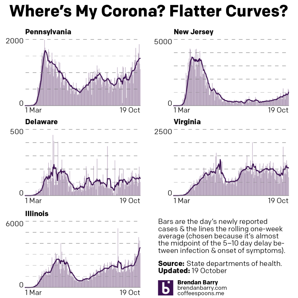
Yep, Covid-19 remains a thing. About a month or so ago, an article in City Lab (now owned by Bloomburg), looked at the data to see if there was any truth in the notion that people are fleeing urban areas. Spoiler: they’re not, except in a few places. The entire article is well worth a read, as it looks at what is actually happening in migration and why some cities like New York and San Francisco are outliers.

But I want to look at some of the graphics going on inside the article, because those are what struck me more than the content itself. Let’s start with this map titled “Change in Moves”, which examines “the percentage drop in moves between March 11 and June 30 compared to last year”.

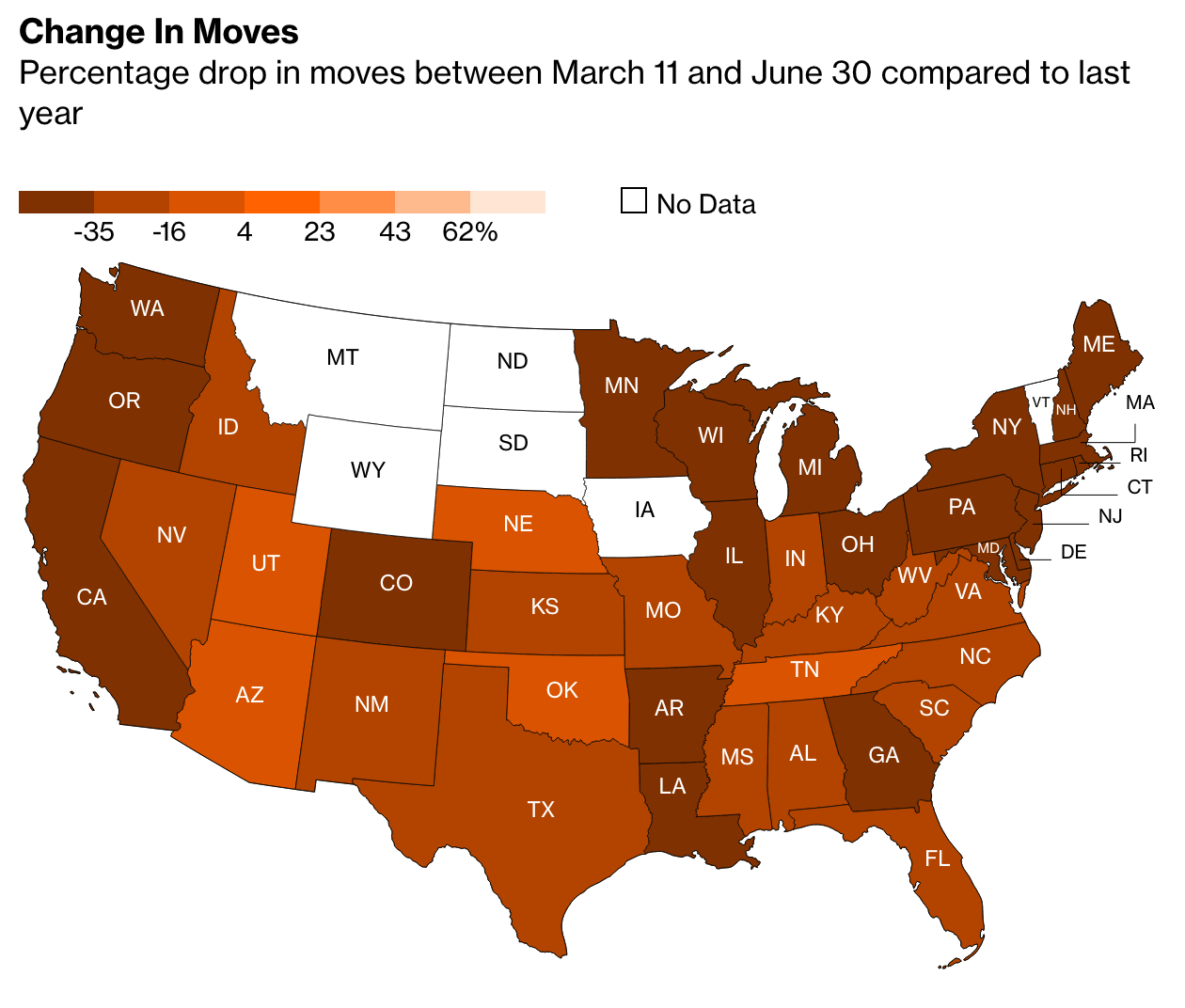
Conventionally, what would we expect from this kind of choropleth map. We have a sequential stepped gradient headed in one direction, from dark to light. Presumably we are looking at one metric, change in movement, in one direction, the drop or negative.

But look at that legend. Note the presence of the positive 4—there is an entire positive range within this stepped gradient. Conventionally we would expect to see some kind of red equals drop, blue equals gain split at the zero point. Others might create a grey bin to cover a negative one to positive one slight-to-no change set of states. Here, though, we don’t have that. Nor do we even get a natural split, instead the dark bin goes to a slightly less dark bin at positive four, so everything less than four through -16 is in the darker bin.

Look at the language, too, because that’s where it becomes potentially more confusing. If the choropleth largely focuses on the “percentage drop” and has negative numbers, a negative of a negative would be…a positive. A -25% drop in Texas could easily be mistaken with its use of double negatives. Compare Texas to Nebraska, which had a 2% drop. Does that mean Nebraska actually declined by 2%, or does it mean it rose by 2%?

A clean up in the data definition to, say, “Percentage change in moves from…” could clear up a lot of this ambiguity. Changing the colour scheme from a single gradient to a divergent one, with a split around zero (perhaps with a bin for little-to-no change), would make it clearer which states were in the positive and which were in the negative.

The article continues with another peculiar choice in its bar charts when it explores the data on specific cities.

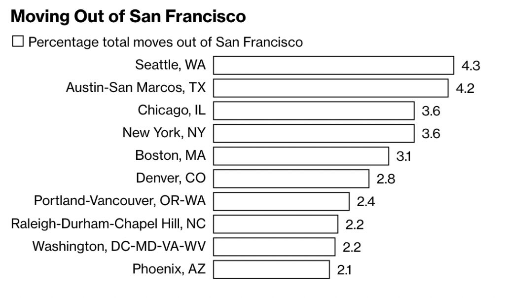
Here we see the destinations of people moving out of San Francisco, using, as a note explains, requests for quotes as a proxy for the numbers of actual moves. What interests me here is the minimalist take on the bar charts. Note the absence of an axis, which leaves the bars almost groundless for comparison, except that the designer attached data labels to the ends of the bars.

Normally data labels are redundant. The point of a visualisation is to visualise the comparison of data sets. If hyper precise differences to the decimal point are required, tables often are a better choice. But here, there are no axis labels to inform the user as to what the length of a bar means.

It’s a peculiar design decision. If we think of labelling as data ink, is this a more efficient use with data labels than just axis labels? I would venture to say no. You would probably have five axis labels (0–4) and then a line to connect them. That’s probably less ink/pixels than the data labels here. I prefer axis lines to help guide the user from labels up (in this case) through the bars. Maybe the axis lines make for more data ink than the labels? It’s hard to say.

Regardless, this is a peculiar decision. Though, I should note it’s eminently more defensible than the choropleth map, which needs a rethink in both design and language.

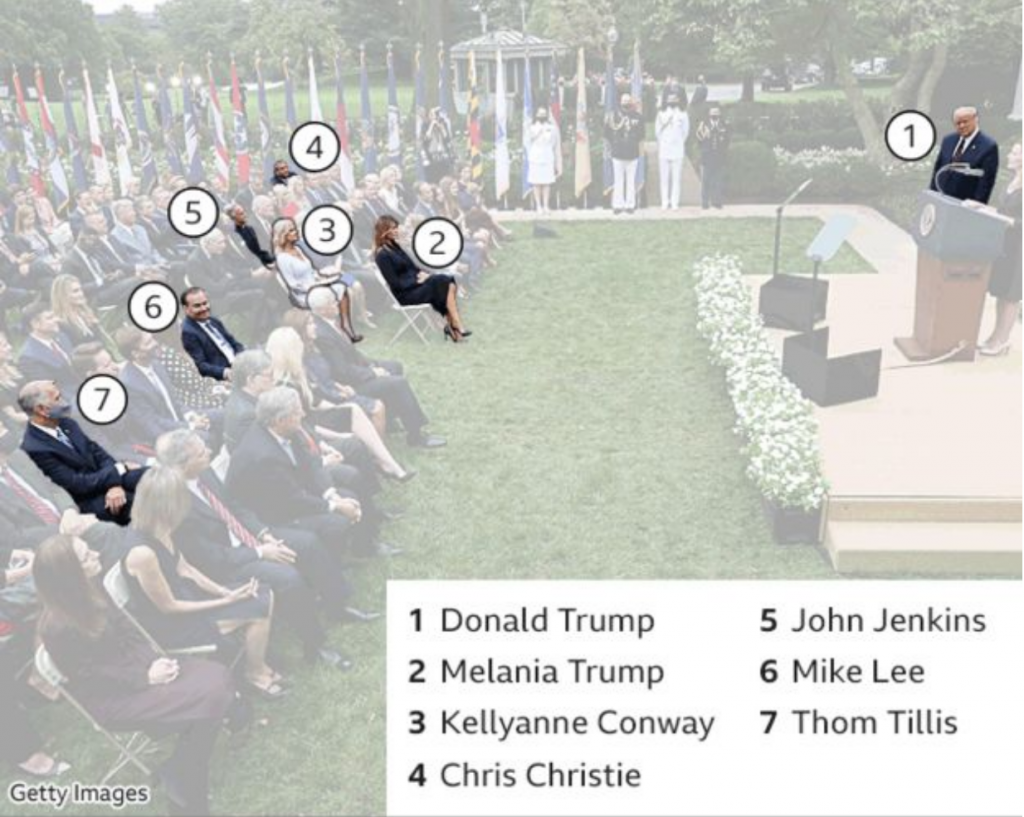
Credit for the piece goes to Marie Patino.

Covid-19 Update: 19 October

I took a holiday yesterday. To be honest, I’ll be taking a lot of short holidays as the year winds down on account of not taking any the first three quarters of the year. So expect quite a few quiet Mondays and Fridays in the next few months.

But back to Covid-19. I won’t have a lot to say in this weekly update, because I didn’t write anything last night when I made these. Suffice it to say that things are bad and getting worse. Although, things could also be much worse. And by that I mean, while we are seeing dramatic rises in new cases, we are not yet seeing the rises in deaths that accompanied similar rises in March and April.

Although it should be said that while still low, deaths have been rising. The easiest seen instance of that is in Illinois, below. You can see deaths are rising slowly upwards and the state is approaching 50 deaths per day. While that is still off from the peaks of 100+ earlier this year, that’s still too many people.

New case curves for PA, NJ, DE, VA, and IL.
Death curves for PA, NJ, DE, VA, and IL.

Credit for the pieces is mine.

Mask Up

Well, we made it to Friday. But, if you’ve been following me on the social, you’ll know that Covid is beginning to spread once again in Pennsylvania, New Jersey, Delaware, Virginia, and Illinois. I live in a tower block and I can say that many of my neighbours are no longer wearing masks indoors. Yet mask-wearing is the easiest defence we have against the spread of the coronavirus. So let’s take a look at the most effective types of masks, thankfully charted by xkcd.

Credit for the piece goes to Randall Munroe.

Covid-19 Is Not the Flu Part Augh!

Yesterday, President Trump once again lied to the American public on his social media platforms. He falsely claimed that Covid-19 was nothing worse than the flu, which he falsely claimed sometimes kills more than 100,000 people. Once again we are going to look at the data comparing influenza to the novel coronavirus and the disease it causes, Covid-19. We are going to look at the president’s claim that Covid isn’t much worse than the flu, which sometimes kills more than 100,000 people.

I mean, I don’t know where else to begin. Over the last decade, not in any flu season has the flu killed 100,000 people. In the 2017/18 season, the CDC estimates the flu killed 61,000 Americans. But they also give a range where they feel with 95% confidence that the flu killed between 46,000 and 95,000 Americans. And that is the closest it’s come.

In fact, as of yesterday, Covid-19 has killed 207,000 Americans. That averages out to about 30,000 Americans per month. In other words, Covid-19 has killed each month the same number of people the flu kills in an entire (average) fly season.

And the worst part is that we still haven’t exited the first wave of the coronavirus, because we never got it under control in the first place.

I just don’t know how many more times we have to say this, but because the president keeps lying about it, I feel like I need to say, once again…

Covid-19. Is. Not. The. Flu.

Credit for the piece is mine.

Super Spreading Garden Parties

If you were unaware, in the wee hours of Friday, President Trump announced that he had tested positive for the coronavirus that causes Covid-19. It should be stated in the just three days hence, there is an enormous amount of confusion about the timeline as the White House is not commenting. From the prepared statement initially released it seems Trump first tested positive Wednesday. But that statement was then changed to fit the diagnosis in the wee hours of Friday morning. But just last night I saw reporting saying that test was actually a second, confirmatory test and the president first tested positive earlier Thursday.

The timeline is also important because it would allow us to more definitively determine when the president was infected. The reporting indicates that he caught the virus at a Rose Garden ceremony at the White House to introduce his Supreme Court nominee, Amy Coney Barrett. This BBC graphic does a great job showing who from that ceremony has tested positive with the virus.

The photo also does a great job showing how the seven people there were situated. Six of the seven did not wear masks, only North Carolina Senator Thom Tillis did. There is no social distancing whatsoever. And not shown in this photo are the indoor pre- and post-ceremony festivities where people are in close quarters, mingling, talking, hugging, shaking hands, all also without masks.

It should be noted others not in the photograph, e.g. campaign manager Bill Stepien, communications advisor Hope Hicks, and body man Nicholas Luna, have also now been confirmed positive.

The final point is that this goes to show how much the administration does not take the pandemic seriously. Right now the Covid data for some states indicates that the virus is beginning to spread once again. And so maybe this serves as a good reminder to the general public.

Just because you are socialising outdoors does not make you safe. Outdoors is better than indoors. No gatherings is better than small gatherings is better than large, well attended garden parties. Masks are better than no masks. Rapid result test screening is better than no test screening. Temperature checks are better than no temperature checks.

But the White House only did that last one, temperature checks, in order to protect the president before admitting people to the Rose Garden. Compare that to how they protect the president from other physical threats. He has Secret Service agents standing near him (or riding with him in hermetically sealed SUVs for joyrides whilst he is infected and contagious); he has checkpoints and armed fences further out to secure the perimeter. Scouts and snipers are on the White House roof for longer range threats. And there is a command centre coordinating this with I presume CCTV and aerial surveillance to monitor things even further out. In short, a multi-layered defence keeps the president safe.

If you just take temperatures; if you just hang out outside; if you just wear masks; if you just do one of those things without doing the others I mentioned above, you are putting yourself—and through both pre-diagnostic/pre-symptomatic and asymptomatic spreading, others—at risk.

But on Sunday night, Trump campaign strategist went on television said that now that President Trump has been infected, been hospitalised, he is ready to lead the fight on coronavirus. Great. We need leadership.

But where was that leadership seven months ago when your advisors told you in January about the impact this pandemic would likely have on the United States? Where was the leadership in February saying the coverage was a hoax? Where was it in March when he said the virus would go away in April with the warmer weather? Where was it in April when it didn’t go away, when things continued to get worse? Where was it in May when thousands of Americans were dying? Where was it in June when states began to reopen even though the virus was still out-of-control and testing and contact tracing was less available than necessary to contain outbreaks? Where was it in July? And August? And September? Where was the leadership at a Rose Garden party celebrating the nomination of a Supreme Court justice, a party where at least seven people have been infected and one of them, the president of the United States, has been hospitalised with moderate to severe symptoms?

Credit for the piece goes to the BBC.

Covid-19 Update: 28 September

Apologies for the lack of posting, work is pretty busy as we wrap some projects up. But here’s a look at the latest Covid data for Pennsylvania, New Jersey, Delaware, and Illinois. Normally we look at Virginia as well, but their site was down for maintenance and so there was no data to report.

When it comes to new cases, we have on the one hand places like New Jersey and Illinois, where new cases continue to rise. The rate is nowhere near as fast as it was in March and April, but the inclines are clearly there. Delaware has been up and down, but largely hovering around just shy of 100 new cases per day. Pennsylvania is a bit harder to tell because of some dramatic swings that have knocked the average around, but it does appear to be trending upward, though I’m not quite as confident in that as I am with New Jersey and Illinois.

New cases curve in PA, NJ, DE, and IL.

And then when we look at deaths, we generally have good news. Last week we were looking at Virginia and its working through a backlog of unreported deaths. That artificially inflated recent days, but also depressed deaths earlier in the pandemic. Beyond the old Dominion, however, deaths have remained fairly low. Only in Pennsylvania and Illinois do they hover around 20 deaths per day from the virus.

Death curves in PA, NJ, DE, AND IL.

Credit for the piece is mine.

Covid-19 Update: 21 September

Apologies for the lack of posting yesterday, but I wasn’t feeling well. I had some other things planned for today, but then some other things happened this weekend and then I took ill. But it’s still important to look at what’s going on with the pandemic, especially in the United States where it’s been disastrously handled by the White House.

As we approach 200,000 dead Americans, we still look at what’s going on in the tristate region alongside Virginia and Illinois. Specifically we compare last week’s post to this week’s post. Note that normally we look at Sunday data on Monday morning and today we’ll be looking at Monday data on a Tuesday. Both Sunday and Monday are reports from their preceding days, and so we are still looking at weekend reporting of figures. So we can expect them to be lower than workweek data.

New cases curves for PA, NJ, DE, VA, & IL.

If we compare the above chart to last week’s, we can see that Pennsylvania has decidedly reversed course. Whereas things had been headed down in terms of averages, I was worried about the days of daily new cases exceeding the average. Sure enough the average has caught up to the new cases and we’re seeing a rise in the average to levels not really seen since the summer.

New Jersey remains on the path of slowly increasing its numbers of new cases. Delaware looks to be heading back down after a small bump. We might be seeing the beginning of a decline in cases in Virginia, down from its long-running plateau of nearly 1000 new cases per day. And finally in Illinois, it’s not quite clear where things are headed at present. But for the one-day spike that raised the average, it seemed as if new cases had been in decline, but the end of that otherwise decline might have been an inflection point as the average may be trending back upwards again.

Death curves in PA, NJ, DE, VA, & IL.

Then when we look at deaths, well we see no real significant change in four of the states. But last week, we were saying Virginia was at a good spot with its latest surge cycle coming to an end. Well now look at that spike and deaths that are higher now than they were in the spring. If you follow my daily posts on social media, you’ll know that there’s a reason for this.

For the last week Virginia has been working through a backlog of deaths that were not entered into its electronic database. And so these deaths happened over the last several months. Consequently the rise, if there even is one, is not nearly as high as shown. But it also means that the earlier peaks may have been far higher than reported at the time.

Credit for the pieces is mine.

Covid-19 Update: 13 September

Apologies for the lack of posting last week. I’m on deadline for, well, today. Plus I had some technical difficulties on the server side of the blog. But it’s a Monday, so we’re back with Covid updates for Pennsylvania, New Jersey, Delaware, Virginia, and Illinois.

New cases curves for PA, NJ, DE, VA, & IL

The good news, such that it is during a global pandemic, is that in Pennsylvania, Delaware, and Illinois, the seven-day average appears to be lower than this time last week or, especially in Delaware’s situation, about to break. For the First State, I’m looking at those days prior to the weekend below the average line that, in combination with the weekend, will likely begin to push that trend downward, especially if we keep seeing fewer and fewer cases this week.

Unfortunately, some states like Virginia and New Jersey appear to be, not surging, but experiencing low and slow growth. Low and slow, while great for barbecue, is less than ideal during a pandemic. Granted, it’s better than the rapid infections we saw in March, April, and May, but it still means the virus is spreading in those communities.

Death curves in PA, NJ, DE, VA, & IL.

When we look at deaths from Covid-19 in these five states, the news is better. The only real significant level of deaths was in Virginia, but we can see that the latest little surge, which was at peak last week, has now all but abated, almost to a level not seen since the spring.

The other states remain low with, at most, deaths average about 20 per day. Again, not good, but better than hundreds per day.

Credit for the pieces is mine.

Covid-19 Update: 7 September

Yesterday was a holiday in the States, and so let’s begin this shortened week with a look at the Covid situation in Pennsylvania, New Jersey, Delaware, Virginia, and Illinois.

If we compare this morning’s charts of yesterday’s data to last Monday’s, we can see some concerning trends.

New case curves in PA, NJ, DE, VA, & IL.

In Pennsylvania, that includes a rising trend. Anecdotally, that might be tied to the outbreaks in and around universities. We see rising trends in Delaware and Virginia as well, though some of Delaware’s new numbers might be tied to some cases that failed to initially make into the state’s digital database. And so as the state begins to enter them now, it artificially inflates the new case numbers.

Illinois had an enormous spike of cases from a backlog that the state entered, over 5,000 new case in that one day. That’s going to mess with the average trend given the size of the anomaly. So we’ll need to wait until later this week to see where the trend really is.

Then in terms of deaths, the most worrying state was Virginia which last week was mid-peak. But that appears to maybe be trending back down. Though the data we have does include two day’s of weekend numbers and Tuesday’s numbers, instead of the usual “rebound” will be more of the usual weekend depressed numbers.

Death curves in PA, NJ, DE, VA, & IL.

Credit for the pieces is mine.

Pretty Much My Life These Days

It’s another Friday. Which means another work week come and gone. Most of my days now consist of Covid-related work. A couple of months ago, Memorial Day began the surge in Covid-19 cases. Hopefully people take it more seriously now, and everyone masks up and stays distant so that Labour Day does not become a new big inflection point. Consequently, this piece from xkcd feels most appropriate.

For my American audience, since it is a holiday weekend, again, enjoy Labour Day. For my British audience, you already had your summer bank holiday. For everyone, have a good weekend.

Credit for the piece goes to Randall Munroe.