One of the important stories of last week that was not black hole related was that of the re-election of the Likud Party in Israel, a party headed by Benjamin Netanyahu. This will be his fourth consecutive time as prime minister plus a fifth back in the late 1990s. Of course, he is facing an expected arrest and charges on corruption, so how long he might remain in office is yet to be determined.
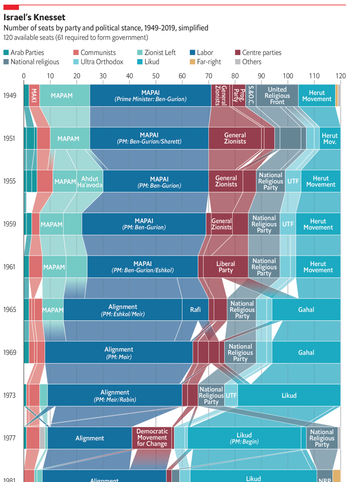
However, the Economist put together this great piece using a Sankey diagram showing the ebbs and flows of the various political parties in Israel since its founding.
It’s definitely not a two-party system…
Obviously, this is only a partial screenshot, but it does a great job showing those changes. Most impressive is the designers’ ability to show the continuity of the evolving parties and the name changes and the splits and recombinations.
Credit for the piece goes to the Economist Data Team.
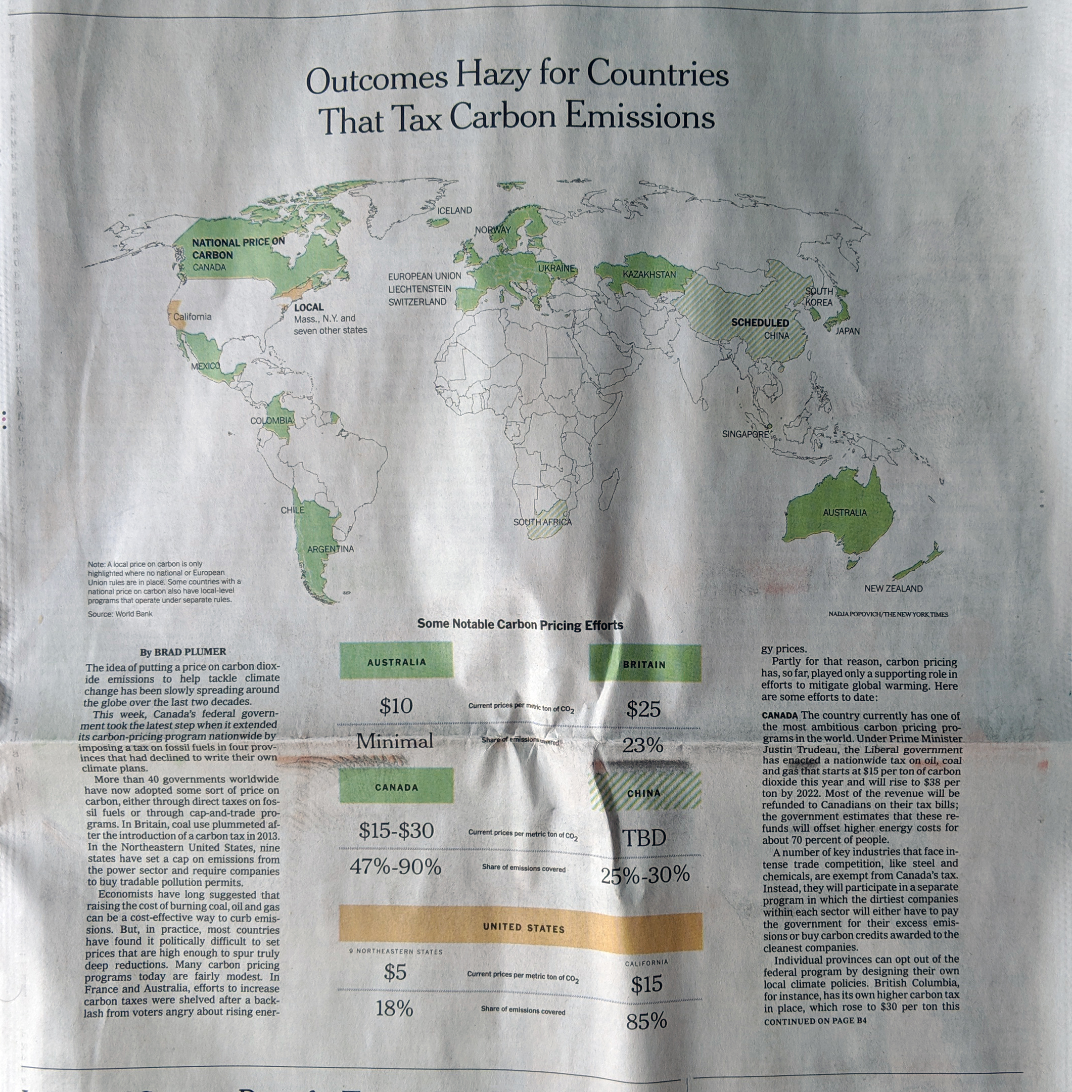
Last week the New York Times published an article about carbon taxes, looking at their adoption around the world and their effectiveness. It is a fascinating article about how different countries have chosen to implement the broad policy idea and the various forms it can take. And, most importantly, how some of those policies can end up blunting the intended effect of carbon emission reduction.
This, however, is about the print piece, because as I was flipping through the morning paper, I found the Business section had a world map above the fold. And we all know how I feel about big, splashy print graphics.
We could use some more green on this map
Here we have a pretty straight-forward piece. It uses a map to indicate which countries have adopted or are scheduled to adopt a carbon tax programme. The always interesting bit is how the federal system in the United States is represented. Whilst a carbon cap-and-trade deal failed in the US Senate in 2009, individual states have taken up the banner and begun to implement their own plans. Hence, the map shows the states in yellow.
There is nothing too crazy going on in the piece, but it is just a reminder that sometimes, as a designer, I love big splashy graphics to anchor an article.
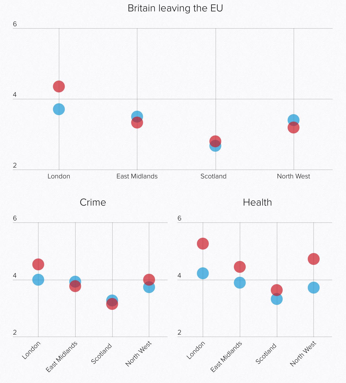
The United Kingdom crashes out of the European Union on Friday. That means there is no deal to safeguard continuity of trading arrangements, healthcare, air traffic control, security and intelligence deals, &c. Oh, and it will likely wreck the economy. No big deal, Theresa. But what do UK voters think about their leading political parties in this climate? Thankfully Politico is starting to collect some survey data from areas of marginal constituencies, what Americans might call battleground districts, ahead of the eventual next election.
And it turns out the Tories aren’t doing well. Though it’s not like Labour is performing any better, because polling indicates the public sees Corbyn as an even worse leader than Theresa May. But this post is more to talk about the visualisation of the results.
Of course I naturally wonder the perception of the smaller parties like the Liberal Democrats or Change UK (the Independent Group)
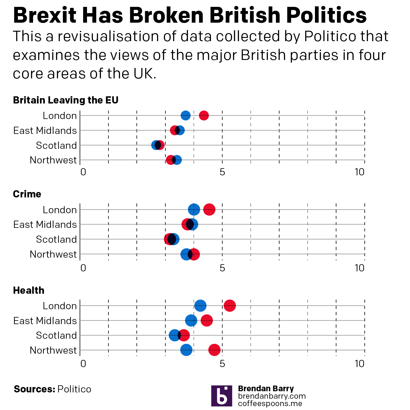
The graphics above are a screenshot where blue represents the Conservatives (Tories) and red Labour. The key thing about these results is that the questions were framed around a 0–10 scale. But look at the axes. Everything looks nice and evenly spread, until you realise the maximum on the y-axis is only six. The minimum is two. It gives the wrong impression that things are spread out neatly around the midpoint, which here appears to be four. But what happens if you plot it on a full axis? Well, the awfulness of the parties becomes more readily apparent.
Neither party looks very good here…
Labour might be scoring around a five on Health, but its score is pretty miserable in these other two categories. And don’t worry, the article has more. But this quick reimagination goes to show you how important placing an axis’ minimum and maximum values can be.
Credit for the piece goes to the Politico graphics department.
Last month Politico published an article called the Democrats’ Dilemma. It looked at what will likely be the crux of their debate for their 2020 candidates. Go moderate or hard left? The super simple version of the argument is that do you win by persuading independents and moderate Republicans to vote Democratic? Or do you win by ginning up the fervour of your liberal base and drive out the vote?
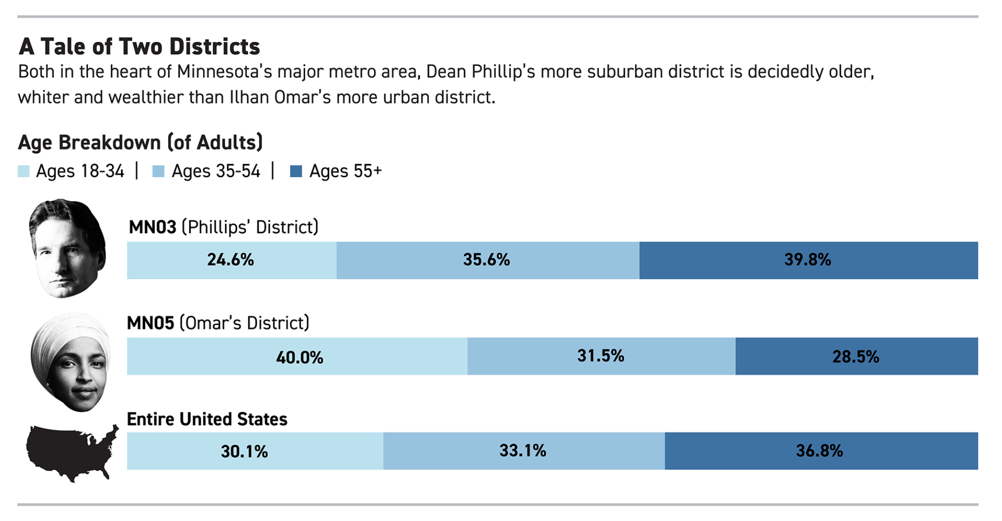
The article contrasts those approaches by looking at two neighbouring congressional districts. The first was won by Ilhan Omar, a Somali-American woman who has been at the centre of several causes célèbres in recent months. The second was won by a moderate, wealthy white man who has not really attracted any attention whatsoever.
But I don’t want to talk about the merits of either representative nor the fascinating split the article discusses. Instead, I want to look at a little piece of the graphics used in the article. It uses some simple stacked bar charts to compare and contrast the demographics of the representatives’ districts. Notably, they are different. But it goes on to compare and contrast them to the overall United States.
But what about New Zealand?
The first thing, I probably would have angled Mr. Phillips’ head so his head is straight, but that is a minor detail. The other thing I immediately noticed is a big pet peeve of mine. For the “Entire United States”, we have a map of the United States. Or do we?
What is missing? The entire states of Alaska and Hawaii, that’s what. I can understand not including Puerto Rico or other insular territories like the U.S. Virgin Islands because they are either not states or so small they would not appear visible at such a scale. However, Alaska and Hawaii are both integral parts of the United States. They are not marginal, like former Attorney General Jeff Sessions’ infamous quip about Hawaii being “some island in the Pacific”.
Perhaps at the above scale, Hawaii would be too small to appear—though I doubt it. But what about Alaska? It is the largest state. And Texas isn’t even a close second. So why is Alaska not included? Unfortunately—though fortunately for Politico, whose work I generally like—this is not a problem specific to Politico.
Even my own employer, the Federal Reserve Bank of Philadelphia, gets it wrong. One of their interactive data visualisation pieces, which for the record my team had nothing to do with, also completely omits Alaska and Hawaii in their map of the United States. And it’s a far larger map with ample space.
Still no New Zealand…
Including Alaska and Hawaii should not be afterthoughts. They are not second-class states. They are full constituent parts of the union. And if it is not easy to include them because they are not contiguous nor sharing the same continent, that should not obviate designers from including them in the United States.
Credit for the piece goes to the Politico’s design department and the Philadelphia Fed’s design department.
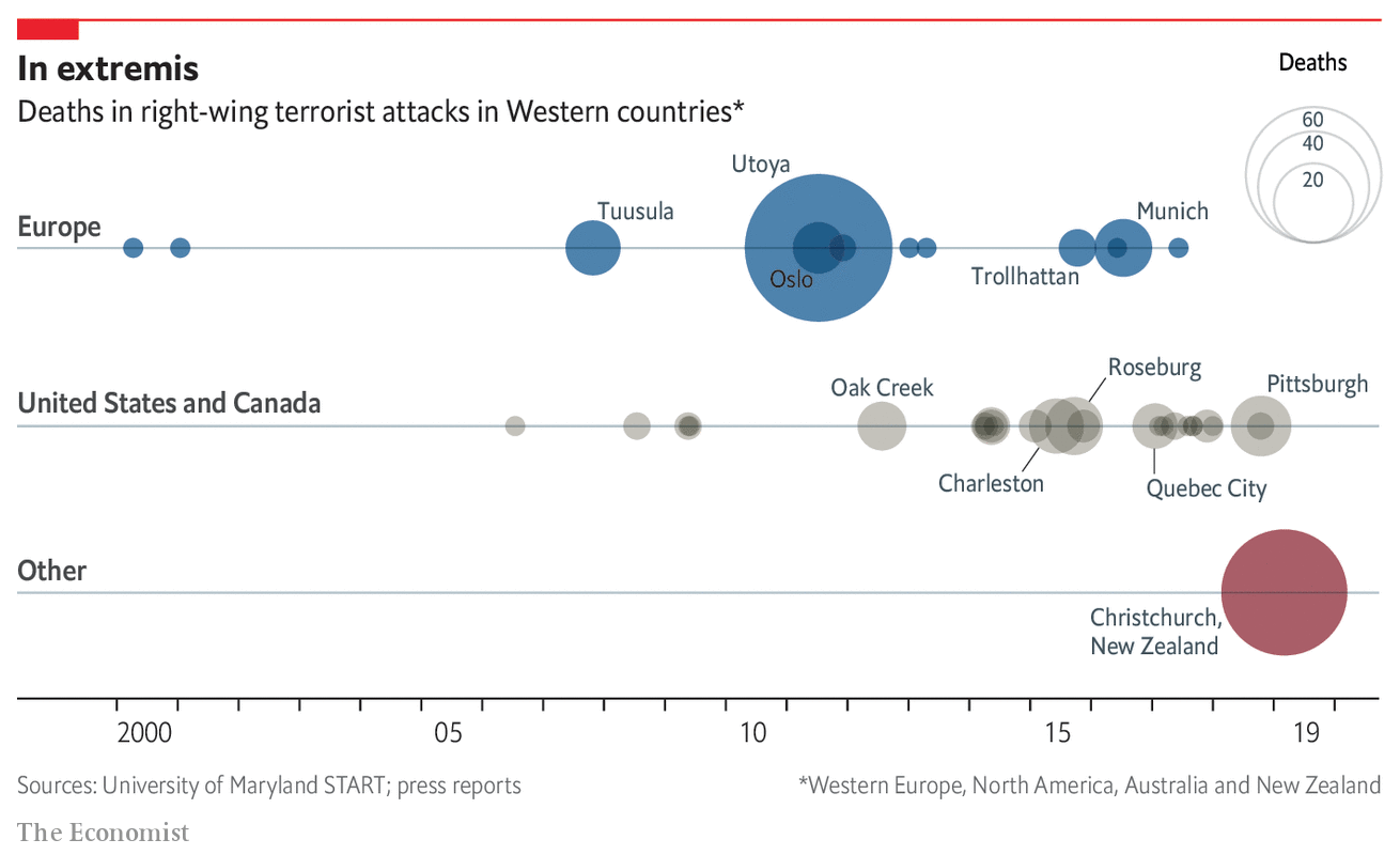
Whilst I was on holiday, a terrorist killed nearly fifty people in Christchurch, New Zealand. Except this time, he was a white man and the victims were all Muslims. Admittedly, I really did not read much about it until I returned to the States, but it clearly is not a thing I was expecting out of New Zealand. But the Economist looked at the question of whether this shooting is more of another in a pattern or a one-off.
Too many dots for my comfort…
The graphic does a fairly good job of showing the increasing frequency of right-wing/white nationalist terror attacks. From a design standpoint, the nice touch is the use of transparency to show overlapping events. For example, the concentric circles for Utoya and Oslo show the two Anders Breivik attacks in Norway.
You could arguably say the treatment begins to fail, however, in the US/Canada timeline. Here, regrettably, there are often too many attacks in too close proximity that the dots are too overlaid. Here I wonder if some other method of stacking or offsetting the incidents could work.
Credit for the piece goes to the Economist data team.
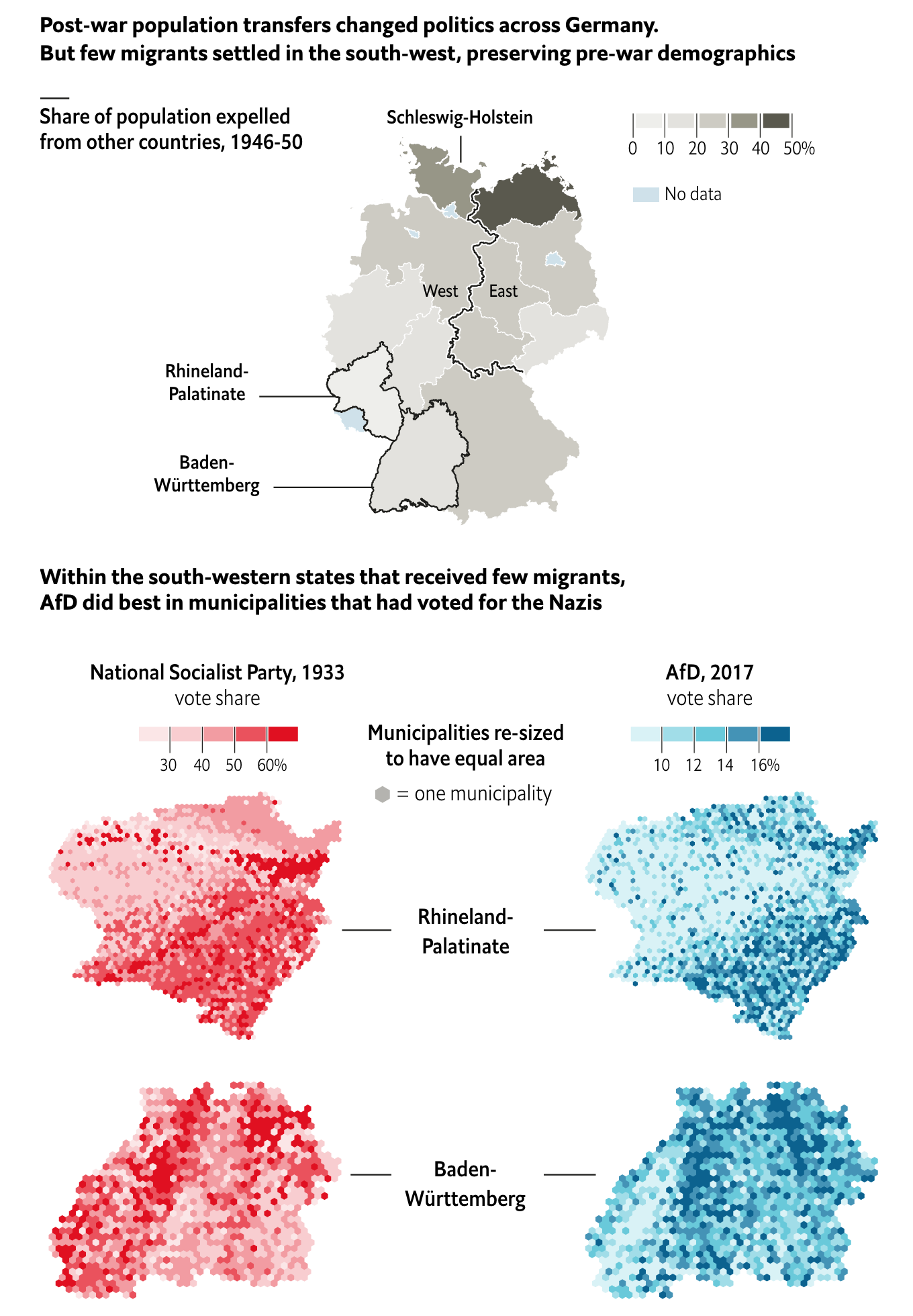
The Economist has an interesting piece looking at the areas of support for the far-right AfD German political party, arguably a neo-fascist nationalist party. It turns out that
Historical analogies are dangerous, but fascinating.
The piece does a great job of setting the case through the demographics map at the top of the piece. It shows how the two areas where the largest AfD support experienced the least changes from prior to the war. And with those demographics in place, the support for hardline nationalism might still be present, as is indicated by the support for the AfD.
In terms of the municipality maps, I would be curious if the hexagon tile map is because those borders have changed. Obviously 84 years can change political boundaries.
But I wonder if a single map could have been done showing the correlation between the 1933 vote and the 2017 vote. Of course, the difficulty could well be in that political boundaries may have changed.
And of course, we should not go so far as to compare the AfD to Nazism.
Credit for the piece goes to the Economist graphics department.
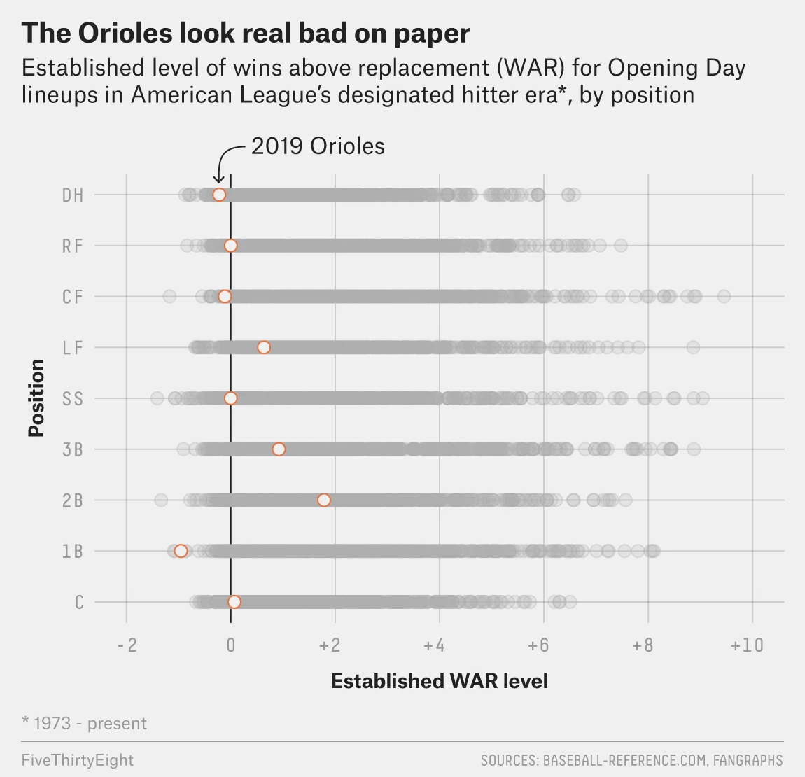
Baseball is almost upon us. And oh boy do the Baltimore Orioles look bad. How bad? Historically bad. FiveThirtyEight went so far as to chart the expected WAR, wins above replacement, of each position of all teams since 1973. And the expected Orioles lineup looks remarkably bad.
They are going to be so bad.
What is nice about this graphic is the use of the medium grey for each team/year combination. I may have used a filled orange dot instead of open, but the dots do at least standout and show the poor positioning of just about everything but the second baseman.
Credit for the piece goes to the FiveThirtyEight graphics department.
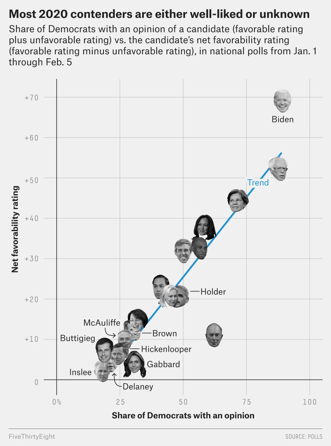
Stepping away from both the Brexit drama and the aircraft drama of the week, let’s look at US political drama. Specifically, the Democratic field and some of the early support for candidates and assumed-to-be candidates.
This piece comes from an article about the bases of various candidates. From a data visualisation perspective it uses a scatter plot to compare the net favourability of the candidate to the share of people who have an opinion about said candidate.
A veritable who’s who of the Democratic field
But what if you don’t know who the candidate is? As in, you don’t know what they look like. Well, then it might be difficult to find Bernie or Elizabeth Warren. This kind of graphic relies on facial recognition. I’m not certain that’s the best, especially when one is talking about a field in which people may not know or have an opinion on the candidates in question.
Another drawback is that the sizes of the faces are large. And, especially in the lower left corner, this makes it easier to obscure candidates. Where exactly is Sherrod Brown? Between a unidentified face and that of Terry McAuliffe.
I think a more simplistic dot/circle approach would have worked far better in this instance.
Credit for the piece goes to the FiveThirtyEight graphics department.
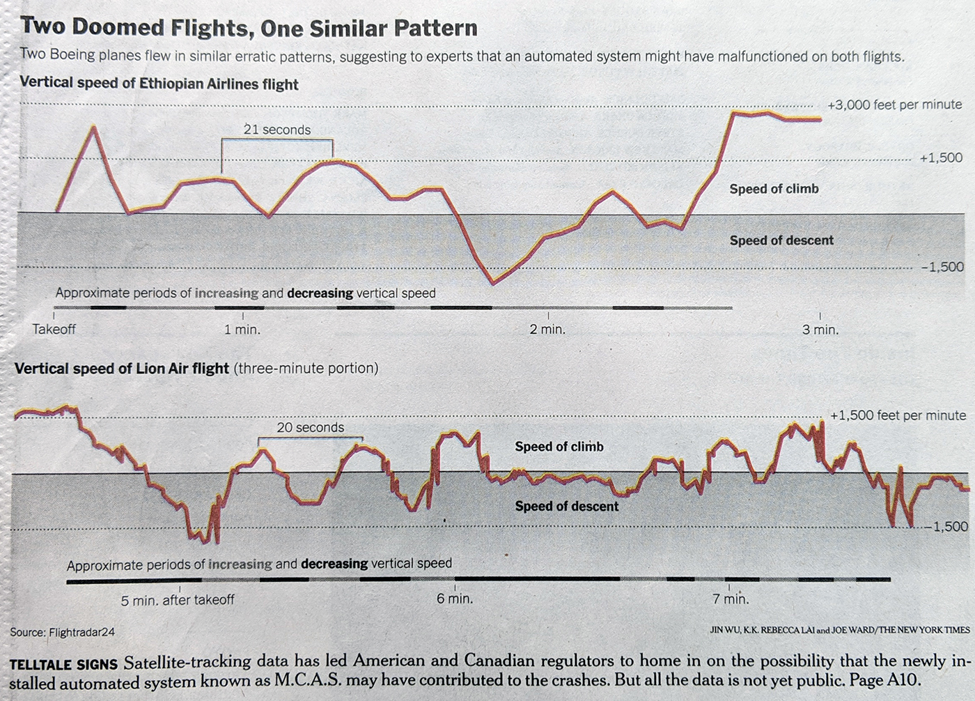
Yesterday we looked at the isolation of the US and Canada in keeping the Boeing 737 Max aircraft in the air. Later that day, both countries grounded those aircraft. Today in the print edition of the New York Times the front page used significant space to chart the vertical speed of the two crashed aircraft.
They are remarkably similar…
It uses the same scale on the y-axis and clearly shows how the aircraft gaining and losing vertical speeds. I am not sure what is gained by the shading below the 0 baseline. I do really enjoy the method of using a chart below the airspeeds to show the periods of increasing and decreasing vertical speed.
Credit for the piece Jin Wu, K.K. Rebecca Lai, and Joe Ward.
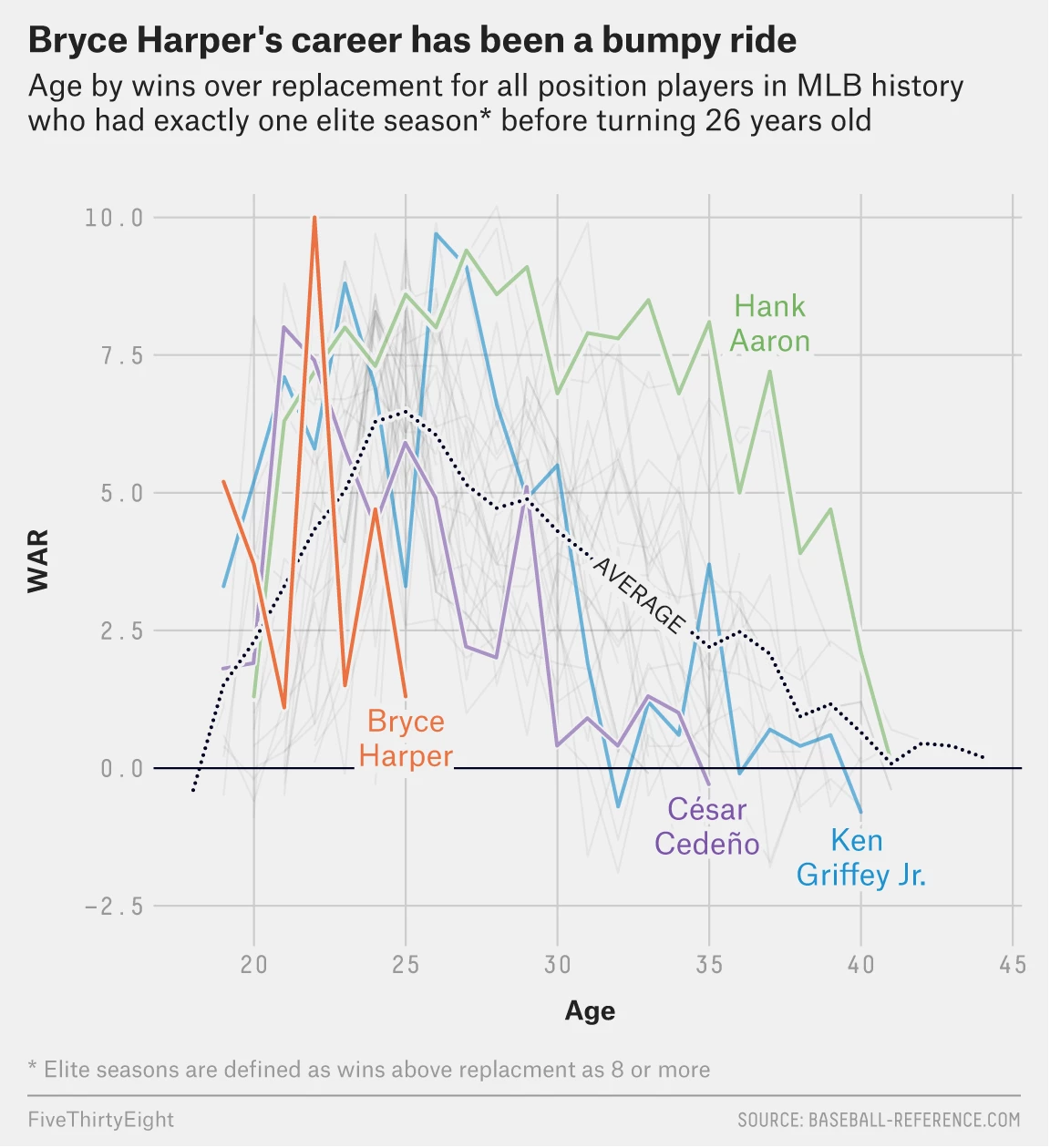
No. Definitely not. But, the position of this article by FiveThirtyEight is that the Phillies, the Philadelphia baseball team that just made the largest guaranteed contract in North American sports, may have purchased the rights to somebody who is a few years past his prime.
The author tracked the performance of similar baseball players over history and found that they peaked earlier and tailed off earlier.
Ken Griffey Jr.’s swing though…
Now, the obvious thing about this graphic that I dislike is the spaghetti-fication of the lines. What does help alleviate it, however, are the greying and lighter weight of the non-identified lines in the background. Interestingly, they are even lighter than the axes’ value lines. There is also a thin outline to the lines that helps them standout against each other.
I also wonder if a few more added benchmark lines would be useful. Elite seasons are defined as those with 8+ wins above replacement (WAR), an advanced measurement statistic. Could that level not be indicated with a line on the y-axis? What about the age of 26, before which the players would have had to produce one and only one 8+ WAR season to be eligible for the data set?
Of course, as I said at the beginning, the answer to this post’s title is no. Harper will make the Phillies a better team and the length of his contract will not be the albatross that was Ryan Howard’s. However, the Phillies may be paying for 13 years of subprime Harper.
Credit for the piece goes to the FiveThirtyEight graphics department.