The Bill Barr Bifurcation

So today’s piece is not a revolutionary piece of information design, but it is fascinating. For two or so years now, we have all heard about the Robert Mueller investigation into potential contacts between the Trump campaign, early administration, and the administration of Russian president Vladimir Putin.

To be clear, thus far, this has been an incredibly productive special counsel.

34: the number of indictments

6: guilty pleas from associates of the Trump campaign

But what happens when the whole thing is done, especially since prevailing Justice Department rules state sitting presidents cannot be indicted? Well to answer that, we have this piece from the Washington Post.

I'm hoping the report isn't…Barred…
I’m hoping the report isn’t…Barred…

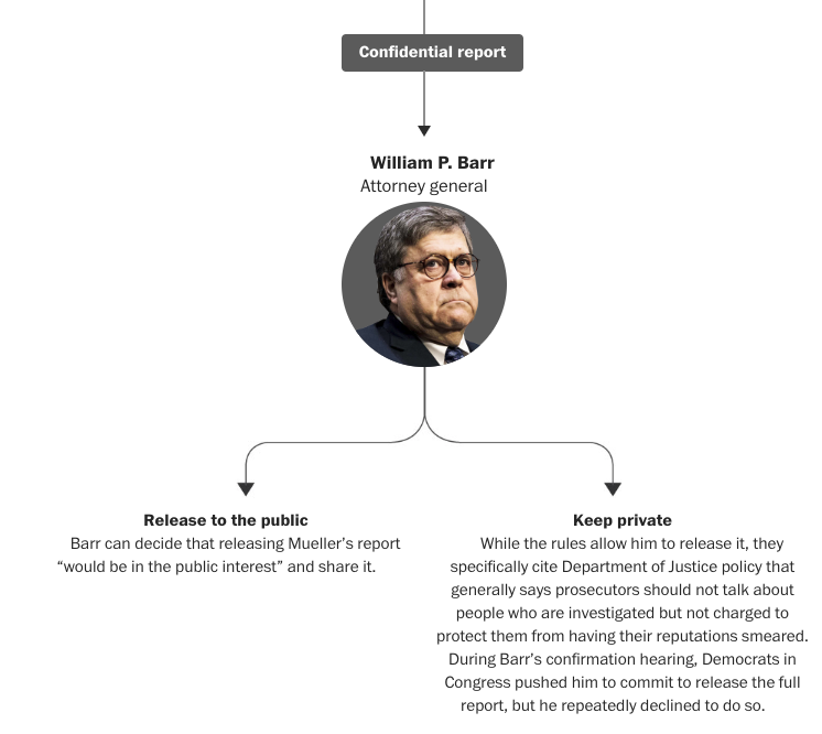
Ultimately it is nothing more than a flow chart broken into pieces, separated by a textual narrative explaining the process. Now, I’m not certain how critical to the design each headshot is—especially Barr’s that looks especially frowny faced. However, the context in the above screenshot is crucial. The public does not necessarily have the right to the findings of the report if individuals in the report are not charged.

This means that design wise, we are looking at snippets of a larger chart interspersed with text. I would be interested to see the entire thing stitched together, but the textual breaks make a lot of sense. Overall, much like the sports pieces we looked at recently, this does a nice job of weaving textual story together with information design or data-driven content.

Credit for the piece goes to Dan Keating and Aaron Steckelberg.

Individualistic Immigrants

As many of you know, genealogy and family history is a topic that interests me greatly. This past weekend I spent quite a bit of time trying to sort through a puzzle—though I am not yet finished. It centred on identifying the correct lineages of a family living in a remote part of western Pennsylvania. The problem is the surname was prevalent if not common—something to be expected if just one family unit has 13 kids—and that the first names given to the children were often the same across family units. Combine that with some less than extensive records, at least those available online, and you are left with a mess. The biggest hiccup was the commonality of the names, however. It’s easier to track a Quinton Smith than a John Smith.

Taking a break from that for a bit yesterday, I was reminded of this piece from the Economist about two weeks ago. It looked at the individualism of the United States and how that might track with names. The article is a fascinating read on how the commonness or lack thereof for Danish names can be used as a proxy to measure the individualism of migrants to the United States in the 19th century. It then compares that to those who remained behind and the commonness of their names.

But where are the Brendans?

The scatter plot above is what the piece uses to introduce the reader to the narrative. And it is what it is, a solid scatter plot with a line of best fit for a select group of rich countries. But further on in the piece, the designers opted for some interesting dot plots and bar charts to showcase the dataset.

Now I do have some issues with the methodology. Would this hold up for Irish, English, German, or Italian immigrants in the 19th century? What about non-European immigrants? Nonetheless it is a fascinating idea.

Credit for the piece goes to the Economist Data Team.

Are Baseball’s Big Contracts Worth It?

On Tuesday the San Diego Padres signed Manny Machado to a guaranteed contract worth $300 million over the next ten years—though he can opt out after five years. Machado was one of two big free agents on the market, the other being Bryce Harper. One question out there is whether or not these big contracts will be worth it for the signing teams. This piece yesterday from the New York Times tries to look at those contracts and how the players performed during them.

Oh, David Price…
Oh, David Price…

Like the piece we looked at Tuesday, this takes a narrative approach instead of a data exploratory approach—the screenshot above is halfway through the read. Unlike the Post piece, this one does not allow users to explore the data. Unlabelled dots do not reveal the player and there is no way to know who they are.

Overall it is a very strong piece that shows how large and long contracts are risky for baseball teams. The next big question is where, for how long, and how much will Bryce Harper sign?

Credit for the piece goes to Joe Ward and Jeremy Bowers.

Be Like Mike?

Back in 2012 the New York Times ran what is a classic data visualisation piece on Mariano Rivera. It tracked the number of saves the legendary Yankees closer had over his career and showed just how ridiculous that number was—and how quickly he had attained it. Last week, the Washington Post ran a piece that did something very similar about LeBron James, a future basketball legend, and Michael Jordan, definitely a basketball legend.

They might have game.

The key part of the piece is the line chart tracking points scored, screenshot above. It takes the same approach as the Rivera piece, but instead tracks scored points. Unlike the Rivera piece, which was more “dashboard” like in its appearance and function, allowing users to explore a dataset, this is more narratively constructed. The user scrolls through and reads the story the authors want you to read. Thankfully, for those who might be more interested in exploring the dataset, the interactivity remains intact as the user scrolls down the article.

While the main thrust of the piece is the line chart, it does offer a few other bar and line charts to put James’ career into perspective relative to the changing nature of NBA games. The line chart breaking down the composition of James’ scoring on a yearly basis is particularly fascinating.

But, don’t ask me about how he fits into the history of basketball or how he truly compares to Michael Jordan. Basketball isn’t my sport. But this is a great piece overall.

Credit for the piece goes to Armand Emamdjomeh and Ben Golliver.

Where is the North Pole?

We have two North Poles. The most commonly known is the geographic north pole that sits at the top of the world. We also have the magnetic north pole, which is where your compass points when you are lost in the woods. But, the magnetic north pole is not static and in fact moves. (In Earth’s past, the north and the south pole have actually flipped so north is south and south is north.)

In this piece from the New York Times, we have a nice map from Jonathan Corum that shows the movement of the magnetic north pole over time. The map is a nice orthographic projection centred on the geographic north pole.

No matter where you go, there you are.

Of course the centre of the displayed map is not the north pole, as the designer cropped it to show the movement from Canada towards Siberia. What I really like is that the line is actually a series of dots. Of course we do not know if each dot is an actual measurement or an interpolation of the determined magnetic north pole, and that should be made clearer. But, I like to think that each dot is a point in the movement of the pole.

Credit for the piece goes to Jonathan Corum.

Trump’s Executive Time

Tonight President Trump will give his State of the Union address, the annual speech about the president’s goals and agenda. Today I have a work meeting about management practices. So when I read this piece yesterday by Axios on Trump’s schedule (from a leak of November and December dates), I figured what better piece to highlight here on Coffeespoons.

All the orange…
All the orange…

To be fair, the concept is pretty straightforward. We have a stacked bar chart with each type of time block represented by a colour. Because the focus of the piece is the Executive Time blocks, I really think the designer did a great job summing the other types of time, e.g. travel and meetings, into one bin. And by being a lighter colour on nearly the same scale as the grey, it helps the orange Executive Time pop. Clearly Executive Time dominates the schedule, which as many analysts have been pointing out, is a departure from recent past presidents.

And, if you’re curious how the time blocks compare, elsewhere in the piece is a stacked bar chart summing all the types of time. Not surprisingly, most of his schedule is Executive Time.

Credit for the piece goes to Lazaro Gamio.

A Not so Dry January

January has ended, and with it for, apparently, a very few Britons, Dry January. The Economist looked at alcohol consumption, using a proxy of beer sales, and compared that against the number of times people searched for “Dry January” on Google.

Not so dry after all…

What I really like about this chart is that it does not try to combine the two series into one. Instead, by keeping the series separate on different plots, the reader can clearly examine the trends in both searches and consumption.

You also run into the problem of how to overlay two different scales. By placing one line atop the other, the user might implicitly understand that as higher or better than the lower series when, one, that may not be true. Or, two, the scales are so different they prevent the direct comparison the chart would otherwise imply as possible.

Here, the designers rightly chose to separate the two plots, and then highlighted the month of January. (I also enjoy the annotation of the World Cup.) I might have gone so far as to further limit the palette and make both series the same colour, but I understand the decision to make them distinct.

But, overall, as the piece points out, drinking in Britain seems to correlate to the weather/temperature. People go out to the pubs more on warmer days than colder. But regardless of any post-holiday hangover, they still consumer beer in January.

I’ll drink to that.

Credit for the piece goes to the Economist Data Team.

Another Week, Another Brexit Day

Well we have another week and so we have another fraught day of House of Commons votes on Brexit. Once again, it looks like HM Government will lose all the votes, but the question is by how much? Significant defeats means there will be little support, but smaller defeats might show the European Union that it needs to open up the Brexit Withdrawal Agreement and renegotiate it.

But that’s not all. As this piece last week from the Economist shows, the Withdrawal Agreement is just one piece—an admittedly very large piece—of many pieces of legislation that need to be passed into law to manage the UK’s withdrawal from the EU. And while some have indeed been passed, many others are languishing.

So much to do, only a handful of business days in which to do it…

The piece overall is effective. It clusters the bills into those that have been passed and those still in the works. And then within each of those, the various stages of the British legislative process exist as colour-coded dots. My quibble would be with those dots. There are a few instances where dots overlap and I would have either made the dots transparent or stacked them vertically above and below the line, just to make it clearer to the reader where the dots are located.

Credit for the piece goes to the Economist Data Team.

Asteroids on the Moon

I hope everybody enjoyed their holiday. But, before we dive back into the meatier topics of the news, I wanted to share this serpentine graphic from the Guardian I discovered last week. Functionally it is a timeline charting the size of 96 known large asteroid impact craters on the Moon, between 80ºS and 80ºN.

Impacts on the Moon
Impacts on the Moon

The biggest question I have is whether the wrapping layout is necessary. I would prefer a more simplistic and straightforward, well, straight timeline, but I can imagine space constraints forcing the graphic into this box—either for the digital version and/or the likely print version.

The transparencies help to give a sense of density to the strikes, especially in the later years. And the orange ones highlight important or well-known craters like Tycho.

I do wonder, however, if the designer could have added a line at the 290 million years point. Since the graphic’s title calls that year out in particular, it might help the audience more quickly grasp the graphic’s…impact. In theory, the reader can more or less figure it out from the highlighting of the Ohm impact crater that is listed as 291 million years old. But a small grey line like those for the 250 million year increments could have been a nice little touch.

Overall, however, it’s nice to see a compact and helpful space graphic.

Credit for the piece goes to the Guardian graphics team.

Border Arrests

We move from one manufactured crisis to another today as we look at a piece by the Economist on the number of illegal immigrants arrested at the US southern border. Lately, here in the United States we have been hearing of an invasion on our southern border. Illegal immigrants streaming across the border. Except, that is not true. In fact, illegal immigration is at or near its lowest rate in recent years.

Note how few there have been in recent years…

The graphic does one thing really well and that is its unorthodox placement of the map. Instead of the usual orientation, here the designers chose to “tilt” the map so that the border segments roughly align with the sets of charts below them. I might have desaturated the map a little bit and cut off the gradient so Mexico does not bleed through underneath the bars, but the concept overall is really nice.

On the other hand, we have the bar charts arranged like funnels. This does allow the reader to see the slopes trending towards zero, however, it makes it incredibly difficult to see changes in smaller numbers. And without a scale on the axis, the reader has to take the bars and mentally transpose them on top of the grey bars in the bottom right corner. I wonder if a more traditional set of bar charts in small multiples could have worked better beneath the map.

Overall, however, I really do like this piece because of the way the map and the bar charts interact in their positioning.

Credit for the piece goes to the Economist Data Team.