Christmas time is a time when people receive gifts. Well this year was no different and I received a few. One, however, was in a box stuffed with old newspaper pages. And it turns out one of said pages had a graphic on it. So let us spend today looking at this little blast from the past.
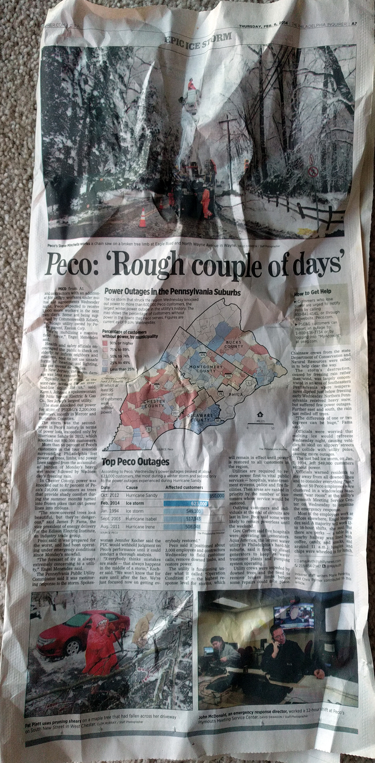
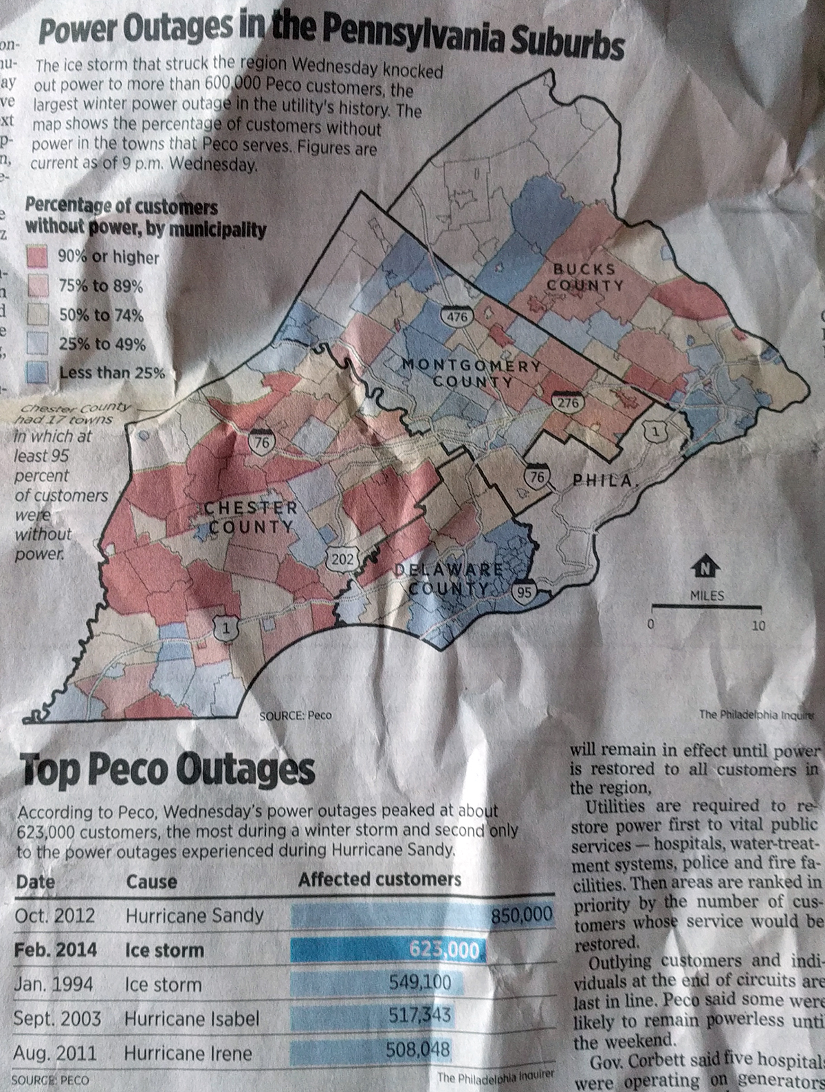
The piece looks at PECO outages, PECO being the Philadelphia region’s main electricity supplier. The article is full page and is both headed and footed with photography, the graphic in which we are interested sits centre stage in the middle of the page.
Full page design.
Overall the graphic is fairly compact and works well at showing the distribution of the outages, which the bar chart below the choropleth shows was historically significant. (Despite my years in Chicago, I was somehow in the area for all but the storm written about and can confirm that they were, in fact, disruptive.)
Ice storms suck.
The choropleth works, but I question the colour scheme. The bins diverge at about 50%, which to my knowledge marks no special boundary other than “half”. If that yellow bin represented, say, the average number of outages per storm or the acceptable number of outages per storm, sure, I could buy it. Otherwise, this is really just degrees of severity along one particular axis. I would have either kept the bins all red or all blue and proceeded from a light of either to a dark of either.
I probably would have also dropped Philadelphia entirely from the map, but I can understand how it may be important to geographically anchor readers in the most populous county to orientate themselves to a story about suburbia.
Lastly, I have one data question. With power lines down during an ice storm, I would be curious to see less of the important roadways as the map depicts and other variables. What about things like average temperature during the storm? Was the more urban and built-up Delaware County less susceptible because of an urban heat bubble preventing water from freezing? Or what about trees? Does the impact in the more rural areas have anything to do with increasing numbers of trees as one heads away from the city?
Those last data questions were definitely out of scope for the graphic, but I nevertheless remain curious. But then again, this piece is almost five years old. Just a look at how some graphical forms remain in use because of their solid ability to communicate data. Long live the bar chart. Long live the choropleth.
Credit for the piece goes to the Philadelphia Inquirer graphics department.
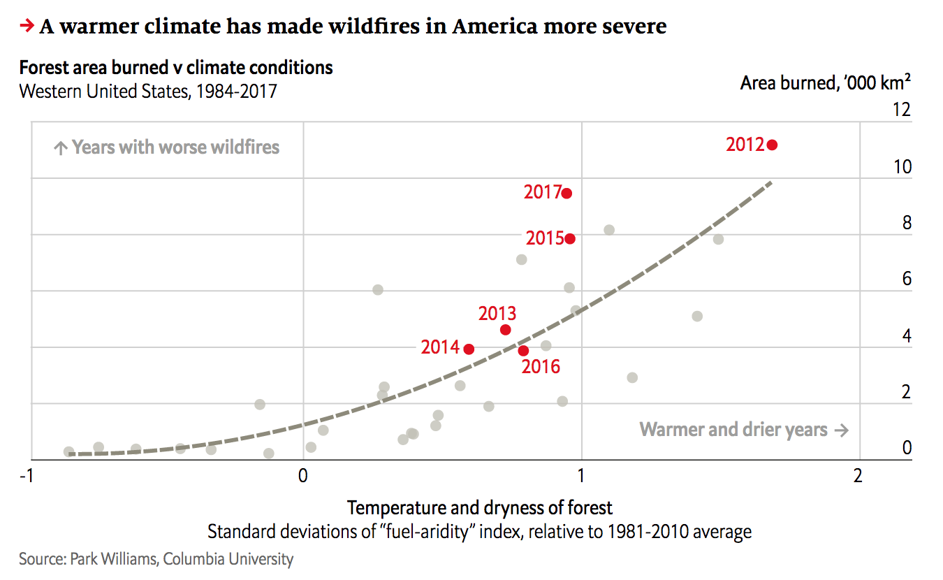
Yesterday we looked at the wildfire conditions in California. Today, we look at the Economist’s take, which brings an additional focus on the devastation of the fires themselves. However, it adds a more global perspective and looks at the worldwide decline in forest fires and both where and why that is the case.
California isn’t looking too…hot. Too soon?
The screenshot here focuses on California and combines the heat and precipitation we looked at yesterday into a fuel-aridity index. That index’s actual meaning is simplified in the chart annotations that indicate “warmer and drier years” further along the x-axis. The y-index, by comparison, is a simpler plot of the acres burned in fires.
This piece examines more closely that link between fires and environmental conditions. But the result is the same, a warming and drying climate leaves California more vulnerable to wildfires. However, the focus of the piece, as I noted above, is actually on the global decline of wildfires.
Only 2% of wildfires are actually in North America, the bulk occur in Africa. And the piece uses a nice map to show just where those fires occur. In parallel the text explains how changing economic conditions in those areas are lessening the risk of wildfire and so we are seeing a global decline—even with climate change.
Taken with yesterday’s piece with its hyper-California focus, this provides a more global context of the problem of wildfires. It’s a good one-two read.
Credit for the piece goes to the Economist Data Team.
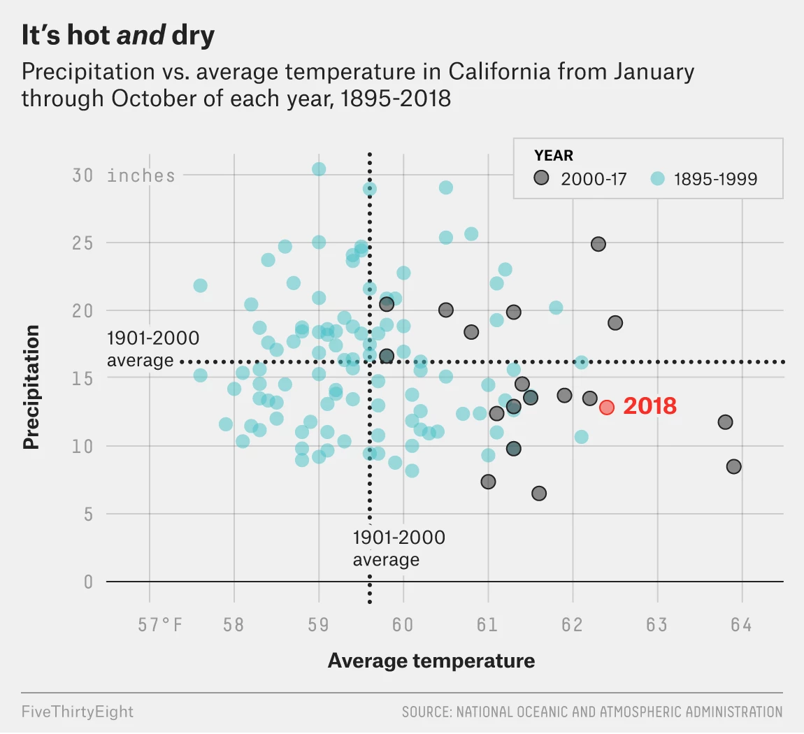
Wildfires continue to burn across in California. One, the Camp Fire in northern California near Chico, has already claimed 77 lives. But why has this fire been so deadly?
FiveThirtyEight explained some of the causes in an article that features a number of charts and graphics. The screenshot below features a scatter plot looking at the temperature and precipitation recorded from winter through autumn every year since 1895.
The evolving California climate
The designers did a good job of highlighting the most recent data, separating out 2000 through 2017 with the 2018 data highlighted in a third separate colour. But the really nice part of the chart is the benchmarking done to call out the historic average. Those dotted lines show how over the last nearly two decades, California’s climate has warmed. However, precipitation amounts vary. (Although they have more often tended to be below the long-term average.)
I may have included some annotation in the four quadrants to indicate things like “hotter and drier” or “cooler and wetter”, but I am not convinced they are necessary here. With more esoteric variables on the x- and y-axis they would more likely be helpful than not.
The rest of the piece makes use of a standard fare line chart and then a few maps. Overall, a solid piece to start the week.
Credit for the piece goes to Christie Aschwanden, Anna Maria Barry-Jester, Maggie Koerth-Baker and Ella Koeze.
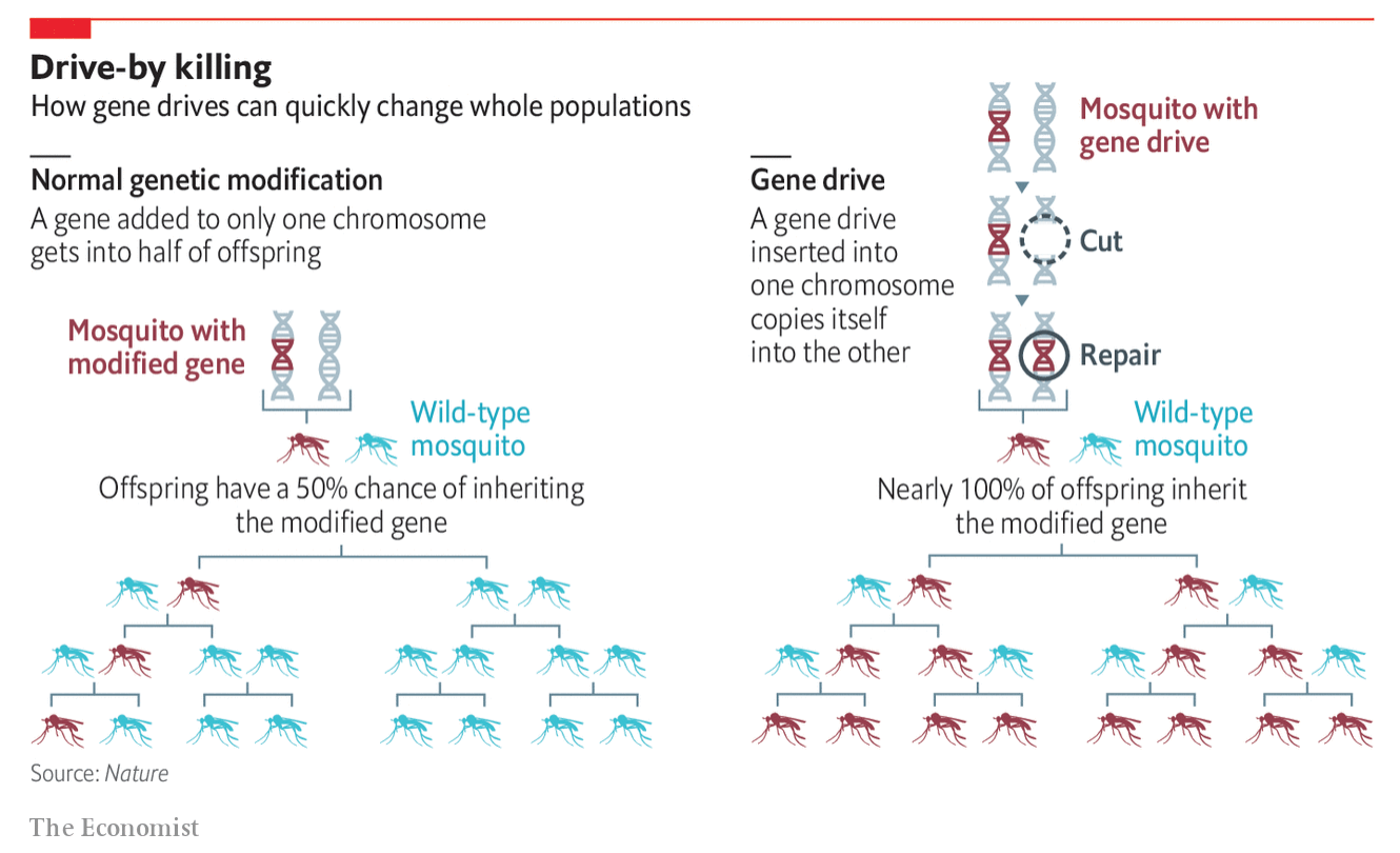
I don’t always get to share more illustrative diagrams that explain things, but that’s what we have today from the Economist. It illustrated the concept of a gene drive by which a gene modified in one chromosome then modifies the remaining chromosome to insert itself there. Consequently it stands an almost 100% chance of being passed onto the subsequent generation.
Naturally this means great things for removing, say, mosquito-born diseases from populations as the gene drives can be used to ultimately eliminate the population. But of course, should we be doing this? Regardless, we have a graphic from the Economist.
I still find them a pest…
It makes nice use of a small mosquito icon to show how engineered mosquitos can take over the population from wild-type. The graphic does a nice job showing the generational effect with the light blue wild-type disappearing. But I wonder if more could not be said about the actual gene drive itself. Of course, it could be that they simplified the process substantially to make it accessible to the audience.
Credit for the piece goes the Economist graphics department.
Your author is back after a few days out sick and then the Armistice Day holiday. But guess what? The elections are not yet all over. Instead, there are a handful of races to call. Below is a screenshot from a FiveThirtyEight article tracking those races still too close to call.
The Republican gain might not be as big as they had hoped
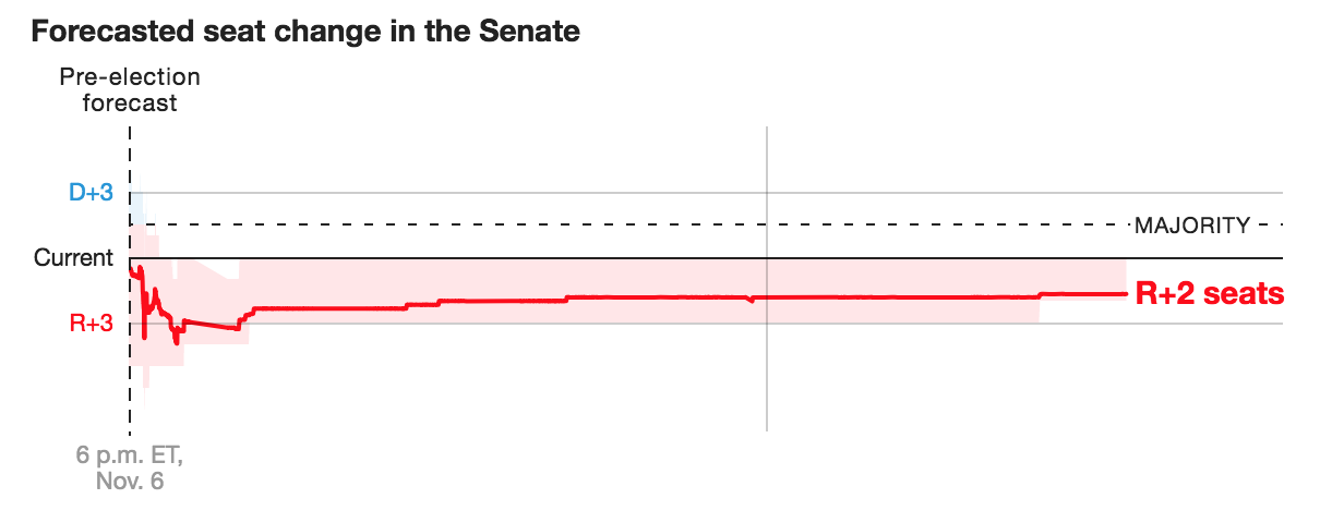
Why are there races? Because often time mail-in ballots need only be postmarked by Election Day. Therefore they can still be arriving in the days after the election and their total must be added to the race. (Plus uncounted/missed ballots et cetera.) For example, the late count and mail-in ballots are what tipped the Arizona senate seat. When we went to bed on Tuesday night—for me Wednesday morning—Arizona was a Republican hold, albeit narrowly. Now that the late count ballots have been counted, it’s a Democratic pickup.
The graphic above does a nice job showing how these races and their late calls are impacting seat changes. Their version for the House is not as interesting because the y-axis scale is so much greater, but here, the user can see a significant shift. The odds were always good that the Republicans would pick up seats—the question was how many. And with Arizona flipping, that leaves two seats on the table. Mississippi’s special election will almost certainly be a Republican hold. The question is what about Florida? The last I saw the race is separated by 0.15% of the vote. That’s pretty tiny.
Credit for the piece goes to the FiveThirtyEight graphics department.
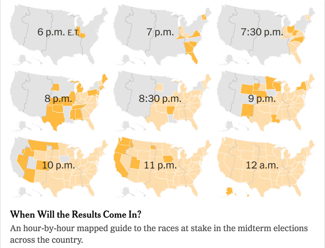
The 2018 midterm elections are finally here. Thankfully for political nerds like myself, the New York Times homepage had a link to a guide of when what polls close (as early as 18.00 Eastern).
I’m not saying you can’t keep voting. You just can’t keep voting here.
It makes use of small multiples to show when states close and then afterwards which states have closed and which remain open. It also features a really nice bar chart that looks at when we can expect results. Spoiler: it could very well be a late night.
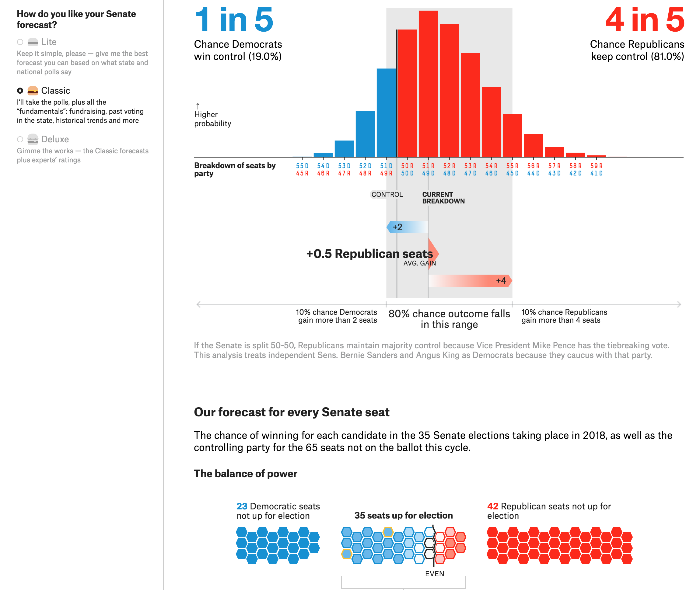
But what I really wanted to look at was some of the modelling and forecasts. Let’s start with FiveThirtyEight, because back in 2016 they were one of the only outlets forecasting that Donald Trump had a shot—although they still forecast Hillary Clinton to win. They have a lot of tools to look at and for a number of different races: the Senate, the House, and state governorships. (To add further interest, each comes in three flavours: a lite model, the classic, and the deluxe. Super simply, it involves the number of variables and inputs going into the model.)
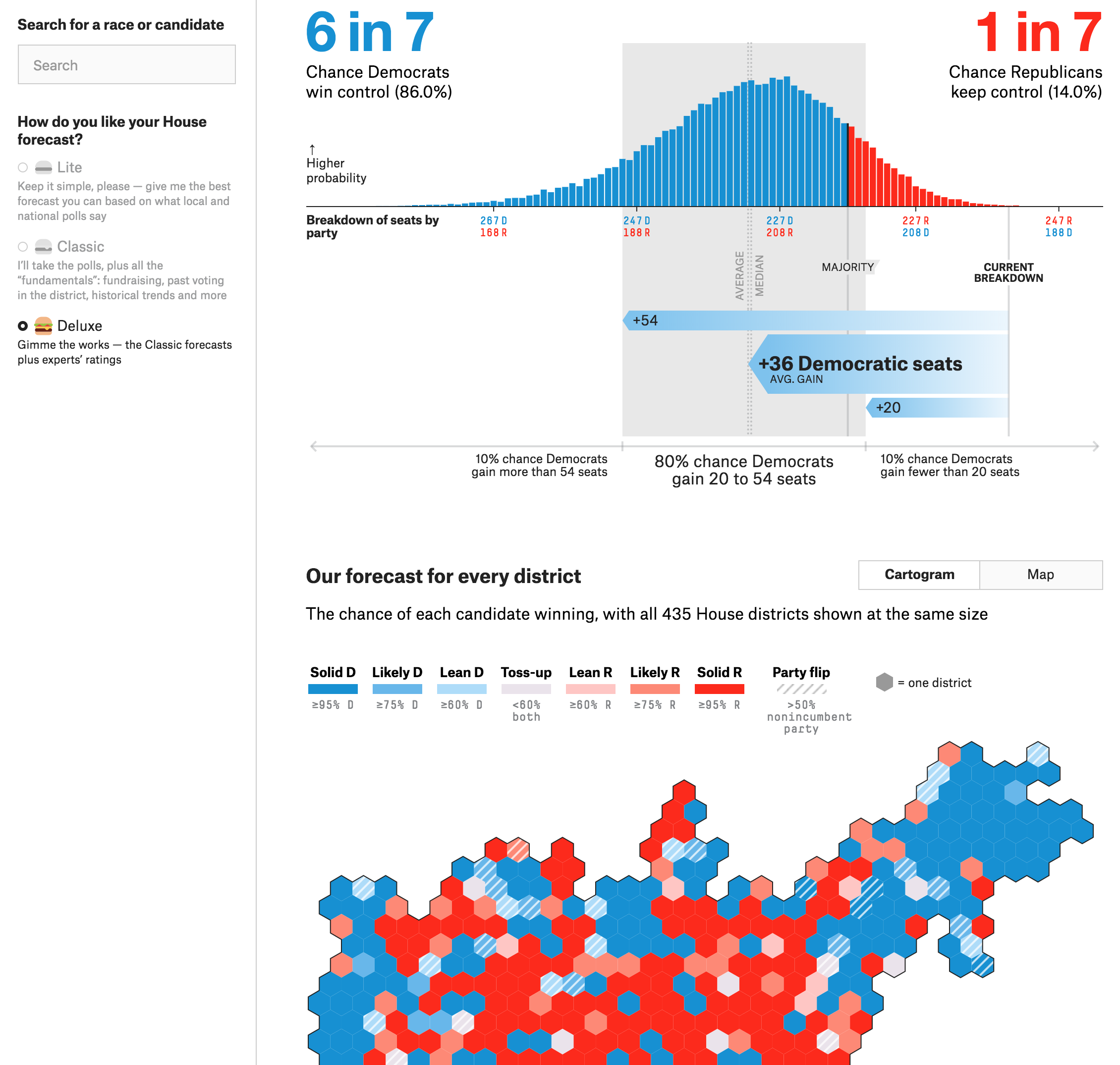
The Deluxe House model
The above looks at the House race. The first thing I want to point out is the control on the left, outside the main content column. Here is where you can control which model you want to view. For the whimsical, it uses different burger illustrations. As a design decision, it’s an appropriate iconographic choice given the overall tone of the site. It is not something I would have been able to get away with in either place I have worked.
But the good stuff is to the right. The chart at the top shows the percentage of likelihood of a particular outcome. Because there are so many seats—435 are up for vote—every additional seat is between almost 0 and 3%. But taken in total, the 80% confidence band puts the likely Democratic vote tally at what those arrows at the bottom show. In this model that means picking up between 20 and 54 seats with a model median of 36. You will note that this 80% says 20 seats. The Democrats will need 23 to regain the majority. A working majority, however, will require quite a few more. This all goes to show just how hard it will be for the Democrats to gain a workable majority. (And I will spare you a review of the inherent difficulties faced by Democrats because of Republican gerrymandering after the 2010 election and census.) Keep in mind with FiveThirtyEight’s model that they had Trump with a 29% chance of victory on Election Day 2016. Probability and statistics say that just because something is unlikely, e.g. the Democrats gaining less than 20 seats (10% chance in this model), it does not mean it is impossible.
The cartogram below, however, is an interesting choice. Fundamentally I like it. As we established yesterday, geographically large rural districts dominate the traditional map. So here is a cartogram to make every district equal in size. This really lets us see all the urban and suburban districts. And, again, as we talked about yesterday, those suburban districts will be key to any hope of Democratic success. But with FiveThirtyEight’s design, compared to City Lab’s, I have one large quibble. Where are the states?
As a guy who loves geography, I can roughly place, for example, Kentucky. So once I do that I can find the Kentucky 6th, which will have a fascinating early closing race that could be a predictor of blue waviness. But where is Kentucky on the map? If you are not me, it might be difficult to tell. So compared to yesterday’s cartogram, the trade-off is that I can more easily see the data here, but in yesterday’s piece I could more readily find the district for which I wanted the data.
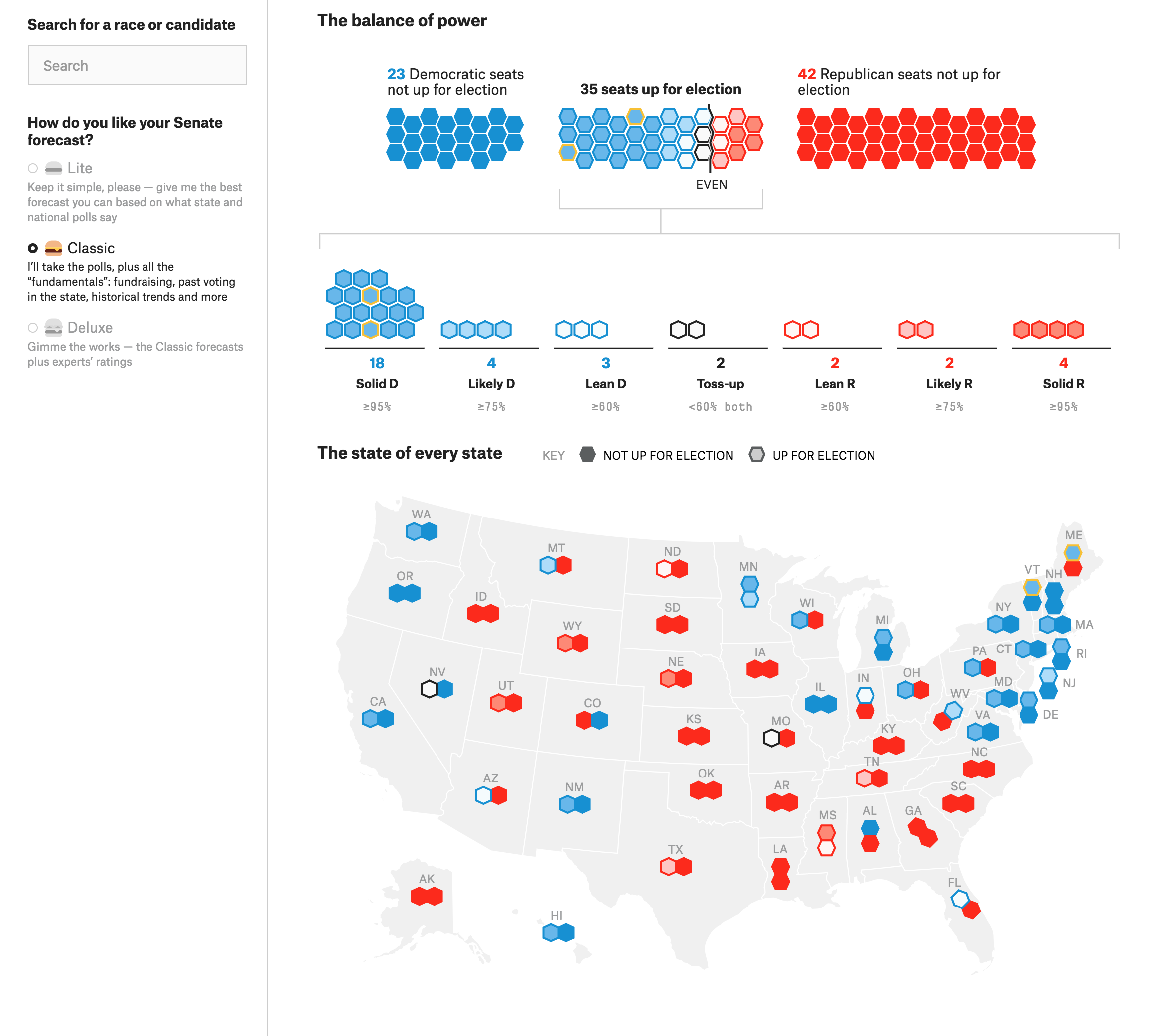
Over on the Senate side, where the Democrats face an even more uphill battle than in the House, the bar chart at the top is much clearer. You can see how each seat breakdown, because there are so fewer seats, has a higher percentage likelihood of success.
In the Senate, things don’t look good for the Democrats
The take away? Yeah, it looks like a bad night for the Democrats. The only question will be how bad does it go? A good night will basically be the vote split staying as it is today. A great night is that small chance—20%, again compared to Trump’s 29% in 2016—the Democrats narrowly flip the Senate.
Below the bar chart is a second graphic, a faux-cartogram with a hexagonal bar chart of sorts sitting above it. This shows the geographic distribution of the seats. And you can quickly understand why the Democrats will not do well. They are defending a lot more seats in competitive states than Republicans. And a lot of those seats are in states that Trump won decisively in 2016.
That’s a lot of red states…
I have some ideas about how this type of data could be displayed differently. But that will probably be a topic for another day. I do like, however, how those seats up for election are divided into their different categories.
Unfortunately my internet was down this morning and so I don’t have time to compare FiveThirtyEight to other sites. So let’s just wrap this up.
Overall, what this all means is that you need to go vote. Polls and modelling and guesswork is all for nought if nobody actually, you know, votes.
Credit for the poll closing time map goes to Astead W. Herndon and Jugal K. Patel.
Credit for the FiveThirtyEight goes to the FiveThirtyEight graphics department.
Tomorrow is Election Day here in the United States and this morning I wanted to look at a piece I’ve had in mind on doing from City Lab. I held off because it looks at the election and what better time to do it than right before the election.
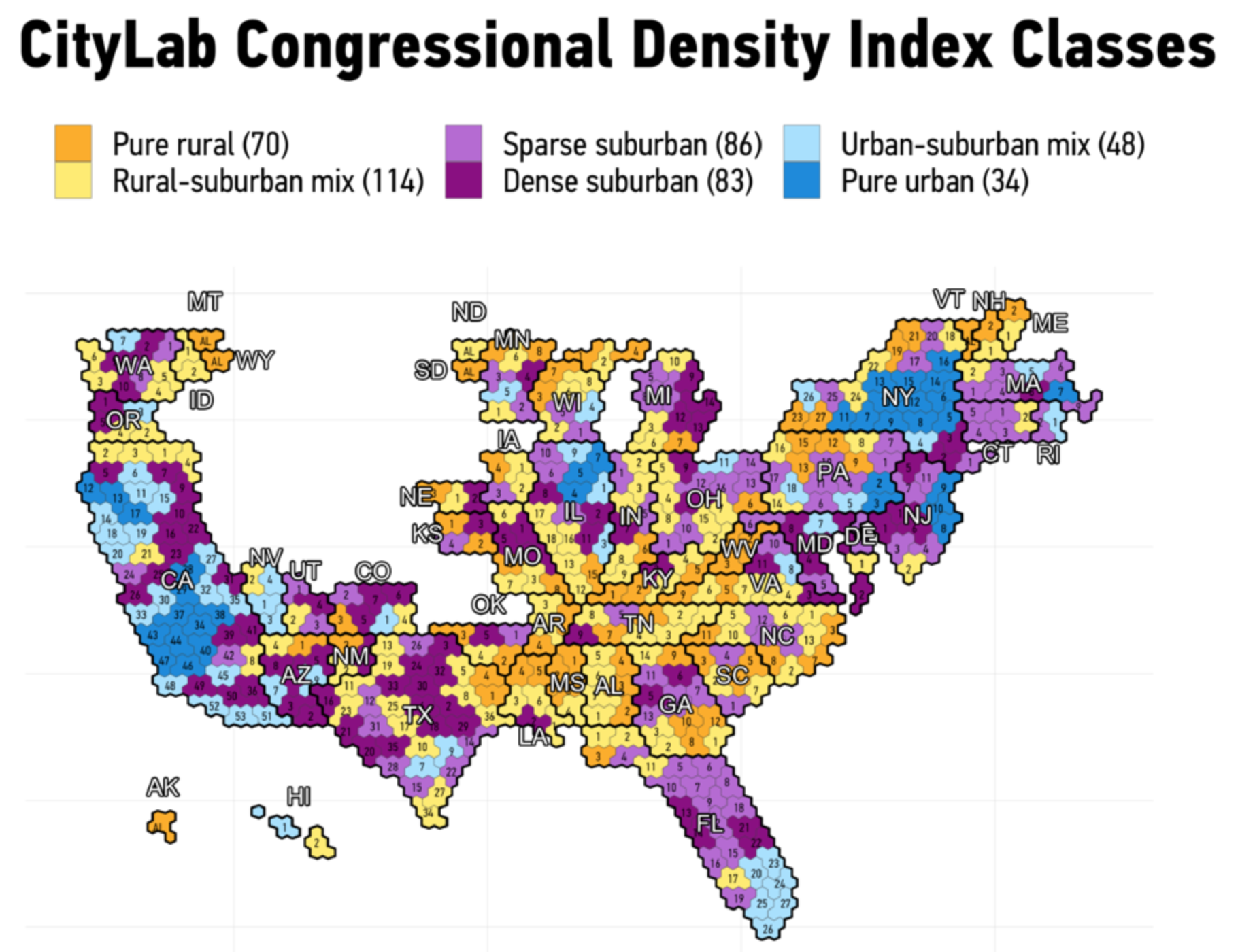
Specifically, the article looks at the density of the different congressional districts across the United States. Whilst education level appears to be the most predictive attribute of today’s political climate—broadly speaking those with higher levels of formal education support the Democrats and those with lower or without tend to support President Trump—the growing urban–rural divide also works. But what about the in-between? The suburbs? The exurbs? And how do we then classify the congressional districts that include those lands.
For that purpose City Lab created its City Lab Congressional Density Index. Very simplistically it scores districts based on their mixture of low- to medium- to high-density neighbourhoods. But visually, which is where this blog is concerned, we get maps with six bins from pure urban to pure rural and all the mixtures in-between. This cartogram will show you.
All the urban and rural seats
Now, there are a couple of things I probably would have done differently in terms of the visualisation. But the more I look at this, one of those things would not be to design the hexagons to all fit together nicely. Instead, you get this giant gap right where the plains states begin west of the Mississippi River stretching through the Rockies over to California. If you think about it, however, that is a fairly accurate description of the population distribution of the United States. With a few exceptions, e.g. Denver, there are not many people living in that space. Four geographically enormous states—North Dakota, South Dakota, Montana, and Wyoming—have only one congressional district. Idaho has two. Nebraska three. And then Iowa and Kansas four. So why shouldn’t a map of the United States display the plains and Rocky Mountain interior as a giant people hole?
Like I said, initially I took umbrage at that design decision, but the more I thought about it, the more it made sense. But there are a few others with which I quibble. The labelling here is a big one. First, we have the district labels. They are small, because they have to be to fit within the five hexagons that define the districts’ shapes. But every label is black. Unfortunately, that makes it difficult to read the labels on the darker colours, most notably the dark purple. I probably would have switched out the black labels in those instances for white ones.
But then the state labels are white with black outlines, which makes it difficult to read on either dark or light backgrounds. The designer made the right decision in making the labels larger than the districts, but they need to be legible. For example, the labels of Alaska and Hawaii need not be white with black outlines. They could just be set in black type to be legible. Conversely, Florida’s, sitting atop darker purple districts, could be made white.
The piece makes use of more standard geographic map divided into congressional districts—the type you will see a lot tomorrow night. And it makes use of bar charts to describe the demographics of the various density types. I like the decision there to use a new colour to fill in the bars. They use a dark green because it can cut across each of the six types.
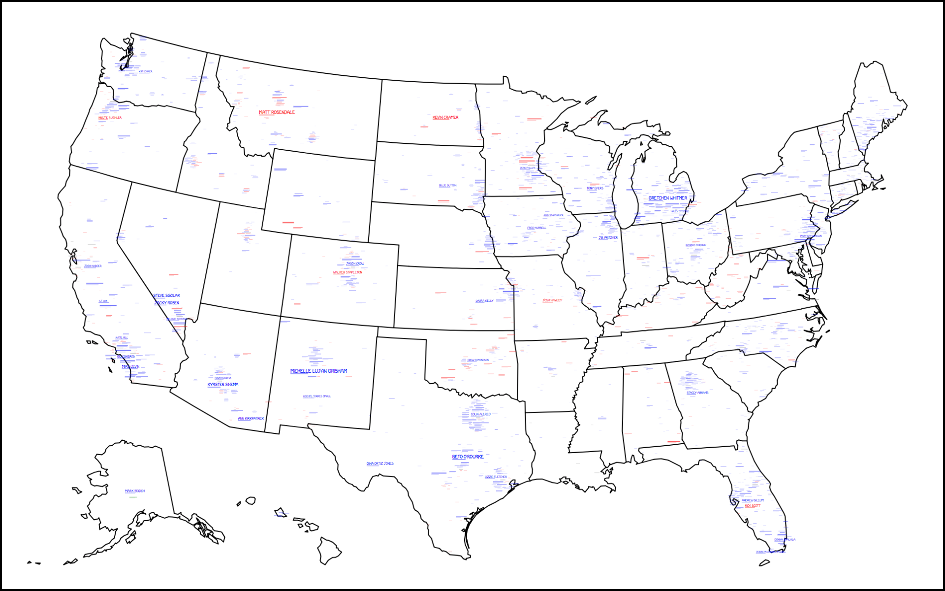
My initial plan for today was that I was not going to run anything light-hearted and focus instead on next week’s elections. But I still love xkcd so I checked that out and…well, here we go.
Your 2018 midterm challengers
At the broadest view, much is unintelligible on the map. But, you can see a lot of blue, or in other words, there are a lot of Democratic challengers to a Republican House, Senate, and state governments. That’s right, it’s also covering state races, e.g. gubernatorial races. But at this level, the difficulty is in seeing any of the details.
The one problem I had with the map was the zoom. On a computer you can double-click or mouse scroll for the zoom, but I was looking for little buttons. Admittedly it took me a few moments to figure it out until I moused over the map to get the tooltip, which of course provided the instructions.
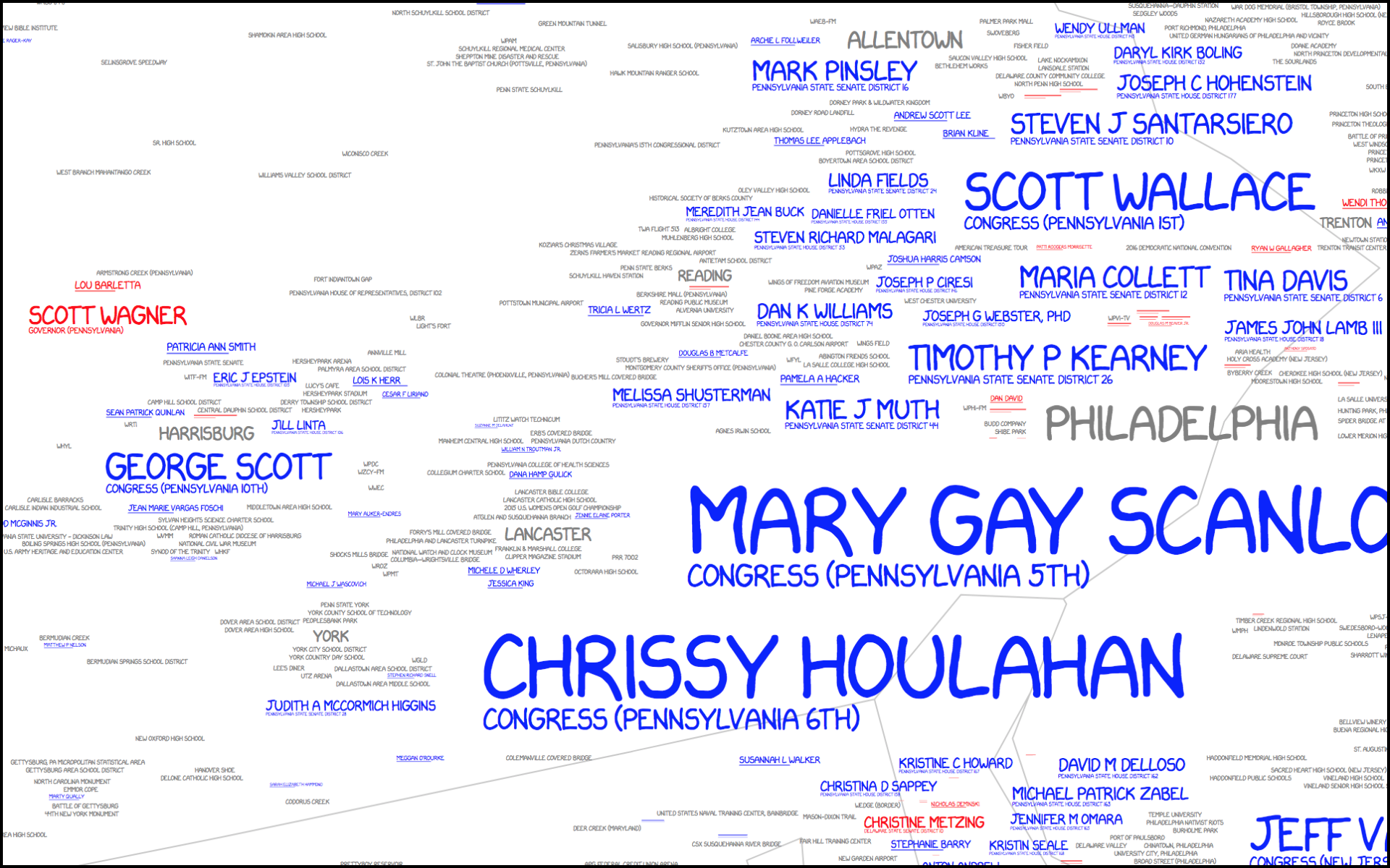
Once you zoom in, however, you can see the details of the map. This here is focused on southeastern Pennsylvania.
Lot of Democratic challengers here in southeastern Pennsylvania
The key to the map is an interesting mix of values as the typographic size of the candidate is related to both their odds of success as well as the importance of their office. So in this view we can see an interesting juxtaposition. Chrissy Houlahan and Mary Gay Scanlon, for example, are running for suburban Philadelphia congressional districts. However, Scott Wagner is running for the arguably higher office of Pennsylvania governor. But his name is fairly small compared to the two women. And just above Scott? Lou Barletta. He is running for one of Pennsylvania’s two senate seats, challenging incumbent Bob Casey Jr. Clearly neither is forecasted to have great success whereas Houlahan and Scanlon are.
Of course the map lacks a scale to say what represents breakeven odds. It is also difficult to isolate the degree to which a level of office influences the size of a challenger’s name. That makes the map less useful as a tool for looking at potential outcomes for Tuesday.
The tooltip that revealed the instructions, however, also had one more big tip. If you found the map needed an update, the instructions were to submit your ballot on 6 November.
Anyway, this is just a reminder to find your polling place over the weekend and get prepared to vote on Tuesday. In the meantime, have a good weekend.
Credit for the piece goes to Randall Munroe, Kelsey Harris, and Max Goodman.
Voting is not compulsory in the United States. Consequently a big part of the strategy for winning is increasing your voters’ turnout and decreasing that of your opponent. In other words, demotivate your opponent’s supporters whilst simultaneously motivating your own base. But what does that baseline turnout map look like? Well, thankfully the Washington Post created a nice article that explores who votes and who does not. And there are some clear geographic patterns.
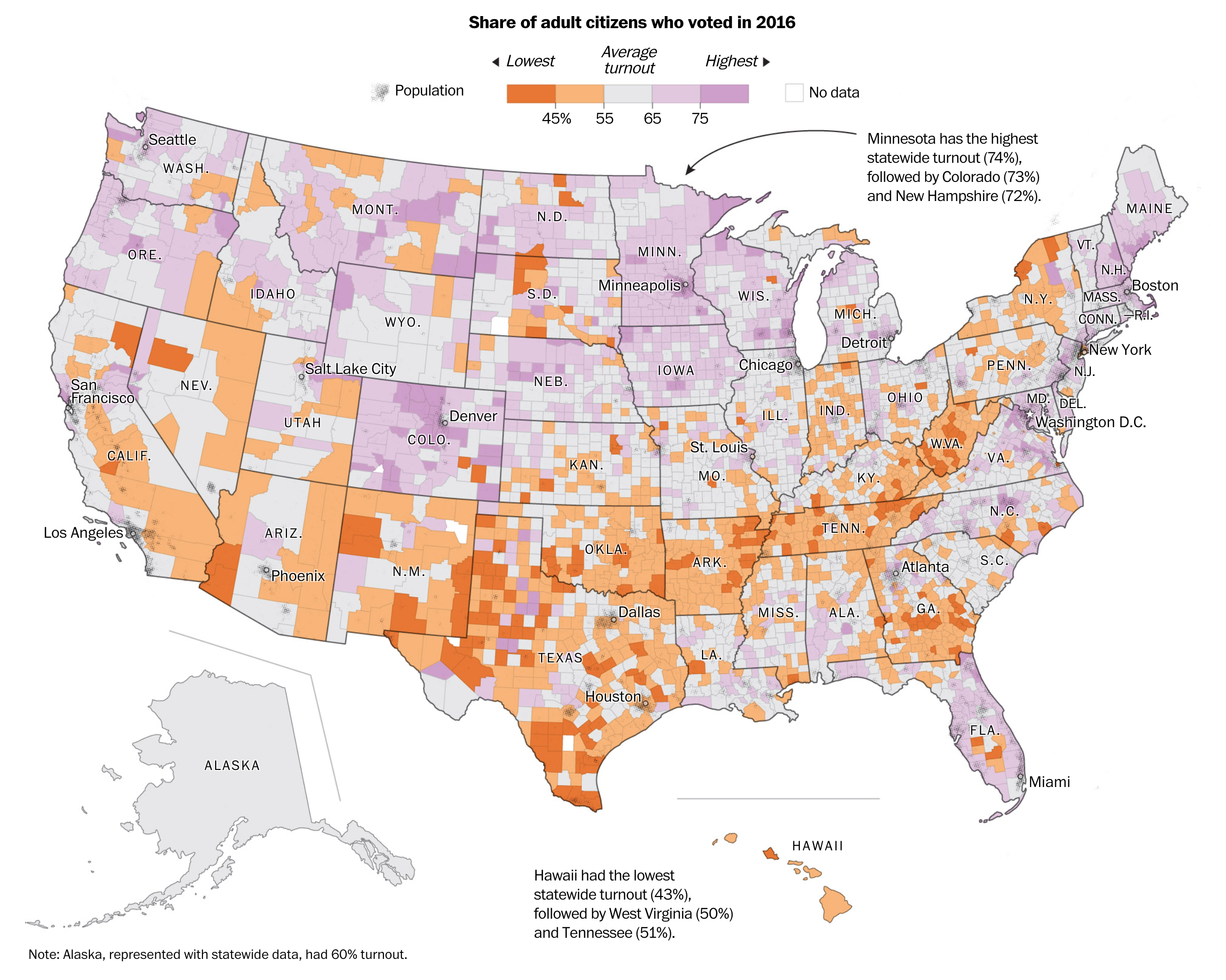
A lot of people don’t vote
The piece uses this map as the building block for the article. It explores the difference between the big rural counties that dominate the map vs. the small urban counties where there can be hundreds of thousands of voters, a large number of whom do not vote. It uses the actual map to compare states that differ drastically. For example, look at the border between Tennessee and North Carolina. On the Tennessee side you have counties with low turnout abutting North Carolinian counties with high turnout.
And towards the end of the piece, the article reuses a stripped down version of the map. It overlays congressional districts that will likely be competitive and then has the counties within that feature low turnout highlighted.
Overall the piece uses just this one map to walk the reader through the geography of voting. It’s really well done.
Credit for the piece goes to Ted Mellnik, Lauren Tierney and Kevin Uhrmacher.
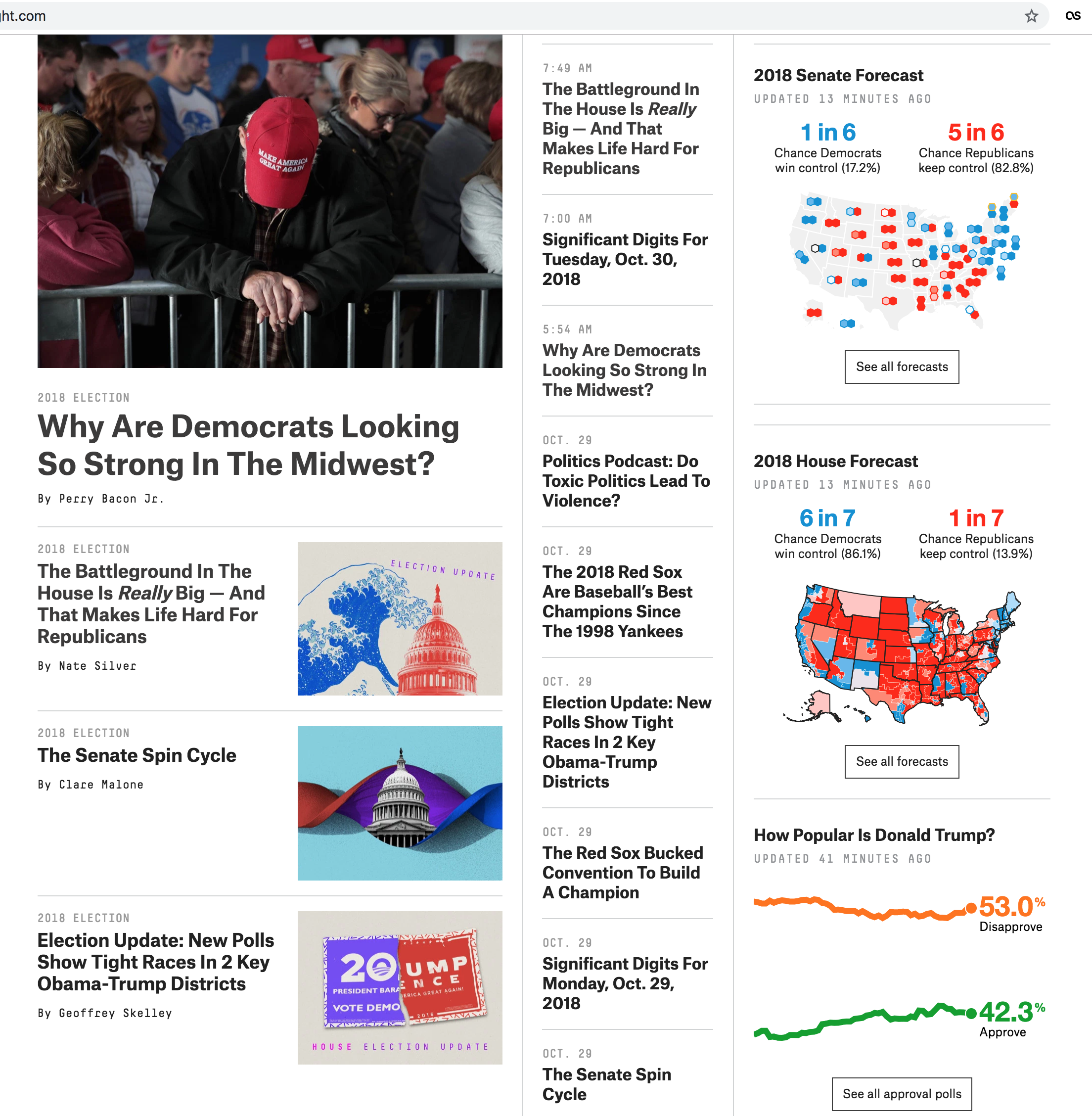
We are now one week away from the midterm elections here in the United States. Surprisingly, we are going to be looking at election-y things over the course of the next week or so. But before we delve into that, I wanted to focus on the homepage for FiveThirtyEight, the below screenshot is from my laptop.
The homepage as of 30 October
The reason I wanted to call attention to it is that right-most column of content. The site does a great job of succinctly providing the latest forecasts and polling number on the two main midterm results, federal representation in the House and Senate, along with polling numbers for President Trump.
Starting from the bottom, the polling numbers chart works really well. It clearly and effectively shows the latest approval/disapproval numbers and their longer term trend whilst providing a link to a page of deeper data. It’s very effective.
Moving up we have the House forecasts. These are tricker to see because so many of the more urban and suburban districts are inherently small geographically ergo very difficult to see in a small map. But the map does the job of at least providing some data along with the key takeaway of the odds of the Democrats flipping or Republicans retaining the House. Again, not surprisingly, it offers a link into the data.
The Senate map is the one where I have the most difficulty. Now when we get to the actual page—hopefully later this week—the map shown makes perfect sense because it exists in a large space. That space is needed to show two hexagons that represent each state’s two senators. But, similar to the problem with the House districts, the Northeast is so geographically cramped that it is difficult to show the senators from Maine through Maryland clearly. I wonder if some of the other visualisations on their Senate forecast page would have been a better choice. However, they do at least provide those odds at the top of the graphic.
Credit for the piece goes to the FiveThirtyEight design department.