For Whom to Root

The World Cup continues. Well for a few teams. Some have already been eliminated from the Round of 16. But for those Americans rooting for Team America, well, if you have not yet figured it out, you got knocked out well before the World Cup even started by…Panama. And so you are stuck in the question of who’s next? Thankfully FiveThirtyEight, in addition to their fantastic live probabilities that we looked at the other day, put together a little quiz to help you find your new team.

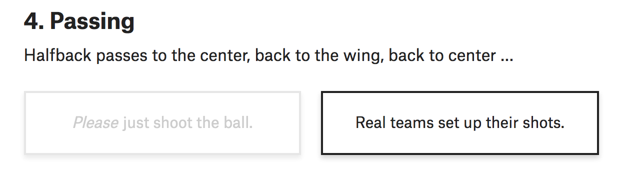
You answer seven questions and you are told your new allegiance. Questions like this:

How would you answer?

Naturally I took the quiz and discovered that in addition to England, I am cheering for…

Goal? Make that skål!

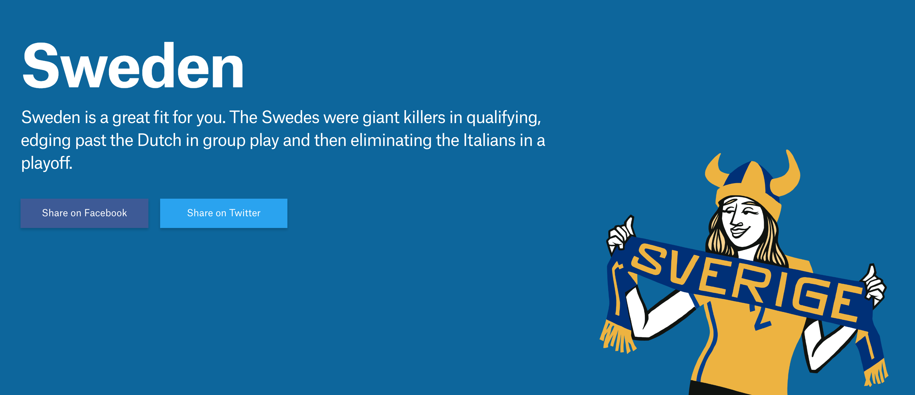
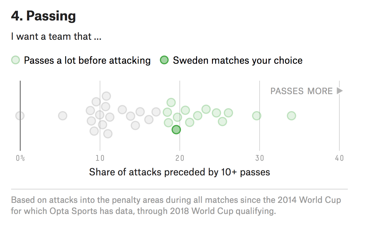
Yep. Fantastic since I was just there in December and happened to love Stockholm. But what I love about this piece is how it uses data to create the newfound bond I have with Sweden. Often times you take a quiz and are given an answer without any sense of why the answer was correct. Here, FiveThirtyEight plots the seven different variables used to create your newfound personality and then shows you how you scored.

Right in the middle there

It’s Friday, it’s the World Cup. Have a great weekend. And in addition to England on Sunday, I’ll now be cheering for Sweden against Germany on Saturday.

Credit for the piece goes to Michael Caley, Rachael Dottle, Geoff Foster, Gus Wezerek, Daniel Levitt, Emily Scherer, and Jorge Lawerta.

World Cup Match Probabilities

The World Cup has had some impressive matches and some stunners. (And the two are not mutually exclusive.) But if you are like me and have to work during most of the broadcasts, how can you follow along? Well thankfully FiveThirtyEight put together a nice statistical model that provides the probability of a team winning—or drawing—in real time.

Looking pretty good for Portugal this morning…

The design is fairly simple: a small table with the score and probability followed by a chart drawn as the match goes on. (Clearly I took this image at the half.)

I included a snippet of the table below to show the other work the FiveThirtyEight team put out there. You can explore the standings, the screenshot above, as well as the matches and then the brackets later in the competition.

The table makes nice use of the heat map approach to show is likely to make easy of the different stages of the competition. Like I said the other day, they are high on Brazil, because Brazil. But a little lower on Germany. But never count Germany out.

Shouldn't Iran be in the top slot?
Shouldn’t Iran be in the top slot?

The only unclear thing to me in the table? The sorting mechanism. In Group B, at least whilst the Portugal match is ongoing, should probably have Iran at the top. After all, as of writing, it is the only team in the group to have won a match. The only thing I can guess is that it has to do with an overall likelihood to advance to the next round. I highly doubt that Iran will defeat either Spain or Portugal. But as with many knockout-style championships, anything can happen in a single match sample size.

Credit for the piece goes to Jay Boice, Rachael Dottle,Andrei Scheinkman, Gus Wezerek, and Julia Wolfe.

When the Whole Is Less Than the Sum of its Parts

Last week we talked a lot about trade—and we will get back to it. But the World Cup is now in full swing and I want to take a look at a couple of things this week. But to begin, the Economist published an article about the difficulty of predicting the outcome of World Cups. It looks at the quirks of random events alongside more quantitative things like ranking systems and their differences.

But one graphic in particular caught my attention. It explore the difference between the ranking in individual players versus the teams as a whole. In short, some teams are valued more highly than their constituent players and others vice versa. The graphic is fairly straightforward in that it plots the team value on the y-axis and the players’ on the x.

When sums are greater or less than the whole…

Personally? I would never bet against Germany. Or Brazil.

But if your author is lucky, he’s going to enjoy the England–Tunisia match this afternoon for lunch—rooting for England, of course. Though thanks to some online tools that’s not the only team I’m rooting for this year. But more on that later this week.

Credit for the piece goes to the Economist graphics department.

Trade with Canada

Yesterday we looked at trade with China. Today, we look at Canada, allegedly ripping off America. But what does the data say? Thankfully the Washington Post put together a piece looking at just that topic. And it uses a few interesting graphics to explore the idea.

The easiest and least controversial graphic is that below, which breaks down constituent parts of our bilateral trade.

The article also points out that very small dairy section, which is one focus of the administration's complaints. But look how tiny it is…
The article also points out that very small dairy section, which is one focus of the administration’s complaints. But look how tiny it is…

Note that the graphic does not just show the traditional goods part of the equation, but also breaks out services. And as soon as you consider that part of the economy the US trade deficit with Canada turns from deficit into surplus.

But the graphic also uses a pair of maps to look at that same goods vs. goods and services split.

The centre of it all…

Parts of the design of the map like the colours, meh. But the designers did a great job by breaking the standard convention of placing the Prime Meridian at the centre of the map. Instead, because the United States is the story here, the map places North America at the map’s centre. It does lead to a weird fracturing of the Asian continent, but so long as China is largely intact, that is all that matters to the trade story.

This all just goes to show that it is important to begin a conversation about policy with facts and understand the actual starting point rather than the perceived starting point.

Credit for the piece goes to Philip Bump.

Tariffs and Trade with China

Following up on yesterday’s post about the facts on tariffs, today we look at an article from Politico that polled voters on their feelings about trade and trade policy. Now the poll dates from the beginning of June and unfortunately a lot of things have changed since then. But, the data overwhelmingly supports the conclusion that voters, at that time at least, do not support placing tariffs on goods coming into the US.

Let’s take a look at another component of the article, however, a chart exploring the infamous trade deficit. First of all, trade deficits do not work like how the president says they do—but we will come back to that in another post. In short, trade deficits are neither good nor bad. They are just one way of describing one facet of a trade relationship between two countries.

This piece looks at the trade balance between the United States and China.

We will get into why this isn't all bad in another post
We will get into why this isn’t all bad in another post

Now, from the topical standpoint, it does a really nice job of showcasing how our imports have surged above our experts. From a topical standpoint, however, we do not know if this is a total trade deficit or just in goods, like the president prefers to talk about, or in goods and services, the latter of which accounts for way more than half of the US economy.

From a design perspective, I have a few thoughts and the first is labelling. The chart does label the endpoints of the data set, 1985 and 2017. But aside from a grey bar representing the Financial Crisis, there are few other markers to indicate the year. In smaller charts, I often do this myself, because space. But here there is enough space for at least a few intervening years to be labelled.

Secondly, the white outline of the red line. I have talked before of a trend to showcase a line over other lines with that thin stroke. But this is the first time I can recall the effect being used over an area filled with colour. Is it necessary? Because the area is light and the line dark and bright, probably not.

Then the outline appears on the text in the graphic, in particular the labels of imports, exports, and the trade deficit label. The labels for the imports and exports likely are necessary because of that light grey used for the text. But, as with the line for the trade deficit, its label likely provides sufficient contrast the thin white outline isn’t necessary.

Credit for the piece goes to Jeremy C.F. Lin.

Primarily California

Today is primary day and everyone will be looking to the California results. Although probably not quite me, because Eastern vs. Pacific time means even I will likely be asleep tonight. But before we get to tonight, we have a nice primer from last Friday’s New York Times. It examines the California House of Representatives races that we should be following.

53 districts are a lot to follow in one night…

Like most election-related pieces, it starts with a map. But it uses some scrolling and progressive data disclosure. The map above, after a bit of scrolling, finally reveals the districts worth following and their 2016 vote margins.

Out of all 53, these are the districts the Times says to watch

From there the article moves onto a bit of an exploration of those few districts. You should read the full article—it’s a short read—for the full context on the California votes today. But it does make some nice of bar and line charts to plot the differences in presidential race vs. congressional race margins and the slow Democratic shift.

Credit for the piece goes to Jasmine C. Lee and Karen Yourish.

Forecasting the American Midterm Elections

We are inching ever closer to the US midterm elections in November. In less than a week the largest state, California, will go to the polls to elect their candidates for their districts. So late last week whilst your author was on holiday, the Economist released its forecast model for the results. They will update it everyday so who knows what wild swings we might see between now and the election.

I will strike out against the common knowledge that this is a wave election year and Democrats will sweep swaths through Republican districts in an enormous electoral victory. Because while Democrats will likely win more overall votes across the country, the country’s congressional districts are structurally designed to favour Republicans as a result of gerrymandering after the 2010 Census redistricting. The Economist’s modelling handles this fairly well, I think, as it prescribes only a modest majority and gives that likelihood as only at 2-in-3. (This is as of 30 May.)

But how is it designed?

The big splashy piece is an interactive map of districts.

The overall state of the US in the 30 May run of the model

It does a good job of connecting individual districts to the dots below the map showing the distribution of said seats into safe, solid, likely, leaning, and tossup states. However, the interactivity is limited in an odd way. The dropdown in the upper-right allows the user to select any district they want and then the district is highlighted on the map as well as the distribution plot below. Similarly, the user can select one of the dots below the map to isolate a particular district and it will display upon the map. But the map itself does not function as a navigation element.

Selecting the newly drawn Pennsylvania 6th

I am unsure why that selection function does not extend to the map because clearly the dropdown and the distribution plot are both affecting the objects on the map. Redeeming the map, however, are the district lines. Instead of simply plopping dots onto a US state-level map, the states are instead subdivided into their respective congressional districts.

But if we are going so far as to display individual districts, I wonder if a cartogram would have been a better fit. Of course it is perfectly plausible that one was indeed tried, but it did not work. The cartogram would also have the disadvantage of, in this case, not exhibiting geographically fidelity and thus being unrecognisable and therefore being unhelpful to users.

Now the piece also makes good use of factettes and right-left divisions of information panels to show the quick hit numbers, i.e. how many seats each party is forecast to win in total. But the map, for our purposes, is the big centrepiece.

Overall, this is solid and you better bet that I will be referencing it again and again as we move closer to the midterms.

Credit for the piece goes to the Economist Data Team.

A Wetter Midwest

Here in Philadelphia, I think yesterday was the first day it had not rained in over a week. Not that everyday was a drenching storm, but at least showers passed through along with some downpours and definitely grey skies. But what about my old home, Chicago?

Well, FiveThirtyEight turned to a longer-term look and examined how over the century the amount of rainfall in the upper Midwest has been increasing. We are actually looking at the same places the Post looked at a few days ago. But instead of political maps, we have rainfall maps.

This one in particular is weird.

Water water everywhere

I get why they have the map, to show the geographic distribution of the rain gauges that collect the data. And those are site specific, not statewide. But did the designer have to choose area?

We know that area is a less than ideal way of allowing users to compare data points. And as I just noted, a choropleth, even at say the county level, is out of the question. But what about little squares? Or circles? Could colour have been used to encode the same data instead of size? And then we would likely have fewer overlapping triangles.

I suppose the argument is that the big triangles make a bigger visual impact. But they do so at the cost of comparable data points across the Midwest. Maybe the designer chose the area of triangles because there were too few gauges across the country. I am not sure, but for me the triangles are not quite on point.

That said, the graphics throughout the rest of the article are quite good, especially the opening scatterplots. They are not the sexiest of charts, but they clearly show a trends towards a wetter climate.

Credit for the piece goes to Ella Koeze.

Gun Control Legislation

Back in March I posted about a great graphic from the New York Times editorial board they made in the wake of the Parkland, Florida school shooting. Saturday morning, the day after Friday’s Santa Fe, Texas school shooting, I was reading the paper and found the updated graphic.

That is a whole lot of months since Sandy Hook…

Yeah, almost nothing has changed. Congress passed and the president signed an omnibus spending bill that included language to improve reporting on background checks.

Yeah.

Now from a design standpoint, what’s nice about this graphic is its restrained use of colour. The whole piece works in black and white. Of course it helps that there is nothing to show that needs to be highlighted in the data.

Yeah.

Credit for the piece goes to the New York Times graphics department.

Turning the Midwest Red

Continuing with election-y stuff, I want to share a fascinating map from the Washington Post. The article came out last week, and it is actually incredibly light in terms of data visualisation. By my count, there were only two maps. The article’s focus is on interviews with Trump voters in 2016 and how their opinions of the president have changed over the last year or so. If you want to read it, and you should as it is very well written, I will warn you that it is long. But, to the map.

I may have used an even lighter shade for 2012 counties…

What I loved about this map is how it flips the usual narrative a bit on its head. We talk about how much a candidate won a county in 2016, or even how much the vote shifted in 2016. And anecdotally we talk about “ancestral Democrats” flipping to Trump. But this map actually tries to chart that. It reveals the last time a county actually voted for a Republican presidential candidate—the darker the red, the further back in time one has to go.

Counties that vote Democratic are white, because why do we need them for this examination. Omitting them was a great design decision. Much of the country, as we know or can intuit, voted Republican in 2012 for Mitt Romney. But what about before then? You can see how the upper Midwest, along the Mississippi River, was a stronghold for Democrats with some counties going as far back as the 1980s or earlier. And then in 2016 they all flipped and that flipping was most significant there—of some additional interest to me are the counties in Maine, the Pacific Northwest, and along Lake Erie near Cleveland.

In short, this was just a brilliantly done map. And it sets the tone for the rest of the article, which is interviews with residents of those counties called out on the map.

Credit for the piece goes to Andrew Braford, Jake Crump, Jason Bernert and Matthew Callahan.