Pennsylvania Primary Night

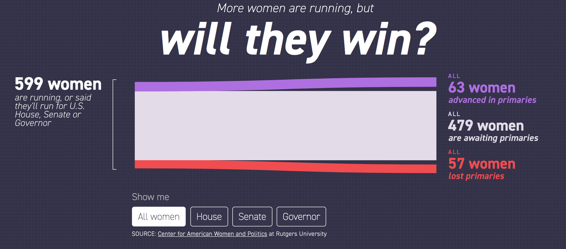
Surprise, surprise. This morning we just take a quick little peak at some of the data visualisation from the Pennsylvania primary races yesterday. Nothing is terribly revolutionary, just well done from the Washington Post, Politico, and the New York Times.

But let’s start with my district, which was super exciting.

The only thing to write home about is how the Republican incumbent dropped out at the last moment and was replaced by this guy…

Moving on.

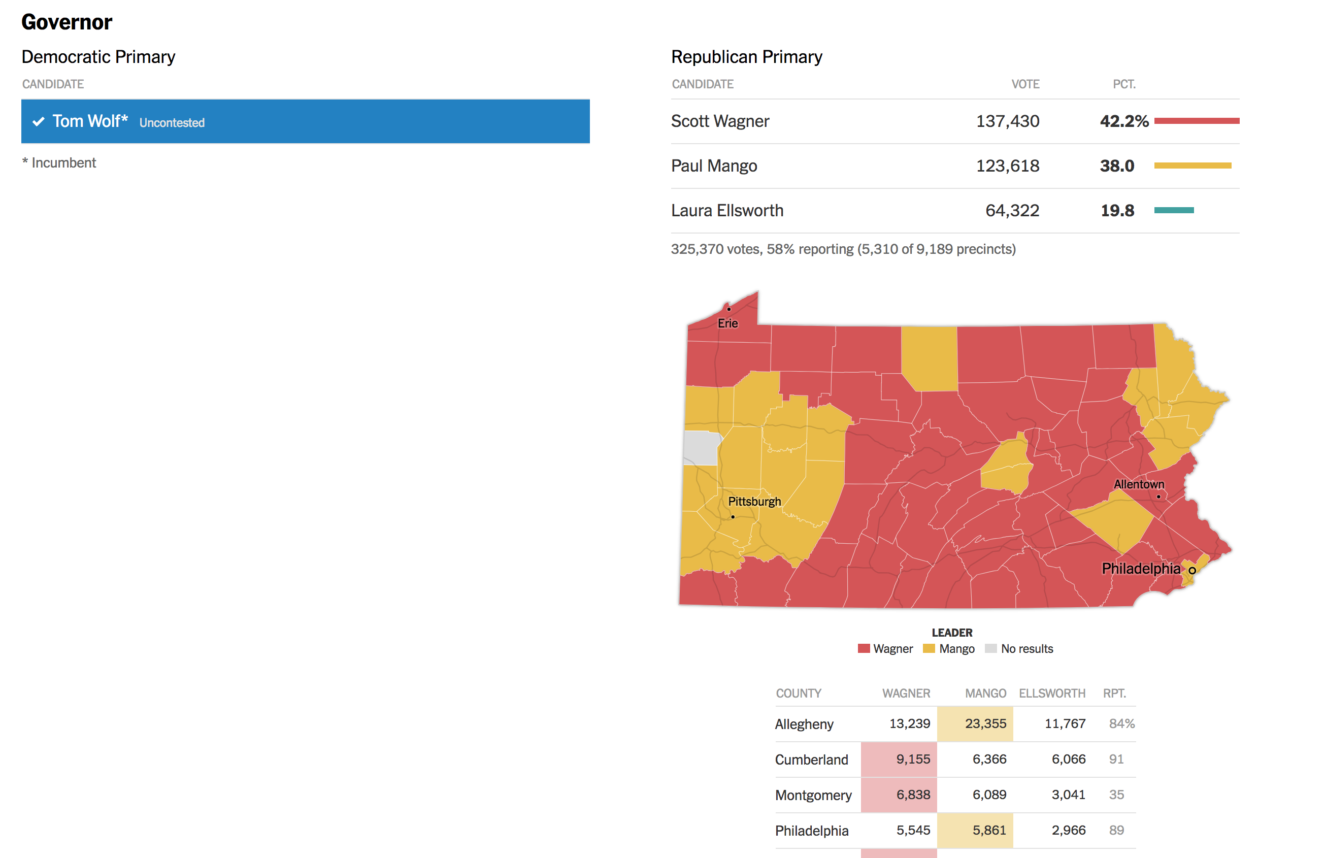
Each of the three I chose to highlight did a good job. The Post was very straightforward and presented each office with a toggle to separate the two parties. Usually, however, this was not terribly interesting because races like the Pennsylvania governor had one incumbent running unopposed.

Mango is represented by what colour?

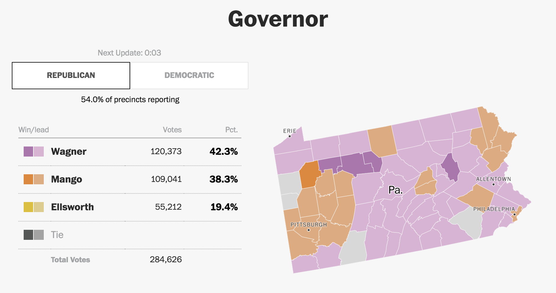
But Politico was able to hand it differently and simply presented the Democratic race above the Republican and simply noted that the sitting governor ran unopposed. This differs from the Post, where it was not immediately clear that Tom Wolf, the governor, was running unopposed and had already won.

Clean and simple design. No non-sense here.

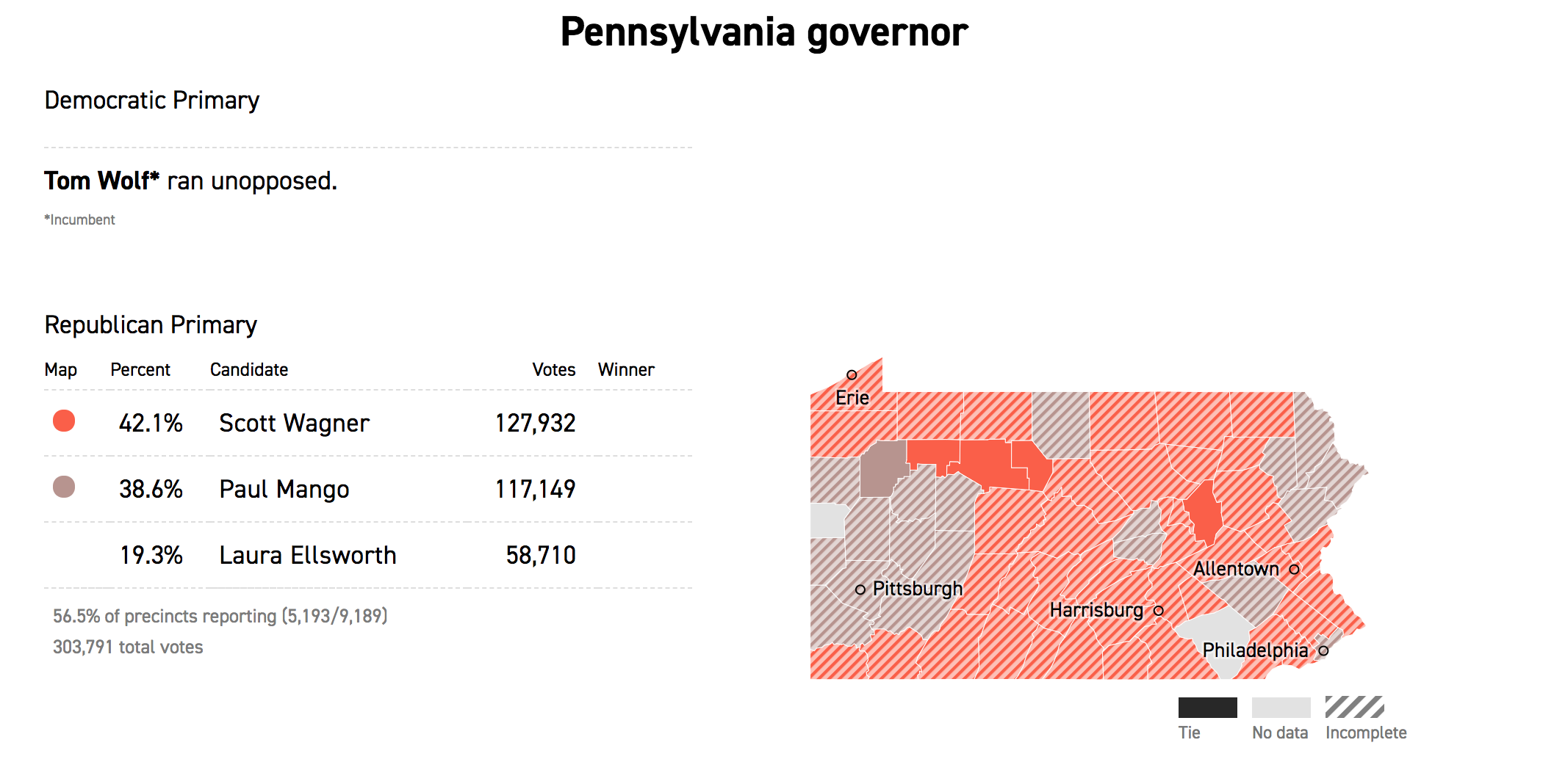
The Times handled it similarly and simultaneously displayed both parties, but kept Wolf’s race simple. The neat feature, however, was the display of select counties beneath the choropleth. This could be super helpful in the midterms in several months when key races will hinge upon particular counties.

The Republican primary for the PA governorship has been ugly

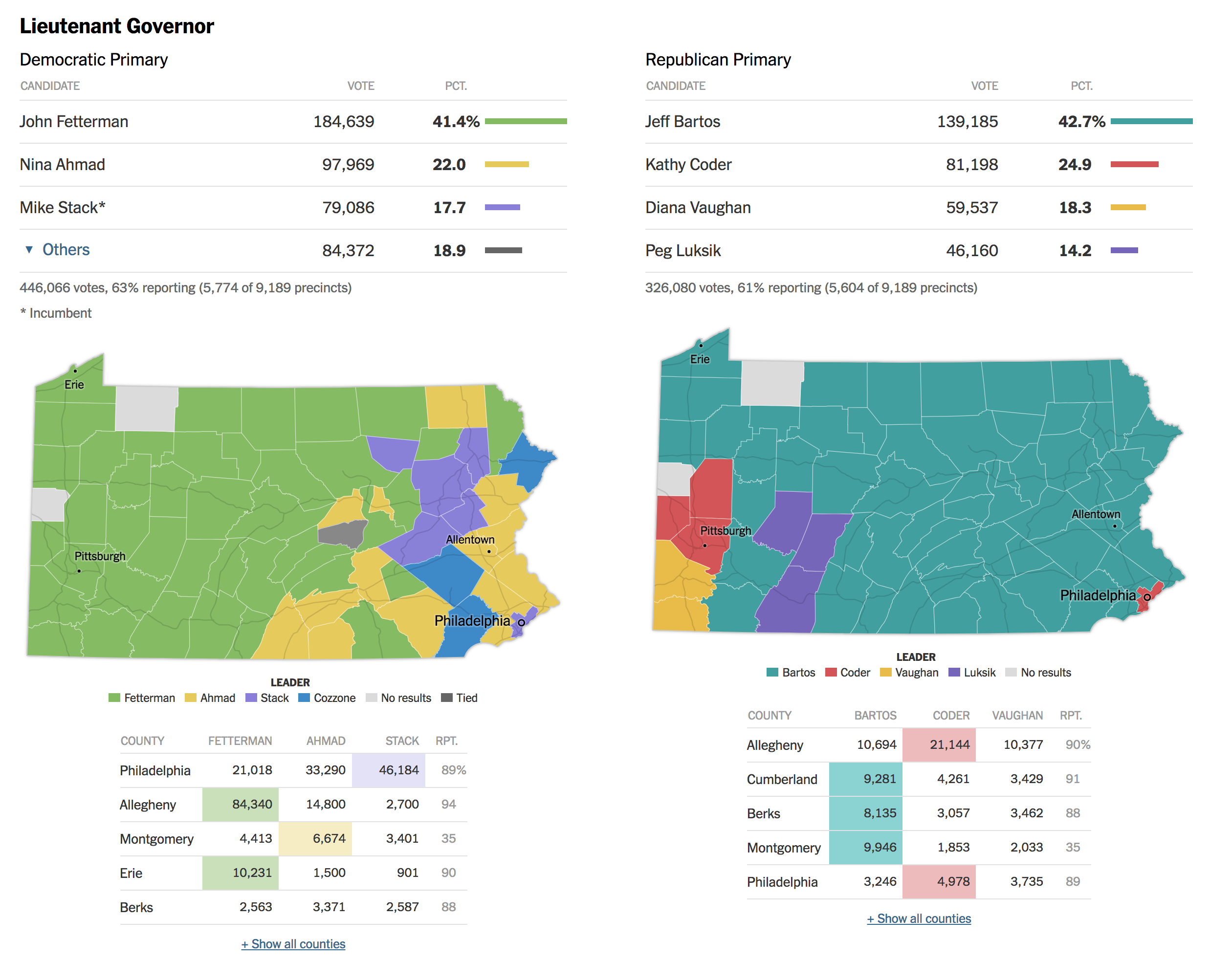
But where the Times really shines is the race for Pennsylvania’s lieutenant governor. Fun fact, in Pennsylvania the governor and lieutenant governor do not run as a ticket and are voted for separately. This year’s Democratic incumbent, Mike Stack, does not get on with the governor and had a few little scandals to his name, prompting several Democrats to run against him. And the Times’ piece shows the two parties result, side-by-side.

Pennsylvania's oddest race this time 'round
Pennsylvania’s oddest race this time ’round

Credit for the Post’s piece goes to the Washington Post graphics department.

Credit for Politico’s piece goes to Politico’s graphics department.

Credit for the Times’ piece goes to Sarah Almukhtar, Wilson Andrews, Matthew Bloch, Jeremy Bowers, Tom Giratikanon, Jasmine C. Lee and Paul Murray, and Maggie Astor.

Tracking the Women Running for Office

Yesterday we talked about a static graphic from the New York Times that ran front and centre on the, well, front page. Whilst writing the piece, I recalled a piece from Politico that I have been lazily following, as in I bookmarked to write about another time. And suddenly today seemed as good as any other day.

After all, this piece also is about women running for Congress, and a bit more widely it also looks at gubernatorial races. It tracks the women candidates through the primary season. The reason I was holding off? Well, we are at the beginning of the primary season and as the Sankey diagram in the screenshot below shows, we just don’t have much data yet. And charts with “Wait, we promise we’ll have more” lack the visual impact and interest of those that are full of hundreds of data points.

Still too many unknowns. But at least these are known unknowns…

But we should still look at it—and who knows, maybe late this summer or early autumn I will circle back to it. After all, today is primary day in Pennsylvania. (Note: Pennsylvania is a closed primary state, which means you have to belong to the political party to vote for its candidates.) So this tool is super useful looking ahead, because it also shows the slate of women running for positions.

Aside from just the number of women running, today's primaries will be fascinating because of the whole redistricting thing
Aside from just the number of women running, today’s primaries will be fascinating because of the whole redistricting thing

I really like the piece, but as I said above, I will want to circle back to it later this year to see it with more data collected.

Credit for the piece goes to Sarah Frostenson.

Women Running for Congress

If you haven’t heard by now, this year is a US Congressional midterm election year meaning that eligible American citizens will be voting for their local representative and 1/3 of the states will be selecting their senator. But perhaps because yesterday was Mother’s Day in the States, the New York Times ran a front-page, above-the-fold piece on the number of women running for Congress this year, either as incumbents or challengers.

It certainly got my attention…

Those of you familiar with this blog will know that I am excited basically anytime smart graphics work their way onto the front page. The map itself shows the rough location of where women candidates are running for office and a quick comparison shows there are more blue, Democratic, women than red, Republican. Nothing too special here.

Where the women are running

But as I began to read the article, I became more interested in my questions that then fortunately became some of the article’s points about where these women were running in terms of competitive seats. Unfortunately the map does not contain any information about that.

Until I got to the inside page later on.

Naturally what I was interested in was on the inside page

This graphic is the more impressive of the article’s two. As a brief inside, these types of graphics always intrigue me. What kind? The kind that do not fit neatly into a box. As part of my job, I serve as creative director, graphics designer, page designer, and production designer for the Philly Fed’s premier quarterly economics journal. Sometimes the job is having a box and filling said box with a graphic, the map on the front page is a great example. But with this graphic, that would leave too much white space at the top and so how do you design around or rather with that?

To the graphic specifically though, we get a nice little treat.

Let's come back in six months and see how this pans out
Let’s come back in six months and see how this pans out

Nothing is complicated in this one. We have three conditions, running in an open seat or running against an incumbent, an incumbent, or running for an open seat. Since this piece focuses on the difficult path to get these women into office, especially because of the challenges of facing an incumbent, that group is the highlighted one. (A less focused piece that shows all three conditions would be neat.)

Then we basically have a graphic where we count the number of icons. In this case, we could have even used little boxes as the icons are not necessary. Personally, I would have opted for something like boxes, but these icons are not too distracting. The icons are then grouped by the competitiveness of the district, the part that interested me, and at this point note that the designer makes certain each grouping is an equal ten units wide.

Visually it becomes quite clear that women should certainly expect greater representation in Congress come 2019, but with so many women running as Democrats against safe Republican incumbents, it will be difficult to see many of these women in Congress. Of course with all this talk of a wave election, if that is true, you would expect some of the seats on the right to move to the left, i.e. safe Republican become lean Republican become tossups.

Overall, this was a nice treat for a Sunday read of the paper.

Credit for the piece goes to Kate Zernike and Denise Lu.

Albert Pujols Isn’t Too Bad at That Baseball Thing

On Friday Albert Pujols joined the very elite club of baseball players who have managed 3000 hits in their career. Thankfully FiveThirtyEight covered it with a few graphics in an article that pointed out just how hard it is to do. Especially because, and I did not know this, Pujols did it in a not terribly common fashion. (Funny story, I had to explain this past weekend how Randy Johnson was a ridiculous pitcher, in the lots-of-strikeouts-and-also-exploded-a-bird way.)

My video game version of me would probably be on there if only those games lasted more than one season…

The piece uses a ternary plot, which we can also just call a triangle chart because it is, you know, in the shape of an equilateral triangle, to look at three components of Pujols’ hit skill.

There are different types of hitters in baseball. The guys who crush home runs all the time, the guys who hit singles all the time, guys who walk a lot. (Technically a walk is not a hit, but they are still getting on base.) There are fancy metrics that can be used to tease out just how much power is in a person’s game, and when you compare that to the batting average and to their walk rate, you can see clusters of players.

These kind of charts can be difficult to read—what does it mean for a player in a certain area of the chart? But what the designer did real well here is label an example of the type of player. Ichiro, called out for being a singles machine, is notable because he just sort-of-retired last week. He also has something like another 1500 hits back in Japan. That guy can hit.

Credit for the piece goes to Neil Paine and Rachael Dottle.

Germany

Last week Angela Merkel, the German chancellor, visited President Trump in Washington. This post comes from the Economist and, while not specifically about that trip, describes Germany in a few different metrics. Back in the day it would be what I called a country-specific datagraphic. That is, it shows metrics not necessarily connected to each other, but all centred around a country. In theory, the framework can then be used to examine a number of different countries.

The thin red line…
The thin red line…

That sort of works here, except the choropleth is for the Alternative for Germany political party. That only real works as a metric in, you know, Germany.

Overall, I like the piece. The layout works well, but Germany is fortunate in that the geographic shape works here. Try it with Russia and good luck.

First let us dispense with the easy criticism: do we need the box map in the lower right corner to show where in the world Germany is? For Americans, almost certainly yes. But even if you cannot identify where Germany is, I am not certain its location in Europe is terribly important for the data being presented.

But the pie charts. I really wish they had not done that. Despite my well-known hatred of pie charts, they do work in a very few and specific instances. If you want to show a reader 1/4 of something, i.e. a simple fraction, a pie chart works. You could stretch and argue that is the case here: what is the migrant percentage in Bavaria? But the problem is that by having a pie party and throwing pie charts all over the map, the reader will want to compare Bavaria to the Rhineland-Palatinate.

Just try that.

Mentally you have to take out the little red slice from Bavaria and then transpose it to Rhineland-Palatinate. So which slice is larger? Good luck.

Instead, I would have left that little fact out as a separate chart. Basically you need space for 16 lines, presumably ranked, maybe coloured by their location in former East or West Germany, and then set in the graphic. Nudge Germany to the left, and eat up the same portion of Bavaria the box map, cover the Czech Republic, and you can probably fit it.

Or you could place both metrics on a scatter plot and see if there is any correlation. (To the designers’ credit, perhaps they did and found there is none. Although that in and of itself could be a story to tell.)

The point is that I still hate pie charts.

Credit for the piece goes to the Economist’s graphics department.

Down on the Farms

Just a neat little piece today from FiveThirtyEight. They take a look at the potential impact of the Trump administration’s proposed tariffs on the farm vote in the United States. The screenshot of the table shows how the farm population compares to Trump’s margin of victory in 2016.

Farming clearly isn't big in Alaska…
Farming clearly isn’t big in Alaska…

The three states at the top? The very same Pennsylvania, Wisconsin, and Michigan about which we hear so often. Yes, Pennsylvania does have large cities like Philadelphia and Pittsburgh, but agriculture is an important part of its economy. So if the tariffs or the reprisals to the tariffs have any significant impact on the livelihood of farmers, that could be enough, all things being equal, to flip those states.

About the design, I think the inclusion of the mini-bar chart helps tremendously. Tables are great for organising information, but scanning over and through cell after cell of black text can hide patterns. The visualisation of those patterns at the end of each row helps the user tremendously, by making it very clear why those three states were highlighted.

Credit for the piece goes to Rebecca Shimoni Stoil.

Differences Between Print and Online

On Monday I read, in print, part of a page one article in the Times. I ran out of times given the whole new royal baby coverage, and opted to read the rest digitally. Originally, this was just for my own enjoyment as there were no graphics in the article.

But this one appeared online.

It's a nice graphic too…
It’s a nice graphic too…

I clearly have nothing to compare it to in print, which is a shame because this is a nice graphic with one thing I really wanted to point out. Although, maybe a print version would not have had the thing I will get to. But maybe there just wasn’t space in the print edition or they tried to make it work, but the colours or layout wasn’t working. Who knows.

When I saw the digital version, the line chart struck me as particularly nice. Now, maybe the Times has been doing this for a little while and I have missed it, but notice the highlighted line, Rural public. Yes the line is thicker or bolder than the others, but more importantly it has a thin white stroke attached that helps separate it from the lines behind it. Those lines are important for context, but not necessarily to tell the story of how rural public servant jobs have been hit the hardest.

You often see this kind of approach taken with maps. Don’t believe me? Take a look at Google Maps as one example. Their text often has a thin white outline to make it stand out from the content of the map. I just have never seen the logic applied to a line chart.

I doubt the design would hold up in a number of other scenarios. For example, a straight line chart with no line highlighted in particular, the spaghetti-ness mess would make the above a largely white line chart. Too much overlap. And a simple comparison, say of two lines, probably is clear enough that the approach is not necessary. But in scenarios like these where the highlighted series is important, the choice clearly works.

On a much smaller note, check out the x-axis labels. They are used only once for the first chart. And then because the bar charts and line charts align, they carry through straight down the rest of the piece. Very efficient.

I only wish I knew how this would have appeared in print…

Credit for the piece goes to the New York Times graphics department.

Southwest 1380

On Tuesday, Southwest Flight 1380 made an emergency landing here in Philadelphia after the Boeing 737-700’s port engine exploded. One passenger died, reportedly after being partially sucked out of the aircraft after the explosion broke a window. But the pilot managed to land the aircraft with only one engine and without any further deaths.

I wanted to take a look at some of the eventual graphics that would come out to visually explain the story. And as of Thursday, I have seen two: one from the Guardian and another from the New York Times.

The Guardian’s piece is the simpler of the two, but captures the key data. It locates the engine and the location of the window blown out by debris from the engine.

The Guardian's graphic
The Guardian’s graphic

The New York Times’ piece is a bit more complex (and accompanied elsewhere in the article by a route map). It shows the seat of the dead passenger and the approximate locations of other passengers who provided quotes detailing their experiences.

The Times' graphic
The Times’ graphic

So the first thing that struck me was the complexity of the graphic. The Times opted for a three-dimension model whereas the Guardian went with a flat, two-dimensional schematic of the aircraft. Notice, though, that the seating layout is different.

Four rows ahead of the circled window location are two seats, likely an exit row, in the Guardian’s graphic where in the Times’ piece they have a full three-seat configuration. If you check seating charts—seatguru.com was the first site that came up in the Google for me—you can see that neither configuration actually matches what the seating chart says should be the layout for a 737-700. Instead it, the Guardian’s more closely resembles the 737-800 model.

The 737-700 layout from SeatGuru.com
The 737-800 layout from SeatGuru.com

Nerding out on aircraft, I know. But, it is an interesting example of looking at the details in the piece. The Guardian’s piece is far closer to the layout, as least as provided by SeatGuru, and the New York Times’ is more representative of a generic narrow-body aircraft.

Personally, I prefer the Guardian in this case because of its improved accuracy at that level of detail. Though, the New York Times does offer some nice context with the passenger quotes. Unfortunately, the three-dimensional model ultimately provides just a flavour of the story, compared to the drier, but more accurate, schematic depiction of the Guardian.

Credit for the Guardian piece goes to the Guardian’s graphics department.

Credit for the New York Times piece goes to Anjali Singhvi, Sahil Chinoy, and Yuliya Parshina-Kottas.

New York Is Still Beating London

So two weeks ago I posted about the graphics in a BBC article about how London has surpassed New York in terms of murders, due to a spate of stabbings in the British capital. Well, somehow I missed this: an article from the Economist that rebuts that point. And it does it brilliantly.

Lies, damned lies, and statistics.

I think everybody who works with data knows that adage. Now, I am not using it to say that the BBC—or the numerous other media outlets that ran the story—lied. Just that it is easy to change the story based on the data, how it is presented, or which subsets of the data are selected.

The Economist’s article points out that the surpassing of New York is a short term data point, a worrying short term trend, definitely, but they then look at the data. They select two timeframes and look at them side-by-side.

It's all about what data you show, choose to highlight, and then how you show it.
It’s all about what data you show, choose to highlight, and then how you show it.

And that is what I love about this piece. It shows the long-term context of New York having a far-higher medium-term history of murder (some 28 years of data is shown). When I was growing up in the 90s, murders in New York—and to be fair almost all large American cities—was just something that was a known fact. During that time, London hovered below 200 or so, compared to the 2000+ in early 90s New York.

But then they also show the short term, which does point to a steady rise in London murders. But, the data could also show a one-time dip in the murders in New York. But they also show that the total number of deaths is still higher in New York than London, despite the three months of data.

Murder is not good. But these graphics are a good example of how selecting different time series for the same data set, and then showing which parts of the data to show. The earlier BBC piece, and my revision of it, did not show the total deaths. Nor did either piece show the longer timeline of data.

Credit for the piece goes to the Economist graphics department.

News Deserts

Yesterday we looked at the shrinking Denver Post. Today we have a graphic from a related story via Politico. The article explores the idea that President Trump performs better in what the article terms “news deserts”, those counties with a very low level of newspaper circulation. (The article explains the methodology in detail.) This piece we are looking at here shows how those counties performed against the circulation rate and their 2016 presidential election result.

How the news deserts performed

Overall, the work is solid. But I probably would have done a few things differently. First, the orange overlay falls in the middle of one column of dots. Do those dots then fall inside or outside the categorisation of news desert?

Secondly, the dots. If this were perhaps a scatter plot comparing the variables of circulation rates and, perhaps, election vote results as a percent, dots would be perfect. Here, however, they create this slightly distracting pattern in the the main area of counties. When the dots are stacked neatly and apart from other columns, as they are more often on the right, the dots are fine. But in the packed space on the left, not as much.

As I was reading through the article I had a couple of questions. For example, couldn’t the lack of newspapers be reflective of the urban–rural split or the education split, both of which can be seen in the same election results. Thankfully the article does spend time going through those points as well. It is a bit lengthy of a read—with a few other perfectly fine graphics—but well worth it.

Credit for the graphics goes to Jeremy C.F. Lin.