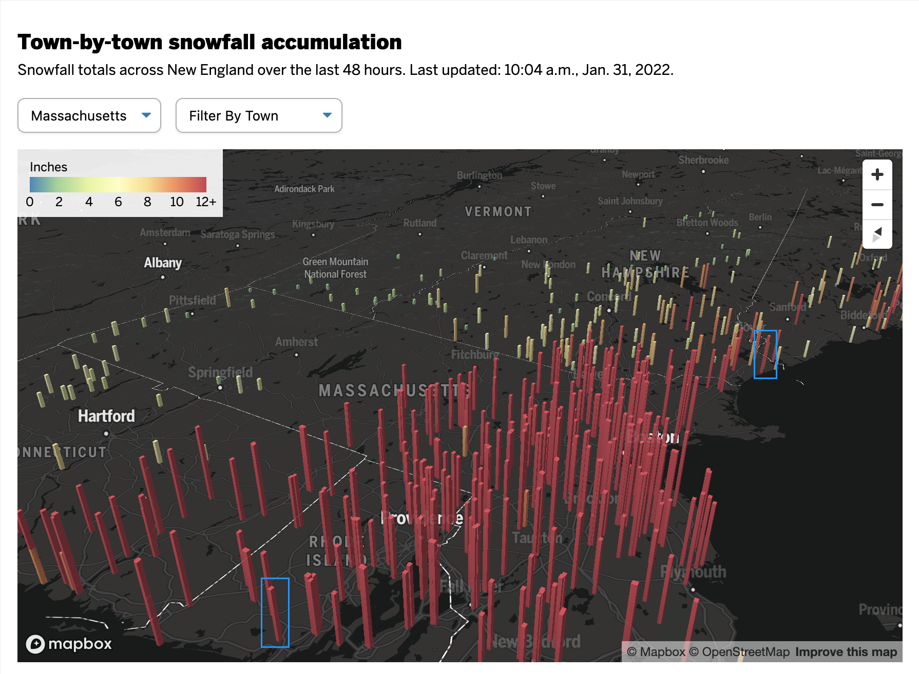
On Friday, I mentioned in brief that the East Coast was preparing for a storm. One of the cities the storm impacted was Boston and naturally the Boston Globecovered the story. One aspect the paper covered? The snowfall amounts. They did so like this:
All the lack of information
This graphic fails to communicate the breadth and literal depth of the snow. We have two big reasons for that and they are both tied to perspective.
First we have a simple one: bars hiding other bars. I live in Greater Centre City, Philadelphia. That means lots of tall buildings. But if I look out my window, the tall buildings nearer me block my view of the buildings behind. That same approach holds true in this graphic. The tall red columns in southeastern Massachusetts block those of eastern and northeastern parts of the state and parts of New Hampshire as well. Even if we can still see the tops of the columns, we cannot see the bases and thus any real meaningful comparison is lost.
Second: distance. Pretty simple here as well, later today go outside. Look at things on your horizon. Note that those things, while perhaps tall such as a tree or a skyscraper, look relatively small compared to those things immediately around you. Same applies here. Bars of the same data, when at opposite ends of the map, will appear sized differently. Below I took the above screenshot and highlighted two observations that differed in only 0.5 inches of snow. But the box I had to draw—a rough proxy for the columns’ actual heights—is 44% larger.
These bars should be about the same.
This map probably looks cool to some people with its three-dimensional perspective and bright colours on a dark grey map. But it fails where it matters most: clearly presenting the regional differences in accumulation of snowfall amounts.
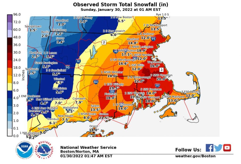
Compare the above to this graphic from the Boston office of the National Weather Service (NWS).
No, it does not have the same cool factor. And some of the labelling design could use a bit of work. But the use of a flat, two-dimensional map allows us to more clearly compare the ranges of snowfall and get a truer sense of the geographic patterns in this weekend’s storm. And in doing so, we can see some of the subtleties, for example the red pockets of greater snowfall amounts amid the wider orange band.
Credit for the Globe piece goes to John Hancock.
Credit for the NWS piece goes to the graphics department of NWS Boston.
Those who know me know one of my pet peeves are when maps of the United States do not display Alaska and Hawaii. I even noted yesterday that those two states were so late of additions to the United States and it made sense as to why they were not included.
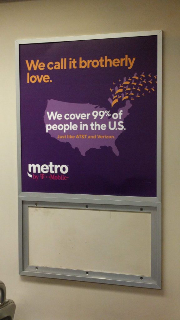
So when I was going through some old photos yesterday, I stumbled across this of a poster on the Philadelphia subway system. I had flagged it for posting, but I guess I never did.
Where are my 49th and 50th states at?
I understand this is an advert and so for creative purposes, creative liberty. And it could be that this service does not exist in either Alaska or Hawaii.
But, the statement here is that Metro covers 99% of the United States. Geographically, to do so Metro must cover Alaska because in terms of land area, Alaska comprises nearly 18% of the entire United States. Yeah, Alaska is big. Now, if you’re talking covering 99% of the people of the United States, Metro has some wiggle room. Combined, both Alaska and Hawaii comprise 0.6% of the United States population. That would still leave 0.4% of the American population not covered, and by definition that must be some part of the contiguous lower 48. But above we can see the whole map is purple.
In other words, this is not an accurate map. They should have found some way of incorporating Alaska and Hawaii.
Credit for the piece goes to Metro’s designer or design agency.
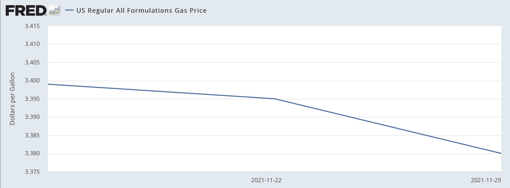
Saw this graphic on the Twitter the other day from the Democratic Congressional Campaign Committee (DCCC), or the D Triple C or D Trip C. The context was that earlier in the day Matt Yglesias posted a clearly tongue-in-cheek chart about how after signing the infrastructure bill, President Biden had single-handedly fixed inflation and gas prices were heading down.
Oh, the power to misuse FRED.
Of course, anyone with a brain knows this isn’t true. The President of the United States cannot control the price of petrol. Because, you know, market economy. The underlying problem of high demand and low supply was, of course, not solved by the infrastructure bill. But lots of people complain on the telly or the internets about Biden not doing more about inflation, but, you know, not really within the wheelhouse.
Anyway, this chart in particular does not bother me. Because Yglesias knows—and most of his audience knows—it is not meant to be taken seriously. It is really just a joke.
But emphasis most of his audience.
Because the DCCC later posted this graphic with the accompanying text “Thanks, Joe Biden”.
Oh boy.
Oh boy.
Clearly they didn’t get the memo about the original being a joke.
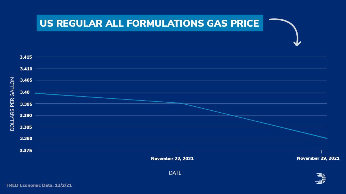
The entire scale of the chart is 4¢. I cannot even recall the last time I had to use the glyph ¢ we’re talking so small a scale. The change in the the three week period amounts to a decline of 2¢.
And now you get the joke of the post. Ask me my 2¢ about the chart…
Now look closely at that y-axis. You’ll also note that we are carrying it all the way out to the third decimal point. Now, it’s true that some petrol stations will have a wee little nine trailing just after the two digits to the right of the decimal. Sometimes you might see a 9/10. As was explained to me in school that’s because people will buy something if it looks even a fraction of a cent cheaper. Thing 99¢—getting the use out of this glyph today—versus $1. Makes all the difference. So back when petrol was cheap (inflation stories come round and round), 0.899 looked better than 0.90. But now that it’s routinely well over a few dollars, that 9/10 is a laughable percentage of the total price.
So, yes, we do present petrol prices to three decimals in the environmental design space. But think to yourself, when have you ever aloud repeated a price to the third decimal point? You probably haven’t. And so this chart probably shouldn’t be using that granular a level of specificity.
The other underlying problem, jokes aside, is that the chart spends all that horizontal space looking at three data points. Three. If the data were showing the daily price, not the weekly average, we’d have 21 days worth of data, and that—scale notwithstanding—would be worthy of charting. My basic rule is that if it’s five or six data points, you can use a table unless there is a contextual or design reason for doing so. Say, for example, you’re doing a series of small multiples for a time series of objects in a category. For all but a few categories you have dozens of data points, but just a few have really spotty observations. In those cases, plot the three or four numbers. But in this case, just don’t.
Instead this kind of graphic is best presented as a factette, a big old number, preferably in a narrow or condensed width. Because a 2¢ decline over a three-week period is also not terribly newsworthy. (Unless your story is how prices haven’t changed much over the last three weeks.)
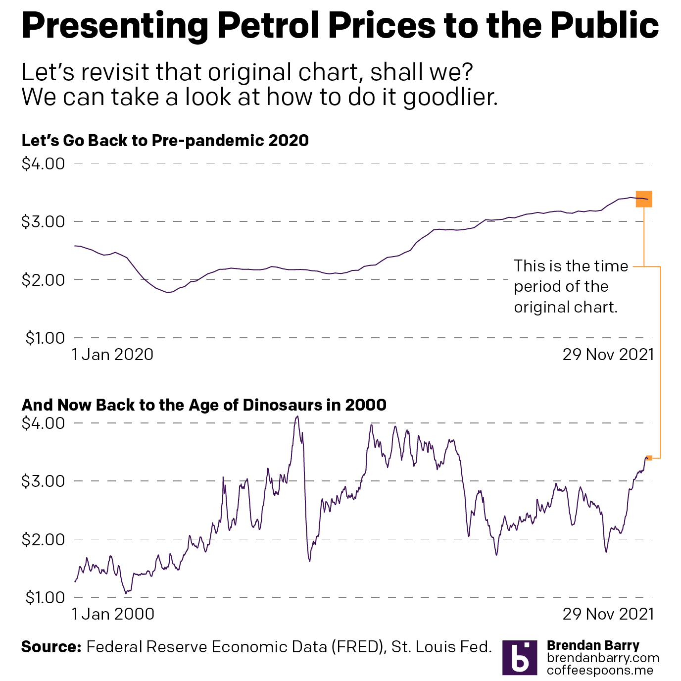
This also points to how the original chart misses the context of time. Granted, a lot can happen in three weeks, but a 2¢ shift is not massive. Give those three weeks their proper place in time, however, and you can see just how little movement that truly is. Cue my own quickly whipped up charts.
That’s more like it.
In the first chart you can begin to see how the change, during the course of the last nearly two years, is not significant. And in the second you can see that things really are not that bad compared to where they were back during the lead up to the Great Recession and then in the recovery that followed. (Aww, look at back in the early oughts when prices averaged just over a $1/gallon. I can still remember filling up my minivan for prices like 99¢.)
If the designer wants to make a point that perhaps we’re reaching the peak prices during this time period, sure. Because a two-week decline in prices could well be the beginning of that. But, to show that you also need to show the context of the time before that.
But once again, the President of the United States cannot much affect the price of petrol short of releasing the strategic reserve, which as its name implies, is meant for strategic purposes in case of national emergency. And high consumer prices are not a strategic national emergency on the scale of, say, a crippling storm impacting the refineries in the Gulf or an earthquake destroying pipelines in Alaska or an invasion or stifling blockade of overseas imports.
At the end of the day, this was just a terrible, terrible chart. And I think it speaks to a degree of chart illiteracy that I see creeping up in society at large. Not that it wasn’t there in the past—get off my lawn, kids—but seems more ever present these days. I don’t know if that’s because of the amplification effect of things like the Twitter or just a decline in education and critical thinking. But those are topics for another day.
This chart fails on so many levels. The concept is bad, i.e. neither Biden nor Trump nor their predecessors nor their successors—unless we adopt a planned economy, am I right, comrades?—can directly affect petrol prices. Prices are governed by larger market forces that boil down to supply and demand.
But also, the sheer design is bad. Don’t use a chart of three data points. Don’t stretch out the x-axis. Don’t use decimal points to a point where they’re unrecognisable.
In the meantime, charts like this? Don’t do them, kids.
Credit for the first original goes to FRED, whose chart Matt Yglesias used.
Credit for the second goes to the DCCC graphics department.
Oh, and because I used Federal Reserve data for the charts, and because I work there, I should add the views and opinions are my own and don’t represent those of my employer.
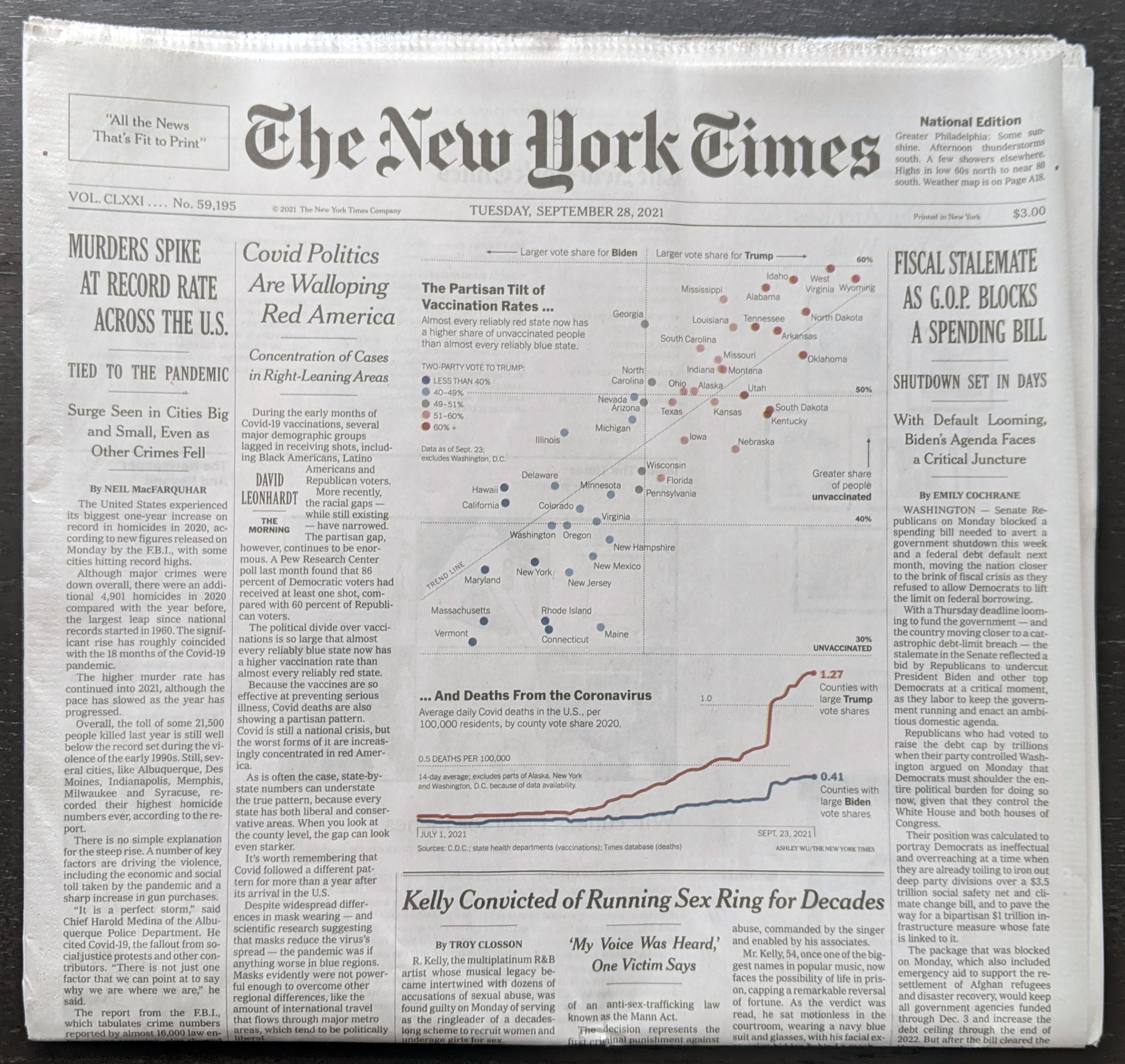
I will try to get to my weekly Covid-19 post tomorrow, but today I want to take a brief look at a graphic from the New York Times that sat above the fold outside my door yesterday morning. And those who have been following the blog know that I love print graphics above the fold.
On my proverbial stoop this morning.
Of the six-column layout, you can see that this graphic gets three, in other words half-a-page width, and the accompany column of text for the article brings this to nearly 2/3 the front page.
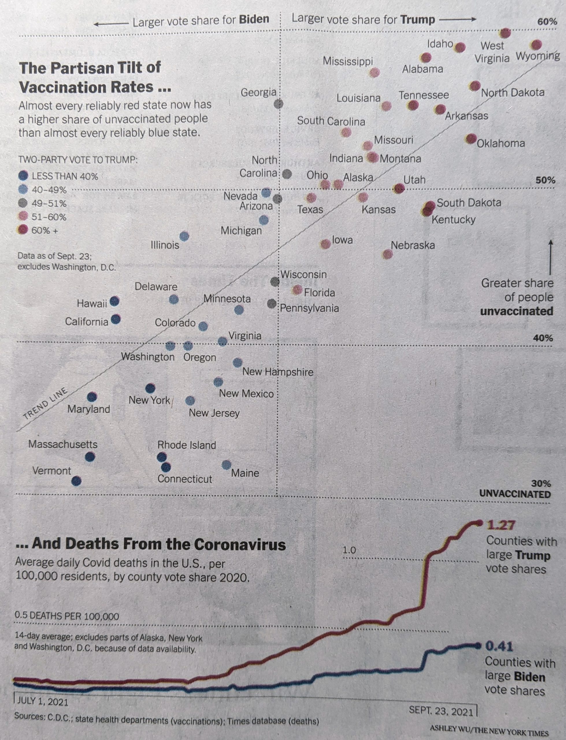
When we look more closely at the graphic, you can see it consists of two separate parts, a scatter plot and a line chart. And that’s where it begins to fall apart for me.
Pennsylvania is thankfully on the more vaccinated side of things
The scatter plot uses colour to indicate the vote share that went to Trump. My issue with this is that the colour isn’t necessary. If you look at the top for the x-axis labelling, you will see that the axis represents that same data. If, however, the designer chose to use colour to show the range of the state vote, well that’s what the axis labelling should be for…except there is none.
If the scatter plot used proper x-axis labels, you could easily read the range on either side of the political spectrum, and colour would no longer be necessary. I don’t entirely understand the lack of labelling here, because on the y-axis the scatter plot does use labelling.
On a side note, I would probably have added a US unvaccination rate for a benchmark, to see which states are above and below the US average.
Now if we look at the second part of the graphic, the line chart, we do see labelling for the axis here. But what I’m not fond of here is that the line for counties with large Trump shares, the line significantly exceeds the the maximum range of the chart. And then for the 0.5 deaths per 100,000 line, the dots mysteriously end short of the end of the chart. It’s not as if the line would have overlapped with the data series. And even if it did, that’s the point of an axis line, so the user can know when the data has exceeded an interval.
I really wanted to like this piece, because it is a graphic above the fold. But the more I looked at it in detail, the more issues I found with the graphic. A couple of tweaks, however, would quickly bring it up to speed.
One of the long-running critiques of Fox News Channel’s on air graphics is that they often distort the truth. They choose questionable if not flat-out misleading baselines, scales, and adjust other elements to create differences where they don’t exist or smooth out problematic issues.
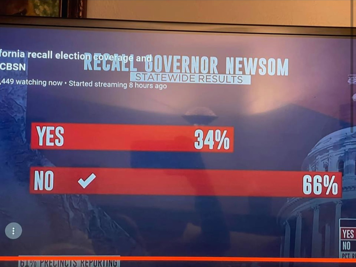
But yesterday a friend sent me a graphic that shows Fox News isn’t alone. This graphic came from CBS News and looked at the California recall election vote totals.
If you just look at the numbers, 66% and 34%, well we can see that 34 is almost half of 66. So why does the top bar look more like 2/3 of the length of the bottom? I don’t actually know the animus of the designer who created the graphic, but I hope it’s more ignorance or sloppiness than malice. I wonder if the designer simply said, 66%, well that means the top bar should be, like, two-thirds the length of the bottom.
The effect, however, makes the election seem far closer than it really was. For every yes vote, there were almost two no votes. And the above graphic does not capture that fact. And so my friend asked if I could make a graphic with the correct scale. And so I did.
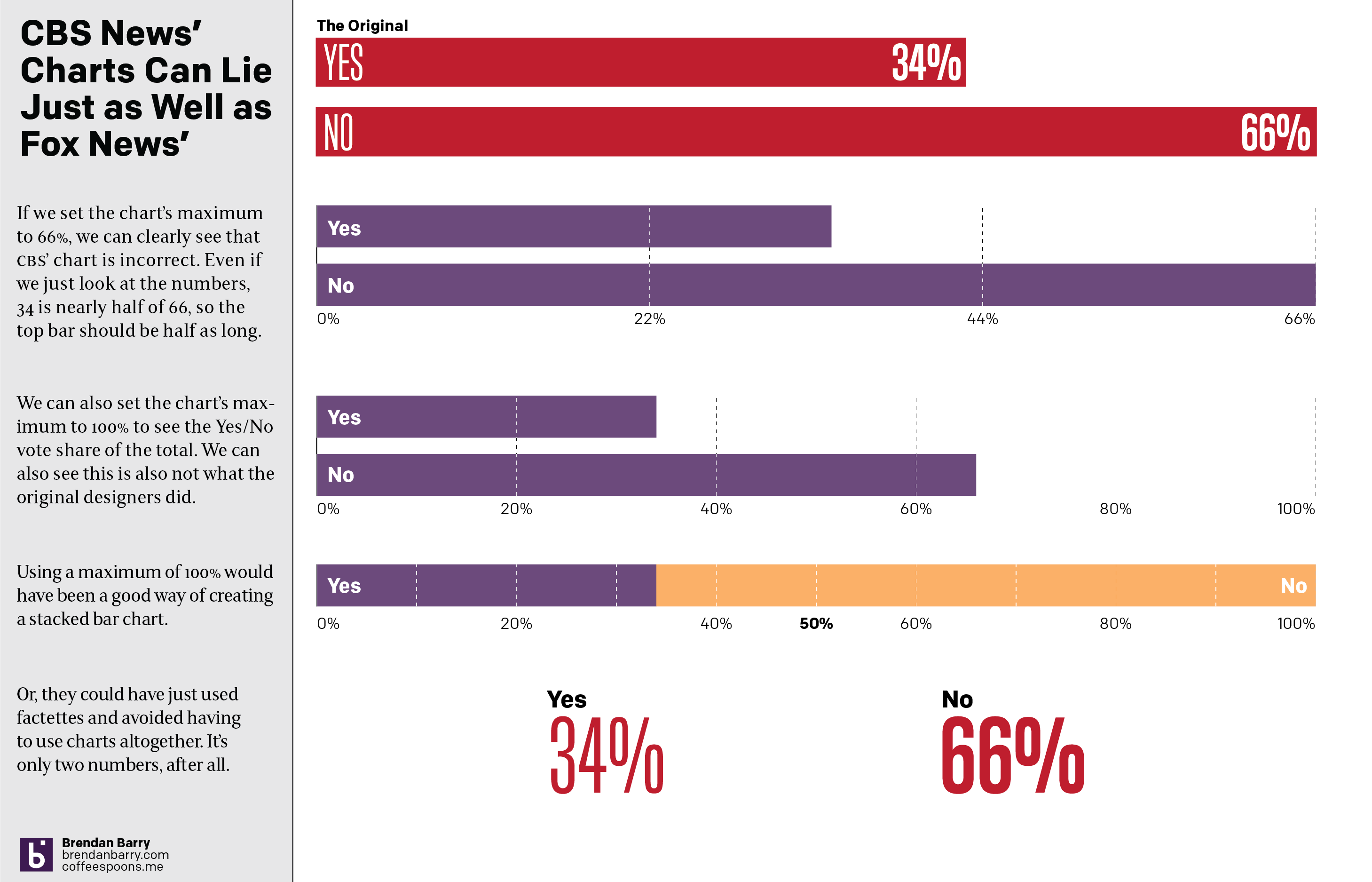
One really doesn’t need a chart to compare the two numbers. And I touch on that with the last point, using two factettes to simply state the results. But let’s assume we need to make it sexy, sizzle, or flashy. Because I think every designer has heard that request.
A simple scale of 0 to 66 could work and we can see how that would differ from the original graphic. Or, if we use a scale of 0 to 100, we can see how the two bars relate to each other and to the scale of the total vote. That approach would also have allowed for a stacked bar chart as I made in the third option. The advantage there is that you can easily see the victor by who crosses the 50% line at the centre of the graphic.
Basically doing anything but what we saw in the original.
Credit for the original goes to the CBS News graphics department.
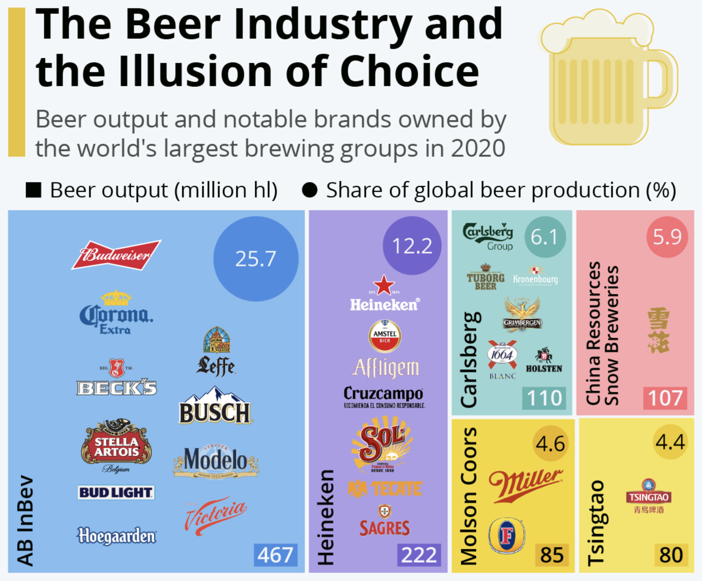
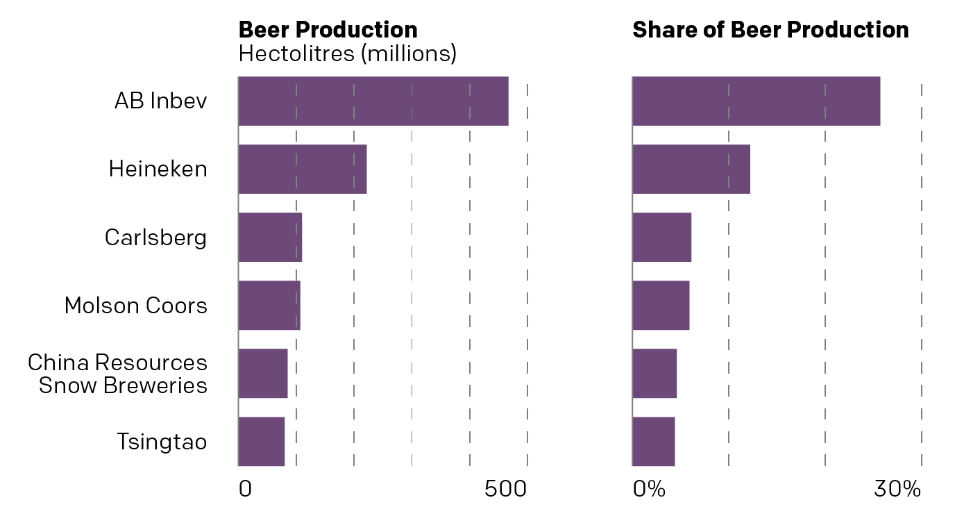
A few weeks back, a good friend of mine sent me this graphic from Statista that detailed the global beer industry. It showed how many of the world’s biggest brands are, in fact, owned by just a few of the biggest companies. This isn’t exactly news to either my friend or me, because we both worked in market research in our past lives, but I wanted to talk about this particular chart.
Not included, your home brew
At first glance we have a tree map, where the area of each “squarified” shape represents, usually, the share of the total. In this case, the share of global beer production in millions of hectolitres. Nothing too crazy there.
Next, colour often will represent another variable, for market share you might often see greens or blues to red that represent the recent historical growth or forecast future growth of that particular brand, company, or market. Here, however, is where the chart begins to breakdown. Colour does not appear to encode any meaningful data. It could have been used to encode data about region of origin for the parent company. Imagine blue represented European companies, red Asian, and yellow American. We would still have a similarly coloured map, sans purple and green,
But we also need to look at the data the chart communicates. We have the production in hectolitres, or the shape of the rectangle. But what about that little rectangle in the lower right corner? Is that supposed to be a different measurement or is it merely a label? Because if it’s a label, we need to compare it to the circles in the upper right. Those are labels, but they change in size whereas the rectangles change only in order to fit the number.
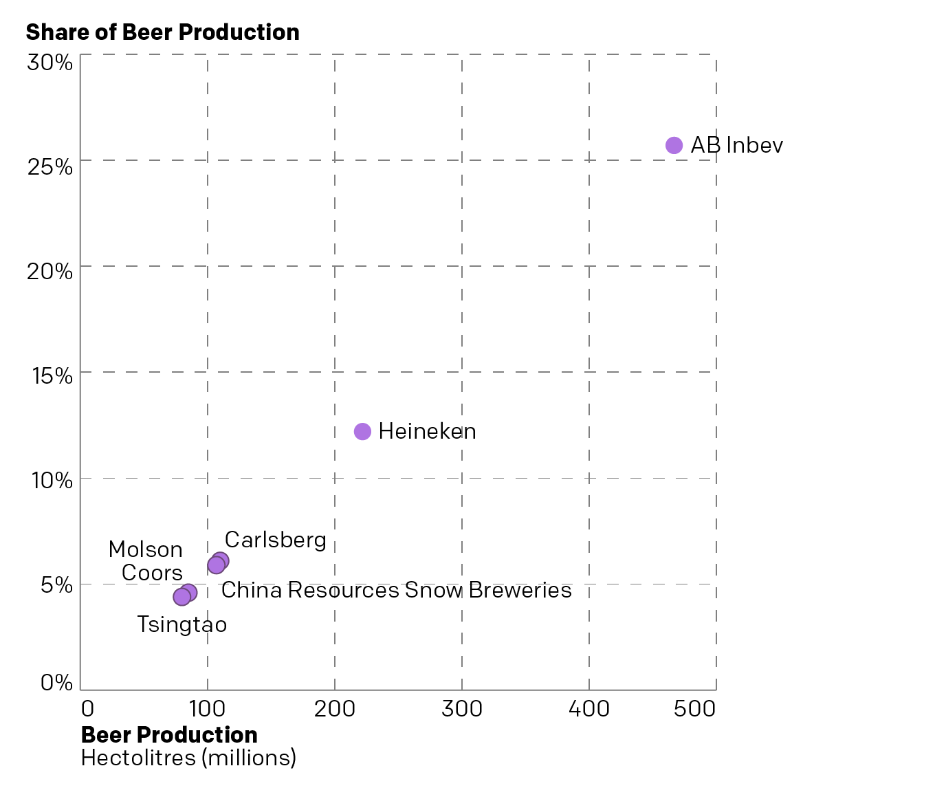
And what about those circles? They represent the share of total beer production. In other words the squares represent the number of hectolitres produced and the circles represent the share of hectolitres produced. Two sides of the same coin. Because we can plot this as a simple scatter plot and see that we’re really just looking at the same data.
Not the most interesting scatter plot I’ve ever seen…
We can see that there’s a pretty apparent connection between the volume of beer produced and the share of volume produced—as one would (hopefully) expect. The chart doesn’t really tell us too much other than that there are really three tiers in the Big Six of Breweries. AB Inbev is in own top tier and Heineken is a second separate tier. But Carlsberg and China Resources Snow Breweries are very competitive and then just behind them are Molson Coors and Tsingtao. But those could all be grouped into a third tier.
Another way to look at this would be to disaggregate the scatter plot into two separate bar charts.
And now to the bars…
You can see the pattern in terms of the shapes of the bars and the resulting three tiers is broadly the same. You can also see how we don’t need colour to differentiate between any of these breweries, nor does the original graphic. We could layer on additional data and information, but the original designers opted not to do that.
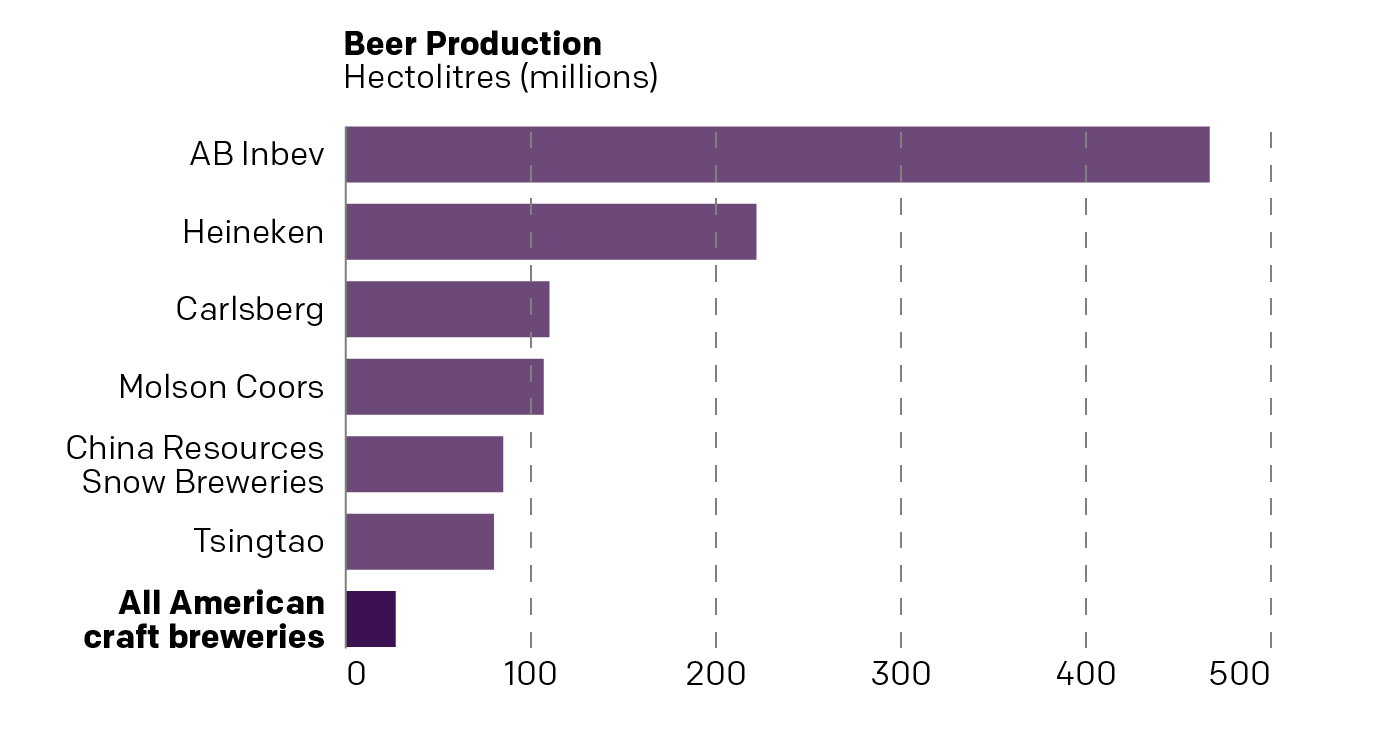
But I find that the big glaring miss is that the article makes the point despite the boom in craft beer in recent years, American craft beer is still a very small fraction of global beer production. The text cites a figure that isn’t included in the graphic, probably because they come from two different sources. But if we could do a bit more research we could probably fit American craft breweries into the data set and we’d get a resultant chart like this.
A better bar…
This more clearly makes the point that American craft beer is a fraction of global beer production. But it still isn’t a great chart, because it’s looking at global beer production. Instead, I would want to be able to see the share of craft brewery production in the United States.
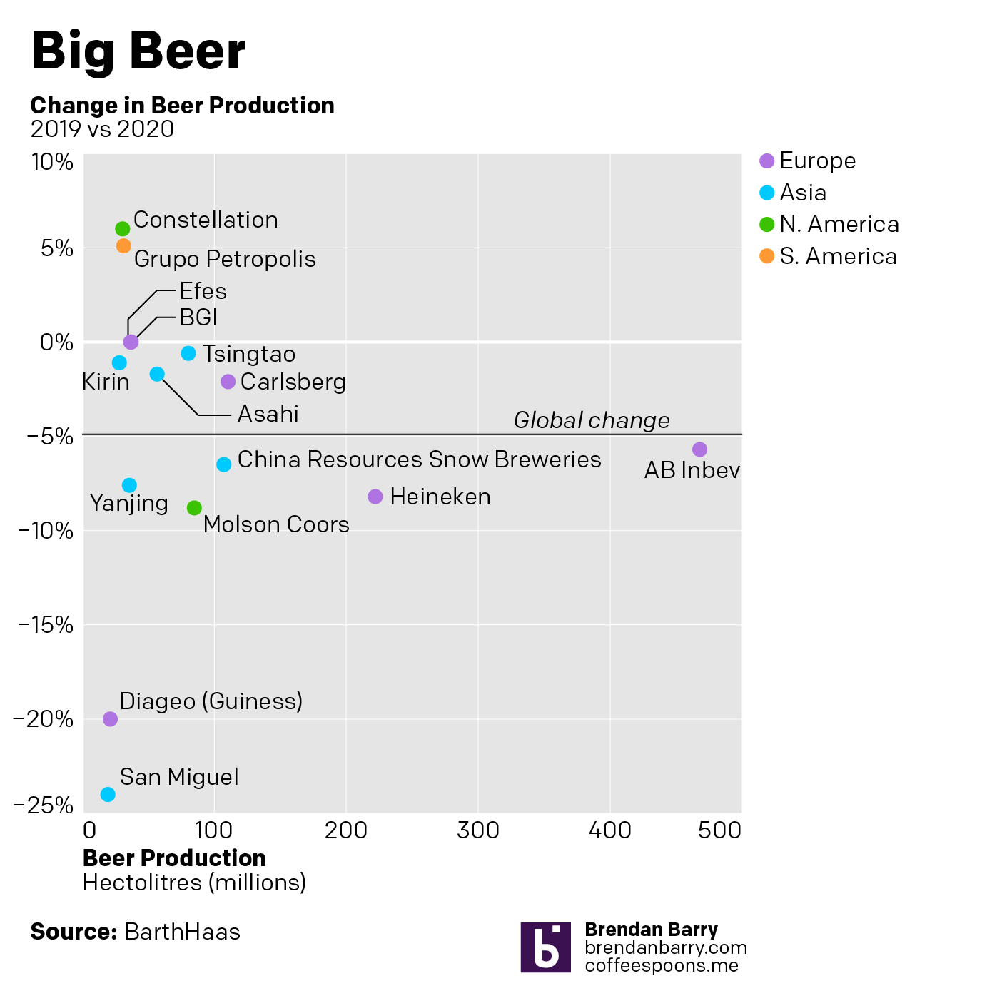
How has that changed over the last decade? How dominant are these six big beer companies in the American market? Has that share been falling or rising? Has it been stable?
Well, I went to the original source and pulled down the data table for the Top 40 brewers. I took the Top 15 in beer production, all above 1% share in 2020, and then plotted that against the change in their beer production from 2019 to 2020. I added a benchmark of global beer production—down nearly 5% in the pandemic year—and then coloured the dots by the region of origin. (San Miguel might not seem to fit in Asia by name, but it’s from the Philippines.)
Now I can use a good bar.
What mine does not do, because I couldn’t find a good (and convenient) source is what top brands belong to which parent companies. That’s probably buried in a report somewhere. But whilst market share data and analysis used to be my job, as I alluded to in the opening, it is no longer and I’ve got to get (virtually) to my day job.
A few weeks ago I wrote about the United Nation’s Intergovernmental Panel on Climate Change (IPCC) latest report on climate change, which synthesised the last several years’ data. If you didn’t see that post, suffice it to say things are bad and getting worse. At the time I said I wanted to return to talk about a few more graphics in the release. Well, here we are.
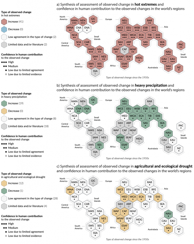
In this piece we have a map, three technically. In a set of small multiples, the report’s designers show the observed change, i.e. what’s happening today, and the degree of scientific consensus on whether humans are causing it.
It’s gotten hotter and wetter here in eastern North America
What I like about this is that, first, improved data and accuracy allows for sub-continental breakdowns of climate change’s impacts. That breakdown allowed the designers to use a tilemap consisting of hexagons to map those changes.
Since we don’t look at the world in this kind of way, the page also includes a generous note where it defines all these acronyms. Of course even with those, it still doesn’t look super accurate—and that is fine, because that’s the point—so little strokes outside clusters of hexagons are labelled to further help the reader identify the geographic regions. I really like this part.
I also like how little dots represent the degree of confidence. The hexagons give enough space to include dots and labels while still allowing the colours to shine. These are really nice.
But then we get to colour, the one part of this graphic with which I’m not totally thrilled. The first map looks at temperature, specifically heat extremes. Red means increase in heat extremes and blue means decrease. Fair enough. Hatched pattern means there is low consensus and medium grey means there’s little data. I like it.
Moving to the second map we look at heavy precipitation. Green means an increase and yellow a decrease. Hatched and medium grey both mean the same as before. I like this too. Sure, with clear titling you could still use the same colours as the first map, but I’ll buy if you’re selling you want visual distinction from the red–blue map above.
Then we get to the third map and now we’re looking at drought. Hatched and grey mean the same. Good. But now we have green and yellow, the same green and yellow as the second map. Okay…but I thought the second map showed we need a visual distinction from the first? But what makes it really difficult is that in this third map we invert the meaning of green and yellow. Green now means a decrease in drought and yellow an increase.
I can get that a decrease in drought means green fields and an increase in drought means dead and dying fields, yellow or brown. And sure, red and blue relate to hot and cold. But the problem is that we have the exact same colours meaning the opposite things when it comes to precipitation.
Why not use two other colours for precipitation? You wouldn’t want to use blue, because you’re using blue in the first map. But what about purple and orange, like I often do here on Coffeespoons? This is why I don’t think the designers needed to switch up the colours from map to map. Pick a less relational colour palette, say purple and orange, and colour all three maps with purple being an increase and orange being a decrease.
Colour is my big knock on these graphics, which unfortunately could otherwise have been particularly strong. Of course, I can’t blame designers for going with red and blue for hot and cold temperatures. I’ve had the same request in my career. But it doesn’t make reading these charts any easier.
Credit for the piece goes to the IPCC graphics team.
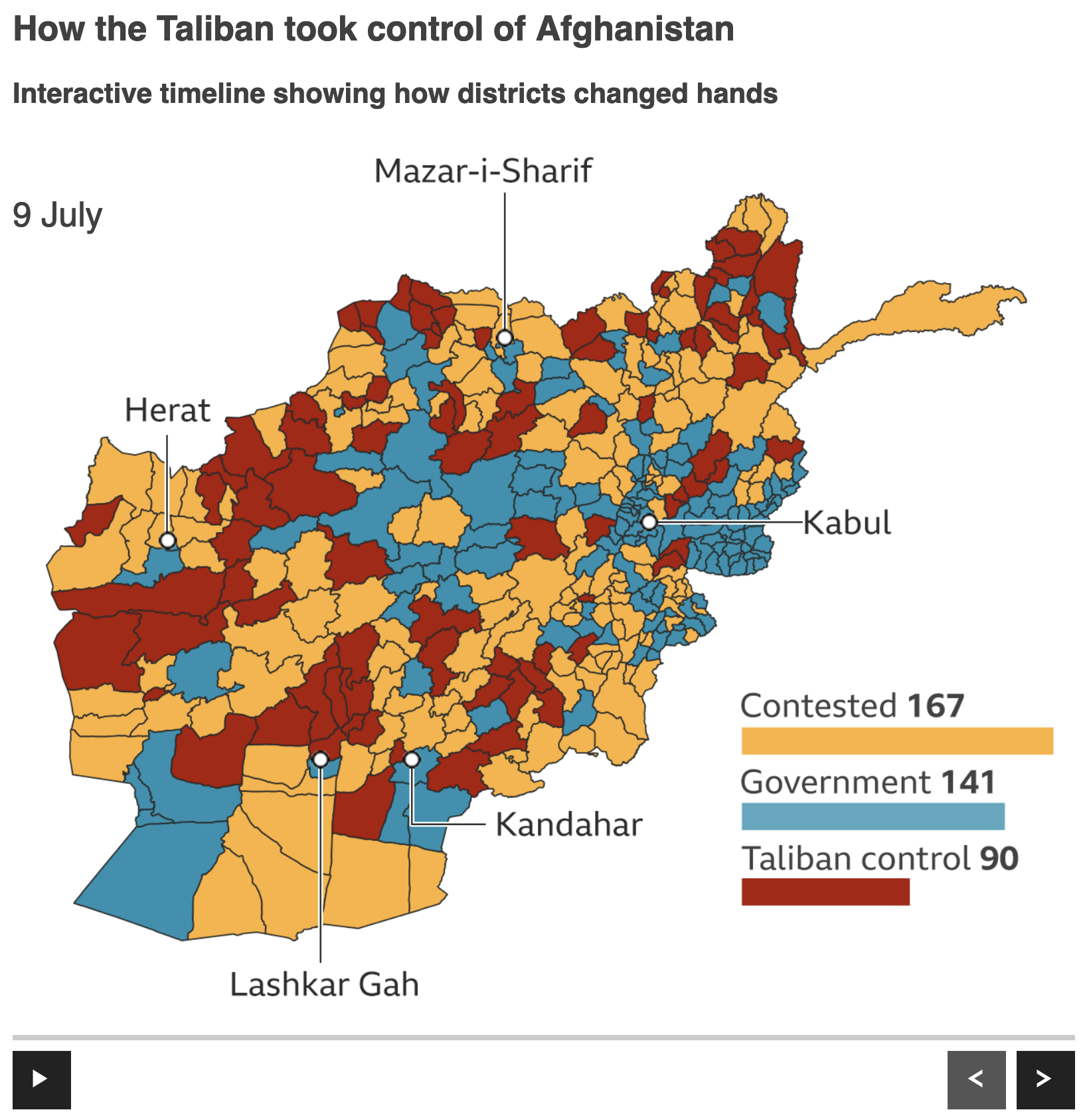
After twenty years out of power, the Taliban in Afghanistan are back in power as the Afghan government collapsed spectacularly this past weekend. In most provinces and districts, government forces surrendered without firing a shot. And if you’re going to beat an army in the field, you generally need to, you know, fight if you expect to beat them.
I held off on posting anything about the Taliban takeover of Afghanistan simply because it happened so quick. It was not even two months ago when they began their offensive. But whenever I started to prepare a post, things would be drastically different by the next morning.
And so this timeline graphic from the BBC does a good job of capturing the rapid collapse of the Afghan state. It starts in early July with a mixture of blue, orange, and red—we’ll come back to the colours a bit later. Blue represents the Afghan government, red the Taliban, and orange contested areas.
The start of the summer offensive
The graphic includes some controls at the bottom, a play/pause and forward/backward skip buttons. The geographic units are districts, sub-provincial level units that I would imagine are roughly analogous to US counties, but that’s supposition on my part. Additionally the map includes little markers for some of the country’s key cities. Finally in the lower right we have a little scorecard of sorts, showing how many of the nearly 400 districts were in the control of which group.
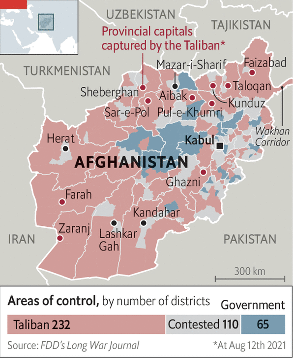
Skip forward five weeks and the situation could not be more different.
So much for 20 years.
Almost all of Afghanistan is under the control of the Taliban. There’s not a whole lot else to say about that fact. The army largely surrendered without firing a shot. Though some special forces and commando units held out under siege, notably in Kandahar where a commando unit held the airport until after the government fell only to be evacuated to the still-US-held Hamid Karzai International Airport in Kabul.
My personal thoughts, well you can blame Biden and the US for a rushed US exodus that looks bad optically, but the American withdrawal plan, initiated by Trump let’s not forget, counted on the Afghan army actually fighting the Taliban and the government negotiating some kind of settlement with the Taliban. Neither happened. And so the end came far quicker than anyone thought possible.
But we’re here to talk graphics.
In general I like this. I prefer this district-level map to some of the similar province-level maps I have seen, because this gives a more granular view of the situation on the ground. Ideally I would have included a thicker line weight to denote the provinces, but again if it’s one or the other I’d opt for district-level data.
That said, I’d probably have used white lines instead of black. If you look in the east, especially south and east of Kabul, the geographically small areas begin to clump up into a mass of shapes made dark by the black outlines. That black is, of course, darker than the reds, blues, and yellows. If the designers had opted for white or even a light shade of grey, we would enhance the user’s ability to see the district-level data by dropping the borders to the back of the visual hierarchy.
Finally with colours, I’m not sure I understand the rationale behind the red, blue, yellow here. Let’s compare the BBC’s colour choice to that of the Economist. (Initially I was going to focus on the Economist’s graphics, but last minute change of plans.)
Another day, more losses for the government
Here we see a similar scheme: red for the Taliban, blue for the government. But notably the designers coloured the contested areas grey, not yellow. We also have more desaturated colours here, not the bright and vibrant reds, blues, and yellows of the BBC maps above.
First the grey vs. yellow. It depends on what the designers wanted to show. The grey moves the contested districts into the background, focusing the reader’s attention on the (dwindling) number of districts under government control. If the goal is to show where the fighting is occurring, i.e. the contest, the yellow works well as it draws the reader’s attention. But if the goal is to show which parts of the country the Taliban control and which parts the government, the grey works better. It’s a subtle difference, I know, but that’s why it would be important to know the designer’s goal.
I’ll also add that the Economist map here shows the provincial capitals and uses a darker, more saturated red dot to indicate if they’d fallen to the Taliban. Contrast that with the BBC’s simple black dots. We had a subtler story than “Taliban overruns country” in Afghanistan where the Taliban largely did hold the rural, lower populated districts outside the major cities, but that the cities like the aforementioned Kandahar, Herat, Mazar-i-Sharif held out a little bit longer, usually behind commando units or local militia. Personally I would have added a darker, more saturated blue dot for cities like Kabul, which at the time of the Economist’s map, was not under threat.
Then we have the saturation element of the red and blue.
Should the reds be brighter, vibrant and attention grabbing or ought they be lighter and restrained, more muted? It’s actually a fairly complex answer and the answer is ultimately “it depends”. I know that’s the cheap way out, but let me explain in the context of these maps.
Choropleth maps like this, i.e. maps where a geographical unit is coloured based on some kind of data point, in this instance political/military control, are, broadly speaking, comprised of large shapes or blocks of colour. In other words, they are not dot plots or line charts where we have small or thin instances of colour.
Now, I’m certain that in the past you’ve seen a wall or a painting or an advert for something where the artist or designer used a large, vast area of a bright colour, so bright that it hurt your eyes to look at the area. I mean imagine if the walls in your room were painted that bright yellow colour of warning signs or taxis.
That same concept also applies to maps, data visualisation, and design. We use bright colours to draw attention, but ideally do so sparingly. Larger areas or fields of colours often warrant more muted colours, leaving any bright uses to highlight particular areas of attention or concern.
Imagine that the designers wanted to highlight a particular district in the maps above. The Economist’s map is better designed to handle that need, a district could have its red turned to 11, so to speak, to visually separate it from the other red districts. But with the BBC map, that option is largely off the table because the colours are already at 11.
Why do we have bright colours? Well over the years I’ve heard a number of reasons. Clients ask for graphics to be “exciting”, “flashy”, “make it sizzle” because colours like the Economist’s are “boring”, “not sexy”.
The point of good data visualisation, however, is not to make things sexy, exciting, or flashy. Rather the goal is clear communication. And a more restrained palette leaves more options for further clarification. The architect Mies van der Rohe famously said “less is more”. Just as there are different styles of architecture we have different styles of design. And personally my style is of the more restrained variety. Using less leaves room for more.
Note how the Economist’s map is able to layer labels and annotations atop the map. The more muted and desaturated reds, blues, and greys also allow for text and other artwork to layer atop the map but, crucially, still be legible. Imagine trying to read the same sorts of labels on the BBC map. It’s difficult to do, and you know that it is because the BBC designers needed to move the city labels off the map itself in order to make them legible.
Both sets of maps are strong in their own right. But the ultimate loser here is going to be the Afghan people. Though it is pretty clear that this was the ultimate result. There just wasn’t enough support in the broader country to prop up a Western style liberal democracy. Or else somebody would have fought for it.
Credit for the BBC piece goes to the BBC graphics department.
Credit for the Economist piece goes to the Economist graphics department.
Earlier this morning (East Coast time) the Intergovernmental Panel on Climate Change (IPCC), the UN’s committee studying climate change, released its latest review of climate change. This is the first major review since 2013 and, spoiler, it’s not good.
I’ve read some news articles about the findings, but I want to critique and comment upon some of the graphics contained within the report itself. This started going too long, however, so I think I will break this into several shorter, more digestible chunks.
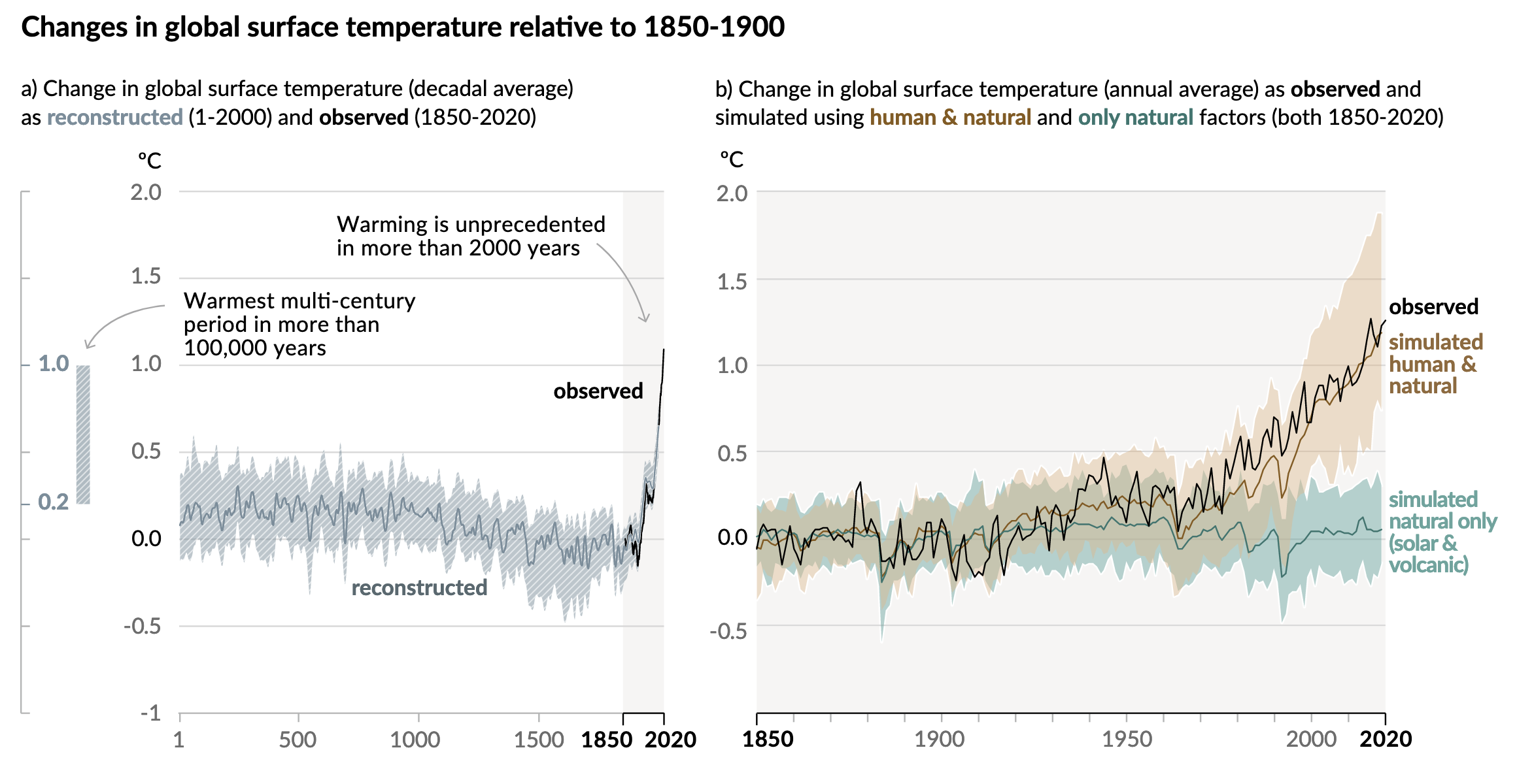
And I want to start with the first chart, two line charts that lay out the temperature changes we’ve seen.
Going up…
One of the first things I like here is the language. Often we might see these or similar charts that simply state temperatures from the year 1 through 2020. One of the common reasons I hear from people that deny climate change is that “people weren’t recording temperatures back in 1 AD.
They would be correct. We do not have planet-wide meteorological observations from the time of Julius Caesar. But in the year 2021 we do have science. And that allows us to take other evidence, e.g. dissolved carbon dioxide in ice, or tree ring size, &c., and use them to reconstruct the temperature record indirectly.
And reconstruct is the word the IPCC uses to clearly delineate the temperature data pre- and post-1850 when their observed data set begins.
The designers then highlight this observed data set, broadly coinciding with the Industrial Revolution when we as a species began to first emit extra greenhouse gasses into the atmosphere. You can see this as a faint grey background and a darker stroke along the x-axis.
Additionally, the designers used annotations to call out the first main point, that warming in the last almost two centuries is far beyond what we’ve seen in the last two millennia.
The second annotation points to a bar, reminiscent of the range of a box plot, that exists outside the x-axis and almost embedded within the y-axis. This bar captures the range of temperatures reconstructed in the past 100,000 years. And by including it in the chart, we can see that we have just recently begun to exceed even that range.
In the second chart, we have the entire background shaded light grey and the whole x-axis in a darker stroke to remind us that we are now looking at the Industrial/Post-Industrial era. But what this chart does is do what scientists do, test whether natural, non-manmade causes can fully explain the temperature increase.
They can’t.
The chart plots the modelled data looking at just natural causes vs. modelled data looking at natural causes plus human impacts. Those lines and their ranges are then compared to the temperatures we’ve observed and recorded.
Since the 1930s and 40s, it’s been a pretty clear and consistent tracking with natural plus manmade causes. For years the scientific community has been in agreement that humanity is contributing to the rising temperatures. This is yet more evidence to make the point even more conclusively.
These are two really good charts that taken together show pretty conclusively that humanity is directly responsible for a significant portion of Earth’s recent climate change.
I’ll have more on some other notable graphics in the report later in the week, so stay tuned.
Credit for the piece goes to the IPCC graphics team.
One trend people have begun to follow lately is that of rising prices for consumer goods. If you have shopped recently for things, you may have noticed that you have been paying more than you were just a few weeks ago. We call this inflation. The Bureau of Labour Statistics (BLS) tracks this for a whole range of goods. We call the the consumer price index (CPI)
Prices can vary wildly for some goods, most notably food and energy. For those of my readers who drive, recall how quickly petrol/gasoline prices can change. Because of that volatility, the Bureau of Labour Statistics strips out food and energy prices and the inflation that excludes food and energy is what we call Core CPI.
Lately, we have been seeing an increase in prices and inflation is on the rise. To an extent, this is not surprising. The pandemic disrupted supply chains and wiped out supplies and stores of goods. But with many people working remotely, many now have pent up savings they want to spend. But with low supply and high demand, basic economics suggests rising prices. As supplies increase in the coming months, however, the rise in prices will begin to cool off. In other words, most economists are not yet concerned and expect this spike in inflation to be passing in nature. But not everyone agrees.
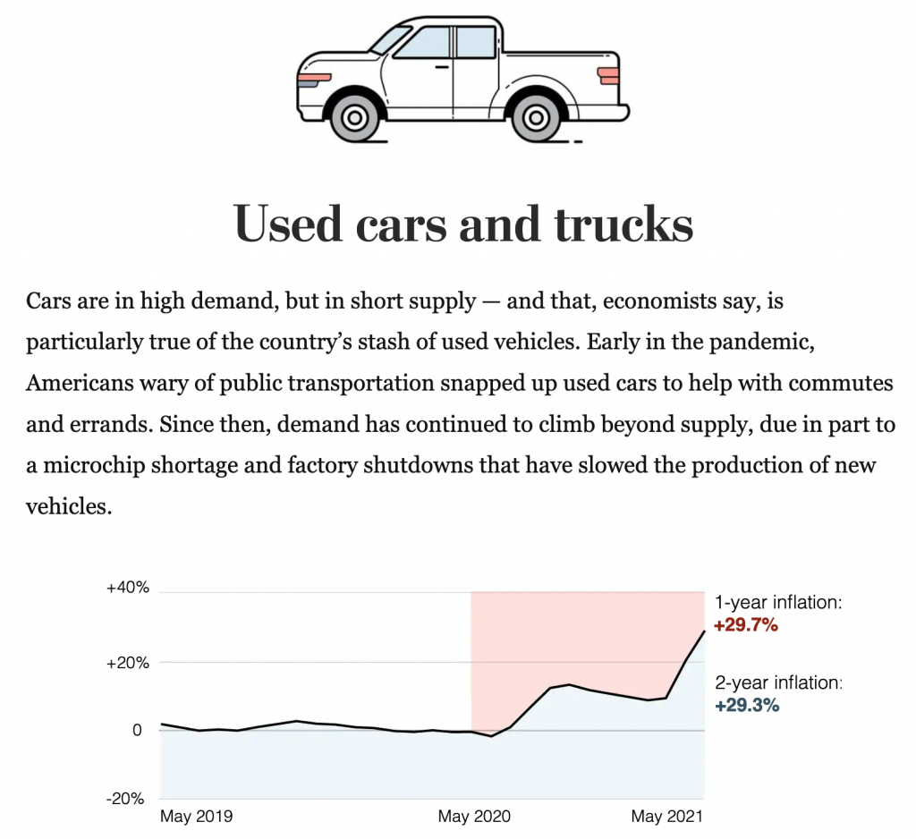
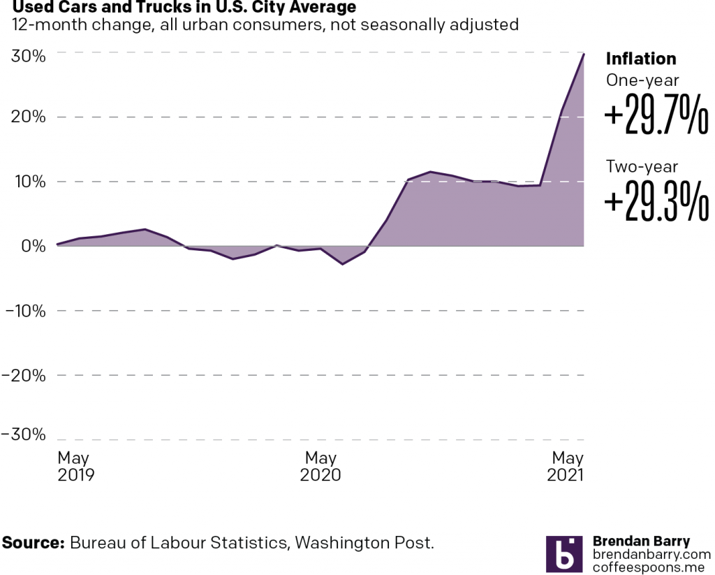
Last week, the Washington Post had an article examining the cause of inflation for a number of industries. To do so, it used some charts looking at prices over the past two years. This screenshot is from the used car section.
Going up…
I want to focus on the design of this graphic, though, not the content. The designers’ goal appears to be contrasting the inflation over the last year to that of the last two years. Easy peasy. Red represents one-year inflation and blue two-year.
Typically when you see a chart that look like this, an area or filled line chart, the coloured area reflects the total value of the thing being measured. You can also use the colour to make positive/negative values clearer. In this case, neither of those things are happening.
Because the blue, for example, starts at the beginning of the time series and at the bottom of the chart, it looks like an enormous amount of consistent blue growth. And when the line runs into May 2020, we begin to see what appears as a stacked area chart, with the blue area increasing at the expense of the red.
Another way of reading it could be that the 29.7% and 29.3% increases equal the shaded areas, but that’s also problematic. If the shaded area locked to the baseline like you’ll see in a moment, I could maybe see that working, but at this point it just leaves me confused.
Now you can use the area fill to make it clear when a line dips above or below the baseline, in this case 0%. And I took that approach when I reimagined the chart as seen below.
The earlier chart, reimagined
What we do here is we set the bottom of the area fill to the baseline. Consequently, where the chart is filled above 0 we have positive inflation, and where it falls below the 0 line we have negative inflation, or deflation.
We need to note here that the text in the original article talks about the monthly change in inflation, e.g. that used car prices have increased by 7.3% last month. That, however, is not what the chart looks at. Instead, the chart shows the change yearly, in other words, prices now vs last May. To an extent, the 29.7% increase is not terribly surprising given how terrible the recession was.
Ultimately, I don’t see the value in the filled blue and red areas of the chart because I am left more confused. Does the reader need to see how far back one year and two years are from May 2021? Don’t the date labels do that sufficiently well?
This is just a weird article that left me scratching my head at the graphics. But read the text, it’s super informative about the content. I just wish a bit more work went into the graphics. There are some nice illustrations beginning each section, but I kind of feel that more time was spent on the illustrations than the charts.
Credit for the piece goes to Abha Bhattarai and Alyssa Fowers.