The Disappearing Urban Middle Class

Today we look at income in American cities and in particular the middle class disappearance. The Guardian published the graphics, but they originate with Metrocosm, LTDB at Brown, and IPUMS National Historical Geographic Information System. So what are we looking at? Well, the big one is a set of small multiples of cities and their income breakdowns as percentages of city census tracts. This screenshot is static, but the original is an animated .gif.

The flattening of the curve

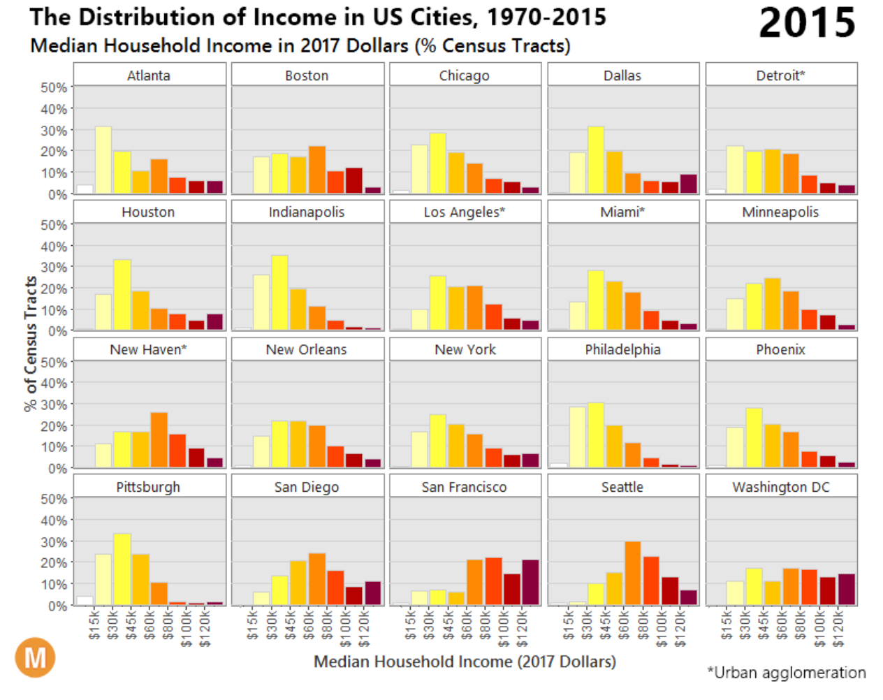
I have a few issues with the design of the graphic, the most important of which is the colour palette. If the goal is to focus on the decline of the middle class—and I admit that may be the point of the Guardian’s authors and not the original authors—why are the most visually striking colours at the top of the income distribution. Instead, you would want to draw attention to the middle of each chart, not the right. And if the idea was that the darker colours represent the higher income groups, well the positioning of each bar on the chart and the axis labelling does that already. After all, if anything, the story is that in a number of cities the middle class has shrunk while the lower income groups have grown. And you can barely see that with the lower income groups coloured yellow.

My other issues are more minor design things such as the city labelling. I kept reading the label as being below the bars, not above as it actually is.

And then I wonder if a different chart form would be more effective at showing the decline in the middle class. Perhaps a line chart plotting the beginning and end points for each cohort?

Then the piece gets into some three-dimensional maps that you can spin and rotate.

Just stop
Just stop

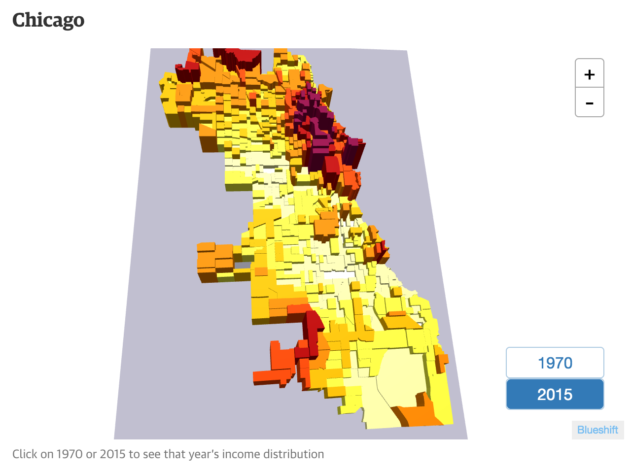
Yeah. Shall I count the ways? A more conventional choropleth would have served the purpose far more effectively. The dimensionality hides lower income tracts behind higher ones. The solution? Allow the user to rotate and spin the map? No, get rid of the dimensionality. It offers little to the understanding of the underlying data. Not to mention, are the areas of shadows shadows? Or are they another bin or cohort of income?

And then you have to read the piece to get a fuller understanding of my criticism.

But don’t worry, I can quote it.

Chicago was largely successful transitioning away from manufacturing to a service-based economy. This shift is evident in the bifurcated pattern present in 2015 – a heavy concentration of wealth in the business/financial district and marked decline in the surrounding area.

Those of you who read this blog from Chicago or who have lived in Chicago will pick up on it. The rest of you not so much. The concentration of wealth is not located in the business/financial district. Those dark red skyscrapers are not actual skyscrapers, they are census tracts located not in the financial district, but the areas of River North, Old Town, Gold Coast, &c. Thinking of the issue more logically, yes incomes are up in cities that are doing well. But how many of those very wealthy live on the same block as their office? Not many. Your higher income is going to be concentrated in residential or mixed-residential neighbourhoods near, but not in the business/financial district.

The data behind this work fascinates me. I just wish the final graphics had been designed with a bit more consideration for the data and the stories therein. And a little bit of proper understanding of the cities and their geography would help the text.

Credit for the piece goes to Metrocosm, LTDB at Brown University, and IPUMS National Historical Geographic Information System.

The US Census Bureau

There is no graphic today. Why? Because I want to illustrate a point that a lot of the work I and others in the information design world depends upon data. After all it puts the data in data visualisation. But yesterday the director of the US Census Bureau resigned because the Trump administration would not meet the Census Bureau’s funding request for conducting the 2020 Census.

And that matters. Yeah, it will be bittersweet to know that Philadelphia has probably slipped behind Phoenix, but the Census and the Census Bureau do so much more than that. They collect and publish data on income, health, housing, trade, and more. And that broad and deep set of data is invaluable.

These days we joke a lot—and I count myself in that we—about alternative facts. But all kidding aside, facts matter because they should underpin any debate we can have about policy. Do you want to have a debate about immigration, well before one goes out and makes wild statements and suppositions, government statistical agencies can provide cold, hard facts about actual levels of immigration. Once we know the scale and scope of the real problem we can begin to design real solutions.

If we want to elevate our society’s discourse and move away from divisive conversations and accusations, we need to establish a common baseline around which we can debate. And observable, provable data points provide just that. If we remove those data points, we will continue to just talk past each other and into our own echo chambers.

Consequently our first step should be properly funding the US Census.

The Typography of Dubai

Information design takes many forms. True, in this blog I focus mostly on graphics, but signage is another important form. And the keys to signage are iconography and typography. So today we are going to take a look at some news in the typography front. Specifically, the introduction of a new typeface for Dubai designed by Nadine Chahine and Microsoft.

The uppercase
The uppercase

First, I am no expert in type design, but I dabble. Second, note that the above screenshot with its white type on black screen, each letter surrounded by keyboard shapes, is the only graphic on the website that I could easily find for a spec sheet.

The typeface does appear to have some nice letters in there and from the site it clearly reads well at small sizes. But that’s the Latin version. The real beauty in the thing is the simultaneous design of the Arabic script side of the face.

I am no expert in type design, but I do have experience setting type in Arabic as well as choosing an Arabic face for brand identity. It is really, really hard. (For the record, I found a really nice version of Avenir Next turned into Arabic.) So what I really like about this project is that it makes a nice typeface in both Latin and Arabic available to the public for free via Microsoft. Great, fantastic.

But where I get suspicious is that second point. That one graphic is the only one I could find. The site copy really pushes Dubai, Dubai, Dubai. And my cynical self wonders if the real purpose was to promote the emirate by throwing some money at design, which it can do because it has a lot of money.

Or to look at it another way, if it were not so Dubai-promotional, would it not have examples of it in use? A full character set on display?

But why am I most doubtful? Well, it does not take more than the first handful of results on the Google to bring up some less than stellar things about Dubai. What do I mean? Well, first look at the first two sentences on the Dubai Font page:

Expression is the way everyone shares their thoughts, ideas, and emotions. Writing is a form of expressing oneself and Dubai is giving the world a new tool to communicate with.

And now snippets from the first three results that are not Wikipedia (worth pointing out that Dubai is part of the United Arab Emirates and these reports are on that country as a whole):

International Centre for Justice and Human Rights

United Arab Emirates is a federal state comprising seven emirates, including Abu Dhabi and Dubai. The UAE nationals represent 11.5% of the population who number 8.5 million people. The country has seen a wave of arrests and violations of human rights and freedoms and mute the voices of dissent. The authorities are continuously and increasingly, restricting personal freedoms and freedom of speech, press, assembly and association. As practiced blatant attacks on the privacy of citizens.

Amnesty International

The authorities continued to arbitrarily restrict the rights to freedom of expression and association, detaining and prosecuting government critics, opponents and foreign nationals under criminal defamation and anti-terrorism laws. Enforced disappearances, unfair trials and torture and other ill-treatment of detainees remained common. Scores of people sentenced after unfair trials in previous years remained in prison; they included prisoners of conscience. Women continued to be discriminated against in law and in practice. Migrant workers faced exploitation and abuse. The courts continued to impose death sentences; no executions were reported.

Freedom House

While the United Arab Emirates (UAE) constitution provides for freedom of speech, the government uses its judicial, legislative, and executive powers to limit this right in practice.

True freedom of expression from Dubai should not and is not about designing a new typeface, but honouring the actual idea of freedom of expression. That is to say that I may say things that you do not like and vice versa.

Designing a new typeface that works in both Latin and Arabic? Well one, where were you like eight years ago? But of almost as much importance, a clean, Dutch-inspired typeface is not going to wipe your slate clean and prevent you from ever visiting the Hague. Actions speak louder than the typeface in which you set your words, whether they’re Arabic or Latin.

Credit for the piece goes to Nadine Chahine and Microsoft, designers of the typeface.

When France Is More Than France

Yesterday we looked at the result of, but today I want to talk about covering of the French presidential election. It dovetails nicely with a recent story here in the states about Hawaii.

Last week Attorney General Jeff Sessions criticised a court ruling because it came from a judge “on some island in the Pacific”. That island, of course, is Oahu. Oahu is one of several islands that comprise the state of Hawaii, including the eponymous island. But it does not matter that the state is in the middle of the Pacific Ocean, it is one of the fifty states of the union. And in terms of population, it isn’t even the smallest state. Should we not care about court decisions in Wyoming because so few people live there? No, because it is one of the fifty states.

Where Hawaii falls within the 50 states

Now you are likely asking, what does that have to do with the French presidential election? Well, it has to do with choropleth maps of French results. Well, most likely you were not looking at a map of the French Republic. Take this map from the New York Times.

Here be France
Here be France

It looks like France, but it’s only a part of France. Instead, we have France 24 presenting the map correctly. The thing missing? All those little geographies around the border.

The real France
The real France

You may recall that France at one point had an empire. At home, France was organised into state-like entities called departments. By contrast, the United Kingdom had an empire with its home territories organised into counties. Then in the 20th century, both empires began to dissolve. In the UK that meant independence for most places, but others transitioned from colonies to crown dependencies, e.g. Gibraltar and until 1997 Hong Kong. But technically, they are not part of the United Kingdom. (Don’t get me started on the Isle of Man, Jersey, and Guernsey.)

In France, there were some conflicts—here’s looking at you French Indochina/Vietnam—and some independence. But for those that did gain independence, the territories took a different track from the crown dependences in the UK. France integrated them into the French Republic and made them full-on departments. (It is a little bit more complicated than that, but for now we’ll keep it simple.) So now, if you visit Canada and take a day trip to St. Pierre and Miquelon, you are stepping on France. This is also different from Puerto Rico and the United States, where Puerto Rico is not fully part of the United States.

And so what does this mean for electoral purposes? Well, as you have probably figured out, this all means that French elections are geographically broader than those of the UK or the US. Gibraltar does not vote for Parliament and so you will not see it on the June election maps. In 2016, notice how you did not see Puerto Rico in the US presidential election maps. But because of how France integrated its former colonies as departments, Cayenne, French Guiana gets as much of a say on the French president as does Paris.

So remember, next time you look at a map of France on Europe, it’s like looking at a map of the United States without Alaska and Hawaii. Because France too exists on an island in the Pacific. It’s called New Caledonia.

I’m Wondering Where France Really Is

Today’s post is not so much about a graphic per se, instead I read an article in the Guardian about how Boston’s public school system has decided to switch from the Mercator map projection system to the Gall-Peters projection system.

The article is worth a read if only for the embedded clip of the episode of the West Wing where they talk about the Gall-Peters. But for those of you not familiar with map projection systems, the problem is it is impossible to perfectly reproduce a three-dimensional spheroid onto a two-dimensional flat plane. Some maps sacrifice proportions for straight lines, others sacrifice shape for area, and so on and so forth.

Seriously, where is France?

Credit for the map image goes to Alamy Stock Photo via the Guardian.

Declining British Wages

Now for the actual piece for today.

We have a scatterplot from the Financial Times that looks at wage and economic growth across the OECD, focusing on the exception that is the United Kingdom. And that is not an exception in the good sense.

The UK had the rare privilege of experiencing economic growth—that’s good—while simultaneously wages fell—that’s bad. But I wanted to comment on the chart today.

I would have designed this a little bit differently

Straight off the bat, the salmon-coloured background does not bother me. That is FT’s brand and best to stick to it and make your graphics work around it. Possibly the colours in the plot could use a bit of a push to increase separation, but that is more a design quibble. Instead, I am not too keen on the colour coding here.

Not that the colours need not be applied, but why to the dots? Note how the dots of a colour fall into one of the quadrants. Instead of having people refer to the legend, incorporate the legend into the chart by moving the labels to the plot background. You could colour code the labelling or even colour the quadrants to make it a bit clearer.

Credit for the piece goes to the Financial Times graphics department.

Snowfall in Philadelphia

Today, 9 February, it finally snowed significantly here in Philadelphia. In Chicago it probably snowed shortly after I moved out in September. Today’s graphic is a forecast map from philly.com using National Weather Service (NWS) data.

Snowfall in Philadelphia

I fail to understand the divergent palette—to be fair this is not the only instance of it throughout the meteorological world. There is a split at the six-inch mark—but why? If anything, my eye would think that the 4–6 range is the heaviest, not the yellow. Snowfall is usually more of a continuous range, and so both within the blues and yellows you get that through a softer edge as the colours become more intense. And then you hit the six-inch mark and a violent shift.

I am also curious as to why the choice to use a coloured map background. Especially if the colour, a lightish green-blue is so close to the lightish blue used by the map to forecast snowfall.

In short, I think this Philadelphia map could use some attention from some designers to make the message a bit clearer.

Credit for the piece goes to the philly.com graphics department.

Hans Rosling Has Died

It’s easy to miss the news these days. But as a designer who does a lot of work—and writes a blog about—data visualisation and information design, I was fortunate to catch the word that Hans Rosling died. You might know him best from his TED talks, but I became familiar with him through his Gapminder project.

Mind the gap, please.

Do I agree with the design decisions? Of course not, just ask anyone who has asked me anything about bubble charts. But that is not the point. He and others laid the groundwork for myself and those newer to the field to work on the presentation of data, and its integration into analysis.

Unfortunately his death comes at a time when the field of data visualisation comes under threat. Not from the Chinese stealing our jobs, or robots doing them better for cheaper, but from those who assail the veracity of data and fact itself.

It’s easy to joke about alternative facts and alternative data—I do it on an almost daily basis now. But, as Rosling knew that accepting facts, even if unpleasant or challenging to your view on things, was critical to public discourse. To quote from Claire Provost of the Guardian, who interviewed him in 2013:

“Rosling stood for the exact opposite – the idea we can have debates about what could or should be done, but that facts and an open mind are needed before informed discussions can begin.”

Hans Rosling, dead at the age of 68.

Credit for the piece goes to Hans Rosling.

Diversity in the 115th Congress

Well, we have arrived at 2017. We all know the big political story in the executive branch. But we also saw elections in the legislative branch. But how different will the 115th Congress look from the 114th? The Wall Street Journal took a look at that in an article.

Congressional diversity

The article’s graphic does a nice job showing the two different compositions. But if we are truly interested in the growth, we could use a line chart to better showcase the data. So what did I do last night? I made that chart. But as I was playing with the data I saw some numbers that stood out for me. So I compared the proportion of minorities in the original graphic to their proportion of the US national population, per Census Bureau data.

Redesigning the original graphic

The line charts, broken out into the House vs. the Senate and then into the two parties, do a really good job of showing how the growth is not equally distributed between the two parties. And the reverse of that is that it shows how one party has failed to diversify between the two congresses.

The 115th Congress might be more diverse than ever. But it has a long way to go.

Credit for the original piece goes to the Wall Street Journal graphics department.

How Healthy Is It?

Happy Friday after the election. Now that we have had our fill on sweets and bitters, we probably need to move towards a more balanced, more moderate diet. A couple of months ago the New York Times put together this scatter plot from the difference between public and nutritionist opinion on whether certain common foods are healthy.

I normally do not comment on the design of my Friday posts, since I intend them to be on the lighter, more humourous side of things. But this piece interests me, because despite the seriousness of the subject matter I find it lighter and less serious. Why? After studying it, I think it is because of the inclusion of photographs of the items. With the labels still present, I am left thinking that a small dot would be equally effective in communicating what falls where.

In general, try to be in the upper right

But more importantly, look at the sizes of the images relative to the plot. Take the bowls of granola or popcorn, for example. They occupy almost an entire square; the actual value could be anywhere with the 10 percentage point range either vertically or horizontally. And for those two, it does not matter a great deal. Each falls firmly on one side of the line. But what about butter? Kind bars? Cheddar cheese? The large graphic size straddles the line, but because the designers opted for photos over more precise dots, we cannot ascertain whether these foods fall on one side of the line or the other.

The point is that the graphics and design of a piece can influence the perceived seriousness of a piece. An image of a can of Coca-Cola certainly can be more engaging than a 10-pixel dot. But the precision of the dot over the image can also be engaging to the right audience, an audience interested in the data behind the story. There are ways of integrating both, because later on in the same article, we see a means of doing just that.

The image lives on the left of the table

Here the image provides supplemental information. Just what does a granola bar look like? Well here you can see it. But even here, despite the smaller size and cropped dimensions, the photographs steal a bit of emphasis from the numbers and the charts to the right. (For things like SlimFast, that is no surprise, because the package is designed to capture your attention.)

At the end of the day, the piece interests me because the data interests me. And the story interests me. And I generally like the data visualisation forms the designers chose. But I keep getting hung up the photographs. And not in a good way. What do you think? Do the photos add to the story? Do they make the data clearer?

Credit for the piece goes to Kevin Quealy and Margot Sanger-Katz.