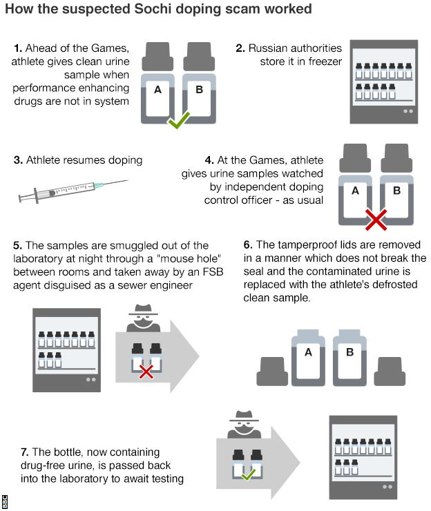
I mean really, given the rampant and pervasive nature of the Russian state-aided doping programme, how could I not use the Russian reversal? Yesterday WADA, the international anti-doping agency, released its findings on Russian doping at the Olympics. And, suffice it to say, the report is rather damning. The BBC published this graphic in an article to help demonstrate the scheme.
How it all worked
Unlike the evidence of doping, I find the graphic itself lacking. More could have been done to create more consistent type. Text justification ranges (pun intended) from left to right, without any clear system. Why do some stages, e.g. four, align to the right and then others, e.g. seven, align to the left?
Also, I believe more could have been done with the illustrations, in particular the bottles labelled A and B, to better differentiate between a clean sample and a contaminated sample. Why, for instance, does Step 1 include both an A and a B when it mentions only one sample?
In short, the story certainly warrants explanatory graphics, especially as to how the sealed lids were removed, but this piece is not the solution (pun also intended).
Credit for the piece goes to the BBC graphics department.
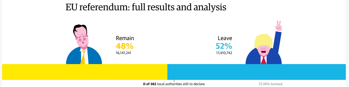
Last one of these critiques—I promise. Earlier this week I looked at the New York Times’ coverage and the BBC’s coverage. Well, today I want to examine the Guardian’s coverage of the Brexit vote results. This piece differs the most from the preceding work and it starts right from the top, literally.
The faces of the campaigns
I am not the biggest fan of the illustrations of David Cameron and Boris Johnson, but in a sense, neither is a throw-in. For the last few months, the Guardian has been using these and similar illustrations of US presidential candidates to tie results into different political camps. Thus in that sense, they do fit the Guardian’s current brand. Interestingly, neither remains (pun intended) in the picture for the future of the Tories.
Data-wise, however, the decision to use the bar chart at the outset of the piece reflects an understanding of the importance of the top-line number. Districts count, but only at that granular level I discussed. What truly matter, though, is the aggregate. And this is a no-doubt-about-it means of conveying that information. (I will admit the David Cameron frowny face does help a wee bit.)
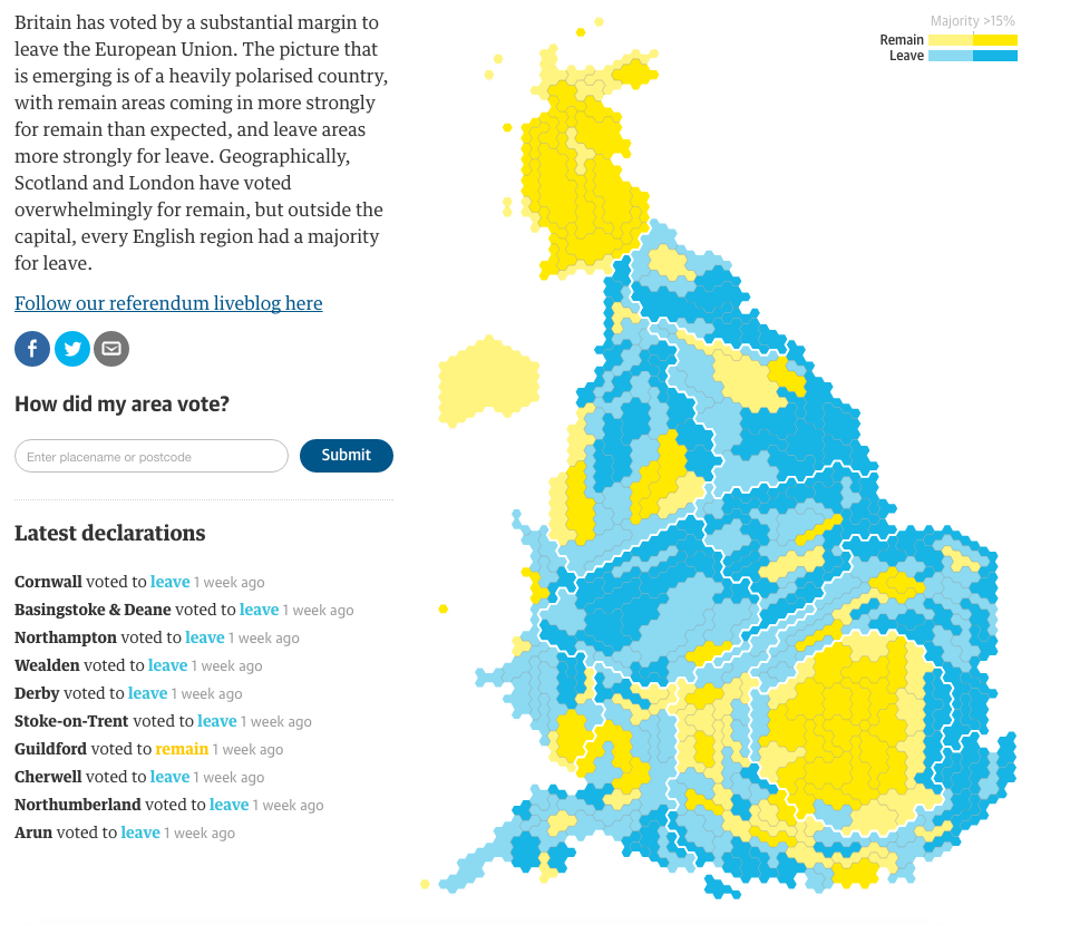
And if the use of big numbers and illustrations at the top of the piece broke with the choropleth map we saw with the New York Times and the BBC, well, we have another clear break.
Hexagonal representation
Instead of using a geographic map, the Guardian employs a cartogram with hexagons. I have covered similar uses a severaltimesbeforetoday. The hexagon shape allows better retention of familiar geographic shapes, while still providing a means of solving the small district problem, especially in places like central London.
From another design perspective, that of colour, we see an improvement over the blue–yellow spectrum used by the BBC. You may recall from yesterday:
Having multiple tints and shades of yellow makes the map difficult to read.
Here, the Guardian instead opted for a simplified, and easier to read, two-step split. Bright blue and yellow with each have a call it half-tint. With only two blues and, more importantly, two yellows to distinguish, the map becomes easier to read. The trade-off, the darker of the colours represents anything above a 15% majority.
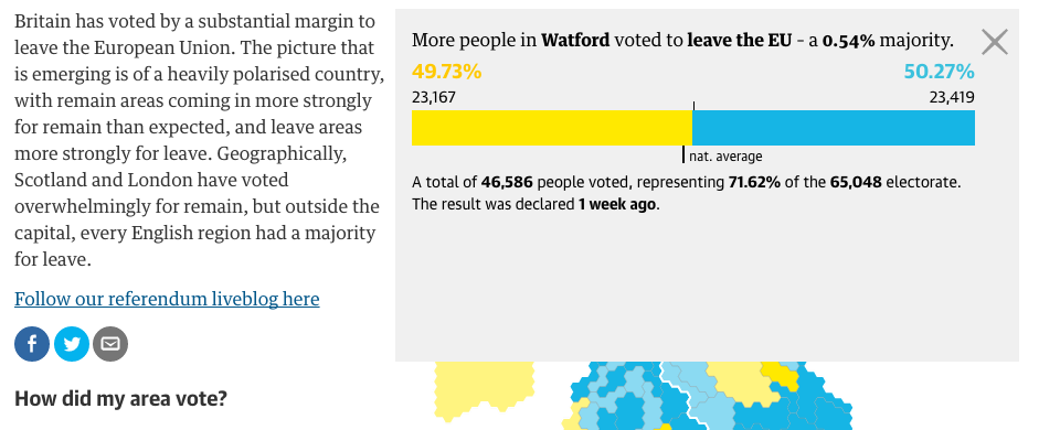
Clicking on the map then provides with a small summary of the district results.
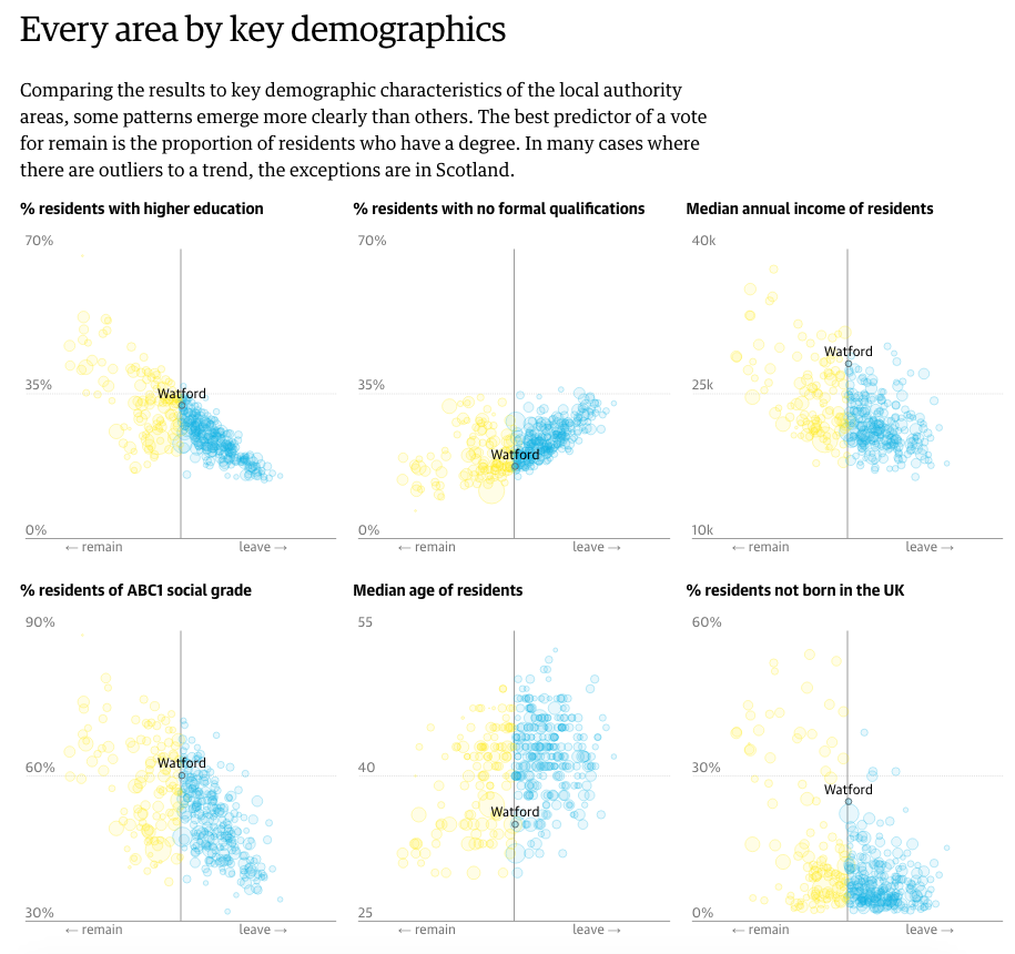
A look at Watford
Here we see nothing too dissimilar from how the BBC treated the interaction with their map. A small, subtle design element I enjoy, however, is the inclusion of the national average. The 50% marker indicates clearly which side won, but the tick below the bar gives the reader context of where the district fell into relation to the remainder of the country.
And that leads us into the next set of comparisons.
Comparisons based on demographics
The Guardian took local district results and compared them against several different demographic and socio-economic indicators. This allowed them to present various correlations of the vote. It turns out that higher education correlated best with the results of the UK vote. From a design perspective, the linked circles provides some stability. However, I would have preferred the ability to click a geography and have it remain sticky and bring up the specific figures. Additionally, some sort of text search for geographies would be helpful.
And then the Guardian’s piece closes as strongly as it opened.
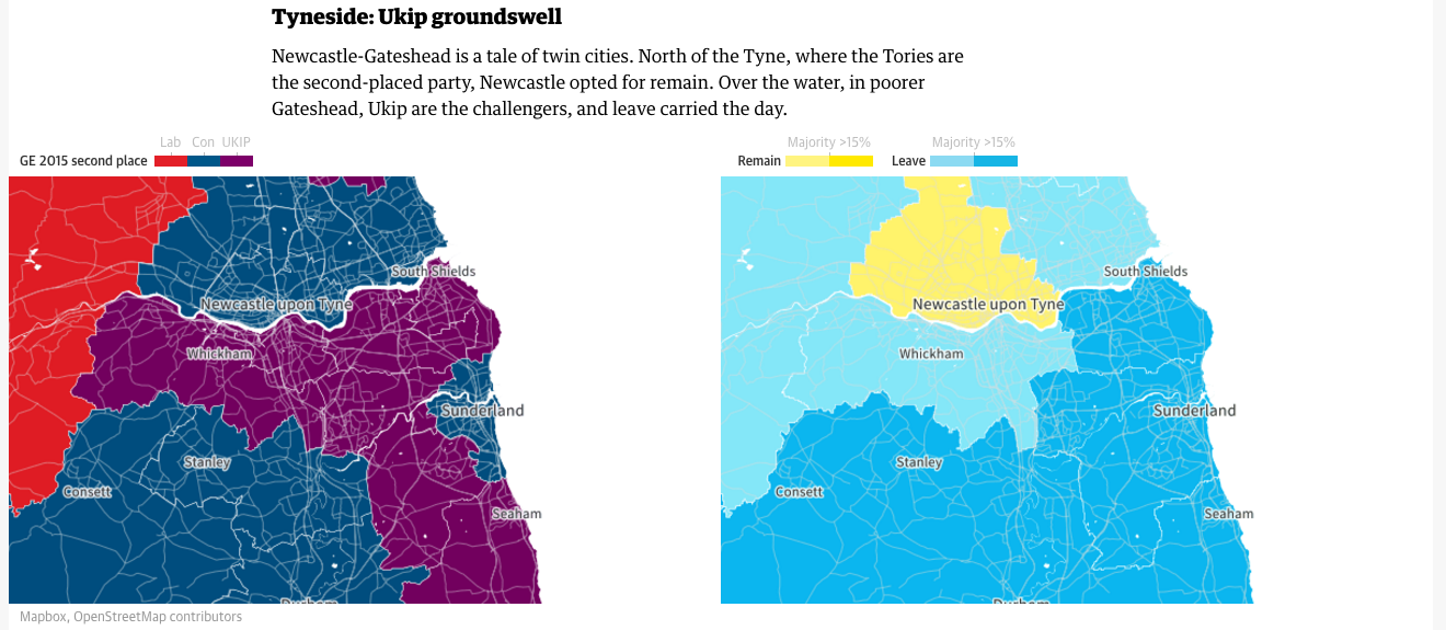
Votes along the Tyne
The piece examines three riverside areas to provide specific analysis to the vote. The screenshot above focuses on the Tyne, which runs alongside the aptly named Newcastle upon Tyne. The Guardian uses the previous general election results for the area to contrast with the referendum results. It does similar analysis for the Thames (London) and the Mersey (Liverpool).
Similar to the New York Times piece, the Guardian’s piece responds well to viewing the content on a small screen. The changes are less complex and they deal mostly with the arrangement of the various components instead of the layout of contextual data. But the Guardian clearly considered how the piece would work on a mobile phone up through a widescreen monitor.
Overall the piece is quite strong and does an excellent job of showcasing the results data and providing insightful analysis that complements the vote totals.
Credit for the piece goes to the Guardian graphics department.
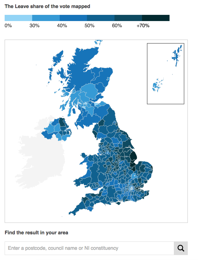
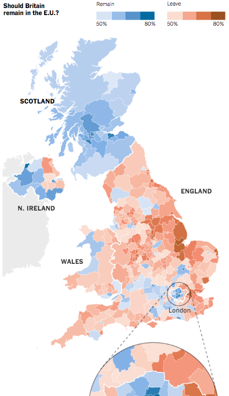
So now it is two weeks since the Brexit vote. Yesterday, I looked at the results designs from the New York Times. Today I want to take a look at those of the BBC. Not surprisingly the two share in the use of choropleth maps; the choice makes a lot of sense. People vote within districts and those form the most granular unit of data available. But, whereas the New York Times led and really focused on one giant map, the BBC opted to use multiple, smaller maps. (They did choose a different page for their live results, but we are comparing post-result coverage.) For example, their piece leads in with a map of Leave’s results share.
Leave’s share
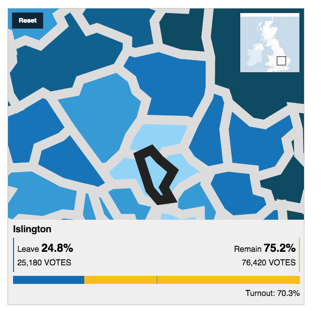
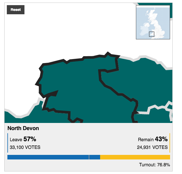
There are a few key differences between this and the New York Times. First and foremost, this map is interactive. Mousing over various districts provides you the name, and by clicking you move into a zoomed-in view of the district. It displays the district name, the vote totals and share for the two camps, and then voter turnout. From a design standpoint, the problem with the zooming in is that the scales of the outlining stroke does not change.
Zoomed in, looking at central London
A thin stroke at the national, zoomed-out view, translates to a thick, clunky, and awkward-looking outline at the local, zoomed-in view. And as the above screenshot highlights, many of the urban districts are small in comparison to the more rural districts. Unfortunately the map does not offer the functionality of zooming-in prior to selecting a district. So many of the districts in the more urban areas like London, Manchester, Birmingham, and Belfast are difficult to see and select. Thankfully, below the map the BBC offers a function to type in your district, post code, or Northern Irish constituency to help you find smaller districts.
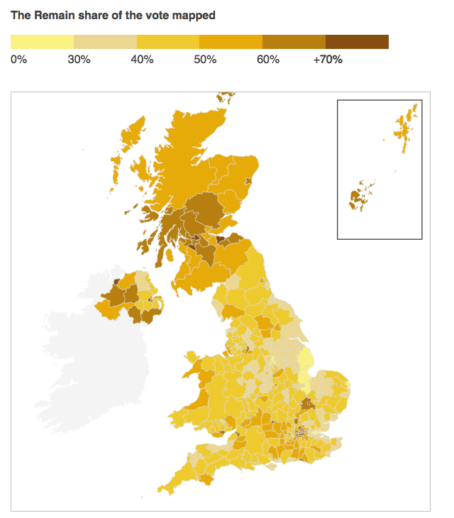
Another design criticism I have with the piece is the colour palette. Broadly speaking, the piece uses blue and yellow. The two colours make sense in a few ways. Both are present on the European Union flag, with yellow stars on a blue field. (Importantly the twelve stars do not represent EU members like the US flag’s fifty stars represent the states.) Another, far looser interpretation could be the blue of the Conservatives and the yellow closer to the gold of the UK’s Liberal Democrats, the former broadly anti-EU and the latter pro-EU. Regardless of the rationale, the choice of yellow to display multiple levels of data is less than stellar (pun intended), as this Remain share map highlights.
Remain’s share
Having multiple tints and shades of yellow makes the map difficult to read. The lowest value yellow is brighter than the next higher level, and so stands out more vividly on the map than those districts that had a higher share of Remain votes. Using yellow against blue does work, especially in the bar charts throughout the piece and seen in the aforementioned Islington screenshot. But, as a colour for wider, more intense use, yellow was not the wisest decision.
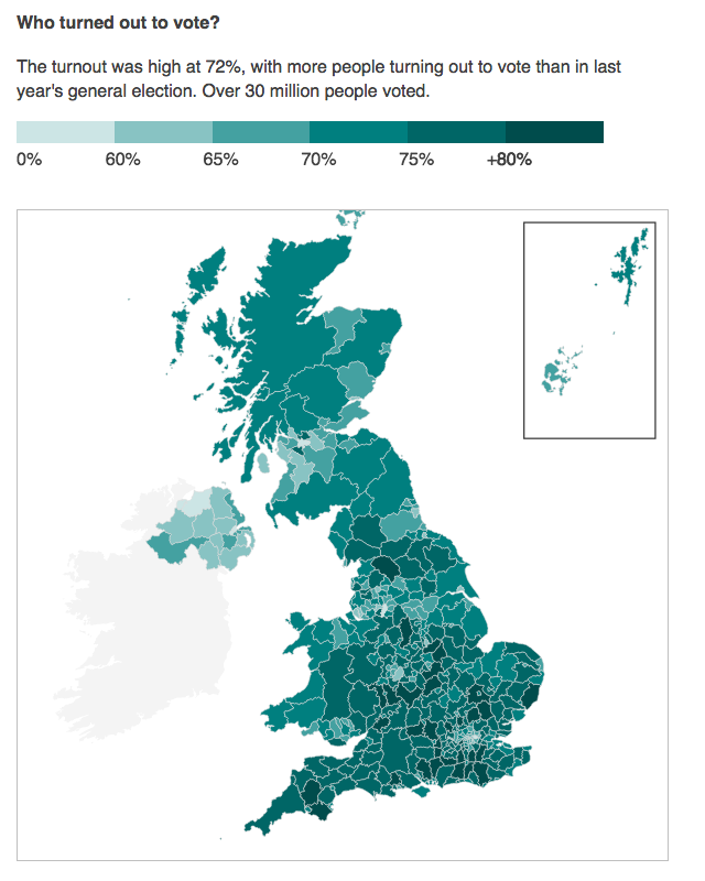
The BBC also included several other choropleth maps exploring the vote breakdown. In this instance of voter turnout, we have the same choropleth map, but a green colour indicating the total vote turnout.
Voter turnout
The colour and its choice makes broad sense; green is what one gets when they mix yellow and blue, when you combine Remain and Leave. However, the map functionality of clicking to reveal results still shows the overall results.
Should the vote results be given the highest priority?
At this point, we have moved on from the vote results themselves to the breakdown of the vote. I would have redesigned the mouse-click to display a results view that highlighted turnout over the results themselves. Certainly keeping the results is important, but the focus of this map is not the vote, but the turnout. The data display should be designed to keep that consistent.
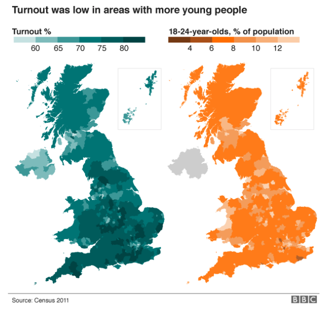
One part of the piece where I quibble with the designer selection of chart type follows on from turnout: a comparison of turnout to the youth population.
The turnout vs the youth
Asking people to compare undistinguished districts on one map to those of another—note the white district lines have here disappeared—is difficult. My first thought: I would have instead opted for an interactive scatterplot. Comparing the turnout on one axis and youth on the other, the user would have an easier time identifying any correlations or clusters of data.
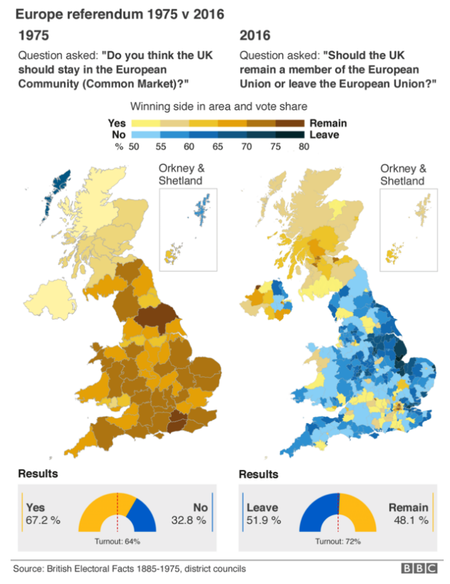
In contrast, the following map comparison would not work via a scatterplot. Here we compare June’s results to those of a vote in 1975. In the intervening years, the geography of the voting districts changed, and so a one-to-one comparison is impossible.
1975 vs. 2016
The broad scope, however, is clear. A resounding vote to stay part of the European Market or single market in 1975 evolved into a narrow but decisive vote to leave the European Union in 2016.
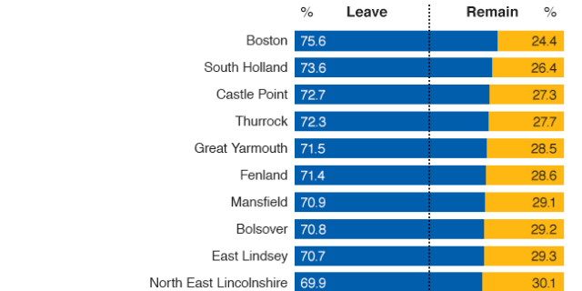
The piece then closes out with an interactive map of the total results and then, importantly, a long list of bar charts showing each district’s results. Unlike the map, however, the bar charts are a static graphic. And with a few hundred to view, it becomes difficult to isolate and compare two in particular. But the selection of the visualisation type makes a user’s comparison far more precise.
The results as a series of bar charts
Overall, I would rate the piece a solid work, but with some clear areas of improvement. And who knows? Maybe there will be a second referendum. Or a new general election. And in that case, the BBC could improve upon the designs herein.
Credit for the piece goes to the BBC graphics department.
Well a little under two weeks later and here we are: Brexit. I wanted to take a moment in a slightly longer piece and comment on it. Not the results, because no, that I can leave to a pint at the pub. Instead I wanted to comment on this particular results content from the New York Times that I rather admire.
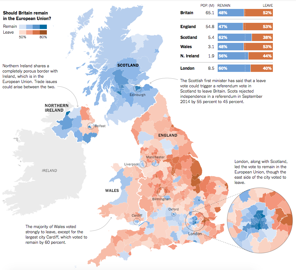
Overall the piece is not interactive; it features a static choropleth map with annotations and insets, particularly of greater London. On a side note, I would be remiss if I did not point out that similarly to the piece I wrote last week, this map omits a voting district: Gibraltar. Gibraltar, like Northern Ireland, borders the European Union directly via Spain. And despite voting overwhelmingly to remain in the EU, Gibraltar is omitted from these results.
The large format results
In a large layout, the piece makes excellent use of annotation text to indicate the overview stories for the home nations of the United Kingdom: Scotland, Wales, and Northern Ireland. Northern Ireland, of course, will likely have to deal with the reintegration of border controls between the Republic of Ireland and Northern Ireland, a point the piece makes quite clear.
Additionally the map makes use of small elements to draw attention to data points, i.e. geographies, worth noting. London dominates the urban landscape, but other important cities like Belfast, Manchester, Birmingham are circled to show the strength of Leave/Remain. I would be curious to know the rationale behind including some areas, but omitting others, e.g. the strong Remain results in Cambridge or Brighton or the strong Leave results in Boston, require knowing just where cities are located in England.
From a design standpoint, the colours used in the map work really well together in contrast to other palette choices one could make. (We will take a look at that tomorrow.) Additionally, the shape of the United Kingdom allows for contextual elements, e.g. the regional result aggregates, to be placed much closer and nearer to the results. The space also allows for those annotations to be placed near their particular geographies.
But, what makes the piece stand out is when the user consumes it on smaller screens. On a more tablet-sized screen, we see a tweaked layout.
The results on a medium-sized screen
It makes use of the remaining wide-aspect dimensions to move the greater London results into a white space carved out by the peninsula of East Anglia. While the city and home nation labels remain, the regional annotations and results are gone from the graphic. Instead, they have been placed below the map, the main and most important part of the story.
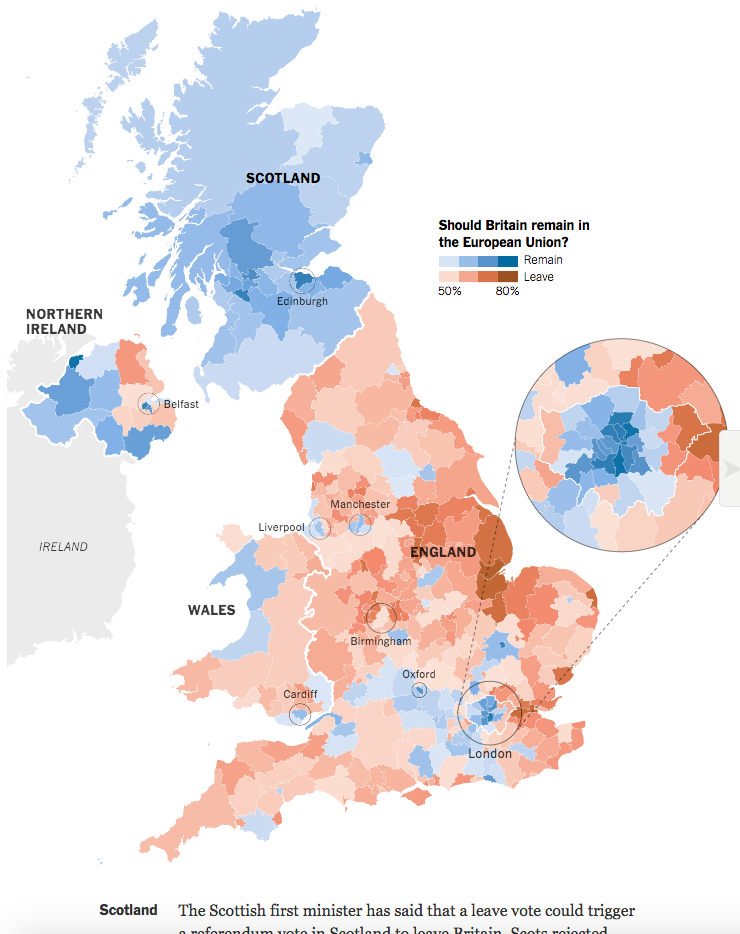
Then for mobile phone or other narrow displays, the piece degrades even further.
The results on a narrow screen
City labels and circles are gone, with the exception of London. The greater London inset moves from alongside the map to now below the map, in the Channel so to speak. This layout allows for a narrow screen to better view the geographic results and then scroll down into the districts of London that require more space to be displayed. The annotations and stories remain below the graphic.
The design of the overall piece accounts nicely for at least three different screen sizes while keeping the story constant. All the truly changes is the layout of the graphic (and the loss of a few contextual labels at the smallest of sizes). Overall, it makes for a rich and compelling—and well designed—piece on the Brexit results.
Credit for the piece goes to Gregor Aisch, Adam Pearce, and Karl Russell.
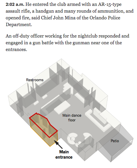
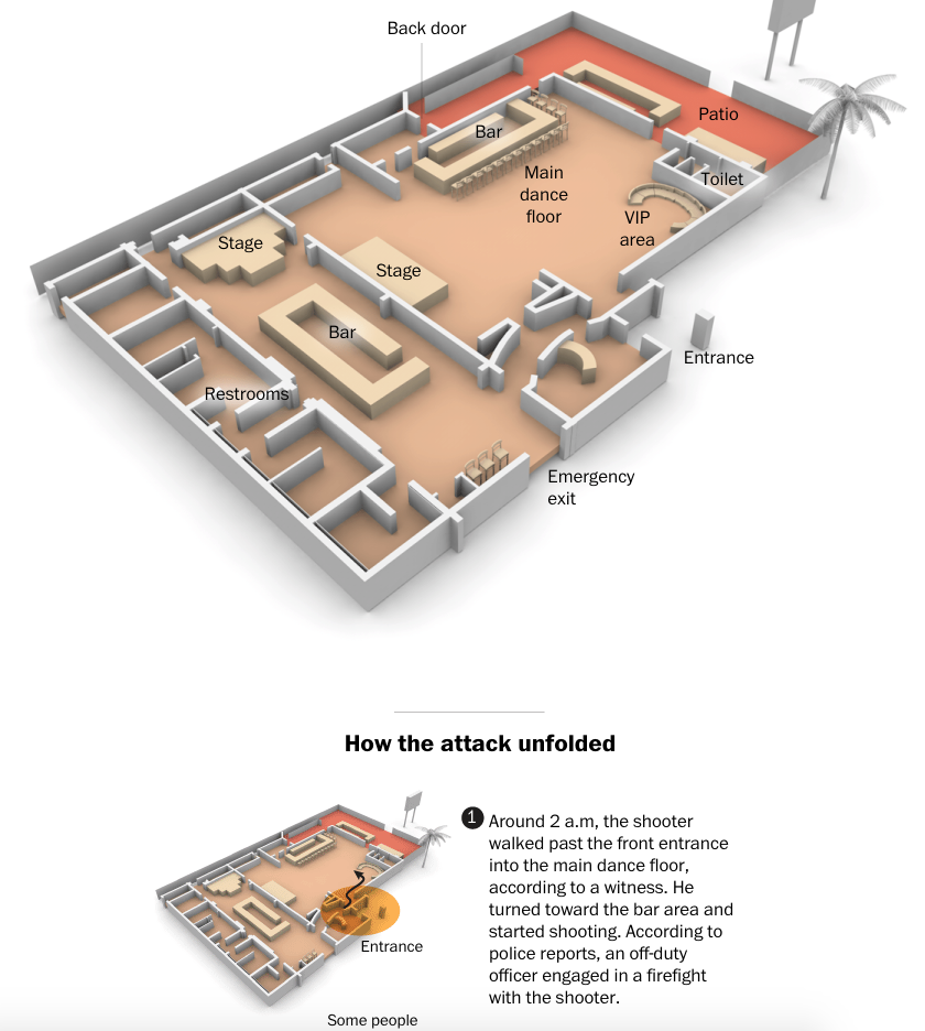
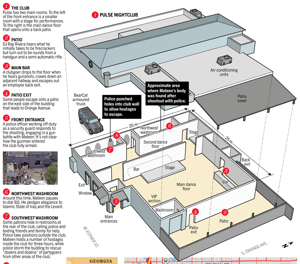
Last Monday I stated that I would attempt a longer piece on the graphics explaining the shootings in Orlando. Since I do not have access to the print versions, I am examining only the digital versions here. Go grab a cup of tea, because this is certainly one of my longer pieces.
One of the most common ways sites covered the story was through maps of the club, Pulse. It makes a lot of sense—if we want to understand what happened inside the building we need to be able to place ourselves inside the building. So how to do that?
The first thought would be photography. But, the site is a crime scene likely riddled with bullets and stained with blood. Probably not the best thing for publications to use. So we are left with illustrations of the interior. But what level of detail do readers need to understand the story?
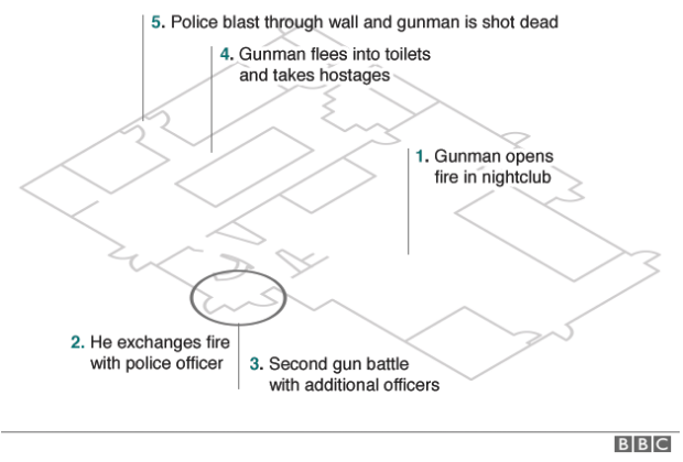
At the one end of the spectrum we have the stripped-down and simplified graphic from the BBC.
The BBC’s layout
In many respects this could offer the clearest explanation. Unlike the next versions, we have no graphical elements with which to confuse and clutter the drawing. Walls are omitted for a far more architectural layout. Doors are clearly marked, but that is it. We have no indication of where other key places are located. Where are the restrooms into which the attacker fled with hostages? Where are the dance floors? Where is the patio through which people escaped? We get some indication through the timeline annotations, but a lot of the detail needed to provide context is missing.
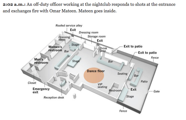
First you can see that the graphics, while smaller, are interspersed within a text-driven timeline of events. Key areas at that point in the timeline are highlighted on the graphic. For the graphic itself, the Times opts for a high-angle view with walls extending from the floor plan and the three key areas are annotated within the graphic. Colour is kept to a minimum with only whites and greys used in addition to the highlight. However, the high grey walls overlap with each other and the unidentified white boxes. What are the white boxes? Are they important? Do the walls need to be grey? Do they need to be so high that they interfere with the graphic?
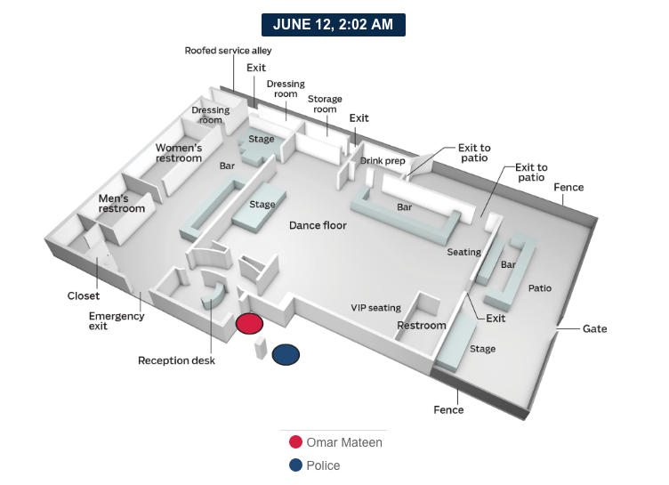
We can see some different answers to those questions from the Wall Street Journal.
The Wall Street Journal’s layout
Here the graphic is lighter in overall tone, with white and very faint greys replacing the darker tones in the New York Times’ piece. They Journal opts for the same graphics within timeline treatment. They also highlight the areas of the club relevant to the story at that moment in time. But here we first find a larger graphic. The Times could have had space limitations on their online site or they could have had to reuse graphics from their print edition for their online edition. While the Times could have very real reasons for the smaller images, the Journal’s larger graphic gives the content the space it needs to be read and understood comfortably. Also note how the use of grey vs. white for emphasis is reversed. Whereas the Times used white for unmarked boxes and grey for walls and floors, the Journal uses white for the floors and the walls. Grey is used to callout important parts of the club that are then crucially labelled, e.g. where the bars are located. Another really nice touch missing from my screenshot is how the Journal only labels the elements in the first graphic in the timeline. The second graphic only calls out the newly important elements.
The Washington Post takes a similar approach to that of the Journal.
The Washington Post’s layout
We see above the timeline a large graphic identifying the key areas of the club. The use of the small multiples in the timeline then allows the graphics to be smaller and thus accompanied by more text. But in the graphics, the Post diverges from the Journal’s direction in the graphic’s design. We find the layout depicted at a lower angle. And instead of a restrained palette, we find warm beiges and ochres depicting the floors and key elements like the bars. The shadows here begin call more attention to themselves than in the previous designs. We also find high levels of detail with the inclusion of bar stools and seat cushions. On the large graphic, the colour and detail, while distracting, still work because of the space. But in the small multiples for the timeline, a simplified version without stools and seats and a toned-down palette could make the graphic easier to understand.
And then somewhere between the approaches of the Journal and the Post we have the Los Angeles Times.
The Los Angeles Times’ layout
We return to a restrained palette with colour used sparingly to emphasise key parts of the narrative. Detail is limited to the key elements, without any illustrative adornments like furniture. Typographic distinctions, bold vs. italic, delineate the important areas of the club from the remainder of the context. Elements like service alleys, fences, and the patio gate are clearly marked and provide that context of the possible escape routes for patrons attempting to flee the attacker. The graphic then repeats through the timeline, but the subsequent graphics reflect a missed opportunity. Each remains as labelled as this first, and the labels begin to distract from understanding the narrative.
Note any similarities in this graphic to the preceding one? The Tribune Publishing Company, to be rebranded as tronc, owns both the Los Angeles Times and the Orlando Sentinel. So my guess would be the graphics departments collaborated or one of them created a shared asset to be used across the Tribune Publishing Company’s—sorry, tronc’s—media platforms. The Sentinel’s version lacks the finer design details of the LA Times’s, for example note how the typographic treatment here lacks the clearer hierarchy present in the LA Times’ version. I doubt the small type size increase would be noticed by the audience, though I could be wrong. But in terms of providing a timeline of events, the Sentinel’s version, which incorporates the above graphic as well as other media, is the most detailed and complete.
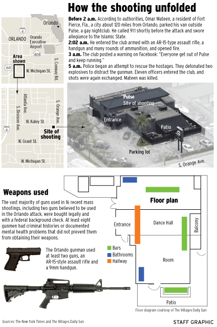
Then similar to some extents to the preceding graphics, we have a piece from the Orange County Register.
The Orange County Register’s layout
As you can likely tell from the screenshot, this is a graphic where the entire piece is designed as a large graphic file instead of components on the page. It could be because the piece was designed primarily for print and not digital consumption. The layout of the club draws heavily on the BBC’s architectural drawing concept, but here is executed far more awkwardly. Instead of including hallways in the schematic, they are indicated by coloured rectangles. And we also know from the other graphics that almost the entirety of the wall at the graphic’s top supported the club’s main bathrooms. The graphic itself is sourced from The Villages Daily Sun, but the OC Register would have been better served by sourcing a more accurate and more clearly designed graphic for the layout. I should also point out the photograph at the top of the graphic appears to have come directly from the New York Times.
Per the style of the National Post, this graphic is more illustrative in its quality than the others. Like the Orange County Register, the National Post designed an entire graphic instead of smaller components on a webpage. The timeline occupies the left column and numbers correspond to locations in the club. However, I think the graphic could have been made more clear if the roof illustration were removed and a higher angle taken to make the back of the club easier to see.
Different publications included different amounts and types of supplemental context. The Washington Post and Wall Street Journal, for example, included additional graphics on mass shootings. Others, like the New York Times, provided links to pieces that examined the context separate from the timeline of events.
Is there a best design among these? Well, design exists to solve problems, and those problems could vary from publication to publication. How soon did the graphics needed to be published? How many people worked on the design? How much information was available when producing the work? Were print considerations necessary?
For me, the Orlando Sentinel’s work, in toto, most clearly presented the narrative. While I quibble with particular elements of the design, again, I would have removed most of the text labels after their first appearance, it provides a balanced amount of detail and broad overviews in a clear fashion. Colour is used to emphasise elements in that moment. The illustration itself does not distract and allows the reader to focus on the story itself.
Credit for the pieces goes to a lot of people.
BBC: BBC graphics department
New York Times: Gregor Aisch, Larry Buchanan, Joe Burgess, Ford Fessenden, Josh Keller, K.K. Rebecca Lai, Iaryna Mykhyalyshyn, Haeyoun Park, Adam Pearce, Yuliya Parshina-Kottas, Sergio Peçanha, Anjali Singhvi, Derek Watkins, and Karen Yourish.
Wall Street Journal: Wall Street Journal graphics department
Washington Post: Weiyi Cai, Emily Chow, Chiqui Esteban, Lazaro Gamio, Chris Ingraham, Laris Karklis, Denise Lu, and Tim Meko.
Los Angeles Times: Eben McCue and Angelica Quintero.
Orlando Sentinel: Gal Tziperman Lotan, Charles Minshew, Mike Lafferty and Andrew Gibson.
Ocean County Register: Ocean County Register graphics staff
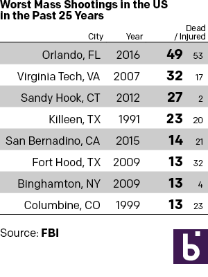
Monday I examined a chart from the BBC that in my mind needlessly added confusing visual components to what could have been a straight table. So here we take a look at some other options that could have been used to tell the same story. The first is the straight forward table approach. Here I emphasised the important number, that of those killed. I opted to de-emphasise the years and the injured in the table. Also, since the bulk of my audience is from the United States, I used the two-letter states codes.
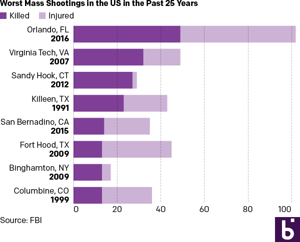
But let us presume we want a graphic because everyone wants everything to be visual and graphic. Here are two different options. The first takes the table/graphic from the BBC and converts it into a straight stacked bar chart, again with emphasis on the dead. I consolidated the list into a single column so one need not split their reading across both the horizontal and vertical.
As a stacked bar chart
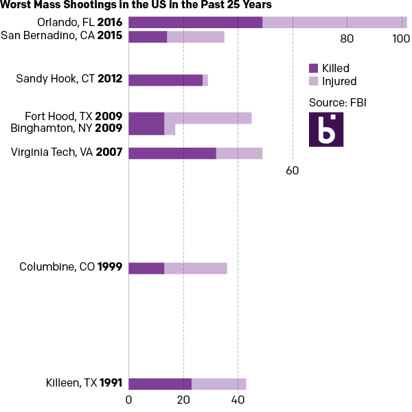
And then if you examine the dates, one can find an interesting component of the data. Of the top-eight shootings, all but two occurred within the last ten years. So the second version takes the graphic component of the stacked bars from the first and places them on a timeline.
In a timeline
For those that wonder about the additional effort needed to create three different options from one data set, I limited myself to an hour’s worth of time. A little bit of thought after examining the data set can save a lot of time when trying to design the data display.
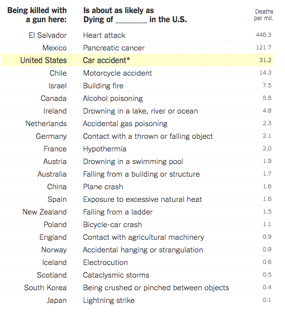
Yesterday I opined about how simple tables can convey meaningful information without the aid of unnecessary chart elements. And while we will get back to that post, I did want to take a moment to share an older piece from the New York Times I recalled and that has been updated since Orlando.
The piece uses a table to compare the gun homicide rates for various countries and compares it to other causes of death. Being killed by a gun in the Netherlands is as likely as dying by accidental gas poisoning in the United States. It puts the absurdly high gun homicide rates in the United States in a new light.
A table of death
Credit for the piece goes to Kevin Quealy and Margot Sanger-Katz.
I will be trying to do a longer piece on the data visualisations surrounding the shootings in Orlando later this week. But for starters, a simple point through this piece from the BBC—not that they are the only culprits of this. Not all data-driven stories need visualisations. Sometimes a nicely typeset table will do the job better and faster.
Green circles?
An actual table with typographic emphasis on the tables would have been better and clearer than this. Or with a little more time and effort—not that those always exist in a journalism organisation—something more appropriate to the type of data could have been designed.
Credit for the piece goes the BBC graphics department.
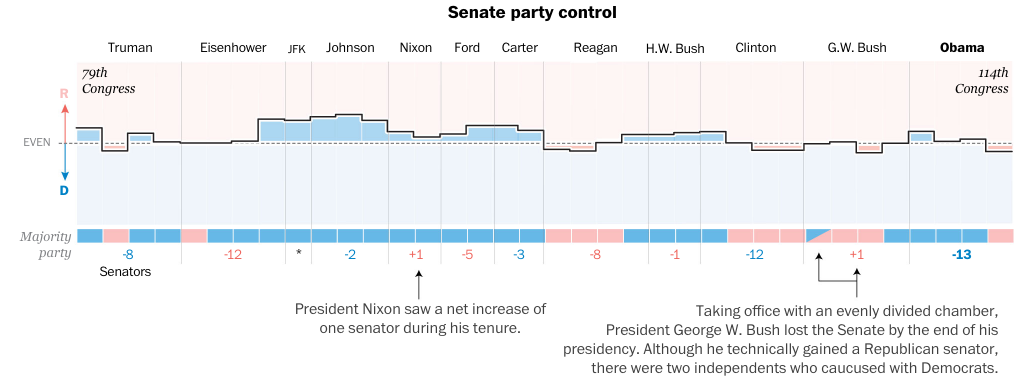
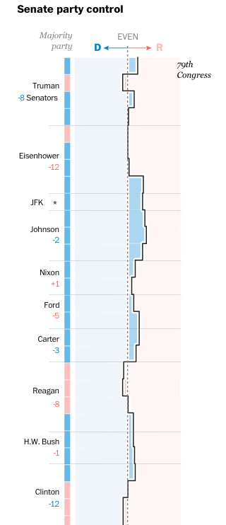
The night after the California primary—or as an East Coaster should say, the night of the New Jersey primary—we take a look at how US presidents often experience a counterbalancing political force in state, gubernatorial, House, and Senate races. The content comes from the Washington Post and it makes use of nicely annotated graphics, including the screenshot below.
How Senate control changedHow Senate control changed
What I enjoy about the piece, however, is how it responds to a narrower browser, like one might see on a mobile phone. The screenshot to the right shows how the data visualisation changes. You can see how some of the annotations disappear, like the note about Nixon’s support growing.
The same adaptation to the display occurs for the other graphics throughout the piece, with axes and orientations changing to take advantage of the more vertical orientation.
I also think it is worth pointing out that the more illustrative ornamentation of the piece, i.e. the presidential illustrations, drop off completely. I could have lived without them as they do not contribute directly to the data story. I also think the white lines on the charts above could be removed to make the narrower margins more visible on the charts.
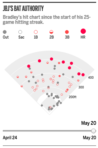
Last week Jackie Bradley Jr., the starting centerfielder for the Boston Red Sox, saw his hit-streak end at 29 games. For those of you who do not follow baseball, that means he hit the ball and reached first base safely without causing an out for 29 games in a row. Quite a feat. Anyway, because it is a feat, the story gets covered and in this case, by the Boston Globe.
They wrote several articles on Bradley and the hit streak, but this one included a small, interactive graphic that mapped out his hits. Because a streak exists over time, the component includes a slider to show how the hits have progressed.
Bradley hit to all parts of the field
Worth keeping in mind that this was merely a sidebar graphic, not a large and fully immersive piece. The piece itself features only a few tables detailing baseball data comparisons, but it exists in a new design layout from the Globe featuring bigger, glossier photographs. Not all graphics need to be the biggest element on the page. From a pacing perspective, it sometimes helps to have a small graphic placed next to the important text to provide immediate context. Speaking of context…
The graphic in the context of the page
Overall, a very nice piece.
Credit for the piece goes to the Boston Globe graphics department.