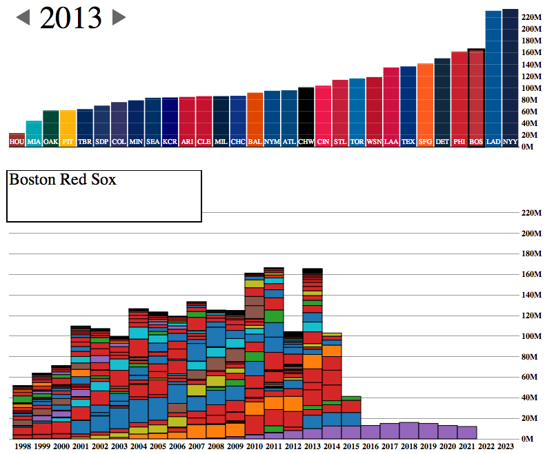
The World Series starts tomorrow night and for all but two teams, that means focusing on the upcoming 2014 roster. And rosters are often defined by payroll flexibility. A co-worker of mine forwarded along today’s interactive graphic that looks at team payrolls through stacked bar charts.
The Red Sox payroll
The design is certainly a bit clunky with heavy black outlines and garish colours. But the story told is clear, especially if you begin to look at different teams. Which teams have players locked up for the long-term and thereby have little flexibility?
The Red Sox, of course, sent most of that bar from 2011 to the Los Angeles Dodgers near the end of 2012. That allowed them to pick up the free agents like Mike Napoli, Johnny Gomes, Shane Victorino, and Koji Uehara. You know, the guys without whom the Red Sox would not have advanced to the World Series.
This small graphic is one of several from a very smart piece on redesigning the traffic map. Have you ever looked at a Google or an Apple traffic map to find the quickest route home or to get an idea of how long it will take you to get to the ballpark? According to Josh Stevens, your traffic map is lying to you.
Potential solutions
The article is a summary or overview of a research paper not-yet-published. When you have a few moments, the whole thing is worth the read for its analysis of popular transit map designs and the five big lies.
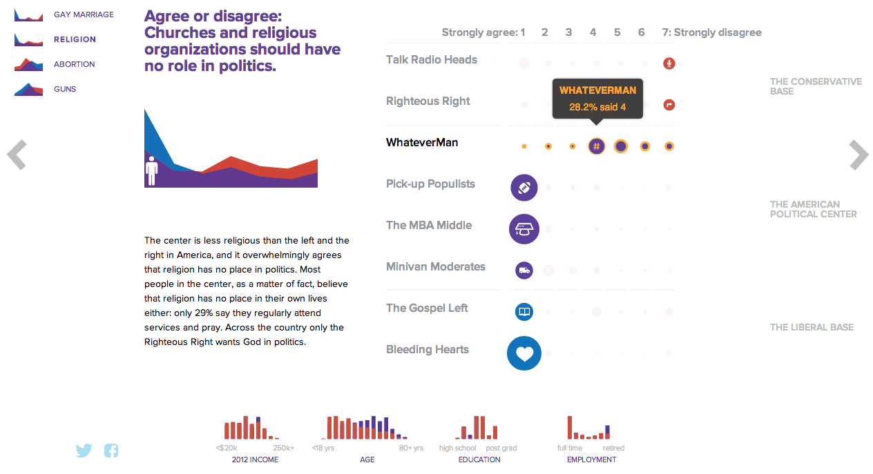
NBC News and Esquire magazine published results from their August survey of some 2000+ respondents that attempted to define the New American Center, i.e. the political persuasions of the majority of the country excepting the radical right and the loony left. For the purposes of Coffee Spoons, I am most interested in looking at the data visualisation and the infographics that result.
Both NBC News and Esquire visualised the results. While I could write two long blog posts looking at both of them, for today, it is more important to look more at the fundamental design difference between the two.
NBC News opted for a design direction emphasising data first. Perhaps because NBC is a news platform, their focus was on the clean communication of the data. Looking
NBC News results
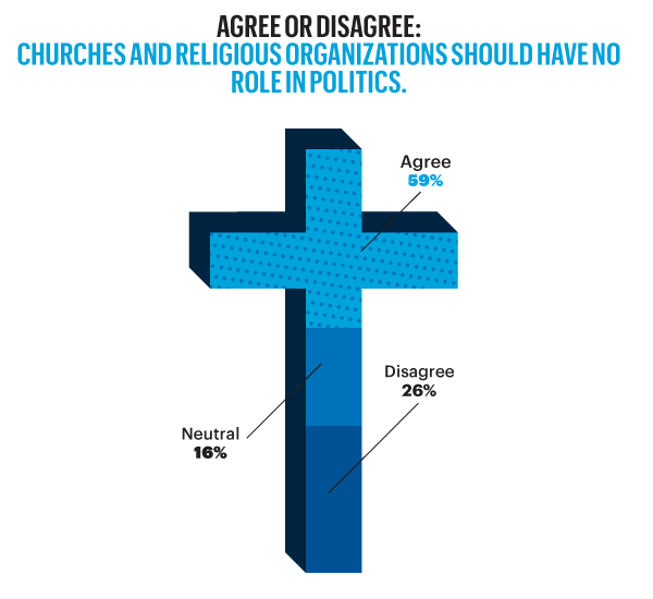
On the other hand, Esquire opted for a more sensationalised direction. The same data points used for the screenshot above creates this graphic below. Not only is less data is contained, less context given, less subtlety and nuance captured, it also is just difficult to read. Is the 59% supposed to be the area of the cross filled in? Its length? Why is it three-dimensional? Where are the Snowdens of yesteryear? At first glance, I ignore the horizontal wings and focus solely on the vertical length of the main bar.
Esquire results
For a useful representation of data, I think NBC News clearly wins. But that both organisations used the same data to craft their separate results, this story on the New American Center is useful for comparing two different design directions and the results thereof.
No designers are specifically mentioned, at least not that I could find, so credit for each piece goes to its respective owner, i.e. NBC News or Esquire.
Happy Friday, everyone. According to xkcd, I am failing the future test. That is to say, by 2019, I will be unable to communicate data through infographics or create data visualisations.
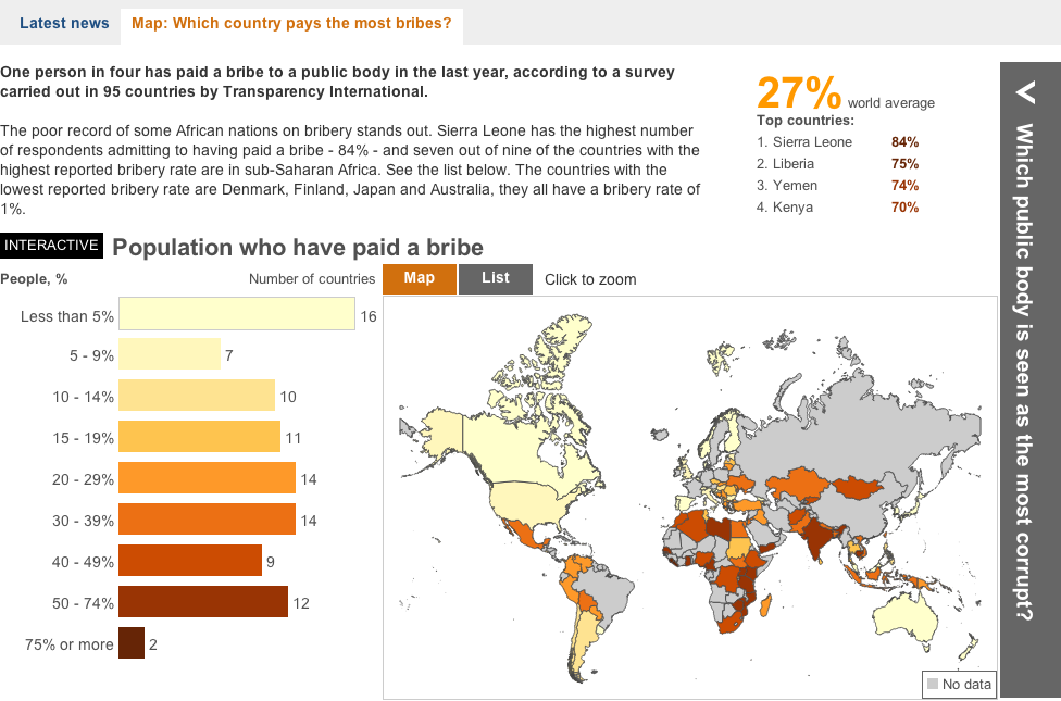
Some say bribes grease the wheels of business. But if that is the case, where are the greasiest wheels? This interactive piece from the BBC showcases an interesting story. It maps who has paid bribes and the value thereof. Then it looks at corruption in the different sectors of the country and which is perceived to be the most corrupt.
A look at bribery
Aesthetically this is not the finest piece. Some of the most interesting countries to view are in Africa and Southeast Asia, i.e. geographies near the equator. Unfortunately the designers here chose a map projection that emphasises Siberia and Arctic Canada at the expense of those very countries. Also, where did Greenland go? I know that the ice is melting, but I don’t think it’s melted that quickly. Furthermore, if the user clicks the “List” option, he or she is presented only with a list of geographies. None of them are selectable nor do they encode data. So why is the list there?
In short, the interface is a bit clunky and strangely designed. Line lengths are too long and it looks ugly. But, there are two interesting things going on here worth noting. First the legend here actually does not just show the range for the choropleth, but it also encodes the number of countries that fall within that range.
Second, by clicking on a particular bin for the legend, the map filters for the selection. I think that from a design perspective, a lighter grey and a lighter stroke outline would have made the filtering a bit more prominent, but the idea is interesting. Unfortunately, I found no way of easily returning to an all-bin view of the map.
A piece for the BBC that misses a few, but also hits a few.
Credit for the piece goes to the BBC graphics team.
I was catching up on some news tonight and I came upon an unhelpful graphic that was supposed to be helping me understand the whip count (who is voting yes or no) for authorising the use of force in Syria. Below is the original graphic from Think Progress.
The whip count as of 15.30 on 3 September
I struggled, however, to directly compare the yes and no votes. While I certainly understand that the splits within both parties are a fascinating subplot to the greater issue of will we bomb Syria, the traditional congressional arc visualisation is not helpful here. So using the same numbers, I simply plotted what is essentially a stacked bar chart. In truly heretical, i.e. independent, fashion I mixed the two parties together and placed them at either ends of the chart. The first to reach 50% wins. (If I were updating this live of course.)
My visualisation of the whip count…
Credit for the original goes to Igor Volsky and Judd Legum.
After two weeks out of the country, I come back and find early this morning (thanks, jet lag) an interactive article published by the New York Times on income mobility. What does that mean? From a medium side, a long narrative interspersed with charts and graphics with which the user can interact to uncover specific data about specific elements in the dataset. From a content side, income mobility means the movement of an individual from one group of money earned to another, e.g. a poor person becoming a millionaire. The piece is fantastic and you should take the time to go read and interact with it.
A map shows the broad context of the data to be looked at in the story
For some time now I have harped on about the need to annotate and contextualise datasets. Too often, large datasets paralyse people; their eyes glaze over and they simply gaze at a graphic without seeing the data, the story, the information. Little notes and blurbs of text can help people synthesise what they see with what they read with what they know to gain better understanding. But in this piece, by combining a lengthy article—very well written although that is not the focus of this post—with powerful interactive maps and graphics, the New York Times has created a powerful piece that states and then proves the point of the article. And while doing all of that, by making the datasets explorable, the Times also allows you to find your own stories.
A story-like piece lets you choose an area and an income to see how the article's topic plays out
Lastly, in the credits section at the end you will see this piece required the input of eight individuals (though I know not in what particular capacities). Clearly, for the Times this is not about to become a regular type of infographic/datavis/journalism piece. But when will skill sets be democratised or dispersed enough that smaller teams can create similar scale projects? That will be interesting to see. However, the Times certainly leads the States if not the world in some of the best information design pieces and undoubtedly this will push other publishers of similar content in this direction.
Ultimately people want to know who's best and who's worse and where they fall and this chart does that at the end of the piece
Credit for the piece goes to Mike Bostock, Shan Carter, Amanda Cox, Matthew Ericson, Josh Keller, Alicia Parlapiano, Kevin Quealy, and Josh Williams.
Last week I looked at a piece from the Washington Post about the possible impact of the Supreme Court rulings on gay marriage in the United States. But with the rulings yesterday, we step back and look at globally how the progression of gay rights has taken steps forward or backward.
The National Post looked at the reversal of bans of gay marriage as well as polling from several countries to look at changing opinions and perspectives across the world. Fascinating/horrifying are some of the stories about specific countries in the map.
Gay acceptance
My only real criticism is that the colour-coding of regions seems a bit jarring. I wonder if grouping countries by region would not have allowed the same data to be presented in a bit quieter tone.
In today’s post we look at a small interactive piece from the Washington Post. Everybody pays taxes. And everybody seeks to find ways to pay less in taxes. This interactive stacked bar chart (and bar matrix) examines how much the different available tax benefits help Americans, grouped into income quintiles. The measure is dollars, not percentage of income (either personal or national), so clearly highest income Americans are the big winners in tax benefits while low income Americans lose out. For example, most low income people do not make enough money to invest in the stock market. Therefore they cannot reap the benefit of preferential tax treatment of dividend income as opposed to wage income.
This Friday we look at plastic or cosmetic surgery. Because you should always feel better about yourself before the weekend begins. The work comes from the National Post and it looks at the popularity of specific types of surgeries for men and women over the last several years.
Plastic surgery
It’s a nice use of small multiples, line charts, and bar charts to explore the issue. I take issue with only one chart near the end of the piece. It looks at minimally invasive procedures and uses bar charts to compare the numbers. However, the bars do not sit on a common baseline and but for the addition of data labels, they would be useless in comparing the numbers of procedures.
Unaligned bar charts
Credit for the piece goes to Mike Faille and Richard Johnson.