On a Line. Or Not.

Two weeks ago I was reading an article in the BBC that fact checked some of President Biden’s claims about the economy. Now I noted the other day in a post about axis lines and their use in graphics. Axis lines help ground the user in making comparisons between bars, lines, or whatever, and the minimum/maximum/intervals of the data set.

I was reading the article and first came upon this graphic. It’s nothing crazy and shows job growth in the aggregate for the first three months of a presidential administration. A pretty neat comparison in the combination of the data. I like.

Pay attention to what you see here. There will be a quiz.

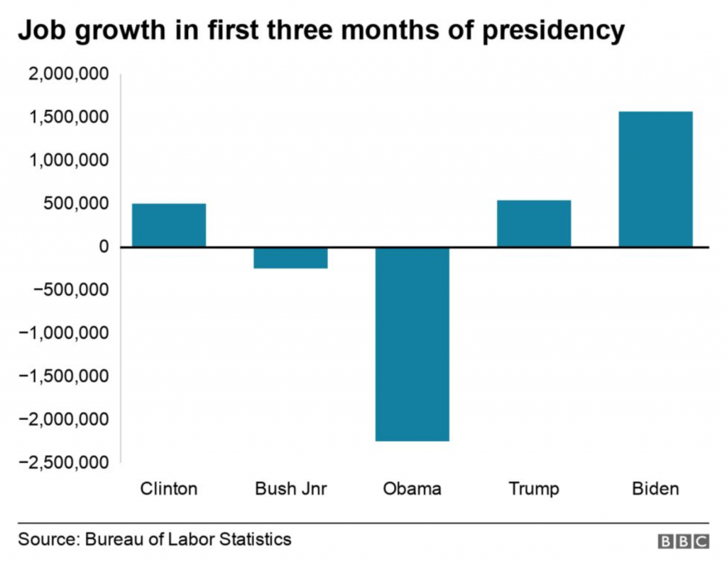
I don’t like the lack of grid lines for the axis, however. But, okay, none to be found.

I keep reading the article. And then a couple of paragraphs later I come upon this graphic. It looks at the monthly figures and uses a benchmark line, the red dotted one, to break out those after January 2021 when Biden took office.

Spot the differences.

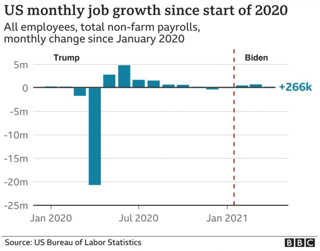
But do you notice anything?

The lines for the y-axis are back!

The article had a third graphic that also included axis lines.

I don’t have a lot to say about these graphics in particular, but the most important thing is to try and be consistent. I understand the need to experiment with styles as a brand evolves. Swap out the colours, change the styles of the lines, try a new typeface. (Except for the blue, we are seeing different colours and typefaces here, but that’s not what I want to write about.)

First, I don’t know if these are necessarily style experiments. I suspect not, but let’s be charitable for the sake of argument. I would refrain from experimenting within a single article. In other words, use the lines or don’t, but be consistent within the article.

For the record, I think they should use the lines.

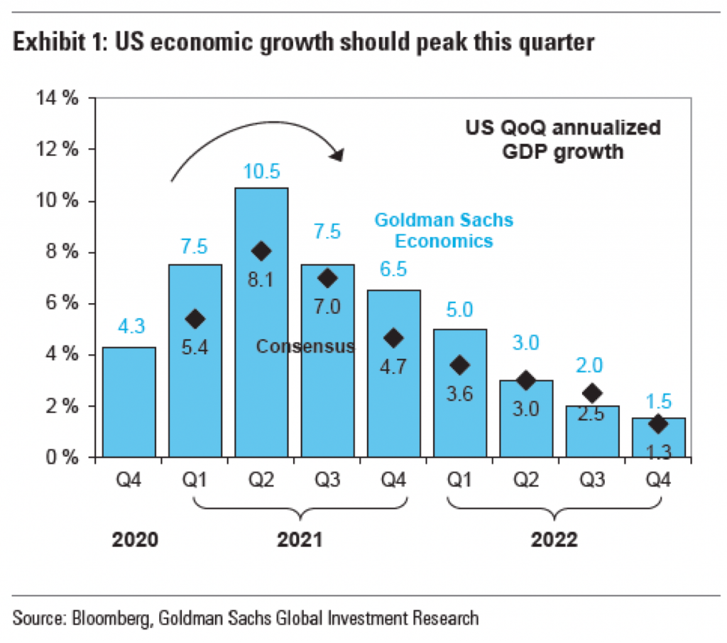
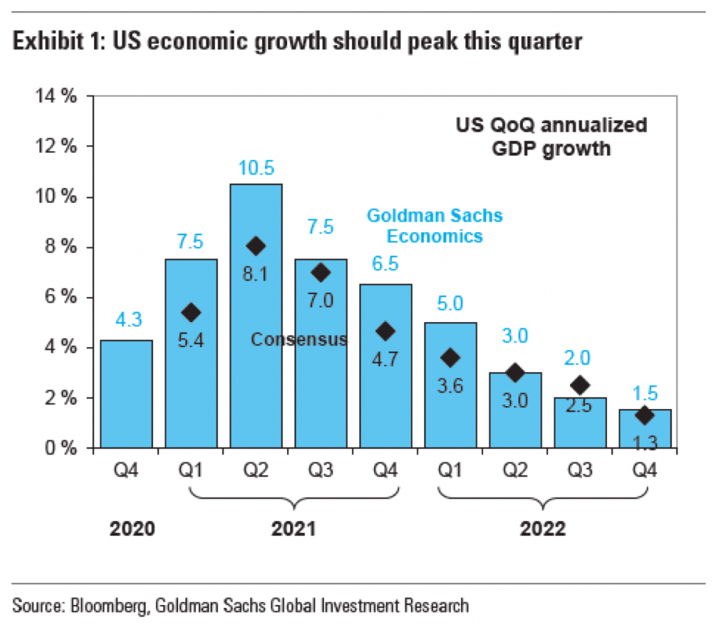
Another point I want to make is with the third graphic. You’ll note that, like I said above, it does use axis lines. But that’s not what I want to mention.

At least we have lines.

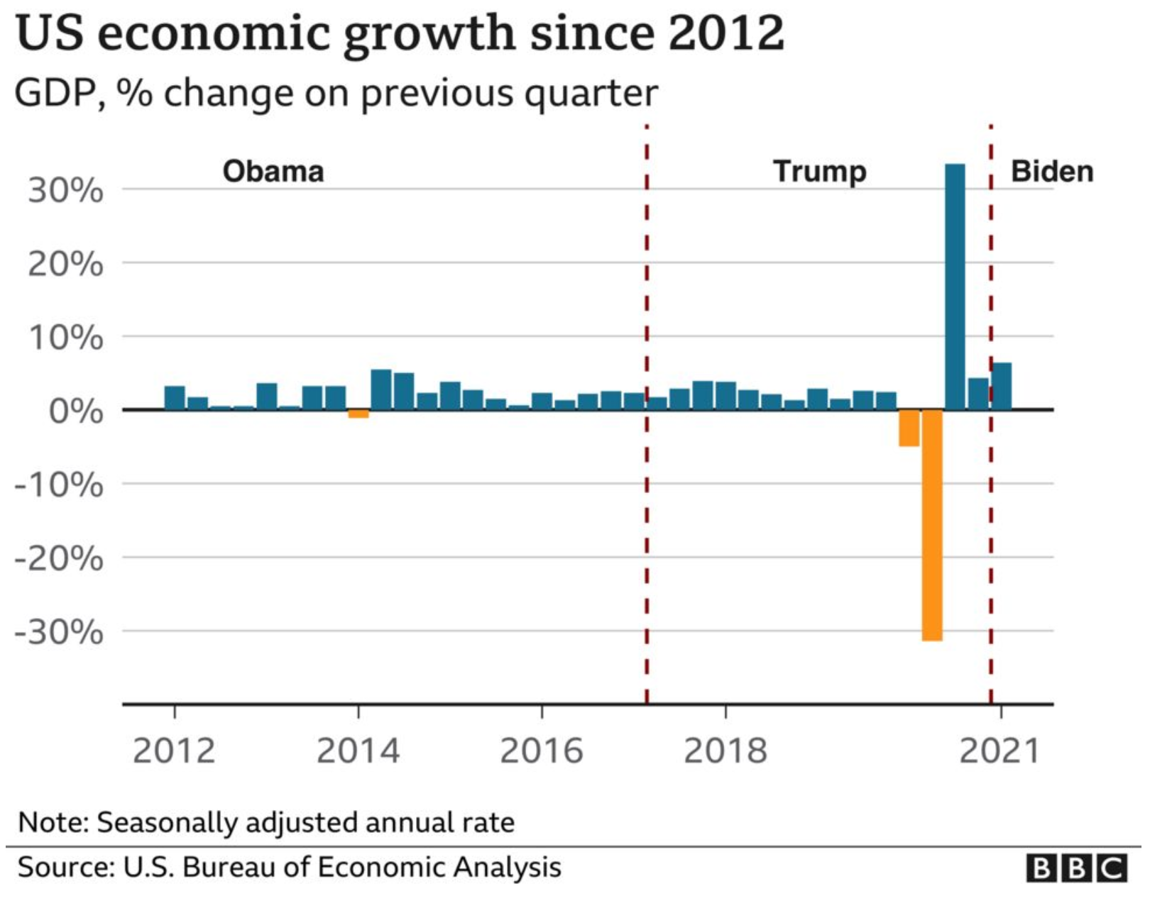
Instead I want to look at the labelling on the axes. Let’s start with the y-axis, the percentage change in GDP on the previous quarter. The top of the chart we have 30%. As I’ve said before, you can see in the Trump administration, the bar for the initial Covid-19 rebound rises above the 30% line. It’s not excessive, I can buy it if you’re selling it.

But let’s go down below the 0-line. Just prior to the rebound we had the crash. Similarly, this extends just below the -30% line. But here we have a big space and then a heavy black line below that -30% line. It looks like the bottom line should be -40%, but scanning over to the left and there is no label. So what’s going on?

First, that heavy black line, why does it appear the same as the baseline or zero-growth line? The axis lines, by comparison, are thin and grey. You use a heavier, darker line to signify the breaking point or division between, in this case, positive and negative growth. Theoretically, you don’t need the two different colours for positive and negative growth, because the direction of the bar above/below that black line encodes that value. By making the bottom line the same style as the baseline, you conflate the meaning of the two lines, especially since there is no labelling for the bottom line to tell you what the line means.

Second, the heaviness of the line draws visual attention to it and away from the baseline, especially since the bottom line has the white space above it from the -30% line. Consider here the necessity of this line. For the 30% line that sets the maximum value of the y-axis, we have the blue bar rising above the line and the administration labels sit nicely above that line. There is no reason the x-axis labels could not exist in a similar fashion below the -30% line. If anything, this is an inconsistency within the one chart, let alone the one graphic.

Third, is it -40%? I contend the line isn’t necessary and that if the blue bar pokes above the 30% line, the orange bar should poke below the -30% line. But, if the designer wants to use a line below the -30% line, it should be labelled.

Finally, look at the x-axis. This is more of a minor quibble, but while we’re here…. Look at the intervals of the years. 2012, 2014, 2016, every two years. Good, make sense. 2018. 20…21? Suddenly we jump from every two years to a three-year interval. I understand it to a point, after all, who doesn’t want to forget 2020. But in all seriousness, the chart ends at 2021 and you cannot divide that evenly. So what is a designer to do? If this chart had less space on the x-axis and the years were more compressed in terms of their spacing, I probably wouldn’t bring this up.

However, we have space here. If we kept to a two-year interval system, I would introduce the labels as 2012, but then contract them with an apostrophe after that point. For example, 2014 becomes ’14. By doing that, you should be able to fit the two-year intervals in the space as well as the ending year of the data set.

Overall, I have to say that this piece shocked me. The lack of attention to detail, the inconsistency, the clumsiness of the design and presentation. I would expect this from a lesser oganisation than the BBC, which for years had been doing solid, quality work.

The first chart is conceptually solid. If Biden spoke about job creation in the first three months of the administration vs. his predecessor, aggregate the data and show it that way. But the presentation throughout this piece does that story a disservice. I wish I knew what was going on.

Credit for the piece goes to the BBC graphics department.

The May Jobs Report

Last Friday, the government released the labour statistics from April and they showed a weaker rebound in employment than many had forecasted. When I opened the door Saturday morning, I got to see the numbers above the fold on the front page of the New York Times.

Welcome to the weekend

What I enjoyed about this layout, was that the graphic occupied half the above the fold space. But, because the designers laid the page out using a six-column grid, we can see just how they did it. Because this graphic is itself laid out in the column widths of the page itself. That allows the leftmost column of the page to run an unrelated story whilst the jobs numbers occupy 5/6 of the page’s columns.

If we look at the graphic in more detail, the designers made a few interesting decisions here.

Jobs in detail

First, last week I discussed a piece from the Times wherein they did not use axis labels to ground the dataset for the reader. Here we have axis labels back, and the reader can judge where intervening data points fall between the two. For attention to detail, note that under Retail, Education and health, and Business and professional services, the “illion” in -2 Million was removed so as not to interfere with legibility of the graphic, because of bars being otherwise in the way.

My issue with the axis labels? I have mentioned in the past that I don’t think a designer always needs to put the maximum axis line in place, especially when the data point darts just above or below the line. We see this often here, for example Construction and Manufacturing both handle it this way for their minimums. This works for me.

But for the column above Construction, i.e. State and local government and Education and health, we enter the space where I think the graphic needs those axis lines. For Education and health, it’s pretty simple, the red losses column looks much closer to a -3 million value than a -2 million value. But how close? We cannot tell with an axis line.

And then under State and local government we have the trickier issue. But I think that’s also precisely why this could use some axis lines. First, almost all the columns fall below the -1 million line. This isn’t the case of just one or two columns, it’s all but two of them. Second, these columns are all fairly well down below the -1 million axis line. These aren’t just a bit over, most are somewhere between half to two-thirds beyond. But they are also not quite nearly as far to -2 million as the ones we had in the Education and health growth were near to -3 million.

So why would I opt to have an axis line for State and local governments? The designers chose this group to add the legend “Gain in April”. That could neatly tuck into the space between the columns and the axis line.

Overall it’s a solid piece, but it needs a few tweaks to improve its legibility and take it over the line.

Credit for the piece goes to Ella Koeze and Bill Marsh.

Off the Axis

Two Fridays ago, I opened the door and found my copy of the New York Times with a nice graphic above the fold. This followed the announcement from the White House of aggressive targets to reduce greenhouse gas emissions

In general, I love seeing charts and graphics above the fold. As an added bonus, this set looked at climate data.

Need to see more downward trending lines.

But there are a few things worth pointing out.

First from a data side, this chart is a little misleading. Without a doubt, carbon dioxide represents the greatest share of greenhouse gasses, according to the US Environmental Protection Agency (EPA) it was 76% in 2010. Methane contributes the next largest share at 16%. But the labelling should be a little clearer here. Or, perhaps lead with a small chart showing CO2’s share of greenhouse gasses and from there, take a look at the largest CO2 emitters per person.

Second, where are the axis labels?

I will probably have more on this at a later date, but neither the bar chart nor the line charts have axis labels. Now the designers did choose to label the beginning value for the lines and the bars, but this does not account for the minimums or maximums. (It also assumes that the bottom of the lines is zero.)

For example, we can see that China began 1990 with emissions at 3.4 billon metric tons. The annotation makes clear that China’s aggregate emissions surpassed those of the US in 2004. But where do they peak? What about developing countries?

If I pull out a ruler and draw some lines I can roughly make some height comparisons. But, an easier way would be simply to throw some dotted lines across the width of the page, or each line chart.

This piece takes a big swing at presenting the challenge of reducing emissions, but it fails to provide the reader with the proper—and I think necessary—context.

Credit for the piece goes to Nadja Popovich and Bill Marsh.

Arrowheads

I don’t know if this is a trend, but I’ve now seen a few graphics appearing using arrows to show the direction or trend of the data. This graphic in an article by Bloomberg prompted me to talk about this piece.

I should add, after rereading my draft, that I’m not clear who made this graphic. I assume that it was the Bloomberg graphics team, because it appears in Bloomberg and all the data is presented to recreate the chart. But, it could also be a chart made by someone at Goldman Sachs that credits Bloomberg as a source and then someone at Bloomberg got hold of a copy. And a graphic made for a news/media outlet will typically be of a different quality or level of polish than one made perhaps by and for analysts. (Not that I think there should be said differences, as it does a disservice to internal users, but I digress from a digression.)

All the things going on in this chart.

The arrow here appears above the peak quarter, i.e. the second of 2021, for both the Goldman Sachs Economics forecast and the consensus forecast. But what does it really add? First, it adds “ink”, in this case pixels. Here, every pixel consumes our attention and there is a finite number of available pixels within the space of this graphic.

When I work with authors or subject matter experts, I often find myself asking them “what’s the most important thing to communicate?” or something along those lines. If the person answers with a long laundry list, I remind them that if everything is important, nothing is important. If everything is set in bold, all caps text, what will look most important is the rare bit of text set in regular, lower-case letters.

In the above graphic, there are so many things screaming for my attention, it’s difficult to say which is the most important. First, I’m fairly certain that “US QoQ annualised GDP growth” could move to the graphic subhead or data definition. Allow the graphic’s data container to contain, well, data. Second, the data series labels can be moved outside the data container. The labels here have an inherent problem is that the Goldman Sachs Economics numbers are in blue, and that blue text has less visual weight than the black text of the Consensus label. Consequently, the Goldman Sachs Economics label recedes into the background and becomes lost, not what you want from your legend.

Third, I don’t believe the data labels here add anything to the chart. They function as sparkly distractions from the visual trend, which should be the most important aspect of a visual chart.

Finally, we get to the arrow, the impetus for this post. First, I should note that it is not clear what growth it shows. The fact the line is black makes me think it reflects the Consensus forecast whereas a blue line would represent the Goldman Sachs forecast. But it could also be the average of the two or even a more general “here’s the general shape”. The problem is that the shape matters. If you look at the slope of the actual forecasts, you see a sharp increase to the peak followed by a slower, more gradual taper. The arrow in the original graphic shows a decelerating curve that is shallower in the lead up to the peak and that is not what is forecast to happen.

Now we get to the issue I mentioned at the top, the extraneous labelling and data ink wasted. If we look at the chart as is, but remove the arrow, we see this.

Immediately to the right of the peak, we have have some blue data labels and then just a bit to the right of that, but sitting vertically above the label we have the bold blue text labelling the data series. But further to the upper right we have a dark and bold block of text that draws the eye away from the peak and into the corner. It draws the eye away from the very element of the shape the peak needs to be a peak, the trough in the wave. Consequently, it makes sense with the eye being drawn up and to the right that the designers threw an arrow in above the peak to show how, no, actually your eye needs to go down and to the right.

But what happens if we then strip out the data series labelling? Do we still need the arrow? Let’s take a look.

I would argue that no, we do not. And so let’s strip the arrow out of the picture and take a look.

Here the shape of the curve is clear, a sharp rise and then a gradual taper to the right. No arrow needed to show the contour. In other words, the additional labelling wastes our attention, which then forces us to add an arrow to see what we needed to see in the first place, but then further wasting our attention.

There are a number of other things I take issue with in this chart: the black outlines of the blue rectangles, the tick marks on the x-axis, the solid border of the container, the lack of axis lines. But the arrow points to this graphic’s central problem, a poorly thought out labelling structure.

So because the chart provides all the data, I took a quick stab at how I would chart it using my own styles. I gave myself a 3:2 ratio, less space than the original graphic had. This is where I landed. I would prefer the legend below the chart labelling, but it felt cramped in the space. And with so few data points along the x-axis, the chart doesn’t need a ton of horizontal space and so I repurposed some of it to create a vertical legend space.

I mixed typefaces only because my default does not have a proper small capitals and I wanted to use small capitals to reduce and balance out the weight of the exhibit label in the graphic title.

I could still tweak the spacing between the bars and perhaps the treatment of the years below the quarters could use some additional work, but the main point here is that the shape of the curve is clear. I need no arrow to tell the user that there is a peak and that after the peak the line goes down. The white space around the bars and the line does that for me.

Credit for the piece goes to either the Bloomberg graphics department or the Goldman Sachs graphics department. Not sure.

The Super Short European Super League

Sunday night, news broke that a number of European football clubs were creating a rogue league, the European Super League. My British and European readers—and Americans who follow football—will know the names of Manchester United, Liverpool, AC Milan, Juventus, Real Madrid, and the others.

To put this in perspective for my American readers, imagine the Yankees, Dodgers, Red Sox, Astros, Padres, Mets, Cardinals, Phillies, Angels, and Nationals saying that they were leaving Major League Baseball to go and form their own new baseball league. That they were doing so to “save the sport”. But in so doing, they also guarantee they all make the playoffs every year.

My frequent readers and those who know me will know I’m a fan of the Boston Red Sox. I should point out that the owner of the Red Sox, John Henry, owns both the Red Sox and Liverpool through his company Fenway Sports Group.

Of course, the analogy doesn’t quite hold up, because there are some significant differences between American sports and European football. Relegation is a big one. Personally, I wish American sports had some way of using relegation to incentivise teams to not intentionally suck.

The basic premise of relegation. Take English football. You have four levels of play and in theory any team can exist in any level. Each year, the worst teams move from their current level down one whilst the best teams move up. And for the top level, the top teams get to compete in lucrative European-wide matches. That is a bit simplistic, but imagine that at the end of last year, the Pirates, Rangers, Tigers, and Red Sox became AAA minor league teams and the four best AAA minor league teams became MLB teams. MLB teams would theoretically try to do everything they could to stay in the MLB and not drop to AAA, because that would mean a loss of money. After all, the Yankees would no longer be heading to Fenway nor the White Sox to Detroit. Would seeing the Detroit Tigers play the Woo Sox really be worth the ticket prices you pay at Comerica Park?

But that’s not how American sports work. And so a few American owners, namely those of Manchester United, Arsenal, and Liverpool, want to ensure a steady stream of money. By creating their own league where their teams cannot be relegated, they guarantee that revenue stream.

In other words, this is all about the owners of these Super League teams making even more money.

Because, during the last year, teams have been hurting without fans in attendance. And that gets us to why I can write this up. Because the BBC in an article about this new league addressed the fact that most of these teams are heavily in debt.

This graphic, however, is a bit misleading. Look at Liverpool. There is no available data for how much financial debt the club holds. So why is it placed between Chelsea and Manchester City? It could well have more debt than Tottenham. Liverpool should really be left off this chart and included in the note, because its placement suggests that it has little debt, when that may well not be the case. This is a really misleading graphic when it comes to how Liverpool fits with the other 11 clubs.

From a design standpoint, I’m also not clear on why the x-axis line extends beyond the labels for £-200m and £600m.

I’m not going to touch all the data labels. That’s for another piece I’ve been working on off and on for a little while now.

At this point I should point out that I was going to post this article later, but in the last 18 hours or so the whole thing has fallen apart as the English teams, followed by the others, have been dropping out under immense pressure from the sport and their fans. To bring back my analogy above, imagine MLB retaliating and saying that if those teams created their own league, the players would not be allowed to play in any other matches and the teams would be locked out from all other competitive baseball games. It’s a mess.

Credit for the piece goes to the BBC graphics department.

Politicising Vaccinations

Yesterday I wrote my usual weekly piece about the progress of the Covid-19 pandemic in the five states I cover. At the end I discussed the progress of vaccinations and how Pennsylvania, Virginia, and Illinois all sit around 25% fully vaccinated. Of course, I leave my write-up at that. But not everyone does.

This past weekend, the New York Times published an article looking at the correlation between Biden–Trump support and rates of vaccination. Perhaps I should not be surprised this kind of piece exists, let alone the premise.

From a design standpoint, the piece makes use of a number of different formats: bars, lines, choropleth maps, and scatter plots. I want to talk about the latter in this piece. The article begins with two side by side scatter plots, this being the first.

Hesitancy rates compared to the election results

The header ends in an ellipsis, but that makes sense because the next graphic, which I’ll get to shortly, continues the sentence. But let’s look at the rest of the plot.

Starting with the x-axis, we have a fairly simple plot here: votes for the candidates. But note that there is no scale. The header provides the necessary definition of being a share of the vote, but the lack of minimum and maximum makes an accurate assessment a bit tricky. We can’t even be certain that the scales are consistent. If you recall our choropleth maps from the other day, the scale of the orange was inconsistent with the scale of the blue-greys. Though, given this is produced by the Times, I would give them the benefit of the doubt.

Furthermore, we have five different colours. I presume that the darkest blues and reds represent the greatest share. But without a scale let alone a legend, it’s difficult to say for certain. The grey is presumably in the mixed/nearly even bin, again similar to what I described in the first post about choropleths from my recent string.

Finally, if we look at the y-axis, we see a few interesting decisions. The first? The placement of the axis labels. Typically we would see the labelling on the outside of the plot, but here, it’s all aligned on the inside of the plot. Intriguingly, the designers took care for the placement—or have their paragraph/character styles well set—as the text interrupts the axis and grid lines, i.e. the text does not interfere with the grey lines.

The second? Wyoming. I don’t always think that every single chart needs to have all the outliers within the bounds of the plot. I’ve definitely taken the same approach and so I won’t criticise it, but I wonder what the chart would have looked like if the maximum had been 35% and the grid lines were set at intervals of 5%. The tradeoff is likely increased difficulty in labelling the dots. And that too is a decision I’ve made.

Third, the lack of a zero. I feel fairly comfortable assuming the bottom of the y-axis is zero. But I would have gone ahead and labelled it all the same, especially because of how the minimum value for the axis is handled in the next graphic.

Speaking of, moving on to the second graphic we can see the ellipsis completes the sentence.

Vaccination rates compared to the election results

We otherwise run into similar issues. Again, there is a lack of labelling on the x-axis. This makes it difficult to assess whether we are looking at the same scale. I am fairly certain we are, because when I overlap the graphics I can see that the two extremes, Wyoming and Vermont, look to exist on the same places on the axis.

We also still see the same issues for the y-axis. This time the axis represents vaccination rates. I wish this graphic made a little clearer the distinction between partial and full vaccination rates. Partial is good, but full vaccination is what really matters. And while this chart shows Pennsylvania, for example, at over 40% vaccinated, that’s misleading. Full vaccination is 15 points lower, at about 25%. And that’s the number that needs to be up in the 75% range for herd immunity.

But back to the labelling, here the minimum value, 20%, is labelled. I can’t really understand the rationale for labelling the one chart but not the other. It’s clearly not a spacing issue.

I have some concerns about the numbers chosen for the minimum and maximum values of the y-axis. However, towards the middle of the article, this basic construct is used to build a small multiples matrix looking at all 50 states and their rates of vaccination. More on that in a moment.

My last point about this graphic is on the super picky side. Look at the letter g in “of residents given”. It gets clipped. You can still largely read it as a g, but I noticed it. Not sure why it’s happening, though.

So that small multiples graphic I mentioned, well, see below.

All 50 states compared

Note how these use an expanded version of the larger chart. The y-minimum appears to be 0%, but again, it would be very helpful if that were labelled.

Also for the x-axis in all the charts, I’m not sure every one needs the Biden–Trump label. After all, not every chart has the 0–60% range labelled, but the beginning of each row makes that clear.

In the super picky, I wish that final row were aligned with the four above it. I find it super distracting, but that’s probably just me.

Overall, this is a strong piece that makes good use of a number of the standard data visualisation forms. But I wish the graphics were a bit tighter to make the graphics just a little clearer.

Credit for the piece goes to Danielle Ivory, Lauren Leatherby and Robert Gebeloff.

Choropleths and Colours Part 2

Last Thursday I wrote about the use of colour in a choropleth map from the Philadelphia Inquirer. Then on Sunday morning, I opened the door to collect the paper and saw a choropleth above the fold for the New York Times. I’ll admit my post was a bit lengthy—I’ve never been one described as short of words—but the key point was how in the Inquirer piece the designer opted to use a blue-to-red palette for what appeared to be a data set whose numbers ran in one direction. The bins described the number of weeks a house remained on the market, in other words, it could only go up as there are no negative weeks.

Compare that to this graphic from the Times.

More choropleth colours…

Here we are not looking at the Philadelphia housing market, but rather the spread of the UK/Kent variant of SARS-CoV-2, the virus that causes COVID-19. (In the states we call it the UK variant, but obviously in the UK they don’t call it the UK variant, they call it the Kent variant from the county in the UK where it first emerged.)

Specifically, the map looks at the share (percent) of the variant, technically named B.1.1.7, in the tests reported for each country. The Inquirer map had six bins, this Times map has five. The Inquirer, as I noted above, went from less than one week to over five weeks. This map divides 100% into five 20-percent bins.

Unlike the Inquirer map, however, this one keeps to one “colour”. Last week I explained why you’ll see one colour mean yellow to red like we see here.

This map makes better use of colour. It intuitively depicts increasing…virus share, if that’s a phrase, by a deepening red. The equivalent from last week’s map would have, say, 0–40% in different shades of blue. That doesn’t make any sense by default. You could create some kind of benchmark—though off the top of my head none come to mind—where you might want to split the legend into two directions, but in this default setting, one colour headed in one direction makes significant sense.

Separately, the map makes a lot of sense here, because it shows a geographic spread of the variant, rippling outward from the UK. The first significant impacts registering in the countries across the Channel and the North Sea. But within four months, the variant can be found in significant percentages across the continent.

Credit for the piece goes to Josh Holder, Allison McCann, Benjamin Mueller, and Bill Marsh.

Choropleths and Colours

In many cities through the United States, real estate represents a hot commodity. It’s not difficult to understand why, as have covered before, Americans are saving a bit more. Coupled with stay-at-home orders in a pandemic, spending that cash on a home down payment makes a lot of sense for a lot of people. But with little new construction, it’s a seller’s market.

The Philadelphia Inquirer covers that angle for the Philadelphia region and in the article, it includes a map looking at time to sell a house. And it’s that interactive map I want to look at briefly this morning.

Red vs. blue

Primarily I want to discuss the colours, as you can gather from this post’s title. We have six bins here, each indicating an amount of time in one-week intervals. So far so good. Now to the colours, we have red for homes that sell in one week or less and blue for homes that sell in five weeks or more.

Blue to red is a pretty standard choice. You will often see it in maps where you have positive growth to negative growth or something similar, I’ve used it myself on Coffeespoons a number of times, like in this map of population growth at the county level here in Pennsylvania.

In those scenarios, however, note how you have positive values and negative values. The change in colour (hue) encodes the change in numerical value, i.e. positive vs. negative. We then encode the values within that positive or negative range with lighter/darker blues and reds. Most often the darker the blue or red, the greater the value toward the end of the spectrum. For example, in Pennsylvania, the dark blue meant population growth greater than 8% and red meant population declines in excess of 8%.

As an aside you’ll note that there are no dark blue counties in that map and that’s by design. By keeping the legend symmetrical in terms of its minimum and maximum values, we can show how no counties experienced rapid population growth whilst several declined rapidly. If dark blue had meant greater than 4% growth, that angle of the story would have been absent from the map.

Back to our choropleth discussion, however. How does that fit with this map of selling times for homes in the Philadelphia region?

Note first that five weeks is a positive value. But so is one week or less. The use of the red-blue split here is not immediately intuitive. If this map were about the change or growth in how long homes sell, certainly you could see positive and negative rates and those would make sense in red and blue.

The second part to understand about a traditional red-blue choropleth is that at some point you have to switch from red to blue, a mid-point if you will. If you are talking positive/negative like in my Pennsylvania map, zero makes a whole lot of sense. Anything above zero, blue, anything below zero red.

Sometimes, you will see a third colour, maybe a grey or a purple, between that red and blue. That encodes a fuzzier split between positive and negative. Say you want to give a margin of 1%, i.e. any geographic area that has growth between +1% and -1%. That intrinsically means the bin is both positive and negative at the same time, so a neutral colour like grey or a blend of the two colours, a purple in the case of red and blue, makes a whole lot of sense.

Here we have nothing like that. Instead we jump from a light yellow two-to-three weeks to a light blue three-to-four weeks.

What about that yellow? In a spectrum of dark blue to light blue, you will see lighter blues than darker blues. But in a red spectrum, that light red becomes pinkish or salmonish depending on that exact type of red you use. (Conversation for another day.) Personal preferences will often push clients to asking a designer to “use less pink” in their maps. I can’t tell you the number of times I’ve heard that.

If that comes up, designers will often keep their blue side of the legend from the dark to light—no complaints there, or at least I’ve never heard any. But for the red side, they’ll switch to using hue or type of colour instead of dark to light red.

Not all colours are as dark as others. Blue and red can be pretty dark. Yellow, however, is a fairly light colour. Imagine if you converted the colours to greyscale, you’ll have very dark greys for blue and red, but yellow will be consistently far lighter than the other two.

The designer can use the light yellow as the light red. But to link the yellow to red, they need to move through the hues or colours between the two. There’s a whole conversation here about colour theory and pigment and light absorption vs. pixels and light emission, but let’s go back to your colours you learned in primary school (pigment and light absorption). Take your colour wheel and what sits between red and yellow? Orange.

And so if a client objects to a light pink, you’ll see a pseudo dark-to-light red spectrum that uses a dark red, a medium orange, and a light yellow. Just like we see here in this Inquirer map.

Back to the two-to-three week and three-to-four week switch, though. What’s the deal? This is my sticking point with the graphic. I am looking for the explanation of why the sudden break in colour here, but I don’t see any obvious one.

Why would you use this colour scheme where blue and red diverge around a non-zero value? Let’s say the average home in the region sells in three weeks, any of the zip codes in red are selling faster than average, hot markets, and those taking longer than average are in blue, cold markets. Maybe it’s the current average, however. What if it were the average last year? Or the national average? These all serve as benchmarks for the presented data and provide valuable context to understand the market.

Unfortunately it’s not clear what, if any, benchmarks the divergence point in this map reflects. And if there is no reason to change colours mid-legend, with only six bins, a designer could find a single colour, a blue or purple for example, and then provide five additional lighter/darker shades of that to indicate increasing/decreasing levels of speed at which homes sell.

Overall, I left this piece a wee bit confused. The general trend of regional differences in how quickly homes are selling? I get that. But because there’s a non-logical break between red and blue here—or at least one I fail to see in the graphic—this map would work almost as well if each bin were a separate colour entirely, using ROYGBIV as a base for example.

Credit for the piece goes to John Duchneskie.

Discontinuous Lead Bars

Last week the Guardian published an article about drinking water pollution across the United States. Overall, it was a nicely done piece and the graphics within segmented the longer text into discrete sections. Each unit looks similar:

PFAs.

The left focuses on a definition and provides contextual information. It includes small illustrations of the mechanisms by which the pollutant enters the water system. To the right is a chart showing the levels of the contamination detected in the 120 tests the Guardian (and its partner Consumer Reports) conducted.

In almost all of the charts, we see the maximum depicted on the y-axis. And the bars are coloured if that observation station exceeds the health and safety limits. (The limit is represented by the dotted line.)

But towards the end of the piece we get to lead, a particularly problematic pollutant. There is no safe level of lead contamination. But how the piece handles the lead chart leaves a bit to be desired.

But how bad is it, really?

The first thing is colour, but that’s okay. Everything is red, but again, there is no safe level of lead so everything is over the limit. But look at the y-axis. That little black line at the top indicates a discontinuity in the lines, in other words the values for those three observations are literally off the chart.

But does that work?

First, this kind of thing happens all the time. If you ever have to work with data on either China or India, you’ll often find those two nations, due to their sheer demographic size, skew datasets that involve people. But in these kind of situations, how do we handle off the charts data points?

There is a value to including those points. It can show how extreme of an outlier those observations truly are. In other words, it can help with data transparency, i.e. you’re not trying to hide data points that don’t fit the narrative with which you’re working.

In this piece, it’s never explicitly stated what the largest value in the data set is, but I interpret it as being 5.8. So what happens if we make a quick chart showing a value of 6 (because it’s easier than 5.8)? I added a blue bar to distinguish it from the the rest of the chart.

It’s pretty bad.

You can see that including the data point drastically changes how the chart looks. The number falls well outside the graphic, but it also shows just how dangerously high that one observation truly is.

But if you say, well yeah, but that falls outside the box allowed by the webpage, you’re correct. There are ways it could be handled to sit outside the “box”, but that would require some extra clever bits. And this isn’t a print layout where it’s much easier to play with placement. So what happens when we resize that graphic to fit within its container?

And resized

You can see that All the other bars become quite small. And this is probably why the designers chose to break the chart in the first place. But as we’ve established, in doing so they’ve minimised the danger of those few off-the-charts sites as well as left off context that shows how for the vast majority of sites, the situation is not nearly as dire—though, again, no lead is good lead.

What else could have been done? If maintaining the height of the less affected bars was paramount, the designers had a few other options they could have used. First, you could exclude those observations and perhaps put a line below the 118 text that says “for three sites, the data was off the charts and we’ve excluded them from the set below.”

I have used that approach in the past, but I use it with great reluctance. You are removing important outliers from the data set and the set is not complete without them. After all, if you are looking to use this data set to inform a policy choice such as, which communities should receive emergency funding to reduce lead levels, I’d want to start with the city in blue. Sure, I would like everyone to get money, but we’d have to prioritise resources.

I think the best compromise here would have actually been a small tweak to the original. Above the three bars that are broken (or perhaps to the right with some labelling), label the discontinuous data points to provide clearer context to the vast majority of the sites, which are below 0.5 ppb.

As easy as ABC

This preserves the ability to easily compare the lower level observations, but provides important context of where they sit within the overall data set by maintaining the upper limits of the worst offenders.

Credit for the piece goes to the Guardian’s graphics department.

Too Much Horsing Around

Last week the Philadelphia Inquirer published an investigation of the staggering number of horse deaths in Pennsylvania’s race track facilities. I found the article fascinating, but admittedly at a point or two a wee bit squeamish when the author described how horses essentially die. Then about halfway through the article I ran into the first of two graphics looking at the data.

Seeing red…

The first is pretty simple, a timeline of deaths over the course of one year, 2019. Overall it works, you can clearly see clusters of racing deaths, but that those clusters spread across the year. When I sat with the graphic for a moment, however, a few things began to stick out at me. The first was a distracting vibration in the background. Not the alternating beige and blue of the months, but if you look closely you’ll see tightly spaced lines within the colour fields: presumably the days of the month for aligning the deaths.

On a large enough graphic it makes all the sense to tick off sub-monthly increments, but in this space I would have probably opted to show only the months. Maybe weeks could have worked, as that approach may have reinforced the statistic about a horse dying every six days on average.

The second point is the black stroke or outline of each dot. Here the designer faces a challenging constraint. Essentially, the smaller the dot (or the symbol) the brighter the colour. In a rich, blood red colour you have a dark heavier colour. Compare that to say a stop sign that is bright red. It has a lighter feel. The blood red colour, in a given space, has let’s say an amount of black ink or pixels—I’m simplifying here—mixed in with the red. But in a large area, there’s enough red ink or pixels to still be clearly blood red. The stop sign red has no other colours but red. And in large areas, it can be an eye-stabbing amount of red—precisely why it’s likely so useful for, you know, stop signs.

But at the small scale of these very small dots, you still proportionally have the same amount of red and black ink, but with fewer and fewer amounts, the eye can begin to experience difficulty in truly reading the colour for what it is. For example, in an area of say 49 pixels (7×7), while the ratio of red to black may be consistent, you still only have a total of 49 pixels with which to convey “red” to the reader. Consequently, in smaller spaces, you may find that designers sometimes opt for brighter colours, a la stop sign red, than they would in larger fields of colour.

Here we have a nice use of brighter red, green, and yellow. (I will quickly add that the choice of red and green can be problematic for colour blindness, but I don’t want to revisit that here.) But to provide better separation between those small, circle sized fields of colour a border probably helps. A thin black line, or stroke, makes sense. But the black is darker than the colours themselves, thus it can draw more attention than the colour fill. And that begins to happen here. I wonder if a thin white stroke may have been less distracting and placed more emphasis on the fill colours.

As I said, overall a really nice if not sobering graphic in an important but disturbing article. I think a few small tweaks could really bring the graphic over the finish line. Pun fully intended. Sorry, not sorry.

Credit for the pieces goes to John Duchneskie.