More on Those Million Covid-19 Deaths

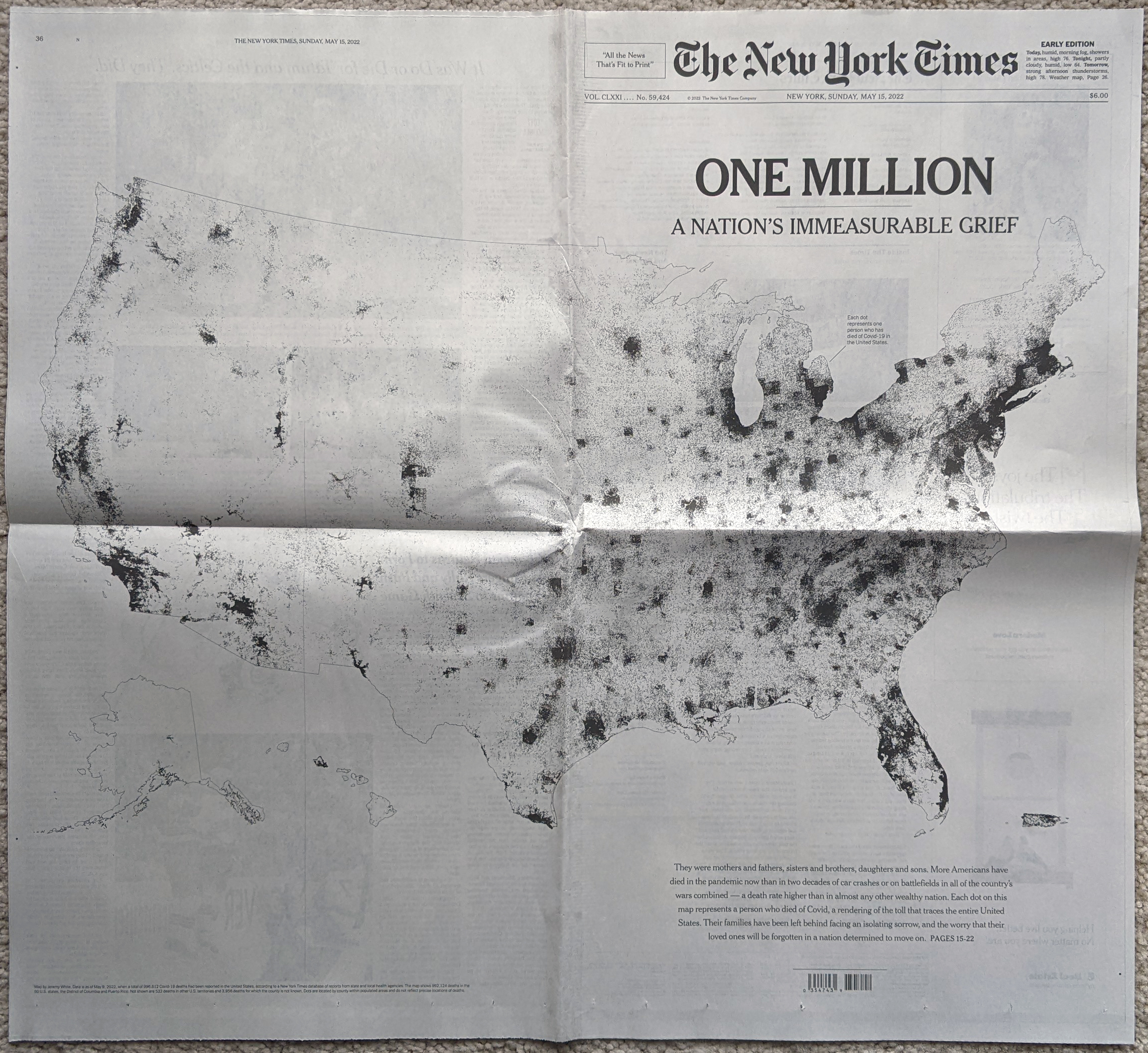
Yesterday I focused on the big graphic from the New York Times that crossed the full spread of the front/back page. But the graphic was merely the lead graphic for a larger piece. I linked to the online version of the article, but for this post I’m going to stick with the print edition. The article consists of a full-page open then an entire interior spread, all in limited colour. The remainder of the extensive coverage consists of photo essays and interviews that understandably attempt to humanise the data points, after all, each dot from yesterday represented one individual, solitary, human being. That is an important element of a story like this and other national and international tragedies, but we also need to focus on the data and not let the emotion of the story overwhelm our rational and logical analysis.

Sometimes it’s hard to realise we’re in the third year of this pandemic.

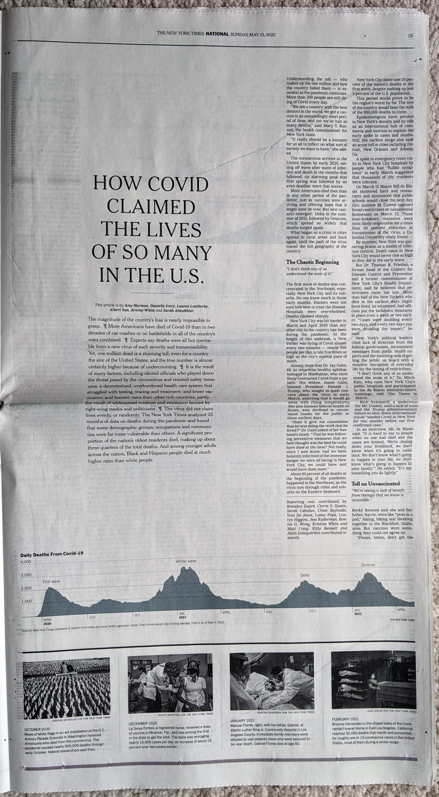
From a data visualisation standpoint the first page begins simply enough with a long timeline of the Covid-19 pandemic charting the number of absolute deaths each day. As we looked at yesterday, the absolute deaths tell part of the story. But if we were to have looked at the number of absolute cases in conjunction with the deaths, we could also see how the virus has thus far evolved to be more transmissible but less lethal. Here the number of daily deaths from Omicron surpassed Delta, but fell short of the winter peak in early 2021. But the number of cases exploded with Omicron, making its mortality rate lower. In other words, far more people were getting sick, but as far fewer were dying.

An interesting note is that if you take a look at the online version, there the designers chose a more stylised approach to presenting the data.

All the dots

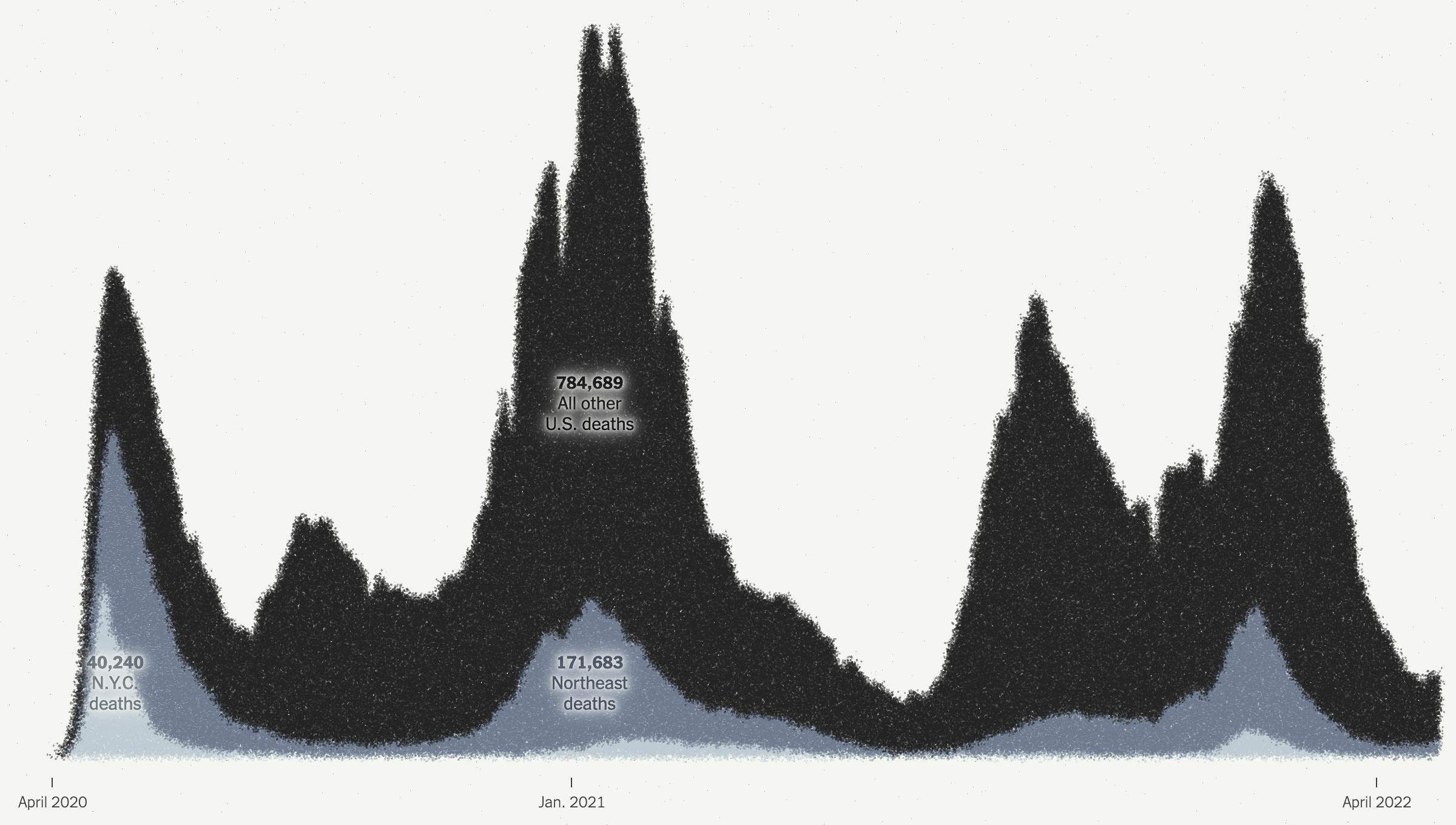
Here they kept the dot approach and simply stacked and reordered the dots. However, I presume for aesthetic reasons, they kept the stacking loose dots and dropped all the axis lines because it does make for a nice transition from the map to this chart. But they also dropped all headings and descriptors that tell the reader just what they are looking at. These decisions make the chart far less useful as a tool to tell the data-driven element of the story.

There are three annotations that label the number of deaths in New York, the Northeast, and the rest of the United States. But what does the chart say? When are the endpoints for those annotations? And then you can compare the scale of the y-axis of this chart and compare it to the printed version above. A more dramatic scale leads to a more dramatic narrative.

This sort of visual style of flash and fancy transitions over the clear communication of the data is why I find the print piece more compelling and more trustworthy. I find the online version, still useful, but far more lacking and wanting in terms of information design.

The interior spread is where this article shines.

Just a fantastic spread.

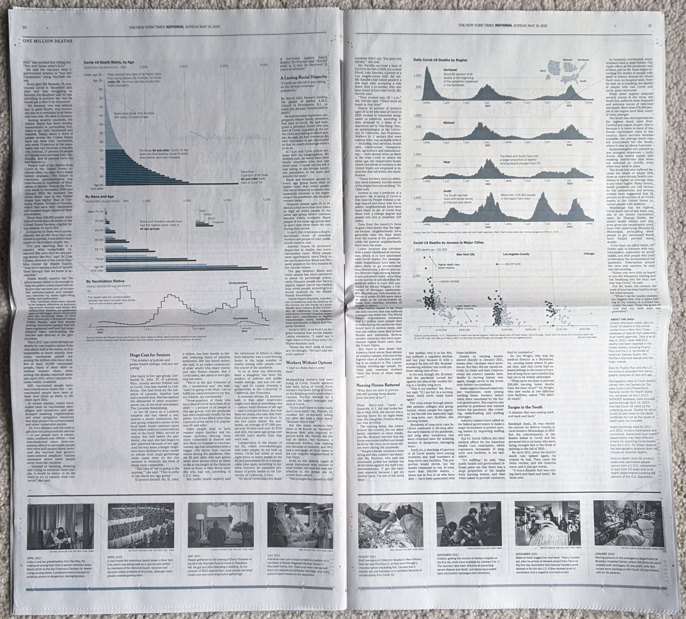
From an editorial design standpoint, the symmetry works very well here. It’s a clear presentation and the white space around the graphic blocks lets that content shine as it should in this type of story. Collectively these pieces do a great job telling the story of the pandemic thus far across the nation. The graphics do not need a lot of colour and make do with sparse flash. Annotations call the reader’s attention to salient points and outliers.

Very nice work here.

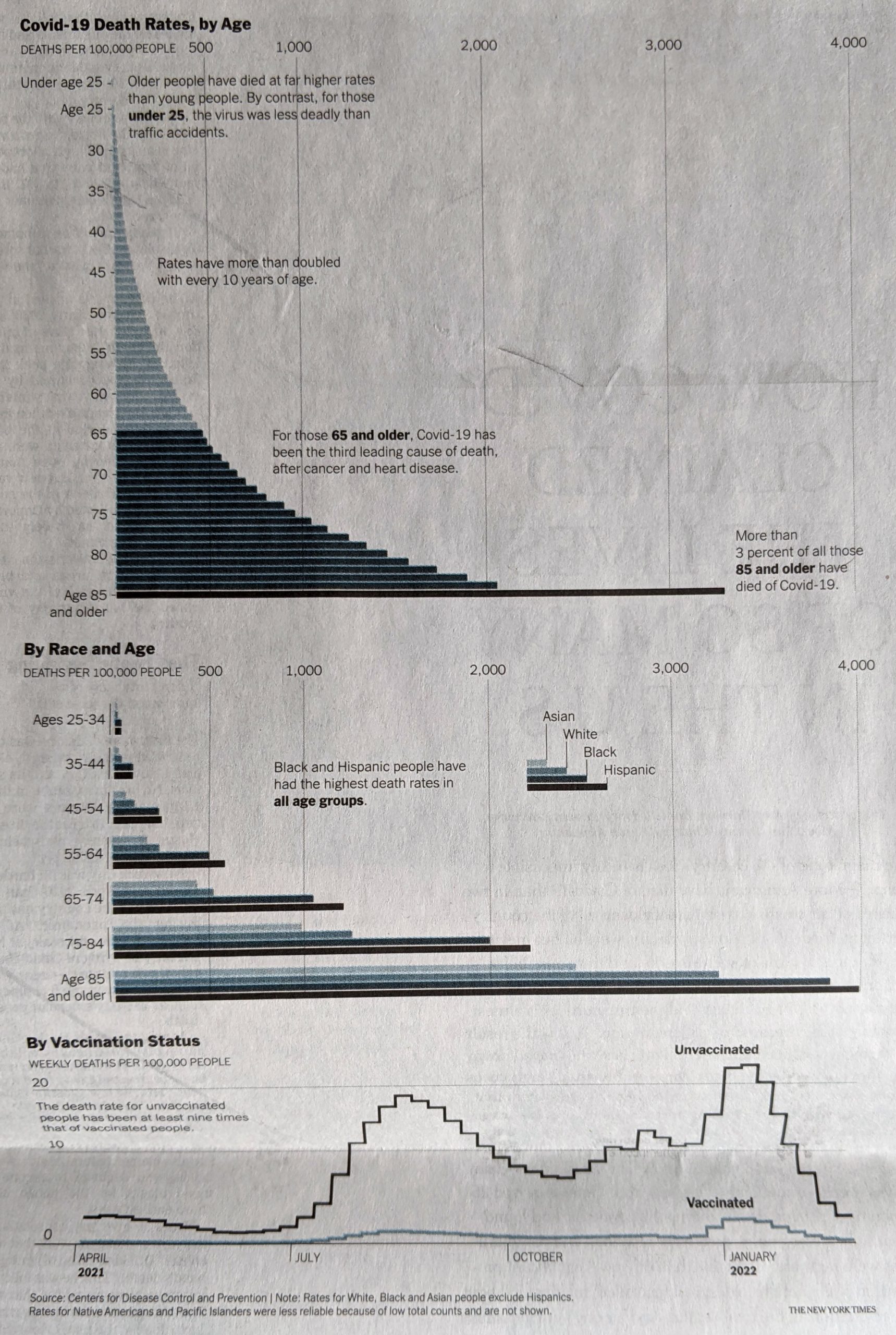
From a content standpoint, I would be particularly curious if we have robust data for deaths by education level. Earlier this year I recall reading news about a study that said education best correlated to Covid cases, and I would be curious to see if that held true for deaths. Of course these charts do a great job of showing just how effective the vaccines were and remain. They are the best preventative measure we have available to us.

More really nice graphics

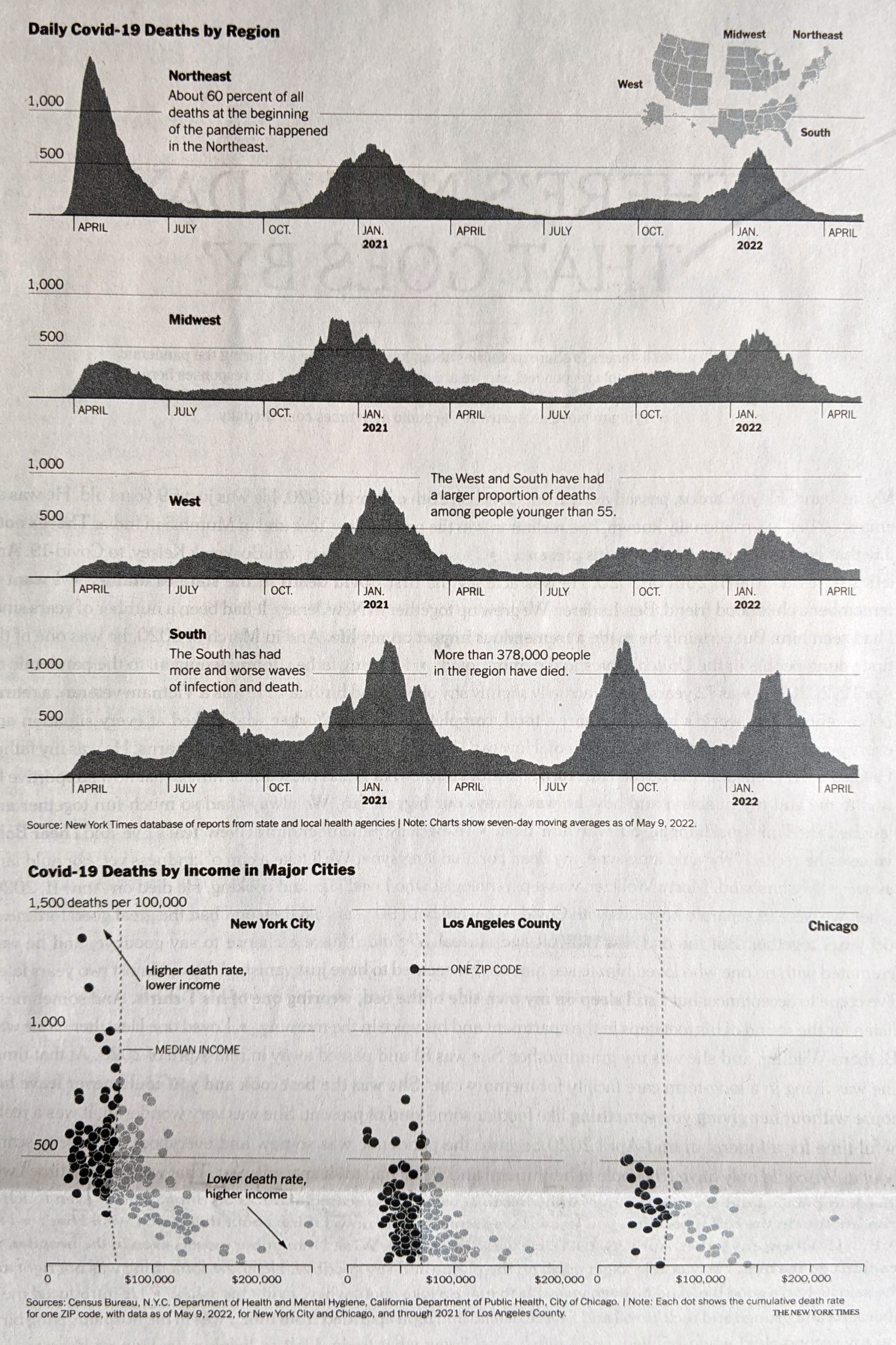
Here I disagree with the design decision of how to break down the states into regions. The Census Bureau breaks down the United States into four regions using the same names as in the graphic above. However, if you look closely at the inset map, you will see that Delaware, Maryland, and West Virginia in particular are included as part of the Northeast. (I cannot tell if the District of Columbia is included as part of the Northeast or South.)

Now compare that to the Census Bureau’s definition:

How the government defines US geography

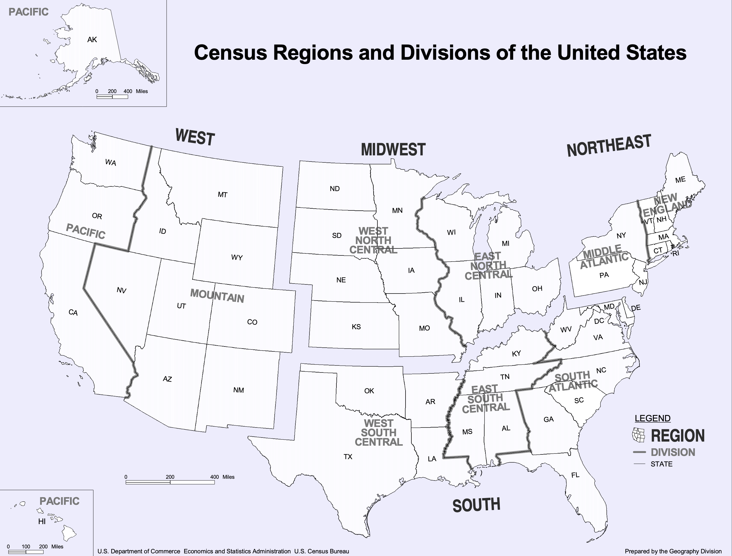
If you ask me to include Delaware and Maryland as part of the Northeast, well, if you’re selling it, I’ll buy it. After all, just because the Census Bureau defines the United States this way does not mean the New York Times has to. Both are connected to the Northeast Corridor via Amtrak and I-95 and are plugged into the Megalopolis economy. Maybe the Potomac should be the demarcation between Northeast and South. But I struggle to understand West Virginia. Before you go and connect it to the Northeast, I would argue that West Virginia has far more in common with the Midwest geographically, economically, and culturally.

More critically, given this issue, it strikes me as a serious problem when the online version of the chart—with the aforementioned issues—does not even include the little inset to highlight this at best unusual regional definition.

Where would you place West Virginia?

And so while I have reservations about the data—how would the data have looked if the states were realigned?—the design of the line charts overall is good.

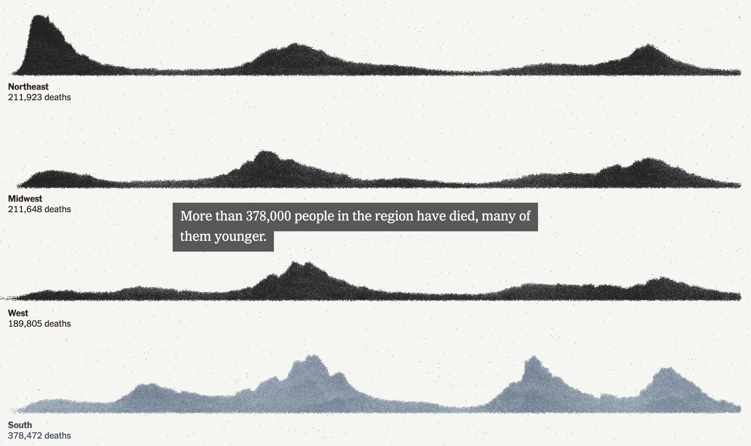
Again, I am talking about the print version, not that online graphic. I would argue that the above screenshot is barely even a chart and more “data art” or an illustration of data. Consider here, for example, that for the South we have that muted slate blue for the dots, but the spacing and density of the dots leads to areas of lighter slate and darker slate. But a lighter slate means more space between stacked dots and darker slate means a more compact design. A lighter colour therefore pushes the “edge” of the line further up the y-axis and artificially inflates its value, not that we can understand what that value is as the “chart” lacks any sort of y-axis.

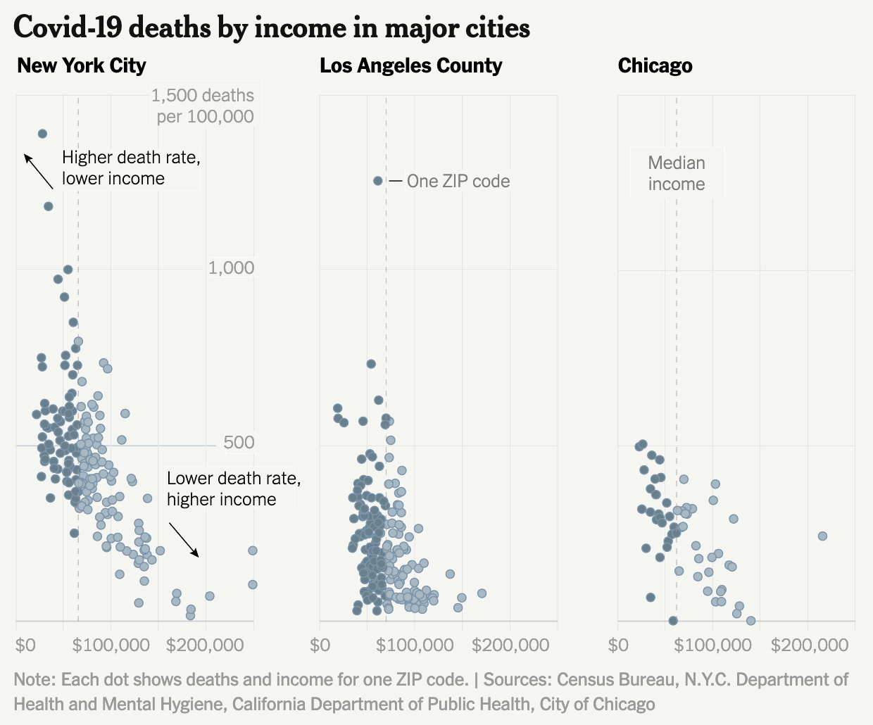
Finally the print piece has a set of small multiples breaking down deaths by income in the three largest American cities: New York, Los Angeles, and Chicago. These are just great little charts showing the correlation between income and death from Covid, organised by Zip code.

But this also serves as a stark reminder of just how much better the print piece is over the online version. Because if we take a look at a screenshot from the online article, we have a graphic that addresses all the issues I pointed out earlier.

Why couldn’t the online article kept to this style?

I am left to wonder why the reader of the online version does not have access to this clearer and more accurate representation of the data throughout the piece?

To me this article is a great example of when the print piece far exceeds that of the online version. Content-wise this is a great story that needed to be told this weekend, but design wise we see a significant gap in quality from print to online. Suffice it to say that on Sunday I was very glad I received the print version.

Credit for the piece goes to Sarah Almukhtar, Amy Harmon, Danielle Ivory, Lauren Leatherby, Albert Sun, and Jeremy White.

One Million Covid-19 Deaths

This past weekend the United States surpassed one million deaths due to Covid-19. To put that in other terms, imagine the entire city of San Jose, California simply dead. Or just a little bit more than the entire city of Austin, Texas. Estimates place the number of those infected at about 80 million. Back of the envelope maths puts that fatality rate at 1.25%. That’s certainly lower than earlier versions of the virus, which has evolved to be more transmissible, but thankfully less lethal than its original form.

Sunday morning I opened the door to my flat and found the Sunday edition of the New York Times waiting for me with a sobering graphic not just above the fold, nor across the front page. No, the graphic—a map where each dot represents one Covid-19 death—wrapped around the entire paper.

Above the fold
Full page
Full spread

You don’t need to do much more here. Black and white colour sets the tone simply enough. Of course, a bit more critically, these maps mask one of the big issues with the geographic spread of not just this virus but many other things: relatively few people live west of the Mississippi River.

Enormous swathes of the plains and Rocky Mountains have but few farmers and ranchers living there. Most of the nation’s populous cities are along the coast, particularly the East Coast, or along rivers or somewhat arbitrary transport hubs. You can see those because this map does not actually plot the locations of individual deaths, but rather fills county borders with dots to represent the deaths that occurred within those limits. That’s why, particularly west of the Mississippi, you see square-shaped concentrations of deaths.

A choropleth map that explores deaths per capita, that is after adjusting for population, shows a different story. (This screenshot comes from the New York Times‘ data centre for Covid-19.

A somewhat different story

The story here is literally less black and white as here we see colours in yellows to deep burnt crimsons. Whilst the big map yesterday morning concentrated deaths in the Northeast, West Coast, and around Chicago we see here that, relative to the counties’ populations, those same areas fared much better than counties in the plains, Midwest, and Deep South.

A quick scan of the Northeast and Mid-Atlantic states shows that only one county, Juniata in Pennsylvania, fell into the two worst deaths per capita bins—the deeper reds. Juniata County sits squarely in the middle of Pennsyltucky or Trumpsylvania, where Covid countermeasures were not terribly popular. No other county in the region shares that deep red.

Look to the southeast and south, however, and you see lots of deep and burnt crimsons dotting the landscape. This doesn’t mean people didn’t die in the Northeast, because of course they did. Rather, a greater percentage of the population died elsewhere when, as the policies enacted by the Northeast and West Coast show, they didn’t need to.

After all, injecting bleach was never a good idea.

Credit for the piece goes to Jeremy White.

Political Hatch Jobs

Earlier this week I read an article in the Philadelphia Inquirer about the political prospects of some of the candidates for the open US Senate seat for Pennsylvania, for which I and many others will be voting come November. But before I get to vote on a candidate, members of the political parties first get to choose whom they want on the ballot. (In Pennsylvania, independent voters like myself are ineligible to vote in party primaries.)

This year the Republican Party has several candidates running and one of them you may have heard of: Dr. Oz. Yeah, the one from television. And while he is indeed the front runner, he is not in front by much as the article explains. Indeed, the race largely had been a two-person contest between Oz and David McCormick until recently when Kathy Barnette pulled just about even with the two.

In fact, according to a recent poll the three candidates are all statistically tied in that they all fall within the margin of error for victory. And that brings us to the graphic from the article.

It would be funny to see a candidate finish with negative vote share.

Conceptually this is a pretty simple bar chart with the bar representing the share of the support of those polled. But I wanted to point out how the designer chose to represent the margin of error via hatched shading to both sides of the ends of the red bar.

In some cases the hatch job does not work for me, particularly with those smaller candidates where the bar goes negative. I would have grave reservations about the vote should any candidate win a negative share of the vote. 0% perhaps, but negative? No. I also don’t think the grey hatching works as well over the grey bar in particular and to a lesser degree the red.

I have often thought that these sorts of charts should use some kind of box plot approach. So this morning I took the chart above and reworked it.

Now with box plots.

Overall, however, I really like this designer’s approach. We should not fear subtlety and nuance, and margins of error are just that. After all, we need not go back too far in time to remember a certain candidate who thought she had a presidential election locked up when really her opponent was within the margin of error.

Credit for the piece goes to John Duchneskie.

All the Colours, All the Space

Everyone knows inflation is a thing. If not, when was the last time you went shopping? Last week the Boston Globe looked specifically at children’s shoes. I don’t have kids, but I can imagine how a rapidly growing miniature human requires numerous pairs of shoes and frequently. The article explores some of the factors going into the high price of shoes and uses, not very surprisingly, some line charts to show prices for components and the final product over time. But the piece also contains a few bar charts and that’s what I’d like to briefly discuss today, starting with the screenshot below.

What is going on here?

What we see here are a list of countries and the share of production for select inputs—leather, rubber, and textiles—in 2020. At the top we have a button that allows the user to toggle between the two and a little movement of the bars provides the transition. The length of the bar encodes the country in question’s market share for the selected material.

We also have all this colour, but what is it doing? What data point does the colour encode? Initially I thought perhaps geographic regions, but then you have the US and Mexico, or Italy and Russia, or Argentina and Brazil, all pairs of countries in the same geographic regions and yet all coloured differently. Colour encodes nothing and thus becomes a visual distraction that adds confusion.

Then we have the white spaces between the bars. The gap between bars is there because the country labels attach to the top of the bars. But, especially for the top of the chart, the labels are small and the gap is at just the right height such that the white spaces become white bars competing with the coloured bars for visual attention.

The spaces and the colours muddy the picture of what the data is trying to show. How do we know this? Because later in the article we get this chart.

Ahh, much better. Much clearer.

This works much better. The focus is on the bars, the labelling is clear, almost nothing else competes visually with the data. I have a few quibbles with this design as well, but it’s certainly an improvement over the earlier screenshot we discussed. (I should note that this graphic, as it does here, also comes after the earlier graphic.)

My biggest issue is that when I first look at the piece, I want to see it sorted, say greatest to least. In other words, Furniture and bedding sits at the top with its 15.8% increase, year-on-year, and then Alcoholic beverages last at 3.7%. The issue here, however, is that we are not necessarily looking at goods at the same hierarchical level.

The top of the list is pretty easy to consider: food, new vehicles, alcoholic beverages, shelter, furniture and bedding, and appliances. We can look at all those together. But then we have All apparel. And then immediately after that we have Men’s, Women’s, Boys’ , Girls’, and Infants’ and toddlers’ apparel. In other words, we are now looking at a subset of All apparel. All apparel is at the same level of Food or Shelter, but Men’s apparel is not.

At that point we would need to differentiate between the two, whilst also grouping them together, because the range of values for those different sub-apparel groups comprise the aggregate value for All apparel. And showing them all next to Food is not an apples-to-apples comparison.

If I were to sort these, I would sort by from greatest to least by the parent group and then immediately beneath the parent I would display the children. To differentiate between parent-level and children-level, I would probably make the bars shorter in the vertical and then address the different levels typographically with the labels, maybe with smaller type or by putting the children in italic.

Finally, again, whilst this is a massive improvement over the earlier graphic, I’d make one more addition, an addition that would also help the first graphic. As we are talking about inflation year-on-year, we can see how much greater costs are from Furniture and bedding to Alcoholic beverages and that very much is part of the story. But what is the inflation rate overall?

According to the Bureau of Labour Statistics, inflation over that period was 8.5%. In other words, a number of the categories above actually saw price increases less than the average inflation rate—that’s good—even though they were probably higher than increases had been prior to the pandemic—that’s bad. But, more importantly for this story, with the addition of a benchmark line running vertically at 8.5%, we could see how almost all apparel and footwear child-level line items were below the inflation rate. But the children and infant level items far exceeded that benchmark line, hence the point of the article. I made a quick edit to the screenshot to show how that could work in theory.

To the right, not so good.

Overall, an interesting article worth reading, but it contained one graphic in need of some additional work and then a second that, with a few improvements, would have been a better fit for the article’s story.

Credit for the piece goes to Daigo Fujiwara.

The Potential Impacts of Throwing Out Roe v Wade

Spoiler: they are significant.

Last night we had breaking news on two very big fronts. The first is that somebody inside the Supreme Court leaked an entire draft of the majority opinion, written by Justice Alito, to Politico. Leaks from inside the Supreme Court, whilst they do happen, are extremely rare. This alone is big news.

But let’s not bury the lede, the majority opinion is to throw out Roe v. Wade in its entirety. For those not familiar, perhaps especially those of you who read me from abroad, Roe v Wade is the name of a court case that went before the United States Supreme Court in 1971 and was decided in 1973. It established the woman’s right to an abortion as constitutionally protected, allowing states to enact some regulations to balance out the state’s role in concern for women’s public health and the health of the fetus as it nears birth. Regardless of how you feel about the issue—and people have very strong feelings about it—that’s largely been the law of the United States for half a century.

Until now.

To be fair, the draft opinion is just that, a draft. And the supposed 5-3 vote—Chief Justice Roberts is reportedly undecided, but against the wholesale overthrow of Roe—could well change. But let’s be real, it won’t. And even if Roberts votes against the majority he would only make the outcome 5-4. In other words, it looks like at some point this summer, probably June or July, tens of millions of American women will lose access to reproductive healthcare.

And to the point of this post, what will that mean for women?

This article by Grid runs down some of the numbers, starting with laying out the numbers on who chooses to have abortions. And then ultimately getting to this map that I screenshot.

That’s pretty long distances in the south…

The map shows how far women in a state would need to travel for an abortion with Roe active as law and without. I’ve used the toggle to show without. Women in the south in particular will need to travel quite far. The article further breaks out distances today with more granularity to paint the picture of “abortion deserts” where women have to travel sometimes well over 200 miles to have a safe, legal abortion.

I am certain that we will be returning to this topic frequently in coming months, unfortunately.

Credit for the piece goes to Alex Leeds Matthews.

The B-52s

Not the band, but the long-range strategic bomber employed by the United States Air Force. This isn’t strictly related to Ukraine, but it’s military adjacent if you will.

I thought about creating a graphic a few years ago to celebrate the longevity of the B-52 Stratofortress, more commonly called the BUFF, Big Ugly Fat Fucker. Obviously I did not, but over at Air Force Magazine, they created a graphic timeline showing the history of the aircraft, specifically as it relates to its engines, which will now be replaced in an effort to extend the life of the bombers.

100 years of bombings

I don’t love the image of the bomber behind the graphic, but I understand why it’s there given the B-52 is the focus of the timeline. I wonder if a different layout could have highlighted the placement of the engines and separated the timeline from the image of the bomber.

Overall I like the graphic, but it could just be that right now I’m spotlighting and working on a lot of graphics dealing with military issues and Ukraine in particular.

Credit for the piece goes to Dash Parham and Mike Tsukamoto.

Battalion Tactical Groups

As Russia redeploys its forces in and around Ukraine, you can expect to hear more about how they are attempting to reconstitute their battalion tactical groups. But what exactly is a battalion tactical group?

Recently in Russia, the army has been reorganised increasingly away from regiments and divisions and towards smaller, more integrated units that theoretically can operate more independently: battalion tactical groups. They typically comprise less than a thousand soldiers, about 200 of which are infantry. But they also include a number of tanks, infantry fighting vehicles (IFVs), armoured personnel carriers (APCs), artillery, and other support units.

In an article from two weeks ago, the Washington Post explained why the Russian army had stalled out in Ukraine. And as part of that, they explained what a battalion tactical group is with a nice illustration.

Just some of the vehicles in a BTG

Russia’s problem is that in the first month of the war, Ukrainian anti-armour weapons like US-made Javelins and UK-made NLAWs have ripped apart Russian tanks, IFVs, and APCs. Atop that, Ukrainian drones and artillery took out more armour. The units that Russia withdrew from Ukraine now have to be rebuilt and resupplied. Once fresh, Russia can deploy these into the Donbas and southern Ukraine.

This graphic isn’t terribly complicated, but the nice illustrations go a long way to showing what comprises a battalion tactical group. And when you see photos of five or six tanks destroyed along the side of a Ukrainian road, you now understand that constitutes half of a typical unit’s available armour. In other words, a big deal.

I expect to hear more out of Russia and Ukraine in coming days about how Russia is providing new vehicles and fresh soldiers to resupply exhausted units.

Credit for the piece goes to Bonnie Berkowitz and Artur Galocha.

Where’s My (State) Stimulus?

Here’s an interesting post from FiveThirtyEight. The article explores where different states have spent their pandemic relief funding from the federal government. The nearly $2 trillion dollar relief included a $350 billion block grant given to the states, to do with as they saw fit. After all, every state has different needs and priorities. Huzzah for federalism. But where has that money been going?

Enter the bubbles.

I mean bubbles need water distribution systems, right?

This decision to use a bubble chart fascinates me. We know that people are not great at differentiating between area. That’s why bars, dots, and lines remain the most effective form of visually communicating differences in quantities. And as with the piece we looked at on Monday, we don’t have a legend that informs us how big the circles are relative to the dollar values they represent.

And I mention that part because what I often find is that with these types of charts, designers simply say the width of the circle represents, in this case, the dollar value. But the problem is we don’t see just the diameter of the circle, we actually see the area. And if you recall your basic maths, the area of a circle = πr2. In other words, the designer is showing you far more than the value you want to see and it distorts the relationship. I am not saying that is what is happening here, but that’s because we do not have a legend to confirm that for us.

This sort of piece would also be helped by limited duty interactivity. Because, as a Pennsylvanian, I am curious to see where the Commonwealth is choosing to spend its share of the relief funds. But there is no way at present to dive into the data. Of course, if Pennsylvania is not part of the overall story—and it’s not—than an inline graphic need not show the Keystone State. In these kinds of stories, however, I often enjoy an interactive piece at the end wherein I can explore the breadth and depth of the data.

So if we accept that a larger interactive piece is off the table, could the graphic have been redesigned to show more of the state level data with more labelling? A tree map would be an improvement over the bubbles because scaling to length and height is easier than a circle, but still presents the area problem. What a tree map allows is inherent grouping, so one could group by either spending category or by state.

I would bet that a smart series of bar charts could work really well here. It would require some clever grouping and probably colouring, but a well structured set of bars could capture both the states and categories and could be grouped by either.

Overall a fascinating idea, but I’m left just wanting a little more from the execution.

Credit for the piece goes to Elena Mejia.

There Goes the Shore

The National Oceanic and Atmospheric Administration (NOAA) released its 2022 report, Sea Level Rise Technical Report, that details projected changes to sea level over the next 30 years. Spoiler alert: it’s not good news for the coasts. In essence the sea level rise we’ve seen over the past 100 years, about a foot on average, we will witness in just thirty years to 2050.

Now I’ve spent a good chunk of my life “down the shore” as we say in the Philadelphia dialect and those shore towns will all have a special place in my life. But that looks more to be like a cherished memory fading into time. I took a screenshot of the Philadelphia region and South Jersey in particular.

Not just the Shore, but also the Beaches

To be fair, that big blob of blue is Delaware Bay. That’s already the inlet to the Atlantic. But the parts that ought to disturb people are just how much blue snakes into New Jersey and Delaware, how much/little space there is between those very small ribbons of land land off the Jersey coast.

You can also see little blue dots. When the user clicks on those, the application presents the user with a small interactive popup that models sea level rise on a representative photograph. In this case, the dot nearest to my heart is that of the Avalon Dunes, with which I’m very familiar. As the sea level rises, more and more of the street behind protected by the dunes disappears.

My only real issue with the application is how long it takes to load and refresh the images every single time you adjust the zoom or change your focus. I had a number of additional screenshots I wanted to take, but frankly the application was taking too long to load the data. That could be down to a million things, true, but it frustrated me nonetheless.

Regardless of my frustration, I do highly recommend you check out the application, especially if you have any connection to the coast.

Credit for the piece goes to NOAA.

Colours for Maps

Today we have an interesting little post, a choropleth map in a BBC article examining the changes occurring in the voting systems throughout the United States. Broadly speaking, we see two trends in the American political system when it comes to voting: make it easier because democracy; make it more restrictive because voter fraud/illegitimacy. The underlying issue, however, is that we have not seen any evidence of widespread or concerted efforts of voter fraud or problems with elections.

Think mail-in ballots are problematic? They’ve been used for decades without issues in many states. That doesn’t mean a new state could screw up the implementation of mail-in voting, but it’s a proven safe and valid system for elections.

Think that were issues of fraudulent voters? We had something like sixty cases brought before the courts and I believe in only one or two instances were the issues even remotely proven. The article cites some Associated Press (AP) reporting that identified only 500 cases of fraudulent votes. Out of over 14 million votes cast.

500 out of 14,000,000.

Anyway, the map in the article colours states by whether they have passed expansive or restrictive changes to voting. Naturally there are categories for no changes as well as when some expansive changes and some restrictive changes were both passed.

Normally I would expect to see a third colour for the overlap. Imagine we had red and blue, a blend of those colours like purple would often be a designer’s choice. Here, however, we have a hatched pattern with alternating stripes of orange and blue. You don’t see this done very often, and so I just wanted to highlight it.

I don’t know if this marks a new stylistic design direction by the BBC graphics department. Here I don’t necessarily love the pattern itself, the colours make it difficult to read the text—though the designers outlined said text, so points for that.

But I’ll be curious to see if I, well, see more of this in coming weeks and months.

Credit for the piece goes to the BBC graphics department.