At least relatively speaking. Today’s post is a Bloomberg article comprised primarily of charts with pithy titles summarising the data story. If listicle is a word for articles consisting of the Top-10 things about [whatever], do we start embracing charticle as the word for chart-driven stories? Even if we do, we should take note that this piece was not the work of one person, but four.
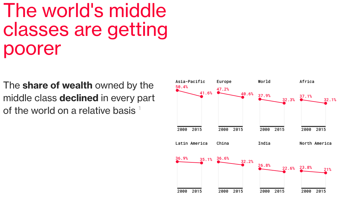
The Middle Class’ share of wealth
The story captures my attention to and dovetails nicely into yesterday’s piece about a possible electoral path for Donald Trump to take the White House later this autumn.
Bonus points for the responsive nature of the post.
Credit for the piece goes to Andre Tartar, Mira Rojanasakul, Jeremy Diamond, and John Fraher.
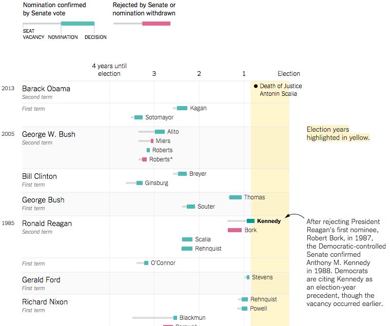
Beyond Donald Trump, Capitol Hill finds itself consumed by the vacancy left by Antonin Scalia. Democrats insist President Obama’s eventual nomination should be considered by the Senate. Senate Republicans rebut saying that a vote should not happen until the next presidential term. That would be the longest, by nearly a factor of three, the Supreme Court has had a vacant seat.
The New York Times put together a graphic article exploring the timeline of Supreme Court nominations: when the seat became vacant; when the successor was nominated; and whether the nominee was accepted or rejected.
Recent history
What I really enjoy is the reversed convention of a timeline. I have made timelines myself on a few occasions and placed recent events at the top, as like here, or to the left in a horizontal format. The idea being recent data and history is more relevant than distant historic information. But placing the relevant data at the bottom or far right makes it more difficult to access.
The timeline bit I like also finds itself in the representation of presidential terms, which the designers chose to display as a countdown from four years from left-to-right. That works very well given the narrative.
And it goes without saying that the annotations add invaluable context.
Overall, a very solid piece.
Credit for the piece goes to Gregor Aisch, Josh Keller, K.K. Rebecca Lai, and Karen Yourish.
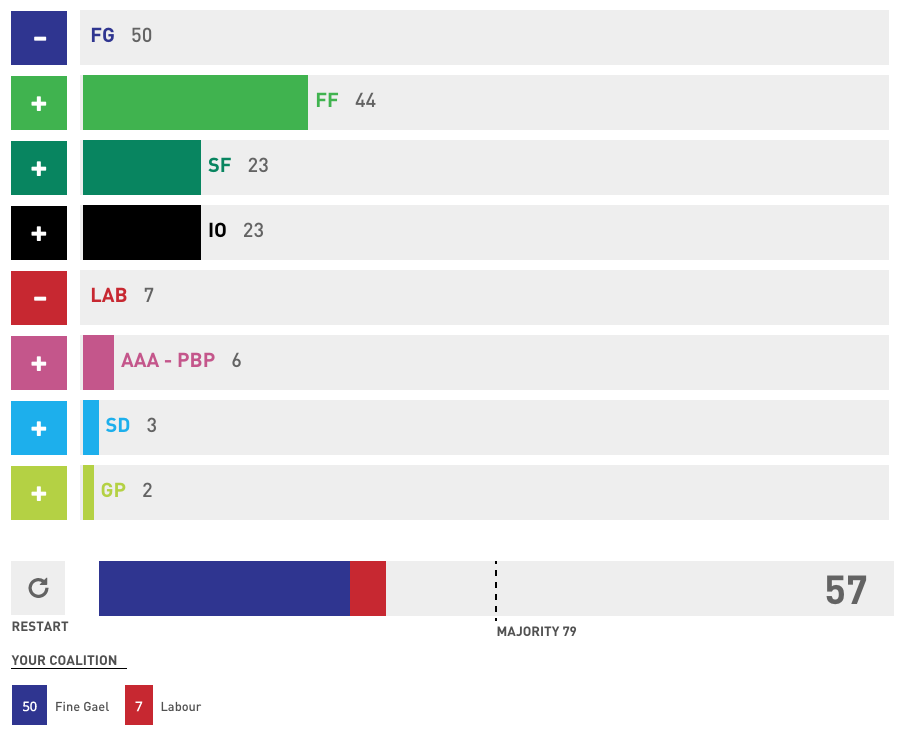
As I alluded to yesterday, in addition to visualising Irish election results the Irish Times built a coalition builder.
The current coalition is far from a majority in the new Dáil
The principle behind the visualisation is sound: how could a government be created? And so the user goes away and creates his or her fantasy government. From a design perspective, the piece is nice with bold, party-related colours and clear controls. The Irish Times also included a nice subtlety with independent TDs (members of the Dáil) as clicking the plus button does not add all ten, but one person at a time. That reflects the fact the independents are not a whole party but ten individuals.
But I personally keep returning to a single question: how realistic are these fantasies? I think an addition that would benefit the story-telling element of the piece would be a guided narrative. Start with the screenshot above, which presents the coalition from the previous Dáil. Clearly they are far from a majority. A guided narrative could explain the likelihood and possible priorities of a various number of plausible coalitions. It would also be able to exclude the more ridiculous pairings.
Credit for the piece goes to the Irish Times’ graphics department.
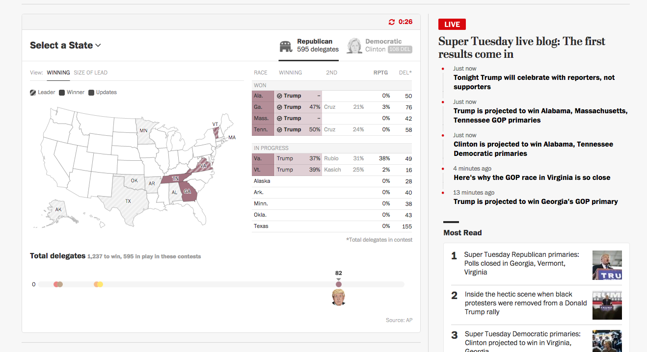
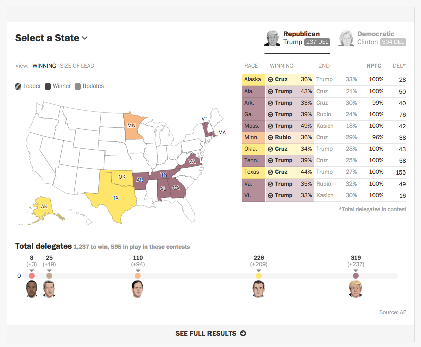
On Tuesday I tracked the results primarily with the New York Times and the Washington Post. I really enjoyed the Post’s coverage as they designed a homepage for the night’s results. The results were placed at the centre of the content, as you can see in the screenshot below. Below the map and table, content updated on the right with links to more static content on the left.
The results hub Tuesday night
The map and table above naturally updated throughout the course of evening. I found their decision to move states from one table to the other when the race was declared a brilliant little decision. When reinforced with a small checkmark, the movement from the lower table to the final table at the top gave a real sense of progress—maybe momentum—to the victories of both Donald Trump and Hillary Clinton.
Final results table and map
Overall, this was a very helpful site for me to follow the results streaming in Tuesday night.
Credit for the piece goes to the Washington Post graphics department.
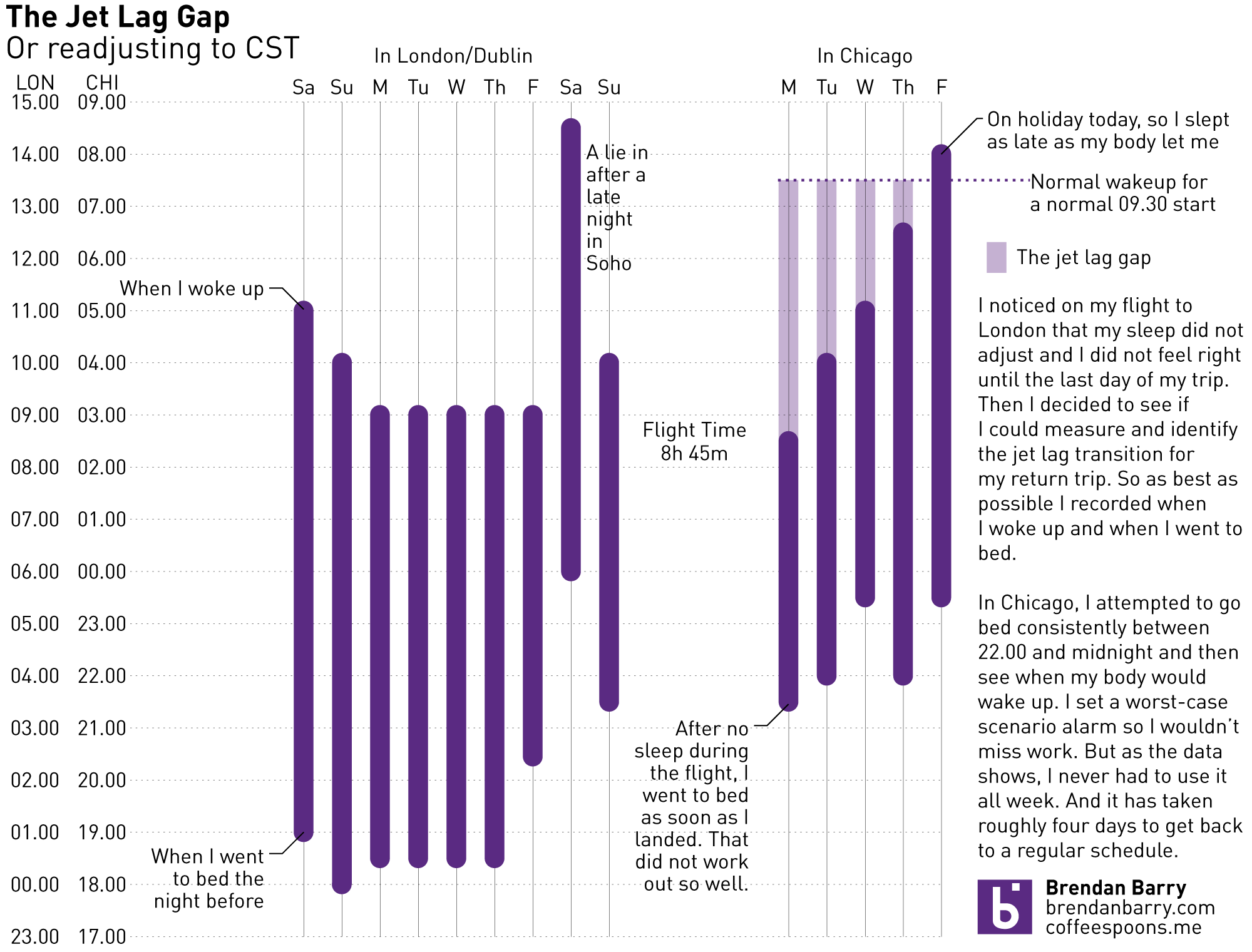
As I mentioned earlier this week, I visited London for work for a week and then took some rollover holiday time to stay around London and then visit Dublin. But now I am back. And this week that has meant all the jet lag. And while everybody experiences jet lag and recovers from it differently, I wanted to take a look at my experience. The data and such is below. But the basic point, it is about four days before I return to normal.
What is missing, unfortunately, is the Chicago-to-London data. Because anecdotally, that was far, far worse than the return flight.
It’s Monday, folks. And for most of us that means going back to work. Which means dressing appropriately. And that’s about as far as I’ve got introducing this subject matter, because I wear a dress shirt and tie everyday. Not a t-shirt. But we’re talking t-shirts. Specifically their sizing.
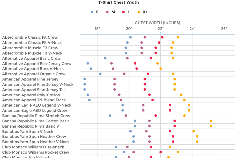
Threadbase is a New York startup looking to do some cool things with data about t-shirts. But that requires having data with which to play. And they are starting to do just that. Their opening blog post has quite a few data visualisations.
Comparing actual sizes via a dot plot
The dot plot above charts the sizes by dimension for various brands and makes. I might quibble with the particular colours as the red and purple are a bit on the difficult side to distinguish. Symbols could be away around the issue. But the only real issue is that on my monitors the full image runs long and I lose the reference point of the actual dimensions in inches.
But the piece is worth the read for the cyclical changes in dimensions.
Mostly it’s just a pity that I’m not a jeans and t-shirt sort of guy.
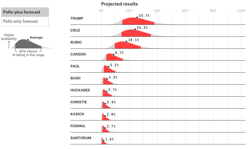
If you did not realise it, today is the first day of the second phase of the American presidential election process. Phase 1 was all the posturing and getting-to-know-me stuff from every candidate. A few dropped out, but now the first votes will be placed in the cold and later tonight snowy town centres of Iowa. The big story for Iowa is can Trump fend off Cruz and can Hillary fend off Bernie. (I like how we can clearly delineate the two parties by whether we use surnames or given names.)
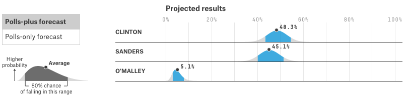
I love election season and in particular the visualisations that go along with them. But I have been making a conscious effort not to go overboard. But that phase is over, so today we look at FiveThirtyEight’s range plots that I have enjoyed for some time now.
Who will be first in Iowa?
They are sort of like a more intuitive version of the familiar box plot. Your highest probability falls within the red—what other colour did you expect—and the average value is denoted. But you can also see that the curves are asymmetric. In short, anybody from Carson up really has a shot. But expect to see Trump or Cruz on top in Iowa.
The race, however, is not quite as exciting on the Democratic side. However, much like I am surprised that Trump is not just still running, but leading, I am surprised about Bernie Sanders’ strength. While he is further behind than Cruz is behind Trump, it is still quite possible for Iowa to “feel the Bern” as they say.
The Democratic plots
There are of course other visualisation pieces out there—on this page even—but how about we ease into the commentary? After the presidential election is much more a marathon than a sprint. Anyway, I guess we will all see how accurate these plots are come this time Tuesday.
Credit for the piece goes to the FiveThirtyEight design team.
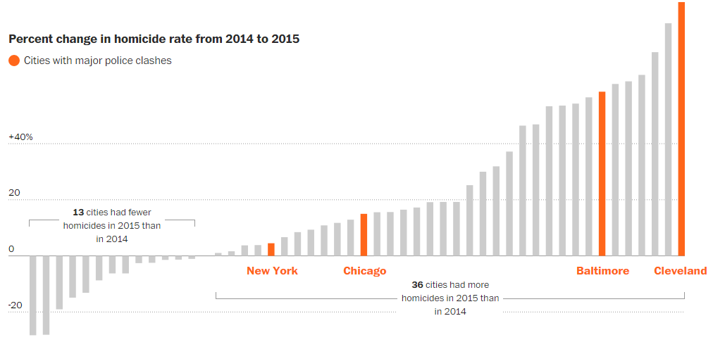
Today we look at a really nice piece from the Washington Post on urban homicide. It combines big, full-width images that use interactivity to promote exploration of data. But as you can see in the screenshot below, the designers took care to highlight a few key stories. Just in case the reader does not want to take the time to explore the data set.
The growth rate is an interactive piece
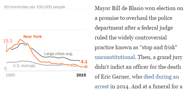
But the piece uses scale to provide contrast throughout the article. Because in addition to the three or four big graphics, a similarly well-thought-out and well-designed approach was taken towards smaller, inline supplemental graphics. Here is an example about the homicide rate for New York.
New York’s homicide rate as an inline graphic
What I really enjoy about these small graphics is the attention paid to highlighting New York against the background averages provided for context. Note how the orange line for the city breaks the grey lines. It is a very nice detail.
Overall, this is a really strong piece marrying written content and data visualisation.
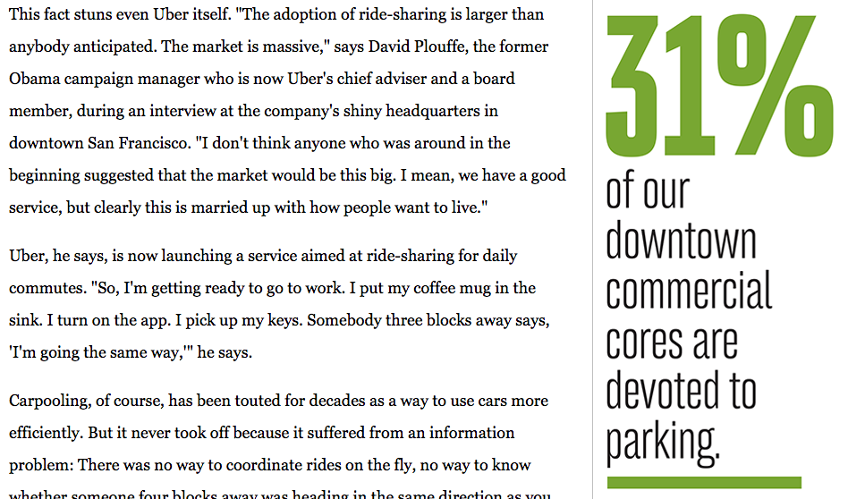
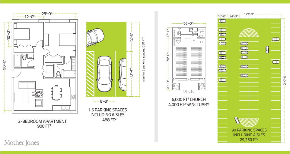
Mother Jones had a lengthy but fascinating piece on urban parking. (I mention the lengthy bit only lest you think it a quick lunch read.) While the design uses a few factettes as sidebars to the main body copy:
Sidebar factette
The more interesting piece is the illustrative comparison of a 1.5 vehicle parking space to the size of a 2-bedroom flat. This is the main and really only graphic of the whole piece. However it does a great job comparing the sizes required for humans and for vehicles. We use a lot of space for vehicles.
2 bedrooms vs 1.5 vehicles
Not that I have any intention of getting rid of my car.