Sugary Sweet Donut Charts

I know, I know. You probably expect some sort of climate post given the whole Paris thing. But instead, this morning I came across an article where the supporting chart failed to tell the story. So today we redesign it.

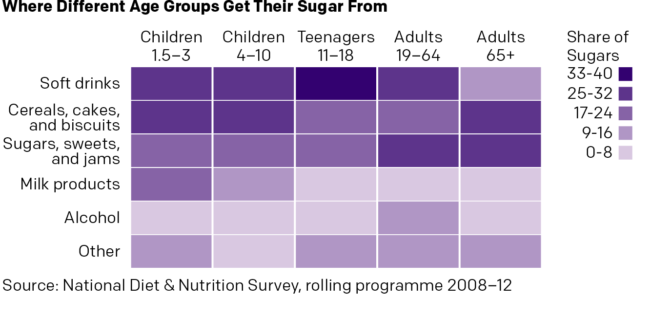
The BBC has an article about MPs backing a tax on sugary drinks. Within the text is a graphic showing the relative importance of sugary drinks in the sugar consumption of various demographics. Except the first thing I see is alcohol—not the focus of the article. Then I focus on a series of numbers spinning around donuts, which are obviously sugary and bad. Eventually I connect the bright yellow to soda. Alas, bright yellow is a very light colour and fails to hold its own on the page. It falls behind everything but milk products.

The BBC likes sugary donuts

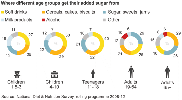
So here is 15 minutes spent on a new version. Gone are the donuts, replaced by a heat map. I kept the sort of the legend for my vertical because it placed soda at the top. I ran the demographic types horizontally. The big difference here is that I am immediately drawn to the top of the chart. So yeah, soda is a problem. But so are cakes and jams, you British senior citizens. Importantly, I am less drawn to alcohol, which in terms of sugars, is not a concern.

My version of sugar is so much sweeter

Credit for the original goes to the BBC graphics department. The other one is mine.

What do People Look for on Black Friday?

Well, today is Black Friday. And so there were probably lines at the door of your local department store at the wee early hours of the morning. But I was working, and partly to bring you this. Google has data on what each state searches for the most. And Vox turned that into a map. Turns out a lot of you want boots.

All the boots
All the boots

Credit for the piece goes to Javier Zarracina.

The Future of Climate Change

At the end of the month the world will gather in Paris, France for the next round of climate change talks. In advance of the talks, the Financial Times put together this model of how emissions reductions will help—or not—get climate change under control. The piece is two-fold. The first is a ten-step narrative that showcases the tool’s split of the time series into short-, medium-, and long-term impacts and how those work in the best and worst case scenarios. But it then allows the user to jump right on in and create their own scenarios.

Is it getting hot out there?

Credit for the piece goes to John Burn-Murdoch and Pilita Clark.

The Relative Value of Republican Primary Votes

The day after Election Day—no, not that Election Day—we take a look at a nice scatter plot from FiveThirtyEight. They explore how an eventual conservative candidate, whoever that may be, will face a structural challenge. There are slightly more delegates at play in blue states than red. And typically those blue Republicans are “less religious, more moderate and less rural.” The big graphic supporting their argument looks at the value of the primary votes. Surprise, surprise, the higher-value primary votes come from blue states.

The relative value of the votes

Credit for the piece goes to the FiveThirtyEight graphics department.

Redesigning the Turkish Election Results

Turkey held its elections over the weekend. And so on the way to work this morning I decided to check the results on the BBC. And I saw this graphic—screenshot from my phone.

The BBC results
The BBC results

So I decided to scrap today’s blog post and instead spend all of five minutes tweaking this to make it a bit clearer. Or, a lot clearer. Simple little tweaks can make all the difference in data clarity. Now you can visually see the scale of difference in the votes. You also don’t need to refer to a legend off to the side with tints of the same colour.

My results with their data

Credit for the original piece goes to the BBC graphics department.

Paul Ryan is Your New Speaker

Paul Ryan is about to takeover for John Boehner as Speaker of the House. So the Washington Post put together a nice graphic-featuring article about how Ryan compares to previous speakers—turns out he is fairly young. But the end of the piece uses this graphic to look at the number of days, i.e. experience, each speaker had prior to taking the role.

But try comparing him to someone other than Boehner…

By putting the dots around a circle, the Post has created an interesting graphic. But the format makes it difficult to compare individuals who are not close together.

Credit for the piece goes to Philip Bump.

The Canadian Elections

Canada held an election yesterday. For your briefing on it, John Oliver did a great job on Last Week Tonight. But for the serious coverage, we have results.

Here we have the results coverage by the National Post. It’s your standard choropleth coloured by the victor in each riding, or constituency. From a design side, I find the pattern fill interesting and not something I have seen done before for a political map.

I just chose a place I had visited in Canada

But I really like what the CBC did. They built an interactive application to cover the evening’s results as they arrived. This screenshot is for the riding in Fredericton, where my ancestors lived in the 19th century. (I had to have a connection to the ridings somehow.) In particular, I liked the ability to star ridings of interest and have them immediately retrievable. The CBC complemented that with a list of ridings to watch. It was a great resource for the evening.

Fredericton results
Fredericton results

But then they also covered the results with an article with interactive graphics. This is more your standard fare with choropleths, bar charts, and line charts. But they flow through the article quite sensibly. Overall, a solid results piece.

Party results per region

Credit for the National Post piece goes to the National Post graphics department.

Credit for the CBC piece goes to the the CBC graphics department.

McDonald’s All-day Breakfast

I don’t know about you, but I have seen a lot of those all-day breakfast bags sitting about the city of Chicago the last few days. (That they are not in waste bins is a different story.) CBS took a look at where the biscuit vs. McMuffin offering is available in the US—hint, not Chicago—and compared that geographic spread to something else. It’s worth a quick look.

Where to go for biscuits

Credit for the piece goes to CBS graphics department.

The First Democratic Debate

Last month we looked at the Washington Post’s coverage of the second Republican Debate. For those unaware, the first Democratic Debate was held last night. And so it is only fair for us to look at the Post’s coverage of that event.

Who engaged whom
Who engaged whom

Credit for the piece goes to Samuel Granados, Richard Johnson, Denise Lu, Ted Mellnik, and Kevin Schaul.

The Safe List

Migrants and refugees continue to reach Europe. But some of those people can be sent back, depending upon their country of origin. The tricky part is that there is no common set of countries as this graphic from the Economist shows.

The safe list
The safe list

In terms of design, we see nothing too elaborate here. This is really just a table where checks, half-checks, and exes would have sufficed. But, sometimes, a table is really all you need to convey the important data.

Credit for the piece goes to the Economist’s Data Team.