A few weeks back the White House announced some new plans for clean electricity. The Washington Post put together an interactive graphic looking at the sources for American power.
America’s power sources
Credit for the piece goes to John Muyskens, Dan Keating, and Samuel Granados.
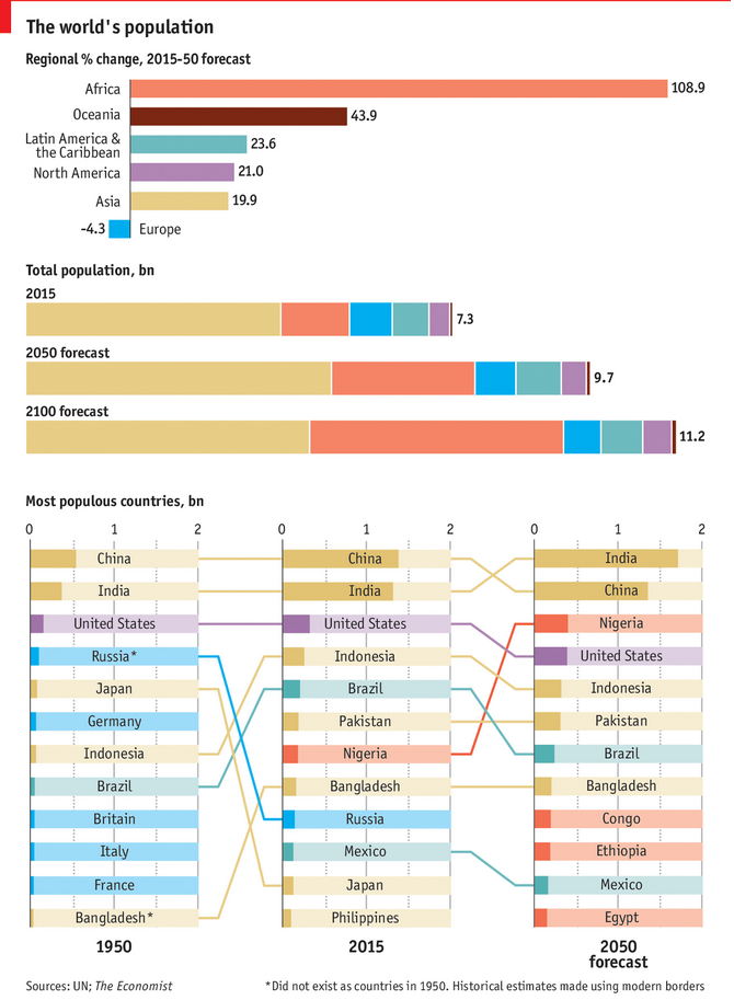
The UN released some new population estimates. And no surprise here, the world is still getting larger and a lot of that growth will be in Africa. But the Economist put together a graphic looking at some of the forecasts, including the ever popular bragging rights of “Who is the Largest Country?”
Population growth forecasts
Credit for the piece goes to the Economist Data Team.
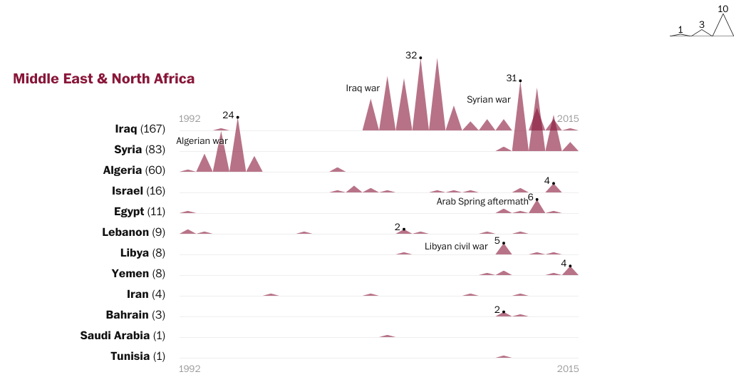
Journalism is not always a safe profession. Indeed, many journalists risk their lives to bring us news from conflict zones or otherwise dangerous places. This piece from the Washington Post supplements an article about a particular Pakistani journalist, but looks at a broader set of journalist deaths over the last 20+ years.
Mountains of conflict
That said, unless you are a fan of the Mountain of Conflict, this graphic does nothing for me. Because of the way the points form mountains, it begins to emphasise the area of the triangle, not the height of the point. Secondly, the mountains overlap and then because of the way the colours interact, give increased emphasis where there should not be any. After all, the overlap does not signify anything of itself.
Credit for the piece goes to John Muyskens and Samuel Granados.
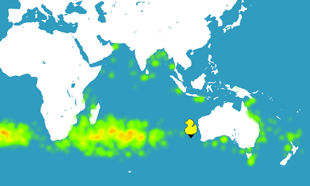
Last night (Central Daylight time), news broke that what might be part of the wing of a Boeing 777, which is the same type of aircraft as the missing Malaysian Flight 370, washed up on the French island of Réunion in the Indian Ocean. The Guardian was following the story last night and one of their reporters used a ocean currents simulator to see if wreckage from a crash off the coast of Perth (western Australia) could make it to Réunion.
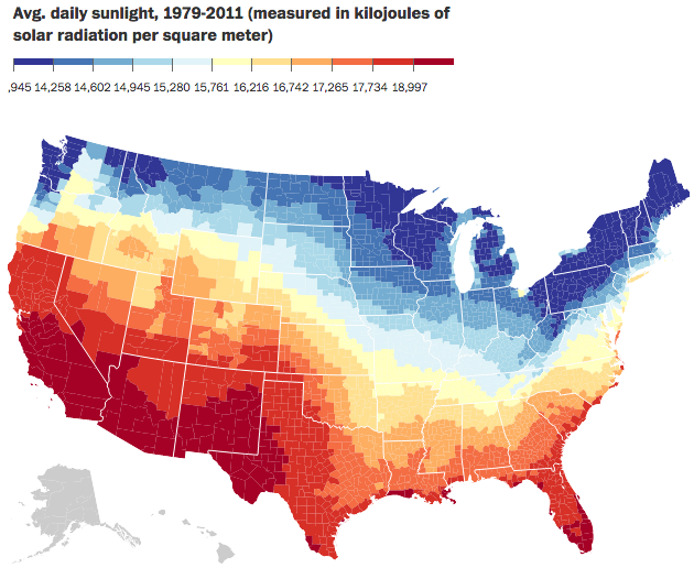
I was talking with someone the other day about how I dislike warm weather. Give me nice, cool, crisp weather any day of the week. And also how I am okay without sunshine—a cool, misty, grey day is lovely. Much of weather, of course, is determined by sunlight, energy, hitting the Earth. Well, just a few weeks ago the Washington Post published a piece looking at daily sunlight. At the end of the piece it has a nice small multiple graphic too.
Average daily sunlight
Credit for the piece goes to the Washington Post graphics department.
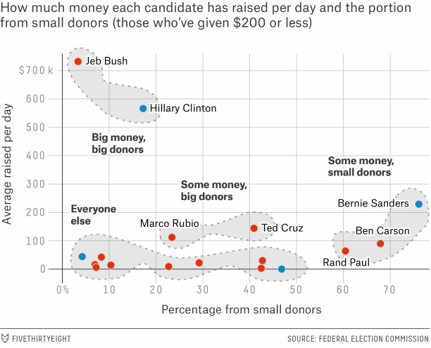
We are past the halfway point for summer in 2015 and that means the autumn 2016 presidential election is off and running. But running an election campaign, if even just for the primary phase, costs money. So where does each candidate receive its money? Well, FiveThirtyEight looked at the early reporting and identified four types. Their scatter plot does a nice job of summarising the state of the field.
Funding source types
Credit for the piece goes to the FiveThirtyEight graphics department.
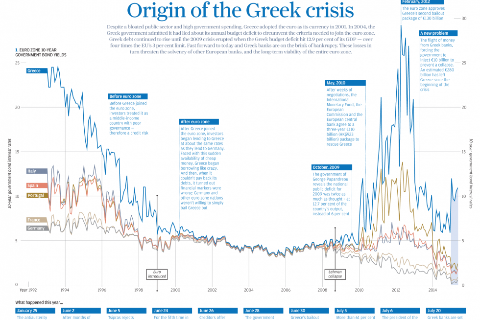
In today’s post we look at a graphic made by the South China Morning Post to explain the Greek Crisis. The graphic does a nice job anchoring the story in a combined chart and timeline. The reader then continues down the piece learning about additional points from demographics to text-based explanations.
The combined chart and timeline
Credit for the piece goes to the South China Morning Post graphics department.
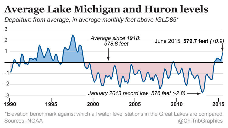
Today’s a little piece for those of you who follow me from the Chicago area. It turns out that in the last 30 months, the water level of Lake Michigan has risen three feet. Despite what some people think, Lake Michigan is not an ocean—I have overheard conversations in my neighbourhood about people who went “swimming in the ocean today” and want to show them a map that points out the Atlantic is almost a thousand miles away—and is not under the same threat as the coast via melting icecaps. The Great Lakes are instead impacted by other regional and cyclical patterns, e.g. El Niño. This article by the Chicago Tribune makes use of this small but clear line chart in its discussion of those very factors.
Water levels for Lakes Michigan and Huron
Credit for the piece goes to the Chicago Tribune’s graphics department.
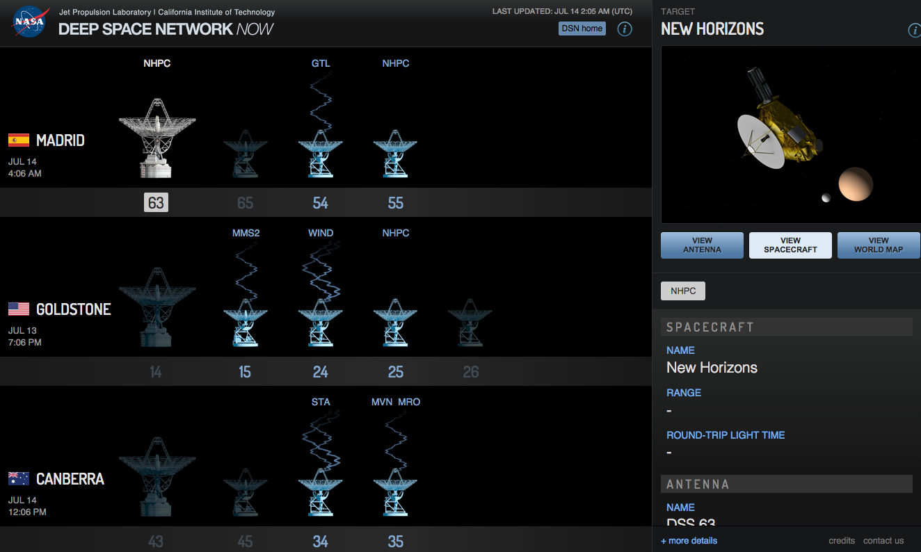
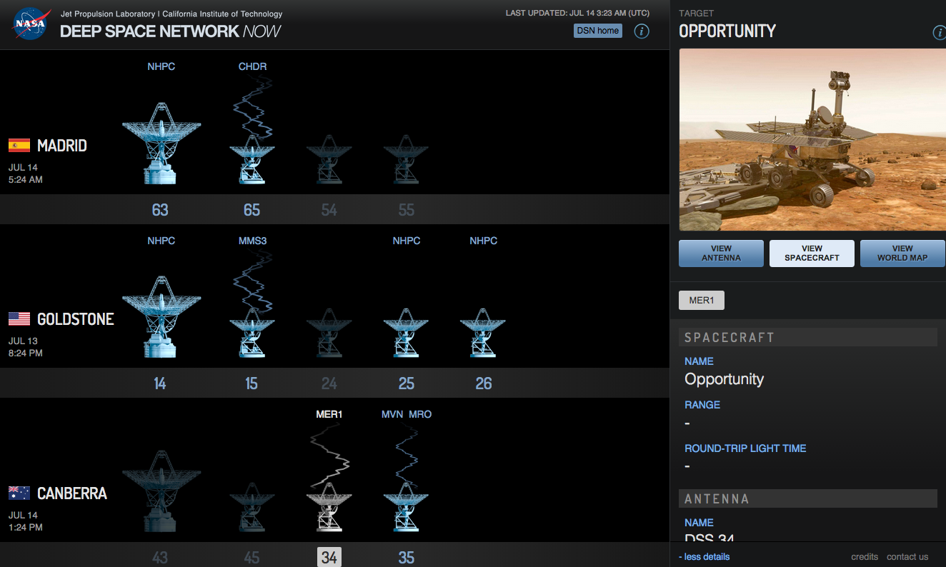
So New Horizons is long since gone from Pluto. But it will still take 16 months to send back all the photographs and science. Why so long? Because so far away. 3 billion miles away. Put another way, light from the sun takes eight minutes to reach Earth as it travels at, well, the speed of light. Radio signals that travel at the speed of light take 4.5 hours to reach Earth from Pluto. So imagine trying to send large data files that far away at a download speed less than that of a 56k modem, for those of you old enough to remember such a thing.
But what receives these radio signals? NASA’s Deep Space Network of antennae that allow NASA to communicate with spacecraft and such things that are in, wait for it, deep space. These antennae are scattered throughout the world, but in this screenshot taken Monday, you can see just what the antennae at the various complexes are doing. Here, we see New Horizons (NHPC) just prior to its flypast communicating with the large antenna at the Madrid complex. The lack of signal lines indicates that it is preparing to setup, takedown, or is tracking the spacecraft.
From early Monday night
As a fun aside, I left the tab open in the browser and a few hours later came back to find the Deep Space Network sending signals to the Mars rover Opportunity (MER1), the Chandra X-Ray Observatory (CHDR), and the Mars Reconnaissance Orbiter (MRO) amongst others.
Opportunity is still chugging along on Mars
Credit for the piece goes to the NASA graphics department.
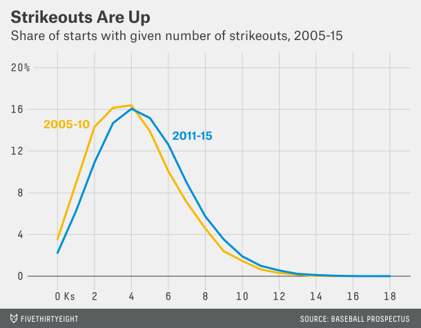
Baseball has changed in the last twenty years or so. (And I’m old enough to recognise it.) Gone are the days of the high strikeout/high pitch count starts from the likes of Roger Clemens, Pedro Martinez, Randy Johnson, and Kerry Wood. In are high strikeout/low pitch count games…
What does that mean? You can read this article from FiveThirtyEight to make the most sense of it. But this chart explains part of it:
More strikeouts per game
Basically, baseball is played with a lot more data than it used to be. We now know empirically that pitchers are most effective the first time through the lineup. Less so the second time. Even less so the third. The great pitchers, obviously, lose less effectiveness, but everybody does. So, if you can maximise your strikeouts (which come at a great cost of pitches thrown per arm—separate story that) by limiting a start to, say, twice through a lineup, you do so. Because then you can plug in hard-throwing relievers who, in their first and often only time through the lineup, can rack up a few strikeouts. So the result from that is higher strikeouts, lower pitch counts.
And that means that it is highly unlikely you will see games where a starting pitcher throws 120, 130, 140 pitches in a start and strikes out 16+ batters. Which is a shame, because I’m clearly old as those were my favourite ball games to watch.
Credit for the piece goes to the FiveThirtyEight graphics department.