ISIS Throughout the World

ISIS is still a threat to the Middle East, evidenced by the US announcing yesterday that it is intensifying strikes against the quasi-state in both Syria and Iraq. But just where has ISIS spread? And are its attacks spreading? This New York Times piece looks at just those two questions. The first through an obvious map.

The geographic reach of ISIS at all points over time

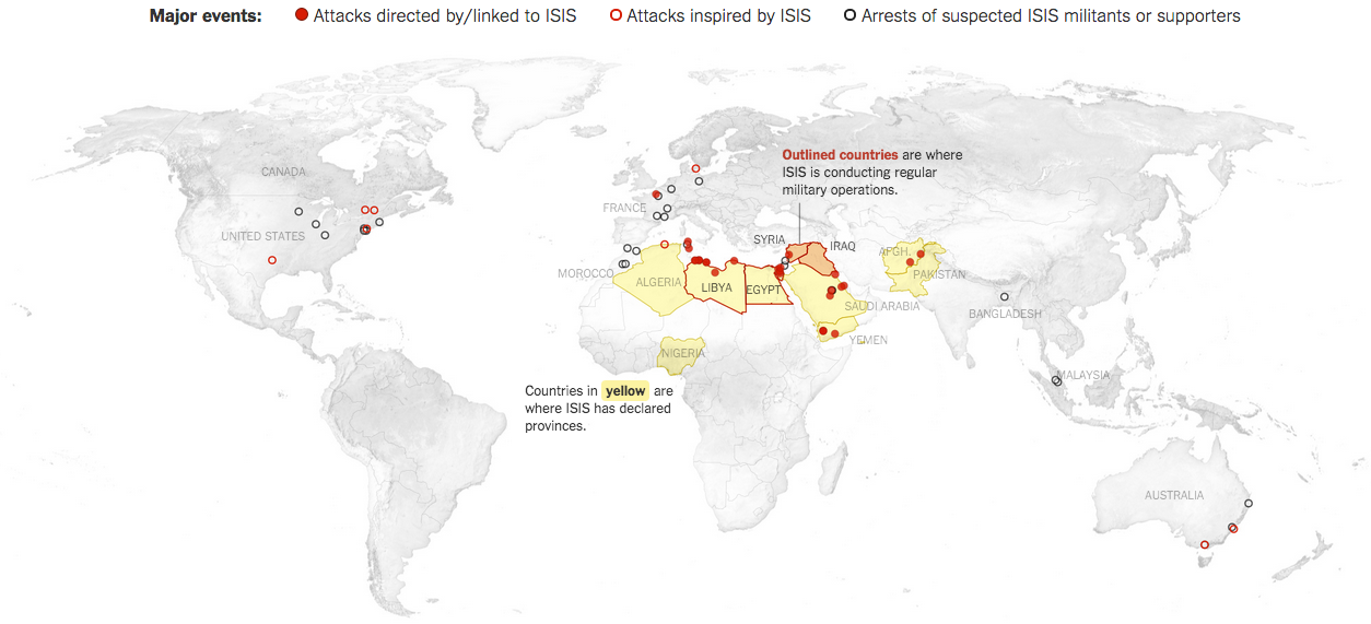
What the map does is show you where ISIS has attacked around the world over all time. So yes, it has global reach. But the map alone cannot show you if things are improving or getting worse. For that you need a visualisation type that can plot things over time. And as aforementioned, the piece includes that as well.

A spike in attacks this winter presaged a summer of terror

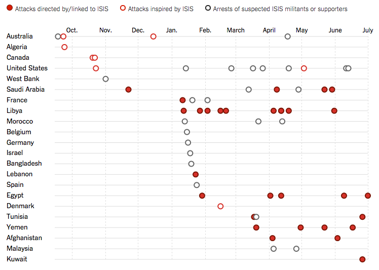
Unfortunately, it appears that yes, ISIS is attacking or at least attempting to attack more targets in more countries both within and without the Middle East and its declared provinces.

Credit for the piece goes to Karen Yourish, Derek Watkins, and Tom Giratikanon.

Greek Referendum Results

So when I initially planned to do this post for today, I thought the results would be a lot closer and the data display more interesting. But, I was wrong. It turns out the Greeks voted overwhelmingly against the European Union’s offer in a greater than 60–40 result. But, here we go anyways, a whole lot of no in this piece from the Guardian.

Turns out Greeks don't want austerity
Turns out Greeks don’t want austerity

Credit for the piece goes to the Guardian’s graphics team.

The Supreme Court’s Recent Liberalism

Last week the Supreme Court ruled in favour of the Affordable Care Act, better known colloquially as Obamacare, and said that the federal tax subsidies are, in fact, constitutional. But, this piece is not so much about that one individual ruling, but rather the surprising trend of the recent Roberts’ court terms to skew liberal instead of the expected conservative. In this Upshot piece from the New York Times, an interactive graphic backs up the article explaining just what has been going on in the Supreme Court.

The court has been conservative for decades

Credit for the piece goes to Alicia Parlapiano, Adam Liptak, and Jeremy Bowers.

The Curviest Tracks on the Northeast Corridor

If you remember a little while back, Amtrak No. 188 derailed in North Philadelphia at Frankford Junction. I covered it here and here. Well, the New York Times has analysed the Northeast Corridor to identify the curviest segments of track, excluding entrances and exits from stations. Perhaps as no surprise, Frankford Junction is right among the top segments.

Tracks north of Centre City Philadelphia

Credit for the piece goes to the New York Times graphics department.

Atlas

Today’s blog post is not so much about a single piece of content, but rather a site of content. Today we look at Atlas, a new chart site from Quartz that at launch is designed to showcase chart-only content from Quartz. They state the later goal is for curated content from contributors. The charts are all made from Quartz’s in-house chartbuilder tool, an open-source platform they use to build the charts you see in a lot of their articles. And now all over Atlas.

Below the fold, the charts begin

The other nice thing about Atlas is its focus on extensibility, i.e. how you the audience can reuse the content. You can share it, you can download the data, you can link to it. You just probably shouldn’t call it your own. At launch, nothing looks too fancy. But, as a nice reminder folks, the fancier your charts get, the more likely it is that they will be harder to read and understand.

Credit for the piece or site goes to Quartz.

Failing to Whack the Mole

The story and data behind today’s graphic are worth telling. But, the execution leaves me feeling a bit empty. The piece kicks off a new series called Data Points from National Geographic. But, here in this piece we are looking for clear communication of data. So what do we get? Circles. Circles within circles within circles. My problem?

The overview view
The overview view

Well you can see from the first screenshot that we are missing the gap space, i.e. the space between the container circle and the data circle. The gap makes the container look larger than it really is. Granted, area is not a great way of comparing data points, but that aside, something like a tree map would probably be more accurate and still allow for the nesting that occurs, see below.

A nested view looking at snakes

The overall display includes nice ancillary data about top importers and exporters along with how the animals in question are used. Some animals even have trade notes that offer more context on how particular animals are used.

On the plus side, the piece’s title is great: Space Monkeys and Tiger Wine. I mean, how can you not read that? While they missed lots of the moles popping out of circles on this one, they did nail the title.

Credit for the piece goes to Katilin Yarnall and Fathom Information Design.

Aquifers Around the World

It has rained quite a bit in the south the last couple of days, thanks to tropical weather systems. But, as some new data from NASA shows us, the world is running out of water. That is largely because we drain large underground water systems called aquifers faster than the natural environment replenishes them. The Washington Post has a small interactive map that looks at the world’s largest aquifers and respective trend towards either being recharged or drained.

Aquifers are being drained around the world

Credit for the piece goes to Todd Frankel.

LeBron James in the NBA Finals

I really do not know much about basketball. I did not realise that the finals had been going on. But, rest assured, they were. The Washington Post looked at whether or not LeBron James had the best finals match performances since 1985. It turns out, not so much. For those of you from the Chicago area, you may instead take solace that one of those guys from that Chicago team represents well.

The top five performances since 1985

Credit for the piece goes to Todd Lindeman and Richard Johnson.

What if the World Were of States with Equal Populations?

Well, thanks to a reddit editor frayuk, via a nice post on Vox, we now can look at what that world would look like. It’s a bit difficult to see some of the details, but click through to the Vox piece to see just those.

A map of equals
A map of equals

Credit for the piece goes to frayuk.