If you did not hear about it the other day, the head of FIFA resigned. That is kind of a big deal because football (in the rest-of-the-world sense of the word) is kind of a big deal. But the organisation that runs it is generally seen as wholly corrupt. So this BBC piece takes a look at the revenue and spending—at least so far as we know about it.
Sort of a Sankey diagram
Credit for the piece goes to the BBC graphics department.
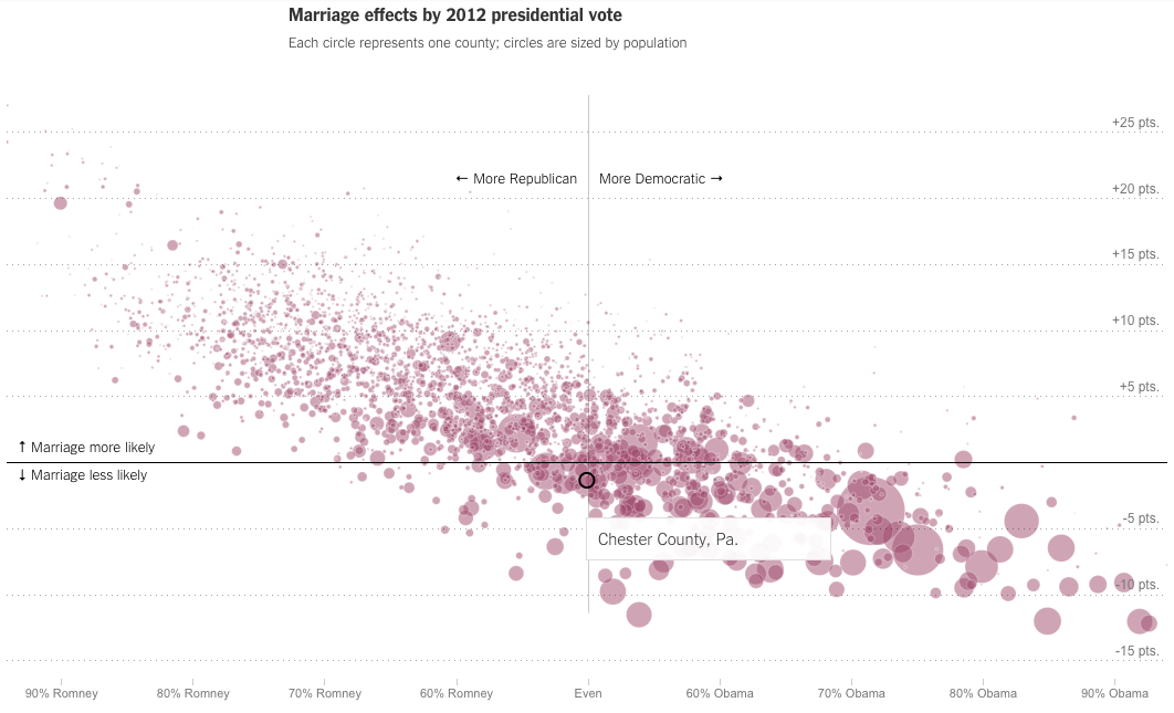
Last week we looked at the New York Times piece on where you grew up’s impact on future income. This week, we look at their follow-on piece, how your hometown impacts your odds of getting married. The piece includes some nice interactive choropleth maps, but my favourite part is the scatter plot correlating politics (as determined by 2012 election votes) to marriage. My hometown (‘s county) is highlighted in the screenshot below.
Chester Co., PA is almost even politically, but slightly less likely to marry
Credit for the piece goes to David Leonhardt and Kevin Quealy.
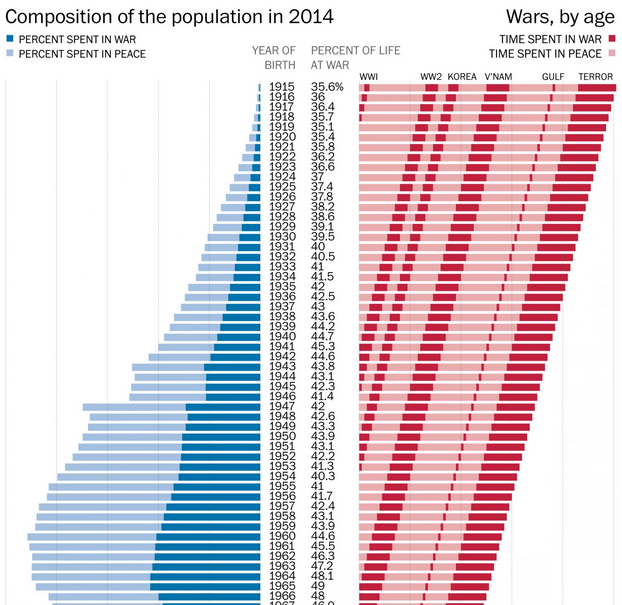
Monday was Memorial Day here in the States. As a millennial, that means I have spent nearly most of my life in wartime. Today’s post looks at a graphic from the Washington Post that explains how anybody born after 2001 has spent the entirety of their life in wartime. Before then, however, and the numbers get fuzzier, because of the subjective nature of when the United States has been at war. But, given the undercounting in the article—as it notes—it is safe to say that the percentages visualised are low.
Lifetimes at war
Credit for the piece goes to the Washington Post graphics department.
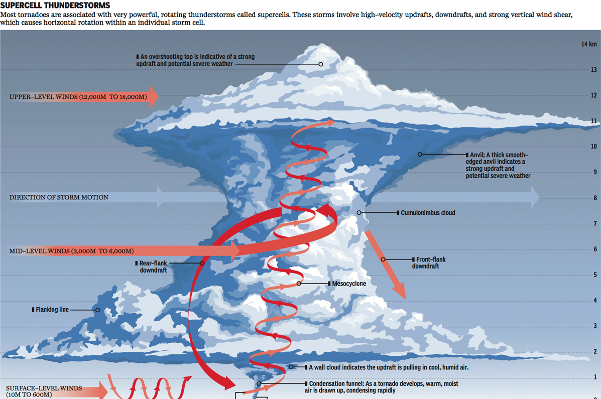
I just returned from my trip to Kansas City last night. Kansas, if you did not know it, exists within what people call Tornado Alley. That means they receive a lot of tornadoes. But what are tornadoes beyond the plot points of mid-90s action films? Basically complicated micro-weather systems. So complicated we still don’t entirely understand them. But the National Post looks at explaining what we do know.
Inside a tornado
Credit for the piece goes to Andrew Barr and Mike Faille.
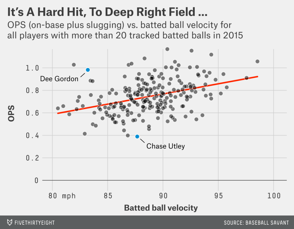
We all know that I am a Red Sox fan. But I grew up in Philadelphia, largely before the era where the internet made watching out-of-market games a reality. That means I am quite familiar with my hometown Philadelphia Phillies. And for a good chunk of my life that meant names like Rollins, and Utley were familiar to me. So now as that group of players begins to retire and/or leave Philadelphia, we have Chase Utley underperforming to start 2015. But FiveThirtyEight asks the question: is he really? Or is it just that Utley is unlucky?
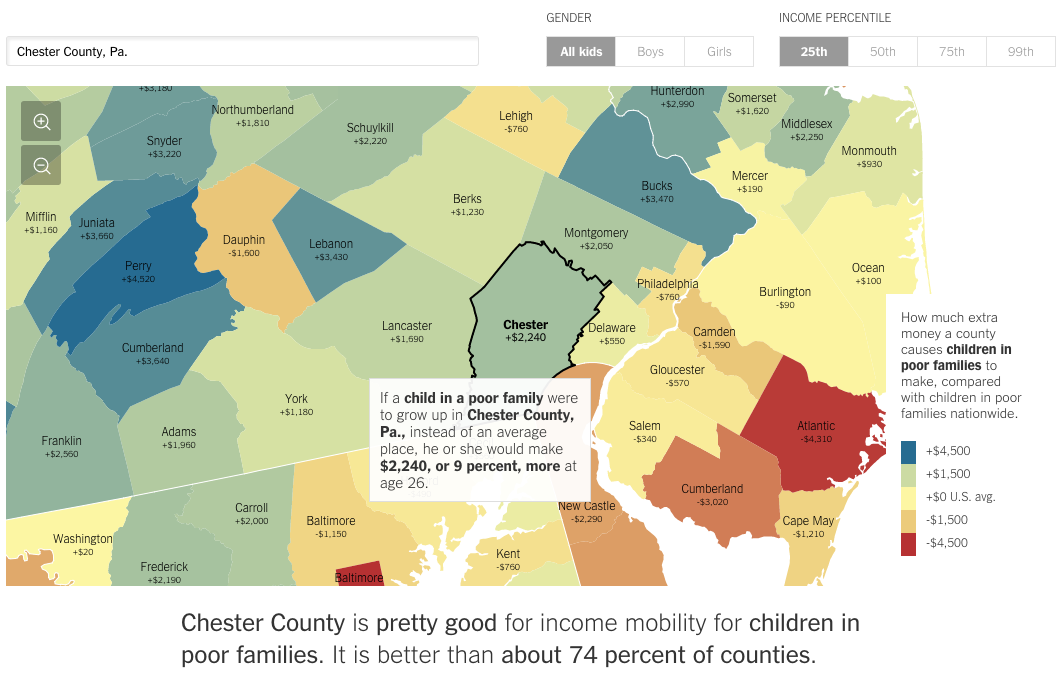
Today we have a really interesting piece from the New York Times. In terms of visualisations, we see nothing special nor revolutionary—that is not to say it is not well done. The screenshot below is from the selection of my hometown county, Chester County in Pennsylvania. Where the piece really shines is when you begin looking at different counties. The text of the article appears to be tailored to fit different counties. But with so many counties in the country, clearly it is being done programmatically. You can begin to see where it falls apart when you select rather remote counties out west.
How the poor in Chester County fare
But it does not stop simply with location. Try using the controls in the upper right to compare genders or income quartiles. The text changes for those as well.
Credit for the piece goes to Gregor Aisch, Eric Buth, Matthew Bloch, Amanda Cox, and Kevin Quealy.
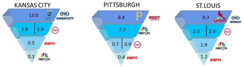
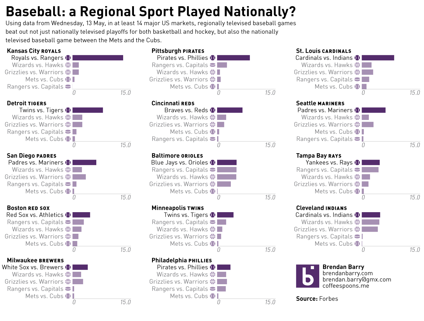
There was an interesting article in Forbes on Monday that looked at baseball’s popularity. In short, the commonly believed argument is that baseball is becoming less popular vs. sports like football, basketball, &c. Hence, one of the reasons for the pace of play changes. However, last Wednesday, there were three nationally televised playoff games—two in basketball and one in hockey—and one nationally televised baseball game, Mets at the Cubs. The logic of the common argument would have non-playoff baseball falling behind the playoff games. But, in 14 of 24 media markets, the local baseball games drew more television viewers than playoff basketball or hockey, or even national baseball games. Unfortunately, the article in question used some really poor graphics to communicate this story. So, I decided to spend my Monday night making it clearer for you. Compare a snippet of the original to mine. You make the call.
The original chartHow the local baseball game did against the national sports games
Credit for the original piece goes to the Forbes graphics department.
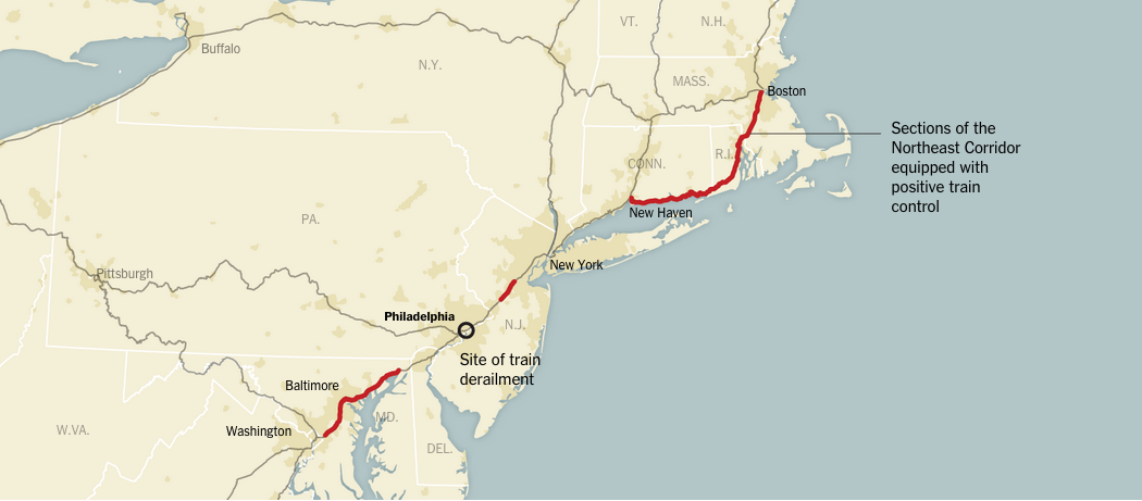
Tuesday I posted my late-night work on Amtrak No. 188’s derailment, (now with a few minor updates, including the speed information released this afternoon) so you could all get a sense of what happened yesterday. Of course, in the last 24 hours, we have seen a lot of news outlets covering the story.
The New York Times has a nice piece mapping out the details of the accident. Of particular interest, they included a map showing the parts of the Northeast Corridor equipped with positive train control. That is a system designed to prevent trains from exceeding their speed limits.
Positive train control implemented on the Northeast Corridor
The Washington Post has two nice pieces. The first, below, incorporates both illustration to simplify the wreck site for the audience and then photographs to provide context of just how destroyed some of the train cars are, the first in particular.
Using both illustrations and photographs
The Post, however, also has a supplemental piece that looks at Amtrak’s accidents over the last ten years. This is the most data-centric piece of all that we are looking at, but that is okay. Most of the story is not reliant on data, but rather illustrations and diagrams trying to piece everything together.
Comparison of derailments vs. vehicle collisions
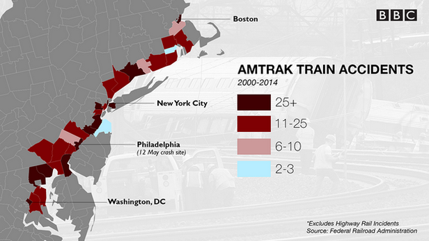
Lastly, the BBC has an article with several small graphics looking at US train risks. Spoiler, American trains, while safe, are far less safe than those in Europe and Asia. Here, though, the map looks at accidents along the Northeast Corridor.
Amtrak accidents
Credit for the New York Times piece goes to Gregor Aisch, Larry Buchanan, Bill Marsh, Haeyoun Park, Sergio Peçanha, Julie Shaver, Joe Ward, and Karen Yourish.
Credit for the Washington Post piece on the derailment goes to Bonnie Berkowitz, Patterson Clark, Alberto Cuadra, Todd Lindeman, Denise Lu, Katie Park, and Gene Thorp.
Credit for the Washington Post piece on Amtrak accidents goes to Dan Keating and Lazaro Gamio.
If you have not noticed, lots of news sites are using a variant of the cartogram lately. Basically, the idea is that geographic maps have the limitation of accurately representing landmass. And that means small polities, e.g. Rhode Island or Belgium, that might be quite important are visibly not so much, because they are geographically small. These pseudo-cartograms sort of do the trick by making all polities the same size. The trade off? Geographic fidelity. Anyway, there is an intelligent piece worth reading over at the NPR blogs explaining the thought process going on there about why to use the form. (You may recall I wrote about a similar project for London boroughs back in February.)
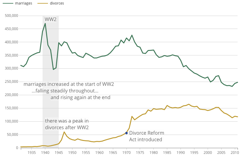
Friday was Victory in Europe Day, or VE Day for short, which marks the end of World War II in Europe. (The war continued in Japan for a few more months.) Anyway, the United Kingdom’s Office of National Statistics put together a couple of charts looking at the war’s impact on the structure of the British population. Many know the baby-boom phenomenon. But, did you know about the divorce-boom phenomenon?
Marriage and divorce rates over time
Credit for the piece goes to the ONS Digital team.