The UK General Election

Well for those of you among my British audience, today is the big day. Can Malcolm Tucker save Nicola Murray from—wait, nope, that’s fictional British politics. But that doesn’t mean today’s results won’t be exciting. For those of you now from the UK, a majority of my readers, the UK is looking at what is called a hung parliament. In other words, nobody will win a majority of seats, which means that smaller parties will need to be included in a coalition government, a sort of fairly new—but also not really—development in British politics.

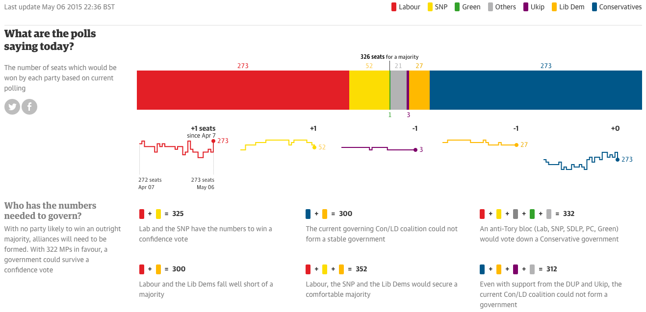
We could dive deep into all of these, but I have not the time. But, let’s start with the Guardian. They have a nice set of polling and prediction guesstimators. What is really nice, however, is the seat changing graphics. These show you where the gains and losses are predicted to originate.

The Guardian's predictions
The Guardian’s predictions

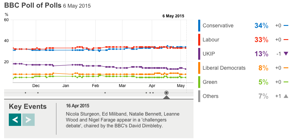
The BBC has a much less involved piece. This is the only thing I can find. However, the BBC will undoubtedly have interesting visuals during their live broadcast of the results. Jeremy Vine can always be counted on for weird presentational things. Oh, and they have the swingometer.

The BBC's poll tracker
The BBC’s poll tracker

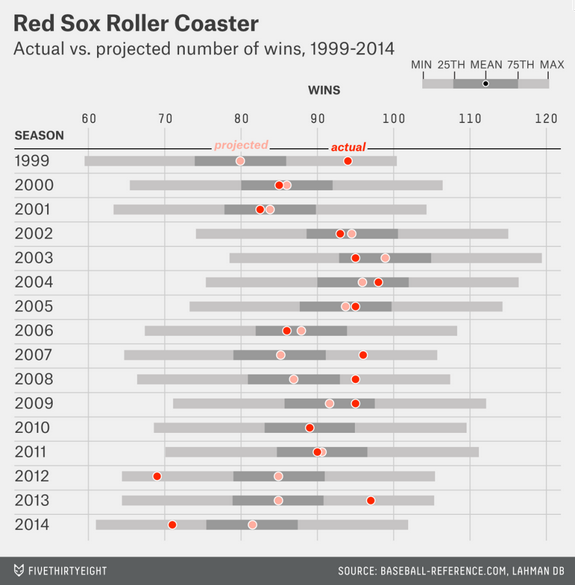
Back in April we looked at the Fivethirtyeight predictions. And we might as well throw the latest screenshot up and compare that to the Guardian and the BBC.

Fivethirtyeight's updated predictions
Fivethirtyeight’s updated predictions

The Economist has a nice poll tracker with some simple controls for some simple filtering. But, these are, like the BBC’s, without an impact of number of seats. The Economist does, however, offer a separate build-your-own-majority calculator. 

What the Economist shows on their Election homepage

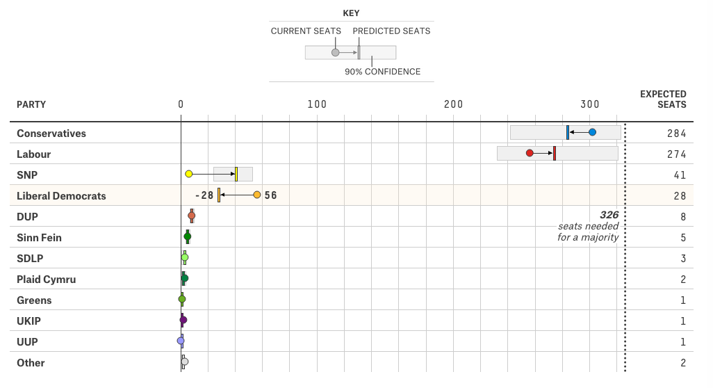
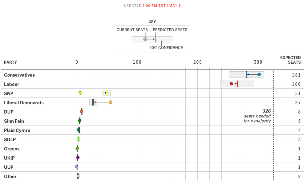
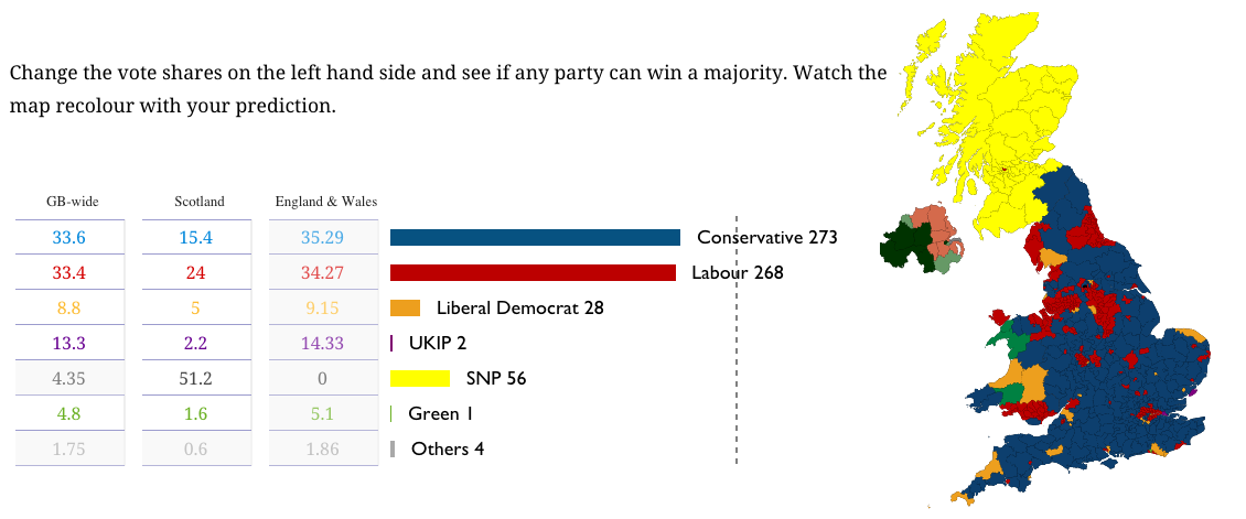
The New Statesmen has built a site dedicated to May 2015, and their current predictions are as follows below.

New Statesmen's predictions
New Statesmen’s predictions

The only drawback to all of these pieces is that I will be busy coaching softball tomorrow night. So I will be unable to watch the BBC’s coverage of election results. And that is most unfortunate, because British politics are far more fascinating than the bland and boring two-party politics of the United States.

Credit for the Guardian piece goes to Caelainn Barr, Helena Bengtssoni, Chia-Jung (Apple) C.Fardel, Seán Clarke, Cath Levett, Alberto Nardelli, and Carlo Zapponi.

Credit for the BBC piece goes to the BBC graphics department.

Credit for the Fivethirtyeight piece goes to Matthew Conien and Ritchie King.

Credit for the Economist piece goes to the Economist’s graphics department.

Credit for the New Statesmen piece goes to the May 2015 graphics team.

Mapping Migrant Deaths

Yesterday we looked at a map of coal plants, with the dots sized by capacity. Today, we have a similar approach in a much smaller graphic about a much different topic. The BBC published this map yesterday in the context of an article about a report of the EU contacting Australia in regards to its migrant interception programme.

Where the migrants have died

Compared to the maps we saw yesterday, I’m not so keen on this. Not the idea, mind you. I think that the story bears telling in a graphical, visual format. Look at how many of those deaths occur in the waters between Libya and Italy. Not between Tunisia and Italy. Not between countries of the eastern Mediterranean and islands like Cyprus or Crete.

But, the blue-green colour used to identify previous incidents is too close to the blue of the Mediterranean for my taste. Though, in fairness, that does make the purplish colour highlighting the most recent incident stand out a bit more. But even the map of the Mediterranean includes details that are not likely necessary. Do we need to show the topography of the surrounding countries? Do we need to see the topography of the sea floor? Probably not, although in a different piece the argument could be made geography determines the migration routes. Compare that to Bloomberg’s piece, where the United States was presented in flat, grey colours that allowed the capacity story to come to the forefront.

Lastly, a pet peeve of mine with maps and charts like this. Please, please, please provide a scale. I understand that humans are poor at comparing differences in area. And that is a reason why bars and dots are so often a clearer form of communication. But, in this piece, I have no idea whatsoever about the magnitude and scale of these incidents. Again, compared this to the Bloomberg piece, where in the bottom corner we do have two circles presented to offer scale of capacity.

Credit for the piece goes to the BBC graphics department.

The Coal Century

The other day I misread a poster on the road that “The Cool Century” for “The Coal Century”. That is the origin of today’s title. The origin of today’s piece, however, is Bloomberg, which looked at the impact of some new environmental regulations on the coal industry vis-a-vis dozens of coal power plants.

Coal plants
Coal plants

Basically, you have a map with plant size indicated by the dot size, and the type of plant by the colour of the dot. The line chart to the right shows total coal capacity. Overall, it’s a nice, clear, concise graphic. Two buttons give the user immediate access to the story: the pre-regulated environment—see what I did there?—and then then post-regulated one.

Credit for the piece goes to Eric Roston and Blacki Migliozzi.

Foul Balls at Fenway

Happy Friday, everyone. Foul balls are the souvenirs of fortune at baseball games. (Home runs as well I suppose.) You can’t buy them, you can only hope to be one of the lucky few who catch one. So the Boston Globe ran an article with an integrated interactive piece that told the story of a select few foul balls caught by fans at ten games at Fenway. But from the data visualisation side, they plotted where each foul ball landed. But, the real gem is that they then had a few small multiples showing where various Boston hitters tended to deposit their fouls.

Ten games' worth of foul balls
Ten games’ worth of foul balls

Credit for the piece goes to Stan Grossfeld, Rachel G. Bowers, and Luke Knox.

Battle of Mons Graupius

I just finished reading Tacitus’ account of his father-in-law Agricola. Agricola is the Roman—more likely from a family of Romanised Gauls—general who conquered Great Britain for Rome. His crowning victory was the Battle of Mons Graupius. It should all be taken with a grain of salt, because there are no other corroborating sources—to my knowledge. For one thing, nobody knows for sure where this battle occurred—if it did—other than somewhere in what is now Scotland. So, I decided to attempt to illustrate the battle as I couldn’t find a satisfactory one on the internets. Again, with the knowledge that Tacitus’ account is not the most thorough.

Battle of Mons Graupius

Context for the Baltimore Riots

Baltimore is going crazy, if you haven’t heard. So the LA Times put together a set of maps putting the riots in context. They look at the racial makeups of the neighbourhoods with the violence along with median income and education.

The racial makeup of the neighbourhoods witnessing riots

Credit for the piece goes to Jon Schleuss, Kyle Kim, and the LA Times graphics department.

The Internet in the Middle East and Arab World

Keeping with the unplanned theme of this week, i.e. things going on in the Middle East and Arab world, let’s take a look at another piece of work from Spiegel. Unfortunately, this one is not so much in English. The graphics, yes, the supporting context, no.

There are seven of them, this looks at what the designers termed Halal Internet. It looks delicious.

Iranian website access

And while this looks delicious, it’s white chocolate, unfortunately. But change that bit, and I would be okay eating it.

Facebook usage
Facebook usage

Check out the article for the rest.

Credit for the piece goes to Klaas Glenewinkel and Jess Smee.

Who Are the Red Sox?

As Massachusetts and Maine celebrate Patriots’ Day, the Boston Red Sox are set to play their earliest game of the year with an 11.00 start time. (Yes, there is also a marathon today.) So after two weeks or twelve games, the question people want answered is what Red Sox do we get this year? FiveThirtyEight looked at what they called roller-coaster seasons of late, primarily using a box plot graphic to show just how much whiplash Boston fans have endured of late.

Projected vs. actual wins

So who are the Red Sox this year? The cellar dwellers of 2012 and 2014? Or world champions like in 2013? Who knows?

Credit for the piece goes to Neil Paine.

Predicting the UK General Election Results

(To be fair, I forgot to schedule to publish this post before I left somehow.)

Your humble author is still on holiday. So, today, you can enjoy a nice interactive piece from FiveThirtyEight that predicts the results of the 7 May general election. Of particular interest, the box part of the plot that shows the 90% confidence range.

Dot plotting the results

The piece also has a choropleth map. My only feature request(s) would be to have a zoom feature for urban constituencies and/or to have a search field that allows the user to see the predicted results for a specific constituency.

Credit for the piece goes to Matthew Conlen and Ritchie King.

Friday Baseball Drinking

Your humble author is out of town today. And unfortunately he is not watching a ball game. But if he were, he would be drinking a beer. And even more unfortunately, his favourite team and favourite ballpark has the most expensive beer. And most unfortunate, the other two teams he is perhaps most likely to watch have the…same most expensive beer. Business Insider charted the prices and the price per ounce. To be fair, I am often too busy scoring a game to get drunk during a game.

It's expensive getting drunk at Fenway. And Citizens Bank. And Wrigley.
It’s expensive getting drunk at Fenway. And Citizens Bank. And Wrigley.

Credit for the piece goes to Business Insider.