Baseball’s Pace of Play

So now the baseball season is in full swing, one of the things we will be looking for is shorter duration for games. As I have probably said many times before, I enjoy the long games. But there are none longer than Red Sox–Yankees match-ups so take that with a grain of salt. I am spoiled. Anyway, in time for the season, over at Time they plotted the 2014 winning percentage and average length of game for all Major League teams.

Winning isn't based on pace of play
Winning isn’t based on pace of play

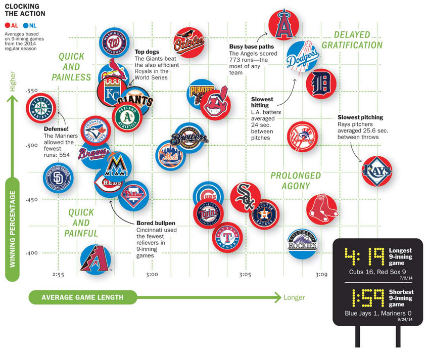
Clearly from this chart we can see that neither playing slowly nor playing quickly has any correlative impact on a team’s winning percentage. Teams are spread out all over. But, in many ways, baseball is all about timing and getting inside the head of the pitcher or the batter. And one way to take the advantage is to mess up the other’s timing. By eliminating that element of the game—or at least attempting to—the game becomes a little bit duller.

Credit for the piece goes to Lon Tweeten.

Baseball in 2015

For most of us, baseball, the 2015 edition, began yesterday. For the Red Sox, it was an 8–0 victory over the Phillies in which Boston’s Clay Buchholz kept the ball down in the strike zone, where it is tougher for batters to make solid contact. Whereas Cole Hamels of the Phillies kept the ball up in the zone and thereby let the Boston lineup hit four home runs in five innings. (Boston added a fifth, a grand slam, in the ninth inning.)

But low strikes are nothing new. In fact, umpires increasingly have been calling low strikes as seen in this chart by FiveThirtyEight in an article looking at 2015’s trends in baseball. (Interestingly they also chart something on Cole Hamels.) It is not the most complicated chart, but it does serve as a reminder that for the next six months, baseball is back.

Pitch height over the last few years

Credit for the piece goes to Rob Arthur.

Sex, Drugs, and Rock Oil

North Dakota’s economy has been booming because of shale oil. Most of that economic growth has been centred on what was the small city of Williston, North Dakota. Economic growth often leads to population growth, however, and that can at times lead to growth in less than wholesome economic activities. The National Journal took a look at the population growth in the area and what has been happening concurrently in a few metrics of the less wholesome sectors of the economy, i.e. drugs and prostitution. Turns out, they are both up.

Population growth in North Dakota

Credit for the piece goes to Clare Foran and Stephanie Stamm.

It’s Melting! It’s Melting!

Spring has finally arrived. And that means that far to your humble author’s north, the sea ice in the Arctic is beginning to recede from its annual maximum coverage. However, this year’s coverage was the smallest since satellite records began in 1979. The New York Times covers the story in a nice article with two big data pieces. The first is a really nice map—not shown—that looks at this year’s coverage compared to average extents.

The really nice part, however, is a line chart of historical ice coverage from 1979 through to the current date. While the piece is not interactive, the annotations in the graphic do a nice job explaining the different lines and outliers. Overall, a solid piece.

Annual cycle of Arctic ice coverage

Credit for the piece goes to Derek Watkins.

British Parliament Timeline

For those of you who don’t know, the British Parliament was dissolved today ahead of the 7 May elections. In other words, it is now election time. Last week the Economist published a small interactive piece that allows you to look at the composition of the British Parliament from 1870 through today.

Parliament over the years

While many (some?) of us would remember times from recent history, e.g. the 1997 electoral victory of Tony Blair, the memory might be a bit foggier one hundred years in the past. But to help you, if you click on a particular year, the view changes from an overview to a focus on Parliament in that particular year.

Parliament in 1915
Parliament in 1915

Credit for the piece goes to the Economist’s Data Team.

Yemen’s Tangled Web

Did you see the news about Saudi Arabia bombing Yemen. Are you confused about what is going on in Yemen? And how that relates to what is going on in Iraq? And the rest of the Middle East? Well, so am I. But, I also only had time to research and work on one graphic last night. So, today we look at Yemen. And as my graphic attempts to explain, it is a bit of mess.

Yemen's tangled web
Yemen’s tangled web

Germanwings Flight 4U 9525

Yesterday an Airbus A320 operated by Germanwings, a subsidiary of Lufthansa, crashed in the French Alps with no survivors. This morning, I am showing the two best graphics I have come across thus far attempting to explain just what happened.

The first is from the New York Times. In a series of maps, it points out through satellite photography the roughness of the terrain and therefore the difficulty likely to be experienced by recovery crews. The final line chart plots the altitude of the flight, which fell from a cruising altitude of 38,000 feet to just over 6,000 feet in eight minutes. Overall, especially given the limited amount of information that we currently possess, not a bad piece.

The New York Times' explainer map
The New York Times’ explainer map

The second comes to us from the Washington Post. What I enjoy about this piece is that it combines the altitude chart with the map. This gives a bit context to the fact that despite being still 6,000 feet above sea level, the aircraft was in fact flying into the high mountains of the Alps.

The Washington Post's explainer map
The Washington Post’s explainer map

Credit for the New York Times piece goes to the New York Times graphics department. And credit for the Washington Post piece goes to Gene Thorp and Richard Johnson.

Lee Kuan Yew Built Modern Singapore

Lee Kuan Yew died this weekend. He is lately responsible for designing and implementing the policies that transformed Singapore from a poor fishing village to a commercial hub. The transformation came at a price of course. Singapore enjoys limited free speech and the country is effectively a one-party state, with the one party now controlled by Lee Kuan Yew’s son. Regardless of the faults, the transformation itself is remarkable. And the Economist put together a timeline to showcase that.

The Life of Lee Kuan Yew and Singapore's development
The Life of Lee Kuan Yew and Singapore’s development

Credit for the piece goes to the Economist’s graphics department.

Happy St. Patrick’s Day

I am unabashedly Irish-American. So, Happy St. Patrick’s Day. But, I am not the only Irish-American in America. In 2013, Trulia put together a post about the Irish in America using US Census Bureau’s American Community Survey data. The post also links to an interactive map looking at US counties by their self-reporting Irish-ness. Not surprisingly, the Northeast is the most Irish, Philadelphia is the 8th largest metro area at 14.2%.

Chester County
Chester County

Credit for the piece goes to Trulia.

Boston’s Snowy 2015

Boston has finally had it. And by it I mean the snowfall that broke the record. And by record I mean the record for the most snowfall in a year. Well, at least since they started recording it in 1872. The Washington Post has a nice chart placing the season not just in context, but also showing how quickly the snow fell. Most of the snow has fallen only from 25 January onward. And winter is not yet over.

DC is puny compared to  Boston

Credit for the piece goes to Kevin Uhrmacher.