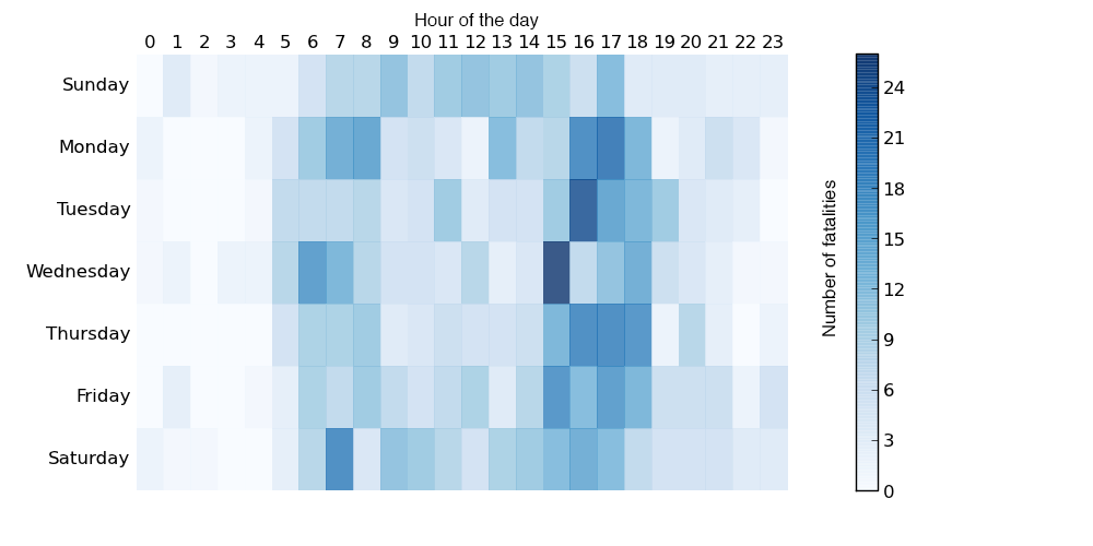
Cycling can be quite dangerous. But apparently this summer was quite dangerous over in Australia. So much so that the Guardian did some data reporting on it back in June. Thankfully they included some charts in that reporting, the heat map below being one example.
Cyclist fatalities
None of the data visualisation in the piece is revolutionary or earth-shattering, but it is a solid piece with some solid charts backing up an interesting story.
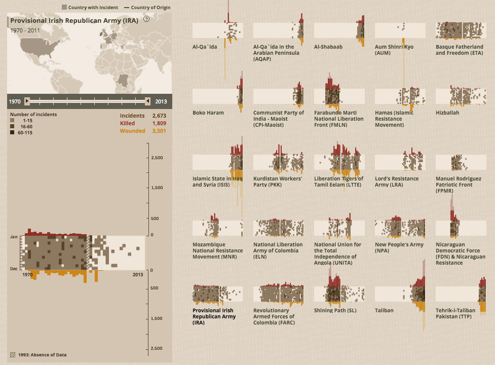
Last week many American observed 11 September in remembrance of the terror attacks that brought down the Twin Towers, a section of the Pentagon, and four airliners in total. So this week we are going to see some fantastic work from Periscopic that highlights several other terror groups operating in the world across the last few decades.
Irish Republican Army attacks
The charts work as a timeline from 1970 through 2013 and then vertically from January through December. Above and below the timeline, respectively, are the numbers of people killed and wounded. When shown as small multiples, the overall piece can show you which groups have been active and lethal, active but without lots of fatal attacks, and those that are fading out or fading in.
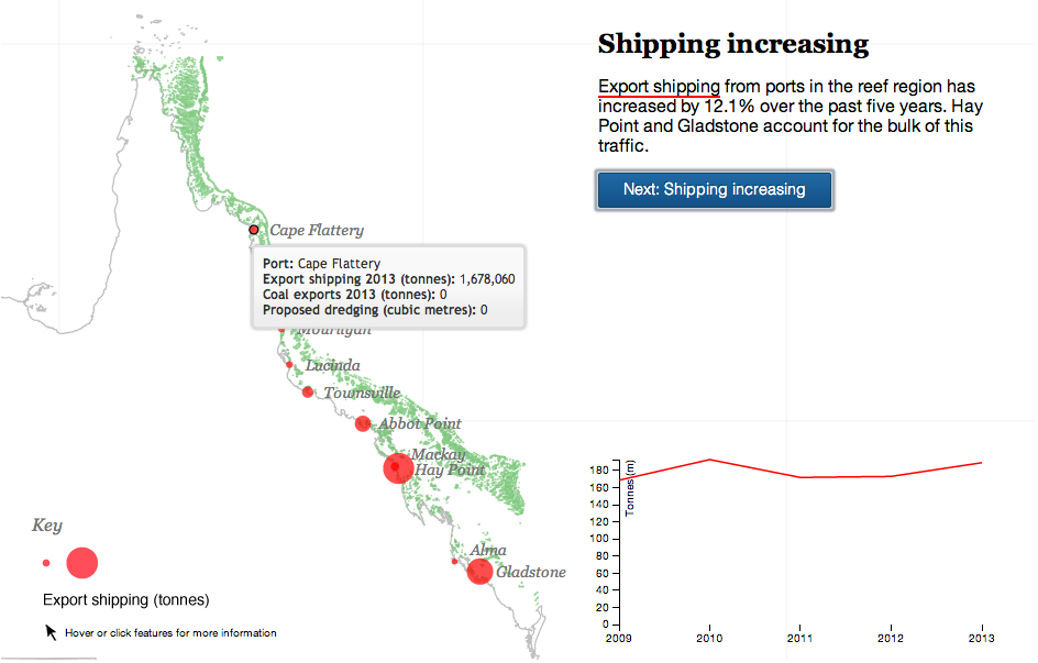
Your humble author is away this week. But the Great Barrier Reef in Australia is still here. For now. The Guardian takes a look at the growing threat to the World Heritage site from the coal industry in Queensland, Australia. The author takes you through the narrative in a chapter format, using charts and maps to illustrate the points in the brief bit of text. A really nice job altogether.
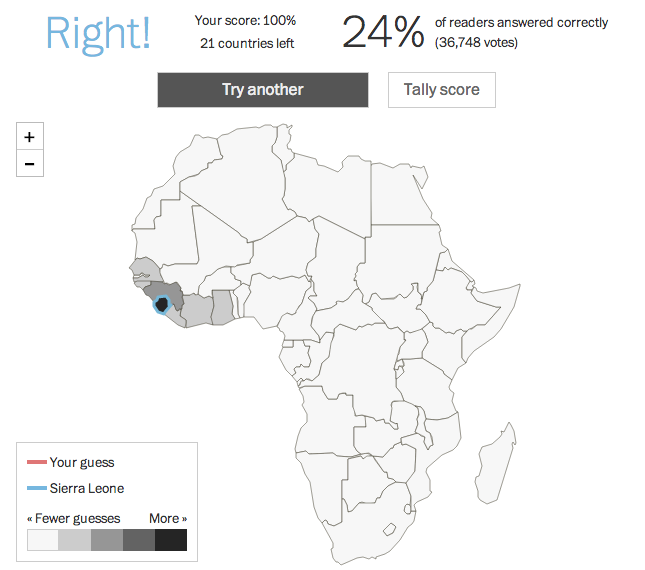
Beyond the fact that it isn’t a country? This week the White House hosted the US–Africa Summit. The Washington Post took the opportunity to quiz readers on their knowledge of African countries’ locations on a blank map. So this Friday, you get to take the quiz and post your results if you dare. A nice touch is that the map colours the countries by the number of guesses and then provides different colour outlines for your selection and the correct one—should you err.
Sierra Leone
I messed up Burundi—I always confuse it and Rwanda—and only got a 98%. /humblebrag
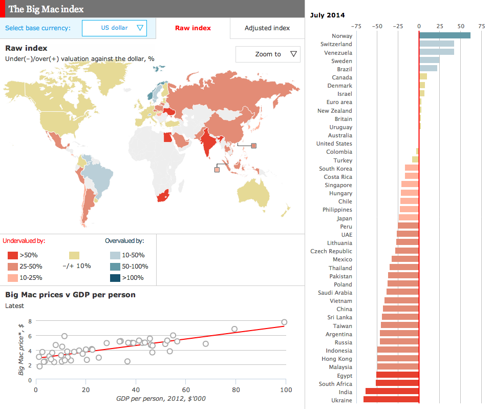
For years, the Big Mac Index from the Economist has been a standard of sorts for examining differences in currencies across the world. Well now we have an online, interactive version of the index.
The Big Mac Index
Credit for the piece goes to the Economist’s graphics department.
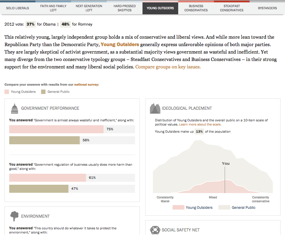
Maybe? But thanks to Pew Research, you can see if we align politically. Today’s post comes via Pete, a coworker of mine, and it is basically a survey that works by asking you 23 political questions on topics from big/small government, immigration, climate change, gay rights, defence spending, &c. They crunch some numbers and spit you out on a results page, the image below a crop from the results for your humble author. (For better or worse revealing my political leanings.)
My type
From a survey standpoint, I found it interesting the questions presented only binary responses. In general, I found that I never agreed with either statement entirely and was forced to choose the “closest” response. Since I never see myself on the conservative side of the spectrum, I was surprised to see my “type”, Young Outsiders, coloured with a tint of red. Regardless, I’m still thankful that according to Pew, I am still more in the centre than on the ends as it makes it a lot easier to compromise. I’ve heard that that is an adult thing to do.
By the way, if you want the results of the full survey upon which this quiz was based, you can check out that site here. It’s full of bar charts for those who like the data visualisation.
Credit for the piece goes to the Pew Research Center.
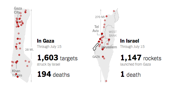
Today’s piece, the first not on Québec, is a small but poignant reminder of the disparity between the number of deaths in Gaza and in Israel during this most recent conflict. According to the article, as of 16 July there has been one death in Israel for 194 in Gaza. This small piece from the New York Times shows the geographic location of the attacks from both sides and tallies the number of strikes. And the number of dead.
Comparing the death toll
Credit for the piece goes to Craig Allen, David Furst, Nilkanth Patel, Archie Tse, and Derek Watkins.
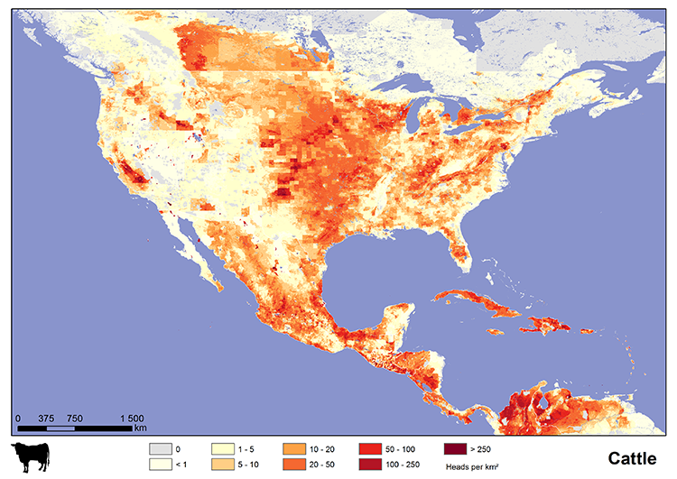
Today I’m enjoying some really good burgers. So via Fastco, today’s graphic looks at cattle, pig, and chicken populations across different regions of the world. In the United States, as you can see in the map here, that dark red spot in eastern Pennsylvania, that has to be Lancaster County.
US cattle population
Credit for the piece goes to International Livestock Research Institute.