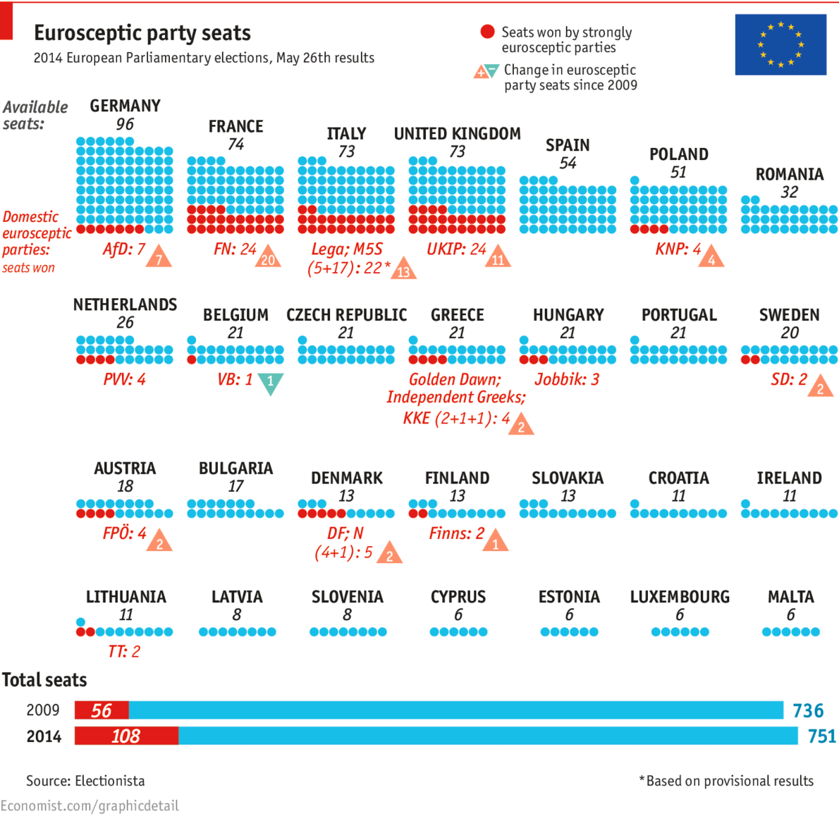
Sunday (and a few days preceding it) was election day in the European Union for the European Parliament. Unfortunately it was also a banner day for the far-right parties. In France the National Front (FN) took the top slot and in the United Kingdom that went to the UK Independence Party (UKIP). This graphic from the Economist looks at the results, highlighting the right-wing or eurosceptic parties.
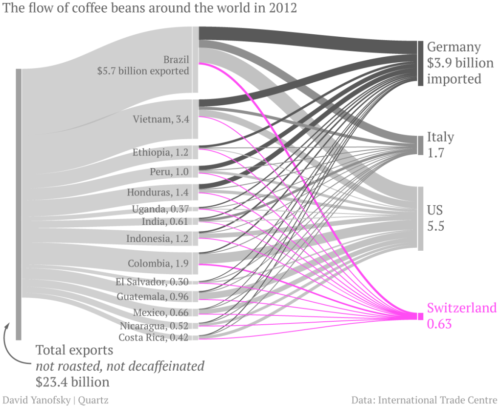
While I hate coffee, I do like sankey charts. And this piece from Quartz makes use of one when discussing the exports of coffee. In particular, the article focuses on the value that coffee manufactures, e.g. Nestle, add to Swiss imports of un-roasted beans before exporting them roasted. (Increasingly in little pods.) Overall, the piece is of a digestible length and worth a read. If you like coffee. Personally, I’m sticking with tea.
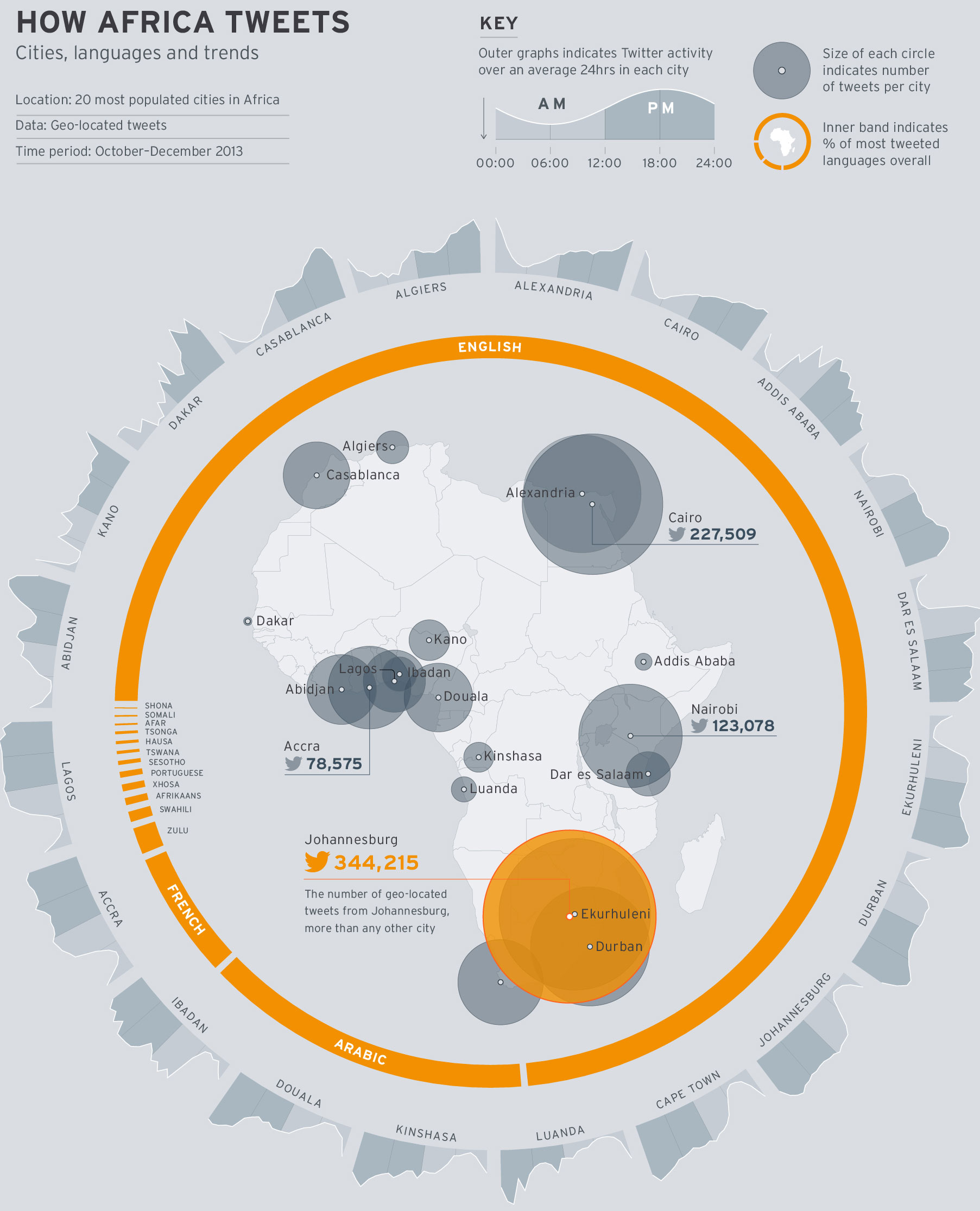
Today’s piece is hit and miss. It comes from the World Economic Forum and the subject matter is the use of Twitter across Africa. I think the subject matter is interesting; mobile communication technology is changing Africa drastically. The regional trends shown in the map at the core of the piece are also fascinating. Naturally I am left wondering about why certain countries. Does spending on infrastructure, GDP per capita, disposable income levels have any sort of correlation if even only on a national and not city level?
How Africa tweets
But what really irks me is the content that wraps around the map. First the donut chart, I think my objections to donuts—at least the non-edible kind—are well known. In this case, I would add—or sprinkle on—that the white gaps between the languages are unnecessary and potentially misleading.
Secondly, the cities are eventually displayed upside down. Thankfully the labels are reversed so that city names are legible. However, the continually changing angle of the chart makes it difficult to compare Douala to Luanda to Alexandria. A neatly organised matrix of small multiples would make the data far clearer to read.
In short, I feel this piece is a good step in the right direction. However, it could do with a few more drafts and revisions.
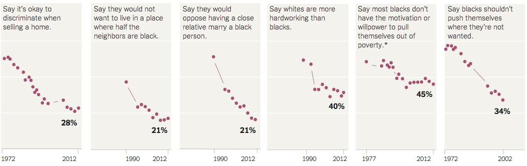
Racism is a long-standing problem for humanity. But in the wake of the Donald Sterling scandal in the NBA, the New York Times put together a graphic looking at white attitudes towards blacks in the United States. The data reveals that while racist views are down from highs decades past, there is still a substantial amount.
Racism in America
From a design standpoint, I would have probably added some sort of axis label. Additionally, I would have removed that topmost segment and used the space for the labelling.
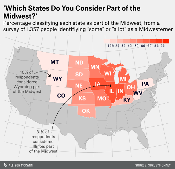
Last Friday, we looked at how one individual defined the state of Florida. Today, we look at how FiveThirtyEight attempted to get lots of people to define the Midwest.
Defining the midwest
Personally, as someone from Philadelphia I tend to side with the author of the article, Walter Hickey. He writes he’s “from New York, and [he] generally consider[s] anything west of Philadelphia the Midwest.” That’s pretty much the truth.
And if you like this piece, check out the subsequent piece on defining the South.
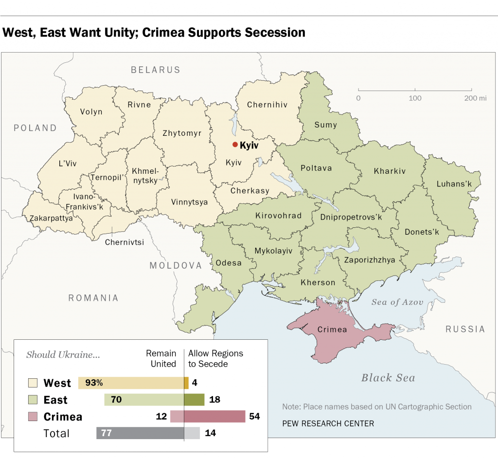
In the votes held this past weekend, the separatists in Donestk and Luhansk claim they received a mandate for independent states. However, according to polls conducted by Pew a few weeks back, most of Ukraine, with the notable exception of Crimea, wants to remain united as a single country. In fairness, this poll was conducted after Russia annexed Crimea but before the deaths of pro-Russian separatists in Odessa and Mariupol. (Anecdotally, those events have driven some to the separatist camp.) The map below is part of the Pew report. However, I have an issue with it that, again in fairness, might not be solvable given whatever raw data with which Pew was working.
Who wants secession? Only Crimea.
The map colours each oblast, roughly equivalent to a US state, according not to the results of the survey, but rather to which region the oblast belongs. For example, Kirovohrad is the same colour as Donetsk. Donetsk, however, is the epicentre of the unrest in Ukraine whereas I have at least seen no reports of unrest in Kirovohrad. Are they really reporting the same desire of unity or secession? Would the map not be clearer if each oblast was reported independently?
My guess is that results like these are clear to the Kremlin. And so I think while Donetsk and Luhansk will remain Ukrainian, Crimea will likely remain Russian.
Credit for the piece goes to the Pew Research Center’s graphics department.
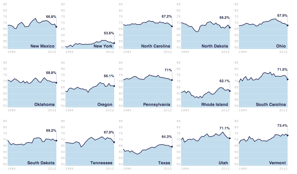
I am pretty much a sucker for small multiples. And so today I present a good one from the Washington Post. The story starts looking at the broad, national scope of the issue. And from there it breaks home ownership down by state.
Home ownership by state
Credit for the piece goes to the Washington Post’s graphics department.
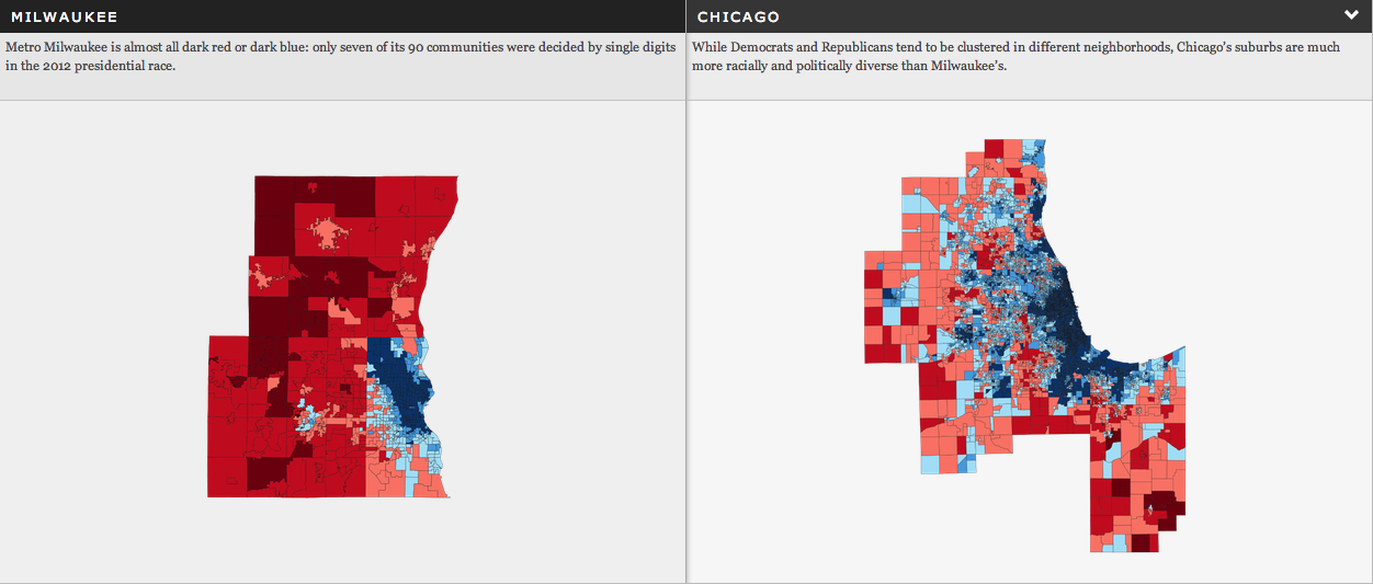
Today we dive into state-level politics north of Chicago, in the state of Wisconsin. The Milwaukee Journal Sentinel published an in-depth article looking at the political divide in the Milwaukee metropolitan area. While one could publish an article of that nature with just lots and lots of words, the Journal Sentinel chose to use maps and charts to support their arguments.
Comparing Milwaukee urban vs. suburban voting patterns
Credit for the piece goes to Craig Gilbert and Allan James Vestal.
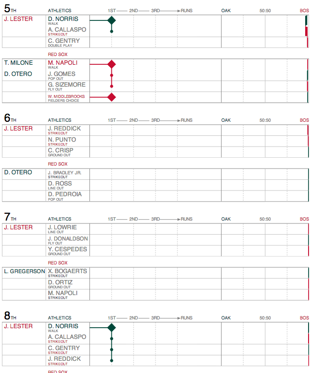
This past weekend was some good Red Sox baseball. Okay, so we only won two of three from Oakland, but that second game was fantastic. John Lester dominated. Last fall I mentioned a studio called Statlas that was visualising the World Series. They continue to update and tweak their product and so it was great to see Lester’s performance documented.
Lester dominates
Though, as you can see, Lester so dominated the Athletics, you can see almost nothing happening from Oakland’s batters. But, I will skip the near ninth-inning implosion of Boston’s relief corps that nearly cost us the game. Mostly because the visualisations of the game tell a great story. And so if you like baseball and data visualisation, you should check it out.
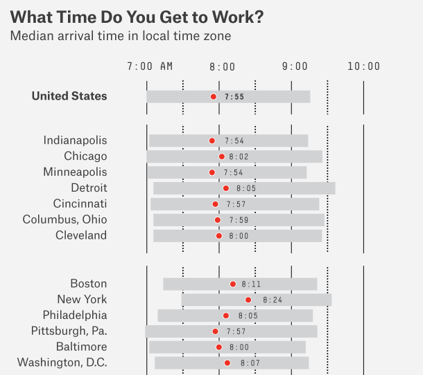
…forty minutes late with an iced coffee? It’s what we millennials do since we don’t understand that time exists between 04.00 and 10.30. Don’t believe me? Well, Nate Silver over at FiveThirtyEight crunched the numbers and it turns out that there is some truth in the humour. Cities with a younger, more millennial workforce tend to see workdays start later.
Selected cities in the Eastern and Central time zones