Defence Spending

As troops and tanks and rumble around the Ukrainian–Russian border, I was left to wonder just how NATO has been doing with defence spending. So I took defence spending as a share of total GDP. In general, NATO countries have been spending less since the end of the Cold War. The Baltic states are a bit of an exception. I would guess that is based on their fears of their big Russian neighbour. A fear that, as Ukraine shows, is not entirely irrational. The United States, of course, has been spending a lot because of Afghanistan and Iraq. As for Russia, after the collapse of its economy in the late 1990s, it’s been spending more and more on the military.

Defence spending
Defence spending

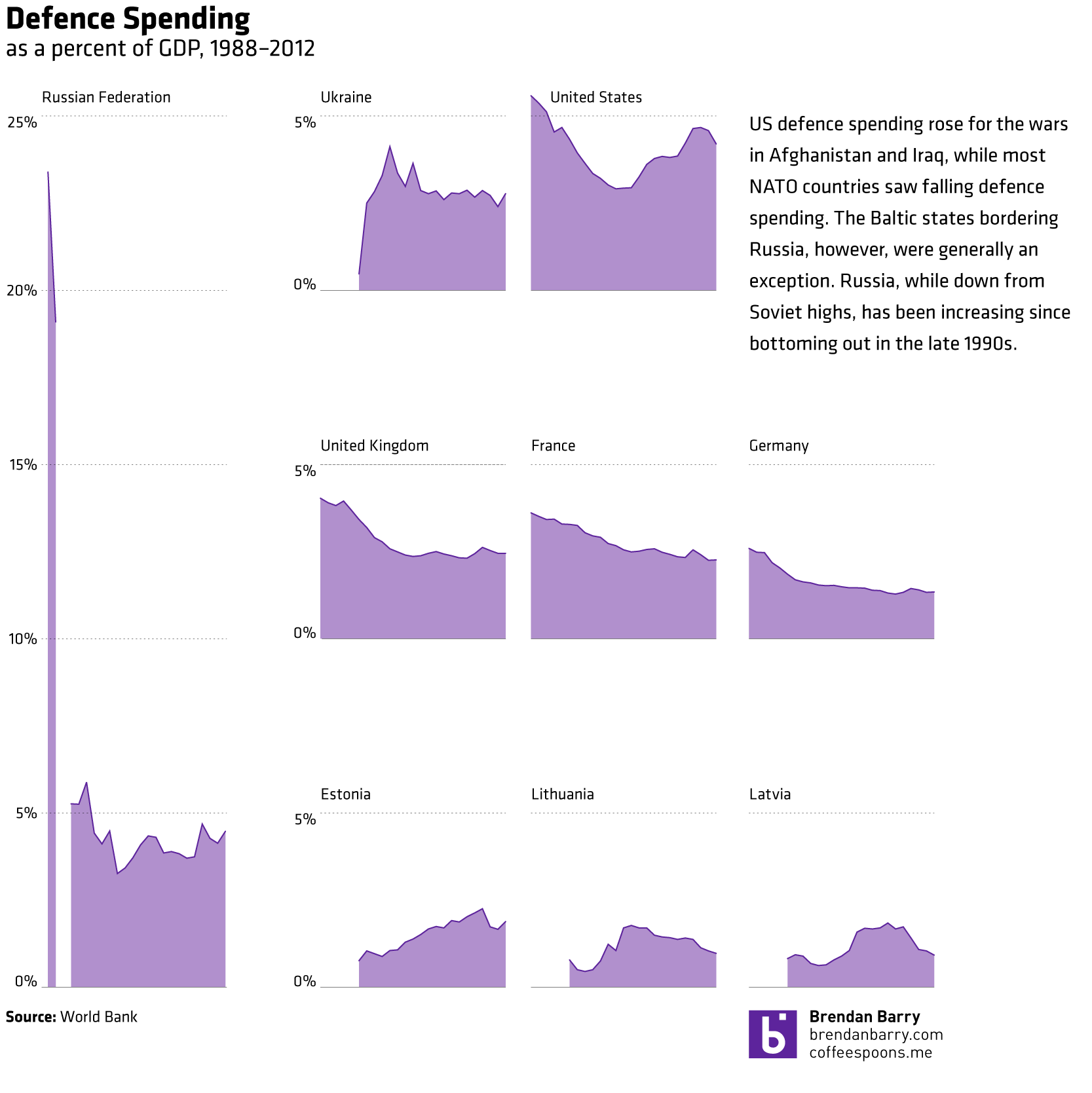
The data comes from the World Bank.

Indoor Plumbing

Today’s post is a small interactive map—nothing fancy there—about indoor plumbing. As it turns out not every home in the United States has it. Of course, last weekend I ended up driving through those dark counties in western Pennsylvania. And I can believe it. And I can definitely say I saw a few outhouses.

Lack of indoor plumbing in western Pennsylvania

Credit for the piece goes to Christopher Ingraham.

Don’t Do This At Home…

In fact, don’t do this ever. Today’s bad chart comes from the Philadelphia Mayor’s Office of Transportation and Utilities. I saw it and could only shake my head and wonder why.

The Mayor's Office version
The Mayor’s Office version

Something more like this much more easily communicates the story.

My take on the data
My take on the data

Credit for the original piece goes to the Mayor’s Office of Transportation and Utilities.

There’s No Diversity in Baseball!

Well, okay, actually there is. But the cultural reference would have made even less sense if I omitted the negative. Anyway, in honour of the two baseball games I am seeing this week—last night’s and tonight’s Red Sox games—here comes this piece from Pew Research Center.

It’s a simple but fairly clear graphic. We are looking at the ethnic breakdown of baseball since 1947, when Jackie Robinson broke the colour barrier. My only qualm, as ever, with this stacked area chart is that while you can see the clear trend upward in white share, it is a bit more difficult to see the directions the other ethnicities are moving.

Diversity in baseball

Credit for the piece goes to Pew Research Council.

Tax Day and Income Inequality

Tax Day for Americans seems like a great time to talk about income inequality. The article from which this chart comes talks about a recent book exploring the parallels of the 19th century’s inequality—as the article reminds us, the time of “Please, sir, may I have another?”—and the forecast for the 21st. Anyway, the graphic is a nice use of small multiples and highlights that despite the damage done to capital wealth by Great Depressions and two world wars, it is well on its way back to unequal levels.

Income inequality
Income inequality

Credit for the piece goes to the New York Times graphics department.

Allergens of DC

Good news and bad news, folks. The good news is that this chart does not apply to people living in Chicago, Philadelphia, or elsewhere. Unless—here’s the bad news—you live in Washington, D.C. In that case, well, prepare to die. You know, if you have allergies. The Washington Post has a nice graphic that outlines the arrival and peak seasons for different pollen allergens.

Allergens of DC
Allergens of DC

Credit for the piece goes to Bonnie Berkowitz and Patterson Clark.

Comparing Urban Statistics

Sometimes when you are considering moving, you want to look at some broad statistics on the area in which you want to move. In Boston, the Boston Globe has put together a neat little application that does just that. Type in two settlements in the metro area and then get a quick comparison of the two.

Comparing Boston metro cities

Credit for the piece goes to Catherine Cloutier, Andrew Tran, Russell Goldenberg, Corinne Winthrop.

Chicago’s Disappearing Middle Class

President Obama has made a big deal recently about income inequality. The story in short is that the rich in the country are getting rich; the poor are getting poorer; and the people in the middle are fewer in number. Here in Chicago, this has meant that over the last few decades, many of the former middle-class neighbourhoods have been gutted of, well, the middle class. Daniel Kay Hertz has created a series of maps to show just how drastic the change has been since 1970.

Chicago's disappearing middle class
Chicago’s disappearing middle class

Credit for the piece goes to Daniel Kay Hertz.

Motorcycle Helmet Laws

Today’s piece does not involve any particularly crazy graphics or forms of data visualisation. Instead, the piece is a novel way of telling a story. People are increasingly familiar with what we might call here scrolling stories. Scroll down the page and suddenly you have glossy photos or high-definition videos. The New York Times, however, has taken this idea in a different direction for a story about motorcycle helmet laws.

Instead of glossy photos, we have clear and concise charts. Instead of lots of text blocks, we have just a few sentences. The story is told by the charts and the text offers the necessary context or background. Not all stories will have the data behind them to allow the story to be told—or shown—in such dramatic fashion. But, I can hope they do.

Motorcycle helmet laws

Credit for the piece goes to Alastair Dant and Hannah Fairfield.