Recent Military Expenditure

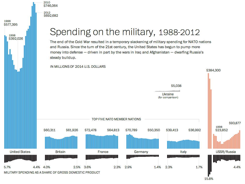
The Crimean situation has highlight how much not just Ukraine is not ready to fight Russia, but also how much less Western Europe is prepared to fight. This piece from the Washington Post examines actual defence expenditure and then defence expenditure as a share of GDP. While Europe has remained steady or in decline, Russia has been ramping up its defence spending since the beginning of the 21st century.

Defence spending
Defence spending

Credit for the pieces goes to Patterson Clark.

Spilling the Oil

A few weeks ago, Bloomberg Businessweek published a nice graphic that summarised the last 25 years of oil spills. I’m finally getting around to posting it. But what it does really well is show just how bad the Deepwater Horizon spill was compared to the other big name disaster: Exxon Valdez. Of particular note is the bar chart at the bottom right comparing the millions of gallons of oil spilled.

Oil spills
Oil spills

Credit for the piece goes to Evan Applegate.

Finding MH370

Today’s piece comes from USA Today via a colleague. The piece is part of a larger article about the increasingly all-but-certain crash of MH 370. In step-by-step fashion, it guides the user through several facets of the flight and the investigation as well as the human impact.

Finding MH 370
Finding MH 370

Credit for the piece goes to Frank Pompa, Janet Loehrke, Jeff Dionise, Anne R. Carey and Denny Gainer, Alejandro Gonzalez, and Kevin A. Kepple.

Smoking in the US

Today’s piece comes from the New York Times. It fits within a broader article about smoking in the United States. The map is a choropleth that compares the smoking rate across counties and states in 1996 and 2012. However, as the article talks about how difficult it has been to decrease the smoking rates among the poor, I wonder if even just a third map would be useful. This map could have shown the actual decline, perhaps in percentage points, of counties between 1996 and 2012. Or another related graphic could have tried to correlate income and said change.

Map of Smoking in 2012

Credit for the piece goes to the New York Times graphics department.

Income vs. Life Expectancy

Today’s post comes via the New York Times. It’s a simple concept, but shown clearly in this collection of scatter plots. Growth in income for many counties has meant a growth in life expectancy. Unfortunately, not all counties are prospering and so the gap between rich and poor, and therefore the long-lived and shorter-lived, has grown.

Household income vs. life expectancy for men

Perhaps the only criticism I have about this piece is that for the highlighting of Fairfax County, Virginia and McDowell Country, West Virginia, an additional component could have summarised the growing gap between the two. For example, a bar chart along the axes of each could measure the growth in income disparity and the growth in life expectancy disparity.

Credit for the piece goes to Alicia Parlapiano.

Jade Rabbit

In December, China landed a rover named Jade Rabbit on the Moon. The South China Morning Post created a nice infographic to explain the lunar landing and place it in the context of other missions to the Moon.

Cropping from the infographic

Credit for the piece goes to Adolfo Arranz.

One Proposal to Simplify the Tax Code

Republican congressman Dave Camp, Chairman of the House Ways and Means Committee (basically responsible for the tax code), wants to simplify the tax code. This nice graphic by the Washington Post basically sums up the changes.

Proposed bracket simplification

Credit for the piece goes to the Washington Post graphics department.

Mobile Data Visualisation

Today’s post is not news-related for a change. (Don’t worry, I’ll likely get back to that next week.) Instead, we have a new collection of mobile data visualisations curated by Sebastian Sadowski. You can choose to see either smartphone or tablet visualisations and then filter by visual form.

Smartphone Data Visualisation

Credit for the site goes to Sebastian Sadowski, to the various works to the various designers.

Malaysia Airlines Flight 370

Ukraine has dominated the news much of the last few weeks. But the new 24/7 international news story is the missing aircraft (at least as of my writing this) that was Malaysia Airlines Flight 370. There are presently two nice graphics I have seen attempting to explain the story. The first, a cropping of which is below, is from the Washington Post.

The Washington Post piece

The second piece, again another cropping, is from the South China Morning Post.

South China Morning Post's graphic
South China Morning Post’s graphic

Credit for the Washington Post piece goes to Gene Thorp, Alberto Cuadra, Laris Karklis, and Richard Johnson.

Credit for the South China Morning Post piece goes to the South China Morning Post graphics department.

Answering Some More Questions About Ukraine

So Ukraine is even more of a mess and in less than a week’s time, the Crimean people will vote in a referendum on whether they want to remain a part of Ukraine or rejoin Russia. This graphic of mine is an attempt to answer some questions—though hardly all I wanted—about Ukraine, Crimea, and about what the Russians have been doing. (To be fair, the Russians still don’t admit that the troops and soldiers are theirs. But really, I mean come on, we all know they are.)

Why Crimea?
Why Crimea?