Where Medicaid is Not Expanding is Where it is Needed Most

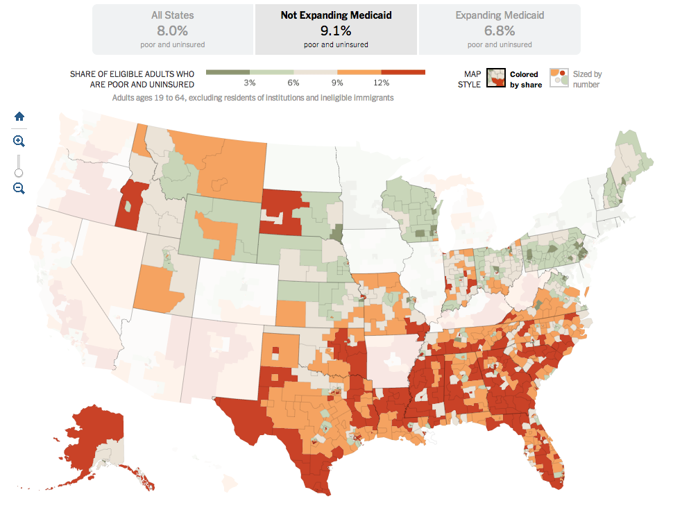
Last summer, the Supreme Court ruled that most of the Affordable Care Act, also known as Obamacare, was constitutional. The one exception, however, was the plan to force states to expand their Medicaid coverage. Medicaid is the government plan tasked with helping to provide health insurance to the poor. But between the poverty level and the income level for subsidies for the new state exchanges, there is a gap. That gap was supposed to be covered by the state expansion of Medicaid.

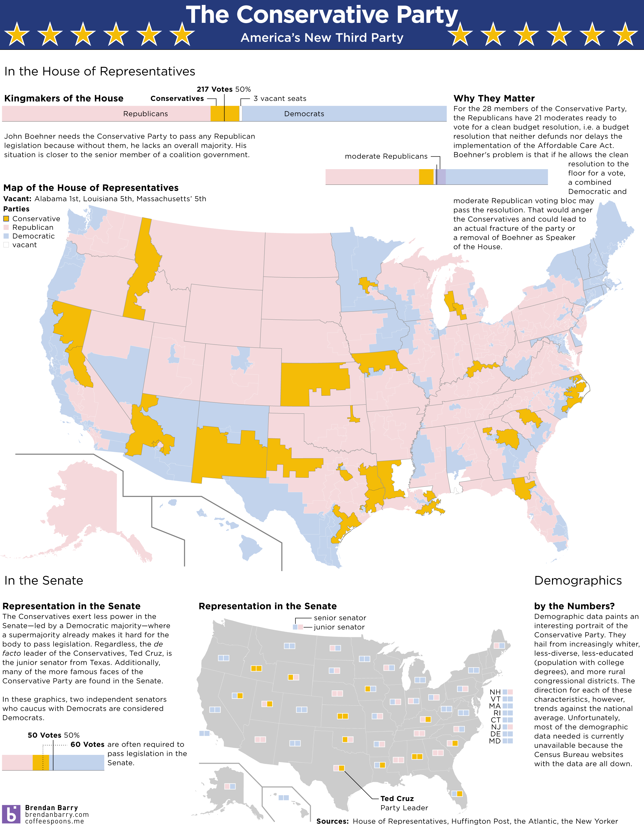
Because the states are not being forced to expand their coverage, there now exists state-by-state gaps in health insurance coverage. This excellent interactive graphic from the New York Times looks at the poverty and insurance coverage segregated into those states that are and are not expanding their coverage. A good number of those states with high rates of poor and uninsured are Republican, deep-South states. If you’re really clever, you’ll compare this map to my map from earlier this week about the Conservative Party. Notice any overlaps?

States not expanding Medicaid

Credit for the piece Robert Gebeloff, Haeyoun Park, Matthew Bloch, and Matthew Ericson.

Boston’s 2013 Season

If you’re not a Boston Red Sox fan, what’s wrong with you? Well, okay, so long as you’re not a Yankees fan, you’re not that bad. Anyway, the Boston Globe looked at the 2013 Red Sox season. Game by game, inning by inning. And because Boston is now advancing to the American League Championship Series, and since they will probably face Detroit, here’s a screenshot of the great game that was Scherzer vs. Lester.

Red Sox 2013 season review

Credit for the piece goes to Chiqui Esteban.

The Republicans Who Support a Clean Budget Resolution

Yesterday, we looked at the new Conservative Party of America. But those are the votes that John Boehner fears to upset—and possibly fracture his party and cost him his job—if he should let a clean budget resolution come to the floor and should it pass. But why would it pass if it needs 217 votes and there are only 200 Democrats? Well, now we have a nice interactive graphic from the Washington Post that explores the moderate Republicans. Which, if this count is accurate, would provide enough votes when combined with Democrats to pass a clean budget.

The moderate Republicans…

Why are these Republicans in favour of a clean budget resolution? The y-axis shows that they are in moderate or mixed congressional districts, i.e. not Conservative districts. The x-axis shows that a fair number of these moderates have a high proportion of federal workers within their respective district. And who’s not working/earning money during the shutdown? Yep, a lot of federal workers.

Credit for the piece goes to Aaron Blake, Dan Keating, Ted Mellnik, and Darla Cameron.

The Conservative Party of America

We enter our second week of the government shutdown. Of course, blame for the shutdown falls largely upon a small number of conservative Republican members of the House, bolstered by Senator Cruz (R-TX) and his allies in the Senate. But we already know that there are a number of moderate Republicans who want to pass a clean budget resolution. So one way of looking at this new conservative faction is as a new minor party in a coalition government with Ted Cruz as Party Leader.

The idea is not mine. Ryan Lizza first wrote about the “Suicide Caucus”, a topic that Philip Bump expanded upon several days later. However, as a thought experiment, I was curious to see what would happen if this third party, a Conservative Party, would look in data visualisation terms. So here’s a quick stab at America’s newest third party.

The Conservative Party of America

Paying Federal Employees

The Washington Post put together this infographic looking at paydays for federal employees who will still be working during the shutdown, e.g. military service personnel. Of course, if the shutdown drags on, the paychecks for those still working would be delayed.

Paying essential personnel

Credit for the piece goes to Lisa Rein and Todd Lindeman.

Funding the Improbable

This interactive map from the Washington Post is one part of a long-form piece that looks at NASA and the improbable tasks facing the agency. Specifically the piece looks at how NASA wants to get to Mars, but how difficult that is and how an also difficult asteroid mission is as a backup plan.

Funding the improbable

Really fantastic is about all I can say.

Credit for the piece goes to Joel Achenbach, Alberto Cuadra, Kennedy Elliott, Rebecca Rolfe, and Ricky Carioti.

Paying a Bribe

Some say bribes grease the wheels of business. But if that is the case, where are the greasiest wheels? This interactive piece from the BBC showcases an interesting story. It maps who has paid bribes and the value thereof. Then it looks at corruption in the different sectors of the country and which is perceived to be the most corrupt.

A look at bribery
A look at bribery

Aesthetically this is not the finest piece. Some of the most interesting countries to view are in Africa and Southeast Asia, i.e. geographies near the equator. Unfortunately the designers here chose a map projection that emphasises Siberia and Arctic Canada at the expense of those very countries. Also, where did Greenland go? I know that the ice is melting, but I don’t think it’s melted that quickly. Furthermore, if the user clicks the “List” option, he or she is presented only with a list of geographies. None of them are selectable nor do they encode data. So why is the list there?

In short, the interface is a bit clunky and strangely designed. Line lengths are too long and it looks ugly. But, there are two interesting things going on here worth noting. First the legend here actually does not just show the range for the choropleth, but it also encodes the number of countries that fall within that range.  

Second, by clicking on a particular bin for the legend, the map filters for the selection. I think that from a design perspective, a lighter grey and a lighter stroke outline would have made the filtering a bit more prominent, but the idea is interesting. Unfortunately, I found no way of easily returning to an all-bin view of the map.

A piece for the BBC that misses a few, but also hits a few.

Credit for the piece goes to the BBC graphics team.

Foreclosing on Homes in Washington, DC

Today’s post comes from the Washington Post. It is a single interactive graphic, a map, that supports a long-form article about foreclosures in Washington.

DC foreclosure map
DC foreclosure map

Credit for the piece’s graphics goes to Ted Mellnik, Emily Chow, and Laura Stanton.

Where’s the Wine?

So my wine palate is neither as refined nor sophisticated as it was before I moved to Chicago. (Oh hi, whisky.) However, wineries are springing up all over the country—and not just in California. This interactive graphic from the New York Times details the country, mapping out wineries up top and then exploring the growth in several key states near the bottom. In particular, note the chart for the number of wineries in California that runs down the right-hand side.

Map of US wineries
Map of US wineries

Credit for the piece goes to Kevin Schaul, Tim Wallace, and Adrienne Carter.

My/Your Dialect

Joshua Katz from North Carolina State University has created an interactive version of the dialect survey maps first perhaps popularised several years ago. Katz has also created an interactive map that looks at a city’s dialect and maps its areas of similarity and difference. An interesting extension of the original survey data, however, is the ability to take the survey yourself and see where your dialect fits. There are two versions, a 25-question survey and a 140-question survey.

The screenshot below is my result from the 25-question version. And it fits me fairly well since I spent most of my years in the suburbs of Philadelphia but every summer in South Jersey (and quite a bit of time in Allentown). Click the map to take the quiz for yourself. Feel free to reply and share your results.

Clearly I am Philadelphia raised

From the technical side, for those wondering, this is a piece that is done in Shiny, the interactive version of R.

Credit for the piece goes to Joshua Katz.