Overpaying for Underachievers

Major League Baseball is set to suspend Alex Rodriguez this morning—if the news reports are true. That will all but end the season for Rodriguez, though he could well play through his appeal so you never really know. But what does this mean for the Yankees and their offense?

The New York Times put together an interactive scatter plot charting the annual salary against the number of hits (roughly a measure of offensive production throughout the year) with benchmark lines for the league average of both. First, the user can see the team averages.
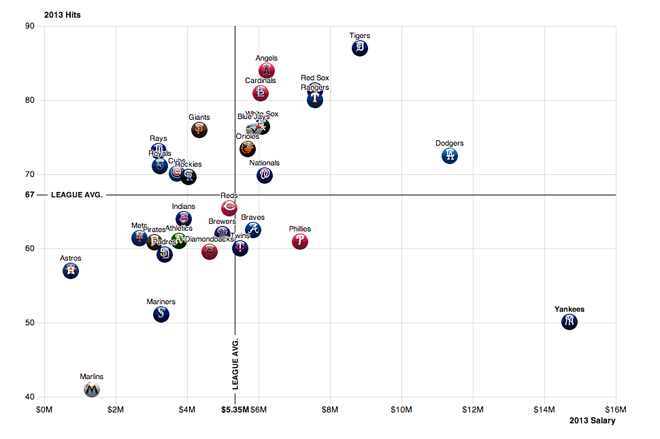
Comparing baseball teams salaries vs. offensive production

At the team-level, one can see that, roughly speaking, the more money a team pays to hitters, the more productive the team. Production it should be noted, does not necessarily equal wins. Look at the Angels, who have some of the most hits, but are in fourth place (out of five) and in a difficult place to make the playoffs.
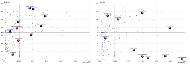
Quick comparison of the Red Sox's hitters to the Yankees' hitters

But then the user can switch to the top-10 paid hitters on each team. (Four presets are offered beneath the piece, but click on a player from any team and his compatriots will appear.) You can see how the Yankees are hitting poorly in comparison to the Red Sox. (The only reason the Yankees are not truly awful is because their pitching has not been horrible.)

So if Rodriguez is suspended for this year and next, maybe they can use his salary for next year to buy a one-year free agent that isn’t at the bottom right of the this chart.

Credit for the piece goes to Mike Bostock and Joe Ward.

16 Useless Infographics

Happy Friday, everyone. Today’s post comes via colleagues of mine in London, who shared with me the Guardian’s selection of 16 useless infographics. They are shit infographics. Well, at least one is. Check them out and you’ll understand.

Using maps to explain maps…

Credit for the selection goes to Mona Chalabi. Credit for each infographic belongs to the infographic’s respective designer.

Ye Olde Boston Mayoral Candidate Map

A map? Again? I know. But trust me, this one is interesting. For those of you who do not know, Boston’s Thomas Menino is not running for reelection this year. By the time he leaves office, he will have been the mayor of Boston for over twenty years and so this year is the first open election in a long, long time.

So what’s better than graphics for election-related data? Graphics with a medieval/Renaissance/fiefdom aesthetic, that’s what. With a little bit of fun, the Boston Globe mapped out the local areas of strength for the 12 candidates for mayor. The residence of each is denoted by a castle keep while areas of strength, location of donors, and key voting areas are signified in different colours. And the map’s background? Well, you can see for yourself.

Boston mayoral candidate map

Credit for the piece goes to Alvin Chang, Andrew Ryan, Javier Zarracina, and Matt Carroll.

Mapping Hepatitis vs HIV

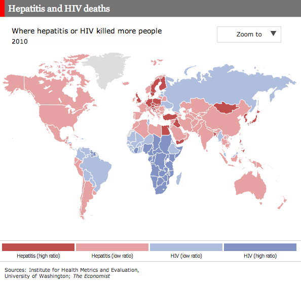
I don’t often write about maps, especially of the choropleth kind. In many cases I choose not to because so many of the maps are one-dimensional: how fast is x growing across the world; which is predominant across the world, y or z? So I was pleasantly surprised by the Economist yesterday when they published this interactive map on the scourges of hepatitis and HIV.

Hepatitis vs HIV
Hepatitis vs HIV

Quickly put, the map is a success. It shows a clear geographic pattern; the developed/Western world along with the Middle East and Asia have a larger problem in hepatitis than HIV whereas Africa and Latin America are dealing moreso with HIV. (Admittedly, the fact that 117 out of 187 countries are dealing more with hepatitis is lost because so many of the countries are small in area.) But, the really nice bit about the map is not just the colour by virus, but the tint by comparative ratio. The darker the colour, the stronger the one virus over the other.

Lastly, from a data perspective, I just wonder if the ratios could not be adjusted for population, or deaths as a percentage of the national population? I would be curious to see if that would yield interesting results.

Credit for the piece goes to C.H., R.L.W., J.S., and D.H.

Delivery Delays

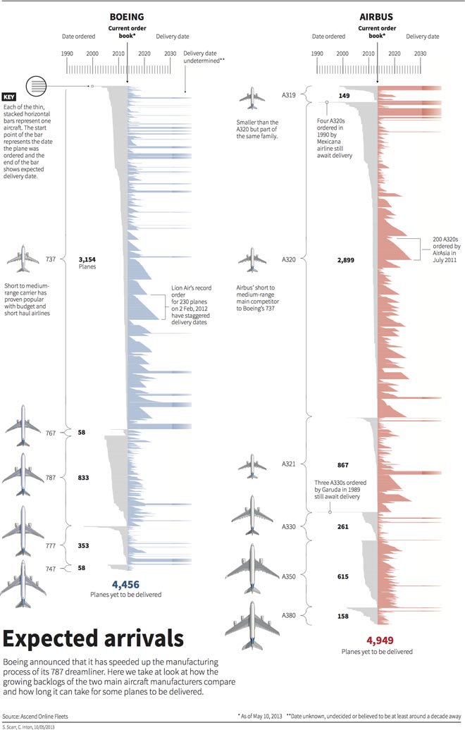
Today’s graphic looks at the backlog of aircraft delivery, i.e. the manufacturing of civilian aircraft. Why? Because Boeing is attempting to increase production of its 787 Dreamliner. And this weekend I arrived in Chicago from Warsaw via a 787.

This is a really nice piece from Thomson Reuters that looks at the manufacturing lines for both Boeing and Airbus and how many planes have yet to be delivered. The annotations really help to explain some of the stories behind some of the aircraft and their delayed deliveries.

Aircraft manufacturing backlog

Credit for the piece goes to Simon Scarr and Christian Inton.

Charting and Mapping Income Mobility

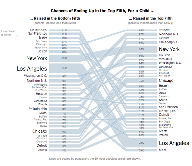
After two weeks out of the country, I come back and find early this morning (thanks, jet lag) an interactive article published by the New York Times on income mobility. What does that mean? From a medium side, a long narrative interspersed with charts and graphics with which the user can interact to uncover specific data about specific elements in the dataset. From a content side, income mobility means the movement of an individual from one group of money earned to another, e.g. a poor person becoming a millionaire. The piece is fantastic and you should take the time to go read and interact with it.

A map shows the broad context of the data to be looked at in the story

For some time now I have harped on about the need to annotate and contextualise datasets. Too often, large datasets paralyse people; their eyes glaze over and they simply gaze at a graphic without seeing the data, the story, the information. Little notes and blurbs of text can help people synthesise what they see with what they read with what they know to gain better understanding. But in this piece, by combining a lengthy article—very well written although that is not the focus of this post—with powerful interactive maps and graphics, the New York Times has created a powerful piece that states and then proves the point of the article. And while doing all of that, by making the datasets explorable, the Times also allows you to find your own stories.

A story-like piece lets you choose an area and an income to see how the article's topic plays out

Lastly, in the credits section at the end you will see this piece required the input of eight individuals (though I know not in what particular capacities). Clearly, for the Times this is not about to become a regular type of infographic/datavis/journalism piece. But when will skill sets be democratised or dispersed enough that smaller teams can create similar scale projects? That will be interesting to see. However, the Times certainly leads the States if not the world in some of the best information design pieces and undoubtedly this will push other publishers of similar content in this direction.

Ultimately people want to know who's best and who's worse and where they fall and this chart does that at the end of the piece

Credit for the piece goes to Mike Bostock, Shan Carter, Amanda Cox, Matthew Ericson, Josh Keller, Alicia Parlapiano, Kevin Quealy, and Josh Williams.

http://www.nytimes.com/2013/07/22/business/in-climbing-income-ladder-location-matters.html?smid=pl-share

The Carpatho-Rusyns of Slovakia

If all is going according to plan, I should be somewhere in the Carpathian Mountains at this point, specifically in the Presov region of Slovakia. So as a reminder of just what that means, here is a (recycled) piece I created this time last year about the Carpatho-Rusyns (sometimes known as Ruthenians) living in Slovakia. Click the image to go to the full infographic.

Cropping of the Rusyns of Slovakia

Credit goes to me for the piece, but to the statistics office of Slovakia for the data.

Secret Life of the Cat

It’s Friday. So what else could you want but cat videos?! On the internet?!

But seriously, that’s what I have for you today. But with a twist. The BBC and the Royal Veterinary College collaborated to document a day in the life of cats by attaching collars with micro-cameras and GPS trackers to several felines in one English village. Cats are selected by illustration at the top of the graphic. Their day’s walking path is traced out over the village while video clips of some of the more interesting parts of the day are available to watch.

A day in the life of Phoebe the cat

Credit for the piece goes to Steven Atherton, Chris Finch, Alex Ranken, Lucy Rodgers, Helene Sears, Marina Shchukina, and Noah Veltman.

Corporate Taxes

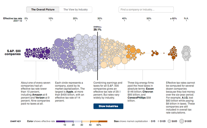
Corporate taxes are always a fun discussion point. Who pays too much? Too little? Not at all? In May, the New York Times published an interactive piece examining US companies and their effective tax rates from 2007 through 2012.

At its core, the piece is a bubble chart along one axis that plots the tax rate for the company, with the bubble sized proportionally to said company’s market capitalisation. Colours reinforce the tax rate plotting, but are not themselves necessary. I think they would have been better tied to something along the lines of industries or profit or sales growth.

Overall corporate tax rates

Of course that was when I saw the button for viewing the data by industry. The view of all companies is broken up into a series of charts about each particular industry. And of course, if you want information on a particular company, the smart search/filter is particularly useful.

Corporate tax rates by industry

Credit for the piece goes to Mike Bostock, Matthew Ericson, David Leonhardt, and Bill Marsh.

Office Space(s)

Today’s piece comes to me from my colleague Eileen. The Harvard Business Review published a report commissioned by Steelcase that looked at how different cultures prefer different office layouts, based upon different attitudes and traits exhibited by the people of different countries. That lead to three different types of spatial layouts.

But what is really nice is that the piece prompts you to start through an example or case study to see how the data works to shape the conclusion. You can of course skip to the data exploration mode, but that is not the default mode. But when you do arrive at the exploration area, you can click through different countries and see how their surveyed opinions plot against each other.

Cultural characteristics

And if you want to understand more about the different layouts presented for each group of countries, you can click on the layout to bring up more information. This panel of information provides context and explains just how the general traits shared by those geographies leads to the preferred office space layout.

Explaining a layout
Explaining a layout

Credit for the piece goes to Christine Congdon and Catherine Gall.