Dunkin Donuts vs. Starbucks

I’m not a coffee guy. I drink tea. At most I have one or two espresso drinks per year. But up in Boston, they have been looking this week at coffee preferences. The question is which is your coffee spot? Dunkin Donuts (from Massachusetts) or Starbucks (from Washington)? Northeast or Pacific Northwest? In a piece that reminds me of the New York Times’ Wawa vs. Sheetz graphic, the Boston Globe plotted the locations of the two national coffee chains. This interactive piece allows you to toggle between dots for Dunkin Donuts (orange, naturally) and Starbucks (green, of course).

Dunkin Donuts vs. Starbucks in Massachusetts

They complemented the Massachusetts-focused piece with a longer article that looked at the national distribution.

Dunkin Donuts vs. Starbucks between New York and Philadelphia

Credit for the piece goes to Alvin Chang and Matt Carroll.

Piracy on the Seas

Today’s post looks at an interactive graphic from the Los Angeles Times. The subject matter is piracy and the piece has three distinct views, the second of which is displayed here.

Pirate attacks in the Indian Ocean

Generally speaking, the package is put together fairly well. My biggest concern is with the first graphic. It uses circles to represent the number of attacks by locale over time. I would have either included a small table for each geographic area noted, or instead used a bar chart or line chart to show the progress over time.

Credit for the piece goes to Robert Burns, Lorena Iñiguez Elebee, and Anthony Pesce.

A (Time and) Space Race

First of all, I grew up a fan of Star Trek and not Star Wars. Star Trek is, after all, more science-y. Now, for today’s post, I could make references to the battlestar Galactica, the good ship Tardis, Planet Express deliveries, or avoiding the Alliance throughout the Verse. Instead I’ll just submit this interactive graphic from Slate.

Voyager 1 is slow
Voyager 1 is slow

It compares the times needed by various nerd-loved starships/spaceships/space vehicles to reach very distant (and real) stellar destinations. Don’t worry, there is a bar chart in the end with Voyager 1 thrown in for comparison to reality. (Though I suppose they could have just made it Voyager 6.)

Not accounting for differing technologies or laws of physics

See, a bar chart. It fits within the scope of this blog.

Credit for the piece goes to Chris Kirk, Andrew Morgan, and Natalie Matthews.

Changes in Global Life Expectancy

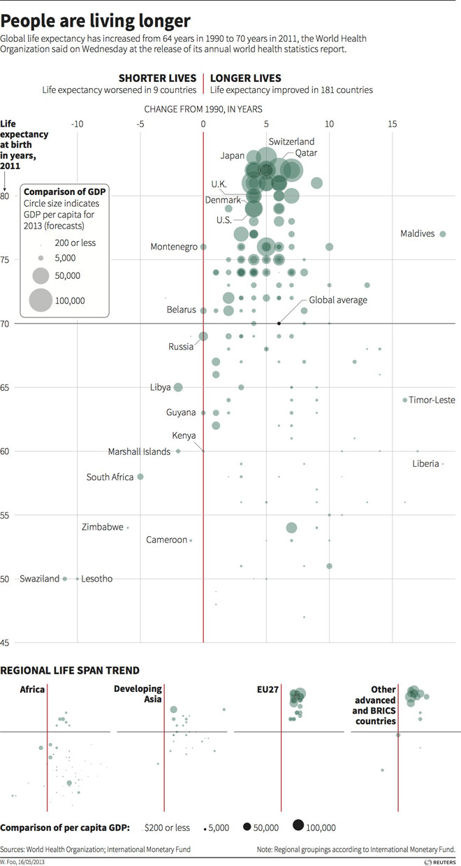
Today’s post is a scatter plot from Thomson Reuters looking at changes in global life expectancy since 1990. What is really nice about this piece is the main space for the data visualisation presents all of the data for all of the available countries. Beneath the main visualisation, the designer chose to use small multiples of the same chart to highlight broader regional trends.

Change in global life expectancy

Credit for the piece goes to, I think, Hwei Wen Foo. (Credit on the graphic is W. Foo.)

Scatter Plots in Time (and Space?)

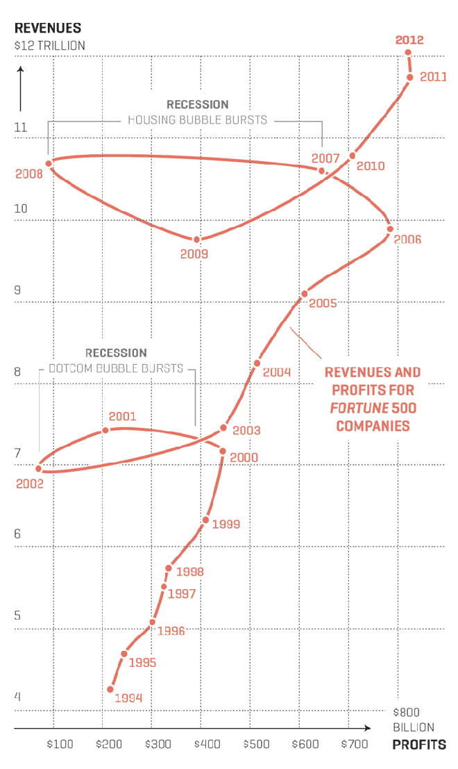
Well maybe not so much the space. Anyway, Nicolas Rapp, who does a lot of work for Fortune Magazine and previously the AP, created his first connected scatter plot. I have been a fan of them for quite some time and have been able to use them from time to time. Rapp’s scatter plot looks at the profits and revenues of the Fortune 500 in the last 20 years. But what I think makes his piece particularly strong are the two annotations he provides to explain the “loops” in the data: the two big recessions.

Profits and revenues for the Fortune 500

Credit for the piece goes to Nicolas Rapp.

Student Debt Levels are Soaring

Earlier this month the Federal Reserve Bank of New York published a report on household debt. Among the findings was the story that student debt is rising to problematic levels as it may act as a brake on economic recovery. In short, without an economy creating jobs for the young (recent university graduates) it becomes increasingly difficult for the young to pay pack the loans for the sharply rising costs of university tuition.

The report made this argument by use of interactive choropleth maps and charts. The one below looks at

Which consumers have how much debt

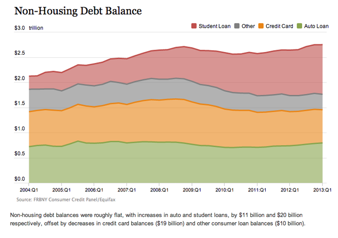
But another chart that talks about the rising levels of student loan debt misses the mark. Here we see some rather flat lines. Clearly student loans are growing, but without a common baseline, the variations in the other types of debt muddle that message.

The NY Fed's presentation of non-housing debt

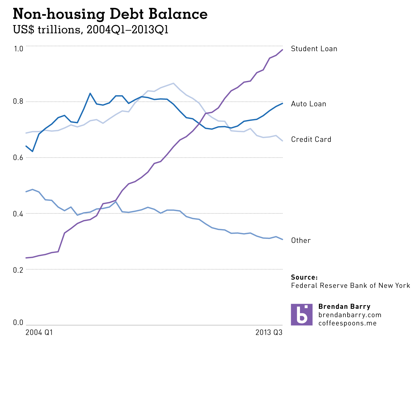
I took the liberty of using the data provided by the New York Fed and charting the lines all separately. Here you can clearly see just how in less than ten years, student loans have risen from $200 billion to $1,000 billion. This as credit card debt is falling along with other forms of debt (non-automotive).

My take on non-housing debt

The New York Fed did some great work, but with just one tweak to their visualisation forms, their story is made much more powerful and much more clear.

Credit for the original work goes to the Federal Reserve Bank of New York.

Alaska Airlines

Here’s an older, March graphic from the New York Times that looks at Alaska Airlines. This exemplifies what maps do well; it maps relevant data onto a map. Perhaps that reads silly, but too often people map data just because most things are tied to a geography; things that happen in the world happen somewhere, ergo everything could be mapped.

The growth of Alaska Airlines

In this graphic, however, mapping the tight and Alaska-focused network with tendrils sneaking off-map to distant cities. The map supports the article that tells how after decades of focusing on Alaska, the airline has begun to expand to Midwestern cities in the US, cities in Mexico, and Hawaii.

I am not terribly keen on the stacked bar chart. It highlights the steady Alaska market over the decades at the cost of showing dynamism in those Midwestern, Mexican, and Hawaiian markets.

Credit for the piece goes to the New York Times Graphics Department.

Strikeouts on the Upswing

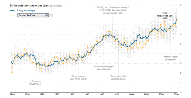
Strikeouts are an important part of baseball. They are the moments where the pitcher wins the duel between pitcher and batter that is the essential element of baseball. But over the years the game has seen more and more batters striking out more often. Earlier this year the New York Times looked at the rising rates of strikeouts in a story supported by interactive data visualisation components.

Strikeouts on the upswing

Like the piece on Bryce Harper, this piece on strikeouts is more of a narrative with the interactive graphics supporting the written words. It is not as lengthy as the Washington Post’s piece, but this one is far more interactive as the user can select his or her favourite teams and follow their performance over time.

Credit for the piece goes to Shan Carter, Kevin Quealy and Joe Ward.

Bryce Harper

Bryce Harper is undoubtedly one of the best baseball players in the game today. To put it simply, he hits. And he hits well. And he hits well often. So the Washington Post put together an interactive, long form piece about Harper’s swing and hitting.

Pitching to Bryce Harper

The piece begins with a narrated video outlining the science behind Harper’s swing. Then the reader can down into the piece and learn more about Harper’s history and development and how he compares to other hitters. Statistics and data visualisation pieces show just how impressive Harper is as a hitter and how pitchers are trying to combat that.

Interactive long form articles are appearing more and more often online. But this is perhaps the most data- and science-intensive piece I have seen thus far. What is particularly nice about the format is that, as I have often noted, annotations and explanations are what make good infographics and what move data visualisation from presentational to informational. That this piece in particular happens to be about baseball, well, all the better.

Credit for the piece goes to Adam Kilgore, Sohail Al-Jamea, Wilson Andrews, Bonnie Berkowitz, Todd Lindeman, Jonathan Newton, Lindsay Applebaum, Karl Hente, Matthew Rennie, John Romero, and Mitch Rubin.

Disabled List Payrolls

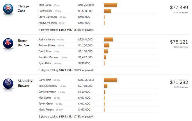
The Boston Red Sox are in Chicago this week to play the other Sox, i.e. the White Sox. So this week we have a bunch of baseball-related pieces. The first is this recent interactive graphic from the New York Times. It is a daily-updated graphic that looks at the payroll of all Major League teams that is tied up on players on the Disabled List, i.e. those unable to play because of injuries.

Comparing all MLB teams

Clearly the Yankees are paying a lot of money for no production. You can go down the list and compare each team’s total spending. But if you want intra-team details, the piece offers you the ability to look at player-by-player salary details. Interestingly one of Chicago’s baseball teams ranks just above the Red Sox while Milwaukee sits just below.

Red Sox players on the Disabled List

Credit for the piece goes to Shan Carter, Kevin Quealy and Joe Ward.