Mexico: the Land of Many Countries (or Comparisons Thereto)

On Thanksgiving, the Economist published an interactive map that looked at Mexico across three metrics: murders, murder rates, and population. Mexico is one of the more populated countries in the world, but it is also one of the most dangerous. In the middle of the previous decade, the Mexican government began to crack down on the drug cartels. But the cartels have violently resisted. Very violently.

The map is nothing new. It labels different Mexican states by comparing their statistics to those of countries across the world. For example, the state of Chihuahua in northern Mexico, one of the “fronts” of this new drug war, has a population of 3.41 million people. The total number of murders so far this year is 2,350. That is only six murders fewer than in the entire country of the Ukraine. Did I mention the population of the Ukraine is over 45 million. More than ten times the size of Chihuahua. And the comparisons go on, though as the map clearly points out the distribution is not uniform.
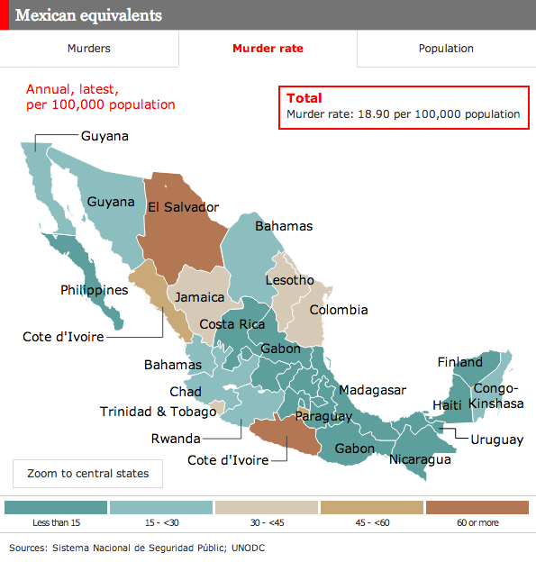
Murder rates in Mexico

In terms of interactivity, a nice little feature is the filtering of the map by the legend at the bottom. Hover over one of the bars and only those areas appear coloured in the map.

Flickers of Red in a Deep New York Blue

The New York Times breaks down the 2012 presidential election results at the precinct level. It shows that despite the city being a bulwark of Democratic support, areas of deep Republican support still exist.

New York City Precinct Results

Maps Are Not Silver Bullets

I make a lot of maps in my line of work. Often times, they are not particularly interesting. Mostly because they follow similar patterns to this. More stuff is bought and sold where there are more people. More stuff is bought and sold where more people have more money. Et cetera, et cetera.

Maps are not always helpful

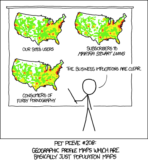
Maps are sometimes very useful. But I have a saying when people ask for a map of some kind of data tied to geographies: Maps are not silver bullets. That is to say, just because you throw data about countries, states, or counties onto a map does not mean you are going to see anything worthwhile let alone new or unexpected.

Credit for the XKCD piece goes to Randall Munroe

The History of Viper’s Dream

My colleague Benjamin Byron plays the upright bass in a few bands, one of which is named Viper’s Dream. We were discussing the flexibility of jazz band rosters and I decided to make an infographic about the membership history of Viper’s Dream. Unfortunately, I know of nobody’s name but Benjamin’s, so they are all listed as [instrument] Guy.

The history of Viper's Dream

Twinkle, Twinkle, Little—Damn That’s Bright.

We’ve had a lot of the rough and gritty politics of late. So now for some  bright and starry-eyed idealism. Well, maybe less idealism and more stars. Lots of them. Courtesy a Google Chrome experiment.

Stars…
Stars…

Electoral College Victories

Despite the claims of a select few, President Obama’s victory in the electoral college last week was not narrow. While it was not a blowout landslide, it was a clear and convincing win. But to show how it compared across American political history, I quickly charted electoral college results since the time of George Washington.

It is worth keeping in mind that prior to 1804, electors did not distinguish their votes between president and vice president, so those numbers look a little bit different than they might seem today.

Electoral College Results

History of Congress

Today is Election Day. Did you vote yet? If not, why the hell not?

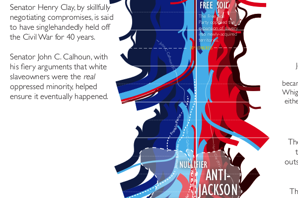
But you are not just voting for president, you are also voting for senators (in some states at least, like Pennsylvania), your congressman or congresswoman, state assemblies, ballot initiatives, &c. And in that spirit, this last pre-vote result post comes from xkcd and looks at the history of Congress and how it leaned right or left over all the years. It’s big, but worth a look.

History of Congress
History of Congress

Credit for the piece goes to Randall Munroe

The Paths to 270

There is one day to go until the presidential of 2012. But despite what many say and a fewer number want, the United States is not a democracy. It was never meant to be. Instead it is a democratic republic. We elect people who make decisions for us. Perhaps one of the most misunderstood ways in which this happens is through the election for the president.

The popular vote does not matter. If the popular vote did matter, Al Gore would have been elected president in 2000, not George Bush. Instead, your state’s electors matter because they belong to something called the electoral college. Different states have different numbers of electors (loosely based on their political representation in Congress). Given which states are certain to vote for President Obama (Illinois) and Governor Romney (Georgia), there are only a few states that are available for either to win (Ohio).

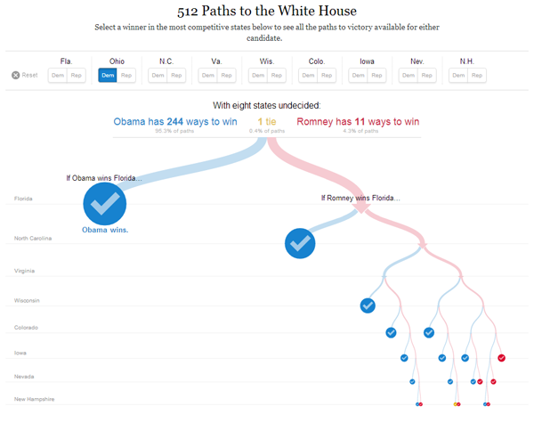
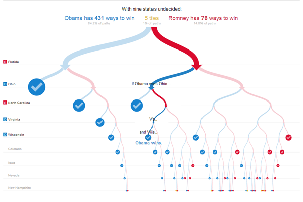
Different combinations of states can be had to reach 270 electoral college votes, which is the number necessary to become president. While Governor Romney might be able to make 50.1% of the national vote, as this interactive piece from the New York Times shows, his path to 270 votes is very narrow and he cannot stray too far and still hope to win. And it is because of this fact (generally speaking) that many, e.g. Nate Silver of the New York Times, are saying that a re-election of President Obama is far more likely than a Governor Romney victory.

There are two ways to really play with it. First, select different states and see how many different routes are left open to Governor Romney. The second is to leave the selections blank and then follow the flow chart given by the New York Times.

Play with the Toggles Until You Get a Winner
Follow the Red Road for Romney

Credit for the piece goes to Mike Bostock and Shan Carter.

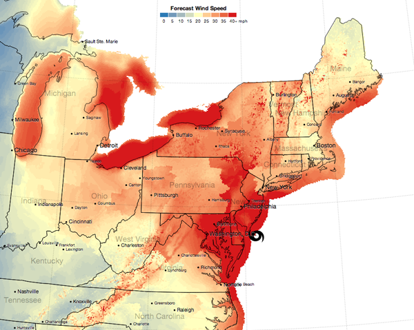
Sandy’s Winds

Hurricane Sandy also brought quite a lot of wind. Before the storm landed just south of Atlantic City I was travelling east on the Pennsylvania Turnpike. And as the map below from the New York Times illustrates, I was driving through not insignificant winds (with quite a few more powerful gusts). In the first few hours after landfall, the winds within 100 miles of Sandy’s centre—which was due to pass within miles of my hometown—continued to whip everything exposed to the environment. Thankfully after those first few hours, things began to calm very quickly.

Sandy's Forecast Wind Speeds

The link through the image above is an animation of sorts of the timeline of wind forecasts.

Credit for the piece goes to Mike Bostock and Shan Carter.

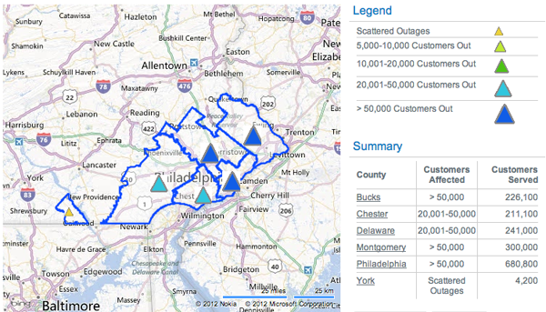
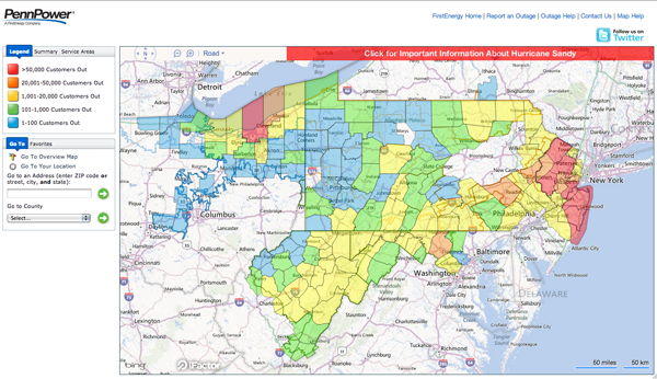
Electrical Outages from Sandy

Hurricane Sandy hit the Jersey shore before moving northwest through southeastern Pennsylvania. These were two maps from two different electric utility companies providing information on the number of outages. This first and smaller graphic is from PECO. The second and larger is from FirstEnergy. The graphic from FirstEnergy breaks into the township level when zoomed in sufficiently. Clearly from being able to post this, I am among the fortunate with my electricity still up and running.

PECO Outages on Tuesday
First Energy Outages on Tuesday

Clearly these are not all outages, only the outages reported by these two electrical utilities. At the time of writing some 1.3 million people were without electricity in Pennsylvania and over 7 million in the Northeast while Sandy—now an extra-tropical low pressure system—continues to dump rain and snow on the interior reaches of the area.