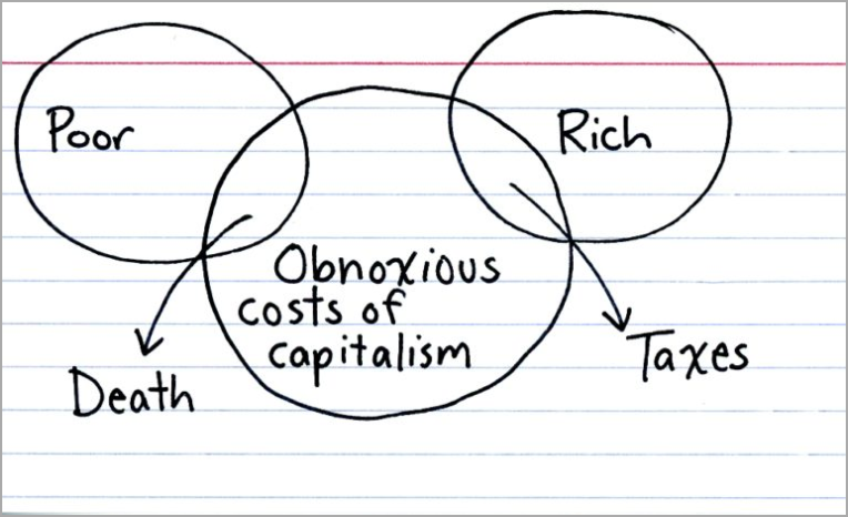
This week was tax week for my American readers—hopefully you all filed or received an extension. And with it comes to my mind the quote by that guy who did a lot of stuff in and for Philadelphia: Benjamin Franklin. Nothing in life is certain, he said, but for death and taxes.
Enter Indexed, who had this great Venn diagram on Tax Day.
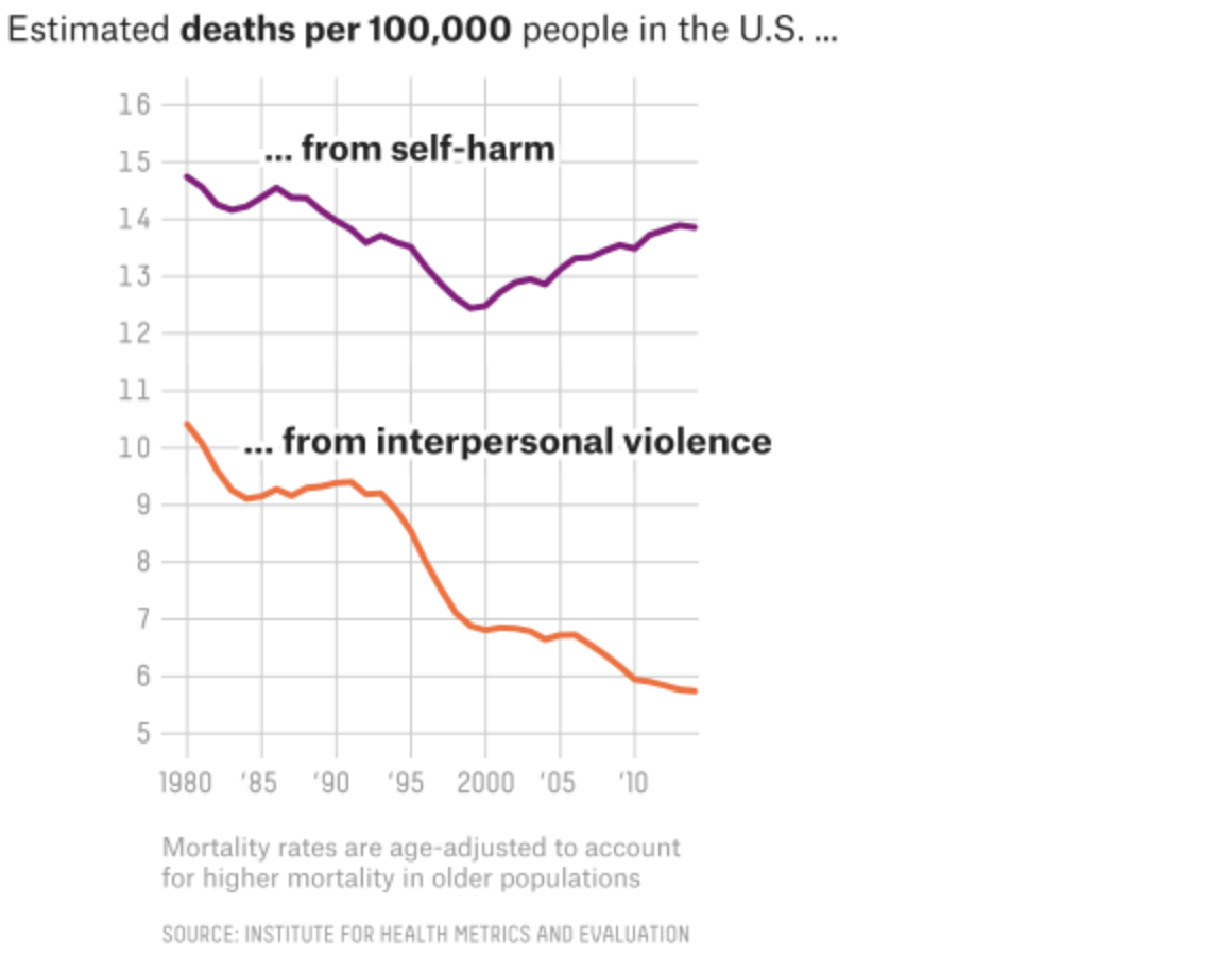
Yesterday was murders in London and New York. Today, we have a nice article from FiveThirtyEight about deaths more broadly in America. If you recall, my point yesterday was that not all graphics need to be full column width. And this article takes that approach—some graphics are full width whereas others are not.
This screenshot shows a nice line chart that, while the graphic sits in the full column, the actual chart is only about half the width of the graphic. I think the only thing that does not sit well with me is the alignment of the chart below the header. I probably would align the two as it creates an odd spacing to the left of the chart. But I applaud the restraint from making the line charts full width, as it would mask the vertical change in the data set.
The screenshot is of the graphic’s full width, note the lines only go a little over half the width.
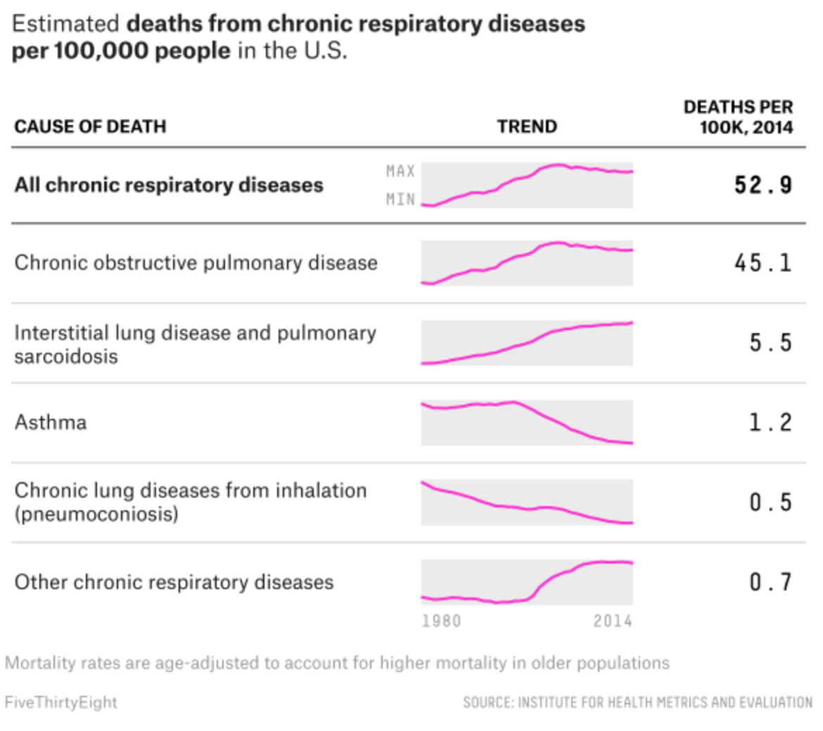
Meanwhile, the article’s maps all sit in the full column. But my favourite graphic of the whole set sits at the very end of the piece. It examines respiratory deaths in a tabular format. But it makes a fantastic use of sparklines to show the trend leading towards the final number in the row.
Loving the sparklines…
Credit for the piece goes to Ella Koeze and Anna Maria Barry-Jester.
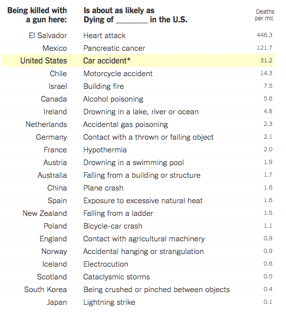
Yesterday I opined about how simple tables can convey meaningful information without the aid of unnecessary chart elements. And while we will get back to that post, I did want to take a moment to share an older piece from the New York Times I recalled and that has been updated since Orlando.
The piece uses a table to compare the gun homicide rates for various countries and compares it to other causes of death. Being killed by a gun in the Netherlands is as likely as dying by accidental gas poisoning in the United States. It puts the absurdly high gun homicide rates in the United States in a new light.
A table of death
Credit for the piece goes to Kevin Quealy and Margot Sanger-Katz.
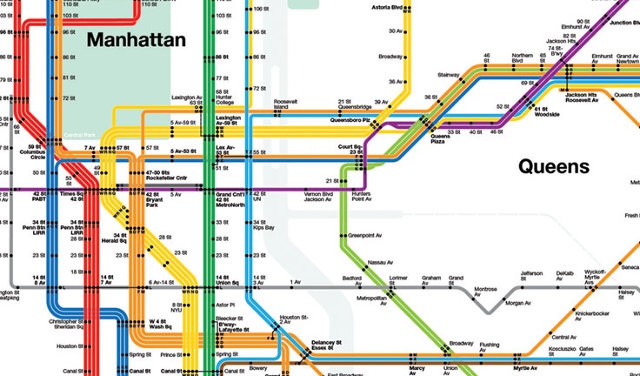
Massimo Vignelli died yesterday at the age of 83. Fastco has a much better article than I think I could read, this image is from their piece but is of Vignelli’s transit map for New York. I wrote about an interactive piece several years back that allowed you to compare Vignelli’s map to the new system map for the MTA.