Parties in Pennsylvania

This is from a social media post I made a few days ago, but think it may be of some relevance/interest to my Coffeespoons followers. I was curious to see at 30+ days from the general election, how has the landscape changed for the two parties since 2016?

Well, this project has driven me to a related, but slightly different project that has been consuming my non-work time. Hopefully I will have more on that in the coming days. Without further ado, the post:

Pennsylvania will likely be one of the more critical battleground swing states in this year’s election. In 2016, then candidate Trump won the state by less than one percentage point. But four years is a long time and I was curious to see how things have changed.

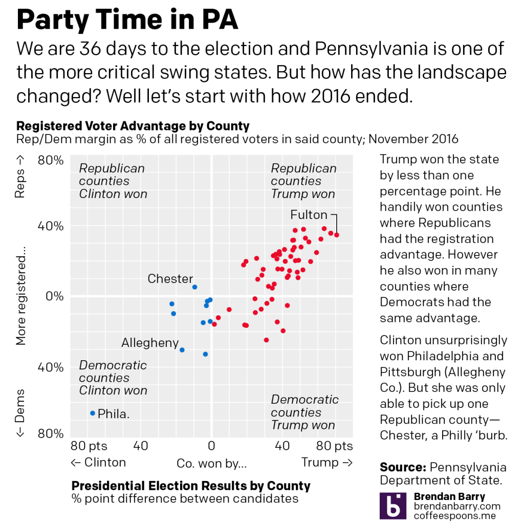
In the first chart on the right we see counties won by Trump and on the left, Clinton. The further from the centre, the greater the candidate’s margin of victory over the other. The top half plots registered Republicans’ margin over Democrats as a percentage of all registered voters in the county (including independents and third party) and the bottom half does the same for Democrats. Closer to the centre, the more competitive, further away, less so.

Trump’s key to victory was the white, working class voter clustered in the west and the northeast of the state–old mining and steel towns. There Democrats normally counted on organised labour support as registered Democrats. That all but collapsed in 2016. The bottom right shows a number of nominally Democratic counties Trump won, whereas Clinton only picked up one Republican county, Chester.

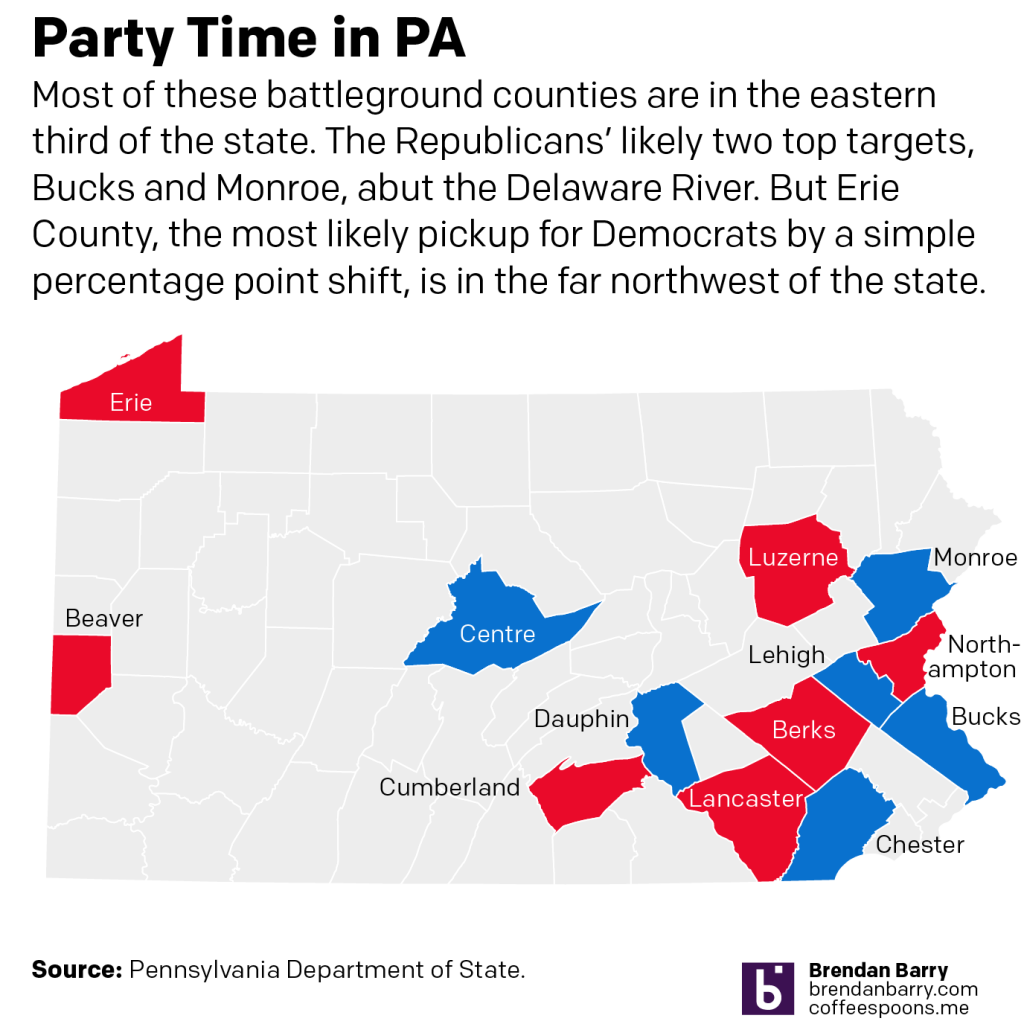
But what are PA’s battlegrounds?

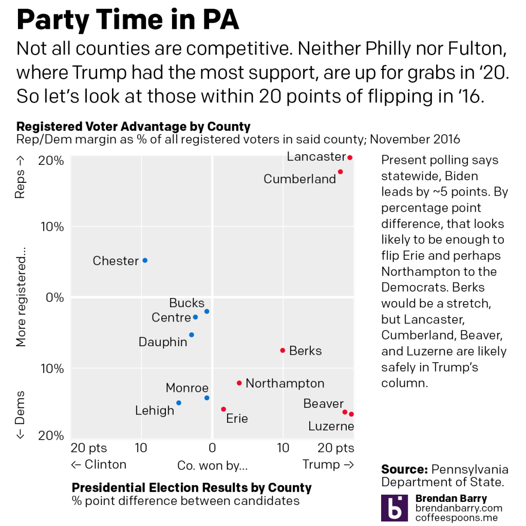
In the second chart we ignore places like Philly and Fulton County and zoom in on more competitive counties within 20 point margins. Polls presently point to a Biden lead of about 5 points in PA. If every dot moved left by 5 points (it doesn’t really work like that), we only see Erie and Northampton with potential to flip.

But Trump’s realignment of politics is accelerating (more on this another day) a realignment of PA’s political geography.

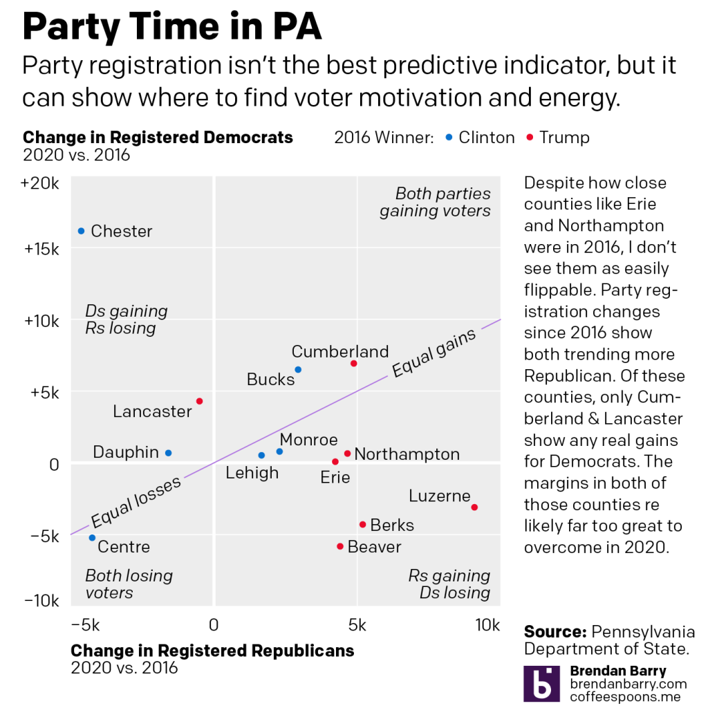
In the fourth chart, neither Erie nor Northampton show any real movement via party registration back to Democrats. Erie may flip, but Northampton’s likely a stretch. Places like Cumberland and Lancaster counties are too solidly Republican to flip this year. Instead Trump is more likely to flip counties like Monroe and Lehigh red, even if he loses the state.

Because, not shown, the key to a Biden victory will be running up the margins in Philly & Pittsburgh, and to a lesser extent Philly’s four collar counties, including Chester, which appears to be rapidly shifting in Democrats’ favour.

Credit for the piece is mine.

Why the Faces?

Stepping away from both the Brexit drama and the aircraft drama of the week, let’s look at US political drama. Specifically, the Democratic field and some of the early support for candidates and assumed-to-be candidates.

This piece comes from an article about the bases of various candidates. From a data visualisation perspective it uses a scatter plot to compare the net favourability of the candidate to the share of people who have an opinion about said candidate.

A veritable who's who of the Democratic field
A veritable who’s who of the Democratic field

But what if you don’t know who the candidate is? As in, you don’t know what they look like. Well, then it might be difficult to find Bernie or Elizabeth Warren. This kind of graphic relies on facial recognition. I’m not certain that’s the best, especially when one is talking about a field in which people may not know or have an opinion on the candidates in question.

Another drawback is that the sizes of the faces are large. And, especially in the lower left corner, this makes it easier to obscure candidates. Where exactly is Sherrod Brown? Between a unidentified face and that of Terry McAuliffe.

I think a more simplistic dot/circle approach would have worked far better in this instance.

Credit for the piece goes to the FiveThirtyEight graphics department.

Blue Dog Democrats

Last week I mentioned that it appeared Politico was running with articles featuring data visualisation. Just this morning I stumbled upon another article, this one about the Blue Dog Democrats. For those that do not know, Blue Dogs are basically a more conservative Democrat and were the remnants of the Democratic south. But in 2010, they got all but wiped out. This article looks at how and where they might just be coming back.

Blue Dogs were largely a faction of the party drawing from the South

If this trend of data-driven and visualised content continues, the Politico could be doing some interesting work over the next year. By then we will be in a rather intense mid-term cycle and there might be some political news to coverage.

Credit for the piece goes to the Politico graphics department.

Party Demographics

Alas, these are not the fun type of parties, but the two main US political ones. But overall, before some more primary and caucus votes tomorrow, I think this Wall Street Journal piece nicely captures and illustrates the changes in and the differences between the bases of the two parties.

The makeup of the two large US political parties

Credit for the piece goes to the Wall Street Journal graphics department.