A Week of Unrest Across the Middle East

Over the last week a video clip on YouTube that mocked the Muslim prophet Mohammad sparked unrest across the Muslim world, from Morocco to Bangladesh and from Turkey to Kenya. While most of the protests were peaceful, a few were not. In Libya, the US consulate in Benghazi was attacked—in circumstances still not entirely clear—and four Americans were killed, including the US ambassador, Christopher Stevens. In Khartoum, Sudan, the embassies of the US, the United Kingdom, and Germany were all attacked. While in Afghanistan, the Taliban successfully attacked the UK’s heavily fortified base of Camp Bastion, nearest to Kandahar, killing two US Marines and destroying six Harrier jets.

Combing through several news sites, including the BBC, AP, and Reuters among others, I mapped where protests occurred and sought to show how much of that country’s population identifies as Muslim. Most nations were, not surprisingly, heavily Muslim. But several countries with rather small Muslim populations such as Kenya, Sri Lanka, and India also hosted protests, some violent. Not included, because of the difficulty in changing the map, is Australia. Sydney experienced protests nearing rioting as protestors marched.

Click the map for the full-sized view.
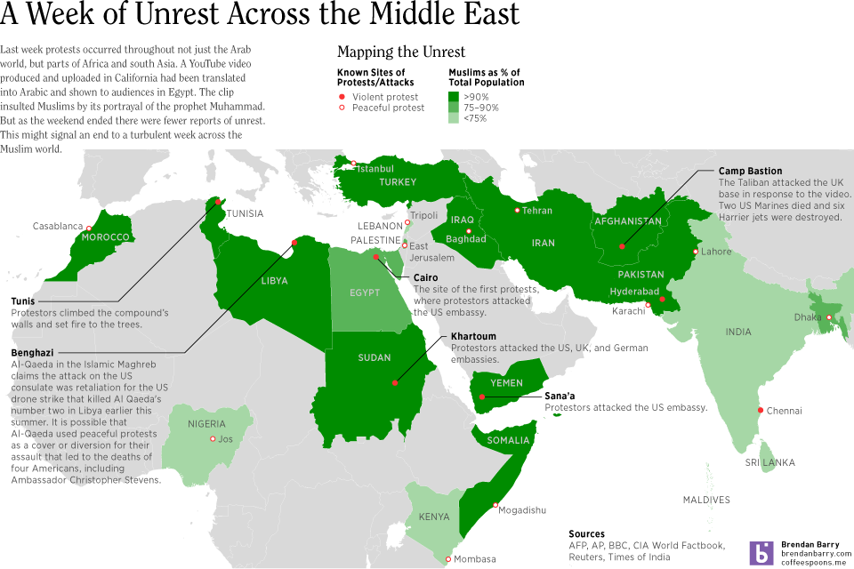
Map of Muslim Unrest; click for the full-size view

How Has the Democratic Party Changed

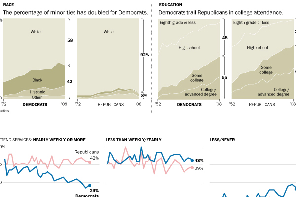
This past weekend the Washington Post published an infographic looking at how the Democratic Party has demographically changed over time and compared those changes to those in the Republican Party. The piece is large, but shows some interesting trends particularly with the racial diversification of the political parties—or lack thereof. It is an important trend when considering the white population is growing at much slower pace than minority groups.

Democratic Party trends

Ethnic Comparison of Romney and Obama Voters

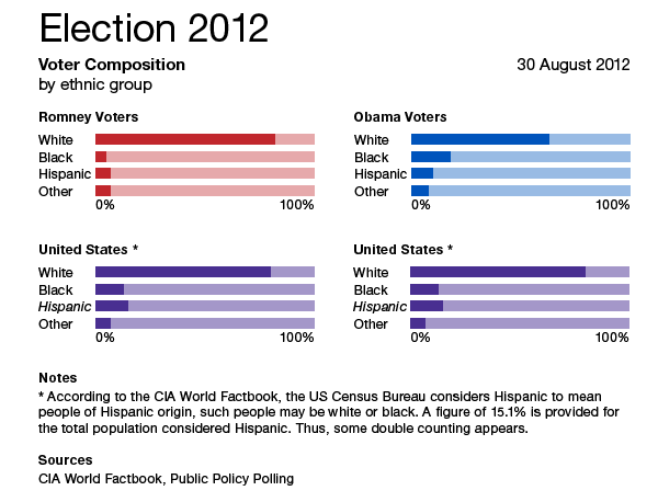
A rare mid-day posting. Some interesting figures published on Twitter by Public Policy Polling look at the ethnic breakdown of the—I presume self-identified—voters for both Governor Romney and President Obama. Perhaps we all already knew this, but one voter group is more diverse than the other.

To see whether these align with the national population, I included some quick stats published by the CIA World Factbook on the ethnic breakdown of the United States. The tricky part, however, is that the US Census Bureau does not regard Hispanic as a discrete ethnic group. Instead, it is considered an origin. Thus, you can be a black Hispanic of Caribbean descent or a white Hispanic from Spain. So, in full transparency, my United States figures for Hispanic are a bit suspect.

Indo-European Language Origin

Polonius once asked Hamlet what he was reading. Hamlet replied “Words.”

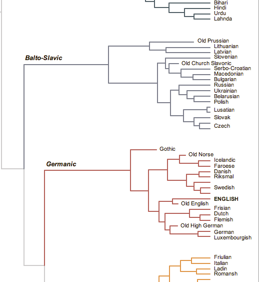
I still love that scene. But, it turns out that we now have an even better idea of where our words came from. It turns out that it is more likely that our shared Indo-European languages originated not in the steppes of Russia but rather Anatolia in Turkey. The New York Times created a graphic that looked at just how the Indo-European family of languages can be broken out.

Branches of our family tree


Obama Administration Failing on Mortgage Modifications

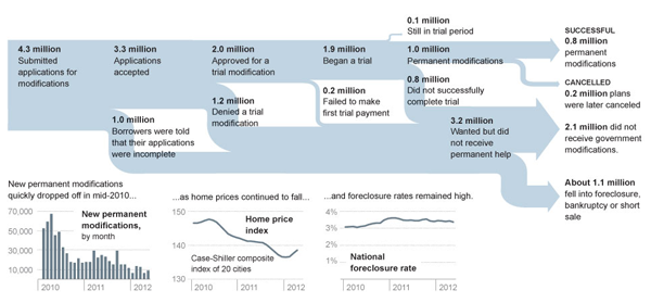
Today’s post features a Sankey diagram from the New York Times that looks at how the Obama administration has been failing to help homeowners with mortgage problems. Less than 25% of applicants have seen successful modifications of their home loans. The diagram here clearly shows the process and the failures that have led to so many Americans not receiving the help they sought.

Sankey
Sankey

Credit for the piece goes to Alicia Parlapiano.

World Bank—Mobile Phones

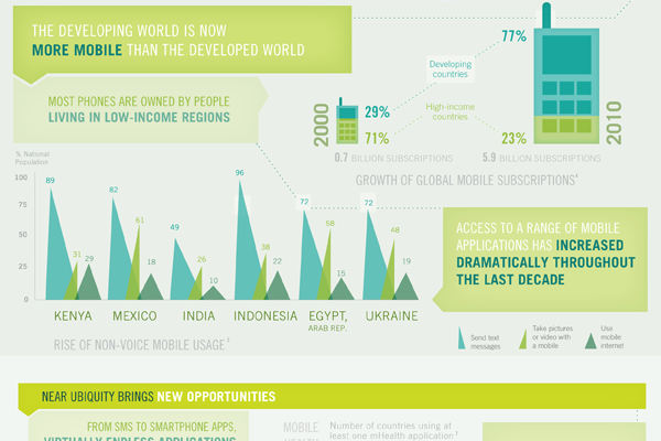
A little while ago the World Bank, generally a rich-country club that doles out loans to the developing world, published an infographic looking at mobile phones and their presence in the developing world.

The piece supplemented a report and is rather large. It actually exists as two separate images. The cropping below focuses just on how people in the developing world use mobile phones. Overall the piece is a bit weak in terms of data visualisation types and some of it is a bit confusing, but the story is clearly worth telling. And fortunately there are more hits than misses.

Developing world usage


The Muslim World

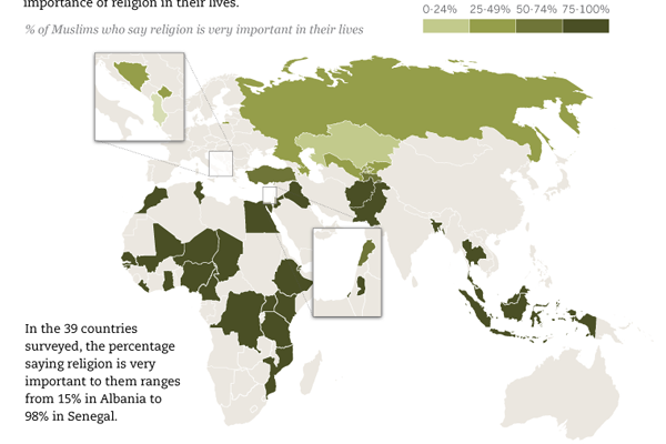
Today’s post comes via a co-worker of mine and is from the Pew Research Center’s Forum on Religion and Public Life. The infographic is of the long-running image type, but in this case is neatly sliced into digestible morsels of tasty infographic-ness. Below is a cropping of the longer piece. It looks at how Muslim populations in different countries feel about the importance of their religion in their daily life.

The Muslim World
The Muslim World

Surveys of Swing States for the 2012 Presidential Election

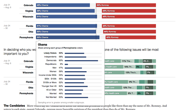
The New York Times has been conducting surveys or polls of voters and likely voters in swing states, i.e. the states where the 2012 election will be decided. The nice thing about the piece is that it allows the user to select different sets of demographics through which one can view the questions asked. Furthermore, the user can mouse over the individual bar of a response and see the whole set.

Election Polling
Election Polling

Olympic Performance vs Economic Performance

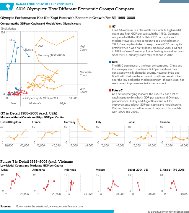
The Olympics are now fully underway and we can begin to see some patterns about who is doing well and who is, well, not. This infographic has a lot more to say about who had been doing well up through 2008. That is important because that was the last year before the fiscal/financial crisis brought about the first global recession since World War II. Stay tuned for the post-Olympic piece where I look at medal performance in 2012 compared to GDP per capita. Some interesting stories appear to be happening.

One can clearly see that GDP per capita is (generally speaking) a good variable for estimating Olympic success. So the countries in this graphic are three major economic regions. The G7, BRIC, and the Future-7. The G7 are the world’s richest/most productive countries. BRIC are supposed to become the next G7. And the Future-7 is a Euromonitor International grouping that looks at a group of countries that are expected to become the next BRIC-like group of countries.

Economic Groups Compared

It is probably worth noting that despite this being an infographic for work, where I generally am not allowed to write analysis, the written analysis is mostly mine with some key ideas brought to my attention by co-workers.

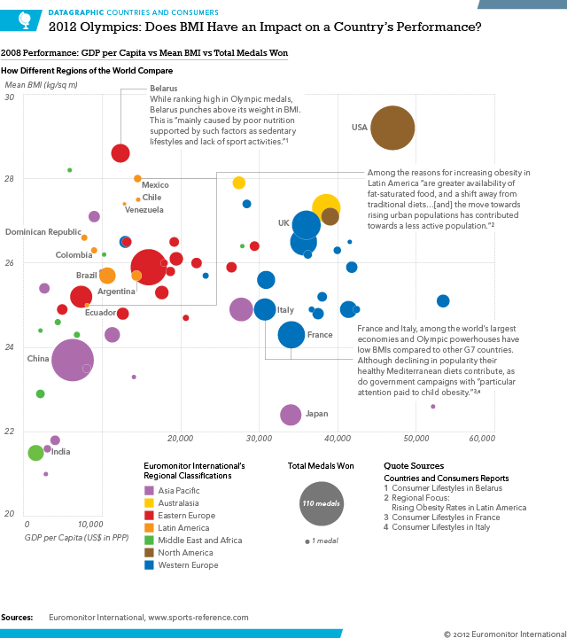
Does a High Average BMI Impact a Country’s Chance at the Olympics?

It turns out not so much. A comparison of the 2008 data for average BMI (coarsely how fat a person is) for countries across their economic productivity (GDP per capita) and total medals won shows that a country’s health culture does not greatly impact said country’s Olympic chances.

Does BMI Impact Olympic Performance?

This is another from my work series on infographics for the Olympics.