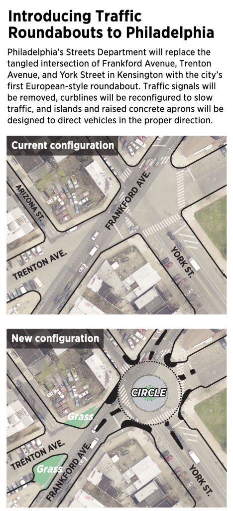
This is a piece I’ve been sitting on for a little while now, okay half a year now. There isn’t too much to it as it’s an illustration overlay on a satellite photo. But the graphic supports an article about the construction of a new roundabout in Philadelphia, coincidentally where I used to live.
That intersection is…tricky to navigate at best as a pedestrian because there are six and a half streets converging at the junction—I give a half to Arizona St because, well, you’ll see shortly. When I lived in the neighbourhood I saw several near accidents between vehicles and pedestrians and vehicles and cyclists. Anything to help improve the safety will be welcome. And that improvement is what the Philadelphia Inquirercovered back in January.
More roundabouts please.
This definitely fits in the category of well done, small graphics. Not everything needs to be large and interactive. This does a great job by using transparency over the satellite image and layering illustration atop the photo.
Now if we could only restore the old rails on Trenton Ave to be some kind of tram/trolley or light rain corridor. Regardless, there are some good restaurants and drinks options in the neighbourhood, so maybe I’ll have to go investigate in person now that going out is an option again. You know, to a do a proper follow-up.
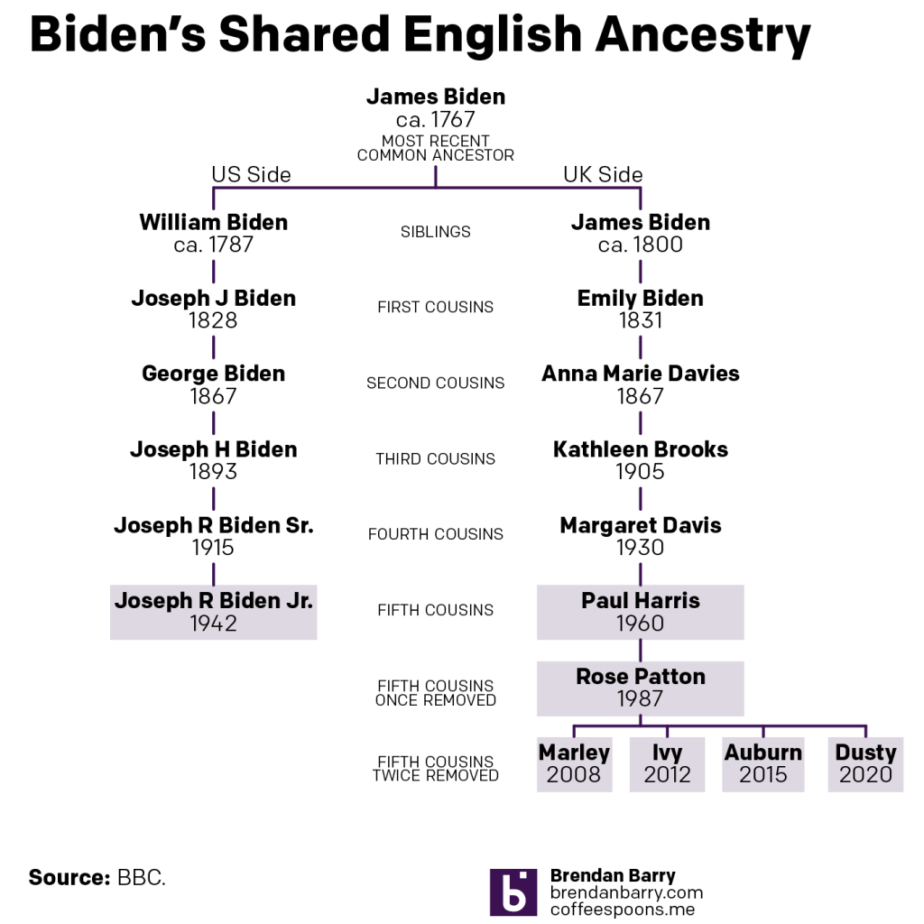
Last week I posted about an article in the BBC on the English ancestry of American president Joe Biden. And these types of article are a bit pro forma, famous person has an article about their personal ancestry with a family tree attached. Interestingly, this article did not, just the timeline I mentioned and a graphic as part of an aside on the declining self-identification as English-American.
And that, normally is it. Perhaps the article comes out with a few revisions upon the famous person’s marriage, birth of children, and more rarely death, but that is it. Yesterday, however, the BBC posted a follow-up article about an English family claiming kinship with Joe Biden. This article, however, included a family tree of sorts.
With some interesting spacing here…
This isn’t a family tree in the traditional sense, I would argue it’s the sort of chart genealogists would use to highlight two parties’ relationship to their most recent common ancestor (MCRA). But this chart does something odd, it spaces out the generations inconsistently and so Joe Biden appears at the bottom, aligned with the grandchildren of Paul Harris, the man at the centre of the story.
If you compare the height/length of the lines linking the different generations you can see the lines on Biden’s side of the graphic are very long compared to those on the Harris’ side. This isn’t technically incorrect, but it muddies the water when it comes to understanding the generational differences. So I revisited the design below.
Now with more even spacing…
Here I dropped the photographs because, primarily, I don’t have access to them. But they also eat up valuable real estate and aren’t necessary to communicate the relationships. I kept the same distance between generations, which does a better job showing the relationship between Joe Biden and Paul Harris, who appear to be actual fifth cousins. Joe is clearly at a different level than that of Paul’s grandchildren.
I added some context with labelling the generational relationship. At the top we have William and James Biden, assuming they are brothers, listed as siblings. The next level down are first cousins, then second, &c. Beyond Paul, however, we have two additional generations that are removed from the same relationship level. This is where the confusing “once-removed” or “twice-removed” comes into play. One way to think of it is as the number of steps you need to take from, say, Paul’s grandchildren, to get to a common generational level. In their case two levels, hence the grandchildren are fifth cousins to Joe Biden, twice removed.
These types of charts are great to show narrow relationships. Because, if we assume that up until recently each of the generations depicted above had four or five children, that tree would be unwieldy at best to show the relationship between Paul’s family and Joe Biden. If you ever find yourself working on your family ancestry or history and need to show someone how you are related, this type of chart is a great tool.
Credit for the original goes to the BBC graphics department
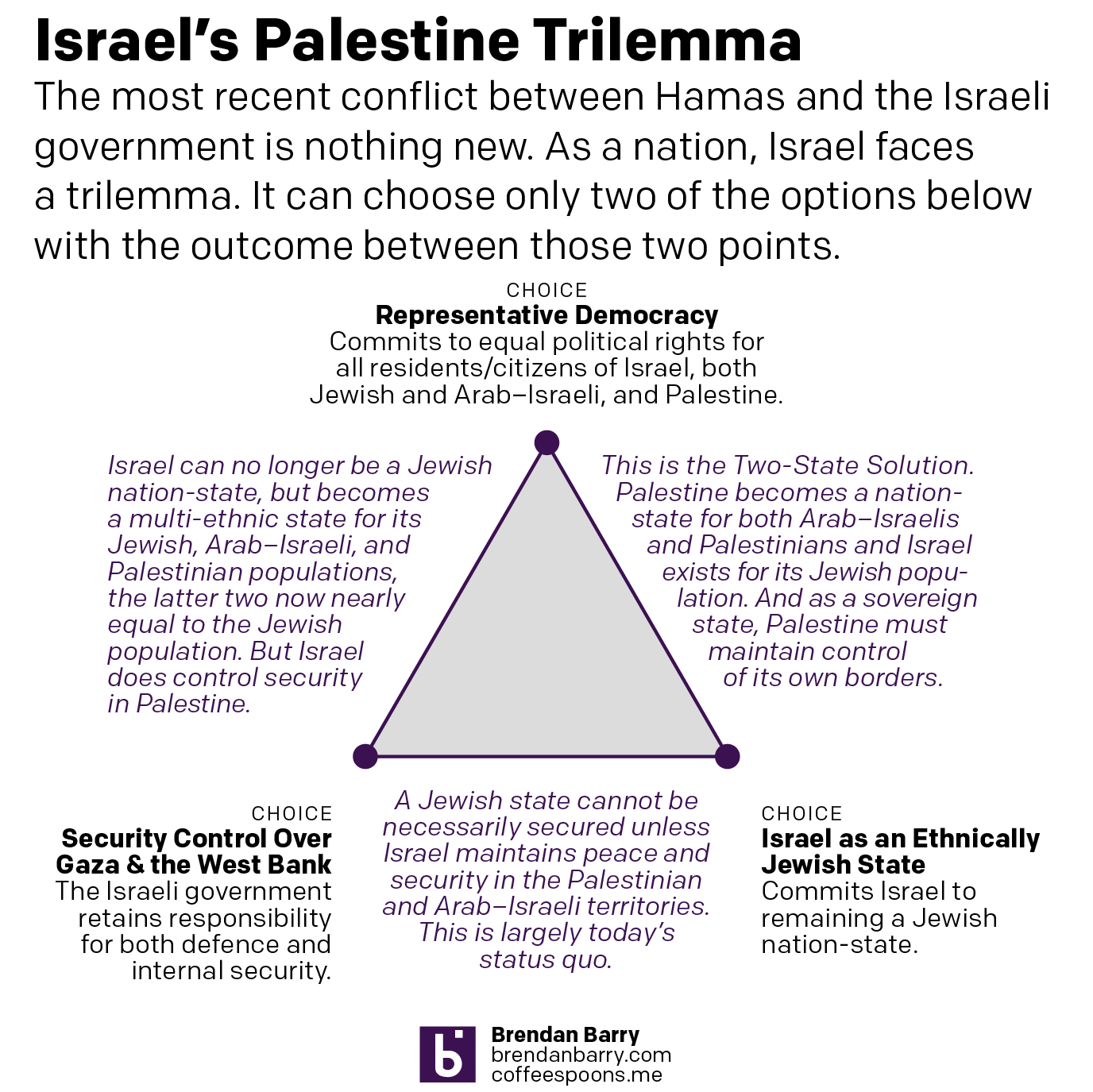
In what feels like forever ago, I wrote about the trilemma facing the British government as it related to Brexit. Brexit presented Westminster with three choices, of which they could only make two as all three were, together, impossible. Once made, those two choices determined the outcome of Brexit. For better or worse, Prime Minister Boris Johnson made that decision.
We can apply the same trilemma system to Israel in relation to the circumstances of Israel and Palestine. I will skip the long history lesson here. Israel faces some tough decisions. I will also skip the critique of Israeli government policy over the last few decades that brought us to this point. Because here is where we are.
Israel needs to balance three things: the importance of being a representative democracy, of being a Jewish state, and of security control of Gaza and the West Bank for the security of Israel. Here is how that looks.
Tough choices.
If Israel wants to remain an ethnically Jewish state—I’m going to also skip the discourse about Jewishness as an ethnicity, though I will point to Judaism as an ethnic religion as opposed to the other Abrahamic universal religions of Christianity and Islam—and it wants to be retain security control over Palestine, i.e. the Gaza Strip and the West Bank, you have what we have today.
If Israel wants to remain an ethnically Jewish state and it wants to be a representative democracy, you get the Two-State Solution. In that scenario, Palestine, again conceived as Gaza and the West Bank, becomes a fully-fledged independent and sovereign state. Israel remains Jewish and Palestine becomes Arab. But, Israel loses the ability to police and militarily control Gaza and the West Bank, instead relying on its newfound partners in the Palestinian Authority or whatever becomes the executive government of Palestine. This has long been the goal of Middle East peace plans, but over the last decade or so you hear Two-State Solution less and less frequently.
Finally, if Israel wants to be a representative democracy, in which case both Jewish citizens and Arab–Israelis and Palestinians all have the right to full political representation without reservations, e.g. the loyalty oath, and it wants to maintain security control over Gaza and the West Bank, you get something I don’t hear often discussed outside foreign policy circles: a non-Jewish, multi-ethnic Israel. Today Arab–Israelis and Palestinians nearly—if not already—outnumber Jewish Israelis. In a representative democracy, it would be near impossible to maintain an ethnically Jewish state in a county where the Jewish population is in the minority. Consequently, Israel would almost certainly cease being a Jewish state.
One can tinker around the edges, e.g. what are the borders of a Two-State Solution West Bank, but broadly the policy choices above determine the three outcomes.
The outstanding question remains, what future does Israel want?
Most of my readers know that I am a designer who works in all formats. But, I really love working in print. Colours, textures, and the physicality of it all. Give me a foil stamp or metallic ink any day.
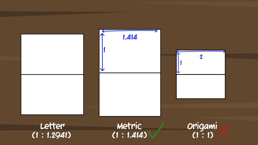
Any American designer who’s ever worked for an overseas client or overseas designer who’s ever worked for an American client knows all about the US Letter vs A4 debate.
For those that don’t, the US (along with Canada, Mexico, and a very few other countries) use what we call letter size paper. The rest of the world uses A4, part of the ISO 216 international standard. A4 has some special properties that make it the superior choice in my opinion.
But this is a Friday, so we’re here for the lighter take. And for that we have a video by CCP Grey, who explains some of the properties of A4 and then provides a fascinating perspective on it all. It’s about nine minutes long for what it’s worth.
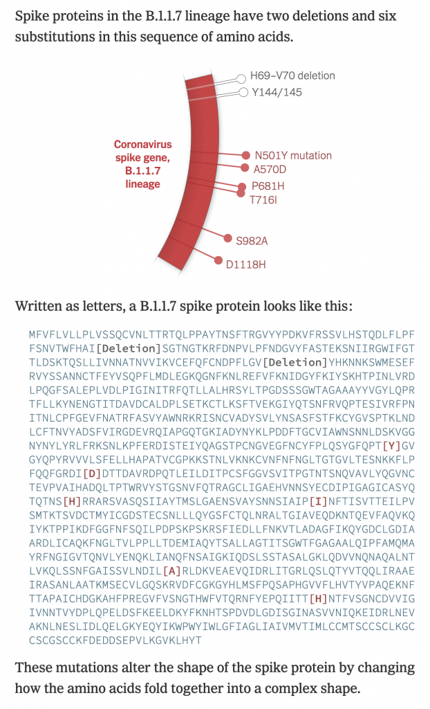
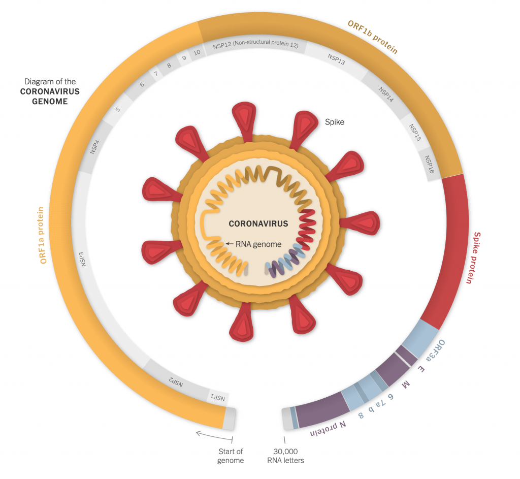
With Covid-19, one of the big challenges we face is the rapid mutations in the viral genetic code that have produced several beneficial—from the virus’ standpoint—adaptations. Several days ago the New York Times published a nice, illustrated piece that showed just what these mutations look like.
Of course, these were not just nice illustrations of protein molecules, but the screenshot below is of the code itself and you can see how just a few alterations can produce subtle, but impactful, effects.
In a biological sense, these mutations are nothing new. In fact, humanity wouldn’t be humanity but for mutations. Rather we are seeing evolution play out in front of our eyes—albeit eyes locked in the same household for nearly a year now—as the virus evolves adaptations better suited to spreading and surviving in a host population.
The piece includes several illustrations, but begins with an overall, simplified diagram of the virus and where its genetic code lies. And then breaks that code down similar to a stacked bar chart.
Designers identify where in the code the different mutations occur and the type of mutation. Later on in the piece we see a map of where this particular variant can be found.
I might come back to that map later, so I won’t comment too much on it here.
But I think this piece does a great job of showcasing just what we mean when we talk about virus mutations. It’s really just a beneficial slip up in the genetic alphabet.
Credit for the piece goes to Jonathan Corum and Carl Zimmer.
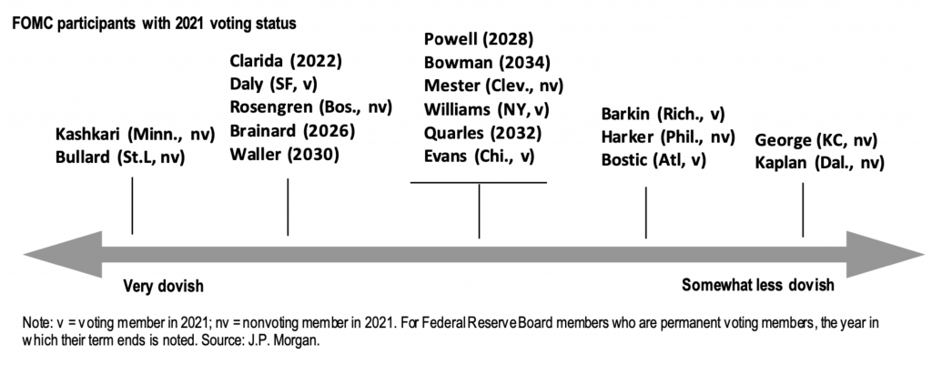
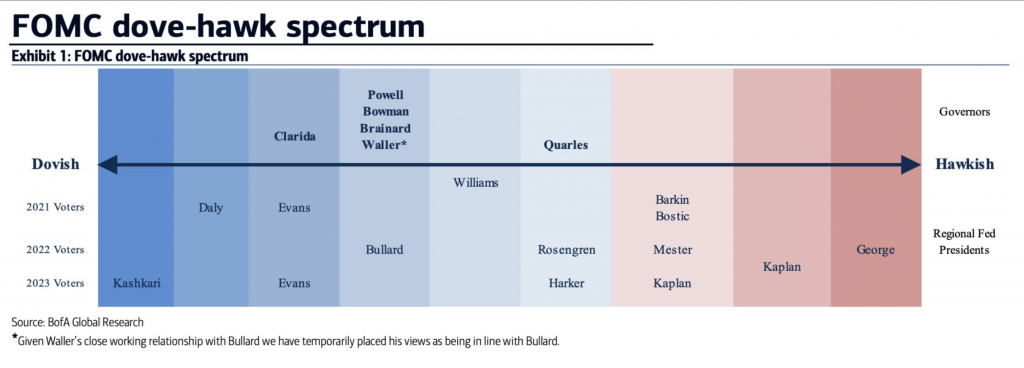
Earlier, I saw these two graphics floating around the Twitter. They each come from a major financial institution and attempt to place the voting (and non-voting members) of the Federal Open Market Committee (FOMC) on a spectrum of doves to hawks or slightly less dovish. The FOMC, part of the Federal Reserve system, sets interest rates for the US economy. Now, I’m being super simplistic here, but it’s broadly true. I should add, full disclosure, I presently work for the Federal Reserve Bank of Philadelphia.
The first graphic is from JPMorgan and plots in one-colour all the voting and non-voting members on a single axis from very dovish to somewhat less dovish. Thin black lines point to evenly spaced points on the axis and people are listed at each interval.
It’s a fairly simple approach, but effective. Nothing revolutionary here. What I find a bit odd is the line underneath the centre tick. What prompts that group to have what I’ll call a summary bar? Is it because Jay Powell, the chair of the Federal Reserve, is placed within that group? It’s a bit unclear.
Now keep in mind the classifications here, very dovish and somewhat less dovish, as we compare JPMorgan’s graphic to that of Bank of America.
The first thing that strikes me is the use of colour. Here we have a fairly straightforward divergent spectrum of red to blue. Along with other design elements, like typographic scale and contrast for the header, subhead, and labels, this piece strikes me as better designed and more polished.
But I still have questions.
Here we have dovish to hawkish. At the hawkish extreme, we have Esther George of Kansas City and Robert Kaplan of Dallas. In JPMorgan’s chart, both are grouped together as somewhat less dovish. But with Bank of America, they are decidedly hawkish. (Although with nine intervals, the Bank of America graphic has a bit more granularity than JPMorgan’s.)
So the biggest question, unfortunately left unanswered by each graphic, is what defines hawkish and somewhat less dovish? Just by words, they sound not at all alike. But both companies clearly place both individuals at the same end of the spectrum.
Part of the issue stems from the divergence point between red and blue. For most spectra of this type, that would be the demarcation between a committee member who is a dove or a hawk. But we have no similar separation for JPMorgan.
There is, however, one design element for Bank of America’s piece that I really like. My explanation of the FOMC at the top was a bit simplistic. Not every regional Federal Reserve president gets to vote every year. They rotate each year except for New York. These presidents get to vote alongside those on the Board of Governors.
In the graphic, note that everybody above the axis label is a member of the Board, i.e. they get to vote every year until their term expires. Below the axis we have the rotation schedule. Each line represents a bank president who can vote in a particular year. For example, the Philadelphia president, Patrick Harker, was a voting member on the committee in 2020, but falls off in 2021 and will not return to 2023. The Bank of America graphic captures this for each president very well.
I am a bit confused as to why some members, i.e. Kaplan and John Williams of New York, appear to sit between lines. I am unaware of any reasons why they would be between years.
Overall, I prefer the Bank of America piece. It more clearly presents the rotation element of the voting members of the FOMC. Yes, it has colours, but I’m confused as to why the demarcation between doves and hawks happens where it does. And why JPMorgan doesn’t describe anyone as a hawk. So while I prefer it, I think it could still use some additional information or context to make it clearer to readers.
Credit for the JPMorgan piece goes to a designer at JPMorgan.
Credit for the Bank of America piece goes to a Bank of American Global Research designer.
The holiday break is over as your author has burned up all his remaining time for 2020 and so now we’re back to work. And that means attempting to return to a more frequent and regular posting schedule for Coffeespoons.
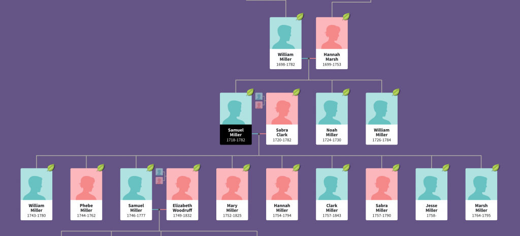
I wanted to start with the death of Diego Maradona, a legendary Argentinian footballer. He died in December of a heart attack and left behind a complicated inheritance situation. To help explain the situation, the BBC created what in genealogy we call a descendancy chart. You typically use a descendancy chart to show the children, and sometimes grandchildren, of a person. (You can also attach people above the person of interest and show the person’s ancestral families.)
This is an example of a descendancy chart from my research into an unrelated family.
The descendants of Samuel Miller
You can see Samuel Miller married Sabra Clark and had at least nine children with her. And I followed one of them, another Samuel, who married Elizabeth Woodruff and they had four children. In this version, you can also see Samuel the elder’s parents and siblings.
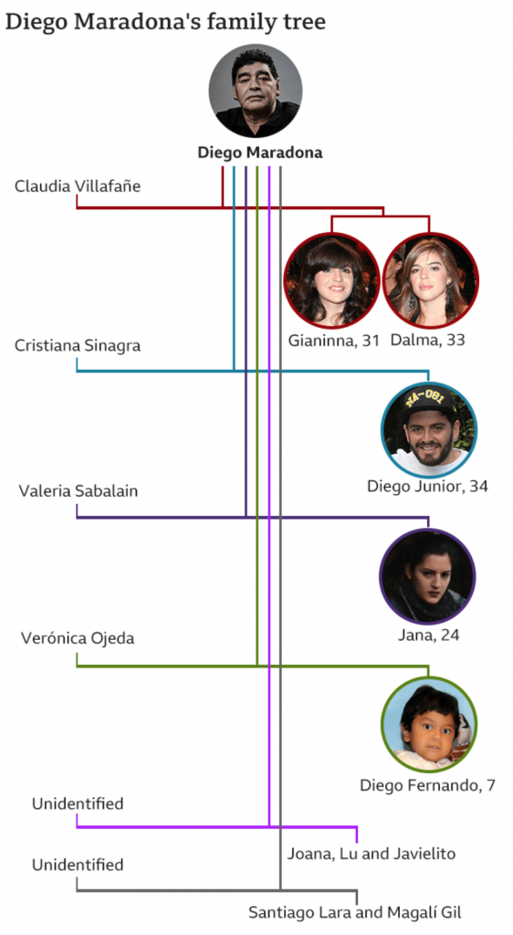
But Diego presents a complicated situation. He was married and had two children, then divorced. That’s not terribly uncommon. But he then went on to have potentially eight children with potentially five different women. (I say potentially because some of the claims are still working their way through the courts via paternity tests.)
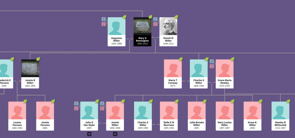
The above type of chart works well with one couple. In my own family, I have at least one ancestor who had potentially two husbands (the second marriage has not yet been confirmed, but she definitely had children with two different men). And when we use this chart type to look at my ancestor’s descendants, you can see it becomes tricky.
Mary Remington’s descendants
Her children’s fathers can be placed to either side and then the children flow out from that. But whereas in the first chart we could see all nine children in one glance, Mary Remington had four and we only see two in this same view.
So how do you deal with one person who has six total relationships that have offspring?
The BBC opted for a vertical chart that uses colour to link the couples. Diego and his ex-wife receive a red line, and that link moves vertically down from Diego with the two daughters shown as descendants on the right.
Diego Maradona’s descendants
Each subsequent relationship with offspring receives its own colour and continues to move vertically down the page, linking the mother on the left to the children on the right.
What I find interesting is the inconsistency within the chart, however. At the end, with the unidentified women, we have two instances of multiple children. Santiago Lara and Magali Gil, for example, descend from one stem. But note at the top how Diego’s two daughters Gianinna and Dalma each receive their own stem. Is there a reason for combining the two children from one unidentified mother into one branch?
And why the vertical format? You can see in my two examples, we are looking at a horizontal format. It works well when I am working on my desktop. The format is less useful on a mobile. I wonder if the BBC knows from their analytics that most people access their content like this via mobile phone and created a graphic that best uses that tall but narrow proportion. Because the proportions do not work well when the article is viewed on a desktop.
The vertical descendancy chart here is an intriguing solution to show descendants from multiple partners in a single mobile screen display. I am not sure how useful it would be as a new form, because I am not certain of how many times we would run into issues of children from six partners, but it could be worth exploring.
Credit for the images from my examples goes to the designers at Ancestry.com.
Credit for the BBC graphic goes to the graphics department of the BBC.
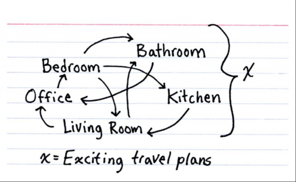
And by world, I mean one-bedroom apartment. It’s another Friday, and so here’s a nice piece from Indexed and Jessica Hagy. It sums up rather well our worlds these days.
Over the last week or so, we have been receiving some encouraging news from the makers of three viable Covid-19 vaccines: Pfizer, Moderna, and AstraZeneca. All three have reported their vaccines as at least 90% effective. This doesn’t mean the relevant regulatory agencies have verified that data, but it’s better than injecting ourselves with bleach.
Keep this in mind, though, a full vaccination roll out will take months. Having 20–40 million doses is great, but the population of the United States is 330 million. The expectation is a return to normalcy will not really begin until the end of Q3 or beginning of Q4 2021.
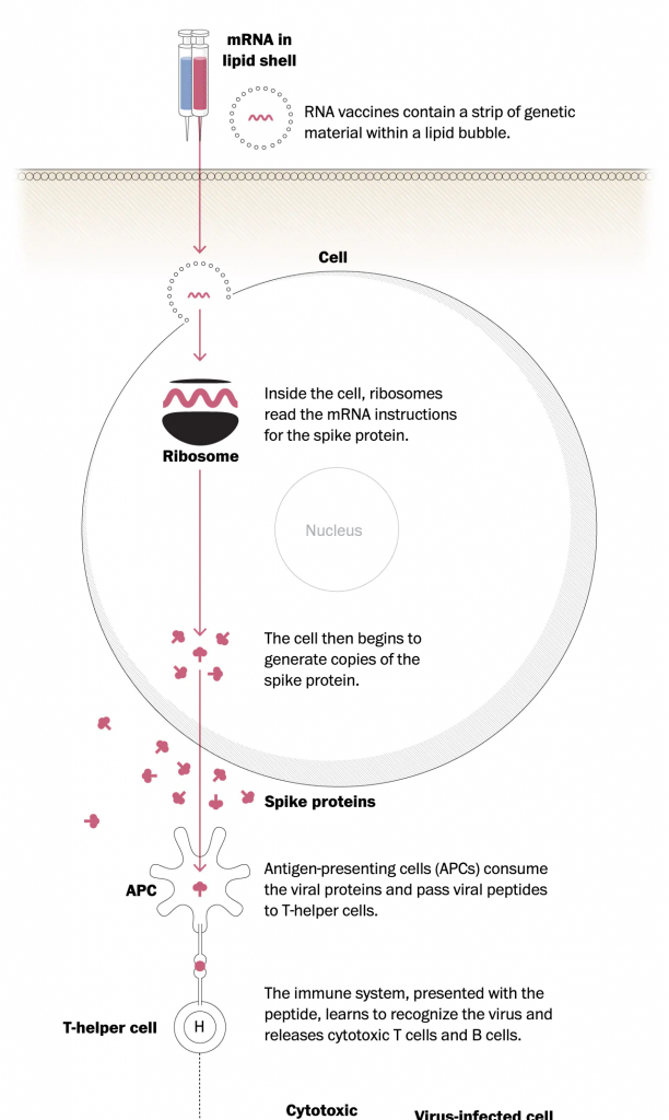
This article from the Washington Post does a good job of explaining some of the next steps—and some of the significant logistical hurdles. They illustrate part of the process of shipping the Pfizer vaccine, which needs to remain cooled -70ºC. That’s -94ºF. A wee bit colder than most normal freezers operate.
The Post article also illustrates how the Pfizer/Moderna type of vaccine works—the Pfizer and Moderna tackle it one way whilst AstraZeneca tackles it via a second method.
The first steps in the process.
There’s a lot going on here, but I like the simplified approach the designers took. This whole situation is complicated, but here we see the process distilled to its most essential elements. And the restrained use of colour helps tremendously.
The vial and then needle are filled red, and that red colour carries through into the messenger RNA (mRNA) that is absorbed by the cells and ultimately creates the spike proteins used by the virus (not the virus itself).
Credit for the piece goes to Carolyn Y. Johnson and Aaron Steckelberg.
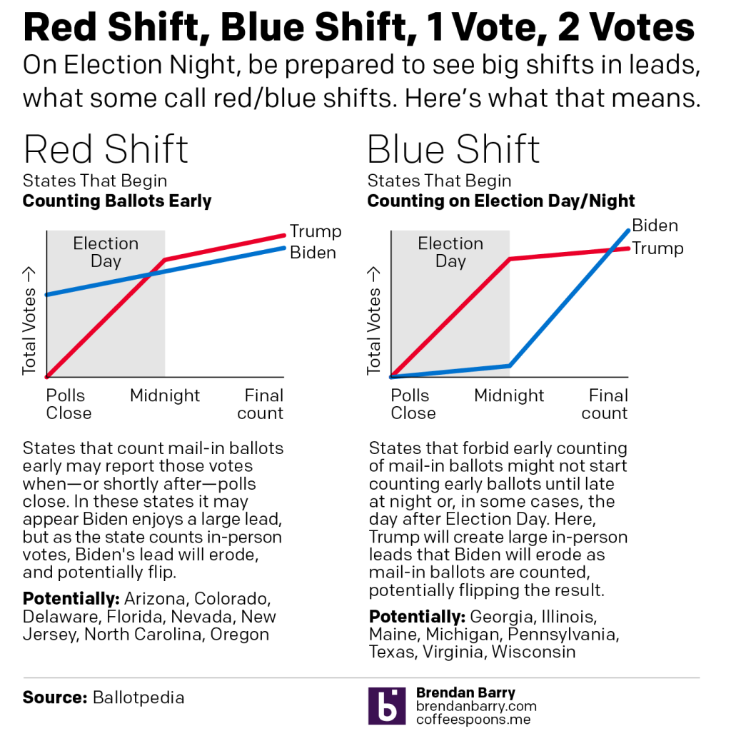
Last night I published a graphic on Instagram that I think people may find helpful if they try to follow Election Day results on Tuesday. I wanted to explain the concept of a red shift or blue shift. (I’ve also seen it described as states having a red mirage or a blue mirage.)
For my non-American readers, it’s important to understand that while this is a national election, the United States’ federal system means that each state runs its own election with its own rules and they can vary some state to state. For example, early or mail-in voting can vary significantly from state to state with some states allowing it only in emergencies (and some of those this cycle will not allow people to cite COVID-19 as an emergency).
Another factor for everyone to consider is that polling indicates President Trump’s fraudulent messaging about, well, voting fraud has shifted a normally split use of early/mail-in voting to a Democratic advantage. In other words, Democrats are far more likely to vote early, either in person or by post. Republicans are far more likely to vote on Election Day.
Combine those two factors and we get Red Shift vs. Blue Shift.
Some states allow election officials to begin counting their early votes prior to Election Day. Other states forbid counting until Election Day morning, or in some cases until after the polls close.
In states where early votes can be counted—the swing states Arizona, Florida, and North Carolina are among this group—it is possible that when the polls close, or shortly thereafter, we will see an instant and enormous lead for Joe Biden. But, as the states begin to count in-person day-of votes, which again favour Republicans, Trump may begin to eat into those margins. The question will be, can Trump’s numbers eat in so much that when the final counts are complete, he can overtake those Biden numbers? This is the Red Shift.
Conversely we have the Blue Shift. In these states—swing states like Georgia, Michigan, Pennsylvania, Texas, and Wisconsin are in this group—election officials cannot begin to count early votes either until the morning or when the polls close. In these states we may see the in-person day-of votes, largely expected to be for Republicans, run up to high totals fairly quickly. At that time, Trump may have a significant lead. Then when officials pivot to counting the early votes, Biden will begin to eat into those margins. And again, the question will be, can Biden eat into those margins sufficiently to shift the outcome after all the votes are counted?
Be prepared to hear about these scenarios Tuesday night.