Dambusters

More formally known as Operation Chastise, the Dambusters Raid occurred just over 70 years ago on 16 May 1943. That night, 19 RAF Lancaster bombers flew over the English Channel with the objective of busting open three dams to flood and cripple the electricity- and water-supplies to the all-important German Ruhr industrial valley.

Canada’s National Post looked at the bombing raid not just because of the story but also because the unit consisted of not just British airmen, but also those from Canada along with Australia and New Zealand. Per usual, their graphics team did an excellent job illustrating the details of the raid. They traced the route, explained how the unusual bombs were carried, released, and detonated and then looked at the success of the mission.
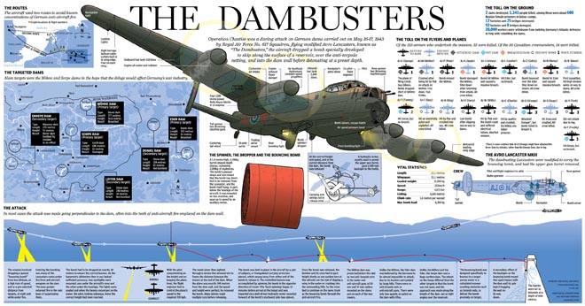
The Dambusters Raid
The Dambusters Raid

Credit for the piece goes to Mike Faille, Andrew Barr, and Richard Johnson.

Testing the Atom Bomb

The Washington Post looked at the testing of the first atomic bomb at White Sands. Nuclear weapons are a topic on which I have done some work in the past. But this piece looks more at the historic test called Trinity.

Trinity Test
Trinity Test

Credit for the piece goes to Alberto Cuadra and Laris Karklis.

Bryce Harper

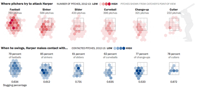
Bryce Harper is undoubtedly one of the best baseball players in the game today. To put it simply, he hits. And he hits well. And he hits well often. So the Washington Post put together an interactive, long form piece about Harper’s swing and hitting.

Pitching to Bryce Harper

The piece begins with a narrated video outlining the science behind Harper’s swing. Then the reader can down into the piece and learn more about Harper’s history and development and how he compares to other hitters. Statistics and data visualisation pieces show just how impressive Harper is as a hitter and how pitchers are trying to combat that.

Interactive long form articles are appearing more and more often online. But this is perhaps the most data- and science-intensive piece I have seen thus far. What is particularly nice about the format is that, as I have often noted, annotations and explanations are what make good infographics and what move data visualisation from presentational to informational. That this piece in particular happens to be about baseball, well, all the better.

Credit for the piece goes to Adam Kilgore, Sohail Al-Jamea, Wilson Andrews, Bonnie Berkowitz, Todd Lindeman, Jonathan Newton, Lindsay Applebaum, Karl Hente, Matthew Rennie, John Romero, and Mitch Rubin.

More Cicadian Rhythms

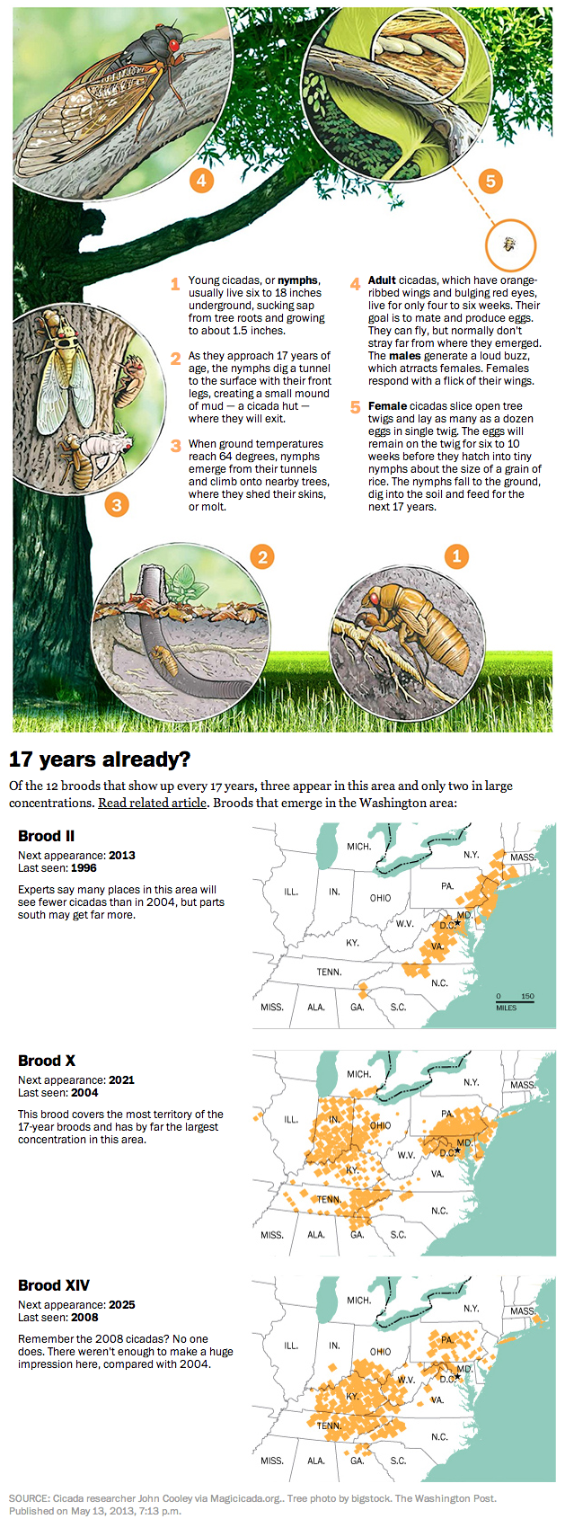
On Tuesday I shared with you some work by Jonathan Corum at the New York Times on the 17-year cicadas now starting to emerge back east. (And as I recall from my childhood, I assure you that they are quite loud.) Today we look at an illustration of the cicada life cycle via the Washington Post.

As I discussed the other day about other graphics, there are differences in how the two newspapers are presenting the same topic or subject matter. The New York Times piece concerns itself with the emergence over time of cicadas across the United States and links to historical articles about those events. Here, however, the Washington Post instead explains just how you get a seventeen-year period between emergences.

Additionally, the Washington Post maps near the end are not interactive as in the New York Times piece. But what this allows the Post to do is focus on those broods that impacted the Washington area instead of all those areas likely outside the Post’s core readership.

The Washington Post's explanation of the periodical cicadas

Credit for the piece goes to Patterson Clark.

Cicadian Rhythm

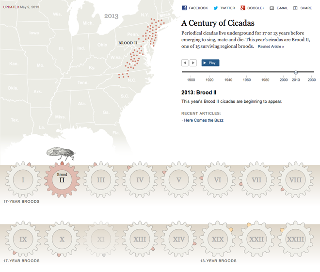
Cicadas are loud. And while some are around every year, there is at least one species that lives for up to seventeen years. They mate every seventeen years. In 2013 we are witnessing the emergence of Brood II, one of the numerous clusters that are synchronised to each other. But when and where have other broods been spotted over time? The New York Times looked at this question last week via an interactive graphic.

Brood II Cicadas
Brood II Cicadas

Credit for the piece goes to Jonathan Corum.

Recapping the Boston Marathon Bombing

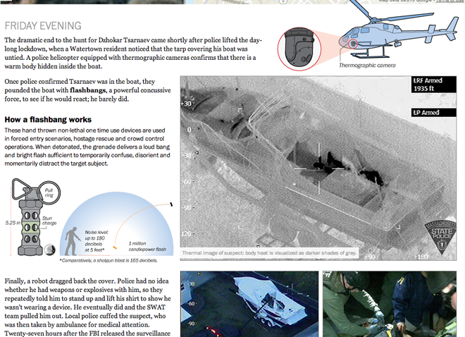
After the capture this weekend of the second suspect in the Boston Marathon bombing, the Washington Post published an interactive piece that looked at the entirety of the story. It captured the bombing, looked at the investigation, then the manhunt, and finally the capture of one of the suspects.

The piece incorporated static diagrams along with video and interactive navigation to tell the story in day-sized chunks on the screen. When taken together as one whole piece, it is quite impressive.

The capture of one of the suspects

Credit for the piece goes to what may well be the entire graphics staff of the Washington Post: Wilson Andrews, Darla Cameron, Emily Chow, Alberto Cuadra, Kat Downs, Laris Karklis, Todd Lindeman, Katie Park, Gene Thorp, and Karen Yourish.

The Universe Keeps Getting Bigger

The Kepler observatory is responsible for finding Earth-like planets in distant solar systems. It was launched only in 2009, but has been incredibly successful. Earlier this week scientists announced the discovery of Kepler 62, a star system that has five planets. Two of those planets exist within the Goldilocks zone, where conditions are just right for habitable planets (for Earth-like organisms) to form and exist. Of course, not all planets in such zones are habitable, look at Venus and Mars for examples. But still, the news is quite significant.

Over at the New York Times, Jonathan Corum plotted all the data on all the systems so far discovered by Kepler, including that new information on Kepler 62. The result is a mesmerising view of star systems beyond our own. The stars are planets are enlarged for visibility and the orbits are made a bit more circular, but the overview is still fantastic.

The chart shows the relative sizes of the stars and their temperatures and allows you to compare the orbits of the planets so far known. You can also sort the chart either by size or time of discovery. It also shows the relative times of the planets’ orbits. That is, they move…

The Kepler star systems

Fans of this will remember that in 2011, the New York Times used a similar, albeit static, method to explain the discovery of planets at Kepler 20, whose planets all orbit closer to their star than Mercury to ours.

Credit for the piece goes to Jonathan Corum.

How Dragonflies Hunt

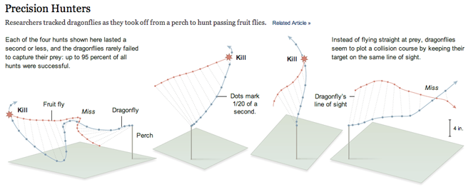
Today’s post is certainly smaller, but it’s always interesting to see how infographics and information design can help us better understand science and nature. This is a piece from the New York Times that illustrates how a dragonfly hunts its prey, fruit flies. Instead of flying straight at the fruit fly, the dragonfly plots a course that keeps it on the same line of sight with the fruit fly. The dragonfly often captures its prey where those two lines intersect, as show below.

How dragonflies hunt

What is really nice about this graphic is the dots that mark out 1/20 second intervals and allow you to plot the course of both animals with respect to each other. The annotations of course explain what is going on, for example when lines intersect by the dragonfly misses.

Credit for the piece goes to the New York Times.

All Fracked Up

Last week a new study revealed that the injection of wastewater from oil drilling and fracking may contribute to earthquakes. Put simply, the theory is that the wastewater injected into the ground lubricates fault lines. And when sufficiently lubricated, the resistance between sides of the fault vanishes and an earthquake is triggered to release the tension in the fault line.

Mother Jones used an animated .gif to explain just how the process of fracking works, specifically to show the wasterwater portion. I chose this piece because it is the first .gif that I have seen attempting to use the looping animation to convey information or a story, especially as an infographic. Make sure to click the image to go the Mother Jones’ article for the animated version.

Step 2 of the graphic

Credit for the piece goes to Leanne Kroll and Brett Brownell.

The ABCs of the F-35

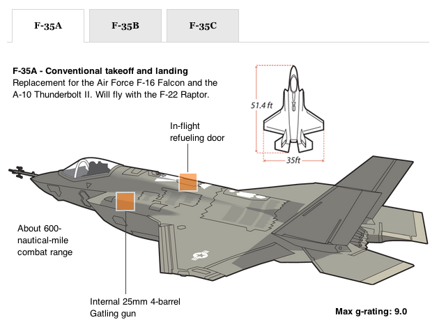
Certainly in the more illustrative range, a few weeks back the Washington Post published a small piece that looked at the F-35. Somehow it has survived budget cuts and become a monstrous $400 billion defence project. Partly that is because it is being built in three different versions for all the main aircraft-flying service branches: the Air Force (A), the Marine Corps (B), and the Navy (C). The Post piece highlights some of the key differences between the  versions.

The F-35A
The F-35A

Credit for the piece goes to Rajiv Chandrasekaran, Alberto Cuadra, and Bill Webster.