Mexican Drug Cartels

Mexico has some serious problems. Primarily with the drug cartels. About two weeks ago the National Post created an infographic that looked at the northern spread of Mexican drugs into the United States. The infographic also included details on the transit and transportation networks the different drugs take along with the geographic spread of the various cartels from the Tijuana, Federation, Juarez, and Gulf Cartels as reported by US cities.

Foreign Policy magazine rates countries as to how close they may or may not be to becoming failed states. Mexico is among those that have fallen into the “Warning” category over the recent years. The second half of the infographic looks at why. In short, in the past few years over 50,000 people have been killed in drug-related homicides and several more thousand have simply disappeared. The police, military, civilian officials, journalists, &c. have become targets of the cartel if they oppose the cartels.

Mexico has some serious problems. Sadly problems have a tendency to spill over borders.

Cropping of the Mexican Cartel infographic

Credit for the piece goes to Jonathan Rivait and Richard Johnson.

Washington Monument

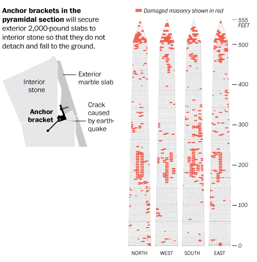
Last summer an earthquake rattled the East Coast; I felt it while lounging on the beach at the Jersey shore when I was on holiday. But Washington got hit pretty hard. The Washington Monument lost some stones. I just lost an iced tea that spilled. But, the Monument is now going to be closed until perhaps 2014 for repairs. This infographic from the Washington Post details where the damage is found on the Monument and how the slabs will be repaired.

Damage to the Washington Monument

Credit for the piece goes to Cristina Rivero.

Your Central Visual Field

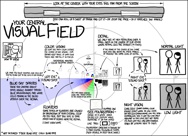
From XKCD comes an informative infographic about your central visual field. As always, it’s quite informative. It’s not quite light hearted for Friday, but you’ll probably get an odd look or a laugh when you move your face really close to your monitor…

Central Visual Field

Also as always, credit for the piece goes to Randall Munroe.

USS Iowa

Battleships are cool. Pointless in the 21st century, but they’re still cool. And now the USS Iowa is open as a museum in Los Angeles. Around the opening of the museum earlier this month, the LA Times put together a few graphics that were collected in one infographic piece that illustrated some of those parts of the ship open to the public. But what’s cooler than the guns that fire shells as big as trees (wrong ship in the song, but the point stands).

The turret
The turret

Credit for the piece goes to Tom Reinken, Raoul Ranoa, and Anthony Pesce.

Venn Diagrams. Let’s Go Back to Grade School.

Last week Mitt Romney’s campaign released a series of infographic adverts. They were Venn Diagrams with messages attacking President Obama by highlighting what the Romney campaign called gaps between what the president has said he would do and what he has in fact done.

Debt Gap
Debt Gap
Deficit Gap
Deficit Gap
Healthcare Gap
Healthcare Gap
Unemployment Gap
Unemployment Gap

The problem with these is that they are all wrong. Do not misunderstand me, the Romney campaign certainly has valid points in these statements. And to use an infographic to communicate their points is a valid approach. But whoever designed these adverts clearly did not know how a Venn Diagram works.

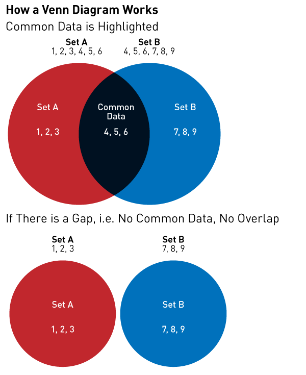
Here is a brief refresher course for those interested.

How Venn Diagrams Work

Unfortunately, the Romney campaign’s message is being lost in a failed medium. It’s like watching a clown give a doctoral thesis in rocket science. He sure might be making a good point. But it’s a clown. People laugh at clowns. People won’t take the clown seriously. The Romney campaign is making good points, but that message is being lost because the campaign cannot master one of the simplest types of charts.

Credit for the originals go to the Romney campaign. The bit on How Venn Diagrams Work is mine.

Higgs Boson. You Can Call It God.

CERN may—or may not—have discovered a particle that may—or may not—be the Higgs Boson that would probably fill in a lot of the holes in our understanding of how the world may work at a sub-atomic level. That is a lot of ‘may’s.

Understanding just what a Higgs Boson does is not quite so easy. In really simplified language, it explains why things have mass. And when you put things of mass on a planet that has gravity, like Earth, why things have weight. Back in the early 1990s, the British minister for science offered a prize for the best explanation to be given in layman’s terms. The following image, via the BBC, is one part of that example. We all probably need to know it just a little more today.

Higgs Boson
Higgs Boson

Voyager 1

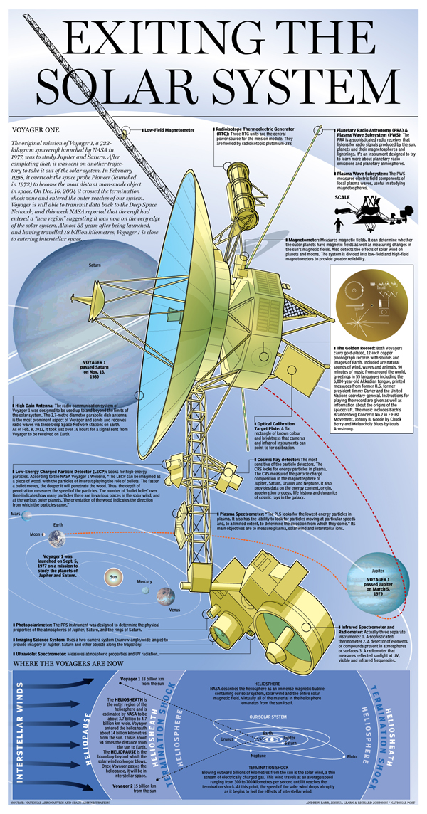
So my prediction of the health care law being thrown out did not come to pass. But what will pass is the space probe Voyager 1 out of the solar system in the very near future. (Don’t worry unlike Voyager, I will return—albeit to the original subject matter next week.) So from the National Post we have an infographic that details just what is Voyager 1. (And no, it is not V’ger, that was the fictional Voyager 6.)

Voyager 1
Voyager 1

Credit for the piece goes to Joshua Rapp Learn, Andrew Barr, and Richard Johnson.

Cancer

From the Sydney Morning Herald, we have a link to an interactive infographic published by the Cancer Council of Australia, a non-profit that seeks to reduce the impact of cancer upon Australia. It is not the most graphical by way of charts, but offers the user “playful” interactions with statistics to better inform him or her about the causes and impacts of cancer. The format is also interesting in that it mimics the fad in infographics of the long, vertical scroll page. But here it is done to much better and ostensibly more useful effect. Useful in the sense of trying to help people.

Bowel cancer
Bowel cancer


Sometimes Small Infographics Are Most Important

This is certainly not the largest, nor the most glamorous infographic. But to drivers in Los Angeles, probably a very useful one. It is a diagram of forthcoming changes to a series of on- and off-ramps to Interstate 405 and Wilshire Boulevard.

Ramp changes
Ramp changes

Simple things like having a dangerous red for the soon-to-be-closed ramps set against the calmer, desaturated colours of the safer, separated ramps of the future highlight the important area of the shared lanes. I probably would have called those areas out with something more than a black, many-pointed star, but it does still work.

Credit for the piece goes to Tia Lai and Anthony Pesce.

Revisiting the End of the Shuttles

This is a post that goes back a little bit in time, but that I stumbled upon and found worth a post. Last summer the United States ended the Space Shuttle programme by retiring all of our orbiters. And of course this prompted many to attempt infographics about the history of bringing liberty and freedom to space.

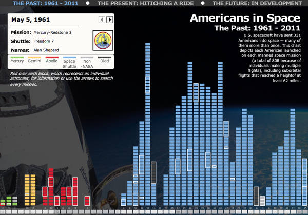
Amidst the fond farewells, I missed this interactive piece from the Philadelphia Inquirer about the history and the future of Americans in space.

Interactive history
Interactive history

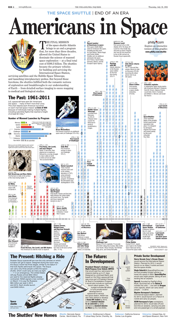
The interactive piece contains three separate sections. The first looks at the individual Americans who made it into space. The second compares the Space Shuttle to the Russian Soyuz craft that we now must use to get into space. The third looks at the future, and what we might use.

But, the Inquirer also had a print edition to worry about, and published a static version of the piece. Is it perhaps a bit cluttered, yes, but the addition of the photographs and the annotations (even though the annotations are available as rollover conditions in the interactive piece) makes the print version more welcoming to explore and read at leisure. Additionally, the difference in scale of the three segments of the piece give a clear importance to the individuals rather than to the technology. This distinction is lost in the interactive piece because each segment is the same size and receives the same scale of treatment.

Static shuttle
Static shuttle

Credit for the interactive piece goes to Kevin Burkett and Rob Kandel. Credit for the print piece goes to Kevin Burkett.