Frack You, Gas Hole.

And not in the polite Galactica way, but more in the let’s drill you, rocks, and split you open. I could go in further detail about the injection of fracking fluids, but let’s leave the double entendre alone and talk about Marcellus Shale. It’s a layer of rocks in the dirt that contain natural gas. It’s a pain in the gas production industry (sorry) and thus is only economically viable when fuel prices are high.

So in the 21st century with high fuel prices, energy companies are hydraulically fracturing (fracking) the rock to suck out all the natural gas. But this might be (probably is) causing environmental problems and thus human health problems. Ergo the controversy. This has now reached New York and so the New York Times created a simple map with some key layers of information to explain the controversy there.
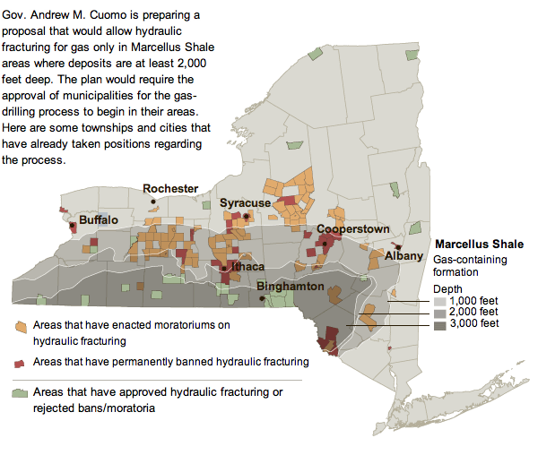
NY Marcellus
NY Marcellus

Note the useful layers of depth of the shale and where those intersect (or do not) with areas that have banned or endorsed fracking.

Western Pennsylvania has had similar problems, and the Philadelphia Inquirer has had an interactive special on their website up for a little while now. And by interactive infographic I mean largely just a play-through of static images. Unfortunately, the online content is not of the best resolution and leaves much to be desired. Fortunately the graphics would appear to be quite informative especially as part of a series. A pity they are not entirely legible.

Location
Location

Credit for the Inquirer piece goes to John Tierno.

A Nine-story Log Cabin

It’s like a log cabin. But taller. A lot taller. The New York Times reports with an infographic on a nine-story block of flats (apartment building for us Americans) in London called the Graphite Apartments that was built almost entirely of timber.

Log cabin
Log cabin

Credit for the piece goes to Mika Gröndahl.

The Golden Gate Turns 75. Time for Gravity Assisted Suicide.

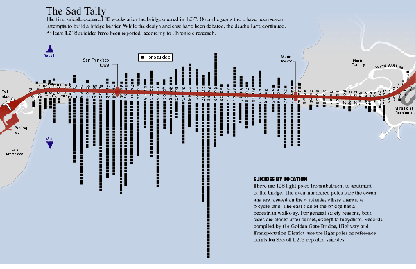
A few days ago the Golden Gate Bridge turned 75. I had been hoping to see an interesting infographic or two about the bridge and its history appear. Alas, none worthy of posting have made their way to my digital desk. So instead I am stepping into the time machine, really just a cardboard box with some drawn-on dials, and pulling out this piece from the San Francisco Chronicle.

It looks at suicides from the bridge by location over its history—up until the graphic was made obviously. I’ve linked to a larger version of the graphic rather than the Chronicle’s site, because their graphic is shrunk too small to be legible.

Suicides by location

Credit for the piece goes to Todd Trumbull.

New York Times Lies About Science

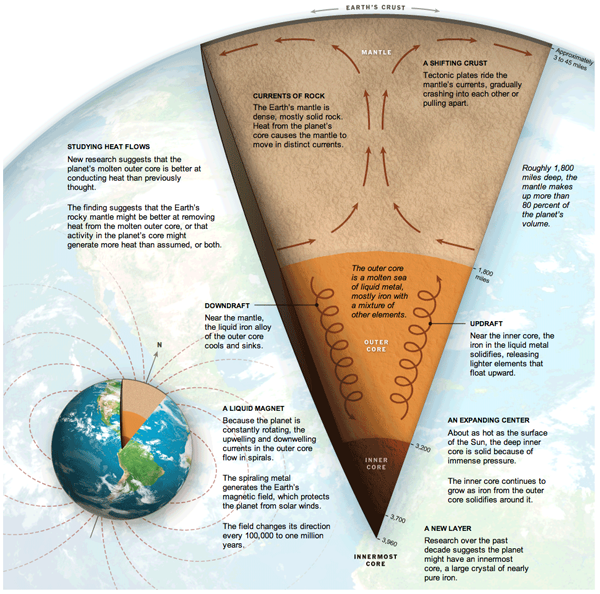
In a rare infographic misstep, the New York Times published an incorrect diagram detailing the centre of the Earth.

Centre of the Earth
Centre of the Earth

Clearly, anyone who knows anything about science knows that it is not a solid core of iron at the centre of the Earth, but dinosaurs. And I see no dinosaurs in this diagram.

Credit for the piece goes to Jonathan Corum, Ritchie S. King, and Frank O’Connell.

Choose Your Own Adventure. Greek Debt Crisis Style.

The Eurozone. Greece. What a complete mess. And that’s just what has happened. What about what’s next?

If you are confused about how the debt crisis in Greece and the Eurozone will unfold, you are not alone. Thankfully, the Guardian has posted an infographic, more precisely an interactive flowchart, to help us sort out the mess. Now you get to choose your own adventure for Greece and the Eurozone.

Choose your own (Greek) adventure

Credit goes to Paddy Allen for posting, but it appears as if Lombard Street Research deserves the credit for the piece. But I might be mistaken.

How to Salvage a Ship

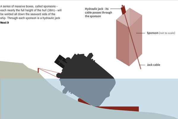
You might recall that back in January an Italian cruise ship sank after striking submerged rocks. In case you were wondering, the ship is still there. But the plan is to refloat the ship and then tow it to a harbour on the Italian mainland and scrap the ship. The Guardian put together a nice interactive infographic explaining just how the process will work.

How to salvage a ship

Credit for the piece goes to Paddy Allen.

How an E-mail is Sent. (And No, I Don’t Mean by Pressing Send.)

Google is a big company. What do big companies do from time to time? Market themselves. And so this is a screenshot from a fun interactive infographic piece that has supplementals from text to photos to videos as Google explains how an e-mail is sent. All the while Google touts its green energy initiatives and energy efficiencies. It’s a game changing win-win paradigm-shifting grand slam of a piece. (Sorry, that just felt like an appropriate place to use CorporateSpeak.)

How an e-mail gets from A to B

Canada Invades the Land of the Mole People

Subways. Home of the mole people. And in the United States an unwanted recipient of government money to build things. Along with being generally unwanted. By those who do not live in cities. Probably because of said mole people. Or something.

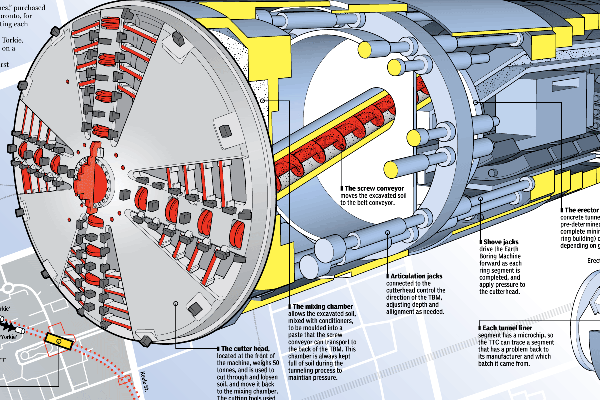
But in Canada, they like subways. At least enough that Toronto is building an extension to a university and from there to a suburb. But the invasion of the mole people homeland is a complex process that, fortunately, the National Post explains in an illustrative infographic, a cropping of which is below.

One of four sibling boring machines: Holey, Moley, Yorkie, and Torkie.

Credit for the piece goes to Mike Faille and Peter Kuitenbrouwer.

It’s Neither a Bird Nor a Plane. It’s a Space Shuttle. On Top of a Plane.

I loved the space shuttle. I mean how awesome is it that the lead ship of the class is named after the Enterprise from Star Trek. But seriously, it was a brick with little stub wings for gliding. It was not meant for flying. So now that all the shuttles are all retired—that’s a whole separate issue—how do they get from Kennedy Space Center to the various museums and installations?

Piggy back rides. On massive 747s. The Los Angeles Times made an infographic to explain just how the process works.

How to attach a space shuttle to a 747

Credit for the piece goes to Tom Reinken, Raoul Ranoa, and Anthony Pesce.

North Korean Missile Technology (Or Lack Thereof)

North Korea wanted to launch a missile, but failed miserably in doing it. Richard Johnson at the National Post created an infographic, prior to the missile’s launch, that looked at what the North Koreans wanted to do.

Unha-3 plan
Unha-3 plan