Super Spreading Garden Parties

If you were unaware, in the wee hours of Friday, President Trump announced that he had tested positive for the coronavirus that causes Covid-19. It should be stated in the just three days hence, there is an enormous amount of confusion about the timeline as the White House is not commenting. From the prepared statement initially released it seems Trump first tested positive Wednesday. But that statement was then changed to fit the diagnosis in the wee hours of Friday morning. But just last night I saw reporting saying that test was actually a second, confirmatory test and the president first tested positive earlier Thursday.

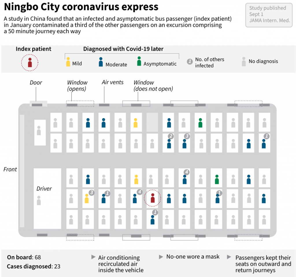
The timeline is also important because it would allow us to more definitively determine when the president was infected. The reporting indicates that he caught the virus at a Rose Garden ceremony at the White House to introduce his Supreme Court nominee, Amy Coney Barrett. This BBC graphic does a great job showing who from that ceremony has tested positive with the virus.

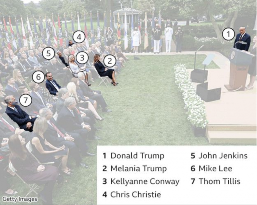
The photo also does a great job showing how the seven people there were situated. Six of the seven did not wear masks, only North Carolina Senator Thom Tillis did. There is no social distancing whatsoever. And not shown in this photo are the indoor pre- and post-ceremony festivities where people are in close quarters, mingling, talking, hugging, shaking hands, all also without masks.

It should be noted others not in the photograph, e.g. campaign manager Bill Stepien, communications advisor Hope Hicks, and body man Nicholas Luna, have also now been confirmed positive.

The final point is that this goes to show how much the administration does not take the pandemic seriously. Right now the Covid data for some states indicates that the virus is beginning to spread once again. And so maybe this serves as a good reminder to the general public.

Just because you are socialising outdoors does not make you safe. Outdoors is better than indoors. No gatherings is better than small gatherings is better than large, well attended garden parties. Masks are better than no masks. Rapid result test screening is better than no test screening. Temperature checks are better than no temperature checks.

But the White House only did that last one, temperature checks, in order to protect the president before admitting people to the Rose Garden. Compare that to how they protect the president from other physical threats. He has Secret Service agents standing near him (or riding with him in hermetically sealed SUVs for joyrides whilst he is infected and contagious); he has checkpoints and armed fences further out to secure the perimeter. Scouts and snipers are on the White House roof for longer range threats. And there is a command centre coordinating this with I presume CCTV and aerial surveillance to monitor things even further out. In short, a multi-layered defence keeps the president safe.

If you just take temperatures; if you just hang out outside; if you just wear masks; if you just do one of those things without doing the others I mentioned above, you are putting yourself—and through both pre-diagnostic/pre-symptomatic and asymptomatic spreading, others—at risk.

But on Sunday night, Trump campaign strategist went on television said that now that President Trump has been infected, been hospitalised, he is ready to lead the fight on coronavirus. Great. We need leadership.

But where was that leadership seven months ago when your advisors told you in January about the impact this pandemic would likely have on the United States? Where was the leadership in February saying the coverage was a hoax? Where was it in March when he said the virus would go away in April with the warmer weather? Where was it in April when it didn’t go away, when things continued to get worse? Where was it in May when thousands of Americans were dying? Where was it in June when states began to reopen even though the virus was still out-of-control and testing and contact tracing was less available than necessary to contain outbreaks? Where was it in July? And August? And September? Where was the leadership at a Rose Garden party celebrating the nomination of a Supreme Court justice, a party where at least seven people have been infected and one of them, the president of the United States, has been hospitalised with moderate to severe symptoms?

Credit for the piece goes to the BBC.

Wear a Mask

It sounds so easy, but too many don’t do it.

Yesterday, Agence France-Presse published an article about a recent study in the Journal of the American Medical Association that examined the efficacy of the coronavirus’ airborne spread potential.

The study centred on a bus trip in eastern China from January, before the widespread adoption of masks as common courtesy let alone mandated safety equipment. Nobody on the bus of 68 travellers wore a mask and the bus’ air conditioning system recycled the air inside the vehicle. (Remember the importance of cycling and filtering air inside subway cars?)

Researchers then mapped the location of patient zero, conveniently from my point of view in the centre of the bus. It should also be noted that patient zero was also asymptomatic at the time of the bus trip. Then researchers mapped the seats of those infected on the bus and this is what they found.

One of the key findings is these conditions, recirculated air amongst people not wearing masks, the virus was able to infect people outside the 2-metre safety radius (6-feet in the non-metric States).

Now from a design standpoint, I really like this graphic. It shows people’s seats and their condition to show the physical spread of the virus from patient zero. (Eerily, people far away were infected whilst one person sitting next to patient zero remained uninfected.) Not only that, but from a chain of transmission standpoint, the designer also included how many people these newly infected victims infected. Some infected nobody further whilst others infected up to four additional people.

My only real quibble here is with the colours used for the status of the infected. I think the light grey works well for those who were not diagnosed with Covid-19. But the green, yellow, blue, and red don’t quite work for me here. The value of the yellow is too close to the grey and consequently almost the mildly symptomatic people fall almost into the background. Compare that to the asymptomatic victims in green, who appear far more prominently.

I understand the desire to progress from mild to moderate vs. asymptomatic. So I wonder if those with mild symptoms were given a light blue and those with moderate a dark blue to contrast with the asymptomatic green. Of course, we still run into the red-green issue, but the dotted circle around patient zero mitigates that concern.

Remember, this was all among people not wearing masks. This piece strongly shows how important it is to wear a mask—not just to reduce the risk of receiving the virus, but to reduce your risk of spreading the virus if you are an asymptomatic case. (To be fair to the people on the bus, we knew very little about the virus in January and who knows what they knew as China was still attempting to downplay the virus.)

The point? Wear a mask.

Credit for the piece goes to John Saeki.

A Foot by Any Other Name

Measurement systems are important. They allow us to compare objects, buy and sell goods, and get from Chicago to Philadelphia. The latter, according to Google, is 759.6 miles. Or 4,010,688 feet.

But what feet?

In this piece from the New York Times we get a look at the two different foot measurements used in the United States. The article provides insight into the history of why we have a standard system of measurement.

Accompanying the wonderful article is an illustration showing how those two feet differ. It’s a simple, scaled illustration. But it does the job.

Of course we would all be better off if the United States joined the rest of the world in using the metric system. Like that time we lost a space probe because we failed to convert from English imperial to metric.

Credit for the piece goes to Eleanor Lutz.

Sweet Summer Air of Subway Cars

For those of my readers who live in a city where the subway or underground is a great means of getting around the city, you know you really miss that late Saturday night/early Sunday morning bouquet in the air. Though as this New York Times piece explains, sure it smells bad, but that air is probably safer than you dining indoors at a restaurant or even a child attending class in person.

The piece focuses on New York City subway cars, but they are very similar to the rest of the stock used in the United States. It uses a scrolling reveal to show how the air circulation and filtration systems work. Then it concludes with a model of how a person sneezing appears, both with and without a mask. (Spoiler, wear a mask.)

It’s a really nicely done and informative piece. It compares the rate of air recycled in a subway car to that of several other locations, and the results were a bit surprising to me. Of course, early on in the pandemic before we began to fully understand it, the threat was thought to be from contaminated surfaces—and let’s be honest, there are a lot of contaminated surfaces in a New York City subway car—but we now know the real risk is particles breathed/coughed/sneezed out from one’s mouth and nose. And we can now see just how efficient subways are at cycling and filtering that air.

Credit for the piece goes to Mika Gröndahl, Christina Goldbaum, and Jeremy White.

What Will the Next Recovery Look Like?

Earlier this morning, the Bureau of Economic Analysis released its US 2nd quarter GDP figures and the news…isn’t great. On an annualised basis, we saw -32.9% growth. That’s pretty bad. Like Great Depression level bad. I’ve posted on the social media how bad this current recession is and how nobody in the workforce today worked or didn’t through the Great Depression to really relate to the numbers we are seeing.

But that’s all today. The sun will come out tomorrow. (And scorch the Earth as climate change renders certain parts of the globe uninhabitable to mankind. But we’ll get to those posts in later weeks.) And when it does come out, eventually, what will the recovery look like? I’ve seen a few mentions recently in the media of a V-shaped recovery. What is this mysterious V-shape?

A long time ago, in a galaxy far away. Or during the last recession in Chicago, I worked with some really smart people in some of my professional projects and we covered the exact same question. There are a couple key “shapes” to an economic recovery. And when we say recovery, we mean just to return to pre-recession peak levels of growth. Anything above that is an expansion. That’s what we want to get back to.

What kind of shape will the recovery take?
Who knew typographers loved economics?

The V-shape we hear a lot about is a sharp recovery after the economy bottoms out (the trough). Broadly speaking, if a recession has to last two consecutive quarters (it doesn’t, but that’s a pretty common definition so let’s stick with it), then in a V-shape, we are talking about a recovery one or two quarters later.

Similar to the V is the W-shape, where things start to improve rapidly, but some kind of shock to the economic system and things go back negative once again before finally picking up quickly. It’s not hard to imagine something going horribly wrong with the Covid-19 pandemic to be just that external shock that could push the economy back down again.

Similar still is the U-shape. Here, after hitting rock bottom, growth isn’t quite as quick to pick up as we linger in the depths of the valley of recession. But after a bit of time, we again see a rapid recovery to pre-recession levels of growth.

These are all pretty short term recoveries, the W being a little bit longer because two sharp downturns. But they are nothing compared to what’s also possible.

First we have the L-shape. Here, after hitting bottom, things start to recover quickly. But that recovery is slow and takes a long time. Growth remains slower than average, creeping up to average, and then still takes its time to reach pre-recession levels. Is something like this possible? Well, if vaccines fail and if some countries still can’t get their act together (cough, US, cough), the willingness of consumers to go out, eat, drink, buy things, travel, and generally make merry could be suppressed for a long time. So it’s certainly not out of the question.

And then lastly we have the UUUU-shape. Though you could probably add or subtract a U or two. This features more drawn out stays at the bottom of the valley with quick and sharp upticks in growth. But those growths, never reaching pre-recession levels, also collapse quickly back into declines, though also never really reaching the same depths as earlier. Essentially, the recovery faces multiple setbacks knocking the economy back down as it sputters to life. As with the L-shape, it’s also not hard to imagine a world where a country hasn’t managed to contain its outbreak struggling to get back on its feet.

What do you think? Are we at rock bottom? Did I miss a recovery type?

Credit for the graphic is mine.

Different Paths to Density

Yesterday we looked at the expansion of city footprints by sprawl, in modern years largely thanks to the automobile. Today, I want to go back to another article I’ve been saving for a wee bit. This one comes from the Economist, though it dates only back to the beginning of October.

This article looks at the different ways a city can achieve density. Usually one things of soaring skyscrapers, but there are other paths. For those interested, the article is a short read and I won’t cover it here. But for the sake of the graphic below, there are three basic paths: coverage, height, and crowding. Or to put in other terms, how much of the city is covered by homes, how tall those homes go, and how many people fit into each home.

Reticulating splines

I really like this graphic. It does a great job of using small multiples to compare and contrast three cities that exemplify the different paths. Notably, it keeps each city footprint at the same scale, making it easier to see things such as why Hong Kong builds skyward. Because it has little land. (It is, after all, an island and the tip of a peninsula.)

One area where I wish the graphic had kept to the small multiples is its display of Minneapolis. There, the scale shifts (note the lines for 5 km below vs. Minneapolis’ 10 km). I think I understand why, because the sprawling city would not have fit within the confines of the graphic, but that would have also hammered home the point of sprawl.

I should also point out that the article begins with a graphic I chose not to screenshot, but that I also really enjoy. It uses small multiples to compare cities density over time, running population on the x-axis and people per hectare on the y-. It is not a perfect graphic (it uses I think unnecessary arrowheads at the end of the line), but scatter plots over time are, I think, an underused graphic to show how two variables (ideally related) have moved in tandem over time.

Overall, this is a strong piece from the Economist.

Credit for the piece goes to the Economist graphics department.

Mapping the Growth of Cities

This is an older piece from back in August, but I was waiting for a time when I would have some related articles to post alongside it. To start off the series of posts, we start with this piece from CityLab. As my titles implies, it looks at the growth of cities, but not in terms of people or technology but in terms of area/land.

The basic premise is that people look for a 30-minute commute and have done so throughout history. To make that point, the authors look at how transport technology evolved to enable people to live and work at further distances from each other, expanding the urban core.

The designer then chose to overlay the city limits of several cities largely defined by these technologies atop each other.

From small, compact, and dense to large, sprawling, and fluffy.

Conceptually the graphic works really well. The screenshot is of an animated. gif leading into the article that step-by-step reveals each city. However, throughout the article, each de facto section is introduced by a city outline graphic.

The graphic does a really nice job of showing how as technology allowed us to move faster, people chose to be further removed from the city core. Of course there are often multiple factors in why people may move out of the core, but transport certainly facilitates it.

Credit for the piece goes to David Montgomery.

Brexit Deal 2.0

I’ve been trying to work on a Syrian changing alliances graphic, but the Brexit news today scuppered that. Instead, we take a look at Boris’ deal, which differs from May’s in that it chucks out the notion of territorial integrity, creating a border in the Irish Sea where goods will have to be inspected. My old Brexit trilemma graphic shows the new deal’s fundamental choices.

Shifting priorities
Shifting priorities

But how does this exiting the customs union and single market work? Well, the whole of the UK is leaving the customs union, but on the single market, there Northern Ireland remains in, aligned to the EU, whereas the rest of the UK is leaving. Ports will screen for some goods to ensure compliance with UK officials ensuring EU standards.

There are still questions about how this will all shake out

The BBC graphic above is pretty straightforward, showing the new border as a dotted line. But the border is there. There is still quite a bit we don’t know. And most important of those questions is can Boris get his deal through Parliament? Remember, he tossed 20 MPs out of the party. And there are signals that the DUP, a conservative Northern Irish party that provides the crucial backing votes to the Tories to ensure the Tory majority (before, again, Boris kicked out 20 of his own MPs), will vote against the deal because it separates them from the rest of the UK.

Credit for the trilemma is mine.

Credit for the BBC graphic goes to the BBC graphics department.

The Roaming Life of Rev. Dr. Stephen Remington

As many of you are aware, one of my personal interests is in genealogy and my family history. And sometimes, data visualisation can help make sense of my research. This past weekend, I was looking through some of my notes on my great-great-great-great-grandfather, a man named Stephen Remington.

One of the outstanding questions is who was his wife, a woman named Eliza Ann. Her surname might be either Garretson or Caustin. So I used a timeline of Stephen’s residences to see if any his residences overlapped with similar surnames. It sort of did, but not until after the year he married her. So still more work is needed.

But then I decided with a few tweaks I could actually plot out where he lived, because he lived all over. His earliest years are a bit of a mystery, because his parents are both unknown and they both died during Stephen’s youth.

Ridgefield was home to a small cluster of Remingtons. Were they related?

In his earlier years he was what was called a circuit rider. Before there were large, dense settlements of people, the rural and frontier people relied upon essentially travelling ministers. The ministers had a responsibility for a small (sometimes large) area. And early in Stephen’s life his circuit riding kept pushing him north up the Hudson River with occasional postings back to New York City.

Rhinebeck is the town demanding my closer attention for Eliza's sake.
Rhinebeck is the town demanding my closer attention for Eliza’s sake.

Eventually, however, he ended up preaching in Massachusetts, where he separately earned his medical doctorate from Harvard University. He practiced medicine on the side for years. Then in 1846 he converted from the Methodist church to the Baptist church. He wrote about it in a notable book/pamphlet: Reasons for Becoming a Baptist.

From then he became an itinerant pastor, never staying at a single congregation for more than five years or so. He travelled from New York to Philadelphia to Louisville for several months then back to New York.

Evidently his time in Louisville was short, possibly because of anti-slavery views.

He preached as a Baptist for twenty-plus more years before finally settling in Brooklyn, where he died at the age of 66. He lived all over the mid-Atlantic, especially the Hudson River Valley. And while he returned to places over the years, notably New York City, he appears to have never stayed in one place longer than maybe five years.

That was a lot of places for Stephen to hang his hat.

As for Eliza, she died in 1850. But I wonder if she may be related to a cluster of Garretsons that lived in Rhinebeck, which included the famous Reverend Freeborn Garretson, a circuit riding Methodist minister.

The daughter born in Hartford is my direct ancestor. She eventually married a man in New York City with the surname Miller. Then, after having a son (my next direct ancestor), she upped and moved to Wisconsin and married another man with the surname Miller, who was not related to the first. There is talk of a divorce, but no record of it. Could she have been a bigamist? That’s a story for another day.