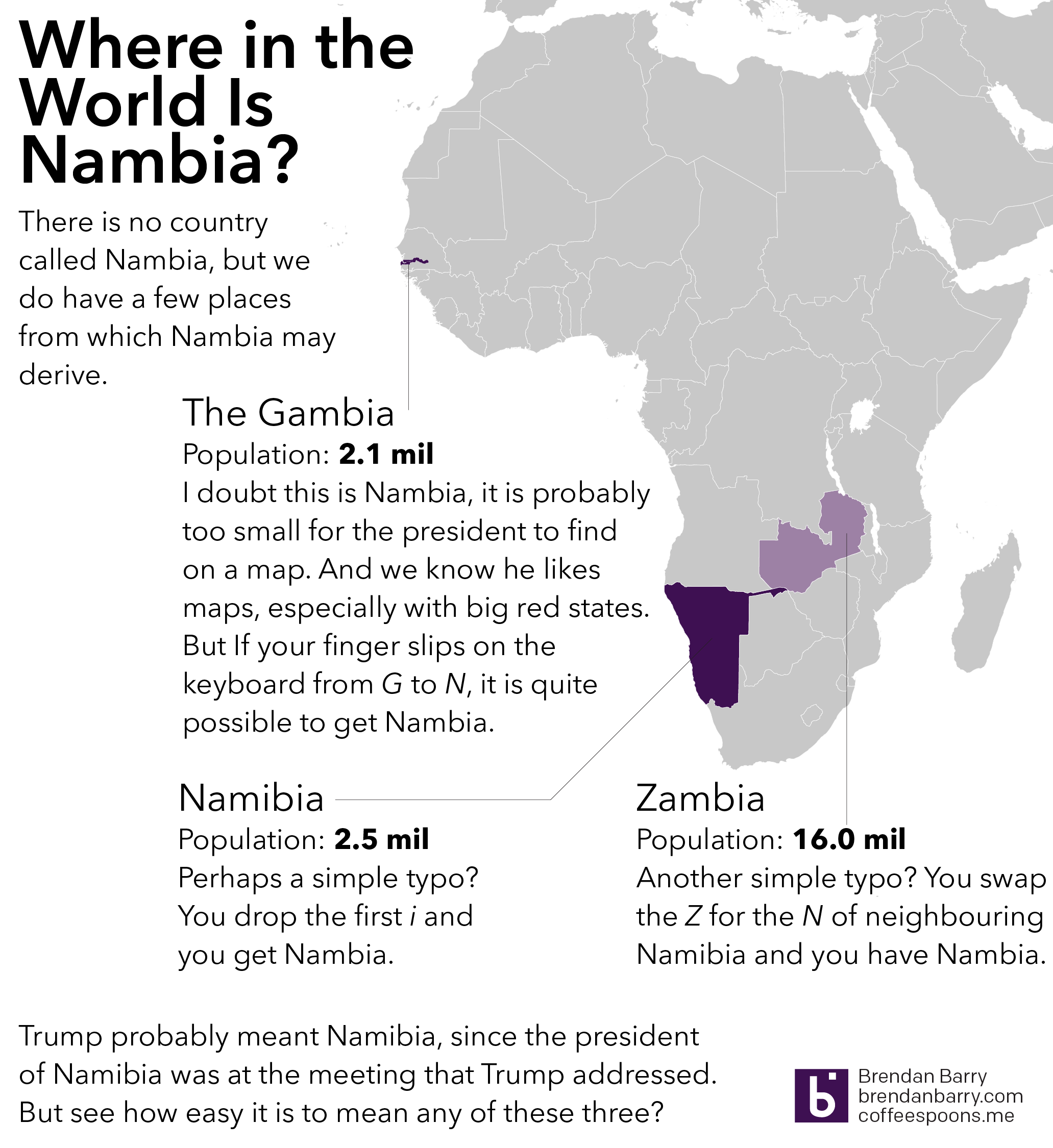
C’mon. You knew I was not going to let that one slip by.
President Trump, in a meeting with African leaders, twice name-dropped Nambia and in one mention held it up as having a nearly self-sufficient healthcare system. Funny thing to mention as the US is on the brink of eviscerating its healthcare system. But I digress. The point is that when you are speaking to the president of a country, you take a minute to learn how to pronounce the country’s name correctly. Even write it phonetically in the text if you have to. (I’ve done that.) So where is Nambia?
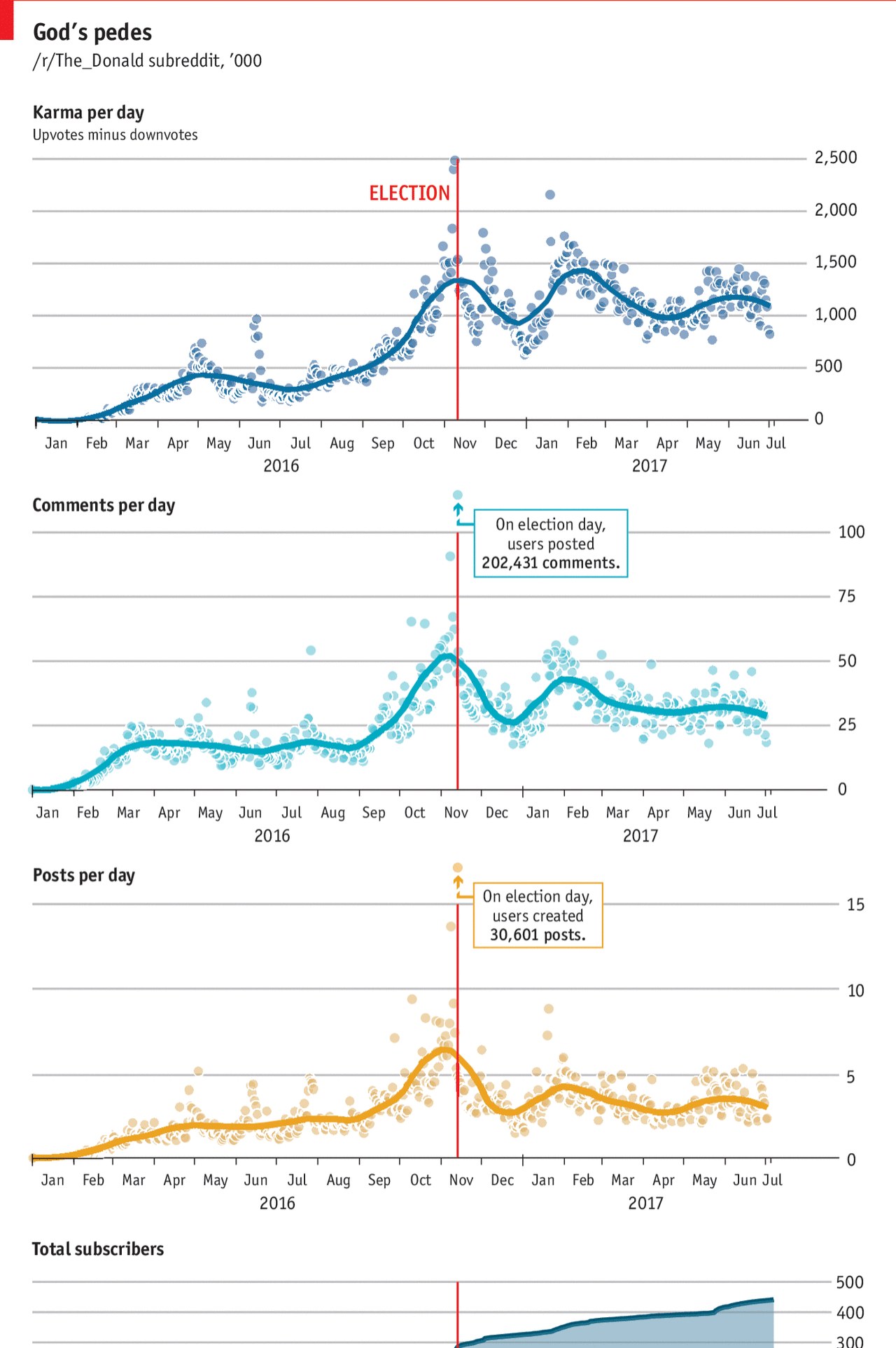
I don’t use Reddit. But things begin to made sense for me in this article from the Economist as it explained the origins behind Trump’s weird tweet of himself beating up a CNN-headed wrestler.
Unfortunately I don’t understand how Reddit works well enough to make full sense of these
I think the thing perhaps lacking from the graphic is a line that tracks Trump’s approval or popularity. The article mentions that explicitly and it would be interesting to see that track over time. Although I certainly understand how stacking so many line charts above each other could become difficult to compare.
And my final critique are the Election Day outliers. They are above the y-axis maximum. But I wonder if there couldn’t have been a way of handling the outlier-ness of the datapoints while remaining true to the chart scales.
Credit for the piece goes to the Economist graphics department.
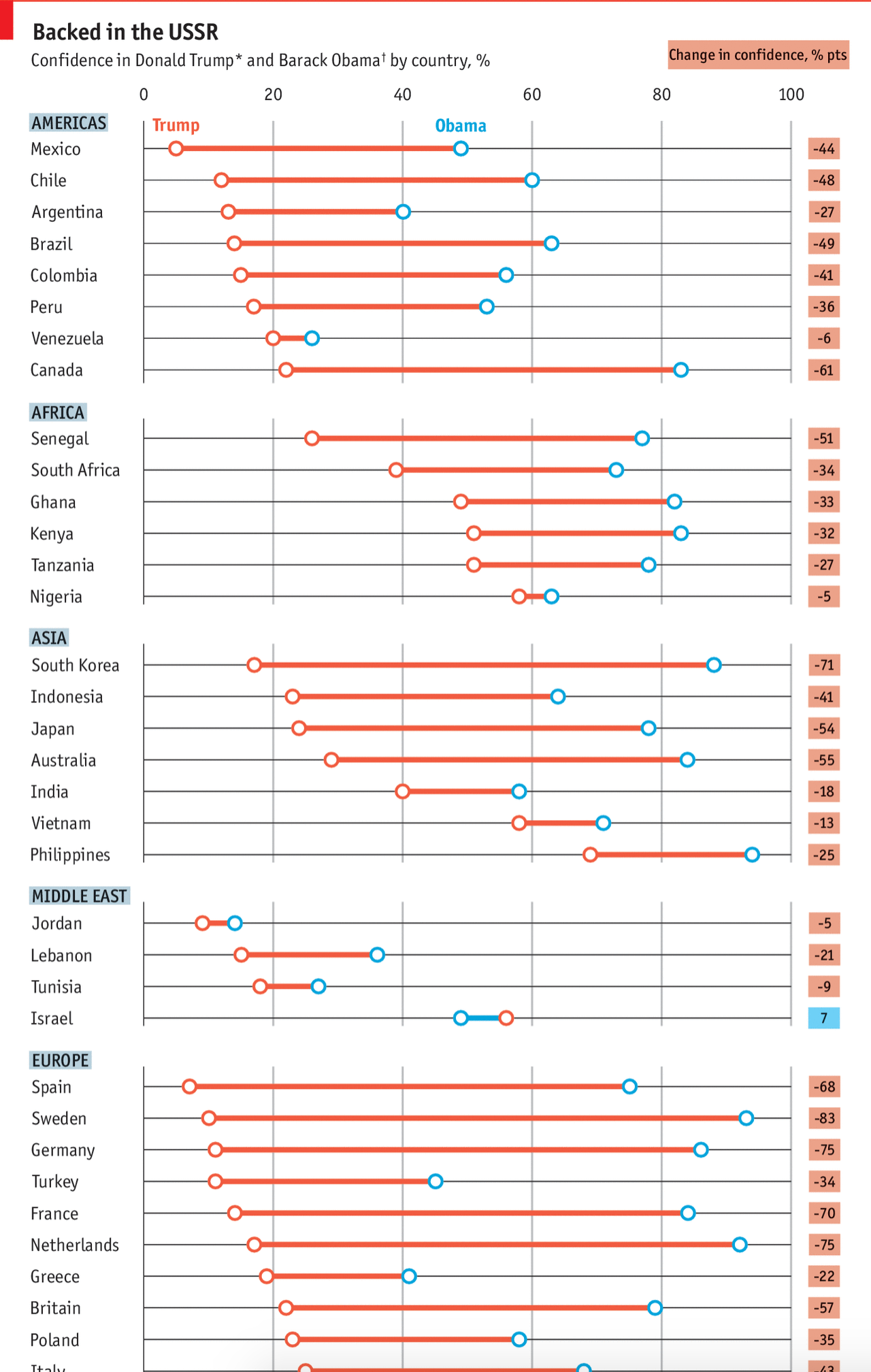
The Pew Research Centre surveyed international respondents about their confidence in Donald Trump vs. Barack Obama. The Economist took those results and visualised them. And the results, well they kind of speak for themselves. But make sure to click through the link for the rest of the graphic.
That’s a lot of declining values
Credit for the piece goes to the Economist graphics department.
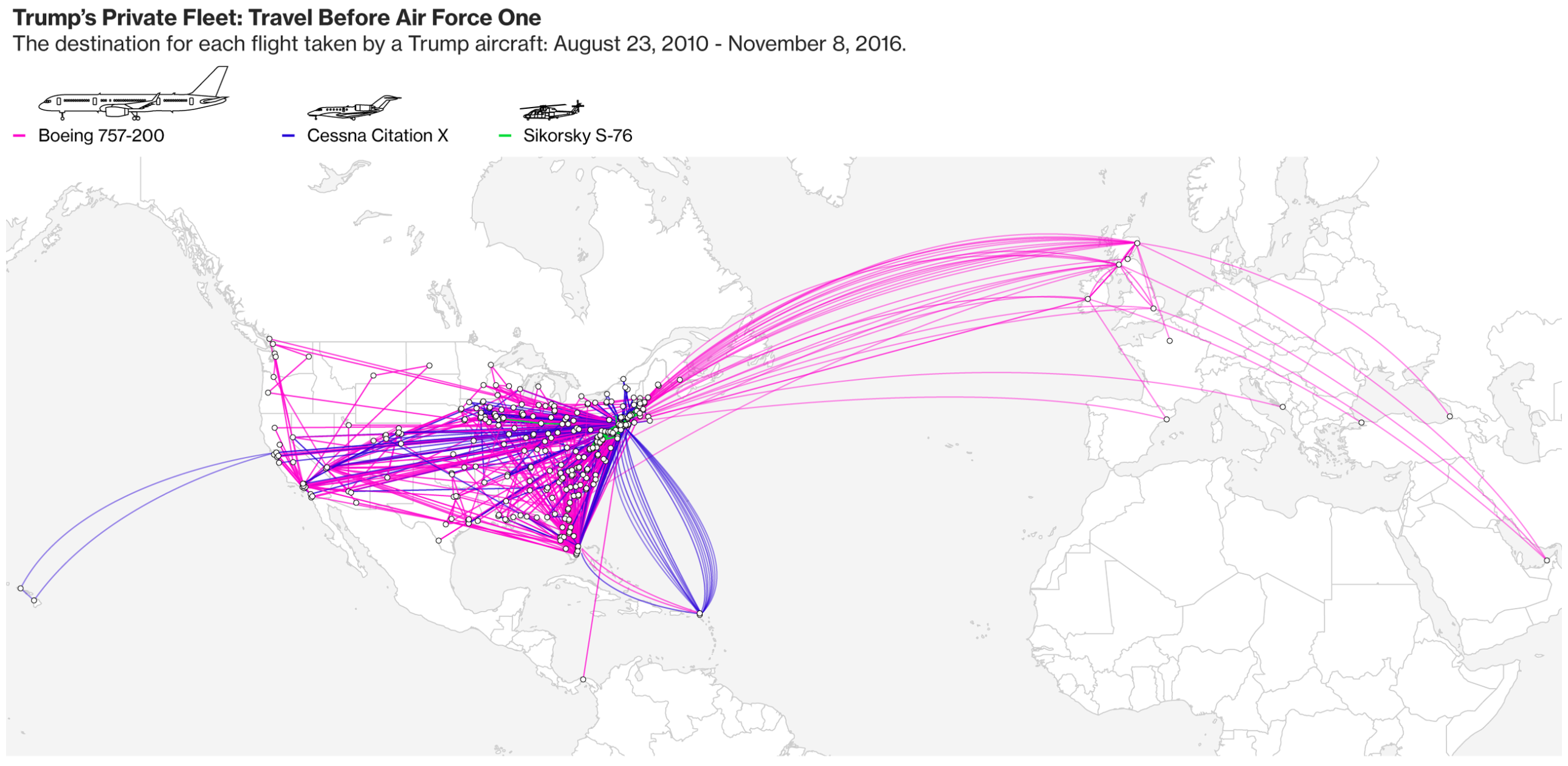
Okay, not entirely. But Bloomberg put together a solid series of graphics tracking not the travels of Donald Trump, but his private aircraft. But that information can serve as a rough proxy for Trump’s travels. But the data is not complete—Russia is missing from the map though he has visited the country for business.
Where Trump’s private aircraft flew
Credit for the piece goes to Vernon Silver, Michael Keller, and Dave Merrill.
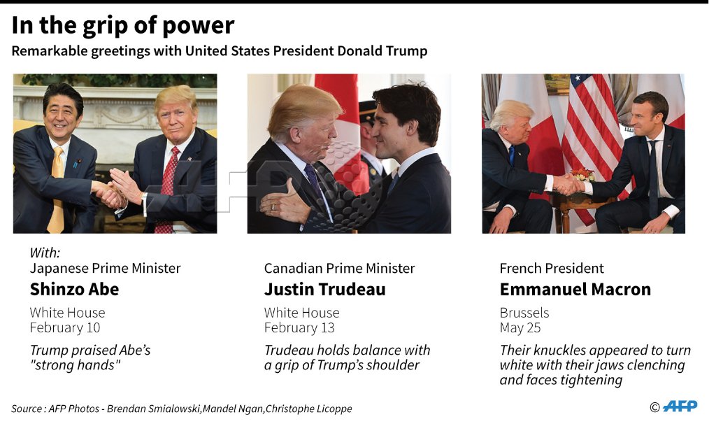
So this isn’t exactly an infographic, but it’s still great because it let’s me links to sites with the video. It’s about Donald Trump’s handshakes. If you missed yesterday’s two between him and new French president, Emmanuel Macron, well you missed something.
Welp
If you want to see the handshake, you can watch it in the video clip at the end of this article from the Telegraph. It sets the stage for the handshake snub that is at the top of said article.
Happy Friday, all.
Credit for the piece goes to the AFP graphics department.
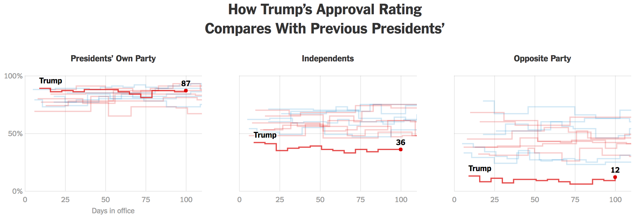
My battery is about to die this morning and I don’t have my charger so this is going to be a shorter piece than usual. But I wanted to look back on the 100 Day polling that the New York Times posted. It does paint an interesting picture of somebody so polarising that Trump is probably safe despite being one of the least favourably viewed presidents in modern times. Why? Because his supporters are so fervently loyal.
Not only is Trump low, he’s low historically
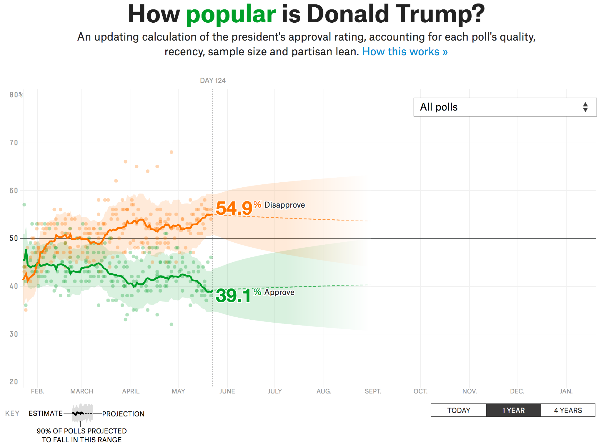
But that piece is almost a month old now. And so I wanted to point out something that FiveThirtyEight is doing—a running tracker of Trump’s polling. I am sure I will return to it in the future, after all we have over three and a half years to go until the next four year presidential term begins.
Trump is pretty low…
Credit for the piece goes to Karen Yourish and Paul Murray for the Times and Aaron Bycoffe, Dhrumil Mehta, and Nate Silver for FiveThirtyEight.
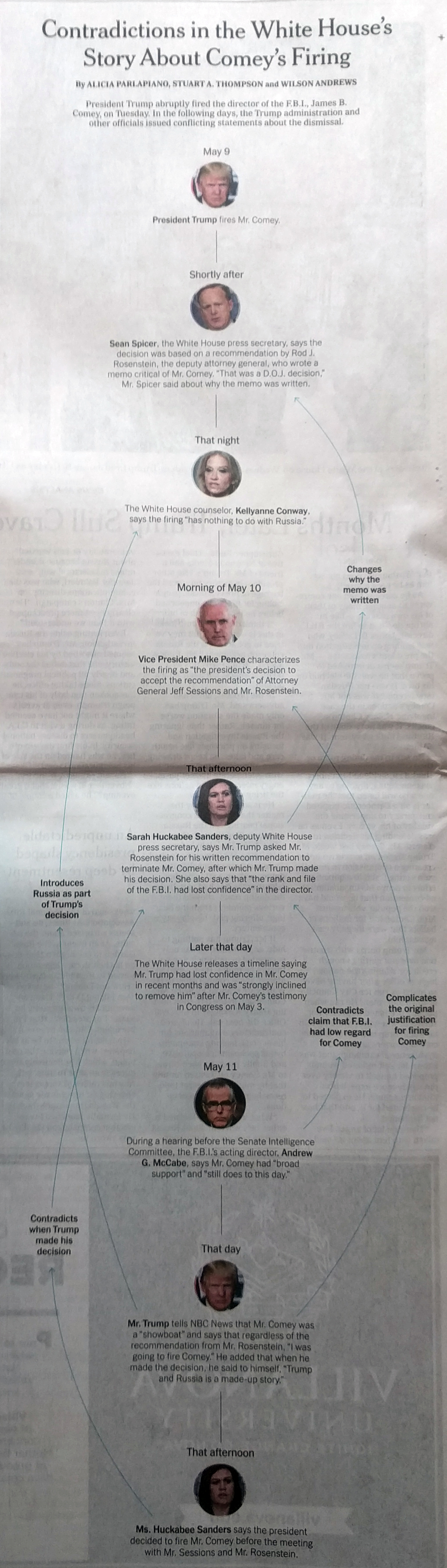
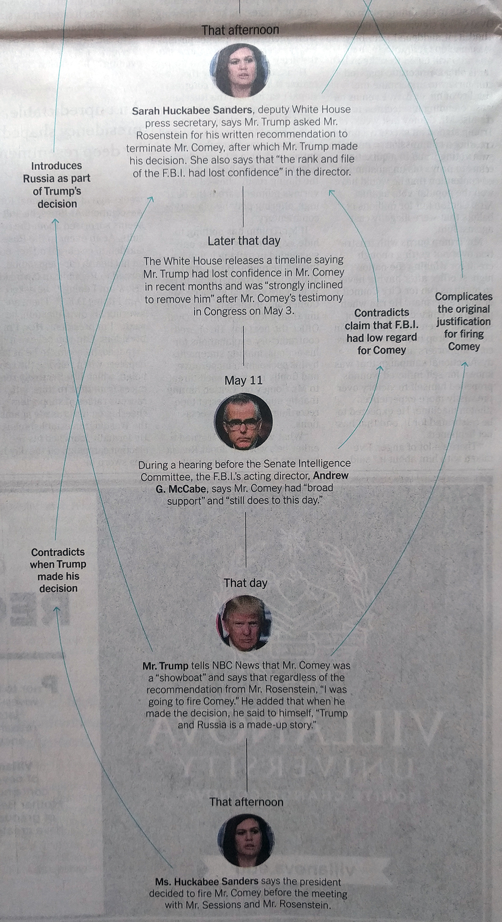
Last week was crazy, am I right? But one thing that made complete sense was President Trump’s rationale for firing FBI Director James Comey.
And to prove just how much of a logical, straight-line reasoning there was we have this graphic from Sunday’s edition of the New York Times.
The complete graphic.
Okay, so maybe that is not quite such a straight line.
I want to excerpt the bottom half because it clearly shows the contradictions—the top half merely establishes the statements to be contradicted.
Yep. It’s all very clear.
I particularly like the use of the blue lines and bold set type to distinguish from the linear narrative of the administration. But what makes it work are the concisely written blurbs that detail just what the contradiction was.
Credit for the piece goes to Alicia Parlapiano, Stuart A. Thompson, and Wilson Andrews.
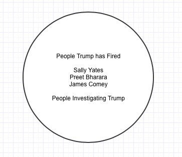
I miss the days when I could design a weekly content strategy. Well, at least sometimes I would design a weekly content strategy. Nowadays I find that what I want to do is often trumped by news out of Washington and the administration.
And that news is the abrupt firing of FBI Director James Comey. There is a lot more to this story than I can type up this morning. (But I am sure we will get to it in the coming days and weeks.) But I saw this image in a tweet this morning and it sort of sums up my concerns.
That is not the sliver in which you want to find people
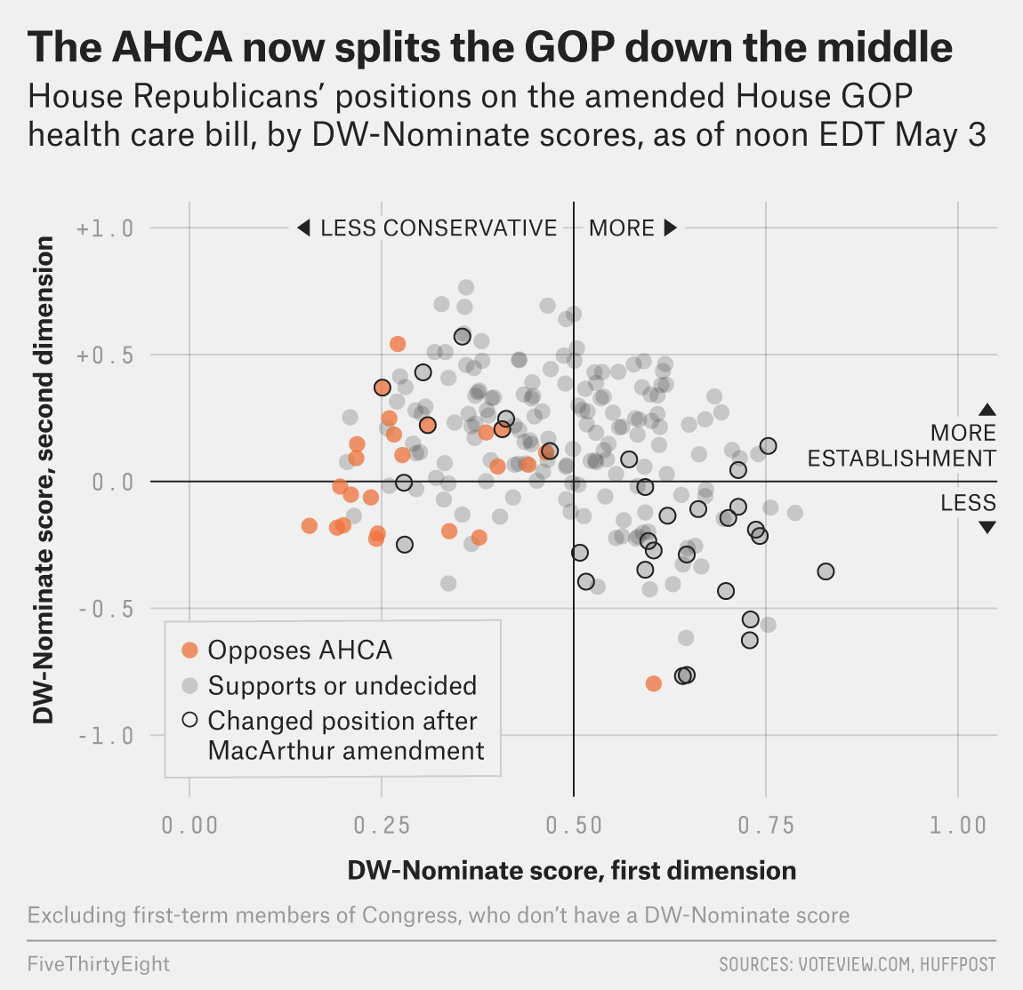
Well as of last night, we are having yet another vote on AHCA, better known as Trumpcare. I will not get into the details of the changes, but basically it can be summed up as waivers for Obamacare regulations. And as of last night, $8 billion over five years to cover those at high-risk. What about after five years? What if, as experts say, that sum is insufficient and it runs out before five years are up?
This is still a bad bill.
But thankfully we have FiveThirtyEight who looked at support before the Upton amendment—the $8 billion bit—and found that the bill could still fail because of a lack of moderate support.
Round and round we go
The basic premise is this: In order to get the conservative Freedom Caucus, which scuppered the bill a few weeks ago, on side Ryan et al. had to make the bill more conservative. They likely had to make it cover fewer people at a higher cost. I say likely because Ryan is not sending this to the Congressional Budget Office (CBO) to score the bill, something typically done to see how much it costs and whether it might work. Problem is, by making the bill more conservative, they push away moderate Republicans. Yes, Virginia, they do exist.
Today’s question is whether an $8 billion throw-in will buy in enough moderate votes.
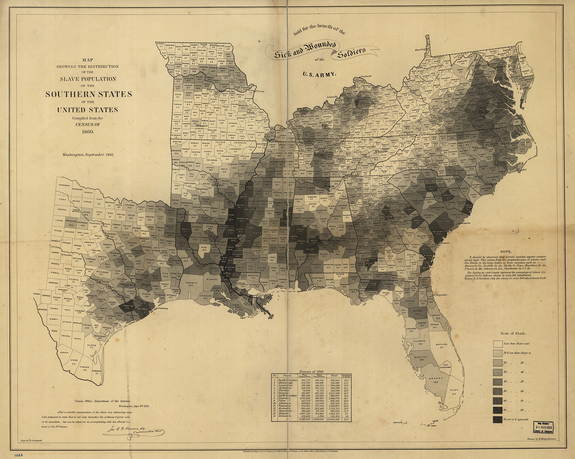
Yesterday, President Trump asked why there had been no discussion about the causes of the Civil War.
No, that is not a joke.
Well, Mr. President, turns out that there has been quite a bit of discussion over the last few years. And the broad consensus?
Do I even have to?
Note the above, with the darker shaded counties representing those with greater percentages of the population held in slavery. What do most of those states have in common with the Confederacy? That they are in the Confederacy.
To be clear, the Union was not perfect. Delaware, Maryland, Kentucky, and Missouri remained part of the Union, but were states where slavery was legal. In fact both Kentucky and Missouri had two governments. Kentucky provides a great example of the fault line with the pro-Union capital of Frankfort situated in the low-slavery east whereas the Confederate capital was located in western, high-slavery Kentucky.
But the point stands. Slavery was the link between Confederate states and Confederate-aligned parallel governments in Union states. So, Mr. President, when you are asked about the cause of the Civil War, now you know the answer.
Credit for the piece goes to E. Hergeshimer of the US Census Bureau.