The 47%

This is the year of the percentages. From 99 to 47. Earlier this week, Mother Jones revealed via a secretly recorded dinner Mitt Romney as claiming that he doesn’t care about the 47% of people who do not pay income tax. He probably meant that he doesn’t care about getting their vote rather than caring for them as people, but regardless of his intention his statement did not sound good. This 47% are people who are dependent on government, or as Romney’s vice presidential candidate would say, they are “takers”. But is this true?

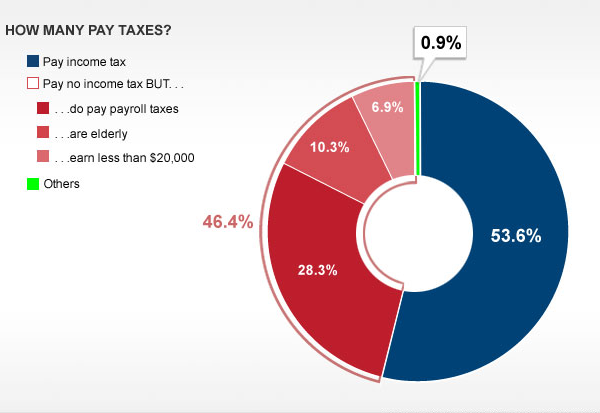
The great thing about news stories and infographics is that as time progresses, one has more opportunities to find data to back stories and arguments. The day of the breaking news, CNN published this simple pie donut chart. Crude, but given the breaking news it is effective.
Federal Income Tax Payers

It proves that Romney was correct, that 47% of people do not pay income taxes. But, it also proves that Romney was at best glossing over the details or at worst manipulating the people listening into thinking that 47% of people do not pay taxes. It may be only 0.9% of Americans who do not pay any taxes. Furthermore, retirees and young people often do not earn income with which to pay taxes. If retired senior citizens are “takers”, I suppose Romney does not want the elderly vote so often important to the Republican base.

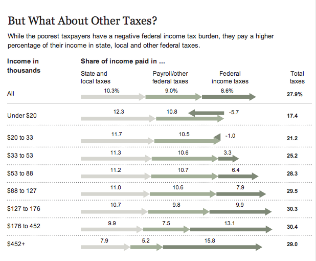
But news stories evolve and more statistics become available. A few days later, the New York Times published a longer infographic piece, with below a cropping of the overall.
The Tax Burden by Income Group

It expands upon the nature of the story and breaks down the actual tax burden of the American public. It is far more nuanced that Romney stated back in May (the original recording of the video). The poorest Americans do not pay federal income taxes, they have the Earned Income Tax Credit (EITC) that is designed to deal with poverty, especially amongst families with children. It is, very simply, what one would call a tax credit incentivising work. The poorest Americans, however, still must pay payroll taxes and then state and local taxes. In percentage terms, the poorest Americans pay more to their states and local governments than do the wealthiest Americans, who in turn have the greater burden at the federal level. It is worth noting that many government programmes, local schools for example, are often funded at the state and local level.

The problem with Mitt Romney’s argument on taxes is that he wants to cut taxes at the highest income brackets and cut the social safety net programmes for the lowest brackets. We already have evidence that such policies do not correlate with economic growth. They instead correlate to a worsening gap between the wealthy and the poor. Think the 1920s rather than the 1950s, 60s, and 70s.

Tax policy is worth discussing. It is worth debating. But we should do so on the facts. I cannot recall the politician who spoke these words, but as someone once said, “you are entitled to your own opinion. You are not entitled to your own facts.”

Credit for the pieces go to Susie Poppick (CNN) and the New York Times.

Ivory Trade

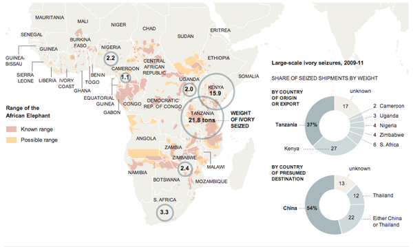
This graphic from the New York Times looks at the illegal ivory trade out of Africa and into, primarily, the markets of Asia. I think the map works fairly well in showing why certain countries are centres for the illicit industry. But the two donut charts integrated into the graphic as part of the Indian Ocean are a bit weaker.

Ivory trade
Ivory trade

My main problem is that the shares are a bit difficult to distinguish as arcs, especially when looking at the export countries. But the second chart with the import markets does work a little bit better. In this case there are really only three markets: China, Thailand, and Others. But the chart contains the ambiguous China or Thailand. So in theory, that demarcation could fall anywhere between China and Thailand—a point harder made if comparing simply by bars. This means that the chart really is looking at China vs Thailand that combine to 87% vs. Others. The trick is finding the break between China and Thailand. Is this chart perfect? No, but in this case I think it an acceptable use of the donut—though I likely would have treated it a little bit differently to emphasise that point.

Red Sox–Dodgers Trade

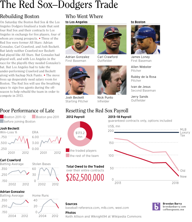
There was a lot of news this past weekend. So we’ll start with the important stuff first. An infographic about the big baseball trade between my Boston Red Sox and the Los Angeles Dodgers. The advantage of a story breaking over the weekend is time to get something together for Monday.

The Red Sox–Dodgers Trade

Follow the Money. And Enjoy a Donut on the Way. Or a Pie.

Visualising government budgets is always fun. Until you realise that you are seeing where your money is going. But now we look at Australia’s expenditures. And as I pay nothing in taxes to Australia, I get to keep my fun.

Australian budget
Australian budget

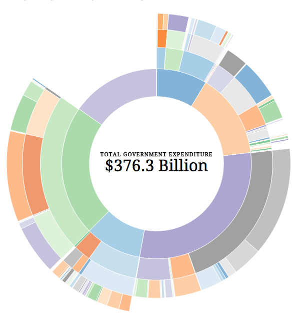
This piece is doing some interesting things within the framework of the donut chart I generally dislike. We do get to see the levels of detail for different departments or areas of spending. For example, one can see that costs for building Australia’s new destroyers and how that fits into the whole budget. Or, by clicking on a slice of the donut, one can zoom in to see how pieces fit at the selected level.

But the overall visual comparison of pieces and then identifying them through colour is less than ideal.

Found via the Guardian’s datablog, credit for the piece goes to Prosple and OzDocsOnline.

Battleground States

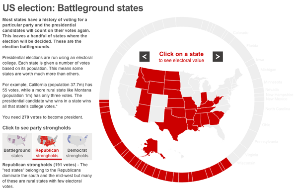
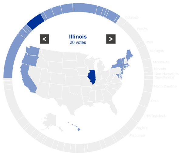
The BBC provides an interactive tool to explore the battleground states in the forthcoming election. A giant donut chart with 50 segments maps a segment to a state and its total number of electoral votes. The larger the electoral vote, e.g. California, the larger the segment. Beyond just a giant chart, however, the BBC has placed the states into different camps, the Democrats, the Republicans, and the Battleground states.

Republican strongholds

Selecting either the Democrat strongholds or the Republican strongholds highlights the states for each respective party. Not a lot of functionality is to be had. Clicking on a state merely displays its name and number of votes. But this is not the main function of the piece.

A Democrat stronghold

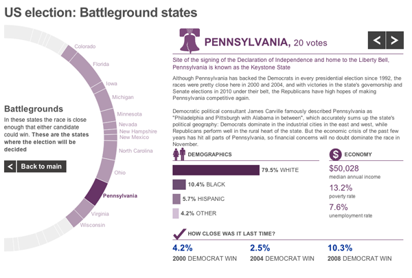
The main goal of the piece is to explore the Battleground states. When the user selects one, he or she is presented with a new view that moves the chart partially off-screen—while keeping the Battlegrounds in view—and moves a profile piece on-screen. This view contains both a text summary of the state and its challenges along with important demographic statistics.

Battleground profile

For an American audience, there is probably little to be gained from the piece unless one is wholly unfamiliar with American politics. But for the more international part of the BBC News audience, this piece gives them quick insights into the various states that will be so important over the course of the next few months.

Chocolate All Over the World

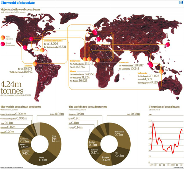
There are a few things in this world that I really dislike. Two of them are coffee and chocolate. So this map from the Guardian, a map made of real melted chocolate, is not quite to my liking.

Chocolate map
Chocolate map

While I can appreciate the concept behind it—regardless of the chocolate-ness—I am left to wonder if from a data visualisation point a world map might not have been the best choice. Only fourteen countries are shown, if I count melted chocolate correctly.

I am just thankful that at the bottom of the piece I am not looking at chocolate doughnuts.

Credit for the piece goes to Jenny Ridley.

A Not So Smart Smartphone Chart

This piece in the Globe and Mail of Toronto looks at smartphone usage by operating system through a comparison of Canada to both the United States and Japan.

Smartphone use in Canada

While I understand the need for aesthetic distinction from having an entire page of bar charts, these ring or donut charts are a touch misleading. Because of the space between rings, the radius of each circle from the central Android icon is significantly increased. This of course proportionally scales up the length of each segment within the rings. In short, it becomes difficult to compare segments of each ring to the corresponding segments on the other rings without looking at the datapoint. And if you need to look at the datapoint, one could argue that the infographic has failed from the standpoint of communication of the data.

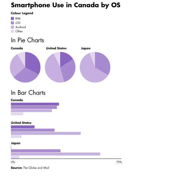
Beneath is the original (with the legend edited to fit into my cropping) with two very simple (and hasty) reproductions of the data as straight pie charts placed next to each other and then as clusters of bar charts grouped beneath each other. I leave it to you the audience to decide which is easiest to decode.

The original ring chart with legend moved
Alternate visualisation types

Credit for the Globe and Mail piece goes to Carrie Cockburn.

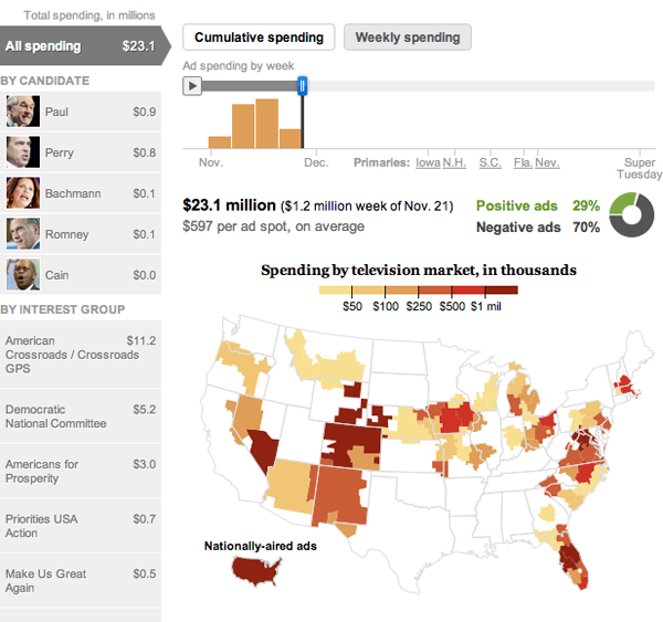
Campaign Ad Spends

I don’t know about you, but to me, it’s beginning to look a lot like campaign season. At least from what I read on the internet. Because, according to this interactive piece by the Washington Post, there has been little local campaign spending on ads in the Chicago television market.

Mad Spending
Mad Spending

By clicking on the left, you are able to see the spending amounts and spending places of ads by both personal campaigns and interest groups. For national ad campaigns, there is a small outline of the continental US in the bottom left.

Above the map you have some facts about the spending and spending over time and a curious bit about whether the ads are positive or negative. Already if you move from the beginning to now, you can watch the positive ad number slip.