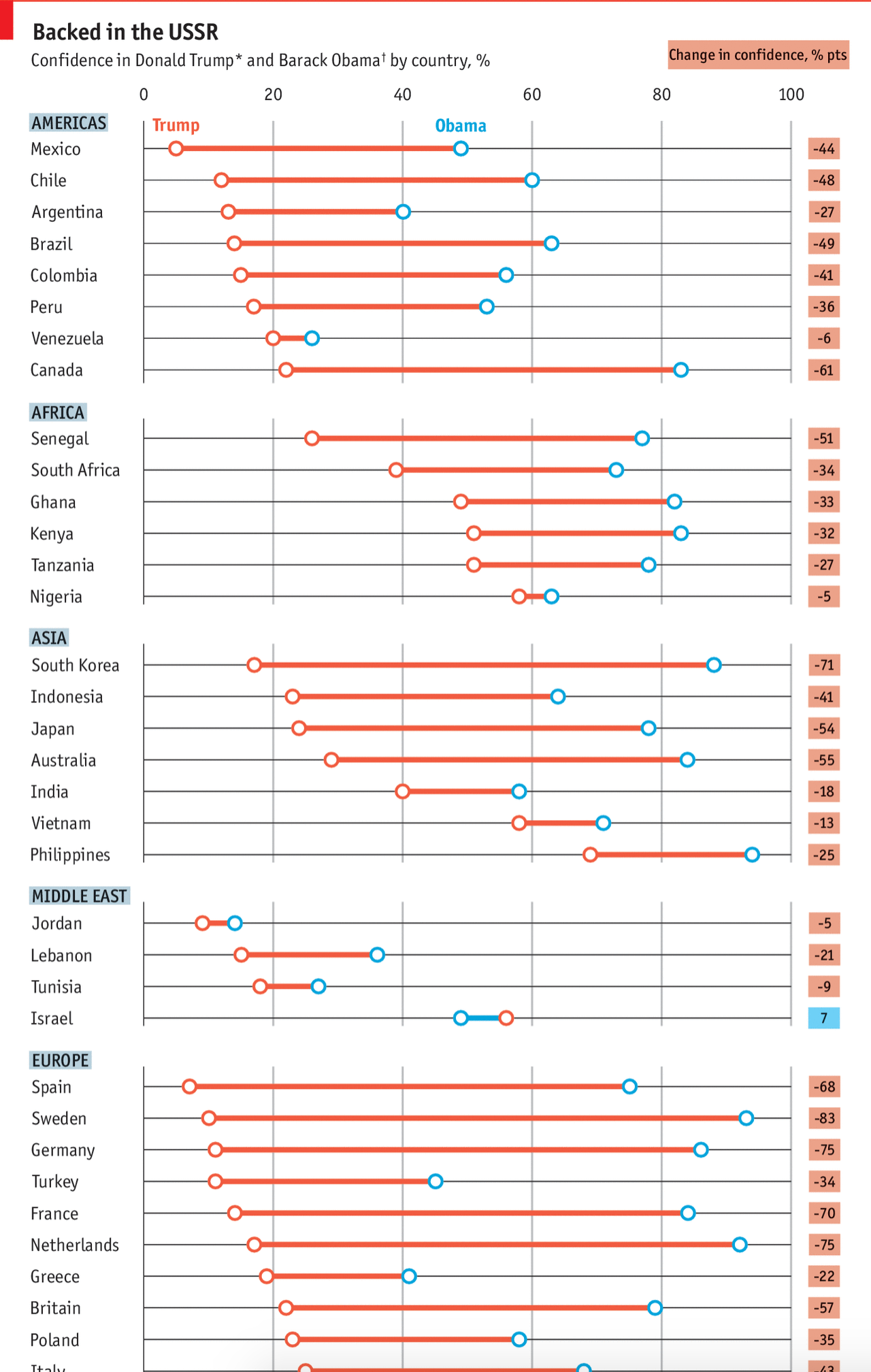
The Pew Research Centre surveyed international respondents about their confidence in Donald Trump vs. Barack Obama. The Economist took those results and visualised them. And the results, well they kind of speak for themselves. But make sure to click through the link for the rest of the graphic.
That’s a lot of declining values
Credit for the piece goes to the Economist graphics department.
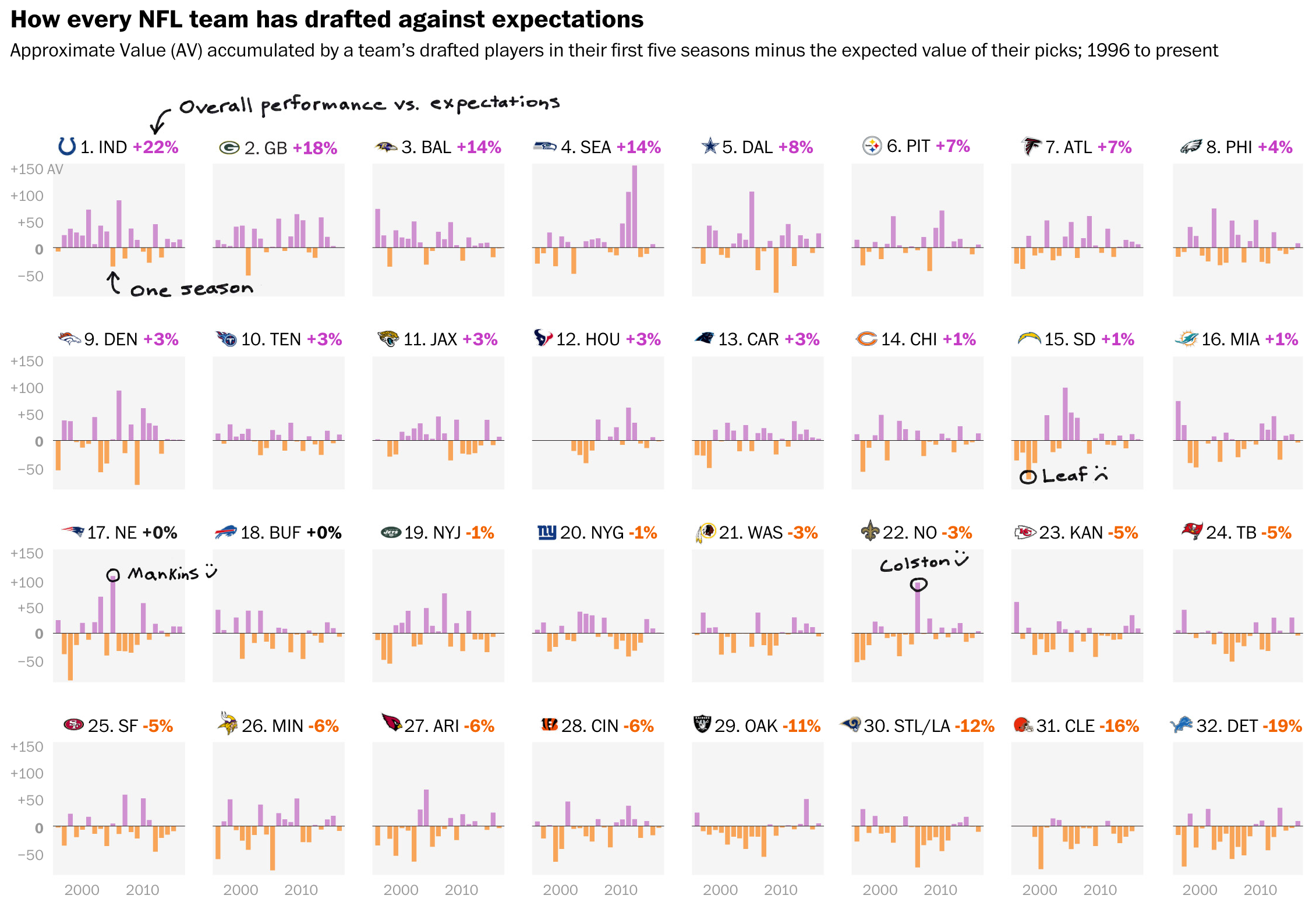
The joke I have been telling everyone in person this past week: I changed jobs and moved 750 miles from Chicago to Philadelphia, but I still cannot escape the NFL Draft. The two previous drafts occurred across the street from my last job and this year they are three blocks away from my new flat. Traffic is a bloody nightmare. So while there is a lot of news to cover through data visualisation and design, the local story is the NFL Draft that begins tonight next to the Rocky statue and in front of the Art Museum. We will return to trade wars with Canada, tax cuts for the rich, North Korea, climate change, and other things over the next few weeks.
Today’s piece comes from the Washington Post and looks at NFL Draft success across the NFL. Unfortunately for all of you, I know almost nothing about the NFL except Free Tom Brady. (I have to transfer my Red Sox allegiance somewhere, right?) But this set of small multiples looks fantastic and generally tells me that the Colts and Packers—the latter likely to the chagrin of my Chicago-born followers—have historically done well.
While I fail to understand the references/anecdotes, the grid looks nice…
Aesthetically, I am not sure about the handwriting typeface. I wonder: could the content have been handled better by a more traditional face?
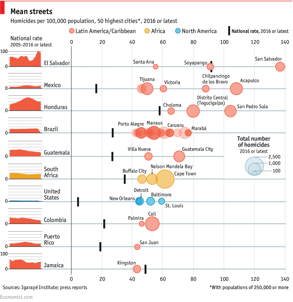
Quite a few things to look at this week. But I want to start with something that caught my attention last Friday. The Economist produced this graphic about the top-50 cities by the always pleasant metric of homicide. I bring it up because of the oft mentioned capital of carnage here in America: Chicago. (To which I’m briefly returning late this week.)
The capitals of crime, the metropolises of murder
Note which city is not on that list: Chicago.
Some countries, sadly El Salvador, Honduras, and Mexico, are among those expected on that list. But the United States is the only rich, industrialised nation present. Unfortunately this is not a list on which we should aspire to be.
The graphic itself does a few nice things. In particular, I like the inclusion of the small multiple national rate to the left of the cities. Because, obviously, high murder rates are not great in El Salvador, but on the plus side, they are down of late. And the same small multiples do go a long way to show that, in general, despite what the administration says, homicide rates in the United States are quite low by these standards.
My quibble with the graphic? Breaking out cities by country. Yeah, it does make a lot of sense. But look at that country listed two spots below the United States: Puerto Rico. I am not here going to get into the whole Puerto Rican statehood vs. sovereignty argument, but suffice it to say that it is a part of the United States.
Credit for the piece goes to the Economist’s graphics department.
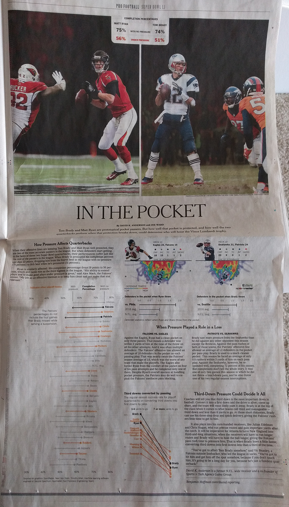
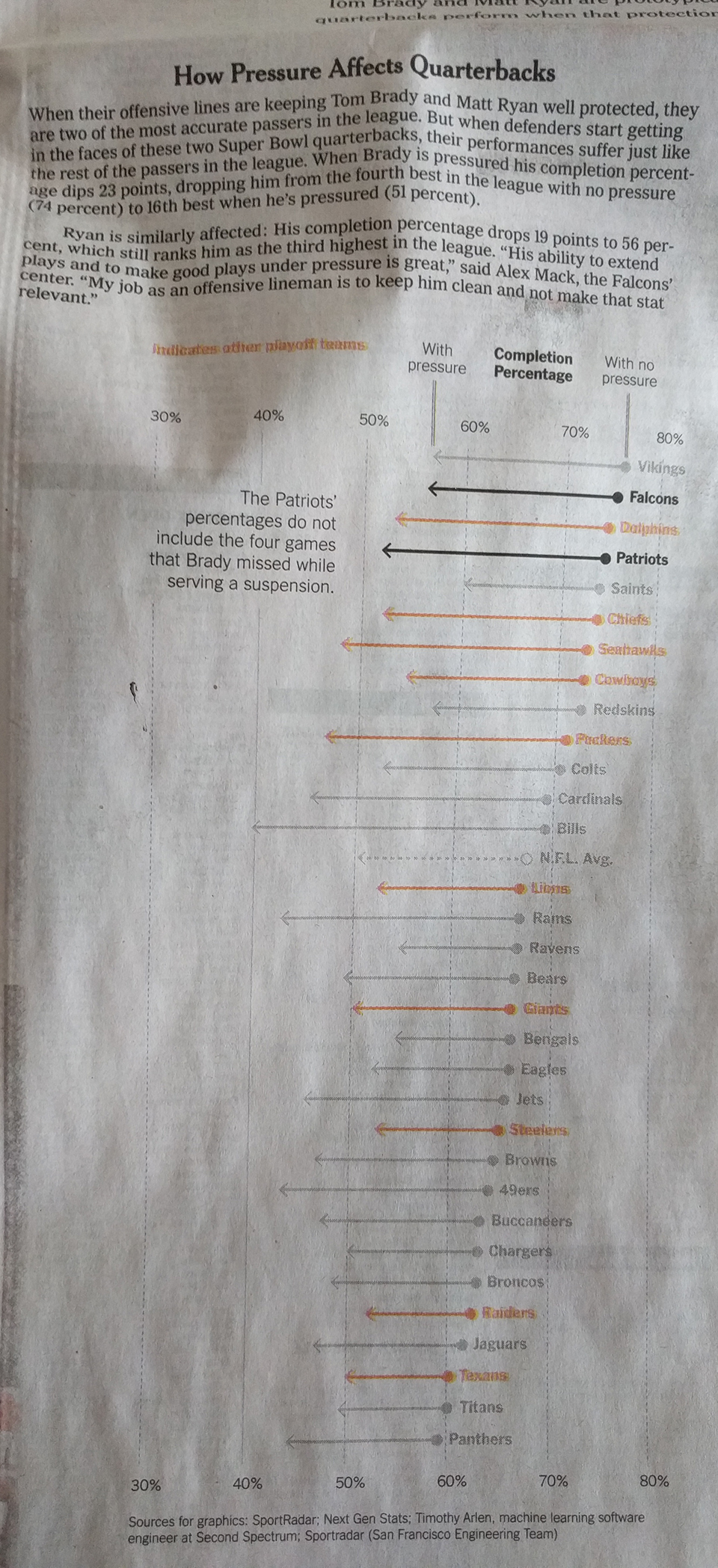
As most of you know, I am a huge baseball fan. I am not so much a huge fan of American football. But I will watch it from time to time. And as a Red Sox fan, that means I will root for the Patriots. So I guess you know how my Sunday night went.
But this past week, I started my subscription to the printed New York Times. And on Sunday I opened the sports section to this full-page graphic.
Page design
It comprises three graphics: The big one on the left looks at completions under pressure. Despite being a full-colour page, the designers only needed two colours to convey the message—black and orange.
Under pressure
Similarly, on the right, the third-down graphic also uses a more limited palette. But, for the heat map it does make some sense to use a full colour palette.
Performance in the pocket
Overall, the page shows that colour, when thoughtfully restrained, makes not just the graphic clearer, but also good sense.
Credit fort he piece goes to David K. Anderson and Joe Ward.
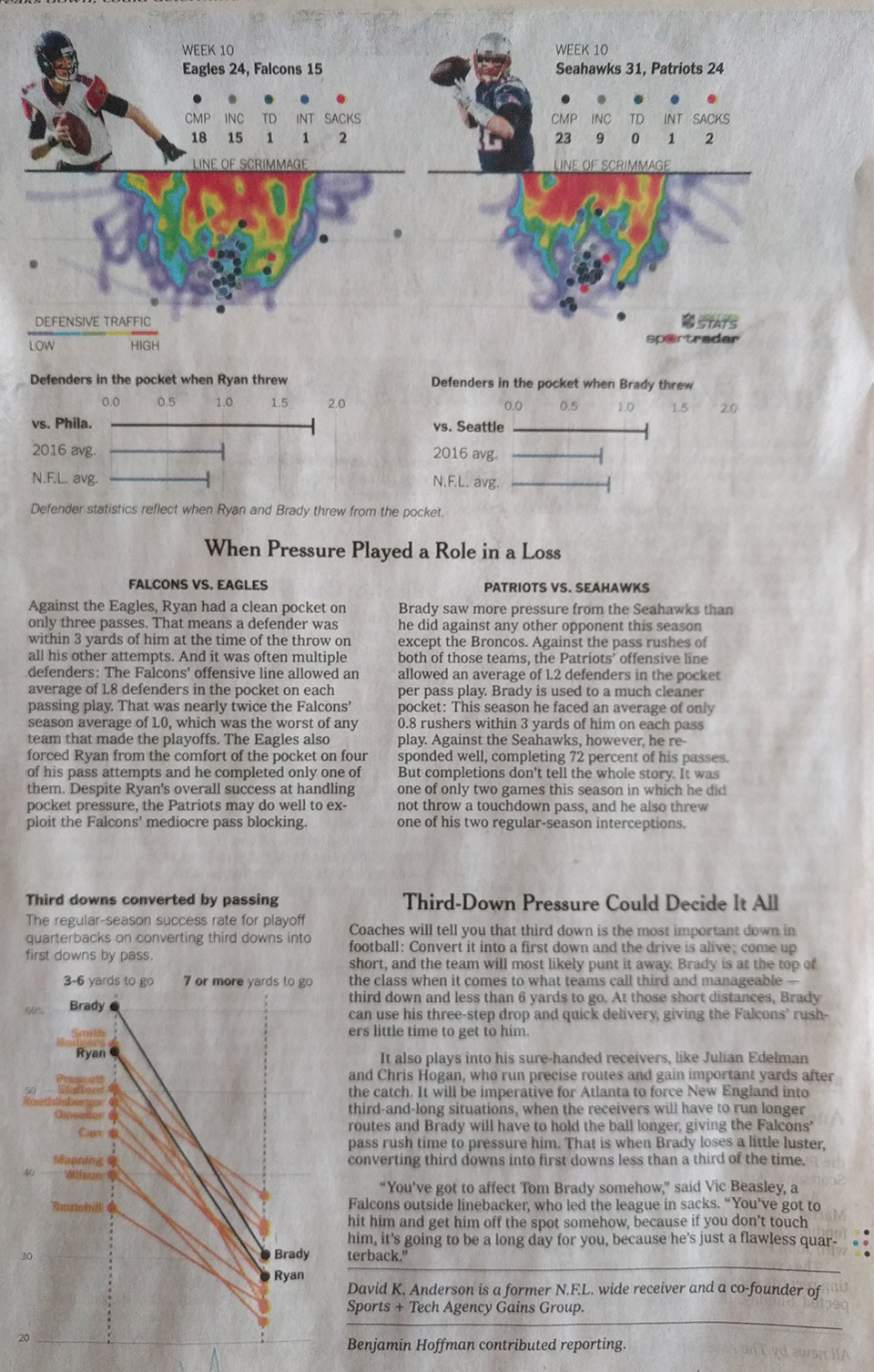
Well, we have arrived at 2017. We all know the big political story in the executive branch. But we also saw elections in the legislative branch. But how different will the 115th Congress look from the 114th? The Wall Street Journal took a look at that in an article.
Congressional diversity
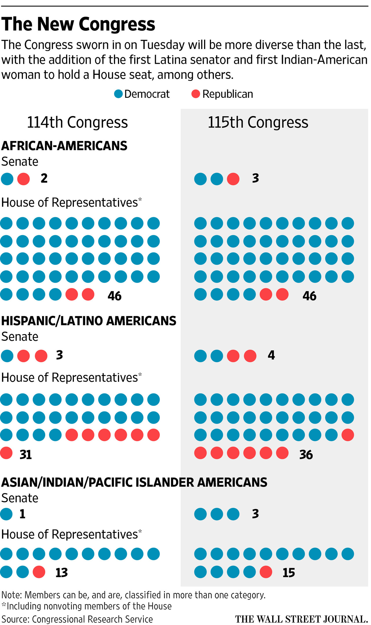
The article’s graphic does a nice job showing the two different compositions. But if we are truly interested in the growth, we could use a line chart to better showcase the data. So what did I do last night? I made that chart. But as I was playing with the data I saw some numbers that stood out for me. So I compared the proportion of minorities in the original graphic to their proportion of the US national population, per Census Bureau data.
Redesigning the original graphic
The line charts, broken out into the House vs. the Senate and then into the two parties, do a really good job of showing how the growth is not equally distributed between the two parties. And the reverse of that is that it shows how one party has failed to diversify between the two congresses.
The 115th Congress might be more diverse than ever. But it has a long way to go.
Credit for the original piece goes to the Wall Street Journal graphics department.
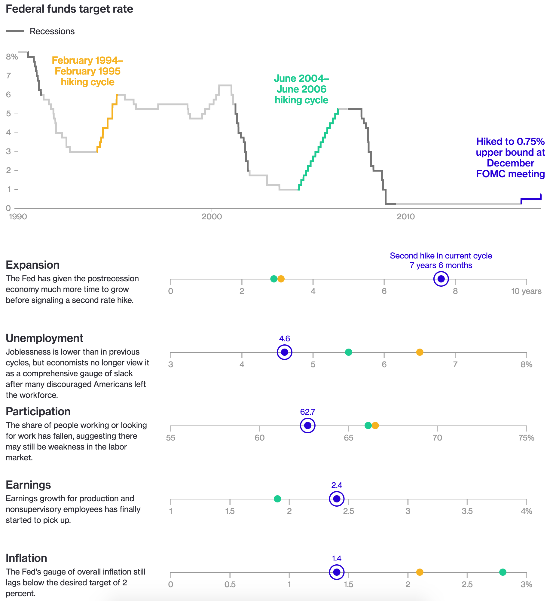
In my new role as data visualisation manager at the Philadelphia Federal Reserve, I am learning a lot about what the Fed does and how it does it. Needless to say, this piece from Bloomberg interested me as it displayed how the federal funds rate has changed over time.
How this potential hike cycle would compare to the two previous
What I really enjoy is how they colour-coded the two previous hiking cycles as well as what I think everyone presumes will be a new one. And those colours then move on down the piece into the dot plots. The dot plots show various potential factors in the decision-making process, and just how far off the current hiking cycle is from the two previous.
Credit for the piece goes to Chloe Whiteaker, Jeremy Scott Diamond, and Jeanna Smialek.
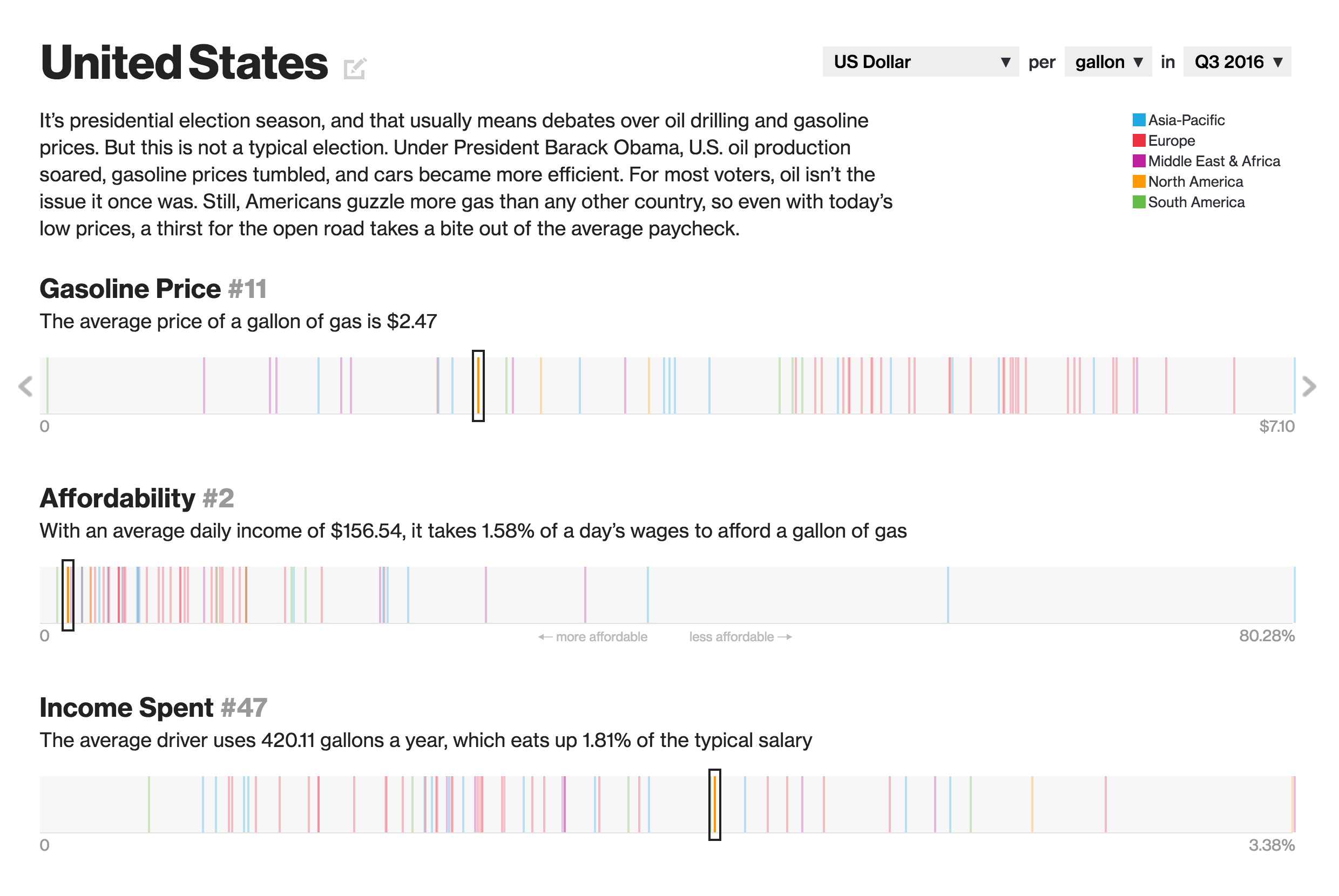
How much does a gallon of milk cost? That, of course, is one of the classic election questions asked of candidates to see how in touch they are with the common man. But the same can be understood by enquiring whether or not they know how much a gallon of petrol or gasoline costs. And Bloomberg asked that very same question of the United States relative to the rest of the world. And as it turns out, here in the States, fueling our automobiles is, broadly speaking, not as painful as it would be in other countries.
The piece includes the below dot plot, where different countries are plotted on the three different metrics and the dots are colour coded by the country’s geographic region. But as is usually the case with data on geographies, the question of geographic pattern arises. And so the same three metrics presented in the dot plot are also presented on a geographic map. Those three maps are toggled on/off by buttons above the map.
How the US ranks compared to the rest of the world
A really nice touch that makes the piece applicable to an audience broader than the United States is the three controls in the upper-right of the dot plot. They allow you to control the date, but more importantly the currency and the volume. For most of the world, petrol is priced in litres in local currencies. And the piece allows the user to switch between gallons and litres and from US dollars to the koruna of the Czech Republic.
Credit for the piece goes to Tom Randall, Alex McIntyre, and Jeremy Scott Diamond.
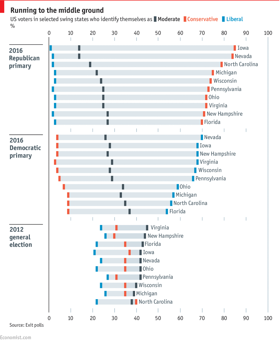
In US presidential politics, the common sense truth is that candidates run to the wings of the parties to get primary voters. They say ridiculous, inane things, but with the hope to walk them back later. Why? Because while they commonly run to the outsides edges during primary season, candidates recognise that in the election itself, victory comes from the moderates. And yesterday, the Economist published a really nice piece on this point.
Moderate voters vote in the autumn
For a sample of battleground states, the Economist examined who voted in the recent primaries versus who voted in the last general election. Given the aforementioned common thinking, not surprisingly self-identified Democrats voted in droves for the Democratic primaries. And self-identified Republicans voted in the Republican primaries. When one looks at the historical 2012 data, however, with the exception (barely) of North Carolina, moderates out voted Democrats and Republicans in all the battleground states.
Not every chart needs to show revolutionary data. Sometimes data can simply validate widely-held truths that people know without knowing the data and facts behind them. And that is what this piece from the Economist does.
Credit for the piece goes to the Economist Data Team.
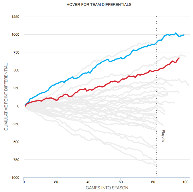
So the basketball finals begin tonight with the Cleveland Cavaliers taking on the Golden State Warriors. This is also the part of the post where I fully admit I know almost nothing about basketball. I did, however, catch this so-labelled infographic from ESPN contrasting the two teams.
Point differential
What I appreciate at this piece is that ESPN labelled it an infographics. And while the data might be at times light, this is more a data-rich experience than most infographics these days. Additionally the design degrades fairly nicely as your browser reduces in size.
The chart formats themselves are not too over-the-top (that seemed like a decent basketball pun when I typed it out) with bars, line, and scatter plots. Player illustrations accent the piece, but do not convey information as data-encoded variables. I quibble with the rounded bar charts for the section on each team’s construction, but the section itself is fascinating.
I might not know most of the metrics’ definitions, but I did not mind reading through the piece.
Go Red Sox.
Credit for the piece goes to Luke Knox and Cun Shi.
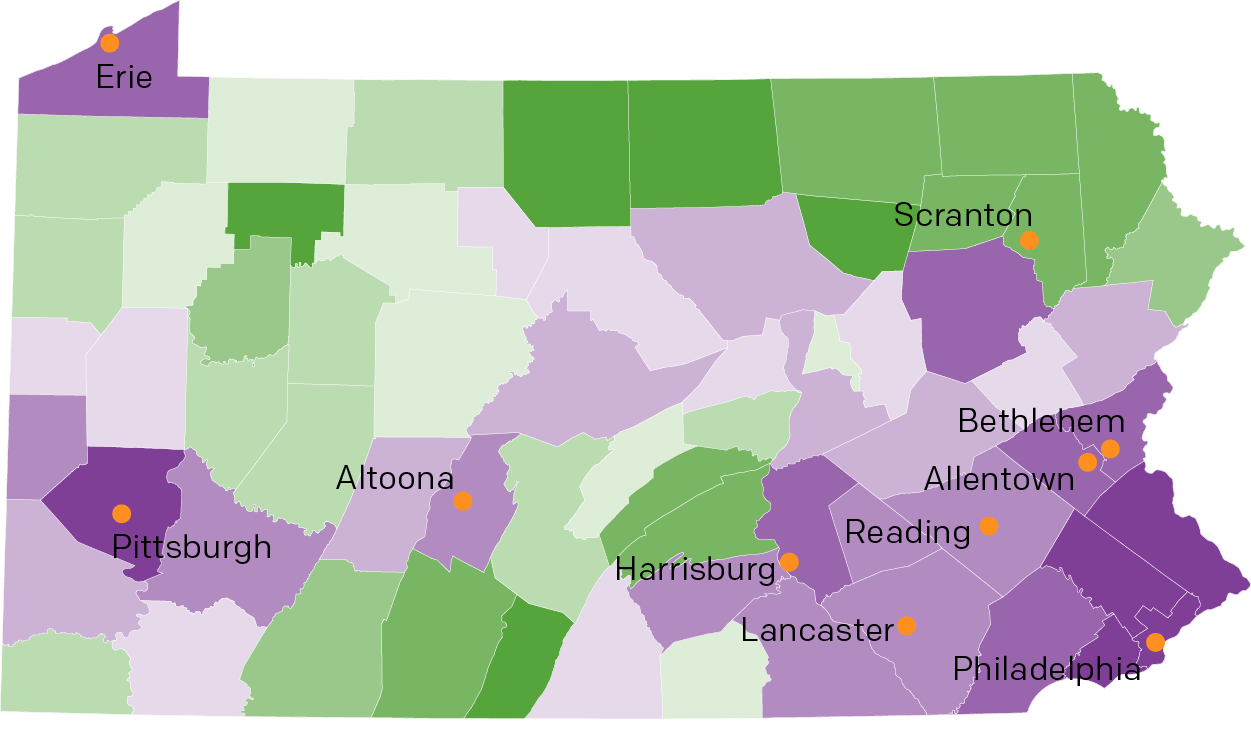
So last week I mentioned Pennsyltucky in my blog post about Pennsylvania’s forthcoming importance in the election. And then on Friday I shared a humourous illustrated map of Pennsylvania that led into an article on Pennsyltucky. But where exactly is it?
Luckily for you, I spent a good chunk of my weekend trying to find some data on Pennsylvania and taking a look at it. You can see and read the results over on a separate page of mine.