
They say that looks don’t matter. But as the Economist reports, better looks do equate to better pay. At least for prostitutes.
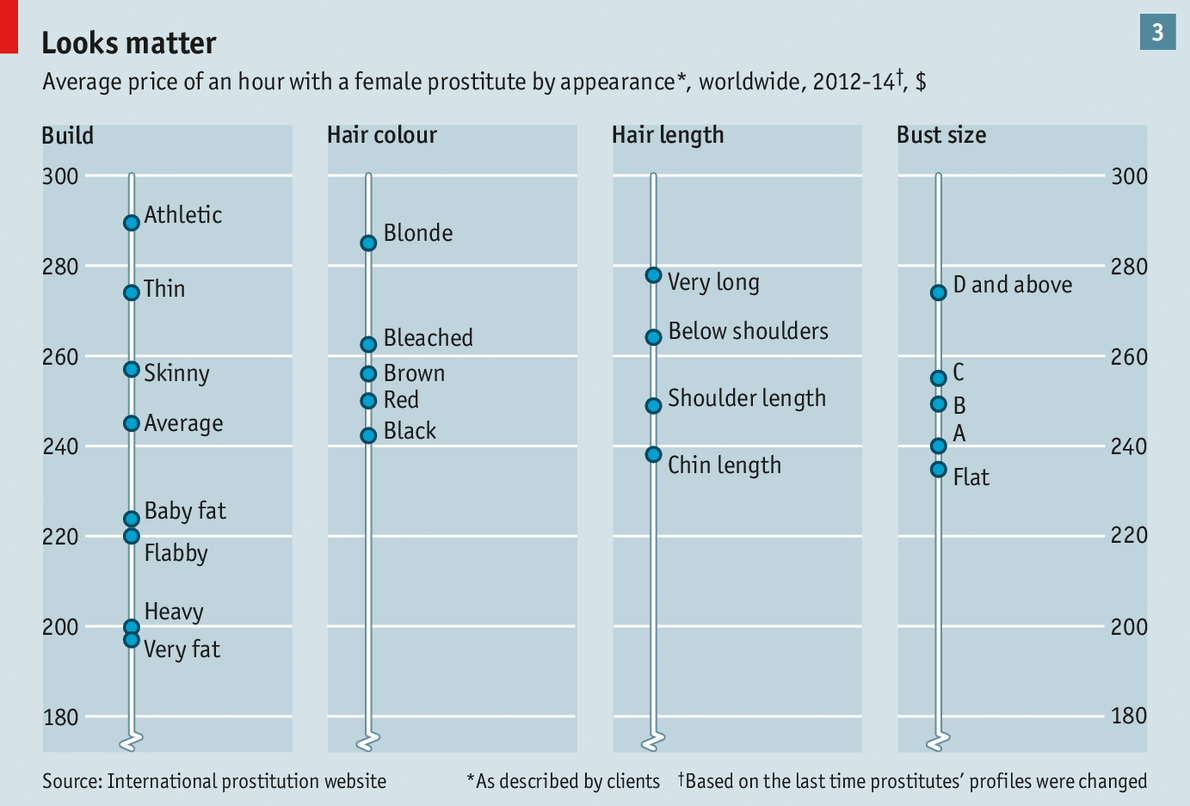
Credit for the piece goes to the Economist’s graphics department.
They say that looks don’t matter. But as the Economist reports, better looks do equate to better pay. At least for prostitutes.
Credit for the piece goes to the Economist’s graphics department.
Yesterday we looked at the growth of inland cities. Today, we follow up with a piece from the Economist that examines the political leanings of America’s larger cities. As one might imagine, the larger cities generally trend liberal. But the most conservative American cities are actually not very conservative. They are better described as centre-right.
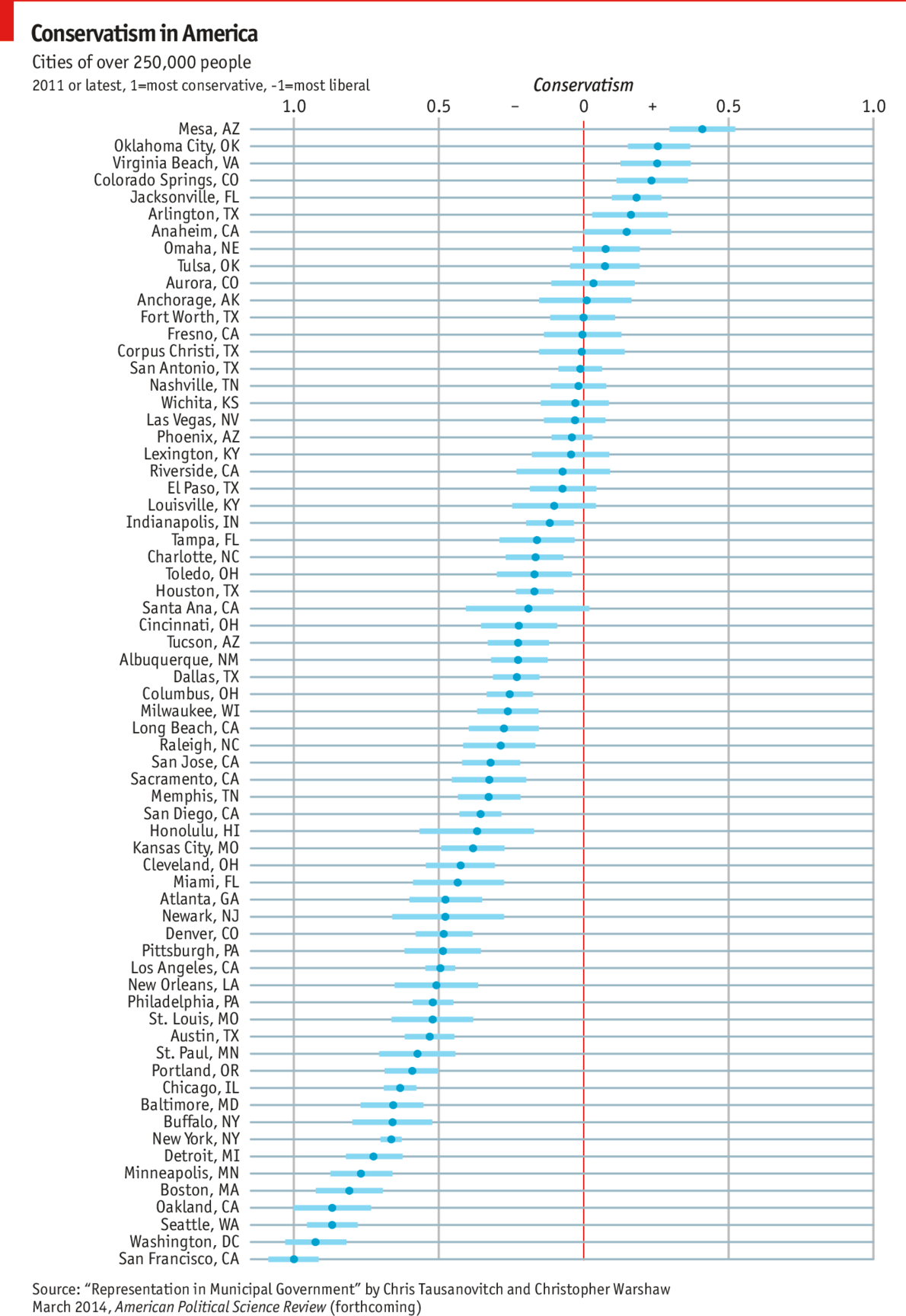
Credit for the piece goes to K.N.C. and L.P.
America loves its gun. The big draw of this piece from the Washington Post is the illustration of the guns used in the mass shootings and whether each was legally or illegally acquired. But more interesting from a data visualisation standpoint are the charts below. They show the numbers of killers, victims, and then the demographics of the killers.
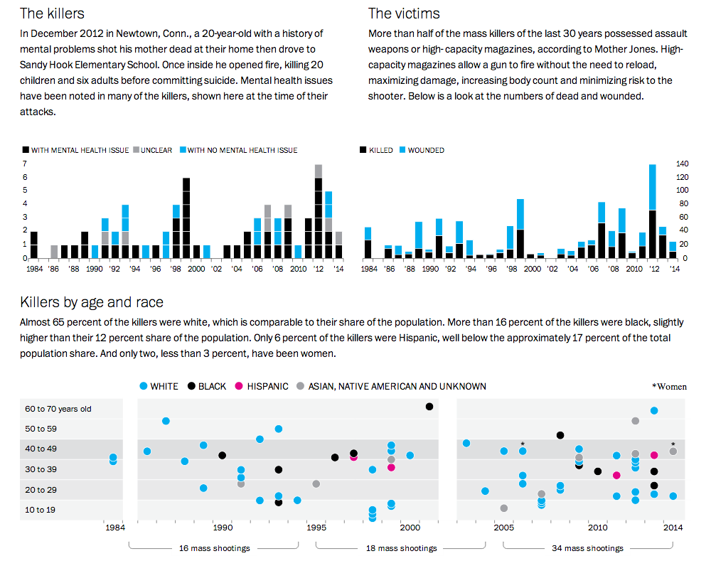
Credit for the piece goes to Alberto Cuadra, Richard Johnson, Todd Lindeman, Ted Mellnik, and Kennedy Elliott
Happy Friday. Happy Memorial Day Weekend. Happy Summer. Just about all of those things mean a drink of some kind. And thanks to Time, we can look at ourselves and find out what drinking culture each of us best reflects. The data comes from the WHO and looks at both total consumption and then share of consumption.
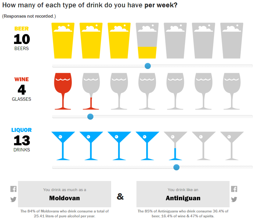
So last week I drank like a Moldovan and most nearly like an Antiniguan. Of course, they meant Antiguan. It just so happens I caught the spelling error. But since most of last week can be chalked up to a house party, I did the week before too. Then I drank like a Belarusian in the style of Guyanese person.
And for those of you who know me, yes, things like this are exactly why I record all the drinks I consumer in my little black book.
Credit for the piece goes to Pratheek Rebala.
Here’s a piece from the New York Times where I have to quibble with some minor design decisions. The story behind the graphic is various state actions on the minimum wage compared to where President Obama wants the minimum wage raised. This is a good story and broadly I like the execution. But these arrows, these arrows pierce my design heart. (Too much of a metaphor?) Instead, I think a simple dot plot would have sufficed. But as I noted above, this is more of a quibble than a shame-on-you.
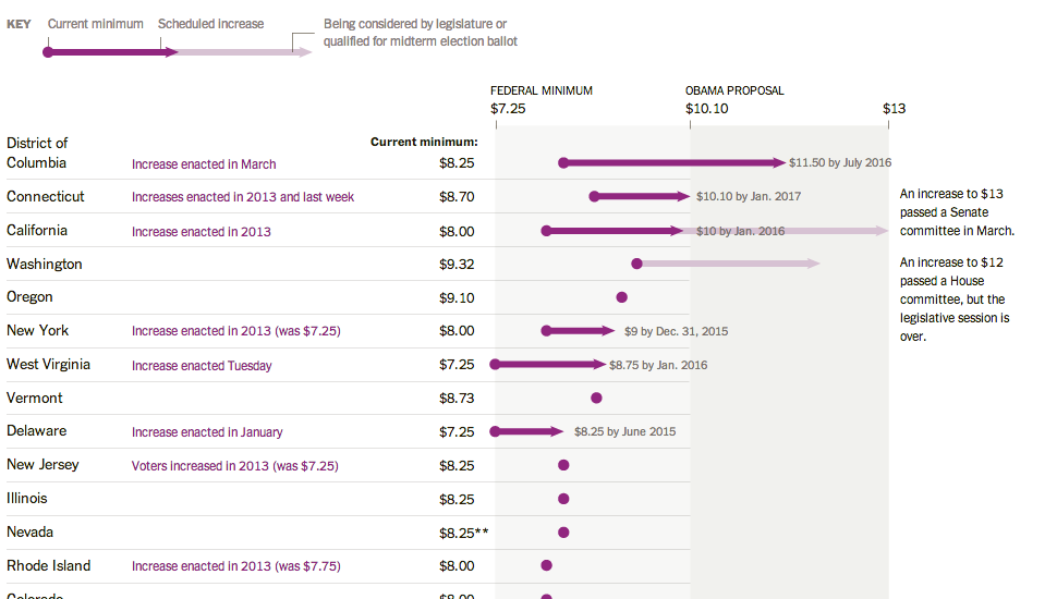
Credit for the piece goes to Alicia Parlapiano.
The Washington Post published this dot plot graphic to explore inequality in household income across numerous American cities.
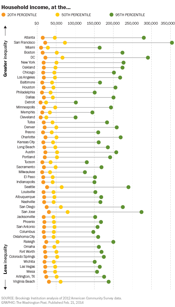
The chart, as most dot plots do, does a good job of showing where several distinct points within a set fall within the entire range of data. Or to put it into other words, where do the poorest, the richest, and the most middlest households in Philadelphia fall within all Philadelphia households? The data is interesting because you will begin to uncover some significant outliers. For example, by quick glance, the 50th percentile in both Detroit and Cleveland earn less than the 20th percentile in San Jose.
Credit for the piece goes to the Washington Post graphics department.
I have spent this past week in Lithuania for work. And it was cold. But it was colder still in Chicago. Thankfully on a Friday we have xkcd to put all this cold into a bit more perspective. Although his example uses St. Louis, I presume it holds for most cities.
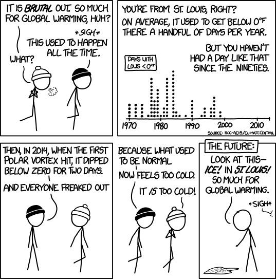
Credit for the piece goes to Randall Munroe.
Today’s post looks at education across a set of 65 countries from a standardised test backed by the OECD, basically a group of wealthy countries. The test results found that some poor countries have surprisingly good education systems whereas some of the world’s wealthiest countries—here’s looking at you, United States—perform poorly. The Huffington Post created this graphic to plot the data.
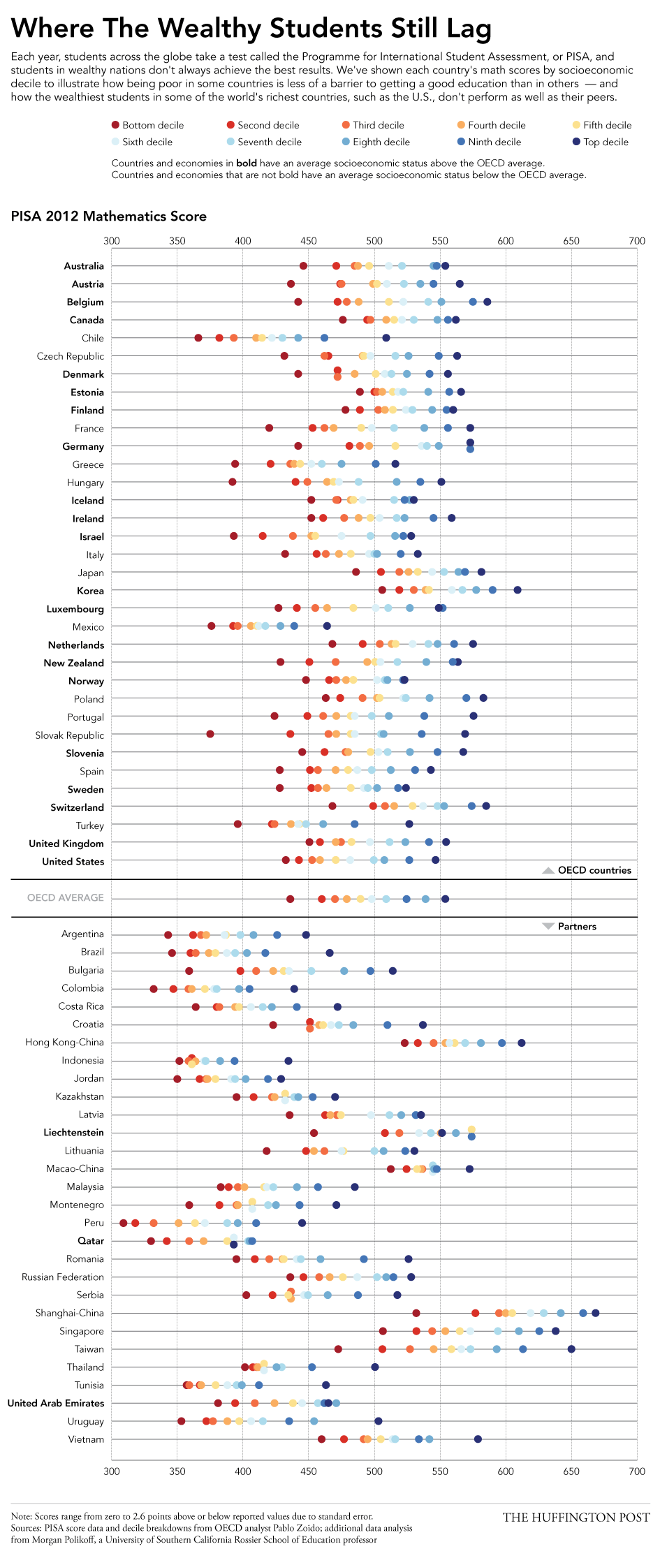
I really enjoy this piece. It plots each income decile’s results, blocks the countries into OECD members versus their partners, and then each country’s average socioeconomic status is shown as being above or below the OECD average. This is the type of piece I see as a static image that I would want to see made interactively—though I fully understand how difficult and time-consuming that can be—so that I could begin to filter and re-arrange the data. Could discoveries be made by organising countries by geographic regions? Could one just look at the top or bottom deciles?
Credit for the piece goes to Jan Diehm.
The Illinois Tollways will be raising speed limits starting 1 January. Part of that process includes researching current driving habits and patterns. This graphic by the Chicago Tribune looks at some of the results. While the map part is necessary to show the routes themselves and the limits on those routes, the more interesting part is the dot plot below.
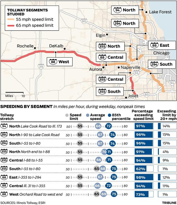
Credit for the piece goes to the Chicago Tribune’s graphic department.
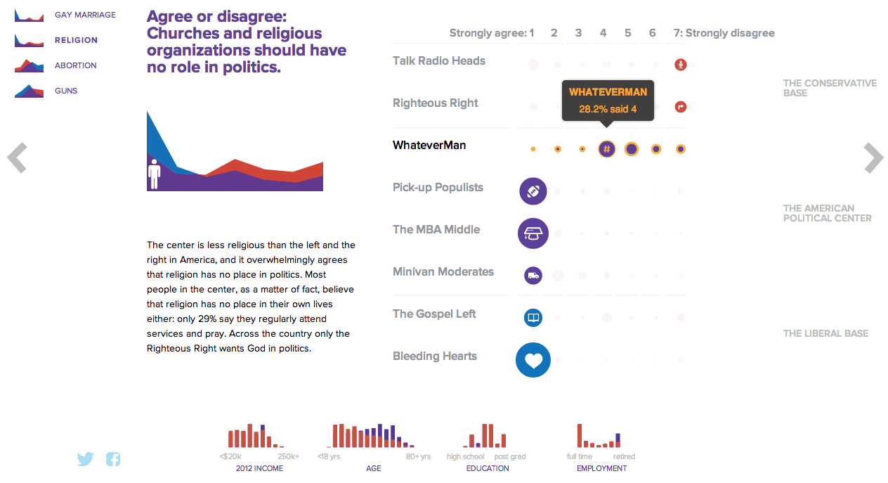
NBC News and Esquire magazine published results from their August survey of some 2000+ respondents that attempted to define the New American Center, i.e. the political persuasions of the majority of the country excepting the radical right and the loony left. For the purposes of Coffee Spoons, I am most interested in looking at the data visualisation and the infographics that result.
Both NBC News and Esquire visualised the results. While I could write two long blog posts looking at both of them, for today, it is more important to look more at the fundamental design difference between the two.
NBC News opted for a design direction emphasising data first. Perhaps because NBC is a news platform, their focus was on the clean communication of the data. Looking
On the other hand, Esquire opted for a more sensationalised direction. The same data points used for the screenshot above creates this graphic below. Not only is less data is contained, less context given, less subtlety and nuance captured, it also is just difficult to read. Is the 59% supposed to be the area of the cross filled in? Its length? Why is it three-dimensional? Where are the Snowdens of yesteryear? At first glance, I ignore the horizontal wings and focus solely on the vertical length of the main bar.
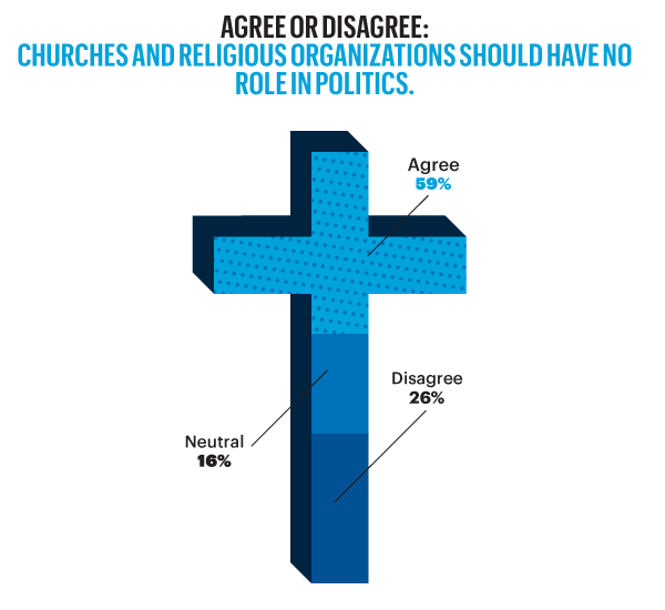
For a useful representation of data, I think NBC News clearly wins. But that both organisations used the same data to craft their separate results, this story on the New American Center is useful for comparing two different design directions and the results thereof.
No designers are specifically mentioned, at least not that I could find, so credit for each piece goes to its respective owner, i.e. NBC News or Esquire.