Florida Primary

The Republican primaries…they’re still going on…on the long inevitable road to Romney’s coronation. Next up is Florida, always an interesting state to watch. There are a lot of people there with a whole host of interesting demographic slices. Perhaps one of the most interesting ones, at least to the media, is the Hispanic vote. Other things to look at in Florida include the burst housing bubble and rather high unemployment.

The New York Times published a graphic with a few maps and charts trying to paint the landscape of the Florida primary battle. These two selections below show which Republican primary candidates won which counties in 2008 as well as the size of the Hispanic population registered Republican.
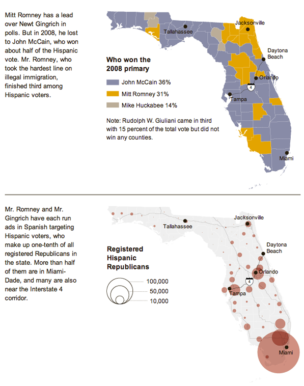
Florida primary landscape

Credit for the piece goes to Haeyoun Park.

Apple And Its Suppliers

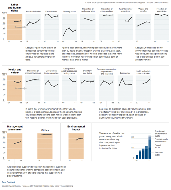
American companies have long been moving their manufacturing overseas. Apple is no exception. However, Apple does audit its suppliers to ensure they are in compliance with the company’s code of conduct. The New York Times reported on this and included a graphic along with its article.

Apple Audits Its Suppliers

We have small multiples of line charts with small blurbs of text to highlight key stories. Clean, clear, and communicative. I contrast this with the number of charts one might see in business presentations, which presumably would have similar content in terms of audits and performance for a company, where these lines would normally be smashed together into one chart. At that point lines become indistinguishable from each other and the individual stories are missed among a muddle of a main story. Furthermore, in my experience, a business presentation would make full use of the width of the medium, in this case some 900 pixels or so. And for this story in particular that would mean, at most, by my count, 900 pixels for 5 plotted points in a timeline.

Seeing work like this is refreshing.

Show Europe the Money

The Guardian has an interactive piece that details payments to and from European Union member states to institutions, determining whether each state is a giver or receiver.

Comparing payments and receipts in EU member states

The concept sounds all well and good. However, the piece itself feels clumsy with too much scrolling and whipping about to pan across the whole EU. The charts look a tad heavy—which could have been remedied for a more concise piece—and the callouts beg for a level of interactivity that is otherwise lacking.

Lastly, I have concerns about the list of countries at the top, although these may stem only from the point of view of an American not too familiar with Europe. Flags are not circles, they are, in most cases, rectangular in shape. Does cropping a symbol or icon of a country make it more or less useful of a symbol or icon? Furthermore, do the British recognise the flags of their fellow EU member states?

The country icons/flags call for some type of sorting function, to compare payments and receipts and their balance. But, instead, they sit there in unalterable silence, providing only an economic overview when clicked. An overview that through its staid design feels more like an afterthought.

The Finances of Social Security

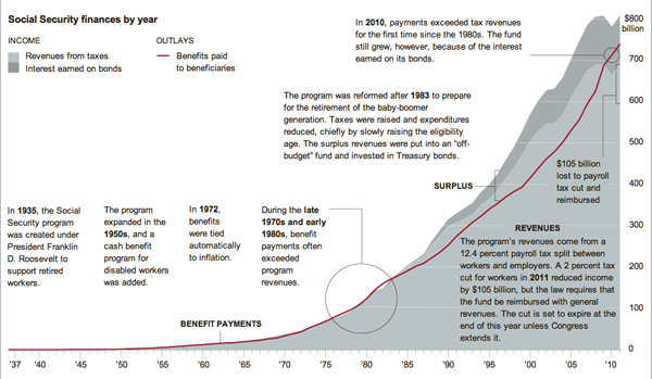
Simple graphs can tell great stories with little annotations. This graphic by the New York Times illustrates that point well with a stacked line chart set behind a line on the same scale. The two should match, or at least the red should be beneath the greys. When they don’t, you have a story and the Times calls it out.

Social Security Revenue vs. Expenditure

Why the Riots?

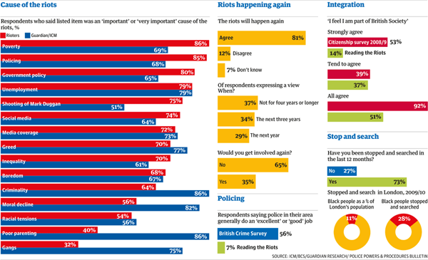
The riots in the UK earlier this year prompted questions about British society and the causes behind the riots. The Guardian has been reporting on different elements of the riots for some time now and has released the results of their work on discovering those causes. And naturally, survey results should be visualised for more awesomeness.

Surveying Rioters
Surveying Rioters

The discrepancies between the causes should be interesting. However, the number of bars and their tight spacing along with contrasting colours makes me wonder if the chart would be more effective not if it plotted the value of the responses, but rather the value of the difference in the responses.

Exporting the Sun

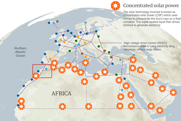
Plans are afoot to harness the power of the sun in the deserts across northern Africa. The electricity generated in Morocco is planned to turn on light switches in Madrid and throughout the rest of Europe.

The Guardian created a map to show how the solar facilities could be connected to each other and to other renewable power sources in Europe—from Icelandic geothermal plants to North Sea wind turbines to Alpine hydroelectric plants.

Renewable Power Map
Renewable Power Map

Credit for the piece goes to Christine Oliver.

Technology Today

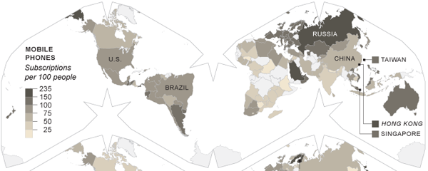
Technology changes and changes rapidly. The United States led the way with cabled phone networks. Now, countries in Africa are skipping landlines and moving straight to mobile phones. The New York Times has an piece on the changes in technology and accompanies that piece with small multiples of choropleth maps that showcase different technologies and their prevalence.

Mobile Phone Subscriptions

What is interesting about these maps is that the Times eschewed the conventional Mercator or Robinson map projections and went with a slightly more unusual layout. But, a layout that saves some space by its contortion of the world’s oceans. Was their reason spatial or something more about maintaining consistent area? I would be curious to see the piece in print to see if it needed to fit a narrow column.

All in all, an interesting set of maps.

Food Consumption

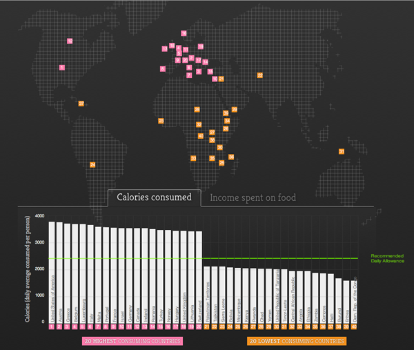
Via Fareed Zakaria, an interactive piece by Food Service Warehouse that looks at the leading nations of food consumption in calories—and what people spend for their food.

Leading (and Lagging) Food Consumers

The map is not entirely useful, although it does at least hint at the geographic locations of the largest consumers (the West) and the smallest consumers (the Rest of the World). More interesting is the simple bar chart at the bottom of the interactive piece.

The BRICs a Decade Later

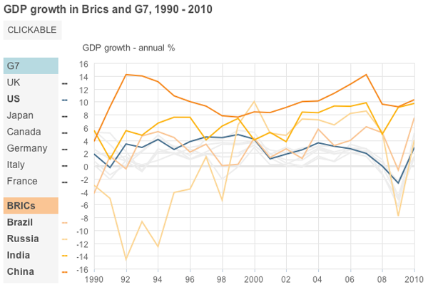
The BRICs are ten years old. Well, not really. But the concept of Brazil, Russia, India, and China becoming some of the world’s largest economies is. Well, not even that necessarily. But the coining of the term BRIC is a decade old. So the BBC has a small interactive piece showing why the BRICs matter.

BRIC GDP Growth compared to that of the US

They do some interesting things with the use of hues and tints to group lines in the line charts and provide consistent groupings throughout the piece. And they have photos of leaders. Just in case you do not know what the finance minister of Italy looked like back in 2001…just do not ask me to remember his name.