Baseball’s Free Agency Problem

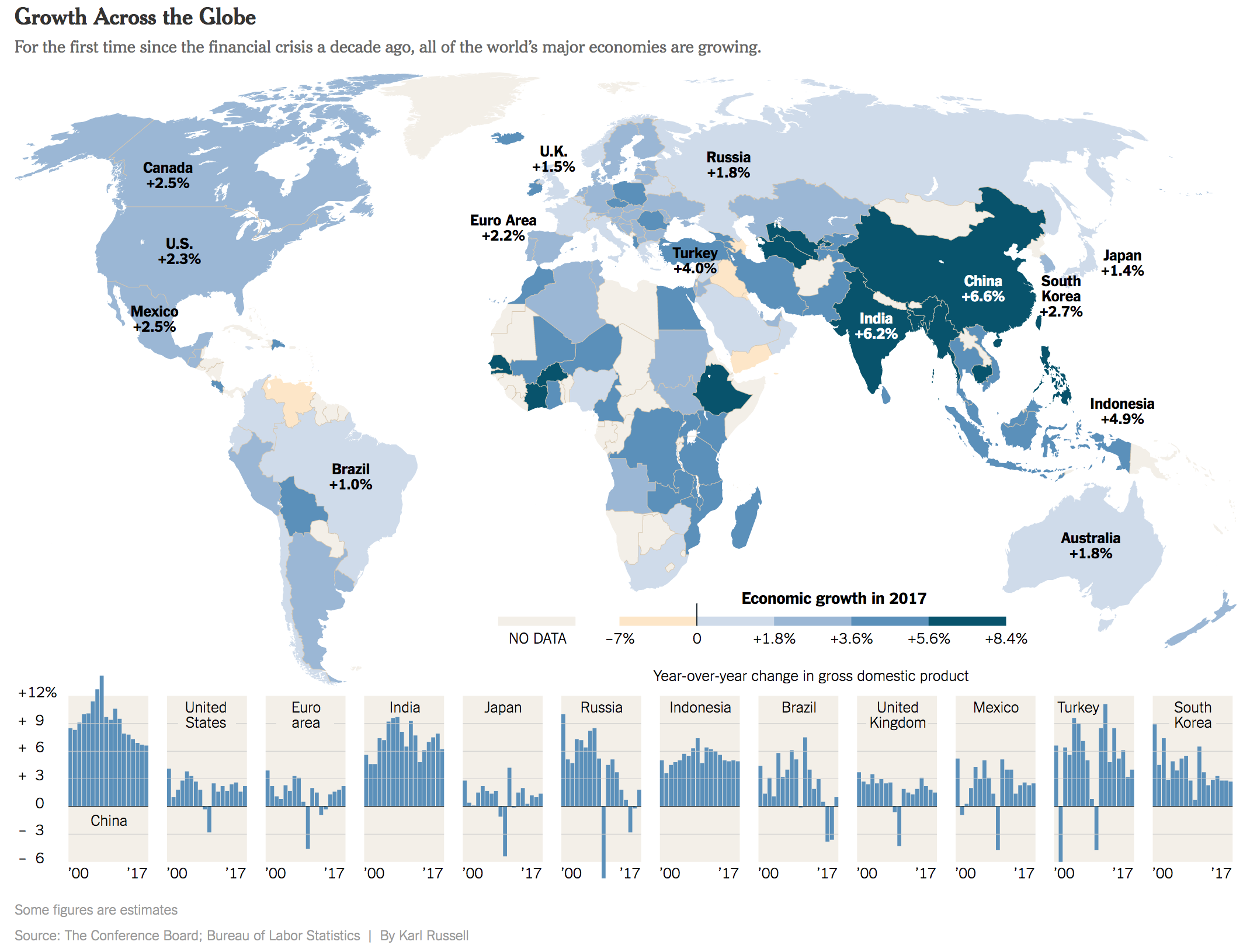
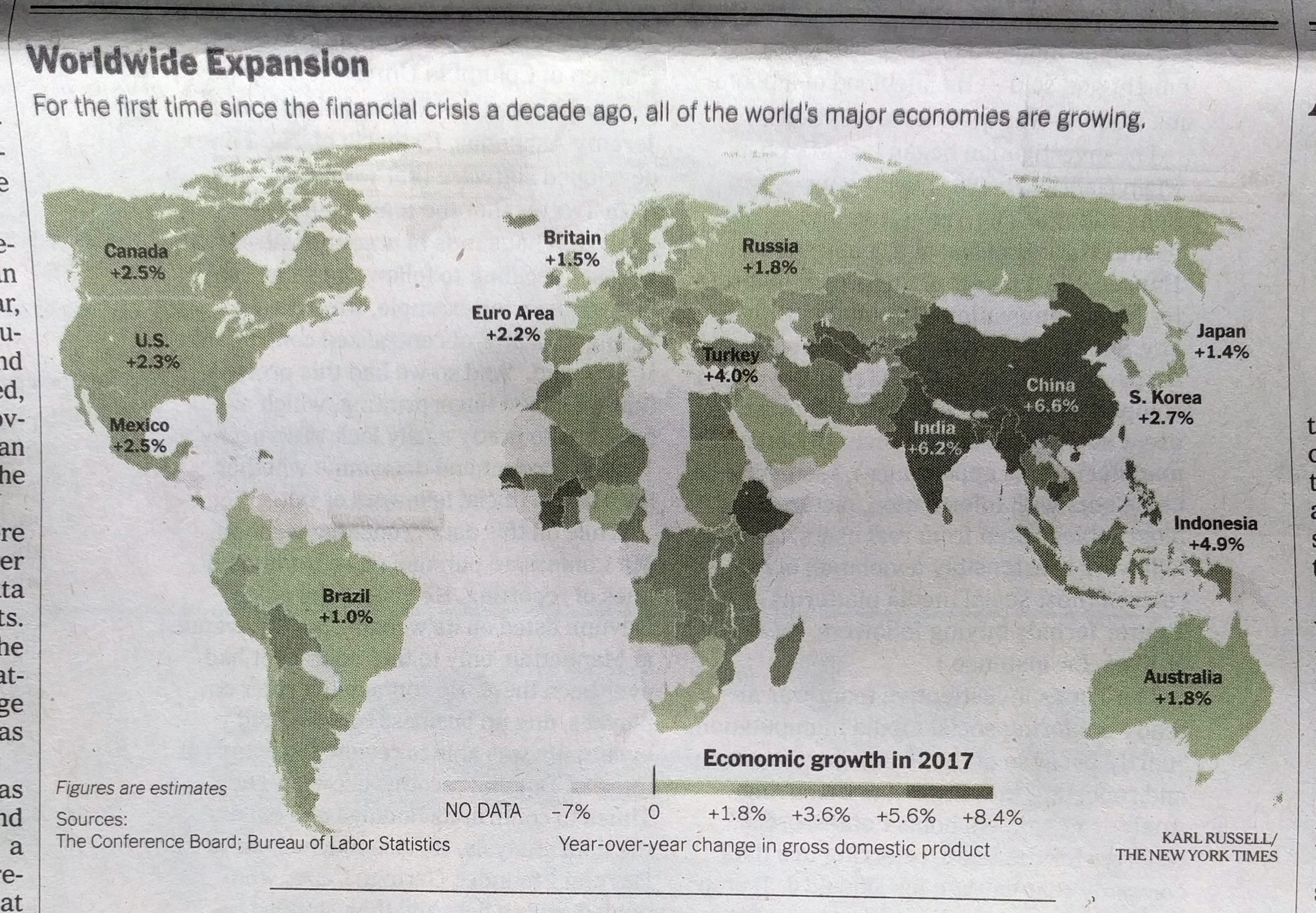
Baseball season begins next week. For different teams it starts different days, but for the Red Sox at least, pitchers and catchers report to Spring Training on Tuesday. But the Red Sox, along with many other teams throughout baseball, have holes in their roster. Why? Arguably because nearly 100 free agents remain unsigned.

I do not intend to go into the different theories as to why, but this has been a remarkably slow offseason. How do we know? Well using MLB Trade Rumours listing of the top-50 free agents this year, and the signings reported on Baseball Reference, we can look at the upper and middle, or maybe upper-middle, tiers of free agency.

The upper tiers of baseball's free agent market, as of 9 February
The upper tiers of baseball’s free agent market, as of 9 February

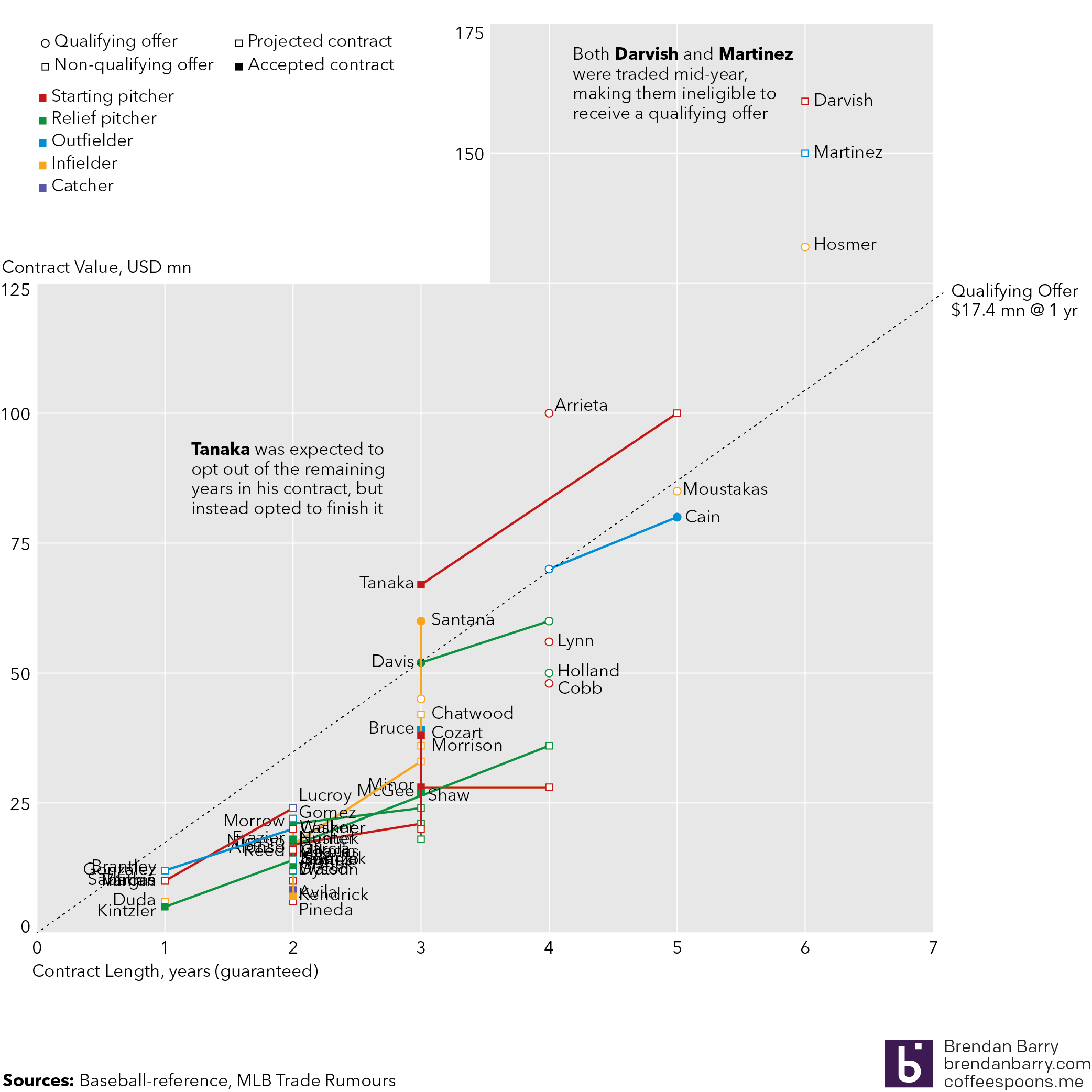
Kind of messy to look at with all the player labels, but we can see here the projected contracts, in both length and total value, along with the contracts players signed, if they have. And for context we can see how those contracts compares to the Qualifying Offer (QO). What’s that? Complicated baseball stuff that is meant to ensure teams that lose stars or highly valuable players are compensated, especially since they might come from smaller market teams that cannot afford superstar prices. The QO is meant to help competitiveness in the sport. How does it do that? Let’s just say complicated baseball stuff. We should also point out that some players, most notably the Yankees’ Masahiro Tanaka, were expected to opt out of their contracts and try the free market. Tanaka did not, which is why his projection was so far off.

Comparing the signed to the unsigned free agents

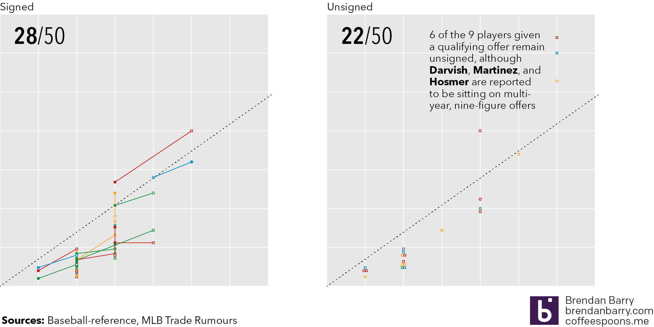
So is it true that free agency is or has moved slowly? Consider that approximately 100 free agents remain unsigned as of late Thursday night—please no big signings tomorrow morning—and that of the top 50, 22 of them remain unsigned. And if we take the QO as a proxy for the best players in the game, add in two players who were exempt because baseball stuff, we can say that 8 of the 11 best players remain unsigned. Though, in fairness to ownership, three of those players are reportedly sitting on multi-year offers in the nine-figure range.

But if players are unsigned, does that mean they are competing for lower value contracts? Possibly. If we use MLB Trade Rumours’ projected contracts, because in years past they have proven smart at these things, we can see that for the 28 who have signed, it’s a roughly even split in terms of the number of players who have signed for more or less than their projection. Sometimes however, non-monetary factors come into play. Two notable free agents, Todd Frazier and Addison Reed, both reportedly signed lesser value contracts to play closer to a specified geography, in Frazier’s case the Northeast and in Reed’s the Midwest.

How are the signed players doing versus their contract projections

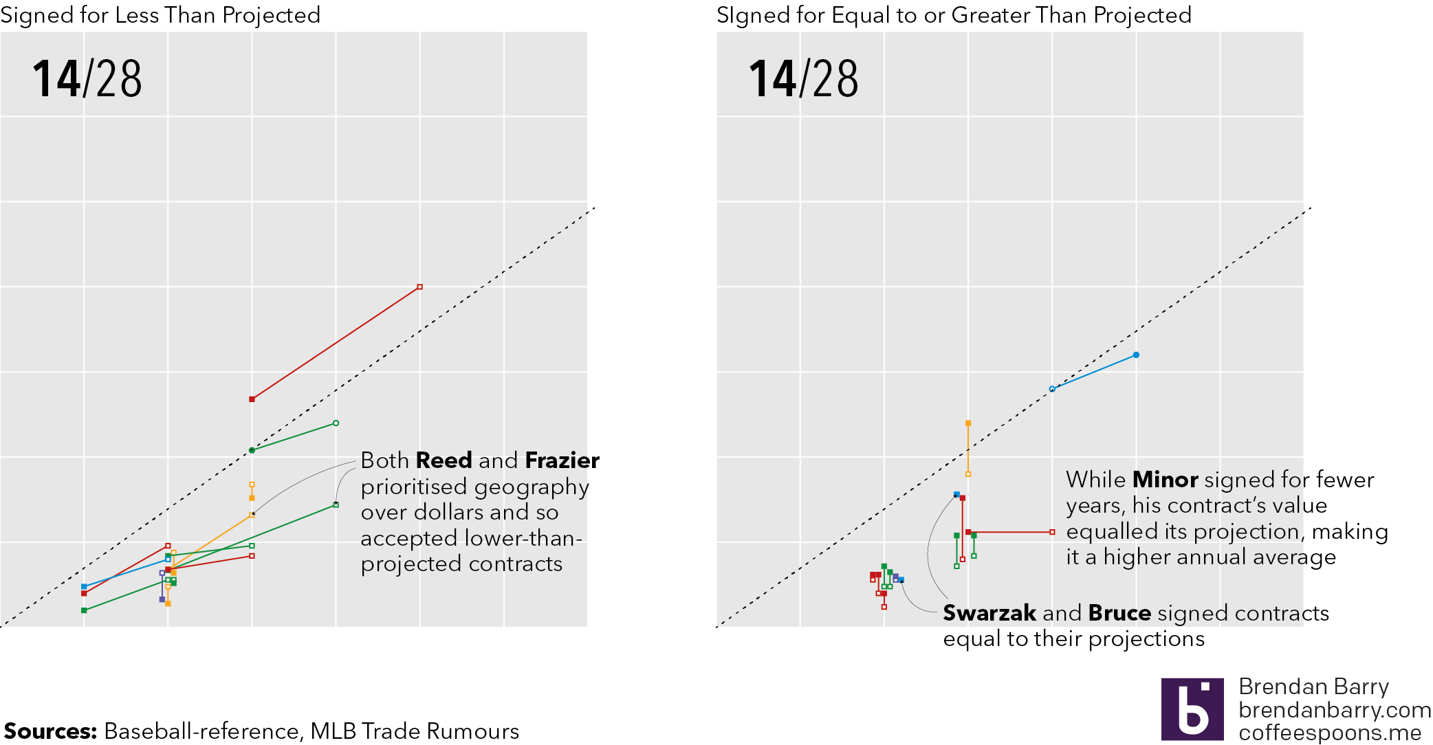
But the telling part in that graphic is not necessarily the vertical movement, i.e. dollars, but the horizontal movement. (Though we should call out the cases of Carlos Santana and Tyler Chatwood, signed by the Phillies and Cubs respectively, who did far better than projected.) Consider that a team might not have a lot of money to spend and so might extend a contract over additional years, offering job security to a player. Or in a bidding war, the length of the contract might be what leads a player to pick one team over another. In those cases we would expect to see more left-to-right movement. So far we have only had one player, Lorenzo Cain, who signed for more years than expected. Most players who have signed for less have also signed for fewer years. Note the cluster of right-to-left, or shorter-than-expected, contracts in the lower tiers versus the small, vertical-only cluster in the same section for those signing greater than projected contracts.

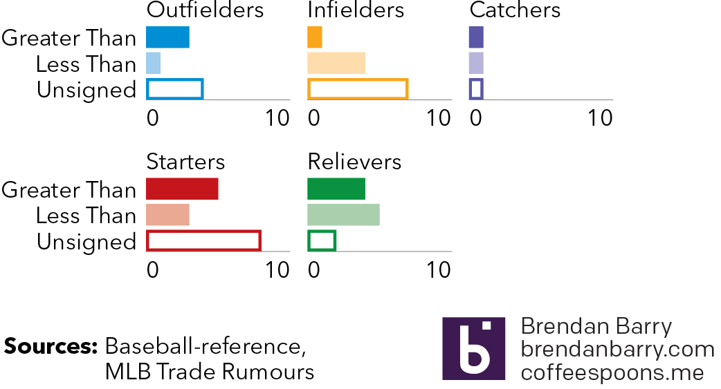
Lastly, are these trends hitting any specific positional type of player? Well maybe. Ignoring the market for catchers because of how small the pool was—though the case of Jonathan Lucroy as the unsigned catcher is fascinating—we can see that the market has really been there for relief pitchers as there are few of the top-50 remaining on the market. Starting pitchers and outfields, while with quite a few still on the market, have generally done better than projected. But infielders lag behind with numerous players unsigned and those that have signed, most have signed for less than projected.

Are there any trends at the position level

But at the same time, I would fully expect that once these higher level free agents come off the board—while one would think they would certainly be signed, who knows in such a weird offseason as this—the unsigned middle and lower tiers will quickly follow suit.

Of course none of this touches upon age. (Largely because lack of time on my part.) Though, in most cases, getting to free agency in and of itself makes a player older by definition the way baseball’s pre-arbitration and arbitration salary periods work. (Again, more baseball stuff but suffice it to say your first several years you play for peanuts and crackerjacks.)

Hopefully by this afternoon—Friday that is—some of these players will have signed. After all, baseball starts next week. If we are lucky this post will be outdated, at least in terms of the dataset, come Monday. Regardless, it has been a fascinating albeit boring baseball offseason.

Credit for the data goes to MLB Trade Rumours and Baseball Reference.

Short and Long Term

One week ago today, President Trump touted soaring stock prices as an indicator of a roaring economy. In truth, stock market prices are not that. They are driven by fundamentals, such as GDP growth, wage increases, and inflation. Furthermore stock prices can be fickle and volatile. Whereas a recession does not begin overnight, the factors build over a period of time, a stock market correction can happen in a single day.

So one week hence, the stock market has seen fully one-third of its gains over the past year wiped out. That is over $1 trillion gone from market funds, 401ks, college saving funds, &c. But again, not to freak people out, these things can and do happen. But because they can and do happen, presidents do not often go touting the stock market as it can come back and bite them.

This morning’s paper therefore had a pleasant graphic to accompany a story about the recent declines. And it was on the front page.

The front page
The front page

Like with the choropleth story I covered a little over a week ago, the graphic in today’s paper was not revolutionary nor earth shattering. It was two line charts as one graphic. What was neat, however, was how it supported two different articles.

One graphic, two articles

But when I looked closer I found what was really neat: context.

Notice the little arrow…

The chart does a great job of showing that context of adding nearly $8 trillion in value over the course of the administration. But then that sharp decline at the right-side of the chart is blown out into its own detail to show how all was steady until Friday’s economic news was released. I think perhaps the only drawback is how tiny and fragile that arrow feels. I wonder if something a little bolder would better draw the eye or connect the dots between the two charts. Maybe even moving the “… and the last week” line above the chart line would work.

Anyway, I was just curious to see how the charts were depicted on the web. And then lo and behold I was treated to two graphics on the home page. The other is for an article about flood risks to chemical plants, not part of this post. But the focus of our post on the stock market was the same as in print. But here is the homepage with two different graphics, always a treat for a designer like myself.

The New York Times homepage this morning

Credit for the piece goes to the New York Times graphics department.

The World Grows On (Part III)

A few days ago I posted about the front cover graphic for the New York Times that used a choropleth to explore 2017 economic growth. Well, this morning whilst looking for something else, I came across the online version of the story. And I thought it would be neat to compare the two.

A very nice graphic
A very nice graphic

Again, nothing too crazy going on here. But the most immediately obvious change is the colour palette. Instead of using that green set, here we get a deep, rich blue that fades to light very nicely. More importantly, that light tan or beige colour contrasts far better against the blue than the green in the print version.

The other big change is to the small multiple set at the bottom. Here they have the space to run all twelve datasets horizontally. In the earlier piece, they were stacked six by two. It worked really well, but this works better. Here it is far easier to compare the height of each bar to the height of bars for other countries.

Credit for the piece goes to Karl Russell.

State of the Union Data

Well there was a lot to poke and prod at in last night’s State of the Union. So over the next couple of days I will be looking at some of the data. I wanted to start with something I could look at over breakfast—unemployment rate data.

President Trump claimed unemployment rates are at the lowest rate in…I forget how many years he claimed. But in a while. And he is correct. But, as this chart shows, he entered office with unemployment rates very near those record lows. A few tenths of a percentage point lower and voila, all-time low. What the data shows is that the bulk of the fall in the unemployment rate actually came under the watch of the Obama administration. The rate peaked at the end of the Great Recession at 10% before falling all the way down to 4.8%, which is about the natural unemployment rate that is somewhere between 4.5% and 5%, what you would expect in a healthy economy.

The unemployment rate

Data is from the Bureau of Labour Statistics, chart is mine.

The World Grows On (Part II)

Earlier this month I wrote-up a piece from the Economist that looked at 2018 GDP growth globally. I admitted then—and still do now—that it was an oddly sentimental piece given the frequency with which I made graphics just like that in my designer days of youth and yore. Today, we have the redux, a piece from the New York Times. Again, nothing fancy here. As you will see, we are talking about a choropleth map and bar charts in small multiple format. But why am I highlighting it? Front page news.

Choropleth on the front page? More please.

I just like seeing this kind of simple, but effective data visualisation work on the front page of a leading newspaper.

Lots of green on that map

I personally would have used a slightly different palette to give a bit more hint to the few negative growth countries in the world—here’s lookin’ at you, Venezuela—but overall it works. And the break points in the bin seem a bit arbitrary unless they were chosen to specifically highlight the called-out countries.

Then on the inside we get another small but effective graphic.

Page 4
Page 4

It doesn’t consume the whole page, but sits quietly but importantly at the top of the article.

The world's leading economies, on their own
The world’s leading economies, on their own

There the small multiples show the year-on-year change—nothing fancy—for the world’s leading economies. A one-colour print, it works well. But, I particularly enjoy the bit with China. Look at how the extreme growth before the Great Recession is handled, just breaking out of the container. Because it isn’t important to read growth as 13.27% (or whatever it was), just that it was extremely high. You could almost say, off the charts.

Overall, it was just a fun read for a Sunday morning.

Credit for the piece goes to Karl Russell and the New York Times graphics department.

The Shitholes

Today’s post is a very quick reaction to the news last night about President Trump calling Haiti, El Salvador, and African countries “shitholes” and trying to get rid of immigrants from those countries in favour of immigrants from places like Norway.

Norwegian contributions to American immigrants peaked well before the 21st century. At that time, Norway was poor and lesser developed. The data was hard to find, but on a GDP per capita level, Norway was one of the least developed countries in Western Europe. On a like dollar-for-dollar basis, El Salvador of 2008 is not too far from Norway 1850.

I wish I had more time to develop this graphic for this morning. Alas, it will have to do as is.

I'm just really hoping Africa isn't a country again…
I’m just really hoping Africa isn’t a country again…

The World Grows On

January is the month of forecasts and projections for the year to come. And the Economist is no different. Late last week it published a datagraphic showcasing the GDP growth forecasts of the Economist Intelligence Unit. I used to make this exact type of datagraphic a lot. And I mean a lot. But what I really enjoy is how successfully this piece integrates the map, the bar chart, and the tables to round out the story.

Take a note at how the chart distributes the bins as well

The easy thing to do is always the map, because people like maps. They can be big, and if the data set is robust, full of data and colour. But maps hide and obscure geographically small countries. And then you have to assume that people know all the countries in the world. Problem is, most people do not.

So the bar chart does a good job of showing each country as equals, a slim vertical bar. In such a small space, labelling every country is impossible, but the designers chose a select number of countries that might be of interest and called them out across the entire series.

Lastly, people always like to know who is #winning and who is a #loser. So the tables at the extreme ends of the chart showcast the top and last five.

I may have rearranged some of the elements, and dropped the heavy black rules between the bins on the legend, but overall I consider this piece a success.

Credit for the piece goes to the Economist Data Team.

Phillip’s Curves are Flatlining

I’ve worked on a few scatter plots of late and so this piece from the Economist grabbed my attention. It examines the correlation between unemployment rates and inflation rates. Broadly speaking, the theory has been that low unemployment rates lead to high inflation rates. But the United States has had low unemployment rates now for a few years, but inflation is around that ideal 2% realm. This theory is called the Phillips Curve.

Straightening out the curve…

The graphic does a nice job of showing three data series all in one plot. Normally, I would argue for splitting the chart into three smaller plots, a la the small multiples. But here, the data aligns just well enough that the overlapping is minimal. And smart colour choices mean that each data range appears clearly separate from the rest. A nice thoughtful addition is the annotations to the time period are set in the same colour as the dots themselves.

My only two quibbles: One, I would probably increase the height of the chart to better show the trend line. I find that for scatter plots, a more squarish profile works better than the long rectangle. Overall, though, a really well done chart. Second, I would consider adding a zero line to the x-axis to show 0% cyclical unemployment. But that might also not be terribly useful, because you can see how the curve should move regardless of that natural line.

Full disclosure: the Economist article cites a paper from the Philadelphia Fed Research Department, which employs me.

Credit for the piece goes to the Economist Data Team.

An Ailing Graphic on the Healthcare Labour Force

I know I have said it before, but I like the increasing number of graphics-led articles published by Politico. Many policy and politics stories are driven—or should be driven—by data. But, myself included, we cannot hit it out of the park at every plate appearance. And that is what we have from Politico today, actually last week.

The graphic focuses on the healthcare industry and its need for a larger labour force in coming years as the baby boomers continue to age and start to retire. If their own doctors retire along with them, who will be their new doctors?

But there are two components of the graphic on which I want to focus. The first is the projection of the number of registered nurses (RNs) in 2024 compared to a 2014 baseline.

We need more. Just more.

The story focuses on the future condition, but that colour is set to the lighter green thus drawing the reader’s eyes to the 2014 data point. Flipping those two colours would shift the focus of the chart to the 2024 timeframe, which would better match the text above.

Then we have the design decision to include a line chart for the growth rate, presumably total, for each category of RN from 2014 to 2024. The problem is that the chart itself does not sit on any baseline. While I do not care for the dual axis chart, that format at least keeps an axis legend on the right side of the chart. (You still have the problem of implying certain things based on what scale you choose to use relative to the first data series.) Here, because there is no chart lines associated with the growth data, I wonder if a table below the x-axis labels would be more efficient? Home health care, a very small category, will have the highest growth (a small change from a small base will beat the same small change or even slightly bigger changes from a far larger base) but the eye has the furthest to travel to reach the 61% number from the top of the bars or the labelling.

The other component I wanted to discuss is the scatter plot that compares the number of jobs to their average salary.

Bursting these bubbles…

But this is a bubble chart, not a scatter plot, and so we have a third variable encoded in the size of the dot/bubble. The first thing I looked for was a scale for the size of the circles. What magnitude is the RN circle vs. the Personal Care Aides circle? There is none, but unfortunately that seems to be a common practice with bubble chart. But after failing to find that, I noticed that the circles decrease in size from right to left. That was when I looked to the legend and saw the y-axis in numbers of jobs and the x-axis in average salary. But then the circles are sized in proportion to the average salary of each profession to the other. In other words, the circles are basically re-plotting the x-axis. The physical therapist circle should be roughly twice as large, by area, than the vocational nurses. But we can also just see by the x-axis coordinates. The bubble chart-ness of the chart is unnecessary and the data could be told more clearly by stripping that away and making a straight-up scatter plot where all the circles are sized the same.

Credit for the piece goes to Christina Animashaun.

Whom the Tax Reforms Will Benefit Most

Yesterday the New York Times published a piece looking at the potential impacts of the proposed tax reforms on Americans. Big caveat, not a lot has been detailed about what the reforms entail. Instead, much remains vague. But using the bits that are clear, the Tax Policy Centre has explored some possible impacts and the Times has visualised them.

RIch do richly
RIch do richly

I like the opening graphic, though all are informative, that cycles through various proposals. It highlights which group benefits most from the proposals. The quick takeaway is that while all would moderately benefit, the rich do really well.

Credit for the piece goes to Ernie Tedeschi.