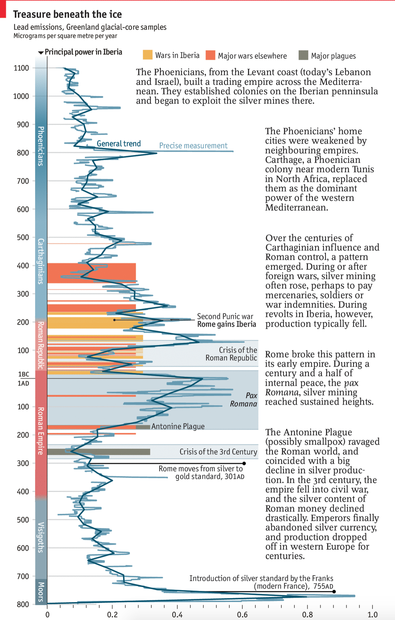
A few weeks back now the Economist posted a graphic about the link between lead, silver, and the rise and fall of the Roman Empire. But not in the way you probably think. Instead, they graph the appearance of lead deposits in the glaciers of Greenland.
I believe that final Iberian power is meant to be the Moops.
For the full explanation you should read the short article. But this piece was right up my alley. We have ancient history, economics, science, and a timeline. And all in one neat little chart.
Credit for the piece goes to the Economist’s Data Team.
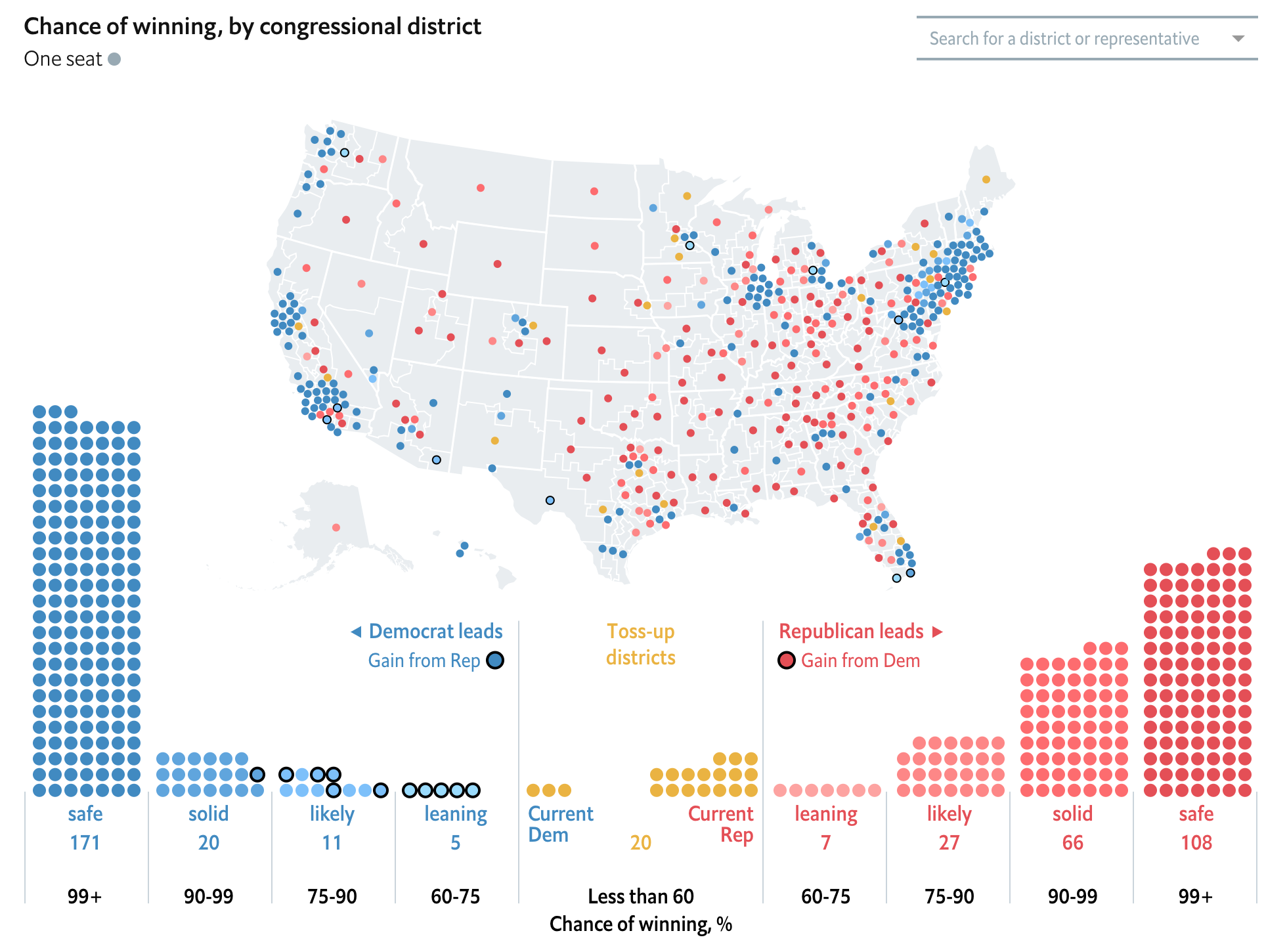
We are inching ever closer to the US midterm elections in November. In less than a week the largest state, California, will go to the polls to elect their candidates for their districts. So late last week whilst your author was on holiday, the Economist released its forecast model for the results. They will update it everyday so who knows what wild swings we might see between now and the election.
I will strike out against the common knowledge that this is a wave election year and Democrats will sweep swaths through Republican districts in an enormous electoral victory. Because while Democrats will likely win more overall votes across the country, the country’s congressional districts are structurally designed to favour Republicans as a result of gerrymandering after the 2010 Census redistricting. The Economist’s modelling handles this fairly well, I think, as it prescribes only a modest majority and gives that likelihood as only at 2-in-3. (This is as of 30 May.)
But how is it designed?
The big splashy piece is an interactive map of districts.
The overall state of the US in the 30 May run of the model
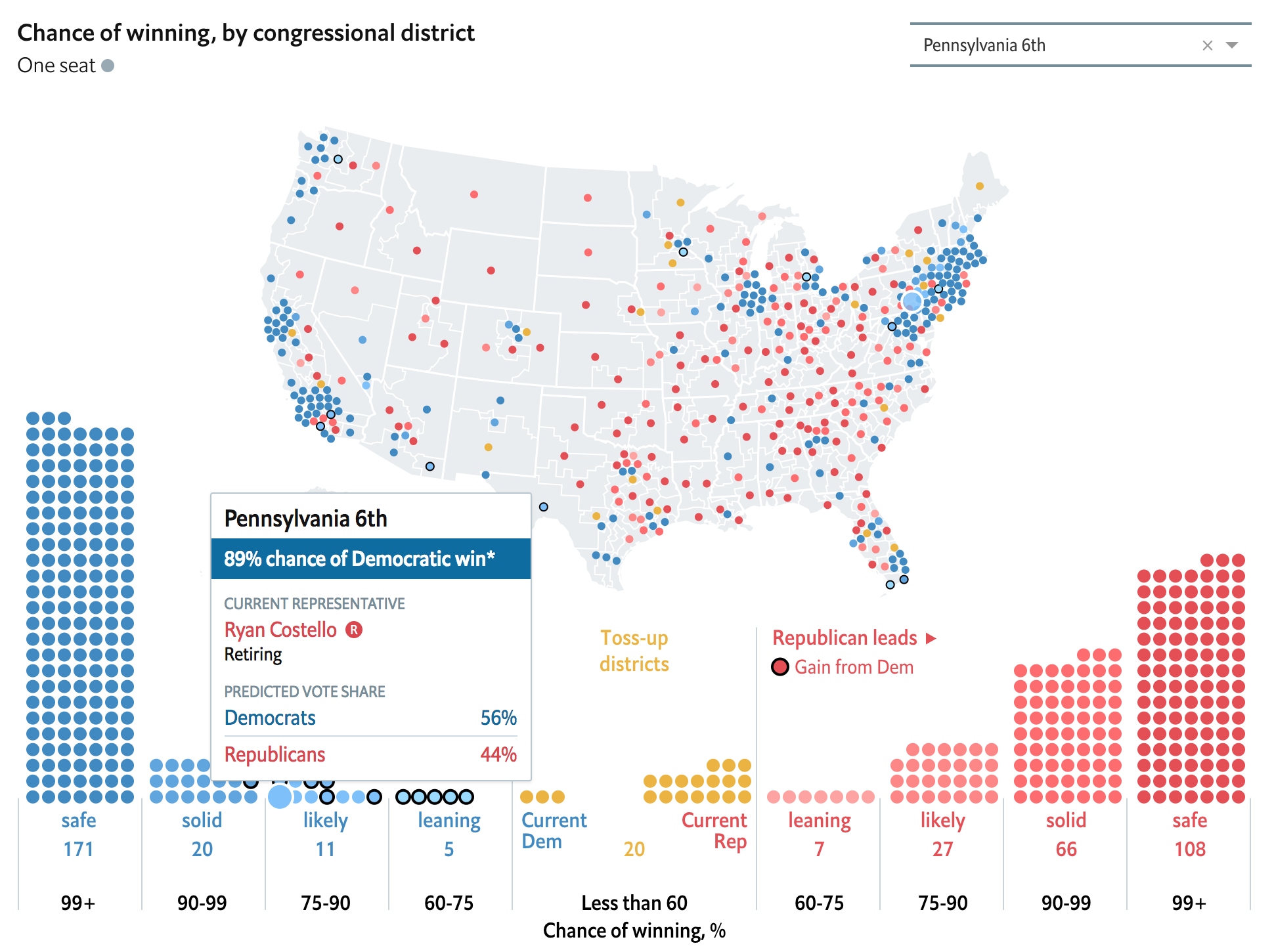
It does a good job of connecting individual districts to the dots below the map showing the distribution of said seats into safe, solid, likely, leaning, and tossup states. However, the interactivity is limited in an odd way. The dropdown in the upper-right allows the user to select any district they want and then the district is highlighted on the map as well as the distribution plot below. Similarly, the user can select one of the dots below the map to isolate a particular district and it will display upon the map. But the map itself does not function as a navigation element.
Selecting the newly drawn Pennsylvania 6th
I am unsure why that selection function does not extend to the map because clearly the dropdown and the distribution plot are both affecting the objects on the map. Redeeming the map, however, are the district lines. Instead of simply plopping dots onto a US state-level map, the states are instead subdivided into their respective congressional districts.
But if we are going so far as to display individual districts, I wonder if a cartogram would have been a better fit. Of course it is perfectly plausible that one was indeed tried, but it did not work. The cartogram would also have the disadvantage of, in this case, not exhibiting geographically fidelity and thus being unrecognisable and therefore being unhelpful to users.
Now the piece also makes good use of factettes and right-left divisions of information panels to show the quick hit numbers, i.e. how many seats each party is forecast to win in total. But the map, for our purposes, is the big centrepiece.
Overall, this is solid and you better bet that I will be referencing it again and again as we move closer to the midterms.
Credit for the piece goes to the Economist Data Team.
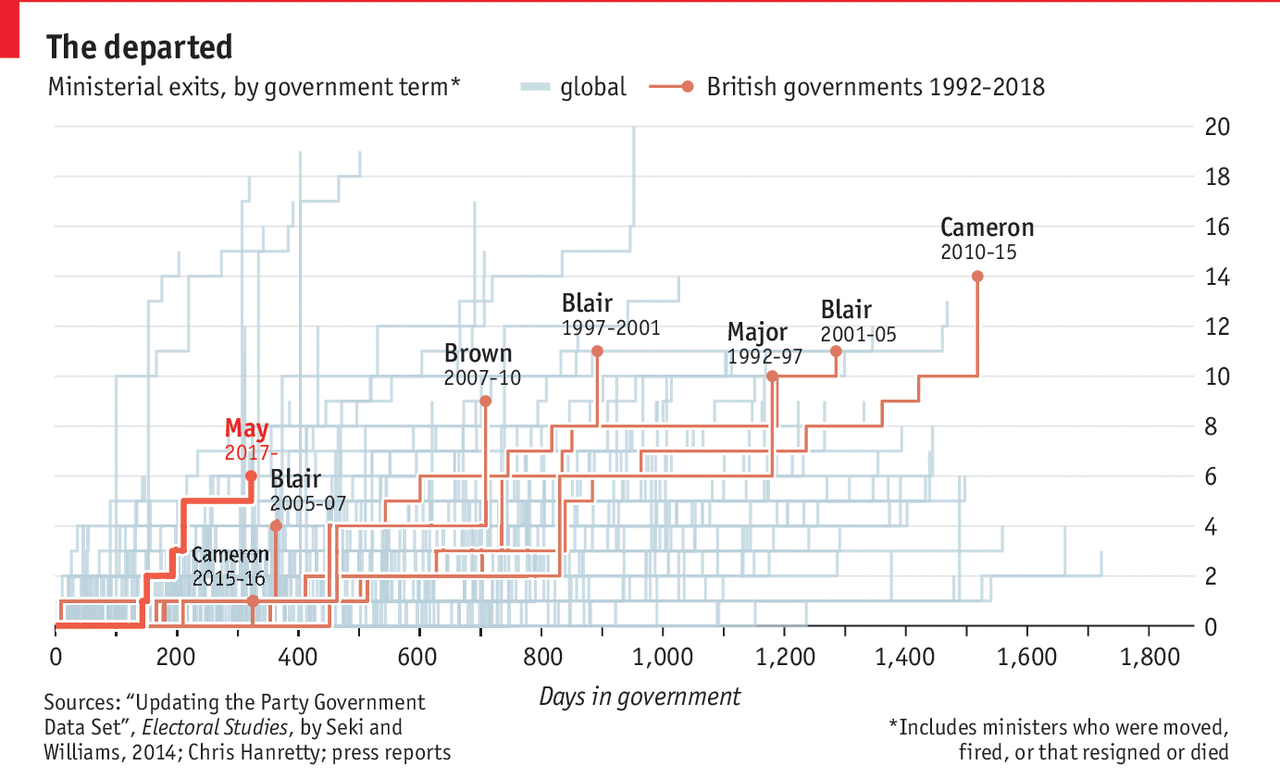
Here in the States we are accustomed to unstable governments—the Trump administration has set records for the most departures so early in its term. But the United Kingdom is not to be outdone as Amber Rudd, the Home Secretary, resigned in response to an immigration scandal. She makes six the number of cabinet officials who have left the British government.
The Economist put together a small graphic showing how long it took various governments, British and otherwise, to reach the level of so many departures. May’s government has been the fastest to reach so many departures in recent years.
I wonder where the US administration falls…
The key thing to note here is what I pointed out last week, which is the use of a thin white stroke on the outside of the lines being highlighted with the Theresa May government using a bolder weight to make it stand out just a wee bit more. This is a bit different than the Times version which uses the outline approach for only what would here be the May line, but it still works overall to draw attention to the British governments.
Credit for the piece goes to the Economist graphics department.
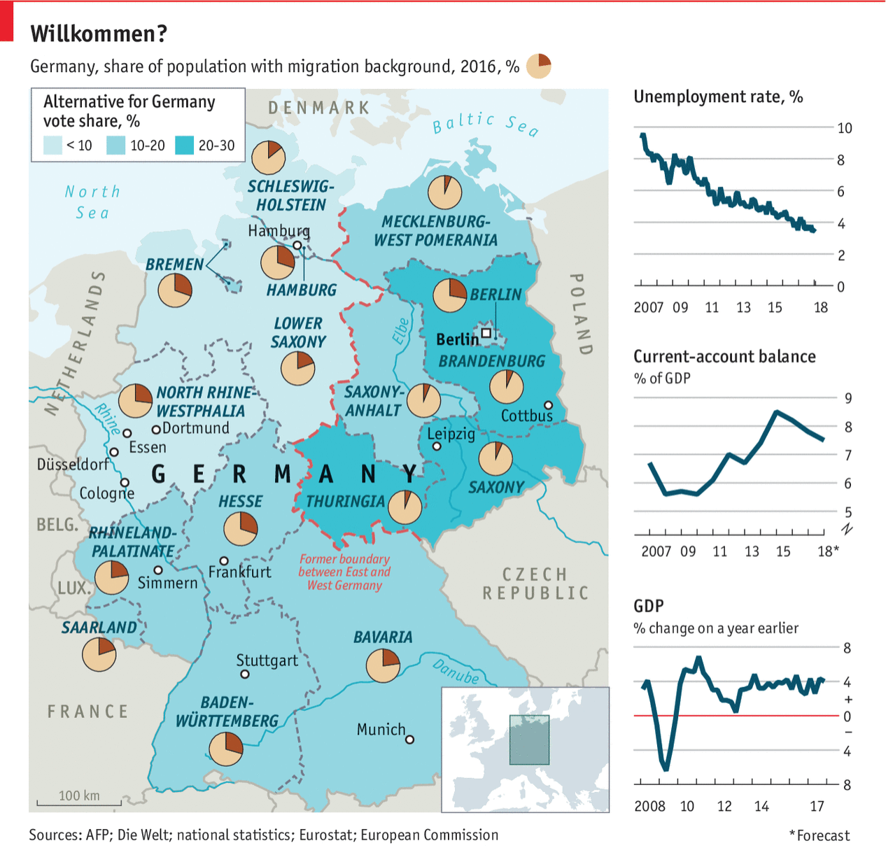
Last week Angela Merkel, the German chancellor, visited President Trump in Washington. This post comes from the Economist and, while not specifically about that trip, describes Germany in a few different metrics. Back in the day it would be what I called a country-specific datagraphic. That is, it shows metrics not necessarily connected to each other, but all centred around a country. In theory, the framework can then be used to examine a number of different countries.
The thin red line…
That sort of works here, except the choropleth is for the Alternative for Germany political party. That only real works as a metric in, you know, Germany.
Overall, I like the piece. The layout works well, but Germany is fortunate in that the geographic shape works here. Try it with Russia and good luck.
First let us dispense with the easy criticism: do we need the box map in the lower right corner to show where in the world Germany is? For Americans, almost certainly yes. But even if you cannot identify where Germany is, I am not certain its location in Europe is terribly important for the data being presented.
But the pie charts. I really wish they had not done that. Despite my well-known hatred of pie charts, they do work in a very few and specific instances. If you want to show a reader 1/4 of something, i.e. a simple fraction, a pie chart works. You could stretch and argue that is the case here: what is the migrant percentage in Bavaria? But the problem is that by having a pie party and throwing pie charts all over the map, the reader will want to compare Bavaria to the Rhineland-Palatinate.
Just try that.
Mentally you have to take out the little red slice from Bavaria and then transpose it to Rhineland-Palatinate. So which slice is larger? Good luck.
Instead, I would have left that little fact out as a separate chart. Basically you need space for 16 lines, presumably ranked, maybe coloured by their location in former East or West Germany, and then set in the graphic. Nudge Germany to the left, and eat up the same portion of Bavaria the box map, cover the Czech Republic, and you can probably fit it.
Or you could place both metrics on a scatter plot and see if there is any correlation. (To the designers’ credit, perhaps they did and found there is none. Although that in and of itself could be a story to tell.)
The point is that I still hate pie charts.
Credit for the piece goes to the Economist’s graphics department.
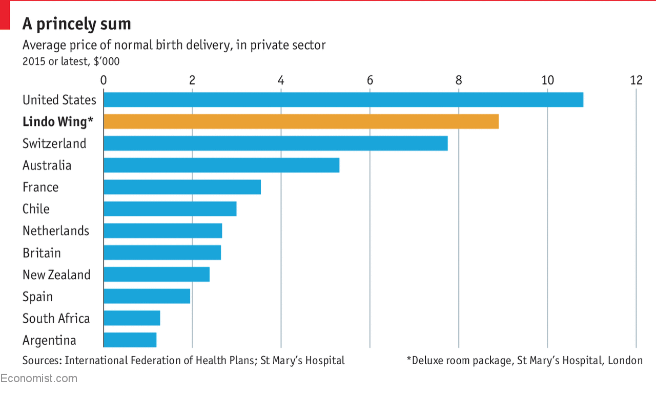
Monday was the birth of the newest British prince. We covered that here. Interestingly, the Economist then covered the cost of giving birth. No surprise, those involving royals tend to be costly. But I did not think that the average American birth actually cost more.
Babies are expensive…
Credit for the piece goes to the Economist’s graphics department.
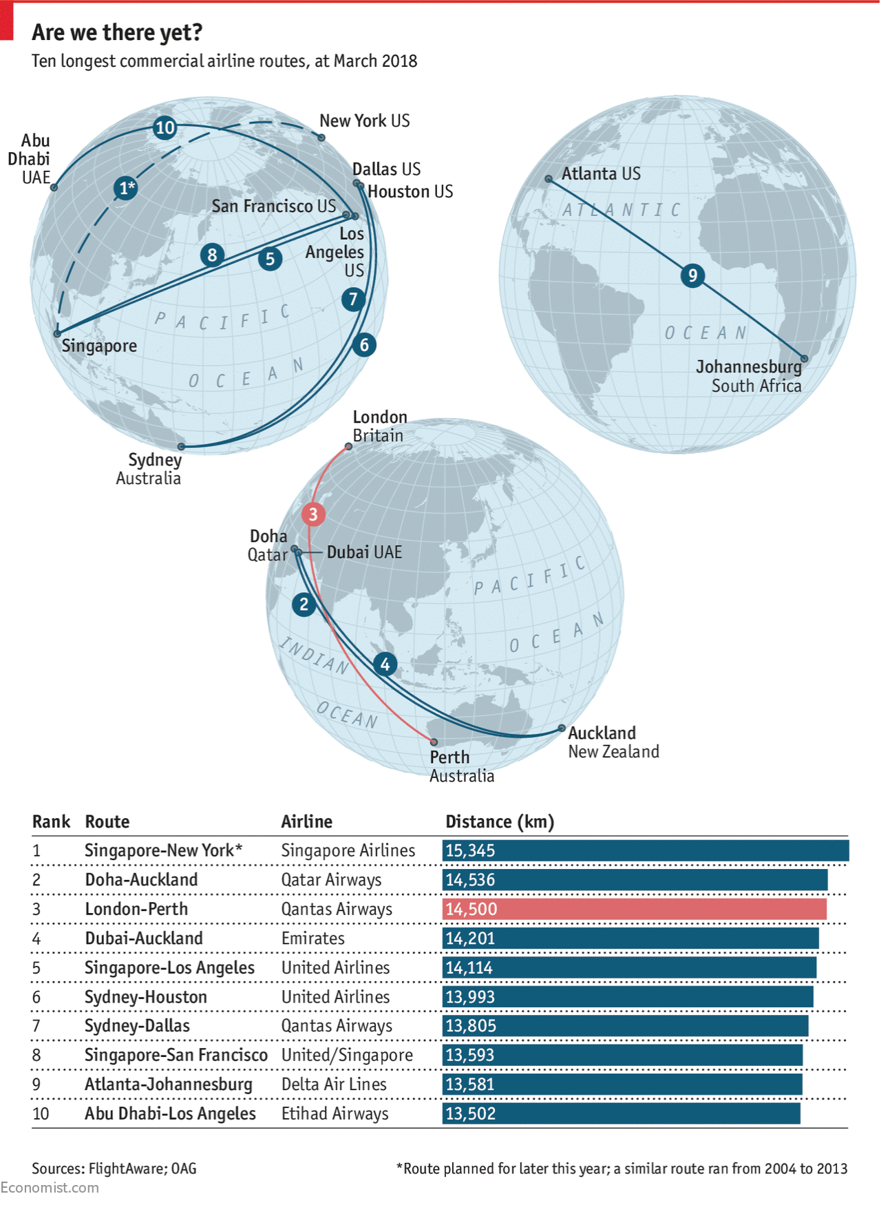
Last week I met a friend for drinks and part of our conversation was about how on a trip to east Asia, he flew from New York and then over the North Pole. The North Pole! I then explained it was cool, but not unique. Instead aircraft typically fly between destinations via great circles. Basically, the shortest distance between two points on the Earth is a straight line, but remember the Earth is not exactly flat. Its spherical nature means that the shortest distance sometimes is what you would see as a curve on a flat map. And sometimes, those curves are shortest when plotted over the North Pole, because unlike a flat map, the east and west ends really do connect.
Lo and behold, yesterday the Economist published a piece about a new non-stop flight between London and Perth, on Australia’s southwest coast. The graphic shows the ten longest commercial flight paths. And what do you know, one of the longest is a soon-to-be flight from New York to Singapore that flies near the North Pole.
Great circles are cool.
Of course the key to this type of diagram is the type of projection. Instead of using the Mercator-like map made popular by direction-focused maps like those of Google, here we see an orthographic presentation. It presents the Earth as if we were to see it from space, allowing us to see the fullness of the flight paths. Tellingly, those that appear to cross the middle of the map are shown as straight lines (Atlanta to Johannesburg), but those nearer the edges show the curvature of the great circles (Houston to Sydney).
Credit for the piece goes to the Economist graphics department.
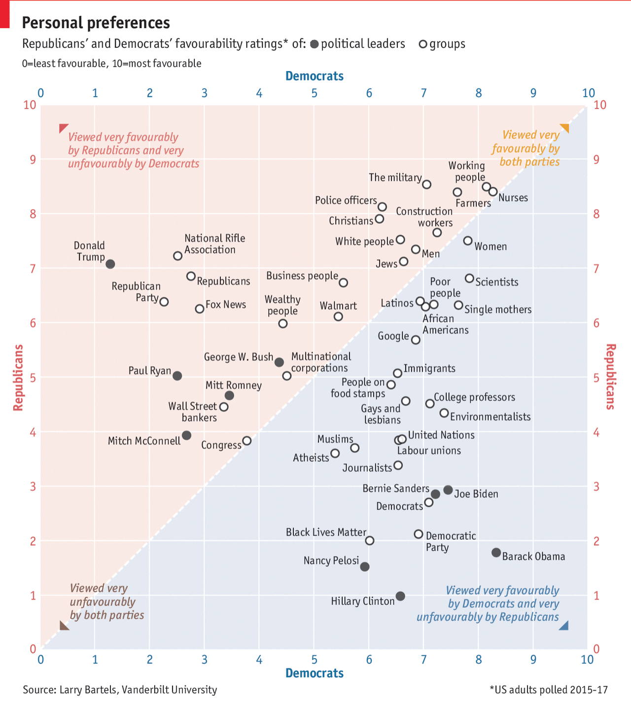
Let’s start this week with a quick hit on popularity and politics. It ties in nicely with the fact that my local congressman, a Republican, announced on Sunday he would not be seeking re-election in a very competitive district.
This piece in particular comes from the Economist and in terms of form, it is fairly simple. A scatter plot tackling the popularity of groups of people and specific politicians divided by whether the respondent is Republican or Democratic.
A nation divided…
The reason I really like this scatter plot are the inclusion of the keys at the four corners. The split between Republicans and Democrats is fairly obvious and nicely coloured. But the little keys really help to clear up any confusion about what is happening as groups of people fall closer to one corner or another. The keys were a small and subtle, but very important design decision.
But what does it all mean? Well, as the headline says, we both rate favourably nurses and working people. Less so Congress and Mitch McConnell.
Credit for the piece goes to the Economist’s graphics team.
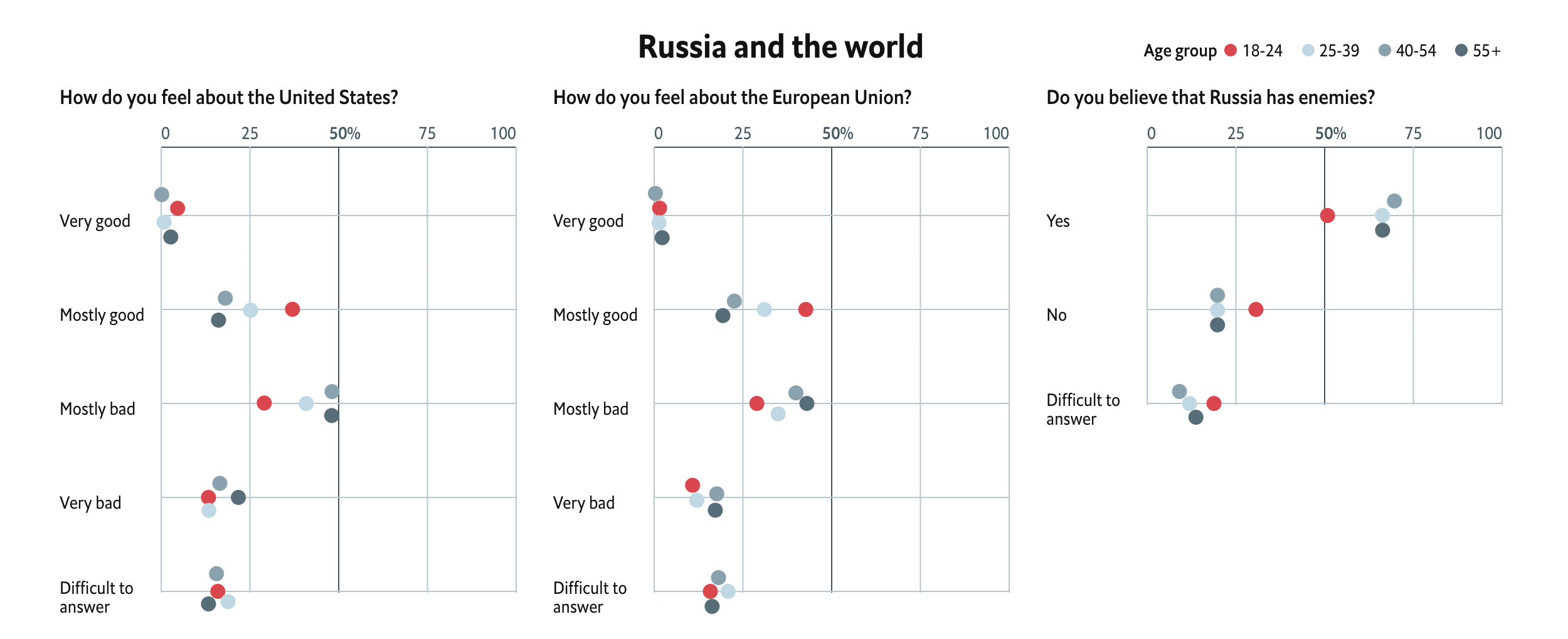
In news that surprises absolutely nobody, Russia “re-elected” Vladimir Putin as president for another six-year term. The Economist recently looked at what they termed the Puteens, a generation of Russians born starting in 1999 who have no memory of a Russia pre-Vladimir Putin.
This piece features a set of interactive dot plots that capture survey results on a number of topics that are segmented by age. It attempts to capture the perspective of Puteens on a range of issues from their media diet to foreign policy outlook to civil rights.
The ideas of youth…
The design is largely effective. The Puteen generation sticks out clearly as the bright red to the cool greys. And more importantly, when the dots would overlap they move vertically away from the line so users can clearly see all the dots. And on hover, all the dots of the same age cohort’s interest are highlighted. I think one area of improvement would have been to apply that same logic to the legend to allow the user to scroll through the whole dataset without always having to interact with the chart. But that is a minor bit on an otherwise really nice piece.
Credit for the piece goes to the Economist’s graphics department.
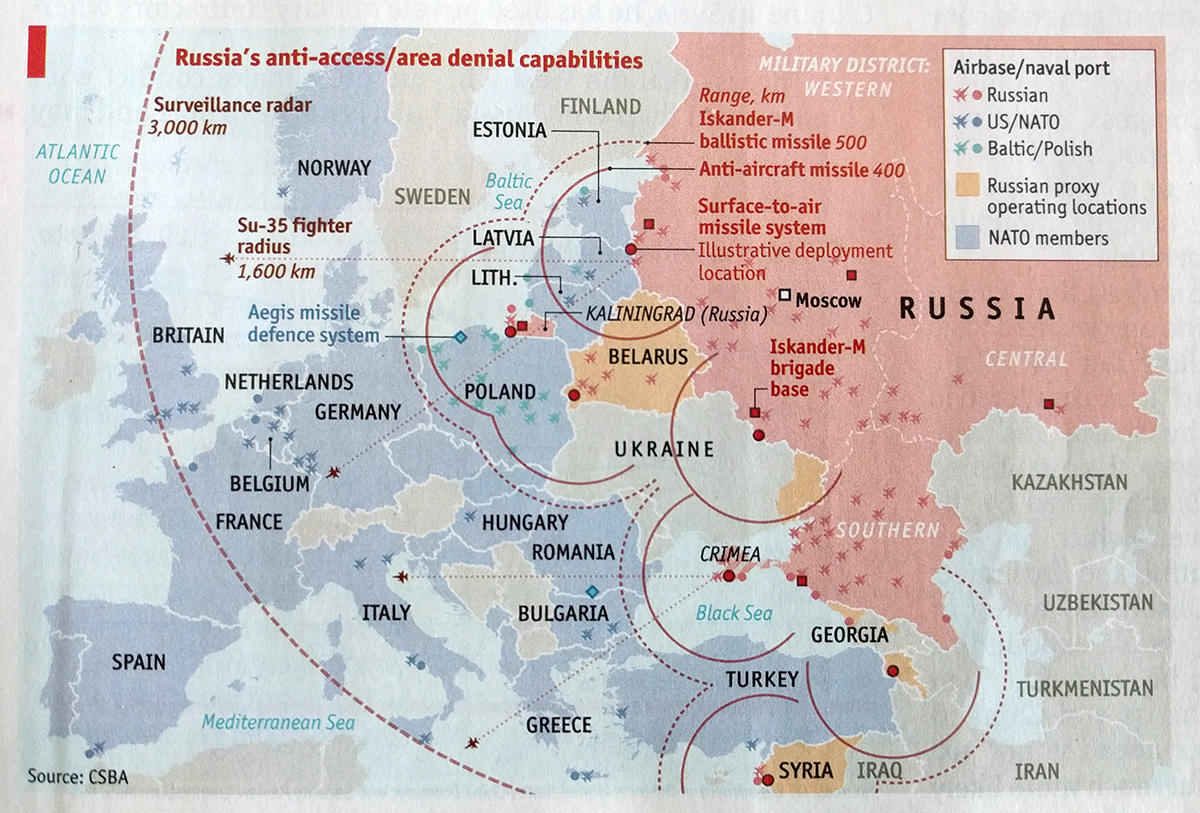
A few days ago a former Russian spy and his daughter were poisoned with a nerve agent, e.g. VX, in Salisbury, England. Over a decade ago, another former Russian spy, Alexander Litvinenko, died in London after being poisoned with polonium, a highly radioactive substance produced inside nuclear reactors, placed inside his tea. Russia’s spies are still a threat in the 21st century, at least attempting to assassinate people they choose in Western cities and capitals.
All that made me think back to an issue of the Economist I received a few weeks ago. It had a special report on the future of warfare and this map on the threat posed by Russian conventional forces.
The Russian threat
It does a good job of showing that in just a conventional sense, Russia remains a dangerous threat to NATO. The Baltic states of Estonia, Latvia, and Lithuania are incredibly vulnerable, all but surrounded by Russia and its allies/proxies.
But as this week’s news highlights, Russia remains a threat in the unconventional space as well. (As also pointed out by the red colour sitting in the formerly Ukrainian Crimean peninsula, seized by unmarked “little green men” in 2014.)
Credit for the piece goes to the Economist graphics department.
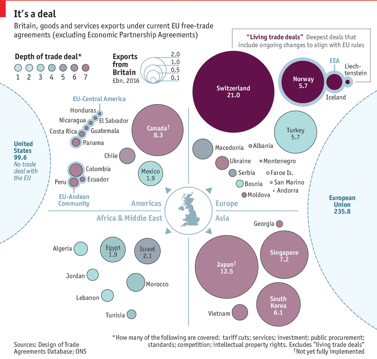
Off of yesterday’s piece looking at the potential slowdown in British economic growth post-Brexit, I wanted to look at a piece from the Economist exploring the state of the UK’s current trade deals.
Still loathe the use of bubbles though…
I understand what is going on, with the size of the bubbles relating to British exports and the colour to the depth of the free trade deal, i.e. how complex, thorough, and wide-ranging. But the grouping by quadrant?
With trade, geographical proximity is a factor. Things that come from farther cost more because fuel, labour time, &c. One of the advantages the UK currently has is the presence of a massive market on its doorstep with which it already has tariff- and customs-less trade—the European Union.
Consequently, could the graphic somehow incorporate the element of distance? The problem would be how to account for routes, modes of transport, time—how long does a lorry have to queue at the border, for example. Alas, I do not have a great answer.
Regardless of my concepts, this piece does show how the most valuable trade partners already enjoy the deepest and largest trade deals, all through the European Union. And so the UK will need to work to replicate those deals with all of these various countries.
Credit for the piece goes the Economist Data Team.