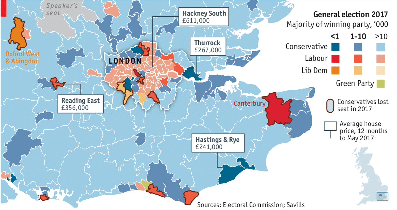
We have a nice little piece from the Economist today, a look at the electoral majority for London-area constituencies and how their housing prices may begin to draw out priced-out Labour votes from London proper.
The political impact of scarce housing supply
What I really like from the design side is the flip of the traditional choropleth density. In other words, we normally see the dark, rich colours representing high percentages. But here, those high majority constituencies are not the ones of focus, so they get the lighest of colours. Instead, the designers point attention to those slimmest of majorities and then offer the context of average home prices.
Credit for the piece goes to the Economist’s Data Team.
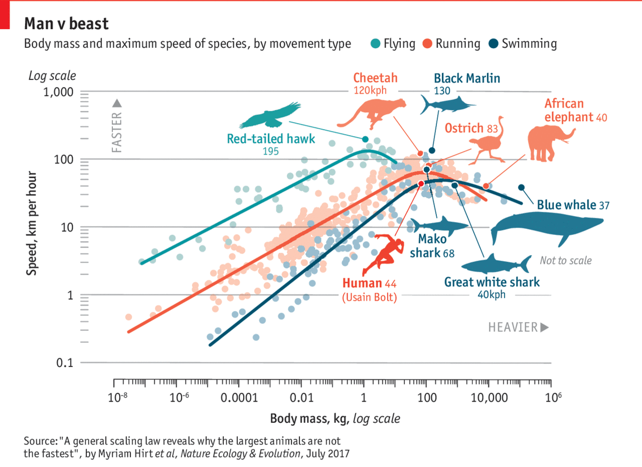
About two weeks ago, Michael Phelps raced a shark. What will they not do for television ratings? The Economist took the basic premise and then had an insightful piece about the speed of animals compared to their size. The whole notion of animals get faster the larger they get. Well, to a point, the Economist found. The graphic is a bit complex, perhaps, in their use of a log scale on both the x and y axes. But they have cute little illustrations of everyone’s favourite animals. So it all balances out in the end.
Man vs. Nature
But there is real science in the piece and it is worth a quick read.
Credit for the piece goes to the Economist graphics department.
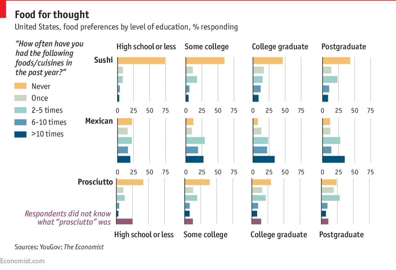
Last week the Economist posted an intriguing article about the relationship between culinary choices/preferences and education and income. It began with an article by David Brooks in the Times, which I have not read, talking about how culture can create inequality as much as economics or government policy. The Economist then conducted a survey looking at the relationship between food preferences and both education and income. This is a screenshot of some of their results.
To be fair, I rarely eat sushi because I don’t much care for it.
Yes, correlation is not causation, but these are some fascinating findings that suggest we should perhaps explore the idea in more depth.
As to the graphics, we have nothing super sophisticated, just a matrix of small multiples. But that goes to the point of “simple” graphics sometimes can do wonders for a story.
Credit for the piece goes to the Economist graphics department.
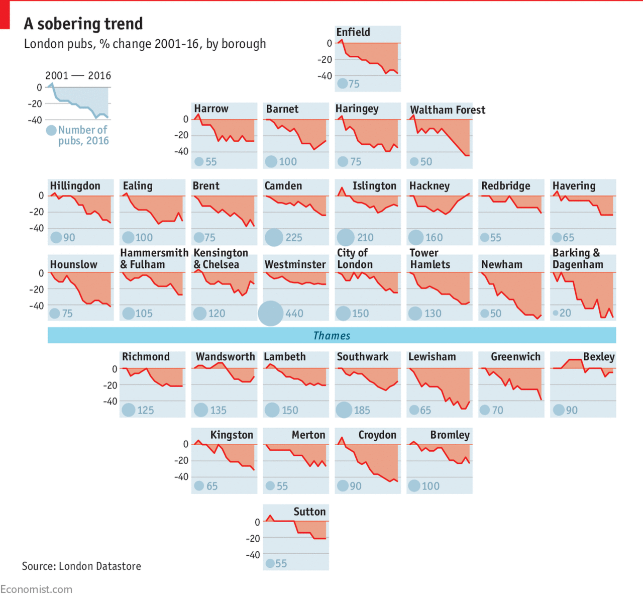
You all know that I love small multiples. And we have been seeing them more often as representations of the United States. But today we look at a small multiple map of London. The piece comes from the Economist and looks at the declining numbers of pubs in London. With the exception of the borough of Hackney, boroughs all across London are seeing declines, though the outer boroughs have seen the largest declines.
Mini London
The only thing that does not work for me is the bubble in each tile that represents the number of pubs. That gets lost easily among the blue backgrounds. Additionally, the number itself might suffice.
Credit for the piece goes to the Economist graphics department.
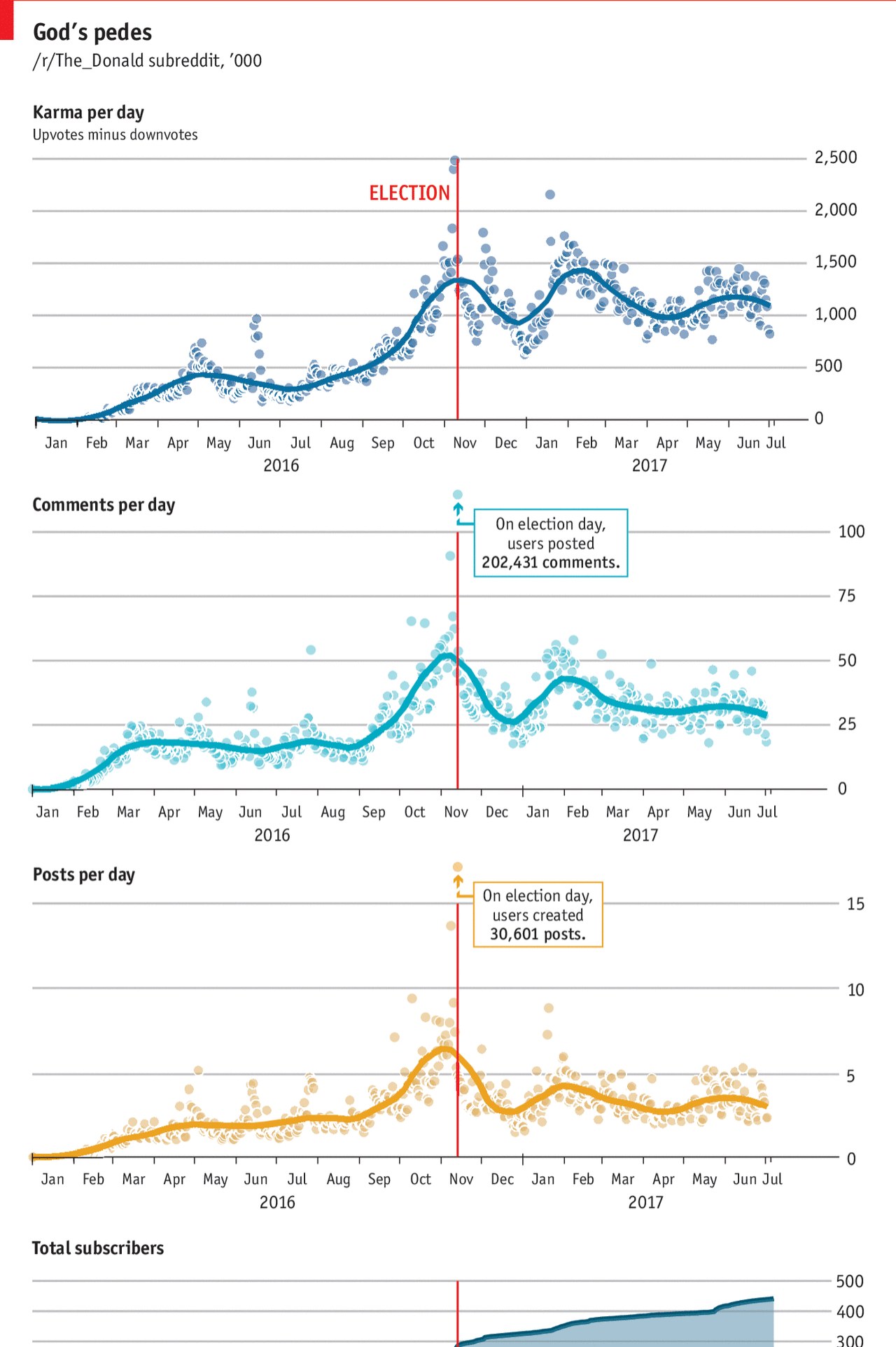
I don’t use Reddit. But things begin to made sense for me in this article from the Economist as it explained the origins behind Trump’s weird tweet of himself beating up a CNN-headed wrestler.
Unfortunately I don’t understand how Reddit works well enough to make full sense of these
I think the thing perhaps lacking from the graphic is a line that tracks Trump’s approval or popularity. The article mentions that explicitly and it would be interesting to see that track over time. Although I certainly understand how stacking so many line charts above each other could become difficult to compare.
And my final critique are the Election Day outliers. They are above the y-axis maximum. But I wonder if there couldn’t have been a way of handling the outlier-ness of the datapoints while remaining true to the chart scales.
Credit for the piece goes to the Economist graphics department.
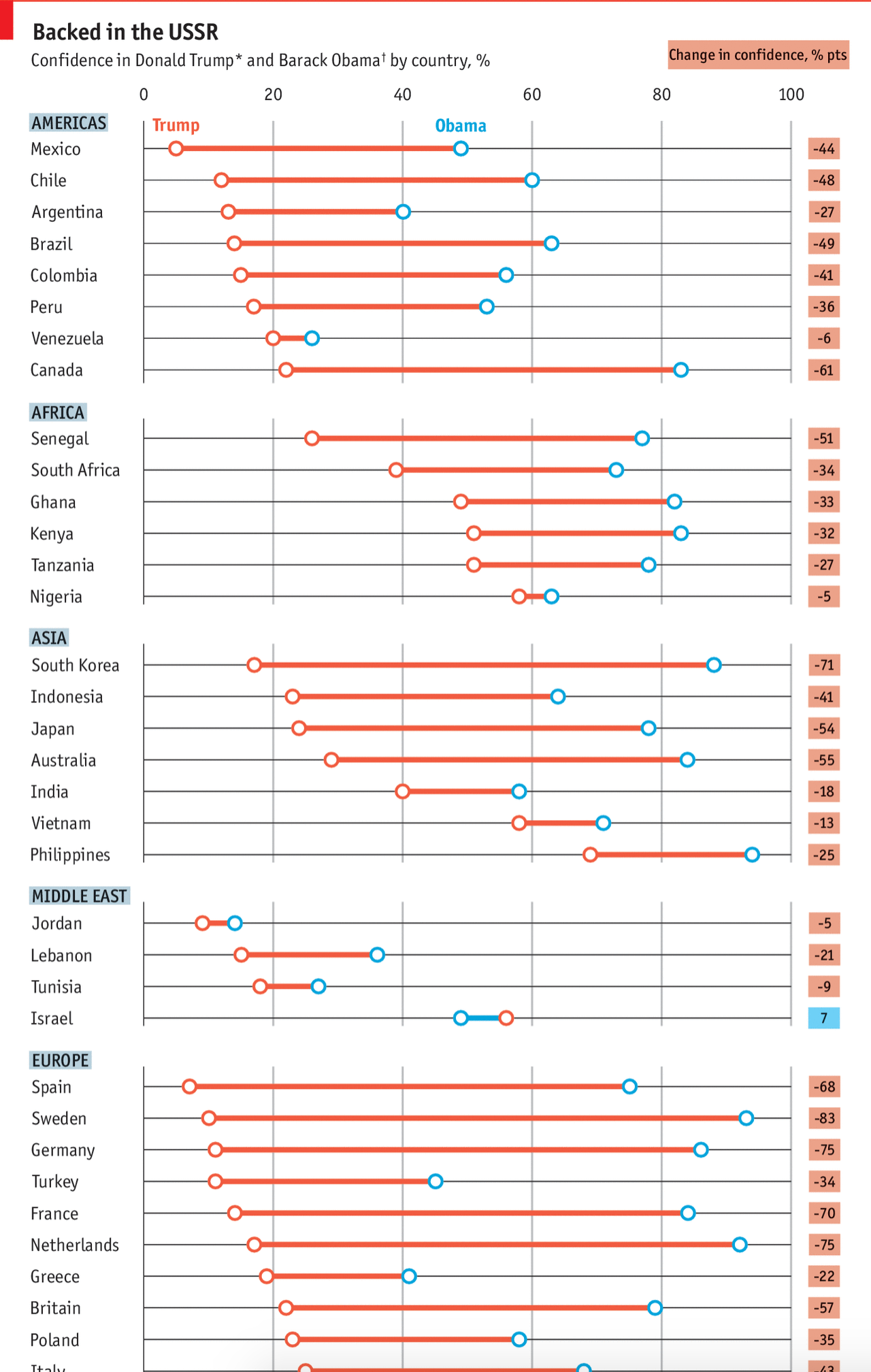
The Pew Research Centre surveyed international respondents about their confidence in Donald Trump vs. Barack Obama. The Economist took those results and visualised them. And the results, well they kind of speak for themselves. But make sure to click through the link for the rest of the graphic.
That’s a lot of declining values
Credit for the piece goes to the Economist graphics department.
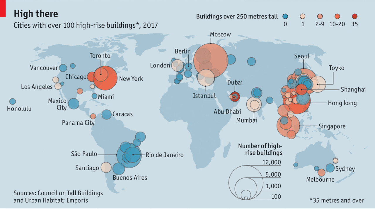
I was reading my print edition of the Economist last night and found this graphic—screenshot from the online version—about the rising importance of skyscrapers in the urban landscape.
The article was written after the Grenfell Tower inferno and looks at things that could be done to improve safety in high-rises.
Where’s Philly?
Naturally, I was reading this on my 11th story balcony in the high-rise tower block in which I live.
Credit for the piece goes to the Economist graphics department.
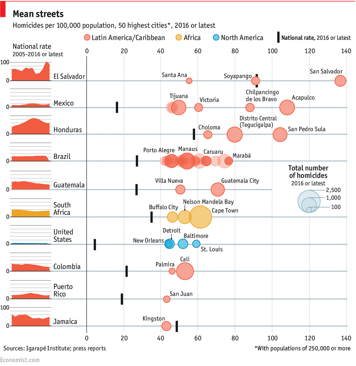
Quite a few things to look at this week. But I want to start with something that caught my attention last Friday. The Economist produced this graphic about the top-50 cities by the always pleasant metric of homicide. I bring it up because of the oft mentioned capital of carnage here in America: Chicago. (To which I’m briefly returning late this week.)
The capitals of crime, the metropolises of murder
Note which city is not on that list: Chicago.
Some countries, sadly El Salvador, Honduras, and Mexico, are among those expected on that list. But the United States is the only rich, industrialised nation present. Unfortunately this is not a list on which we should aspire to be.
The graphic itself does a few nice things. In particular, I like the inclusion of the small multiple national rate to the left of the cities. Because, obviously, high murder rates are not great in El Salvador, but on the plus side, they are down of late. And the same small multiples do go a long way to show that, in general, despite what the administration says, homicide rates in the United States are quite low by these standards.
My quibble with the graphic? Breaking out cities by country. Yeah, it does make a lot of sense. But look at that country listed two spots below the United States: Puerto Rico. I am not here going to get into the whole Puerto Rican statehood vs. sovereignty argument, but suffice it to say that it is a part of the United States.
Credit for the piece goes to the Economist’s graphics department.
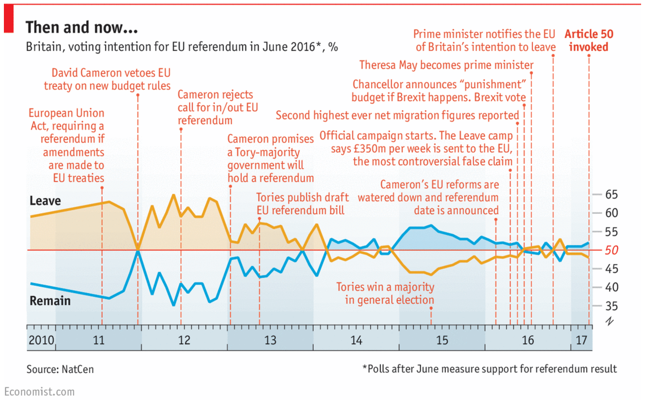
So yesterday was Article 50 Day and several British media companies published graphics about the historic event. I wanted to focus on this piece from the Economist, which is a timeline of the events leading up to Article 50. But more importantly, it includes the polling data for Remain or Leave along the length of those events.
The Brexit campaign timeline
There isn’t a whole lot more to say about this. Article 50 is just kind of a downer.
Credit for the piece goes to the Economist’s graphics department.
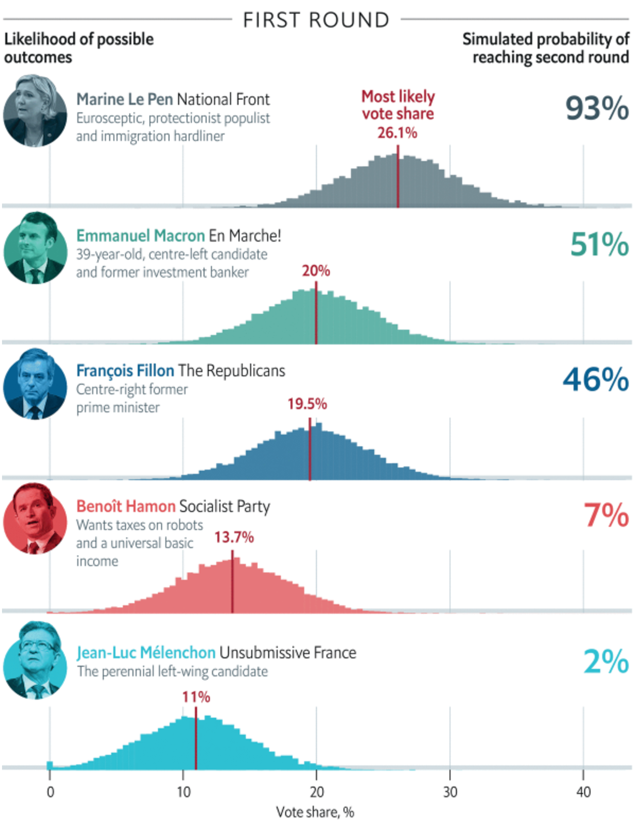
Last Friday the Economist published this article about the odds of Marine Le Pen, the leader of France’s National Front party, winning the French presidential election in April. You may recall I focused on other things last Friday. So today we have this graphic.
Without a majority of the vote, the top two vote earners move to a second round
But this morning news broke about new allegations over fraudulent claims by Le Pen and the National Front. This, after claims of fraud against Fançois Fillon and some unhelpful remarks about Algeria from Emmanuel Macron, could be enough to make the French presidential election a complete toss up.
But for now we just wait to see if the rise of populist nationalism continues.
Credit for the piece goes to the Economist’s graphics department.