Italian Election Results

Europe enjoyed some significant political news yesterday. First, Angela Merkel will serve a fourth term as chancellor as the SPD members voted to allow their party to enter into a grand coalition with Merkel’s CDU/CSU party.

But the more important story is that of the Italian elections, where the centre-left under Matteo Renzi was attempting a comeback against the populist parties the 5-Star Movement and the League, the latter an anti-immigrant party. Also in the mix was Silvio Berlusconi, whose Forza party won 14% of the vote and as a member of a right/centre-right bloc that won 37%.

So I chose to highlight the homepage of IL Sore 24 Ore, an Italian newspaper, that had the results displayed clearly.

Live results at the top of the home page

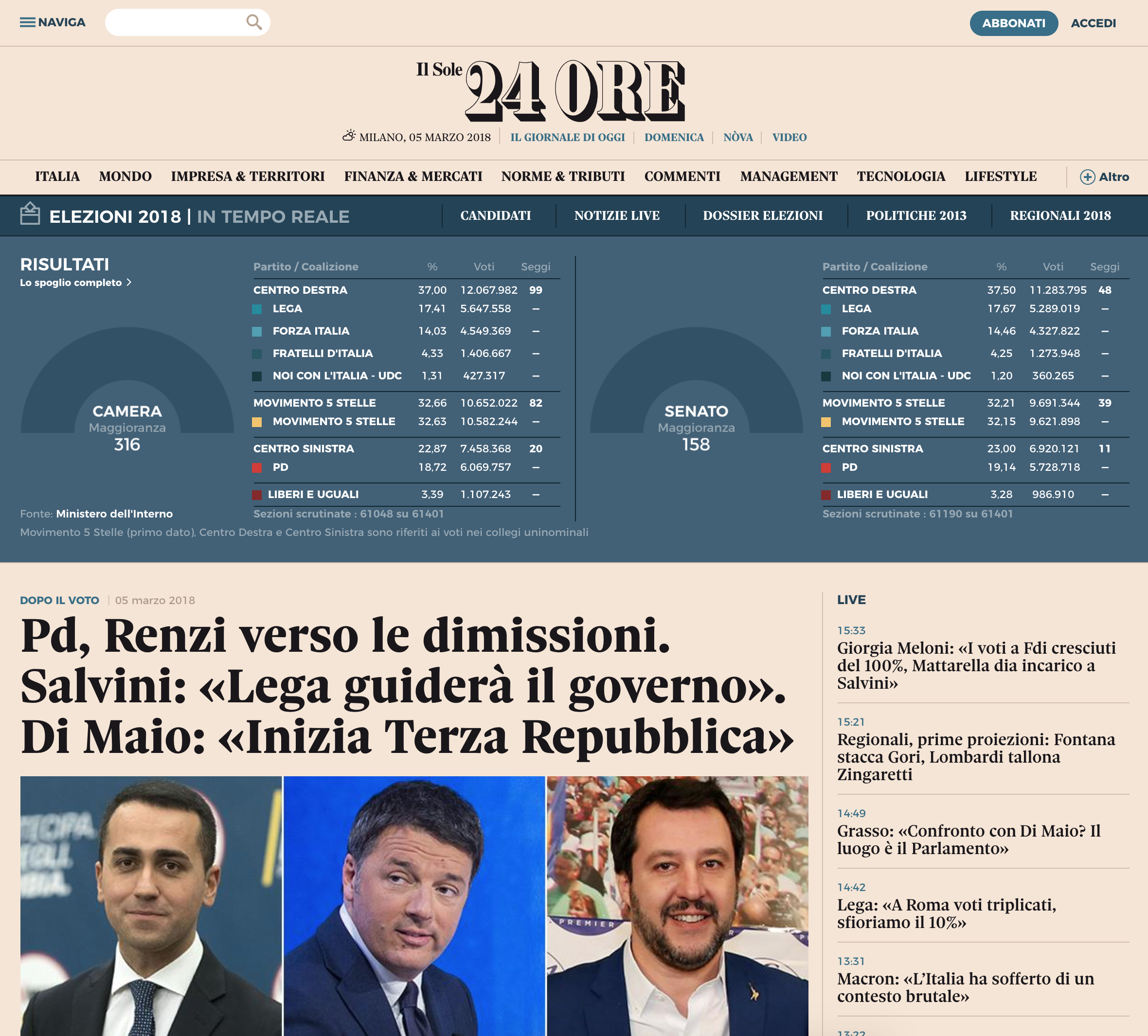
Of course the big problem is that I can neither read nor speak Italian. So figuring out just what every label is proved to be a bit tricky. But once you figure it out, it is quite clear.  The nice blue banner for the real-time results (again with the assuming of translation) does a nice job of clearly separating itself from the rest of the page, but the tables inside are quiet and not screaming for attention. Instead the user is allowed to find his or her party of bloc of interest and then scan to the right for the bold number of seats in the respective chamber.

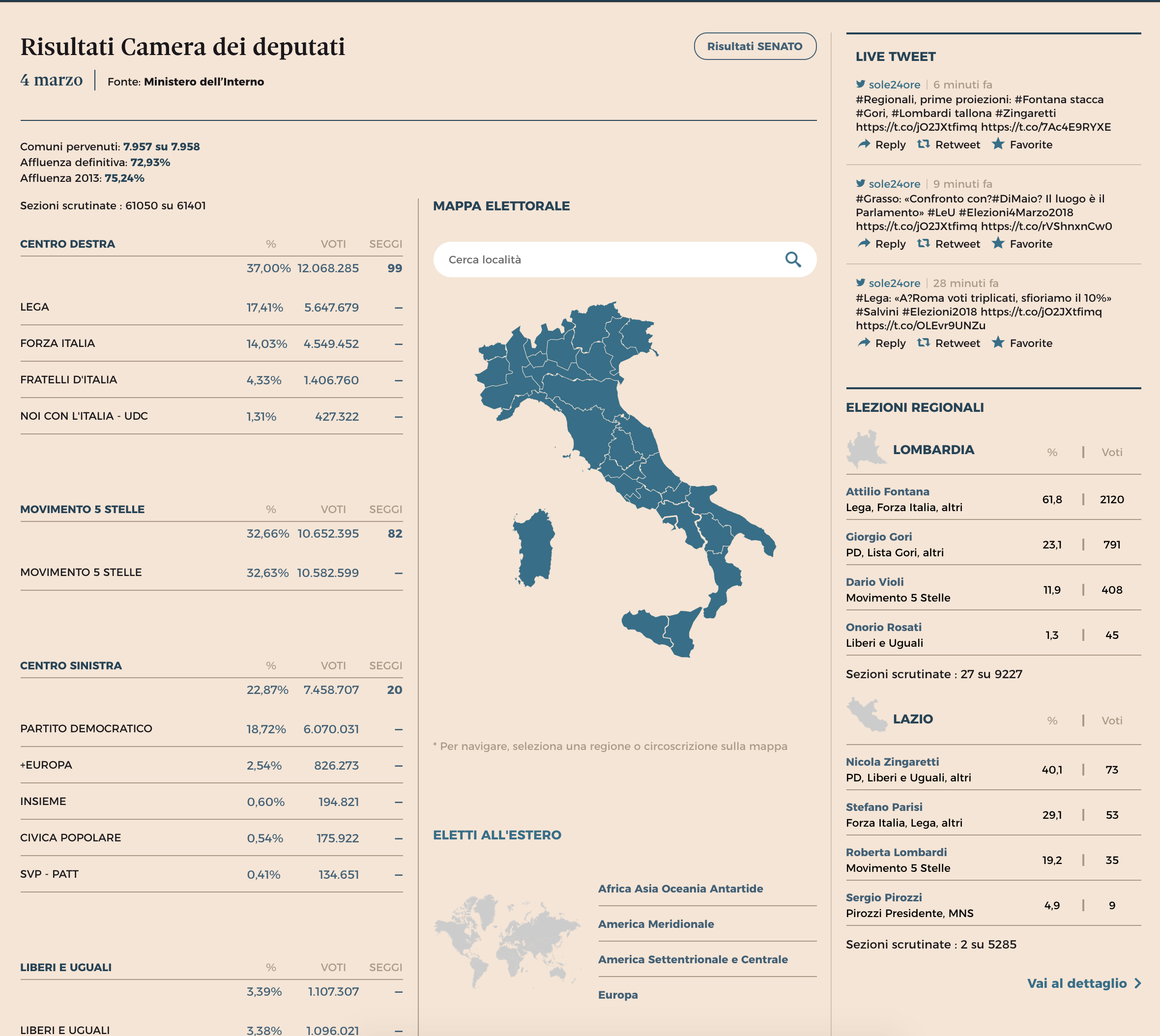
The results page is similarly nice, using clean and simple tables to organise the information. Using the Chamber of Deputies page as an example, the overall results appear on the left while important context via maps and specific regions appear to the right. All the while the use of simple typography and whitespace guide the user to the appropriate data set.

These are the results for the Chamber of Deputies, the equivalent to the US House or House of Commons

And lastly a screenshot of an article about the election results, none of which I can read. Here, instead of an interactive table or graphic, we have a static graphic showing the results. It certainly captures the results in this particular moment—exact seat numbers have not yet been released—but could grow stale as the day goes on. Although there very well could be a page with interactive results like this, but that I cannot find because, again, I cannot read Italian.

The centre-right bloc did well, as did the 5-Star Movement (M5S)

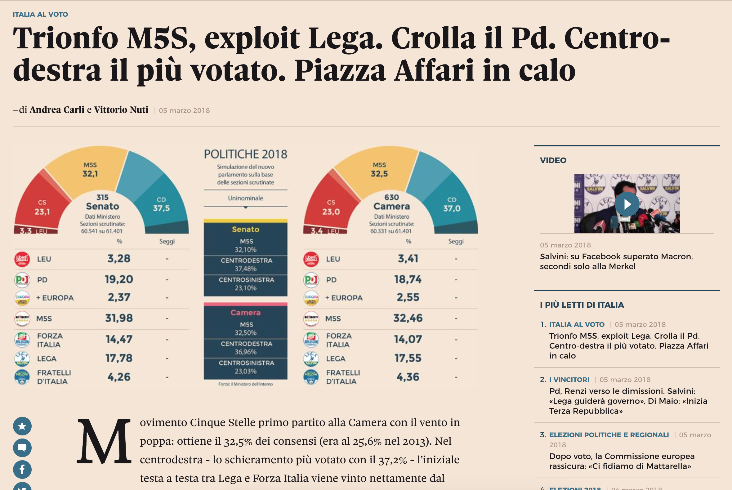
The design of the graphic is nice. It uses the popular half-circle arc to show who “crosses the finish line” in terms of blocs seating more than 50% of the chamber. But once again, I am most impressed by the clarity of the table and information displays through white space and typography. (Though I feel in this case white space should be more like light salmon-coloured space.)

Overall, the designers did a fantastic job of presenting the data and information, so well that a non-Italian could even figure it out.

Credit for the piece goes to the Il Sore 24 Ore graphics department.

Undersea Mining

Today’s piece isn’t strictly about data visualisation. Instead it’s a nice article from the BBC that explores the nascent industry of undersea mining. What caught my interest was the story of Soviet submarine K-129, which sank mysteriously in the middle of the Pacific. But that isn’t even half the story, so if you are interested go and read the article for that bit.

But that sinking may have created the beginning of the undersea mining industry. And so as I read on, I found a nice mixture of text, photography, and graphics explaining processes and such. This screenshot is a comparison of the size of an undersea mining zone compared to a land-based copper mine.

An undersea mine vs. a surface mine

Some of the graphics could use some polish and finesse, but I do appreciate the effort that goes into creating pieces like this. You will note that four different people had to work together to get the piece online. But if this is perhaps the future of BBC content, this is a great start.

Credit for the piece goes to David Shukman, Ben Milne, Zoe Barthlomew, and Finlo Rohrer.

Short and Long Term

One week ago today, President Trump touted soaring stock prices as an indicator of a roaring economy. In truth, stock market prices are not that. They are driven by fundamentals, such as GDP growth, wage increases, and inflation. Furthermore stock prices can be fickle and volatile. Whereas a recession does not begin overnight, the factors build over a period of time, a stock market correction can happen in a single day.

So one week hence, the stock market has seen fully one-third of its gains over the past year wiped out. That is over $1 trillion gone from market funds, 401ks, college saving funds, &c. But again, not to freak people out, these things can and do happen. But because they can and do happen, presidents do not often go touting the stock market as it can come back and bite them.

This morning’s paper therefore had a pleasant graphic to accompany a story about the recent declines. And it was on the front page.

The front page
The front page

Like with the choropleth story I covered a little over a week ago, the graphic in today’s paper was not revolutionary nor earth shattering. It was two line charts as one graphic. What was neat, however, was how it supported two different articles.

One graphic, two articles

But when I looked closer I found what was really neat: context.

Notice the little arrow…

The chart does a great job of showing that context of adding nearly $8 trillion in value over the course of the administration. But then that sharp decline at the right-side of the chart is blown out into its own detail to show how all was steady until Friday’s economic news was released. I think perhaps the only drawback is how tiny and fragile that arrow feels. I wonder if something a little bolder would better draw the eye or connect the dots between the two charts. Maybe even moving the “… and the last week” line above the chart line would work.

Anyway, I was just curious to see how the charts were depicted on the web. And then lo and behold I was treated to two graphics on the home page. The other is for an article about flood risks to chemical plants, not part of this post. But the focus of our post on the stock market was the same as in print. But here is the homepage with two different graphics, always a treat for a designer like myself.

The New York Times homepage this morning

Credit for the piece goes to the New York Times graphics department.

The World Grows On (Part II)

Earlier this month I wrote-up a piece from the Economist that looked at 2018 GDP growth globally. I admitted then—and still do now—that it was an oddly sentimental piece given the frequency with which I made graphics just like that in my designer days of youth and yore. Today, we have the redux, a piece from the New York Times. Again, nothing fancy here. As you will see, we are talking about a choropleth map and bar charts in small multiple format. But why am I highlighting it? Front page news.

Choropleth on the front page? More please.

I just like seeing this kind of simple, but effective data visualisation work on the front page of a leading newspaper.

Lots of green on that map

I personally would have used a slightly different palette to give a bit more hint to the few negative growth countries in the world—here’s lookin’ at you, Venezuela—but overall it works. And the break points in the bin seem a bit arbitrary unless they were chosen to specifically highlight the called-out countries.

Then on the inside we get another small but effective graphic.

Page 4
Page 4

It doesn’t consume the whole page, but sits quietly but importantly at the top of the article.

The world's leading economies, on their own
The world’s leading economies, on their own

There the small multiples show the year-on-year change—nothing fancy—for the world’s leading economies. A one-colour print, it works well. But, I particularly enjoy the bit with China. Look at how the extreme growth before the Great Recession is handled, just breaking out of the container. Because it isn’t important to read growth as 13.27% (or whatever it was), just that it was extremely high. You could almost say, off the charts.

Overall, it was just a fun read for a Sunday morning.

Credit for the piece goes to Karl Russell and the New York Times graphics department.

How to Choose the Match to Broadcast

I was reading the Sunday paper yesterday and whilst I normally skip the sports section, especially during baseball’s offseason, this time a brightly coloured map caught my attention. Of course then I had to read the article, but I am glad that I did.

On Sunday the New York Times ran a print piece—I mean I assume I can find it online (I did.)—about CBS chooses which American football matches to air in the country’s markets. It is a wee bit complicated. And if you can find it, you should read it. The process is fascinating.

But I want to quickly talk about the design of the thing. Remember how I said a map caught my attention. That was pretty important, because the map was not the largest part of the article. Instead that went to a nice big photo. But the information designer I am, well, my eyes went straight to the map below that.

The story dominated the section page

There is nothing too special about the map in particular. It is a choropleth where media markets are coloured by the game being aired yesterday. (The piece explains the blackout rules that changed a few years ago from what I remember growing up.)

But then on the inside, the article takes up another page, this time fully. It runs maps down the side to highlight the matches and scenarios the author discusses, reusing the same map as above, but because this is an interior page, in black and white. It probably looks even better online as they likely kept the colour. (They did. But the maps are smaller.)

To have that much space in which to design an article…

Overall, I really enjoyed the piece and the maps and visuals not only drew me into the piece, but helped contextualise the story.

Credit for the piece goes to Kevin Draper.

The Demilitarised Zone

Over the weekend, the American and North Korean leaders got into an argument with the North Korean leader calling President Trump old and the American leader calling Kim Jong Un short and fat. High class diplomacy.

So what holds the North Korean army, by numbers likely not quality one of the largest armed forces in the world, back from sweeping down the Korean coastlines and overrunning Seoul? Well, that would be the role of the Demilitarised Zone, or DMZ. And thankfully yesterday, whilst your humble author was out sick, the Washington Post published a piece looking at the DMZ.

The title of the piece

The piece uses a giant, illustrated in the background to provide context to the words and imagery sitting in the foreground. (That is how I justified covering it in the blog: map.) Overall the experience was smooth and informative about the sheer amount of destructive power waiting just miles north of Seoul.

Credit for the piece goes to Armand Emamdjomeh, Laris Karklis, and Tim Meko.

Why So Many Mass Shootings?

Well, the data speaks for itself. I wanted to use this screenshot, however, to show you the story because I think it does a fantastic job. Without having to read the article, the image encapsulates what is to come in the article.

Just the visual impact of the outlier

That said, there are a few other scatter plots worth checking out if the topic is of interest. And the explanation of the data makes all the more sense.

But I really loved the impact of that homepage.

Credit for the piece goes to Max Fisher and Josh Keller.

Rising Rate of US Drug Deaths

While today’s post is not an uplifting story, I did find it remarkable in its presentation. Nothing too fancy or revolutionary to be certain, but remarkable nonetheless. What was it? This morning when I picked up the Times there was a chart in black and red, above the fold, below the cover photo.

The story is about the rising number of deaths in the United States attributed to drugs. And, no, the line chart is not groundbreaking—though I do love the way the designers cut into the space to efficiently set copy and annotations. But as an above-the-fold graphic this morning, it did the trick.

Again, I like the layout of the piece

Credit for the piece goes to Josh Katz.

The US Airline Industry

Yesterday Oscar Munoz, the CEO of United Airlines, testified to Congress about the airline industry. All of this just a few weeks after such a great week of press coverage. Of course, the last few weeks have also been a wee bit busy, so I was unable to post today’s piece. But with Munoz’s testimony it makes the perfect segue.

Today’s piece is a graphic article from the New York Times. It examines the state of the US airline industry. I use the term graphic article, because outside of headlines and subheads, it uses few words. Instead the point of the article is conveyed via charts. And what I found really nice is that, as the below photo shows, the article comprised most of the front page of the Business section.

The overall layout of the page

In terms of the structure, the piece did a nice job of giving breathing space around the various elements. This helps focus the reader’s attention on the charts and the data therein. Long headers and subheads break the vertical flow and create sentences or paragraphs that the charts prove.

The graphics above the fold

But then we get below the fold and low and behold we have a pie chart. I would have probably used a bar chart to show the market share. Especially with the top-three airlines so close. On the other hand, I can see the argument for the large, colour-filled visual. It does a nice job balancing the area charts at the opening and puts an emphatic period at the end of the piece.

And then below the fold

Overall, a solid piece and one that I am glad occupied a significant portion of the Business section front page.

Credit for the piece goes to Karl Russel.

The Russians Are Coming

I mean, they’re already here…we will return to that shortly.

I hope you enjoyed your three-day weekend, but this is a busy week, folks. Most importantly we have Thursday’s by-elections in Copeland and Stoke-on-Trent, those are in the UK for my American audience, where we will see just how crazy British politics gets post-Brexit referendum.

But today is Tuesday, and in a slight departure from the normal, as a new subscriber to the failing New York Times, I was pleasantly surprised to see this cover waiting for me Sunday.

In Soviet Russia, newspaper reads you…

Quite a nice use of the Russian constructivist language going on. I’m not accustomed to seeing newspaper copy set on an angle.

Credit for the piece goes to the New York Times graphics department.